What is Shōwa Kissaten?
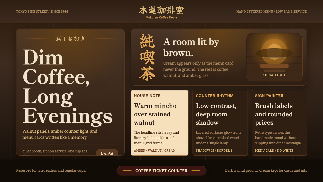
The Shōwa kissaten turned dimness into luxury — walnut panelling, amber lamplight, and a menu-grid quiet that modern cafés never learned to keep.
Shōwa Kissaten in brief
Shōwa Kissaten is a design language drawn from Japan's postwar jun-kissa — independently owned coffee houses that flourished from the 1950s through the bubble years, before convenience-store coffee and chain cafés remade the country's drinking habits. A jun-kissa is defined by what it withholds: no daylight glare, no music louder than a ticking clock, no bright signage competing for attention. The room is panelled in dark stained walnut, lit by low amber lamps that pool light rather than flood it, and centered on a worn wooden counter where the owner (tenshu) pours siphon coffee with the unhurried attention of a craft passed down rather than trained.
The visual system built from this room is dominated by brown — not as a neutral backdrop but as the room's entire emotional register, carried by wood grain, coffee stains, and aged brass rather than by paper or print. Warm mincho serif headings do the talking that neon or sans-serif signage would do in a brighter format; brush-influenced accents and rounded retro lettering nod to hand-written chalkboard menus and softly lit hanging signboards. Cream appears sparingly, reserved for a menu card or a paper coaster, never for a background — the moment cream becomes ground, the room stops being a kissaten and becomes a café.
What makes the style cohere is restraint applied to warmth rather than to austerity. Unlike a minimalist system that removes ornament to achieve clarity, Shōwa Kissaten keeps a great deal of visual incident — wood texture, glass sugar jars catching lamplight, a worn menu-grid layout — but keeps all of it low in value and narrow in hue. The result reads as lived-in rather than designed: a room that has been the same for forty years and intends to stay that way.

Where does Shōwa Kissaten come from?
Kissaten (literally 'tea-drinking shop') is the broad Japanese term for a coffee house, but jun-kissa — 'pure kissaten' — refers specifically to independent, owner-operated establishments that emerged as a distinct urban institution in the years following the Second World War. Coffee itself was a scarce, imported luxury in occupied and immediate postwar Japan; the earliest kissaten served it in small quantities to customers who came as much for the atmosphere and the escape from cramped housing as for the drink itself. As the economy recovered through the 1950s and into the high-growth 1960s, the kissaten multiplied across Tokyo, Osaka, and every regional city, each one built and decorated according to its owner's individual taste rather than any corporate template.
The Shōwa era (1926–1989) spans the entire arc from prewar militarism through postwar reconstruction, the 1964 Tokyo Olympics, the high-growth decades, and the 1980s bubble economy — and the kissaten aesthetic most associated with the term today crystallized specifically in the middle of that span, roughly the 1950s through the 1970s. Owners favored dark hardwoods (walnut being a particular signifier of taste and permanence), leather or vinyl booth seating, brass fittings, and lighting fixtures that produced warm, low-lumen pools rather than even illumination. This was partly aesthetic preference and partly practical: dim, warm lighting made a small, often windowless room feel intimate rather than cramped, and it flattered the wood and brass surfaces the owner had invested in.
The tenshu — the proprietor, almost always a single dedicated individual rather than a chain manager — became a defining figure of the format. Many tenshu treated coffee preparation as a serious, almost ascetic craft, favoring siphon brewing (a glass vacuum apparatus that produces a theatrical, slow-drip ritual visible to the customer) and building menus, often hand-lettered, that rarely changed from year to year. Regulars returned not for novelty but for consistency — the same seat, the same cup, the same low light at the same hour.
By the 1980s bubble years, brighter, Western-style café chains and later convenience-store coffee began eroding the jun-kissa's customer base, and many long-running establishments closed as their aging owners retired without successors. The style survives today partly through a small number of surviving originals in Tokyo neighborhoods like Ginza and Jimbōchō, and partly through a wave of nostalgic reappraisal — younger patrons and design-conscious cafés reviving the aesthetic deliberately, recognizing in its dimness and consistency a value that brighter modern spaces had traded away.
What defines the Shōwa Kissaten look?
Color
Brown dominates almost every surface — walnut wood, roasted coffee, aged leather — and functions as the room's near-neutral ground rather than an accent. Amber and warm gold appear as glowing highlights from lamps and brass fittings, never as a bright fill. Cream is used with extreme restraint, appearing only on a menu card or coaster as a small area of relief; it never becomes a background because doing so would tip the mood from intimate dimness toward ordinary daytime brightness.
Typography
Warm mincho (Japanese serif) carries headings and signage, its bracketed stroke endings and calligraphic weight variation reading as considered and unhurried rather than mechanical. Brush-influenced and rounded retro accent lettering appears for smaller labels, evoking the feel of a hand-lettered chalkboard menu rather than a printed one. The overall typographic mood favors warmth and legibility at close reading distance over the boldness a brighter, more commercial format would demand.
Lighting Logic
Illumination is treated as a pool rather than a flood: a small number of low-lumen amber sources create bright spots against a generally dim field, mimicking the effect of table lamps and pendant fixtures in the original rooms. This uneven lighting is a deliberate feature, not a limitation — it draws the eye to specific focal points (a counter, a menu, a glass jar) the way a real jun-kissa draws attention to the tenshu's hands at work.
Materials and Texture
Wood grain, brass sheen, leather sheen, and the faint iridescence of glass are all treated as legible surface qualities rather than smoothed away — the room's materials are meant to show their age. Digital renderings of this style favor subtle texture and grain over flat fills, since a flat brown field reads as paint rather than as the wood or leather the palette is trying to evoke.
Menu-Grid Layout
Content organization borrows directly from the physical menu board of a jun-kissa: items sit in a modest, evenly spaced grid rather than a magazine-style asymmetric layout, with each row given roughly equal visual weight. This produces a calm, list-like rhythm appropriate to a room where nothing is meant to compete for attention — the layout communicates through consistency rather than hierarchy.
Signage and Ornament
Ornament is drawn from hand-crafted signage — a softly lit hanging sign, a chalked specials board, an etched glass panel — rather than from printed graphic decoration. Anything that reads as mass-produced or overtly commercial (bright plastic signage, high-contrast advertising type) works against the style, which depends on the sense that every element was made or chosen by one person for one room.

Who shaped Shōwa Kissaten?
The tenshu is not a single historical individual but the archetypal proprietor-craftsman at the center of every jun-kissa — almost always the sole owner-operator, responsible for brewing, decor, and the unchanging daily ritual regulars came to rely on. The tenshu's personal taste, rather than any corporate design brief, is why no two jun-kissa look quite alike even as they share a recognizable family resemblance.
The broader institution of the jun-kissa emerged from the specific conditions of occupied and reconstruction-era Japan — scarce imported coffee, cramped urban housing that made a semi-private third space valuable, and a generation rebuilding both cities and daily rituals. This cultural context, more than any single designer, produced the aesthetic vocabulary the style now draws on.
The siphon method — glass vacuum apparatus heated from below, producing a slow, visible brewing ritual — became closely associated with the jun-kissa's craft-focused identity. Its theatrical slowness is part of why the format's pacing (and, by extension, its visual calm) rewards patience rather than speed.
How do you use Shōwa Kissaten today?
Shōwa Kissaten transfers well to any digital product that wants to signal craft, permanence, and a deliberate refusal of speed as a value — a slow-food brand, a specialty-coffee retailer, a hospitality or ryokan booking site, or a journal-style publication about traditional craft. The key to applying it correctly is resisting the temptation to brighten it up: the style's entire emotional payload depends on holding values low and warm rather than compromising toward conventional web brightness for the sake of contrast or accessibility convenience.
For presentation slides, the style favors a cover treatment built from a deep brown-black field with a single warm amber glow — a lamp, a coffee cup rim, a signboard edge — positioned as the visual anchor while a mincho-set title sits nearby in a warm, muted tone rather than stark white. Content slides should keep the menu-grid discipline: rows of roughly equal weight, generous vertical spacing, no bright accent colors breaking the warmth. Data visualizations translate awkwardly into this style and should be handled sparingly — a system built around dimness and warmth resists the high-contrast clarity data charts usually need, so numeric content is often better presented as simple labeled figures within the menu-grid rather than as chart objects.
For web interfaces, the style suits landing pages and about pages for hospitality, food, and craft brands far better than data-dense dashboards, where its low contrast would frustrate scanning. A hero section built on a dim walnut-toned field with a single amber focal glow, mincho headline type, and a restrained call-to-action button reading as etched rather than shouted communicates the brand values well. Navigation should stay understated — text labels rather than iconography, consistent with the style's rejection of bright commercial signage.
For editorial and marketing work, the style rewards long-form, unhurried content: a magazine feature about a coffee roaster, a brand story about heritage craft, or a menu presentation for a restaurant leaning into nostalgia. Photography should be warm-toned and softly lit rather than crisp and evenly exposed, and pull quotes or captions work best set in the same warm mincho voice as headings rather than a contrasting sans-serif.
A common mistake is treating this style as simply 'brown minimalism' and flattening its warmth into a generic dark-mode palette. The style depends on genuine warmth — amber and gold light sources, wood-grain texture, brass sheen — not on desaturated gray-brown. A second common mistake is over-brightening for accessibility reasons until the room reads as a normal café rather than a dim jun-kissa; where contrast must be improved, it should be done by strengthening the single amber accent rather than by lifting the overall brightness of the brown ground.

Shōwa Kissaten — FAQ
Is Shōwa Kissaten the same as general 'Japandi' or minimalist Japanese design?
No — they draw on nearly opposite instincts. Japandi-style minimalism favors light woods, pale neutral fields, and generous negative space, aiming for a bright, airy calm. Shōwa Kissaten favors dark stained wood, low warm lighting, and a deliberately dim, enclosed feeling. Both value restraint, but one expresses restraint through brightness and emptiness, the other through dimness and lived-in warmth.
Why does the style avoid cream or white as a background?
Because the entire mood depends on the room reading as dim and enclosed. The moment a light neutral becomes the dominant ground, the composition shifts from 'a dark room lit by a few warm lamps' to 'a bright room with brown accents' — a fundamentally different, more ordinary café feeling. Cream is preserved as a rare accent precisely so it retains the power to read as a small, deliberate area of relief rather than becoming the default state.
How should data or numeric content be handled in this style?
Sparingly. The style's low overall contrast and warm, uneven lighting logic work against the crisp differentiation that bar charts, line graphs, and dense tables usually need. Where numeric content is unavoidable, it is better presented as a small number of clearly labeled figures set within the menu-grid layout — treated as another row on the menu board — rather than as a distinct chart object competing visually with the rest of the composition.
What kind of imagery fits this style?
Warm, softly lit photography of interiors, hands at work, or close details — a coffee siphon mid-brew, a worn wooden counter, a glass sugar jar catching lamplight — fits naturally. Crisp, evenly lit, high-key photography (the kind common in modern café marketing) works against the style, since it reintroduces the bright, even illumination the jun-kissa aesthetic specifically rejects.
Does this style suit fast-paced or high-tech products?
Generally no. Shōwa Kissaten's core value proposition is patience, consistency, and a refusal of speed — qualities that sit uneasily with products built around rapid iteration, real-time data, or high-energy calls to action. It is far better suited to hospitality, craft, heritage, and slow-living contexts where the brand wants to signal that some things are worth doing the same unhurried way for decades.
Related design styles
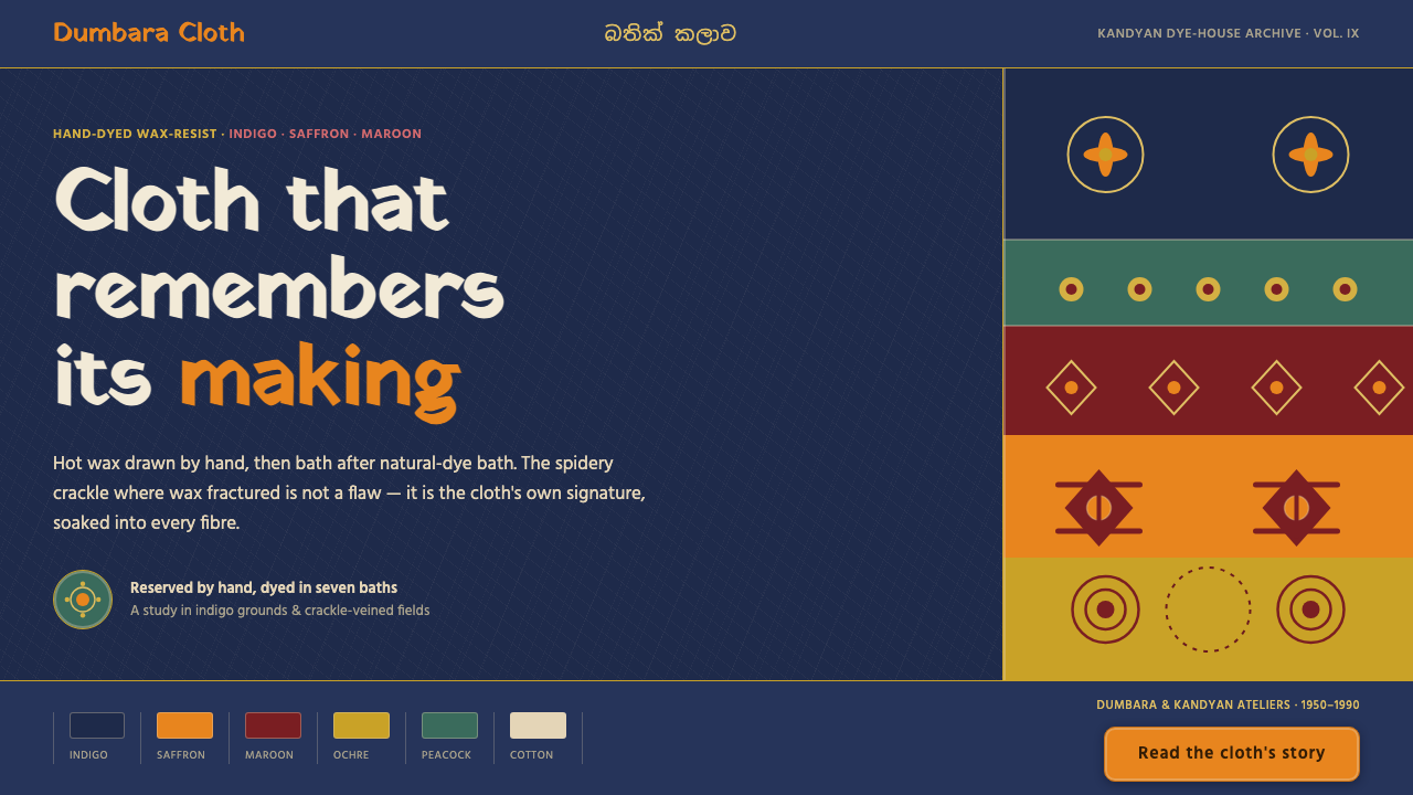 Sri Lankan BatikCloth that remembers its making. Indigo grounds, saffron motifs, veined with…
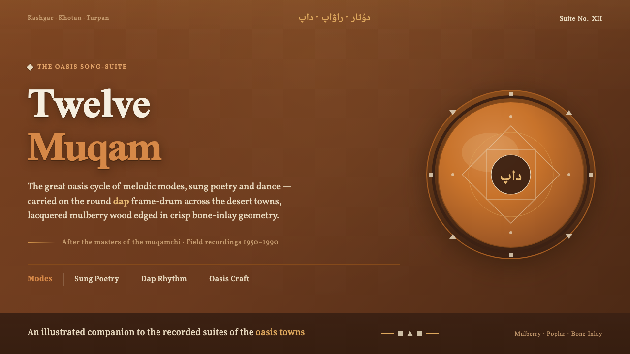 Uyghur Muqam & Dap DrumLamplight on carved wood. Ochre and amber over mulberry-brown, edged in bone-…
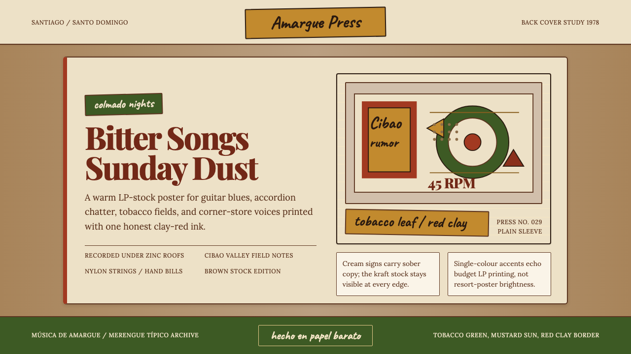 Dominican Bachata & Perico RipiaoPlainspoken warmth. Kraft stock, red clay serif, and typewriter credits carry…
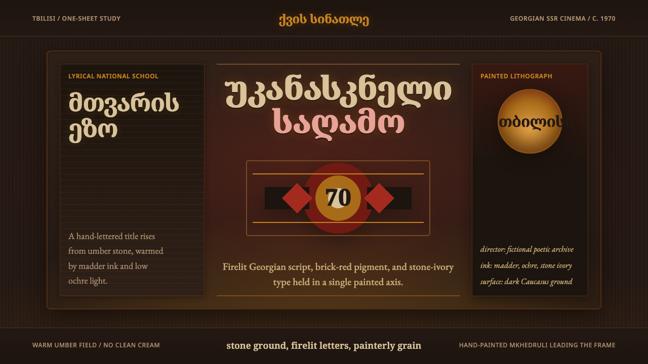 Georgian Soviet Cinema PosterFirelit and handmade. Mkhedruli serif titling glows in madder red and ochre o…
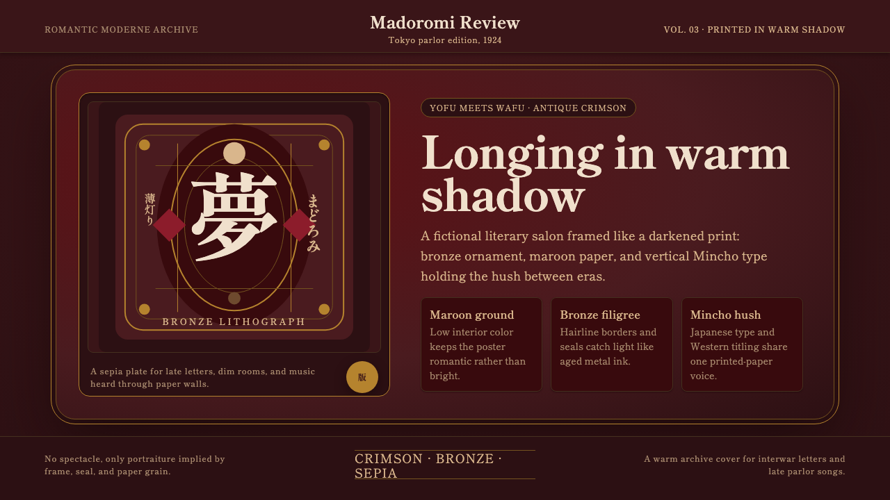 Taishō RomanLonging framed in bronze. Maroon ground, Mincho type, and sepia ornament hush…
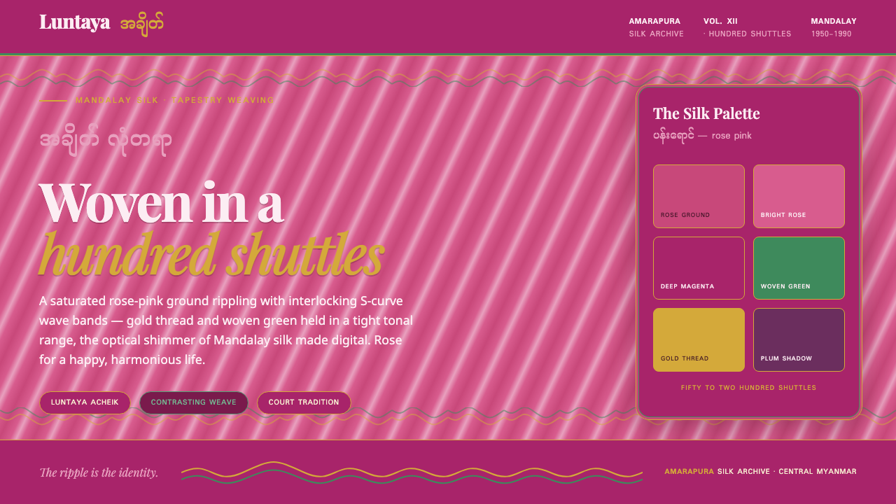 Burmese Acheik LongyiWoven silk shimmer, made digital. Rose-pink ground rippling with gold-and-gre…