What is Burmese Acheik Longyi?
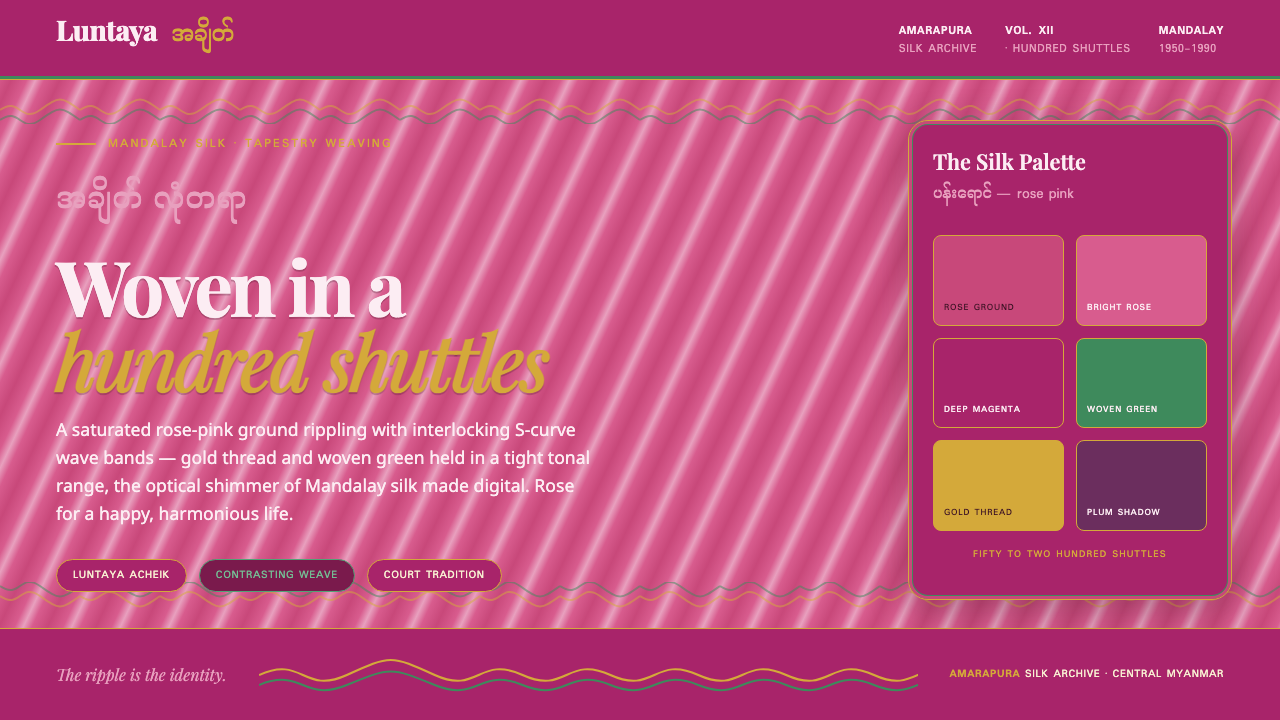
Burmese Acheik Longyi turns Mandalay silk into a living digital surface: rose-pink light, emerald movement, and gold-thread shimmer held inside interlocking waves.
Burmese Acheik Longyi in brief
Burmese acheik is the celebrated luntaya, or hundred-shuttle, tapestry weaving tradition associated with Mandalay and especially Amarapura in central Myanmar. Fine silk is woven into interlocking S-curve wave bands, creating a textile surface that appears to ripple even while lying still. The longyi format gives this intricate visual language a continuous field in which color, sheen, and curved structure can move together.
Its defining effect comes from controlled density rather than broad visual variety. Between fifty and two hundred shuttles can be used to build closely related contrasting shades inside a narrow color range. The result is a trompe-l’oeil shimmer: the cloth seems to carry shifting depth and light, not because it imitates a scene, but because neighboring threads continuously alter the eye’s reading of the wave bands.
The digital Burmese Acheik Longyi system translates that textile logic rather than merely borrowing its colors. A saturated rose-pink ground establishes warmth and fullness; interlocking wave registers carry the composition; bright green supplies vivid counter-movement; and gold accents behave like thread catching light. Myanmar and Latin typography appear together so that the visual language acknowledges both the cloth’s homeland and contemporary bilingual communication.
Where does Burmese Acheik Longyi come from?
The style belongs to a Burmese court textile tradition whose nineteenth-century lineage continued through the period from 1950 to 1990. Its geographic center is Mandalay, with Amarapura especially significant. That location matters because the style is inseparable from a regional practice of silk work: acheik is not a decorative motif detached from its making, but a woven system whose appearance depends on the labor and coordination behind it.
Luntaya is commonly understood through the image of the hundred shuttle. The name points to a demanding tapestry method in which many shuttles cooperate to construct the surface. Rather than applying a wave pattern after the cloth is made, the weaver builds the wave through the structure of the weave itself. The recognizable S-curves are therefore both image and method: an ornamental rhythm produced through a disciplined technical process.
Master luntaya acheik weavers and Amarapura family silk workshops are the central human carriers of this tradition. Their work preserves a visual language in which close colors, silk reflection, and repeated curved registers must remain coordinated across a broad field. The contemporary design system draws respectfully from this continuity, treating rose pink, green, gold, and wave structure as an invitation to understand woven shimmer rather than a generic exotic pattern.
What defines the Burmese Acheik Longyi look?
Rose-Pink Ground
Rose pink is the atmosphere of the system, not a timid backdrop. It should feel saturated, luminous, and silk-rich, carrying the association with a happy and harmonious life described by the tradition. The field needs enough visual fullness to support the green and gold without becoming pale or cosmetic.
Interlocking Waves
Interlocking S-curves are the primary structural language. They should read as registers that pass through and answer one another, not as isolated decorative squiggles. Their continuity creates the sensation of a fabric surface extending beyond the frame, with movement arising from repetition, overlap, and changing visual pressure.
Woven Shimmer
The desired depth is optical rather than pictorial. Closely related shades should make the eye shift between neighboring bands, suggesting silk catching and releasing light. Avoid naturalistic rendering, glossy plastic effects, or theatrical illumination; the surface should feel constructed from threads and tonal adjacency.
Gold Thread Accent
Gold is most convincing when it behaves like a selective thread accent. It clarifies turns in the wave structure, catches focal moments, and gives the composition a restrained ceremonial lift. Used everywhere, it becomes metallic decoration; used with intention, it preserves the impression of silk flashing inside the weave.
Green Counter-Movement
Bright green provides the essential counter-movement to rose pink. It should weave through the composition as a vivid opposing current, sharpening the rhythm of the bands without claiming the entire surface. The relationship is one of lively contrast held within a narrow, coherent chromatic world.
Bilingual Script Pairing
Myanmar script and Latin type should be treated as partners with distinct visual rhythms. The pairing is an act of cultural acknowledgment, not an ornamental flourish. Give both scripts clear hierarchy and generous breathing room, allowing the curved woven language to surround typography without reducing either script to texture.
Who shaped Burmese Acheik Longyi?
Master weavers are central to the tradition because acheik’s visual complexity cannot be separated from the luntaya process. Their command of many shuttles, close shades, and interlocking wave bands produces the shimmer that digital work seeks to interpret. They represent craft knowledge carried through the making of the cloth itself.
Amarapura family silk workshops anchor the style in a living regional setting near Mandalay. Their importance is not simply commercial: the workshop is where silk, color discipline, repeated curves, and family-held weaving practice meet. For a digital adaptation, this context argues for continuity and care rather than anonymous pattern extraction.
The Burmese court textile tradition provides the longer cultural frame for acheik. Its continuation from a nineteenth-century court tradition into the later twentieth century explains why the style carries both formality and motion: it is richly made, highly controlled, and never merely static. The digital system retains that sense of composed splendor.
How do you use Burmese Acheik Longyi today?
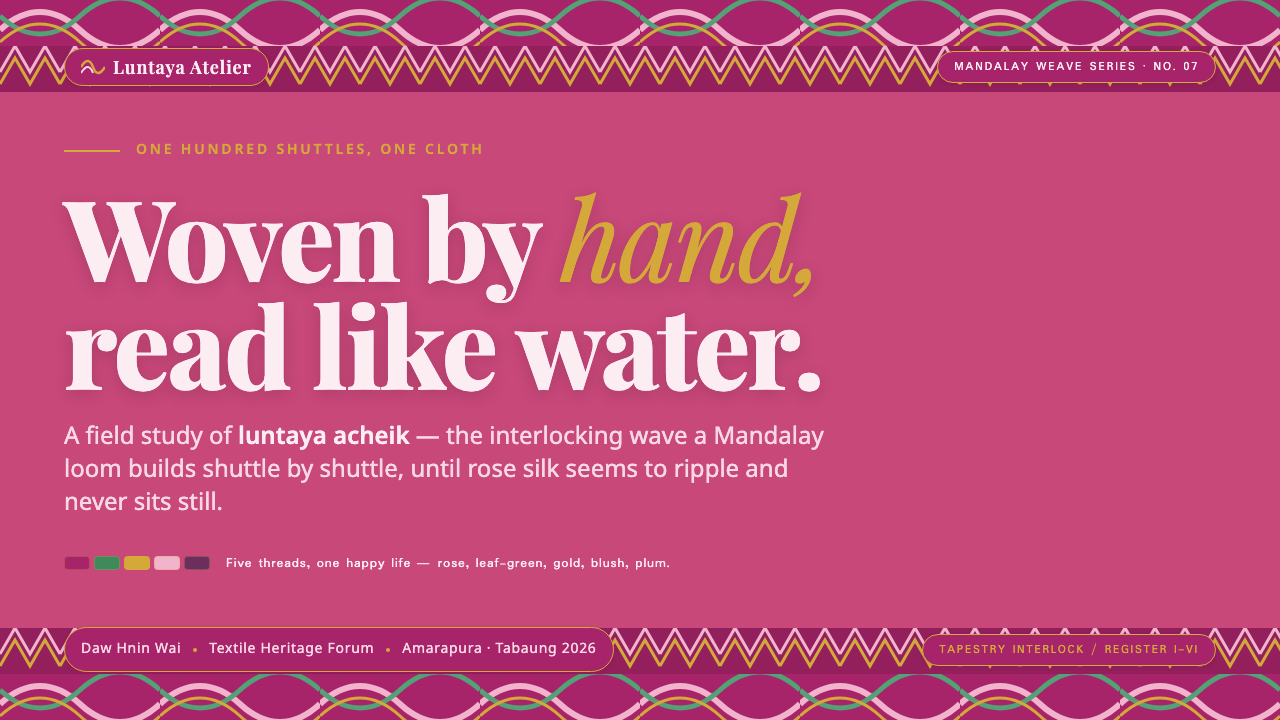
For presentation covers, let one broad wave register establish the composition before adding text. Rose pink can hold the whole field while green and gold mark a few decisive crossings. Titles work best when they sit in a calm area of the weave rather than competing with every curve. Content slides should become quieter: use the wave system as an edge, section marker, or background layer, then give bilingual headings and body copy enough clear space to remain immediately readable.
Data slides need special restraint. The acheik vocabulary is strongest when it gives information a sense of continuity and hierarchy, not when it turns every chart into fabric. Use wave bands to frame a chart, distinguish related sections, or lead the eye across a sequence. Keep comparison marks and labels plain, then reserve gold or green for the one relationship that deserves attention. The textile effect should support interpretation, never obscure it.
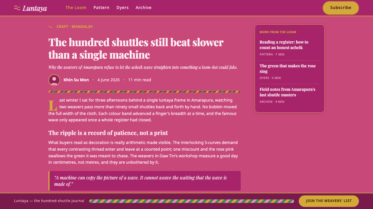
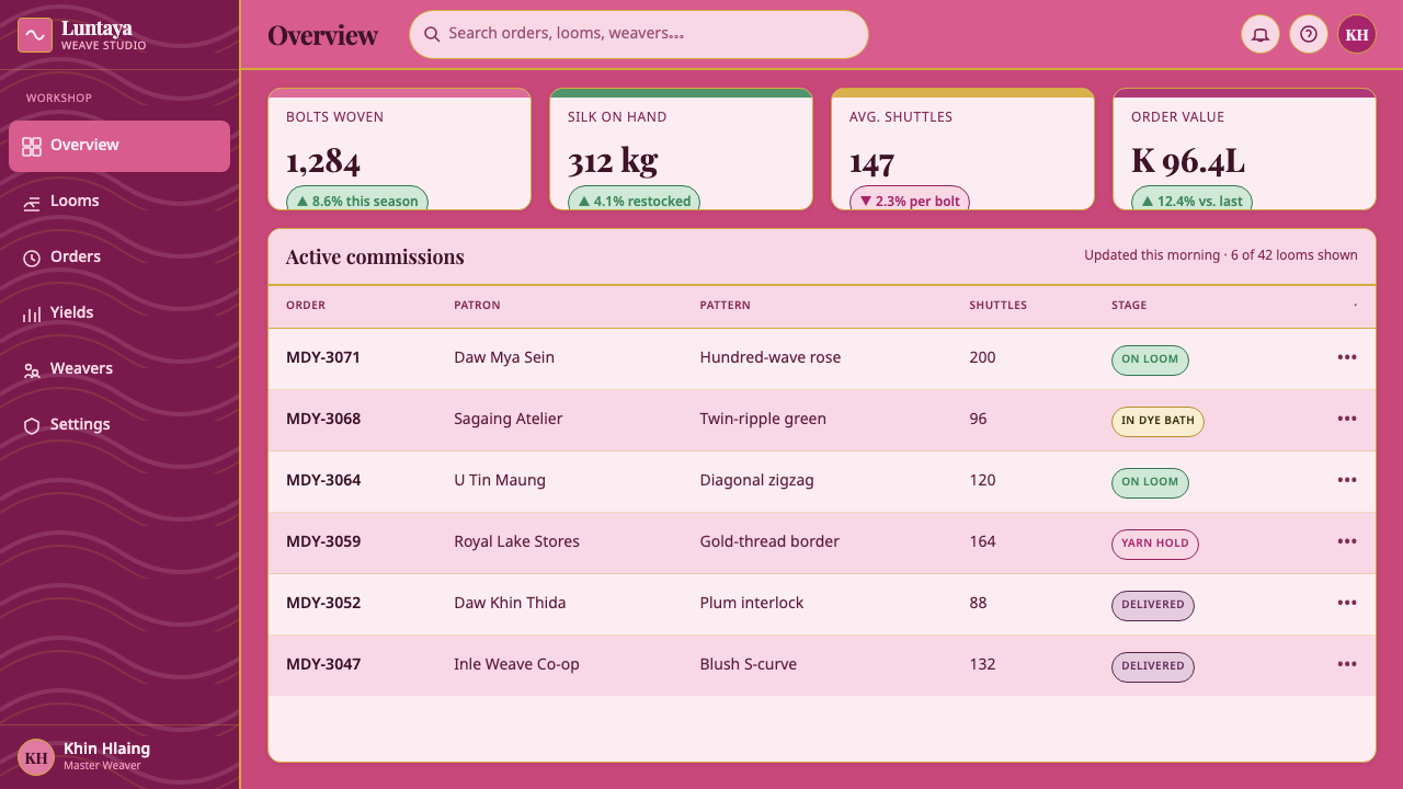
In web interfaces, the system suits editorial dashboards, cultural collections, membership pages, and pricing experiences that benefit from warmth without losing structure. A rose-pink surface can establish the page identity; woven bands can separate major regions or accompany moments of transition; restrained gold can signal featured or elevated content. Inputs, navigation, controls, and dense data should remain calm and direct so that the textile language feels intentional rather than continuously demanding attention.
For editorial and marketing work, acheik is especially effective in feature headers, campaign landing pages, event invitations, and story-led product pages. It can create a sequence in which each section feels like another register in a single cloth: a vivid opening, a quieter reading field, then a return of wave and shimmer at key moments. A common mistake is to flatten the style into generic pink-and-gold luxury. Without interlocking curves, close tonal movement, green counterpoint, and respectful Myanmar/Latin typography, the result loses the specific woven intelligence that makes acheik distinctive.
Burmese Acheik Longyi — FAQ
Is Burmese acheik simply a pink-and-gold decorative pattern?
No. Rose pink and gold are important cues, but acheik is defined by the luntaya weaving logic of interlocking S-curve bands, close contrasting shades, and optical shimmer. Green is also an essential counterpoint in the digital system. If the waves do not feel structurally interwoven, color alone cannot carry the style.
Why is the style associated so strongly with Mandalay and Amarapura?
The approved tradition places luntaya acheik in central Myanmar, especially Mandalay and Amarapura, where master weavers and family silk workshops sustain its practice. The association is therefore material and regional, not just visual. The style’s color, wave structure, and shimmering surface are bound to a local silk-weaving tradition.
How should Myanmar and Latin typography be combined?
Treat both scripts as readable language, not as ornamental texture. Establish a clear hierarchy based on the audience and content, preserve breathing room around each line, and let the woven forms frame rather than crowd the words. The pairing should acknowledge the cloth’s homeland while remaining useful for bilingual contemporary communication.
Where does Burmese Acheik Longyi work less well?
It is less suitable where visual neutrality, severe compression, or highly technical density is the primary requirement. The system depends on a sense of surface, movement, and spacious reading. A crowded operational screen or an information display with no room for wave structure can reduce the tradition to noise. In those cases, use only a restrained accent or choose a calmer visual language.
Related design styles
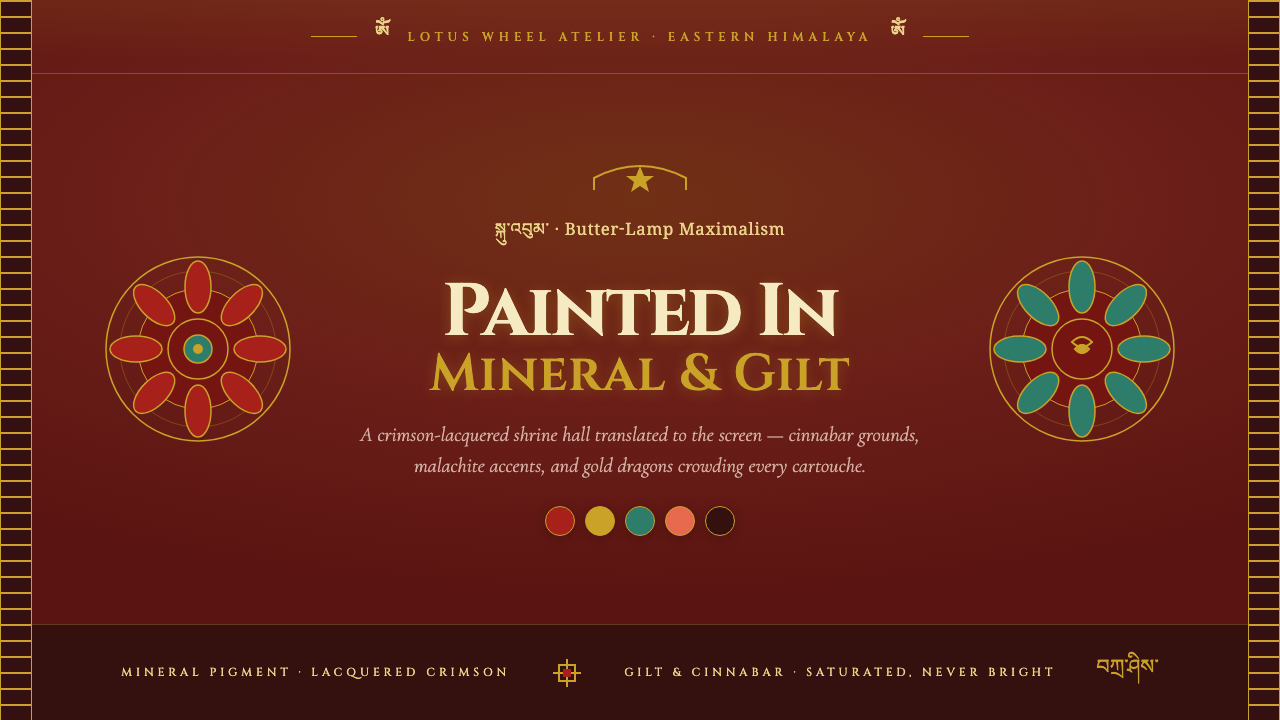 Sikkim Monastery MuralsButter-lamp maximalism. Cinnabar ground, gilt cartouche borders, mandala symm…
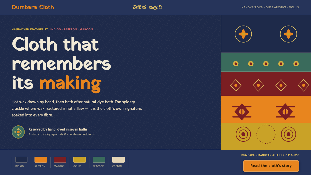 Sri Lankan BatikCloth that remembers its making. Indigo grounds, saffron motifs, veined with…
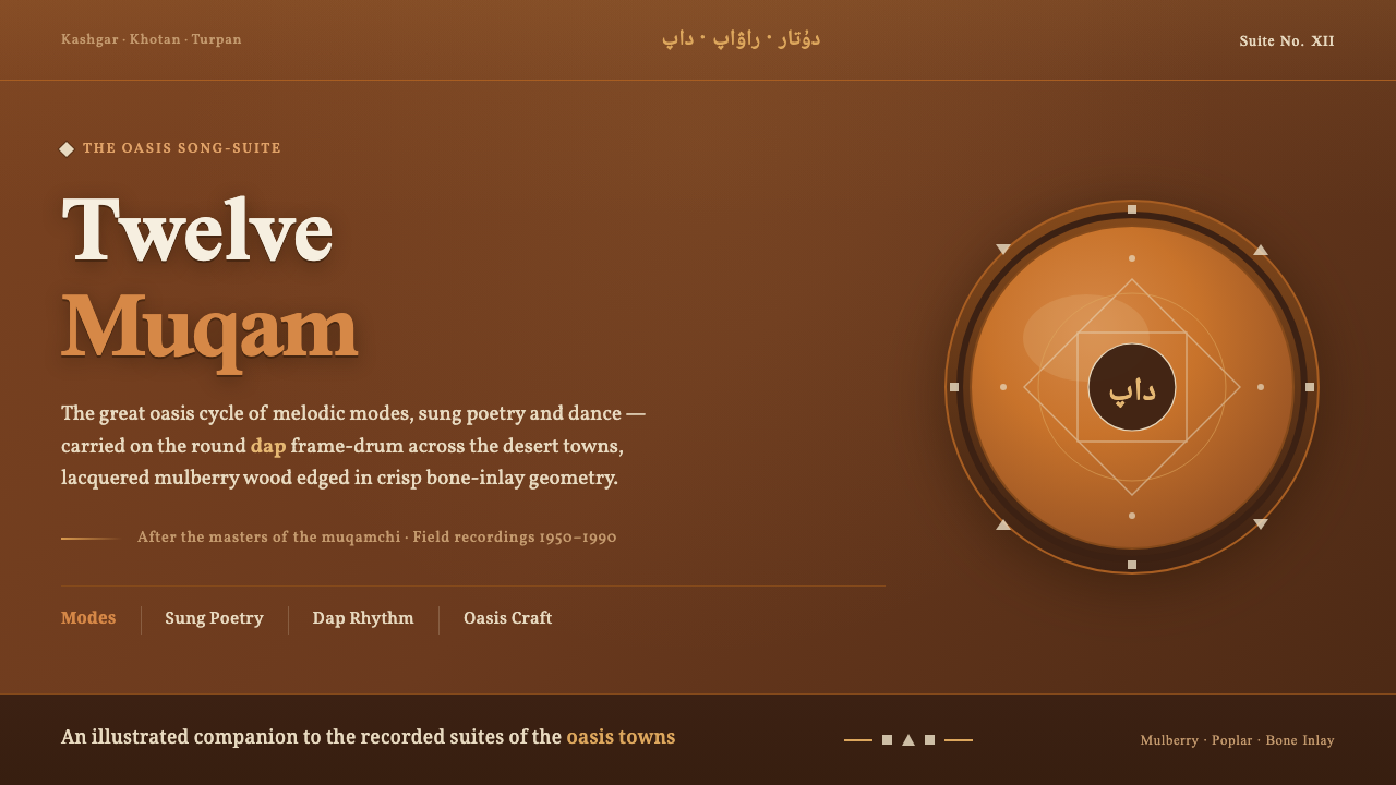 Uyghur Muqam & Dap DrumLamplight on carved wood. Ochre and amber over mulberry-brown, edged in bone-…
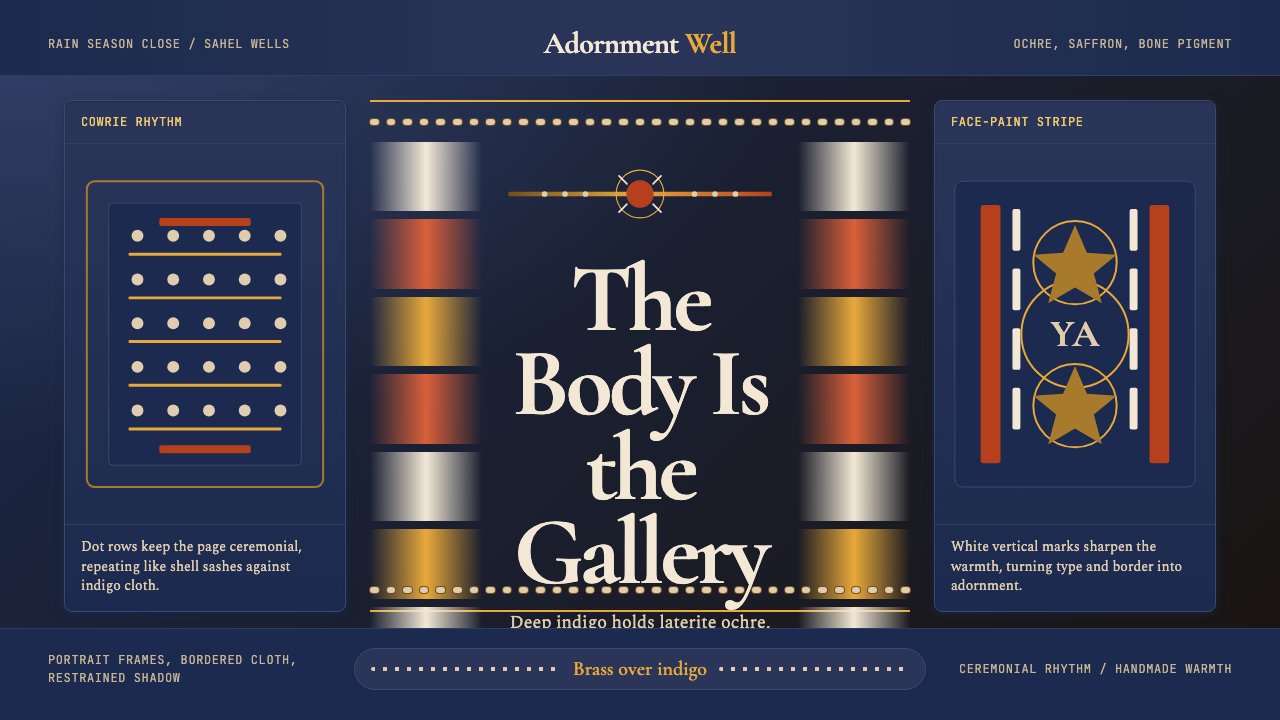 Wodaabe Gerewol Charm FestivalRitual intensity, ornamented. Indigo ground, ochre pigment, cowrie dots, bras…
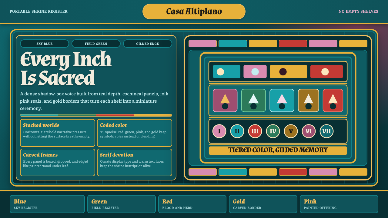 Ayacucho Retablo BoxSacred density. Deep teal shelves pack turquoise, cochineal, folk pink, and g…
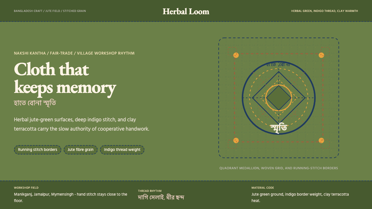 Bangladeshi Jute CraftMemory stays stitched. Jute green, indigo borders, terracotta warmth.