What is Shibam Mud Towers?
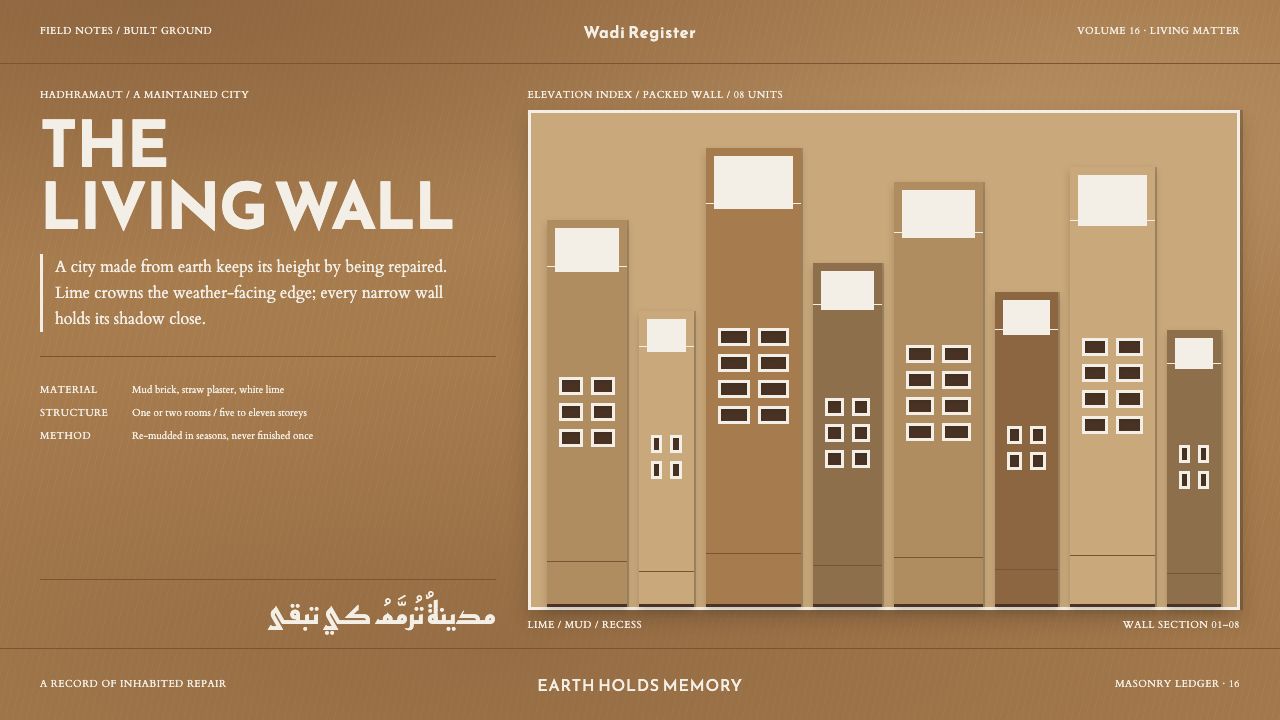
Shibam is a city built to be renewed — hundreds of lime-capped mud towers pressed shoulder to shoulder, with small deep openings punched into a warm brown wall that is never one flat tone.
Shibam Mud Towers in brief
Shibam Mud Towers is a design style drawn from the walled city of Shibam in the Wadi Hadhramaut of Yemen, where roughly five hundred mud-brick towers stand packed inside a single wall on a rock spur. The towers rise five to eleven storeys, with one or two rooms on each floor. Their bodies are mud brick faced in mud-and-straw plaster, a warm brown, while the top storeys, parapets and window surrounds are coated in white lime.
The visual system takes that reading literally. The ground is brown and the figure is white lime. Blocks are tall and narrow and stand shoulder to shoulder, separated by a shadow gap in place of whitespace. Openings are small, deep and punched, as if cut into the wall rather than painted onto it. The overall impression is of density, verticality and warmth, a layout that feels built from earth and stacked high instead of floated on a blank page.
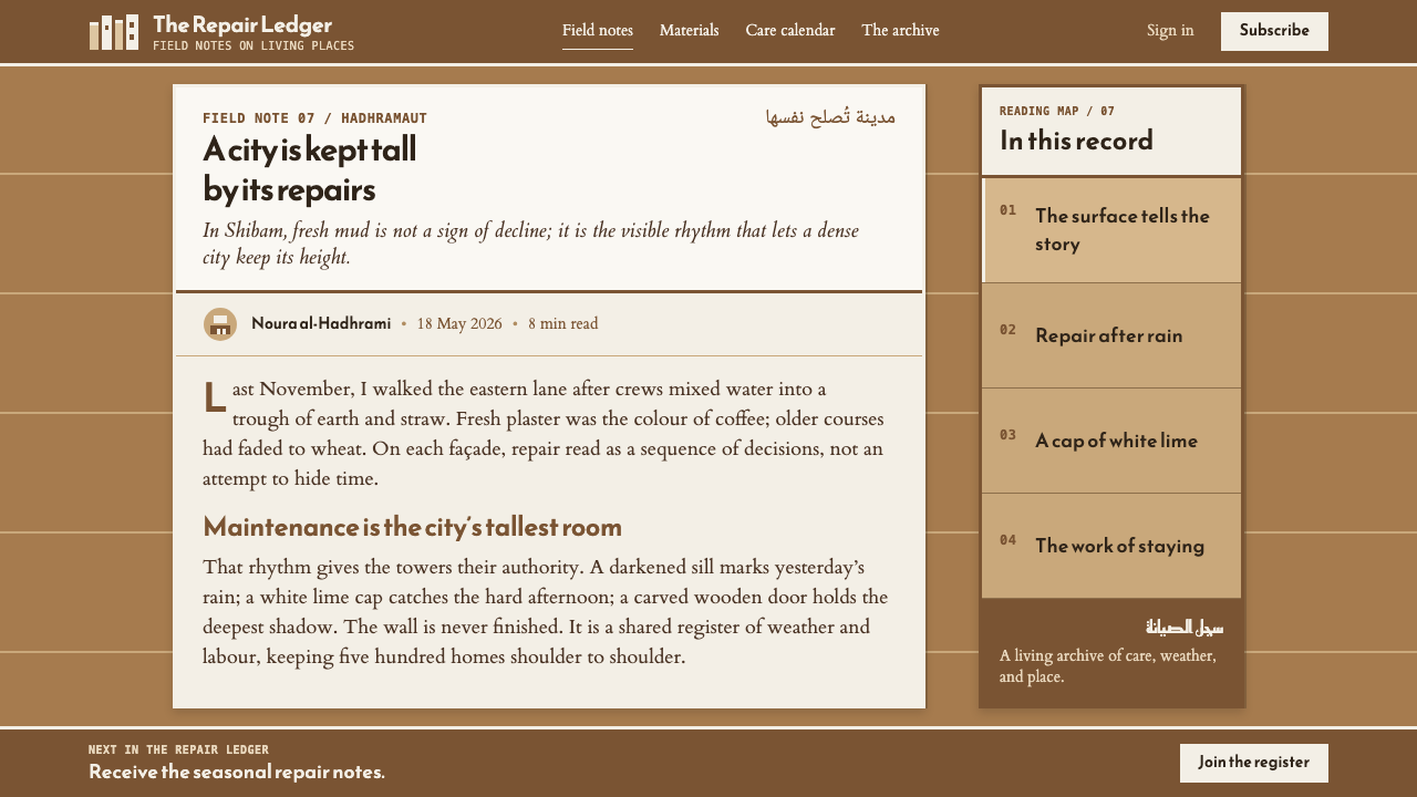
Crucially, it is a style of maintenance rather than ruin. Rain erodes mud walls, so households re-plaster them, and the surface carries the evidence: a freshly laid coat is darker and wetter beside older plaster bleached by the sun. The city is not a monument to the past but an inhabited place that is repaired continuously. A design in this spirit looks lived in and kept up, never pristine and never abandoned.
Where does Shibam Mud Towers come from?
Shibam stands in Wadi Hadhramaut, in the Hadhramaut Governorate of Yemen. The source dates the style as pre-1900 and notes that the site has been occupied since antiquity, while the standing tower city was largely rebuilt from the sixteenth century after a catastrophic flood. That detail matters: the towers that exist today are the product of a deliberate act of reconstruction, packed together on a rock spur in the wadi with a single wall enclosing all of them.
Architecturally the city belongs to what the source calls the Hadhrami mud-brick tower-house tradition, which is also described as a South Arabian vernacular high-rise. The key idea is vertical living in a hot, dry, valley setting: instead of spreading outward, households build upward in a very small footprint, stacking a handful of rooms one above another. Mud brick faced in straw-bearing plaster gives thick walls suited to the setting, and a single shared outer wall encloses the whole cluster.
The craft behind it is carried by Hadhrami master masons, who the source records as unnamed. Their anonymity is typical of vernacular architecture: the work belongs to a trade and a place, not to an individual author. Its recurring task is renewal. Because rain wears the walls down, households re-plaster them, so the city is repeatedly rewritten by its own occupants. The result is a building culture in which repair is not an afterthought but the central activity that keeps the form alive.
In more recent times the city has been described and defended by scholars and institutions. The source names the architect and scholar Salma Samar Damluji among its key figures, and the UNESCO World Heritage Committee, which inscribed Shibam in 1982. Those recognitions fix the city in public memory as a landmark of earthen architecture, and it is from that reading that the Curio system takes its logic: a brown ground, white lime as the figure, towers instead of cards, and a surface that shows its own repair.
What defines the Shibam Mud Towers look?
Brown Ground, White Lime
The palette is two-part and literal: a warm brown ground, like mud-and-straw plaster, and white lime as the figure. White is used for the highest parts of a form, such as caps, parapets and window surrounds, rather than as an all-over page background. The reading from a distance is one brown mass edged and crowned in white, so white works as outline and emphasis, never as empty space.
Tower Cards
Cards and panels are drawn as tall, narrow towers, not as wide, flat rectangles. Each has a white-capped top and a heavier, darker base, so the block reads as something stacked and load-bearing. Heights vary a little, and the group forms a skyline. Verticality is a deliberate choice that changes how lists, galleries and pricing tiers are composed.
Shadow Gap, Not Whitespace
Blocks sit shoulder to shoulder, edge to edge, and the only separation is a narrow dark seam, like the lane between two towers. Generous whitespace is replaced by compression. This makes pages feel built and dense instead of airy, and it gives the eye thin vertical rhythms to follow. Margins and gutters become cuts in the wall, not breathing room.
Small, Deep, Punched Openings
Windows and controls are small and set back, as if punched into thick mud walls. They are inset with visible depth rather than raised as buttons, and they are few. The openings are carefully placed rather than evenly scattered, so a facade reads as mostly wall with decisive voids. In interfaces this encourages recessed inputs, modest icons and sparing use of interactive elements.
A Surface That Is Never One Tone
Because households re-plaster walls as rain erodes them, a new coat is darker and wetter beside older, sun-bleached plaster. The surface therefore carries layers of tone. A faithful rendition avoids flat, uniform brown and allows subtle shifts between patches, edges and bands. The variation is the evidence of continued care, which is why the style never looks like a ruin.
Capped and Crowned Edges
The white lime is not random; it appears on the top storeys, parapets and window surrounds. That gives the style a consistent grammar of edges: crowns on the tops of forms, frames around openings, and the heavy plastered body below. A designer can use it as a rule: white defines where a form ends and what is an opening, while the brown carries the mass.
Who shaped Shibam Mud Towers?
The craftsmen behind the towers are recorded in the source as unnamed Hadhrami master masons, which is the honest way to credit a tradition rather than an individual. They built upward in mud brick, finished walls in mud-and-straw plaster, and capped the highest storeys in white lime. Their ongoing work of re-plastering after rain is what makes the city a living thing and the style a style about renewal.
Damluji is an architect and scholar who appears in the source as a key figure for Hadhrami mud-brick building. Her relevance to the style is interpretive: work like hers helps explain how the towers are built, why they are maintained, and why the tradition matters beyond Yemen. She connects the vernacular craft to wider architectural understanding without turning the towers into museum pieces.
The World Heritage Committee inscribed Shibam in 1982, the date given in the source. The inscription is a milestone in the public understanding of the city, placing a vernacular tower-house settlement alongside better-known monuments. For the design story it supports the idea that this is a cultural landmark of earthen architecture worth studying, even as the city remains inhabited and repaired.
How do you use Shibam Mud Towers today?
Shibam Mud Towers suits work where density, warmth and a sense of continuity matter: heritage and travel sites, architecture and construction brands, community platforms, craft and materials businesses, real estate, and any product whose message is that something is being built up and cared for over time. It is a light-ground style in the sense that its figures are white lime, but its overall impression is warm and earthy rather than bright.
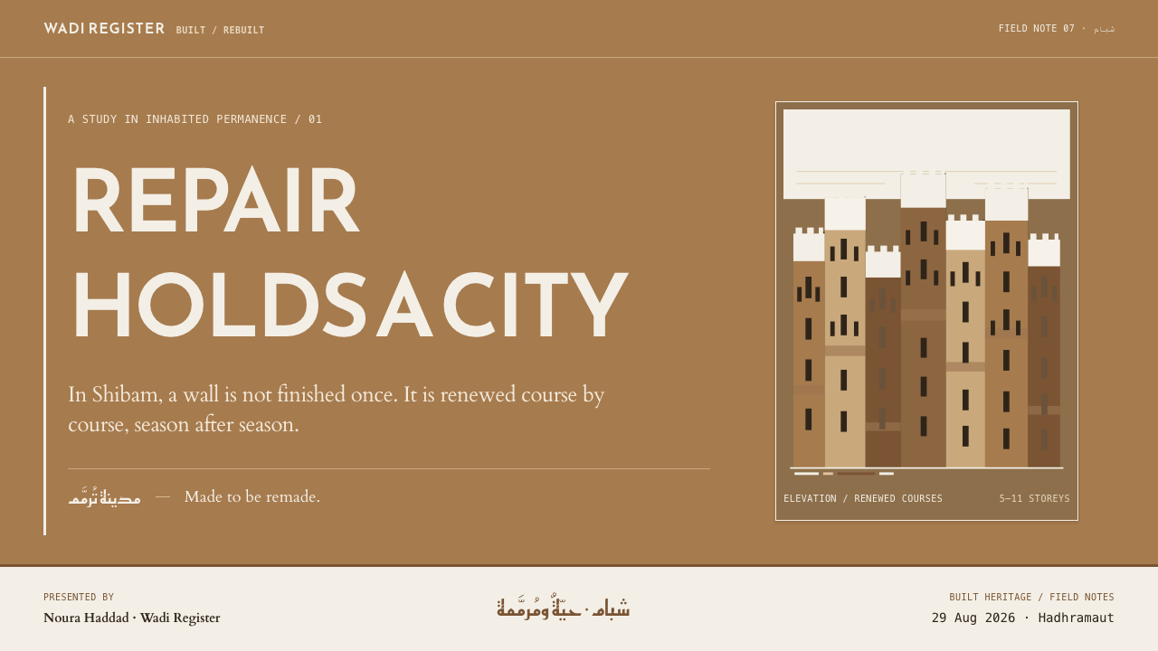
For presentation slides, a cover can be composed as a skyline: a row of tall narrow blocks in warm brown, each capped with a white band, with the title set into one or two of the towers. Content slides work well as a set of vertical panels packed edge to edge, separated only by a thin shadow gap, each carrying one point. Data slides can turn bars into towers, with the top of each bar capped in white so the series reads as a city profile.
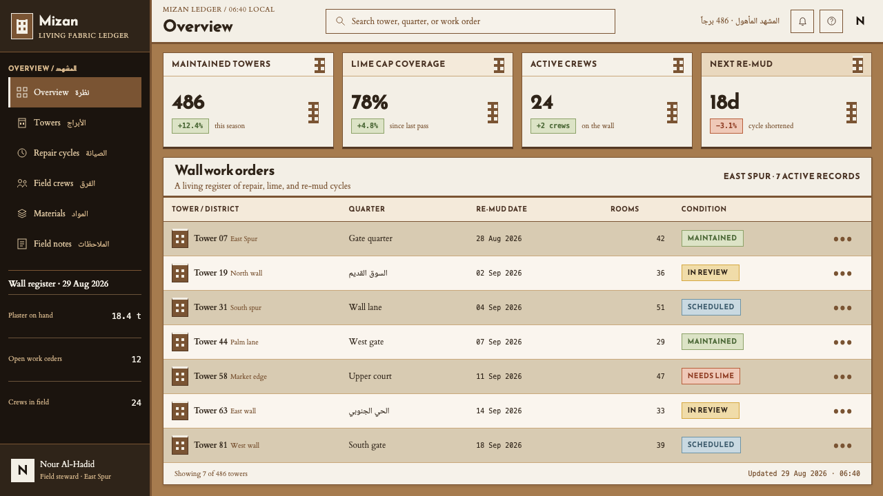
For web interfaces, treat cards, pricing tiers and feature lists as towers: tall, narrow, white-capped and heavy at the base. Use shadow gaps instead of wide gutters, keep inputs and buttons small and recessed, and let background panels shift slightly in tone so that no large area is a single flat colour. Dashboards benefit from the density, provided hierarchy is carried by cap and base rather than by extra decoration.
For editorial and marketing work, use tall columns, strong vertical rhythm and sturdy compact type with little ornament. Section openings can use a white-capped block and a heavier base for headlines. Photography should be warm, earthy and close to the material: plaster, brick, shadow and lime. Marketing pages gain a strong identity from a skyline-style hero followed by tightly packed feature towers.
The most common mistake is to treat the style as a brown filter. Flat sand colour with generous whitespace and floating soft shadows loses everything that matters. The towers, the white caps, the narrow shadow gaps and the small deep openings have to survive. A second mistake is to make the surface perfectly uniform; the style depends on visible variation in tone, because repair is the point. A third is to present it as a ruin. Shibam is inhabited and maintained, and the design should look cared for.
Shibam Mud Towers — FAQ
What is Shibam and why is it a design reference?
Shibam is a walled city in Wadi Hadhramaut, Yemen, where roughly five hundred mud-brick towers of five to eleven storeys stand inside one wall on a rock spur. It is a design reference because its visual logic is unusually clear: brown walls, white lime caps and surrounds, tall narrow blocks, deep small openings and a surface that shows repair. That clarity translates well into layout rules.
Why does the style avoid whitespace?
Because the city is packed. The towers stand shoulder to shoulder within a single wall, and the gap between them is a dark seam, not an empty field. The design takes that literally: blocks sit edge to edge with a narrow shadow gap, so pages feel built and dense. Generous whitespace would turn the towers into floating objects and lose the sense of a city.
Why should the brown not be perfectly flat?
Because rain erodes the walls and households re-plaster them, so a fresh darker coat sits beside older plaster that has been bleached by the sun. The surface is never one tone. Allowing subtle variation between patches and bands keeps the design honest to that process, and it signals that the place is lived in and repaired rather than frozen in the past.
Is Shibam Mud Towers a dark or light style?
It is classed as a light style, but that needs care. The ground is a warm mid-brown and the figure is white lime, so it is neither a bright white page nor a black interface. Think of it as an earthy, mid-tone system where white is reserved for caps, outlines and emphasis. Pushing it toward a pure white background would undermine the brown mass.
Where does the style struggle?
It struggles where lightness, airiness or digital polish are the main goals: luxury minimalism, wellness products, glossy fintech or anything that depends on generous whitespace and soft glass-like effects. It also suits vertical layouts better than very wide ones. It is strongest when the message is solidity, community, craft or continuity, and weakest when the message is weightlessness.
Related design styles
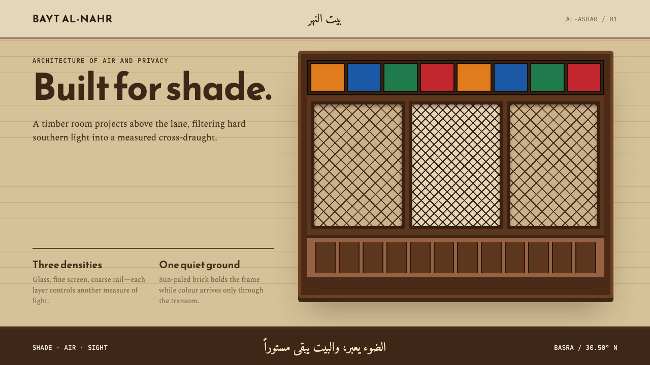 Basra ShanasheelClimate craft becomes ornament. Dark timber lattice projects over sun-paled I…
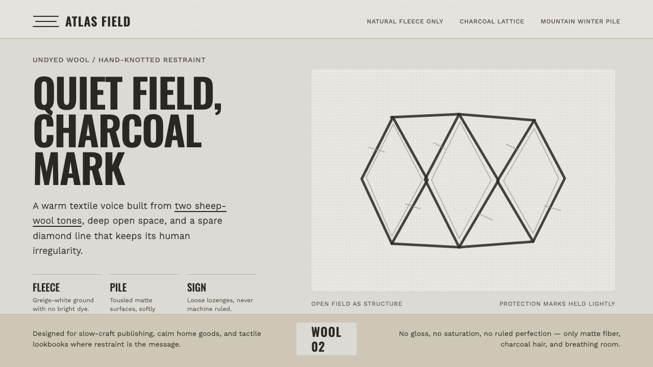 Beni Ourain Berber CarpetRestraint feels tactile. Greige wool field, Oswald type, and a loose charcoal…
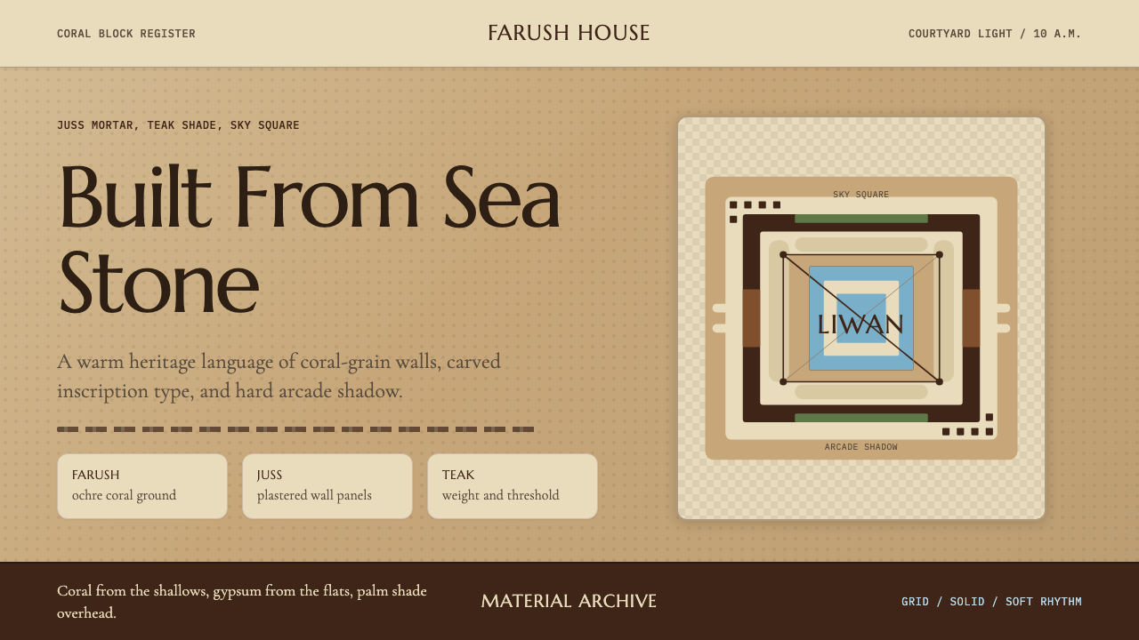 Emirati Bait Al Naboodah Coral HouseFeels built, not styled. Coral ochre, teak brown, and a sky-square courtyard…
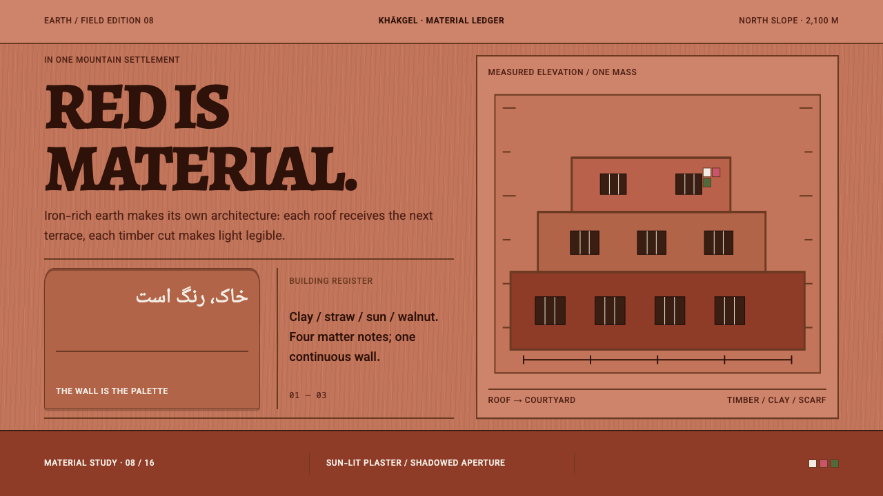 Abyaneh Red VillageRed is material, not decoration. Stepped clay bands and dark timber apertures…
 Adobe Pueblo SouthwestFeels made by hand. Earthen tan, turquoise trim, and viga rhythm shape the fr…
 Ainu Attus RobeProtection is cut, not painted. Indigo bands and square-ended thread hold elm…