What is Sheikh Zayed Grand Mosque?
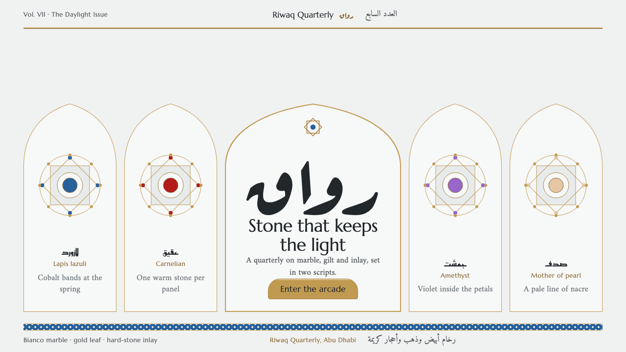
Drawn from the great mosque of Abu Dhabi, this system offers ceremony without gloss: cool white marble, gold that catches light along a single edge, and gem-colored inlays set small like stones in a column.
Sheikh Zayed Grand Mosque in brief
Sheikh Zayed Grand Mosque Marble is a design language derived from the Sheikh Zayed Grand Mosque in Abu Dhabi, completed in 2007. It translates the building's materials, geometry and calligraphy into an interface vocabulary: a page of cool white marble, thin gold lines, pointed arches, symmetrical bays and carefully set Arabic and Latin text.
The central idea is dignity through restraint and craft. The mosque is vast, yet its most memorable surfaces are small and exact: floral inlay in hard stone, fine gold on column capitals, calligraphy that follows a strict rhythm. The design system keeps that scale relationship. Large areas are calm and pale, while richness appears in narrow lines, small inlaid accents and the precision of the arrangement.
Visually, the result is formal without being heavy. The marble ground is cool and even, the gold behaves like leaf catching light rather than a glossy gradient, and the layout follows an arcade of equal bays. It suits subjects that need ceremony, heritage and quiet luxury, and it is one of the few Western-facing systems that sets Arabic script as a first-class citizen rather than an afterthought.

Where does Sheikh Zayed Grand Mosque come from?
The Sheikh Zayed Grand Mosque in Abu Dhabi was built between 1996 and 2007 and opened to the public on Eid al-Adha in 2007. It is named for the founding president of the United Arab Emirates and was conceived as a national monument as well as a place of worship, large enough to hold a very great number of worshippers. For this design system the construction period matters: nearly a decade of work by many hands gave the building its character as an assembly of fine details at monumental scale.
The mosque belongs to the lineage of contemporary Islamic architecture, which reinterprets classical forms for a modern state. It draws on pointed arches, domes, colonnades and courtyards familiar from the long history of mosque building, but it executes them with modern engineering and with materials gathered from many places. The stone that defines its surfaces is a bright white marble, chosen for its fine grain and its calm, cool tone. In daylight the marble reads as nearly colorless, which is exactly why color and gold stand out against it.
Alongside the architecture lies the craft of pietra dura inlay, the technique of cutting hard stones, shell and gem materials into thin pieces and setting them flush into a stone ground to form flowers and patterns. On the columns and in the prayer hall, floral designs in lapis, carnelian, amethyst and mother-of-pearl are set into the marble rather than painted on it. That is the source of this system's rule that color appears as small inlays, never as large fields. The jewel tones are real materials with a physical edge, and the design respects that by keeping them tiny and precise.
The third strand is monumental Arabic calligraphy. Several calligraphic hands appear in and around the building, from flowing naskh to angular kufic, and the names of artists and craftspeople such as Yusef Abdelki, Mohammed Mandi Al Tamimi, Farouk Haddad and Ali Khaliqi are associated with the decorative and artistic work of the project. The design system takes from this the principle that Arabic must be set properly, with the right letterforms for the right role, mirrored layouts for right-to-left reading, and careful pairing with a classical Latin face. The result is a visual language that belongs to a specific building and a specific moment, but speaks a wider grammar of Islamic design.
What defines the Sheikh Zayed Grand Mosque look?
Cool marble ground
The page is a pale, cool white with the faint evenness of fine-grained stone. It is not stark paper white but a softened marble tone with no visible veining, so that text remains easy to read and the surface feels solid. The coolness is deliberate; it is the tone the stone has in clear daylight, and warm color in the system therefore comes only from the gold and the inlays.
Gold as leaf catching light
Gold is the principal accent, but it is drawn as fine lines, narrow borders and single lit edges rather than as large metallic fills. It suggests gilding on a chandelier or capital, where light skims one side. There are no glossy gradients or mirror effects. This is what the idea of ceremony without gloss means in practice: the gold implies richness through thinness and placement, not through shine.
Jewel inlays, never color fields
Deep blue, red-orange, violet and pearly white appear as tiny pieces: a small badge, a dot beside a heading, a floral motif in a corner. They imitate hard-stone inlay set into a marble column, and they stay small so the marble remains the dominant surface. A page that uses these hues as full backgrounds would break the system.
Arcade layout in equal bays
Content is organised like a colonnade: equal-width bays side by side, each holding a card, a column of text or an image. Compositions are axial and mirrored left to right, and sometimes echoed top to bottom like a colonnade reflected in a pool. The grid is rhythmic and predictable, which gives the calm, processional feeling of walking along an arcade.
Pointed-arch shapes
Cards, buttons and image frames take the profile of a pointed arch, with a flat base and a peaked or softly ogee top. The arch is the building's key motif, and using it for interactive elements turns every control into a small doorway. It should be applied consistently but not exaggerated, so that the shapes read as architectural rather than as decoration.
Arabic and Latin as equal voices
Arabic is set in proper calligraphic and typographic styles, with a flowing naskh for reading, a geometric kufic-inspired face for display, and a cursive ruqaa accent for warmth. Latin headings use a classical, inscriptional serif. Layouts mirror for right-to-left reading, and bilingual headings sit in matching bays. Neither script is a translation of the other's design; both are given their own correct form.
Slow, ceremonial rhythm
Spacing is ample and symmetrical, hierarchy is shown through size and gilded rules rather than weight, and motion if any is slow and even. The pace of the page is that of a procession, not a scroll. Anything that rushes, bounces or flashes feels out of place.

Who shaped Sheikh Zayed Grand Mosque?
Artist named among the contributors to the decorative and artistic work of the mosque. His name is associated with the project's rich surface decoration, which is the source of this system's emphasis on delicate ornament within a calm field.
Associated with the calligraphic work of the mosque. His name represents the tradition of Arabic lettering that gives the building its recurrent bands of script and informs the system's insistence on setting Arabic correctly.
Named among the artists and craftspeople connected with the mosque's creation. He stands for the large collaborative effort of designers and makers behind a building that took roughly a decade to complete.
Artist associated with the project's decorative program. His inclusion among the key figures reflects how the building drew on talents from different traditions and regions, which echoes the system's pairing of Arabic and Latin voices.
How do you use Sheikh Zayed Grand Mosque today?
For slides, the style suits cultural institutions, heritage brands, hospitality, luxury goods and formal occasions. A cover can be a pale marble field with a thin gold rule and a centered title under a shallow arch. Content slides work in equal bays: three or four columns under arches, each holding a short heading and a few lines. Data slides should keep figures in a restrained serif or clean sans, using the jewel hues sparingly as small markers for categories rather than as bars filling the slide.
For web interfaces, the arcade metaphor translates directly into card grids and navigation. Give cards pointed tops, separate them with generous gaps, and keep gold to borders and hover edges. A dashboard in this style should be quiet and ordered, with symmetrical panels and legible figures, appropriate for finance, philanthropy or museum-collection tools. For a bilingual product, build the right-to-left layout from the start, mirroring order and alignment rather than only translating strings.
For editorial and marketing work, the system pairs well with photography of architecture, textiles, tilework and craft. Use long, centered headings, thin ornamental dividers and plenty of margin. Invitations, annual reports, exhibition pages and Ramadan or Eid greetings are natural uses. Copy should be measured and respectful in tone; the visual language promises ceremony, and flippant text would break the promise.
A common mistake is turning the gold into a glossy metallic gradient or filling large areas with it, which makes the page look like a casino rather than a mosque. Another is flooding sections with the jewel colors, losing the marble calm. A third is treating Arabic as decoration, using it as a pattern without correct letterforms or reading direction, which is disrespectful and technically wrong. Finally, avoid using religious imagery casually or for unrelated commercial novelty; the source is a place of worship, and the style should be applied with that in mind.

Sheikh Zayed Grand Mosque — FAQ
Is this style only for religious or Middle Eastern subjects?
No, but it carries clear associations, so it works best for subjects that benefit from heritage, ceremony and quiet luxury: museums, cultural programs, hospitality, jewelry, formal events and bilingual Arabic and English products. For unrelated casual products it may feel overdressed, and for religious subjects it should be used with care and respect.
Why is the gold drawn as thin lines instead of large fills?
Because the reference is gold leaf and gilding catching light along an edge, not a glossy metal slab. Thin lines and narrow borders keep the marble dominant and suggest richness through precision. Large metallic fills read as flashy and undermine the dignified, quiet feeling.
How should Arabic text be handled in this system?
Set it with true Arabic typefaces in the right role: a flowing naskh for body reading, a geometric display face for headings, and a cursive accent for warm touches. Use right-to-left direction and mirrored layouts, keep the text as real, selectable language, and pair it with a classical Latin face for English headings. Never use Arabic letters as pure decoration.
What is pietra dura and why does it matter here?
Pietra dura is the craft of cutting thin pieces of hard stone and other precious materials and setting them flush into a stone surface to make flowers and patterns. In the mosque, this technique appears on columns and in the prayer hall. The design system borrows its logic: color is inlaid in small pieces within a calm ground, never spread as large fields.
Can this system work in dark mode?
The reference is a light, marble-white building, and the system is built as a light theme. A dark adaptation is possible, perhaps as a night view with deep lapis grounds, but the gold must remain a thin line and the jewel tones must remain small. If the dark version becomes heavy or glossy, it has lost the original character.
Related design styles
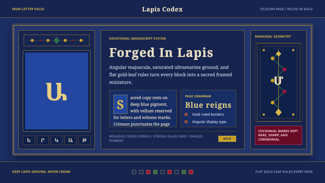 Armenian ErkatʿagirDevotional lapis reigns. Gold rules and angular serif glyphs frame a sacred g…
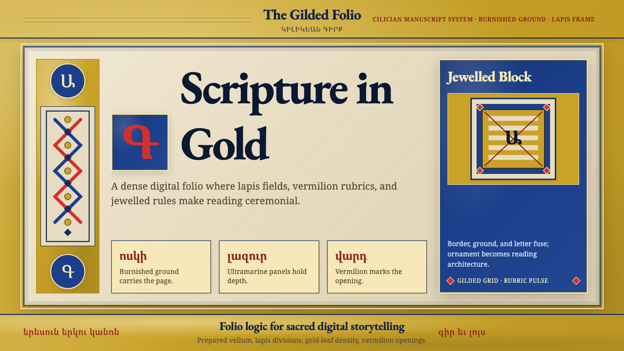 Armenian Illuminated ManuscriptGilded maximalism. Burnished gold, lapis frames, and vermilion initials build…
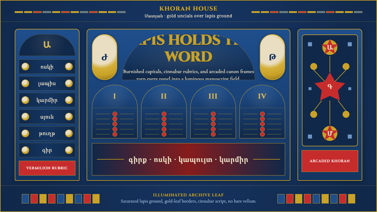 Armenian Manuscript FolkloreJewel-dense devotion. Lapis ground, gold uncials, and vermilion arcades fill…
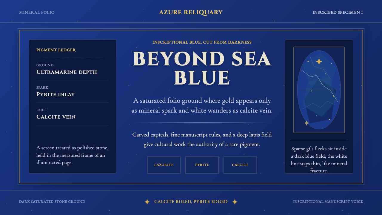 Badakhshan Lapis LazuliStone as manuscript. Ultramarine field, pyrite flecks, calcite veins, carved…
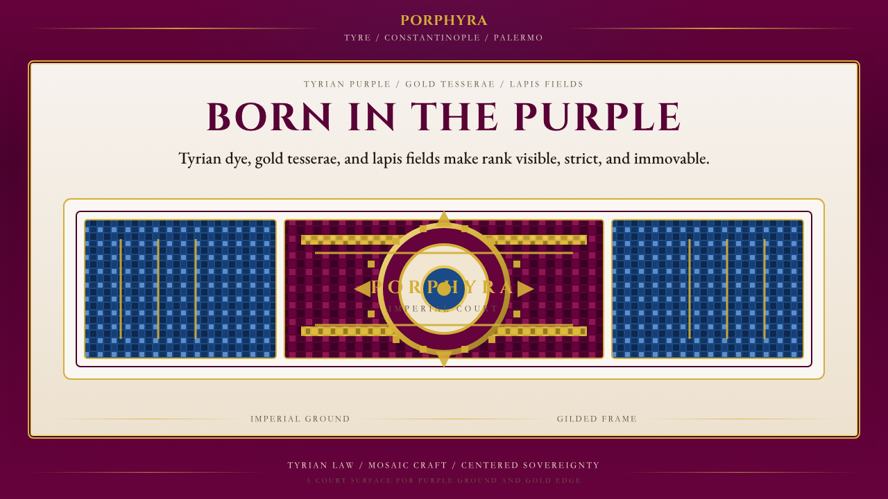 Byzantine Tyrian Purple (Imperial Court)Imperial rank made visible. Tyrian purple, gold tesserae, and centered symmet…
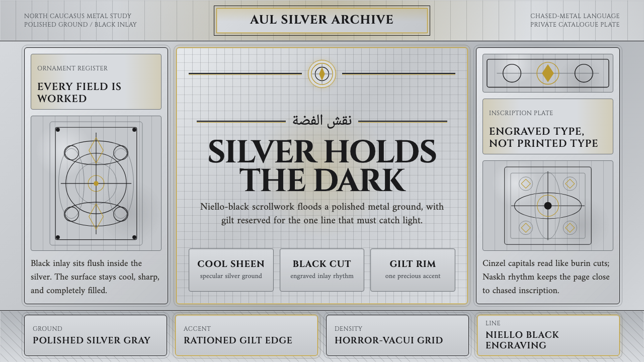 Dagestan Kubachi Silver NielloSilver made obsessive. Niello-black scrolls cover cool metal, with one ration…