What is Dagestan Kubachi Silver Niello?
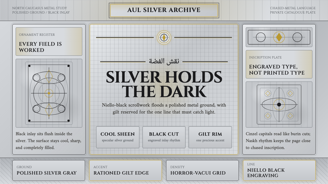
Kubachi silver turns ornament into discipline: cool polished metal, black niello scrollwork, and gilt light rationed to the highest accent.
Dagestan Kubachi Silver Niello in brief
Dagestan Kubachi Silver Niello is a material-led design language drawn from the silverwork of Kubachi, a mountain village in Dagestan and a premier silversmith centre of the Caucasus. Its visual force comes from opposition: a cool, gleaming silver ground against deep niello black, with tangled plant scrolls filling the field and a restrained gilt edge reserved for moments of distinction.
The defining craft is niello. A deep-black metal-sulfide alloy is melted into lines cut by hand into polished silver. The result is neither painted decoration nor a surface pattern laid over metal; the black ornament belongs to the engraved channels, while the silver remains bright around it. This gives every line the authority of an incision and makes the contrast feel structural rather than applied.
Translated to screen, the system becomes dense, reflective, and deliberately obsessive. It favors horror-vacui ornament, engraved Latin and Arabic-script typography, hard-edged linework, and a near-white silver field that behaves like polished metal. Gold is not a general accent color. It appears sparingly, marking the highest level of emphasis while the silver and black carry the everyday hierarchy.

Where does Dagestan Kubachi Silver Niello come from?
Kubachi silver belongs to the traditional silversmithing culture of the Caucasus, with medieval origins and a continuity that extends into the present. Kubachi sits in the mountains of Dagestan, within the North Caucasus, and the village is identified in the source tradition as the premier silversmith centre of the region. Its importance is therefore not merely pictorial. The style begins with a place, a material practice, and a body of craft knowledge carried forward through generations.
Niello gives that practice its unmistakable contrast. The craftsperson first works the silver as a bright metal surface, then creates hand-engraved channels whose darkness will become part of the finished object. The black alloy settles into those cuts, producing ornament that appears both recessed and emphatic. The process explains why the style feels more exacting than printed pattern: the image is bound to the physical behavior of metal, incision, polish, and infill.
The characteristic ornament is built from intertwined plant tendrils that read as black scrollwork across the gleaming ground. Its density approaches horror vacui, not because every available space is randomly filled, but because the surface is treated as a continuous field of attention. The eye travels through curling lines, returns to the silver between them, and occasionally meets a lift of gold gilding. The result is richness governed by control rather than looseness.
The digital design system preserves this material logic while changing its medium. A screen cannot reproduce engraved silver literally, so it translates the experience through a specular cool-silver ground, black line ornament, typographic forms that suggest engraving, and gold reserved for the highest accents. The goal is not historical costume or literal metal simulation. It is to make the screen obey the same hierarchy: polished ground first, niello structure second, gilt distinction last.
What defines the Dagestan Kubachi Silver Niello look?
Silver Ground
The ground should feel like cool polished silver: pale, reflective, and slightly ceremonial without becoming glossy decoration. It carries most of the field and gives the black ornament something luminous to press against. The surface may suggest metal through tonal variation, but its overall impression must remain calm and legible rather than mirror-like noise.
Niello Black
Black is not a neutral text color here; it is the visual equivalent of alloy settled into engraved channels. Use it for scrollwork, primary typography, rules, and the strongest structural statements. Its character should be dense and mineral rather than soft or smoky. Black establishes authority by occupying the cuts and contours of the composition.
Scrollwork
Ornament should be built from intertwined plant tendrils rather than isolated icons or decorative stickers. Lines curl, branch, and reconnect, creating a continuous black field that feels hand-worked. The pattern may frame content, run along a border, or gather around a title, but it should always appear structurally attached to the surface.
Engraved Typography
Typography should suggest letters cut into metal: deliberate, formal, and slightly tactile. Latin and Arabic-script forms can share the same engraved character when the interface requires both. Headlines should feel carved into the silver field, while supporting text remains quieter and more readable. Avoid playful softness, inflated display effects, or type that looks digitally weightless.
Horror-Vacui Density
The composition prefers continuity over generous emptiness. Ornament can occupy edges, bands, and corners so that the page feels worked rather than vacant. This density must be controlled by hierarchy: text still needs clear breathing room, and the pattern should intensify around important zones instead of flattening every part of the interface into equal noise.
Rationed Gilt
Gold is the rarest visual privilege in the system. It should mark the highest accent, a selected state, a ceremonial label, or a decisive edge. When gold spreads broadly, the hierarchy collapses and the work becomes generic luxury styling. Its power comes from appearing after silver and black have already established the composition.

Who shaped Dagestan Kubachi Silver Niello?
The master silversmiths of Kubachi represent the living centre of the style. Their contribution is not a single motif but a complete material intelligence: bright silver, hand-cut channels, niello infill, intertwined plant ornament, and occasional gilding held in one disciplined surface language.
Caucasian niello engravers define the black line as a material event rather than a printed color. By placing the dark metal-sulfide alloy into engraved silver channels, they make contrast inseparable from craft, depth, and the direction of the hand.
The wider Kubachi silver tradition supplies the design system with its continuity. Its medieval origins and persistence into the present make the language feel inherited rather than nostalgic: an old material discipline translated into a contemporary visual surface.
How do you use Dagestan Kubachi Silver Niello today?
The system works best when the interface is treated as an object of craft. Let silver establish the field, let niello black carry structure and reading, and let scrollwork provide continuity at the edges or around key content. Gold should arrive only when the design needs to distinguish the highest level of importance. The result should feel worked, not merely decorated.
For presentation slides, the cover can use a broad silver ground with a concentrated black scrollwork frame and a formally engraved title. Content slides should keep the ornament close to margins, section bands, or title zones so the information remains clear. Data slides can turn charts into engraved diagrams: black lines and forms do the explanatory work, while a restrained gilt accent identifies the decisive figure, state, or conclusion.
For web interfaces, the style suits dashboards and pricing pages that need authority without abandoning material character. Silver can organize the main surface, black can define navigation, labels, tables, and borders, and gold can identify the selected plan or most consequential action. Cards should feel inset or engraved rather than softly floating. Dense ornament belongs at the frame, not behind every piece of data.
For editorial and marketing work, the language supports ceremonial introductions, cultural platforms, luxury craft, and products that want to signal patience and precision. Use a narrow reading field against a generous silver surround, then let a black ornamental band mark transitions. Marketing compositions can pair a quiet metallic field with a heavily worked scrollwork edge, reserving gilt for the name, invitation, or final call to action.
The common mistake is treating the style as generic luxury: adding gold everywhere, using random filigree, or placing shiny gradients behind unrelated content. Another mistake is making the ornament so dense that it competes with the text. The system depends on material hierarchy. Silver is the ground, black is the engraved structure, and gold is the rarest distinction; changing that order breaks the character.

Dagestan Kubachi Silver Niello — FAQ
Is this a historical reproduction or a contemporary adaptation?
It is a contemporary adaptation of traditional Kubachi silver and Caucasian niello engraving. The source language comes from the material relationship between polished silver, engraved channels, niello black, plant scrollwork, and restrained gilding. On screen, those relationships become surface, typography, hierarchy, and ornament rather than a literal reconstruction of a physical vessel.
Why must the silver ground remain light?
The contrast depends on black ornament reading against a gleaming metallic ground. A dark background reverses that relationship and makes the system behave like a generic black-and-gold luxury style. A pale silver field preserves the central tension: the surface is bright, the engraved lines are deep, and gilt remains a rare lift rather than the main source of richness.
How should typography behave in this system?
Typography should feel engraved, formal, and materially anchored. Latin and Arabic-script typography can both participate in the system when their forms retain that carved character. Titles may be more ceremonial and assertive, while supporting text should remain restrained and highly legible. The letters should appear to belong to the silver surface, not float above it as an unrelated digital layer.
Can the scrollwork be used as a repeating background pattern?
It can, but repetition should preserve the sense of hand-worked continuity. The pattern should feel like a connected field of tendrils rather than a tiled wallpaper. Use it to frame, border, or gather attention around selected areas, and leave quieter silver zones wherever reading or data density requires clarity. Horror-vacui richness is effective only when hierarchy still survives inside it.
What kinds of products suit this style best?
It suits products and experiences that value craft, authority, patience, and ceremonial distinction. Cultural platforms, premium craft, editorial introductions, formal dashboards, and carefully tiered pricing can all benefit from its material discipline. It is less suited to interfaces that depend on casual softness, playful immediacy, or highly neutral utility. The style asks the product to accept a visible surface language rather than disappear behind pure function.
Related design styles
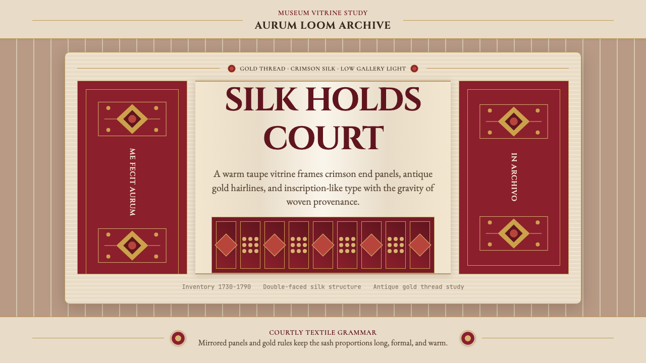 Belarusian Slutsk SashCourtly silk, vitrined. Taupe ground, crimson panels, Cinzel type, antique go…
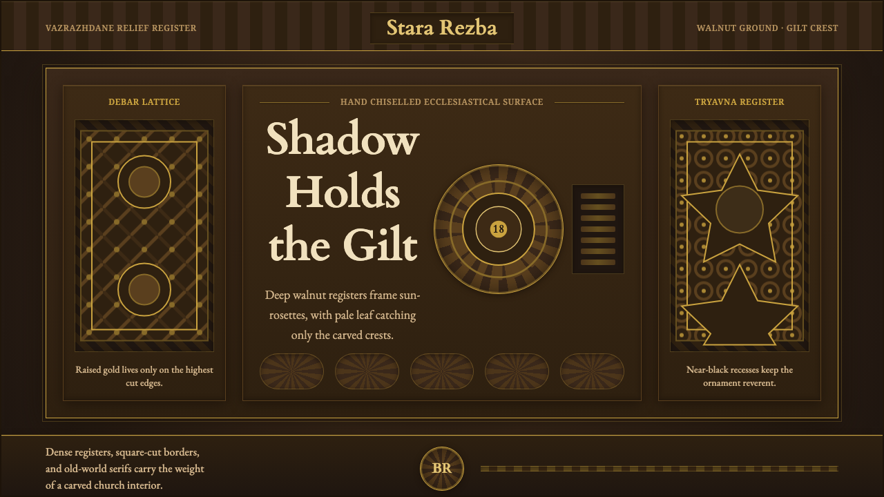 Bulgarian Revival WoodcarvingDark devotion in relief. Walnut panels, Cardo serifs, and gilt rosettes catch…
 Circassian Adyghe Gold BraidCourtly gold on dark wool. Raised braid edges coil over indigo-black panels.
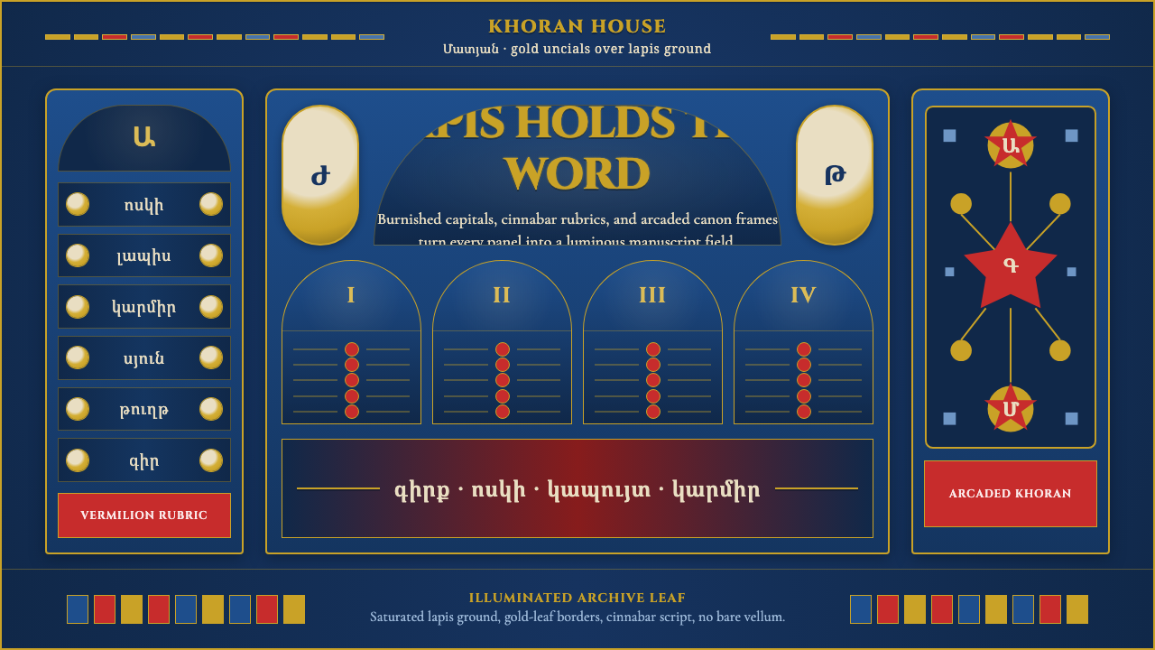 Armenian Manuscript FolkloreJewel-dense devotion. Lapis ground, gold uncials, and vermilion arcades fill…
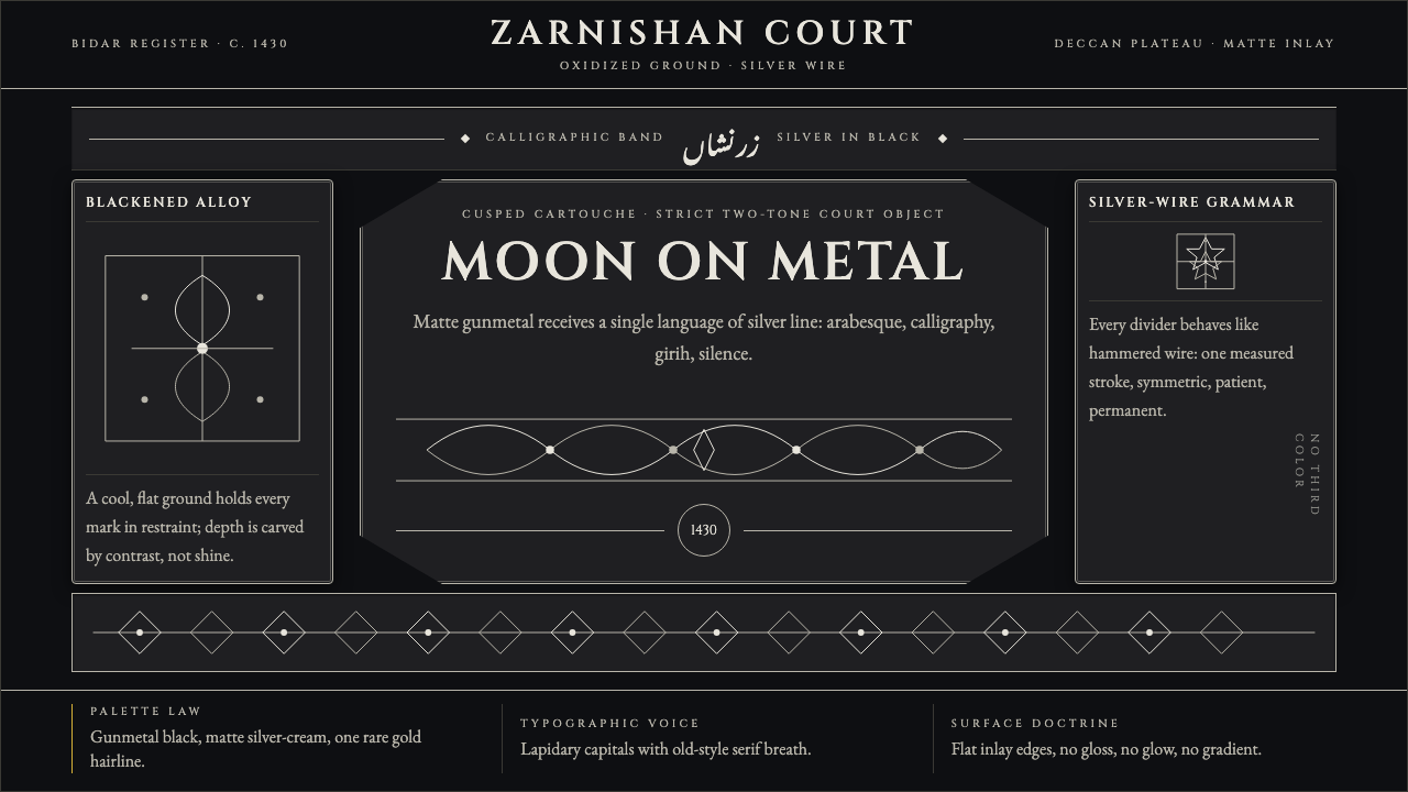 Bidri Deccan MetalworkCourtly darkness, tooled by silver. Cinzel caps and hairline arabesques cut g…
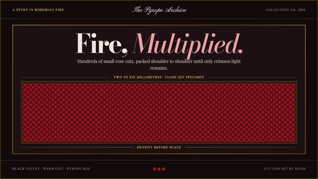 Bohemian GarnetFire thrives in density. Tiny pyrope facets pack tight against black velvet a…