What is Seoul 1988?
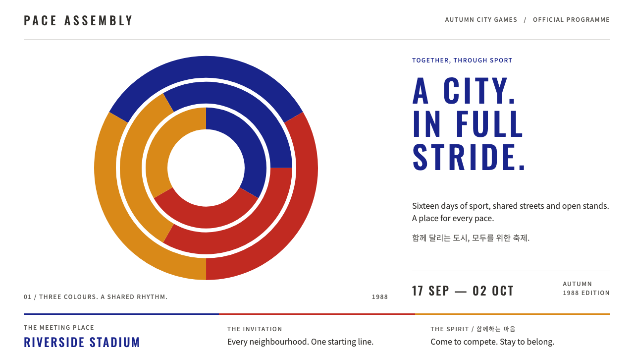
Seoul 1988 is civic pride in motion: three swirling bands of blue, red and gold printed flat on white, wide-tracked condensed capitals, and an orange tiger cub in a ribboned hat.
Seoul 1988 in brief
The Seoul 1988 style is built from the official visual identity of the Games of the XXIV Olympiad, held in Seoul from 17 September to 2 October 1988. Its centre is the emblem, a swirling three-part form in blue, red and gold with speed-line tails, printed flat on white above the Olympic rings and a widely tracked SEOUL 1988 wordmark.
Around that emblem sits a friendly, orderly system. Square sport pictograms, medal tables, ticket stubs and schedules all follow the same flat, clean vector language. The mascot Hodori, an orange tiger cub in a sangmo hat with a ribbon that flicks into motion, brings warmth and a sense of play to what could otherwise be an institutional system.
The tone is civic and confident, cheerful without being cute. It feels like a nation introducing itself to the world: proud, well organised and glad to see you. That balance of formality and cheer is the quality designers most often want from it today.

Where does Seoul 1988 come from?
The 1988 Games were the first occasion on which South Korea introduced itself fully to the world, and the identity programme was designed with that in mind. The emblem was chosen in 1983, several years ahead of the Games, from a design by Yang Seung-choon, a professor at Seoul National University. It takes the taegeuk, the traditional Korean symbol of balance and harmony, and turns it into a dynamic three-part swirl, the samtaeguk, in blue, red and gold. The tails of the bands suggest speed and movement, so that the mark looks as though it is already travelling.
The Olympic identity had a recent history to respond to. Tokyo 1964 and Munich 1972 had set the standard for how a host city could use a coordinated system of colour, typography and pictograms to organise an enormous event, and Seoul worked within that tradition. Square sport pictograms, strict colour use and a clear typographic voice were part of the shared language that visitors had come to expect from an Olympic city.
At the same time the programme was rooted in Korean folk motifs. Besides the taegeuk, the mascot draws on the tiger, a beloved figure in Korean folklore, and on the sangmo, the hat with a long ribbon worn in traditional farmers' music and dance, which flicks and spins as the dancer moves. Hodori therefore carries national character in a form that is easy for children and international visitors alike to read.
Kim Hyun and Hwang Bu-yong are named among the key figures associated with the identity, alongside Yang Seung-choon. The result sits within a Korean modernist graphic design tradition that combined international clarity with local symbolism, and it remains one of the most recognised Olympic identities of the late twentieth century.
What defines the Seoul 1988 look?
Blue, red and gold on white
The palette is the official trio of blue, red and gold, printed as flat colour on a pure white ground. There are no gradients and no textures, so the colours look clean and ceremonial, like ink on a ticket. White is generous, which lets the three colours read as bright and festive.
Swirling bands with speed lines
The emblem's three bands swirl around one another and end in tapering tails. This gesture of rotation and speed is the signature motif and can be reused in dividers, section markers, loaders and backgrounds. It gives otherwise static pages a sense of forward motion.
Wide-tracked condensed capitals
Titles are set in condensed capitals with wide letter spacing, like the SEOUL 1988 wordmark. The tall, narrow letters feel formal and athletic, and the generous spacing gives them air and dignity. Body text remains plain and legible.
Square sport pictograms
Sports are represented by simple figures set inside square frames, drawn in a consistent flat style. The shared shape and weight make a set of many pictograms look like a single family, which is a useful model for any icon set that must cover many categories.
Medal tables and ticket stubs
Information is presented in the forms of an event: ranked medal tables, schedules and ticket-shaped cards with a perforated, stub-like feel. These give data a festive, collectible character without losing clarity, and they suit sports, events and results pages.
Hodori the mascot
Hodori is a round, orange tiger cub in a sangmo hat, its ribbon tracing a motion curve. It appears sparingly and acts as a friendly guide rather than a decoration. Orange is used for the mascot, which adds a warm fourth note beside the three emblem colours.

Who shaped Seoul 1988?
Yang was the professor at Seoul National University whose design was selected as the Games emblem in 1983. His samtaeguk, a dynamic reworking of the traditional taegeuk in blue, red and gold, is the centre of the entire identity.
Kim Hyun is named among the key figures associated with the Games identity and is credited with the design of the mascot Hodori, the orange tiger cub in a sangmo hat.
Hwang Bu-yong is listed among the key figures of the identity programme. His name belongs to the group of Korean graphic designers whose work gave the Games a coherent and recognisable look.
How do you use Seoul 1988 today?
The Seoul 1988 style works best when the subject is a shared event: a competition, a festival, a city, a season. It is formal enough for official information and warm enough for a crowd, and it asks designers to keep their surfaces flat, their colours few and their typography wide and upright.
For presentation slides, a cover can show the three-colour swirl above a wide-tracked condensed title on white. Content slides work as clean sheets with a coloured band at the edge, square icons for categories and generous margins. Data slides suit ranked tables and medal-style summaries, with gold, silver-like neutrals and the three accent colours used to mark rank or category.
For web and product design, the style fits event sites, sports statistics, tournament and league pages, ticketing, city and tourism brands, public-sector campaigns and retro-flavoured product pages. Ticket-stub cards work well for schedules, bookings and receipts, and the swirl motif can drive loaders and page transitions.
In editorial and marketing work, it gives anniversary features, retrospectives, posters and programme guides a confident, celebratory tone. A flat white sheet with a single swirl and a wide-tracked headline is often enough to carry an entire layout.
The most common mistake is to mix in effects the original never used. Gradients, glossy highlights, drop shadows and dark backgrounds make the three colours look heavy and break the ceremonial clarity. Another is making the mascot too prominent or cute. Keep the colour flat, the white generous and the tone cheerful rather than childish.

Seoul 1988 — FAQ
What is the Seoul 1988 design style?
It is a style based on the official identity of the 1988 Seoul Olympics: a swirling blue, red and gold emblem printed flat on white, wide-tracked condensed capitals, square sport pictograms, medal tables, ticket stubs and the tiger mascot Hodori.
What does the emblem mean?
The emblem, designed by Yang Seung-choon and selected in 1983, reworks the traditional Korean taegeuk, a symbol of balance and harmony, into a dynamic three-part swirl called the samtaeguk in blue, red and gold. Its speed-line tails suggest movement and energy.
Who is Hodori?
Hodori is the Games' mascot, a round orange tiger cub wearing a sangmo, the ribbon hat used in Korean folk farmers' music and dance. It draws on the tiger from Korean folklore and gives the system a friendly, playful face.
Where does this style work best?
It suits sports, events, festivals, ticketing, city and tourism brands, public campaigns and nostalgic retrospectives. It is less suited to dark, moody or highly technical interfaces, since its character depends on bright flat colour on white.
How do I avoid making it look too childish?
Keep the layout disciplined: flat colour, generous white, wide-tracked condensed capitals and square pictograms. Use the mascot sparingly as a guide rather than a decoration. The balance of formal structure and cheerful colour is what keeps it civic and confident.
Related design styles
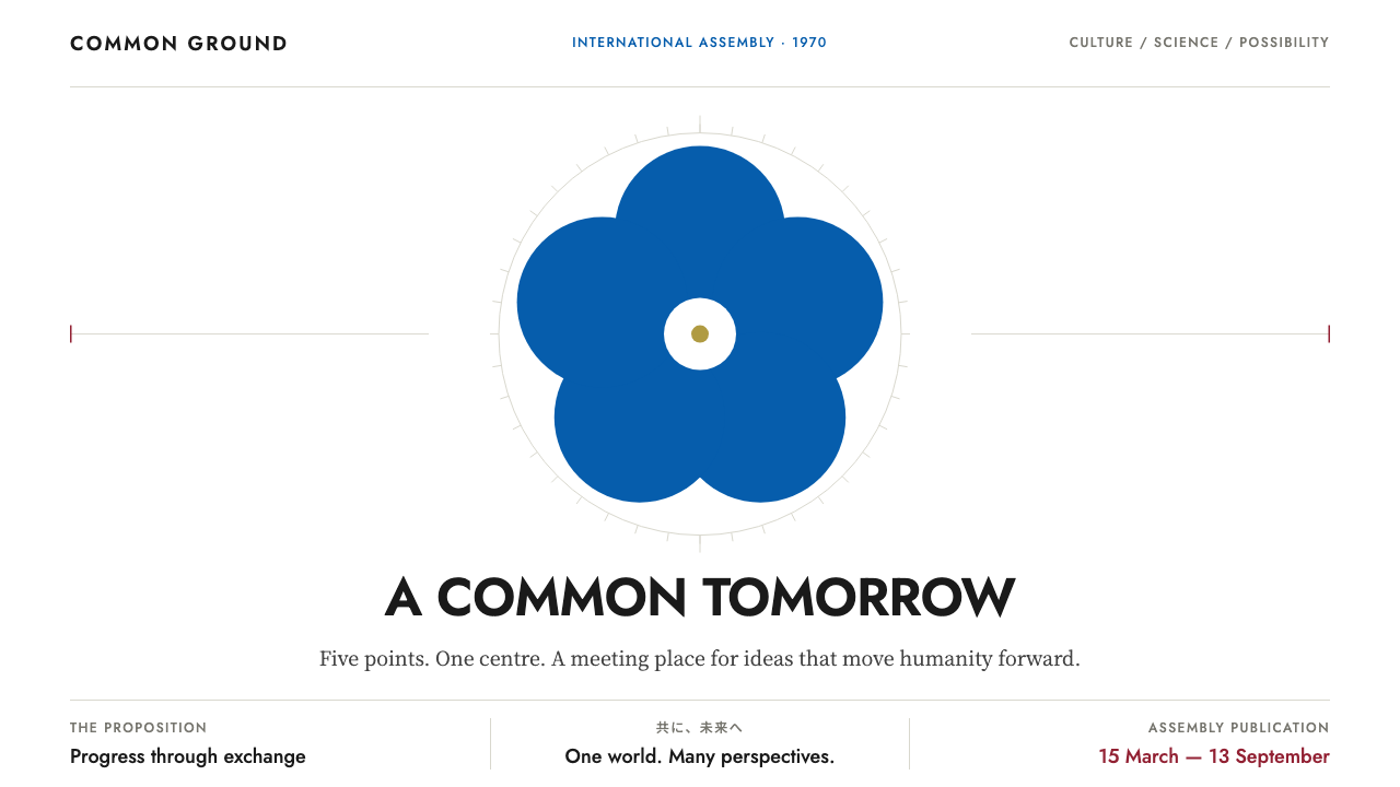 Expo '70Optimism on a single axis. Emblem blue discs, carmine details and geometric t…
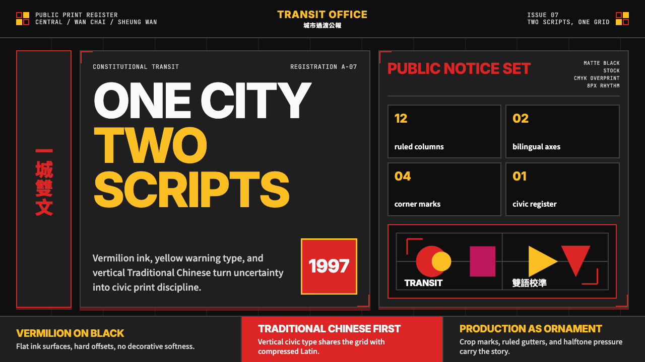 Hong Kong Handover 1997 PosterCivic pressure, printed loud. Vermilion on black, yellow type, bilingual grid…
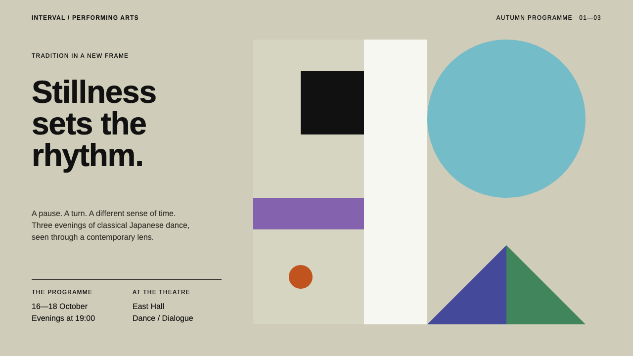 Ikko TanakaCalm carries weight. One blue disc and hard-edged ink blocks anchor a greige…
 Asahi Super DryCold precision at a glance. Black italic type on a white octagon and pinstrip…
 Cairo Metro WayfindingAuthority at speed. Enamel red, Arimo grids, and co-equal Arabic signage.
 Escolta Art Deco ManilaTropical daylight, held in order. Pale cement and black iron meet one oxide-r…