What is São Paulo Tropical Editorial?
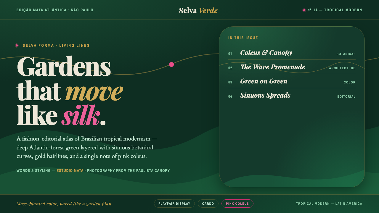
São Paulo Tropical Editorial turns Burle Marx’s garden into a fashion page — deep green layered with botanical abundance, gold-drawn curves, and a single flash of coleus pink.
São Paulo Tropical Editorial in brief
São Paulo Tropical Editorial is a contemporary Brazilian fashion-magazine aesthetic rooted in the landscape language of Roberto Burle Marx. Its visual world begins with the deep green of the Atlantic forest, not as a neutral background but as an enveloping environment. Pages feel planted rather than assembled: green fields overlap, organic curves move through the composition, and botanical imagery provides density, scale, and atmosphere.
The style combines tropical richness with editorial restraint. Gold appears as a fine linear accent, tracing borders, pathways, or structural divisions without becoming ornamental filigree. Pink coleus supplies a sharper chromatic interruption within the green, recalling the patterned vitality of planted foliage. Against this lush field, high-contrast condensed serifs create a disciplined fashion voice: elegant, narrow, dramatic, and immediately legible.
Its defining tension is between abundance and control. The page can feel like a garden in full growth, yet its curves, image crops, type blocks, and accent lines are carefully directed. São Paulo Tropical Editorial is tropical-modern rather than rustic, atmospheric rather than casual, and editorial rather than merely decorative. It treats landscape as a system of rhythm, mass, movement, and contrast.
Where does São Paulo Tropical Editorial come from?
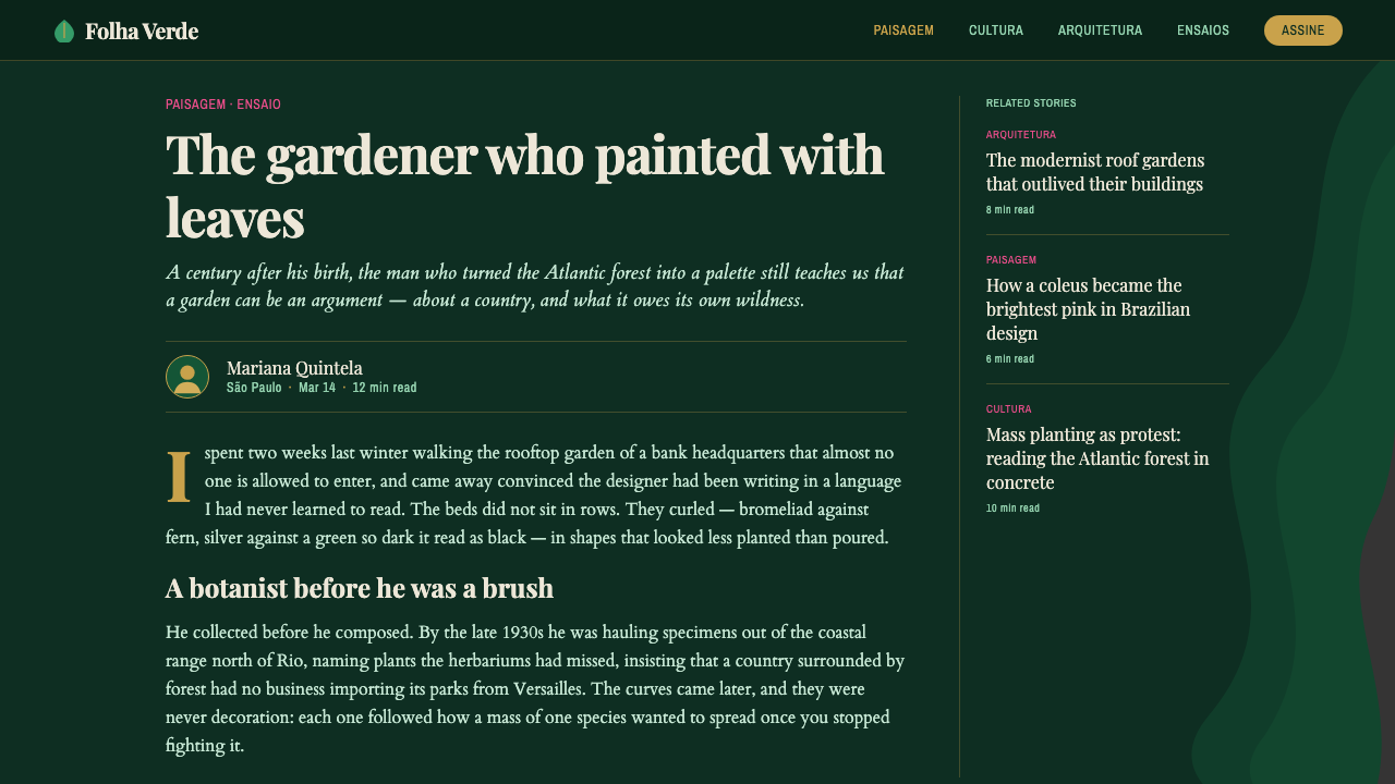
The style belongs to the contemporary period, emerging from the lineage of Roberto Burle Marx’s mid-century landscapes and developing into a fashion-editorial language from 2010 to the present. Its geographic identity is São Paulo, Brazil, within the broader cultural field of Latin America. The name signals a meeting of city, garden, magazine, and image: the cultivated density of tropical planting is translated into a refined page system.
Burle Marx provides the central conceptual inheritance. His landscape language is represented here through sinuous biomorphic curves, mass-planted fields, and a deep sensitivity to green as a compositional material. The garden is not treated as a decorative image placed behind content. It becomes the underlying grammar of the page, determining how shapes gather, how negative space opens, and how the eye travels through layers of foliage-like form.
The contemporary adaptation belongs to Brazilian fashion editors and studios working with editorial atmosphere and brand image. Their contribution is not presented as a separate historical movement but as a transformation of landscape thinking into fashion communication. Botanical richness becomes photographic mood; planted masses become editorial blocks; gold lines become signs of refinement; and the pink-coleus accent becomes a controlled signature within the larger green environment.
The resulting lineage joins Brazilian tropical modernism, mid-century landscape design, and contemporary editorial or fashion branding. It is modern because it abstracts nature into a visual structure, tropical because vegetation and saturated green remain central, and editorial because every image, headline, curve, and accent is arranged to create a directed reading experience. São Paulo Tropical Editorial therefore works less like a fixed historical revival than like a living translation between garden and magazine.
What defines the São Paulo Tropical Editorial look?
Deep Green Ground
Deep Atlantic-forest jungle green establishes the emotional and spatial ground of the style. It should feel enveloping and botanical rather than flatly neutral. Lighter and darker greens may be layered within it to create planted depth, but the overall field remains coherent, dense, and atmospheric. Green is the environment from which every other element emerges.
Layered Green
The palette gains richness through adjacent greens rather than through a crowded range of unrelated hues. Large planted-looking fields can sit behind smaller organic shapes, image areas, or text zones. The result should suggest mass and foliage without becoming literal illustration. Layering gives the page its tropical abundance while preserving a controlled editorial rhythm.
Biomorphic Curves
Sinuous curves replace rigid geometric dividers. They should feel grown, flowing, and landscape-derived, guiding the eye through the page like paths through a garden. Curves can divide image and text, frame a botanical crop, or create a large background movement. Their purpose is structural as much as expressive: they organize abundance into a readable flow.
Gold Hairlines
Gold functions as a restrained sign of polish. Used in fine rules, contours, framing devices, or small navigational marks, it brings light into the deep green without competing with the imagery. Gold should remain delicate and purposeful. Its strength comes from contrast and placement, not from occupying large areas.
Coleus Pink
The pink-coleus accent is the style’s controlled interruption. Against the green field, it feels botanical but vivid, adding a flash of pattern and fashion energy. It works best as a selective signal for a title detail, a small shape, a highlighted label, or a cropped plant passage. Its rarity keeps it distinctive.
Fashion Serif Voice
Elegant high-contrast condensed serifs provide the typographic counterweight to the organic imagery. Their narrow proportions create vertical poise, while the contrast between fine and substantial strokes gives headlines a refined editorial presence. Type should feel composed and luxurious, never rustic or playful. The typography turns tropical density into fashion communication.
Who shaped São Paulo Tropical Editorial?
Burle Marx is the foundational figure behind the style’s visual inheritance. His landscape language supplies the model of sinuous biomorphic movement, massed planting, and green used as an active compositional field. In São Paulo Tropical Editorial, the garden is abstracted into page structure: curves become pathways, planted masses become layered areas, and botanical richness becomes an organizing principle rather than a decorative afterthought.
Contemporary Brazilian fashion editors translate landscape atmosphere into a language of image, headline, pacing, and brand presence. Their role in this style is editorial rather than botanical: they make the dense green environment feel polished, directional, and fashion-led. Through selective accents and disciplined composition, they keep tropical richness from becoming visual noise.
Contemporary Brazilian studios extend the lineage into visual identity and digital editorial systems. They connect tropical modernism with the practical needs of pages, interfaces, campaigns, and branded content. In this interpretation, the studio becomes a mediator between garden and screen, preserving organic movement while giving every layer a communicative role.
How do you use São Paulo Tropical Editorial today?
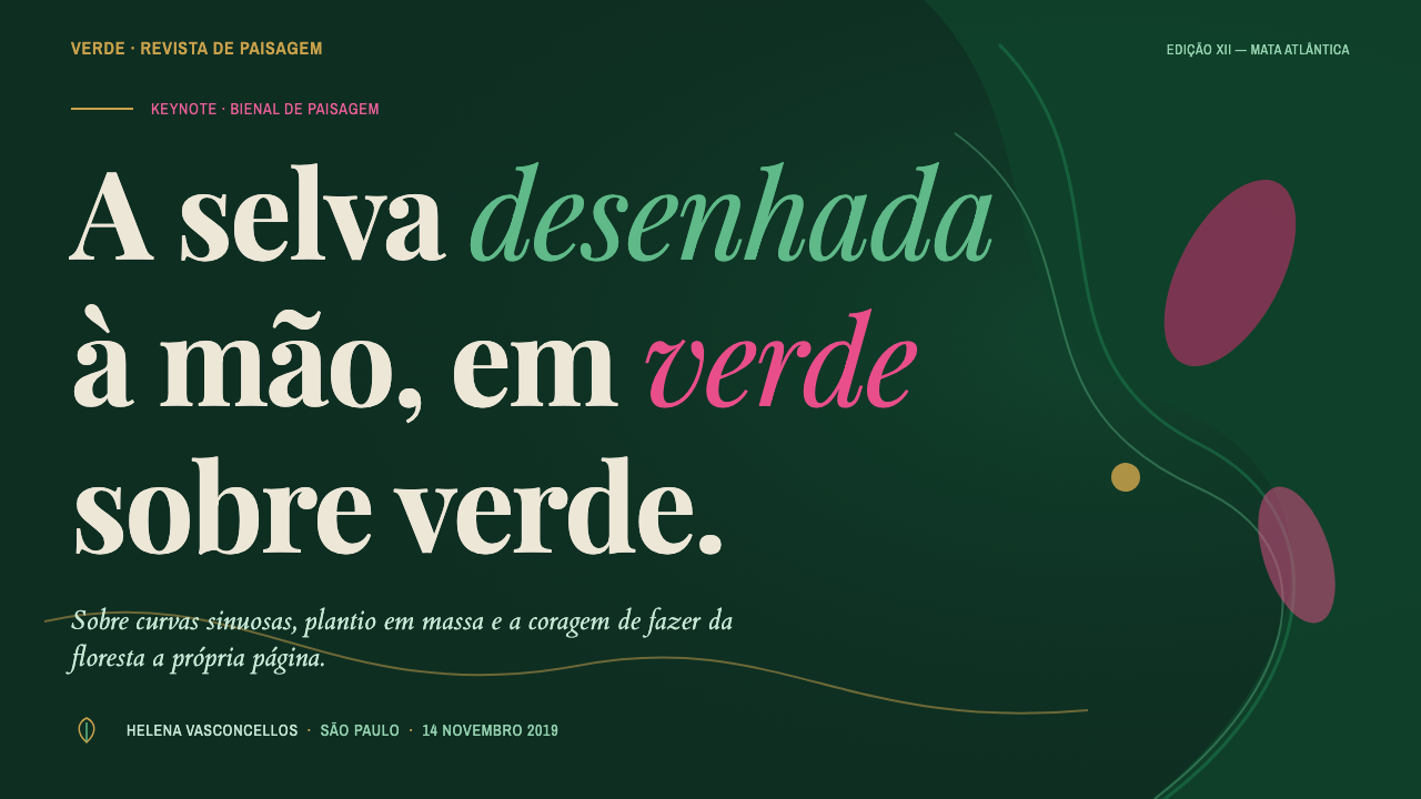
For presentation slides, use the deep green environment as a continuous stage. A cover can pair a large botanical image or flowing organic field with a condensed serif title, then introduce a small gold rule or restrained coleus-pink detail as a signature. Content slides should preserve the same planted atmosphere while allowing text to breathe through clear blocks, deliberate cropping, and curves that guide rather than obstruct reading.
Data slides benefit from treating information as a landscape of masses and paths. Large fields can establish the main area, while gold lines separate categories and pink marks identify the most important change or conclusion. Charts should remain editorial and quiet within the tropical setting: the point is to create hierarchy through contrast, scale, and placement rather than covering every surface with color.
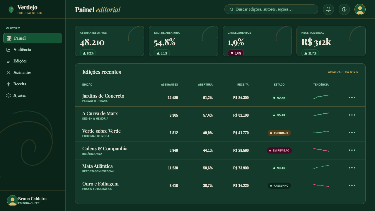
For web interfaces, especially dashboards and pricing pages, the style works when the lushness is kept subordinate to navigation and comparison. Deep green can establish the shell, layered greens can separate panels, gold can clarify selected states or boundaries, and coleus pink can signal a featured tier or important action. Condensed serif headlines can carry the brand voice, while supporting text should remain calm and highly legible.
For editorial and marketing work, São Paulo Tropical Editorial is naturally suited to lookbooks, cultural features, beauty campaigns, hospitality stories, and brand launches that want sophistication with tropical energy. Use botanical photography as an active compositional participant, not a background texture. Let curves create transitions between sections, let gold provide continuity across pages, and reserve pink for moments that deserve a visual lift.
The common mistake is confusing tropical richness with unrestricted decoration. Filling every area with foliage, curves, gold, and pink destroys the hierarchy that makes the style feel editorial. The green field needs quiet zones, the curves need direction, gold needs restraint, and pink needs scarcity. Another failure is choosing ordinary type that cannot withstand the atmosphere; without the high-contrast condensed serif voice, the work may look botanical but no longer feels like São Paulo fashion editorial.
São Paulo Tropical Editorial — FAQ
Is São Paulo Tropical Editorial a historical style?
It is a contemporary aesthetic with a historical lineage rather than a fixed historical movement. Its immediate field is Brazilian fashion editorial from 2010 to the present, while its deeper visual inheritance comes from Roberto Burle Marx’s mid-century landscapes. The style combines that landscape language with current editorial and fashion-branding needs.
Does the style require botanical photography?
Botanical photography is a natural and powerful part of the language, but the deeper requirement is botanical atmosphere. Layered greens, organic curves, and planted-looking masses can establish the same relationship with nature. When photography is used, it should participate in composition through scale, crop, and placement rather than sit passively behind the content.
Why are gold and coleus pink both needed?
They perform different jobs. Gold is a fine structural light, useful for rules, contours, and subtle continuity. Coleus pink is a vivid botanical interruption that draws attention to selected moments. Keeping their roles distinct prevents the accent system from becoming noisy: gold refines the structure, while pink creates emphasis.
Can this aesthetic work on a light background?
Its defining environment is deep jungle green, so a fully light-ground treatment would change its character. Light areas can appear as openings, image fields, or moments of breathing space, but the overall composition should retain the sense of a dark tropical environment. If the green disappears, the relationship between foliage, gold, pink, and fashion typography becomes much weaker.
Where does the style struggle?
It struggles when the project needs a plain, neutral, or purely technical atmosphere. Its strength lies in richness, mood, and a strong editorial point of view. It can also fail when every accent is used at once, when curves have no directional purpose, or when typography is too ordinary to provide a refined counterweight. The style needs both abundance and editorial discipline.
Related design styles
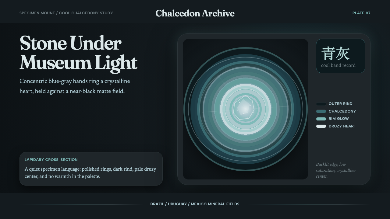 Agate Cross-SectionQuiet mineral glow. Fraunces type and cyan-gray rings shine on matte black.
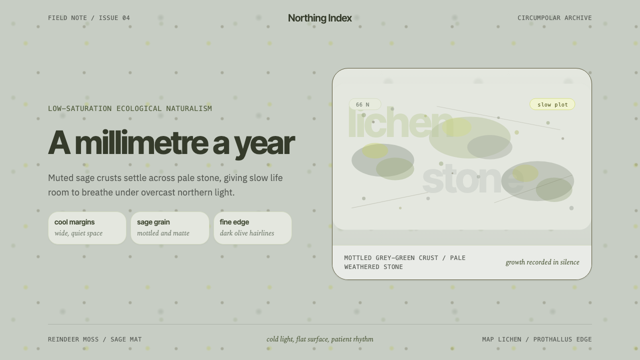 Arctic Tundra LichenPatience made visible. Sage speckles drift over cold stone with narrow, quiet…
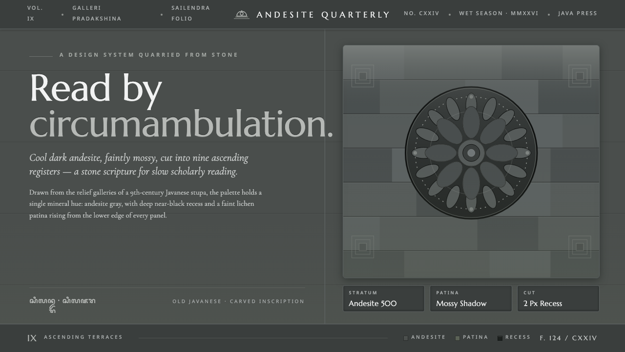 Borobudur Andesite GrayStone read like scripture. Cool andesite gray, near-black recess, mossy patin…
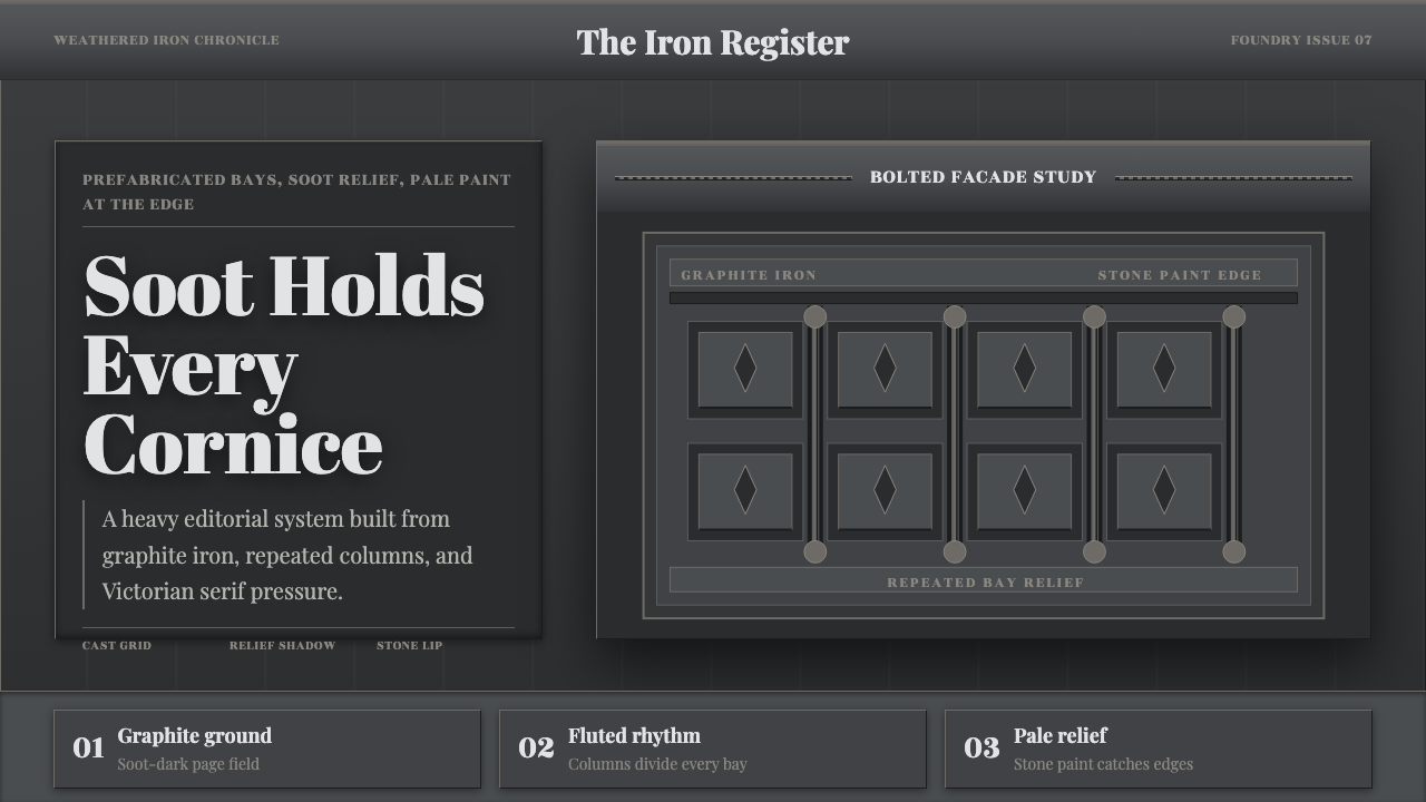 Cast Iron SoHo FacadesIron remembers the city. Graphite bays, Didone type, and pale stone-paint edg…
 Chola Bronze NatarajaA patinated bronze under museum spotlight. Near-black field, verdigris recess…
 Egyptian Malachite PigmentGrave mineral green. Muted malachite bands on green-black stone, cut by fine…