What is Ice Core Climate Data?
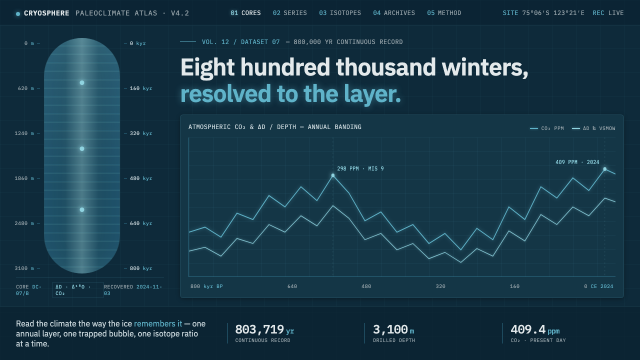
Ice Core Climate Data turns ancient ice into a dark, luminous instrument: cyan traces, monospaced coordinates, and blue depth carrying the story of climate.
Ice Core Climate Data in brief
Ice Core Climate Data distills the visual language of paleoclimatology, the study of Earth’s past climate through cylinders of ancient ice. Back-lit cores reveal bands of annual layering, while fine line plots trace deuterium and CO2 across depth and age. The interface treats these records as evidence: every mark should clarify a measurement, a coordinate, or a change over time.
Its atmosphere comes from the material itself. Thick, clean ice scatters red light and reads as cyan-blue, so the system places glowing cyan curves over a deep ice-blue field. The result is not a decorative frozen landscape, but a controlled simulation of looking through illuminated ice toward a hidden record.
The visual language is sparse and instrument-grade. Monospaced year and depth labels establish a technical register; restrained gridlines create orientation without competing with the plots; translucent back-lit gradients imply depth without turning the screen into an illustration. Meaning comes from contrast, position, and trace behavior rather than ornament.
Where does Ice Core Climate Data come from?
The style belongs to contemporary ice-core paleoclimatology, whose visual references extend across global Antarctic and polar research. It treats paleoclimate data visualization as a meeting point between glaciology, scientific charting, and the physical behavior of blue ice. The interface therefore feels less like a general-purpose dashboard than a window into a specialized research environment.
The Vostok ice-core programme and the EPICA consortium provide the central record-based frame for the style. Their association with ice-core research makes depth and age inseparable from the visual system. A curve is not simply a trend floating on a chart; it is a trace located within a layered archive, where the vertical structure of ice and the passage of time must remain visible together.
The palette grows from the optical idea of back-lit ice. Annual layers become bands, depth becomes a field of blue, and measured change becomes a cyan line that appears to glow against the darker ground. This is why the style avoids a broad decorative palette: color is reserved for the relationship between illuminated ice, readable traces, and the surrounding darkness.
The institutional and dataset references include the British Antarctic Survey, the Vostok ice-core programme, the EPICA consortium, and CDIAC isotope datasets. Together with monospaced data annotation and scientific charting, they establish a vocabulary of careful labeling, visible coordinates, and restrained visual hierarchy. The design does not pretend to replace scientific interpretation; it creates a disciplined surface on which interpretation can happen.
What defines the Ice Core Climate Data look?
Deep Ice Field
The background is a dark ice-blue field rather than neutral black or a bright environmental blue. It suggests depth, cold, and the enclosed darkness of a core while giving luminous traces enough contrast to remain legible. The field should feel continuous and quiet, with tonal variation reserved for back-lit depth rather than decoration.
Cyan Traces
Cyan is the principal signal color. It is used for thin, clean traces representing changes in deuterium and CO2 across depth and age. The glow should remain controlled: the line must read first as data and only second as light. Multiple traces should be distinguishable through position and labeling, not through a crowded spectrum.
Monospaced Coordinates
Year and depth labels use monospaced lettering to give every coordinate an equal visual footprint. This creates a measured, tabular rhythm and makes the interface feel closer to a scientific instrument than to a lifestyle product. Labels should be compact, consistently aligned, and subordinate to the plotted evidence without becoming faint or ambiguous.
Restrained Gridlines
Gridlines provide orientation across the field but remain visually quiet. They establish the relationship between a curve and its depth or age without becoming a second drawing. A successful grid is sensed before it is noticed: it supports comparison, preserves scale, and disappears behind the measured trace.
Back-lit Translucency
Translucent gradients suggest light passing through layered ice. They should create a sense of enclosed depth rather than atmospheric decoration, with soft tonal shifts behind the sharper data marks. The effect works best when it remains partial and restrained, allowing the dark field to persist around every illuminated area.
Instrument-Grade Restraint
The system treats every visual decision as part of measurement. There are no ornamental surfaces competing with the plots, no theatrical effects that imply more certainty than the data carries, and no arbitrary color changes. Hierarchy comes from luminosity, placement, line clarity, and annotation. The interface feels precise because it refuses to perform excess.
Who shaped Ice Core Climate Data?
The British Antarctic Survey anchors the style in the institutional world of Antarctic and polar research. Its presence suggests field evidence, careful observation, and a visual culture where the environment is not a backdrop but the subject being measured.
The Vostok ice-core programme supplies a central reference for reading ancient ice as a layered climate record. In the visual system, it supports the emphasis on depth, age, annual bands, and traces that remain tied to a physical archive.
The EPICA consortium broadens the reference from one named core to a wider research vocabulary around Antarctic records. Its role in the style is conceptual: the interface should make comparison and continuity feel possible without losing the discipline of scientific annotation.
CDIAC isotope datasets reinforce the connection between the visual language and isotope-based climate evidence. They justify the precise treatment of labels and traces, where a curve is valuable because it is identified, located, and presented within a readable data structure.
How do you use Ice Core Climate Data today?
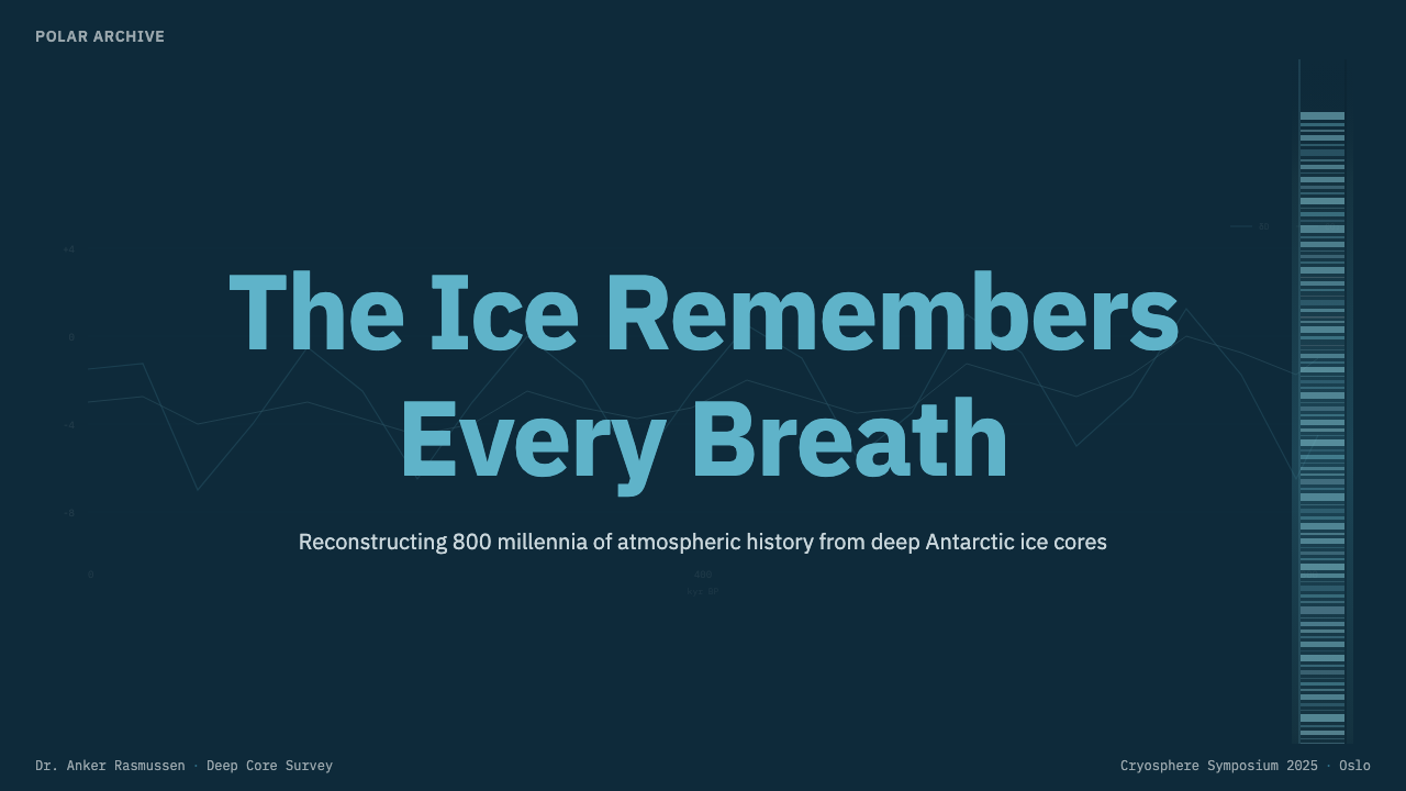
For presentation slides, use the deep ice-blue field as the continuous stage across the deck. A cover can hold a single luminous curve, a restrained depth cue, and a concise title set in monospaced lettering, leaving generous darkness around the signal. Content slides should make one research relationship dominant at a time: a trace with its labels, a layered diagram of annual bands, or a short explanatory passage beside a quiet grid. Data slides should put deuterium and CO2 traces against visible depth and age coordinates, preserving the feeling that each plot belongs to an archive rather than existing as an isolated graphic.
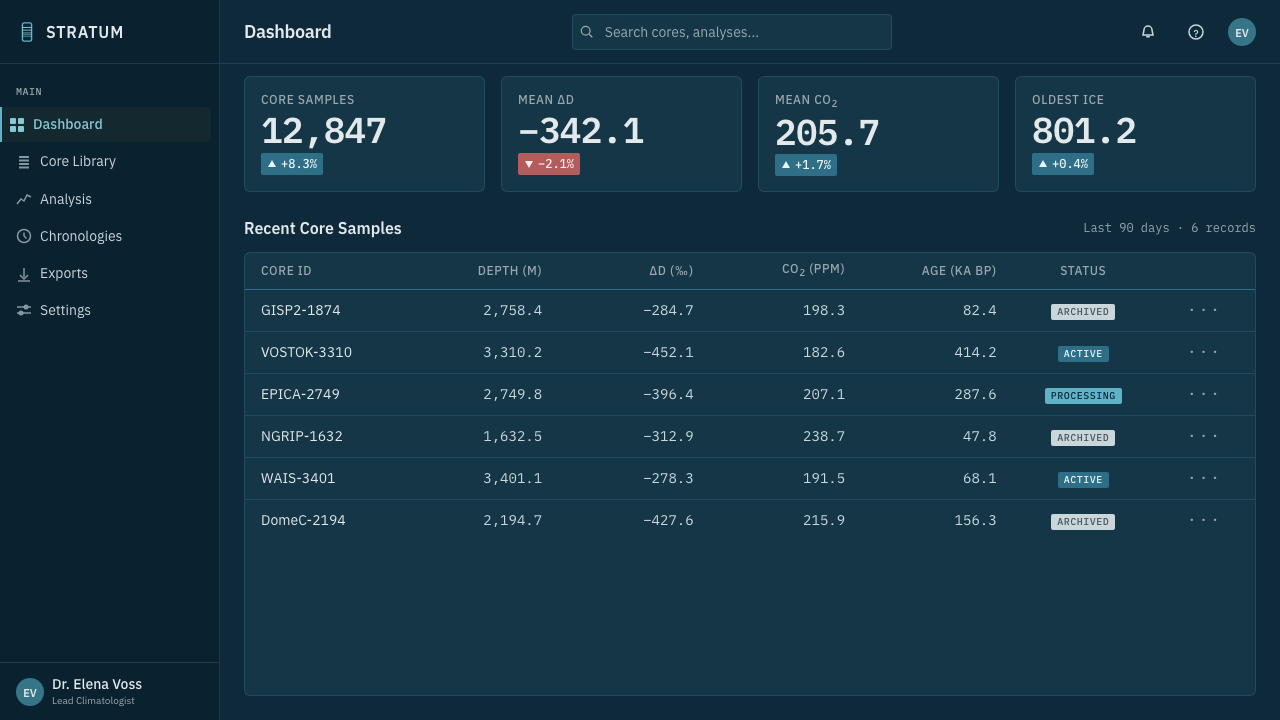
For web interfaces, the style is naturally suited to scientific dashboards, monitoring surfaces, and research tools where coordinates and trends must remain visible. Use cyan for active traces, selected states, or the most important measured value; keep secondary controls dimmer and quieter. It can also work for pricing pages when the product wants to communicate technical seriousness, data discipline, or instrument-grade reliability. In that setting, plan tiers should read like clearly annotated records, with restrained panels and strong labels rather than bright promotional decoration.
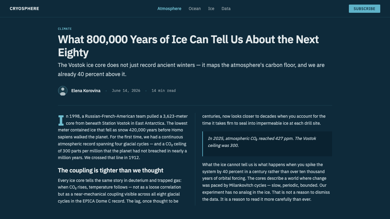
For editorial and marketing work, Ice Core Climate Data supports long-form stories about climate records, research methods, polar environments, and evidence over time. A page can pair a narrow reading measure with a large side annotation showing depth or age, then use a cyan line as a recurring editorial signal. Marketing campaigns can borrow the back-lit quality for launch statements or research reports, but the message should remain specific and evidence-led. The style is strongest when the reader feels guided through a record, not surrounded by an icy theme.
The common mistake is turning the concept into generic neon science fiction. Over-bright glow, excessive gradients, decorative particles, a rainbow of chart colors, or labels treated as tiny afterthoughts all weaken the source logic. The system depends on darkness, measured contrast, and visible coordinates. Keep the field deep, keep the curves clean, keep the grid restrained, and let the data-bearing marks carry the emotional charge.
Ice Core Climate Data — FAQ
Is Ice Core Climate Data meant to look like a literal scientific chart?
It should feel scientifically credible without pretending to reproduce a particular research instrument. The essential qualities are visible coordinates, readable traces, restrained gridlines, and a clear relationship between depth, age, deuterium, and CO2. The visual atmosphere can be expressive, but it should never obscure what the marks are measuring.
Why are cyan curves placed on a deep ice-blue background?
The palette comes from the visual behavior of thick, clean ice under back-lighting. Ice scatters red light and appears cyan-blue, so the interface turns that observation into a controlled visual system. The dark field supplies depth and contrast, while the cyan trace functions as the illuminated evidence moving across it.
Can the style use colors other than cyan and ice blue?
It can, but additional colors should have a clear informational role. The source language is intentionally narrow because color separates the illuminated trace from the dark field. Introducing many unrelated accents makes the interface feel like a generic data dashboard and weakens the connection to ice, back-light, and scientific charting.
How should imagery be handled in an Ice Core Climate Data layout?
Imagery should support the idea of looking through a core toward a record. Back-lit ice, annual bands, and layered depth are appropriate references, while translucent treatment can suggest illumination without becoming scenery. Images should remain subordinate to the data structure; if a photograph becomes the main spectacle, the interface has moved away from its instrument-grade purpose.
What kinds of products suit this visual language best?
It works best for scientific dashboards, climate and environmental research tools, analytical platforms, technical reports, and products that need to communicate measured evidence over time. It is less suitable when warmth, playfulness, or broad emotional accessibility is the primary value. The style is persuasive when the product itself benefits from precision, depth, and disciplined interpretation.
Related design styles
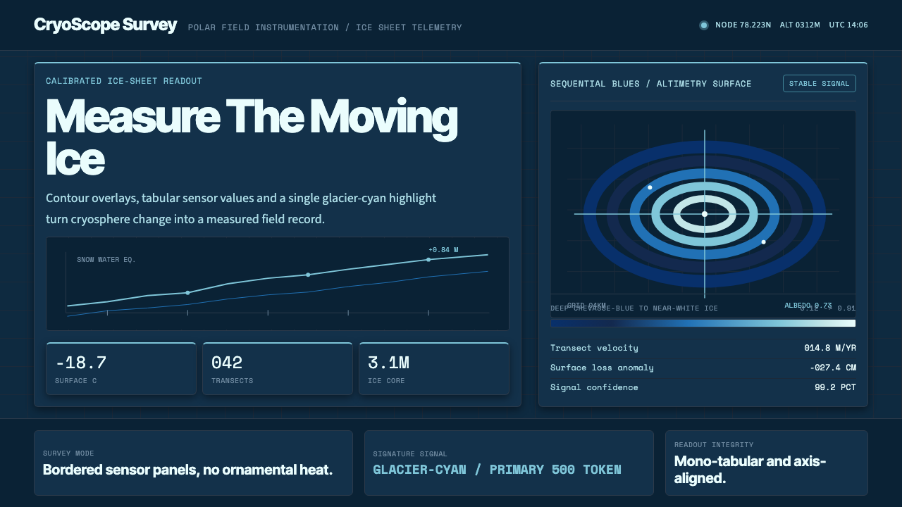 Glacier Arctic SurveyCold precision. Crevasse-blue panels, cyan readouts and contour grids calibra…
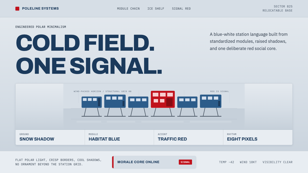 Antarctic StationCold precision, one red signal. Archivo modules ride a blue-white horizon gri…
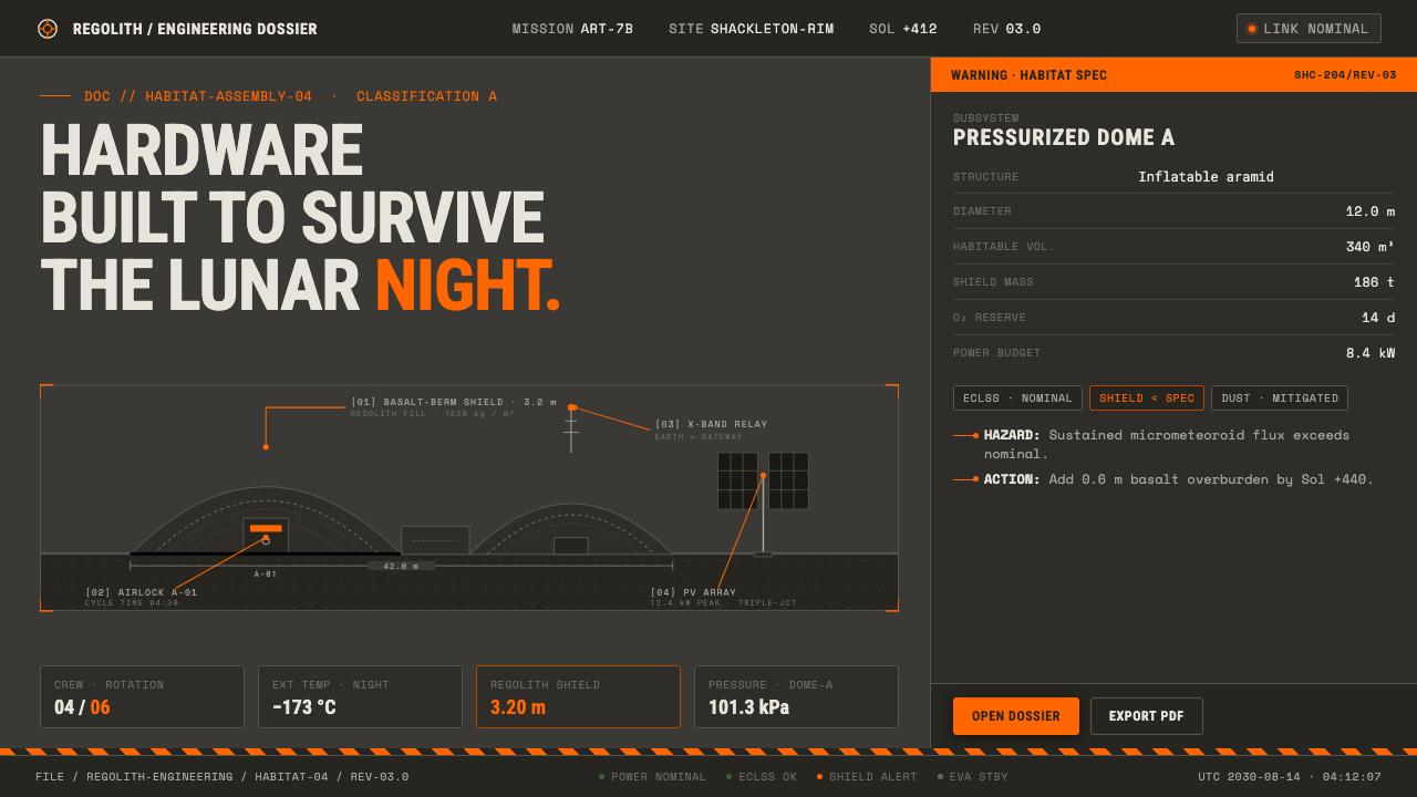 Lunar Base 2030Hardware built to survive the lunar night. Regolith gray, ANSI hazard orange,…
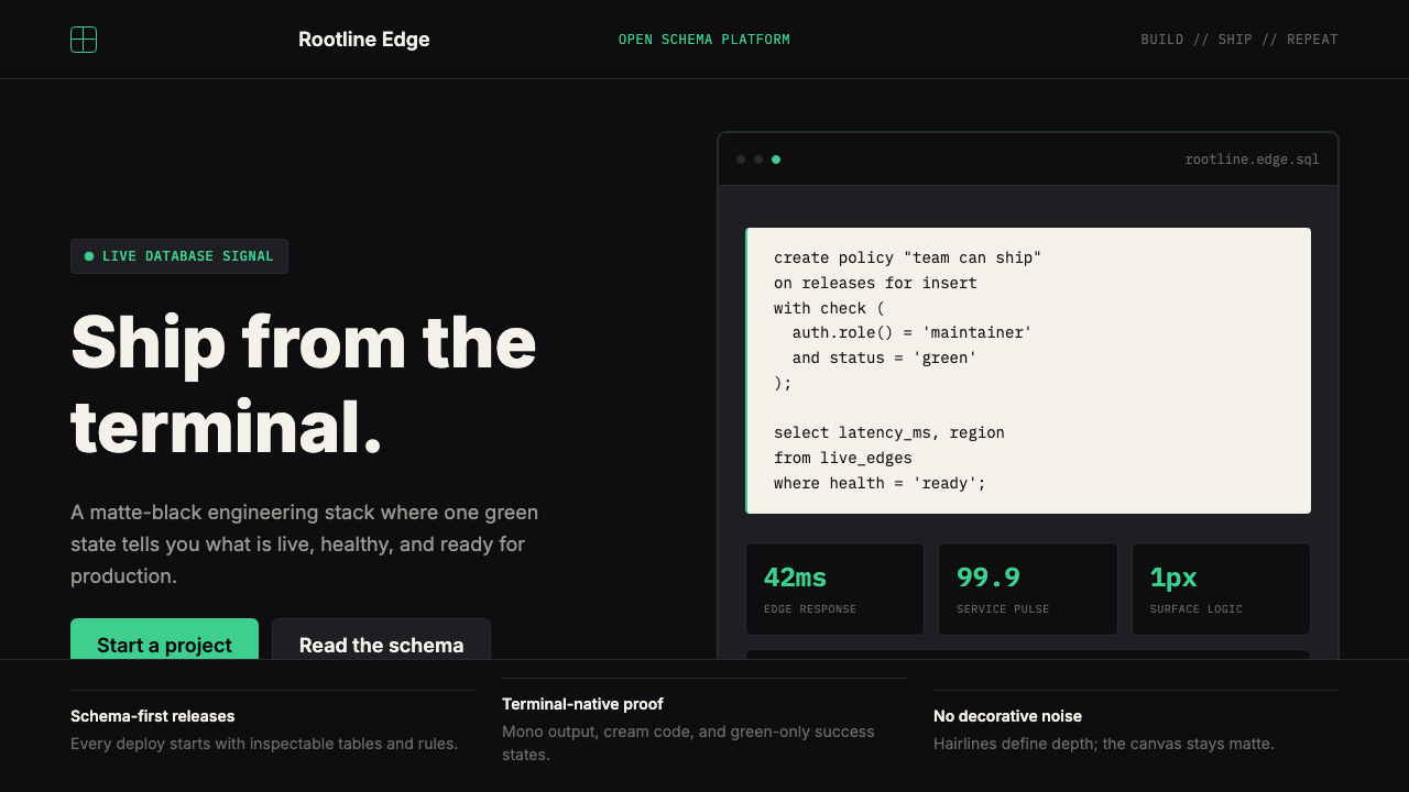 Supabase Postgres Green (2024)Midnight-terminal confidence. Matte black, Inter, mono code, and one electric…
 Caliper MachiningPrecision refuses drama. Steel-gray grid, mono tolerances, one bronze swarf a…
 Cron CalendarDesigner-tech restraint. Purple wash, ink grid, mono shortcuts, surgical even…