What is Scottish Fair Isle Knit Shetland?
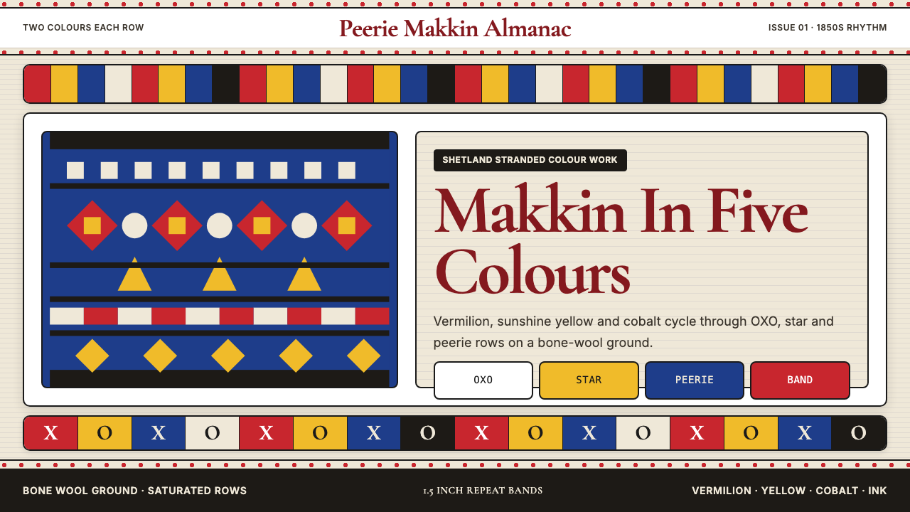
Fair Isle knitting distills centuries of Shetland cottage craft into five bold colors and endlessly repeating geometric bands — a visual rhythm as recognizable as a fingerprint.
Scottish Fair Isle Knit Shetland in brief
Fair Isle knitting is a stranded colorwork technique originating from Fair Isle, a tiny windswept island perched between the Orkney and Shetland archipelagos in the far north of Scotland. The method requires working two colors in every row, weaving the unused strand loosely across the back of the fabric so both colors are always engaged and the resulting cloth has a doubled warmth and density. The visual language this produces — tight horizontal bands of geometric motifs cycling through a palette of warm and cool saturated tones — is among the most immediately recognizable textile aesthetics in the world.
The palette is the style's first signature: vermilion red, sunshine yellow, cobalt blue, ink black, and bone white. These five colors rarely appear all at once on a single row — Fair Isle's two-colors-per-row constraint means the palette reveals itself gradually, band by band, as each motif type rotates through a new pairing. The result is a dense, jewel-like surface where the eye constantly finds new contrast relationships within a system that nonetheless feels completely unified.
The motif vocabulary is the style's second signature: OXO (a cross-and-diamond repeat named for its typographic silhouette), peerie (a small subsidiary pattern filling the gaps between large motifs), star forms derived from compass rose geometry, and horseshoe shapes that interlock into continuous chains. These motifs are not decorative additions — they are the structural logic of the fabric itself, each shape calibrated to sit within the repeat width that the technique's constraints define.
Where does Scottish Fair Isle Knit Shetland come from?
The island of Fair Isle — home to fewer than a hundred people across most of its documented history — sits roughly equidistant between the Orkney and Shetland island groups, battered by North Atlantic weather and accessible only by a twice-weekly ferry or a small aircraft. Its isolation produced a textile tradition of unusual intensity. Evidence of stranded colorwork in the Shetland region dates to at least the early nineteenth century, and by the 1850s, the sale of handknitted goods to sailors and passing traders had become a significant part of the island economy. The five-color palette — working within the natural undyed tones of native Shetland sheep supplemented by plant-dyed or later commercially dyed yarn — evolved as both an aesthetic choice and a practical constraint of the island's available materials.
The technique achieved international visibility in 1921, when the Prince of Wales — later King Edward VIII — was photographed wearing a Fair Isle jumper at a golf match at St Andrews. The photograph circulated widely, and demand for the style surged across Britain and then the wider English-speaking world. The royal endorsement translated the island's cottage production into a fashion commodity: London department stores placed orders, Shetland knitters hired on piece-rates found their income transformed, and the aesthetic moved from working garment to luxury sportswear in a single news cycle. This moment established the enduring association between Fair Isle pattern and a certain kind of upper-class British leisure.
The tradition was sustained through the mid-twentieth century by a network of cottage knitters across Shetland — not just on Fair Isle itself — who adapted the classic palette and motif vocabulary to changing fashion demands while maintaining the hand-knit quality that machine production could not replicate. Key figures in documenting and codifying the tradition include George Williamson, whose early twentieth-century records preserve much of what is known about the pre-fame technique, and later researchers like Sarah Don, whose scholarly work mapped the full range of traditional motif types. Wilma Malcolmson and Mati Ventrillon represent a more recent generation of makers who have continued the tradition on Fair Isle itself, producing hand-knitted garments that command significant prices as slow-fashion luxury objects.
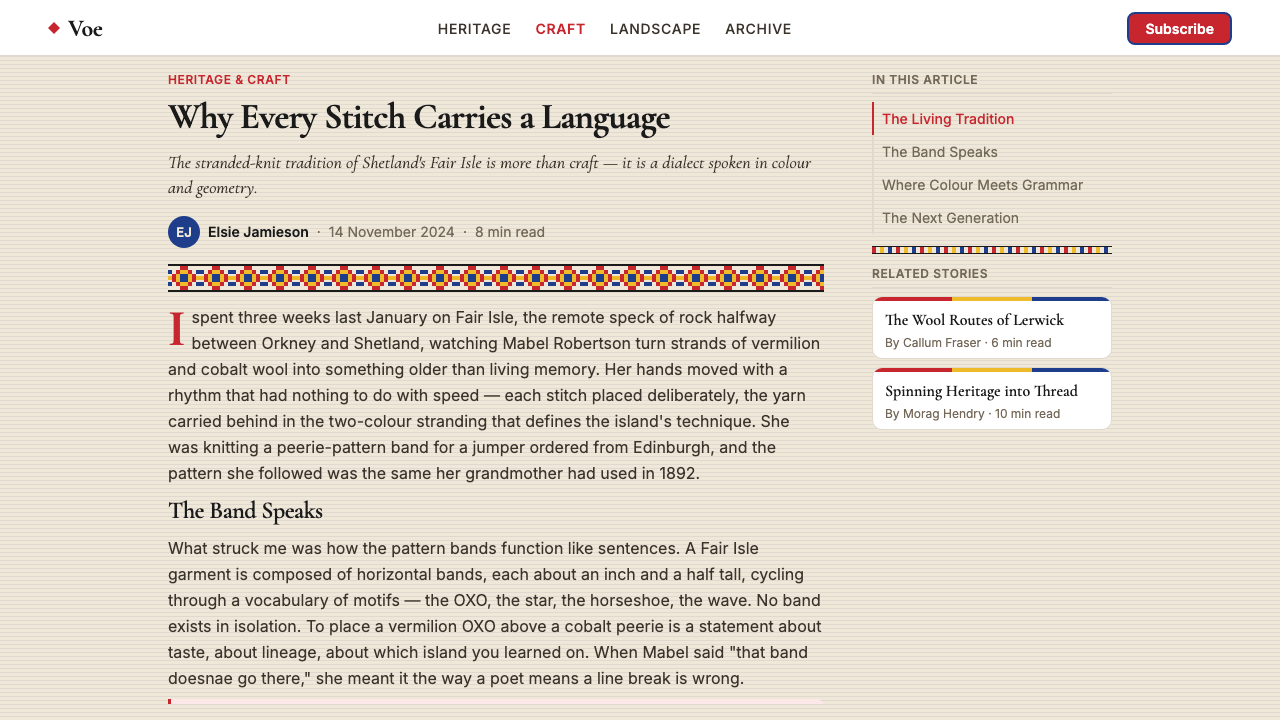
A major revival began around 2010 with the establishment of Shetland Wool Week, an annual event centered in Lerwick that draws knitters from across the world to learn traditional Shetland and Fair Isle techniques from local makers. The revival coincided with a broader cultural reappraisal of slow craft, heritage textile production, and the ethics of handmade versus fast fashion. Fair Isle pattern entered contemporary design vocabulary through this route — appearing in tech company branding, app UI treatments, editorial illustration, and digital design systems — often abstracted into pure geometric band structure separated from its wool-textile origins, but still carrying the warmth, density, and rhythmic confidence of the original.
What defines the Scottish Fair Isle Knit Shetland look?
Saturated Five-Color Palette
The canonical Fair Isle palette clusters around five anchors: a warm vermilion red, a clear sunshine yellow, a deep cobalt blue, near-black ink, and a warm off-white bone tone. These colors carry high saturation even in their wool-yarn originals, and the density of the stranded knit surface makes them appear even more intensely present in print or screen translations. The palette reads as simultaneously bold and warm, avoiding the coldness of pure primaries through the organic quality of natural fiber tones underlying the dye.
Two-Color Row Constraint
Fair Isle's defining technical rule — only two colors may be active in any single row — shapes the entire visual system. This is not a stylistic preference but a structural necessity of the stranded technique: carrying more than two threads across a row creates an unworkable tangle on the reverse side. The constraint produces the distinctive banded appearance, because palette shifts can only happen between rows. It also creates the characteristic rhythm: each band feels complete in itself before the color relationship resets and a new pairing takes over.
Geometric Motif Vocabulary
The traditional Fair Isle repertoire includes a small number of recurring motif families: OXO (a cross-enclosed diamond that reads like the letter sequence), peerie (small filler patterns — tiny crosses, diamonds, and dots — that occupy the narrow bands between principal motifs), star and compass forms, and horseshoe shapes that lock into continuous looping chains. Each motif family has natural proportions that derive from the stitch grid: Fair Isle stitches are slightly wider than tall, so diagonal lines are stepped rather than smooth, and circular forms do not exist as such — diamond forms approximate roundness within the constraint of the rectangular grid.
Banded Horizontal Rhythm
Fair Isle composition is almost always organized as a stack of horizontal bands, each containing one motif type at one color pairing, cycling through the full motif vocabulary across the height of a garment or design surface. The bands are not equal in width — principal motifs occupy the widest bands, peerie patterns fill narrow inter-band spaces — and this variation in band height creates a micro-rhythm within the larger macro-rhythm of motif rotation. The overall reading direction is therefore both horizontal (within any single band, the eye travels through the repeat) and vertical (across the whole surface, the eye reads through the sequence of band types).
Textile Warmth and Density
Unlike geometric styles derived from print or screen media, Fair Isle carries an inherent tactile quality rooted in its wool-textile origins. The stranded knit double-layers the fabric, creating physical warmth that translates into a visual warmth even when the pattern is rendered in digital or print form. The surface always reads as dense rather than airy — there is no negative space within a Fair Isle motif band, every stitch position is occupied. This denseness is not heaviness; it is confidence. The pattern announces itself without apology.
Symmetry Within Bands
Individual Fair Isle motifs are almost always bilaterally symmetrical across a vertical axis, and the band as a whole repeats at a fixed horizontal interval. This strict internal symmetry within each band contrasts with the variation between bands — different motif types, different color pairings, different band widths — creating a system that feels both orderly and surprising. The eye is never bored (because the bands change) but is never lost (because within any band, the logic is perfectly regular).
Heritage Authenticity Signal
Because the Fair Isle technique is documented, named, and associated with a specific geographic origin, the aesthetic carries a strong provenance signal. When used in contemporary design, even in abstracted or digital form, it references a tradition of hand skill, community craft economy, and northern European material culture. This provenance makes it a distinctly different kind of pattern from purely invented geometric ornament — it arrives with cultural weight, and that weight is part of what the style communicates.
Who shaped Scottish Fair Isle Knit Shetland?
Williamson was among the first to systematically document the Fair Isle knitting tradition in the early twentieth century, before the 1921 royal-fashion moment transformed the island's output into an internationally sought commodity. His records — covering motif names, production methods, and the social organization of the island's knitting economy — preserve knowledge that might otherwise have been absorbed into commercial fashion without attribution. Researchers working on the history of Shetland textiles continue to rely on his foundational documentation.
Don's scholarly work on Fair Isle and Shetland knitting traditions is among the most comprehensive produced in the late twentieth century. Her research mapped the full range of traditional motif types — distinguishing between the principal pattern families, charting their regional variations, and tracing the lines of transmission through the cottage knitting economy. Her books gave designers and contemporary knitters a systematic vocabulary for working with the tradition rather than simply borrowing its surface appearance.
Malcolmson represents the living tradition of hand-knitting on Fair Isle itself — one of a small number of makers who continue to produce authentic hand-knitted Fair Isle garments on the island rather than in the commercial Shetland knitwear industry based in Lerwick. Her work is produced slowly, in small quantities, and carries a price that reflects the real labor cost of hand-stranded work. In an era of mass-produced fair-isle-adjacent machine knitwear, her garments document what the original standard actually looks like.
Ventrillon, born in France and trained in textile design before settling on Fair Isle, has become one of the tradition's most visible contemporary practitioners. She studied the historical motif vocabulary and production methods directly on the island, produces hand-knitted garments in the traditional palette, and has collaborated with contemporary fashion designers seeking authentic Fair Isle input. Her dual position — insider to the island community and recognizable to the international design world — has helped carry the tradition into contemporary slow-fashion and heritage-craft conversations.
How do you use Scottish Fair Isle Knit Shetland today?
Fair Isle works best in design contexts that can carry visual density and warmth without becoming cluttered — contexts where the surface is given room to be the subject rather than a background. The pattern is inherently commanding; it does not play a supporting role gracefully. Before applying it, the first question is whether the context genuinely benefits from that kind of intensity.
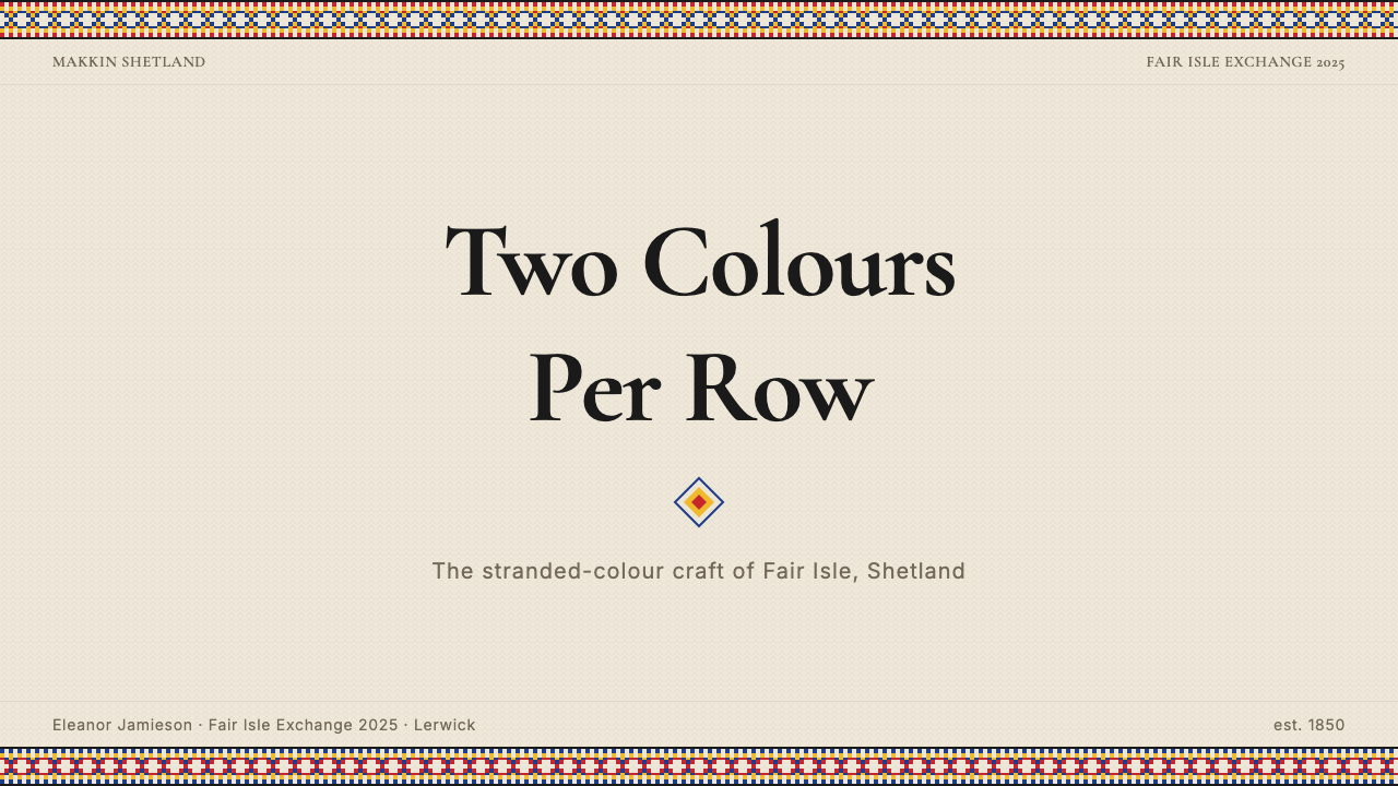
For presentation slides, Fair Isle functions most effectively as a framing device rather than a surface treatment for every page. A cover slide using a full Fair Isle band at the top and bottom — in the authentic five-color palette, with the geometric repeat running edge to edge — creates immediate visual authority and warmth. The interior content pages should retreat to clean white or near-white with the primary palette colors used only for accent: a vermilion heading rule, a cobalt data callout box, a yellow highlighted figure. Using the full band pattern on every slide overwhelms the content; the pattern is so rich that it competes with text at any proximity.
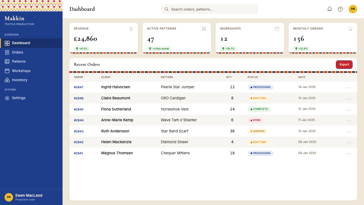
For web interfaces and dashboards, the appropriate approach is abstraction rather than direct application. Full Fair Isle bands work well as hero headers, navigation bars, or footer decorations on marketing pages, but within functional UI — data tables, form fields, interactive controls — the motif should simplify to a border treatment, a loading state indicator, or a subtle background texture at dramatically reduced contrast. The color palette, however, translates directly and well: warm vermilion for primary actions, cobalt for informational states, yellow for warnings, near-black for body text. On a pricing page, the tier differentiation can be carried by the color pairings from the palette without using the geometric motifs at all.
For editorial and marketing work, Fair Isle connects naturally to themes of craft, heritage, quality, winter warmth, and northern European identity. It works well for fashion editorial, outdoor and adventure brands, artisan food and beverage, and cultural or regional heritage campaigns. It struggles in contexts that require lightness, speed, or technological abstraction — fintech, SaaS, health tech, and most corporate applications will find it tonally mismatched. In editorial layouts, the bands can serve as section dividers, chapter headers, or pull-quote backgrounds; using them as full-page backgrounds behind body text creates legibility problems due to the pattern's density.
The most common mistake when applying Fair Isle digitally is treating the palette as purely decorative and losing the constraint logic that gives it coherence. Authentic Fair Isle never uses more than two colors simultaneously in any band, and this two-color-at-a-time discipline is what prevents the palette from reading as chaotic despite its saturation. Digital applications that scatter all five colors across a surface simultaneously — in text, backgrounds, borders, and icons — replicate the hues without the system and produce visual noise rather than richness. A second common mistake is scaling the repeat motifs too large: in the original textile, the motifs are meant to be read as texture at normal viewing distance, not as individual ornamental shapes. When the repeat is enlarged to hero scale, the pattern becomes wallpaper-aggressive rather than textile-warm.
Scottish Fair Isle Knit Shetland — FAQ
What is the difference between Fair Isle and other stranded colorwork traditions like Norwegian or Icelandic knitting?
All three traditions share the stranded two-color-per-row technical method, but their visual languages are distinct. Norwegian knitting (particularly Setesdal and Selbu styles) tends toward bolder, higher-contrast two-color patterns — typically dark navy or black against white — with motifs including reindeer, snowflakes, and folk stars. Icelandic lopi knitting uses a single undyed or simply colored ground with a yoke-only band of pattern, typically in natural undyed tones of grey, brown, and cream. Fair Isle is distinguished by its use of a richer multi-color palette rotating across many narrow bands, its specific motif vocabulary (OXO, peerie, horseshoe), and its geographic and heritage designation. The warmth and density of Fair Isle compared to the graphic contrast of Scandinavian styles is the clearest visual distinction.
Can Fair Isle work on dark backgrounds, or is it inherently a light-ground style?
Traditional Fair Isle is light-ground — the bone white and warm off-white tones serve as the ground from which the colored motifs emerge. A dark inversion is possible but changes the aesthetic character significantly. On a near-black or very deep cobalt ground, the vermilion and yellow tones become the lights in the composition rather than the accents, which can produce a richly jewel-like result. However, the key is maintaining the two-color-per-row discipline even in the dark version: using a single warm accent against the dark ground per band, with the second color reserved for structure, prevents the color relationships from becoming muddy. Dark Fair Isle tends to read as more luxurious and less folksy than the traditional light version.
How should Fair Isle motifs be scaled when applied to digital surfaces?
In the original textile, Fair Isle motifs repeat within a band roughly one to two centimeters wide — small enough that the pattern reads as a unified surface texture at arm's length, with the individual motif shapes becoming visible only on close inspection. This scale logic is important to preserve. In digital applications, the motif repeat should be sized so that the full band registers as a texture band rather than as a pattern of individual ornamental shapes. When the repeat is scaled so that a single OXO motif fills a large area, the design tips from textile warmth into wallpaper aggression. A useful test: if you can easily count the motif units without moving closer to the screen, the repeat is probably too large.
Is Fair Isle appropriate for year-round use, or does it read as inherently seasonal?
Fair Isle carries strong seasonal associations — particularly with autumn and winter, with cold weather, with the comfort of wool, and with holiday-adjacent warmth. In its traditional palette of vermilion, yellow, cobalt, black, and bone white, it reads as inherently warming. That said, the underlying visual logic — horizontal geometric bands, saturated palette, dense pattern — is not exclusively seasonal. A Fair Isle-derived design that reduces the palette to two or three cooler tones (cobalt and off-white, for instance, or a spring green and cream pairing) while retaining the banded geometric structure can read as considerably less autumnal. The wool-warmth association is attached to the full traditional palette more than to the structural logic of the banding.
How does the Shetland Wool Week revival affect how Fair Isle is understood today?
Shetland Wool Week, established in 2010, has done two things simultaneously: it has reinforced the connection between Fair Isle pattern and its geographic, community, and craft origins — bringing thousands of international knitters to Shetland to learn directly from local makers — while also widening the style's reach into contemporary craft and design culture. The event has helped establish a distinction between authentic Fair Isle (hand-knitted on the island using traditional methods and materials) and Fair Isle-derived or Fair Isle-adjacent pattern (machine-knitted, digitally applied, or broadly inspired). Contemporary designers working with the pattern are more likely than their predecessors to acknowledge this distinction and to signal which mode they are operating in.
Related design styles
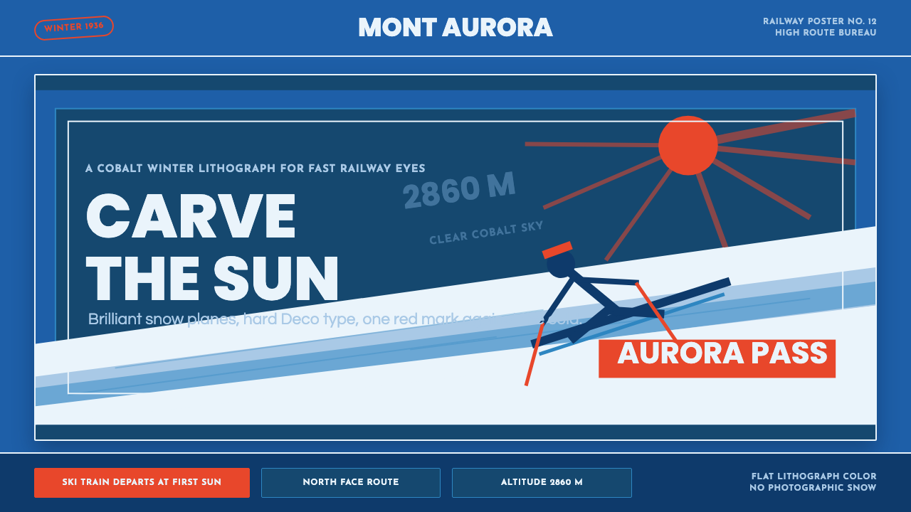 Alpine Ski PosterCold speed sells winter. Cobalt sky, snow planes, sun rays, and one resort-re…
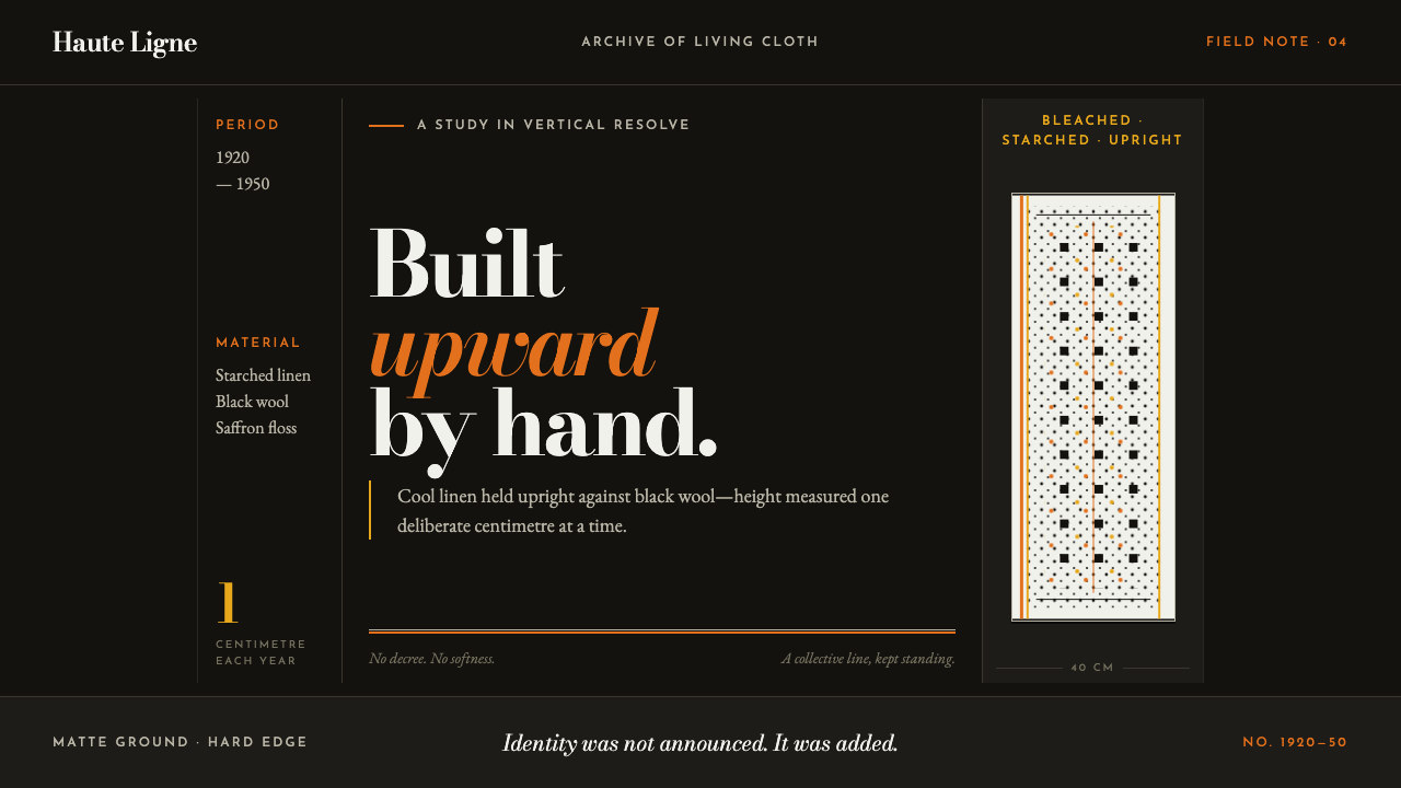 Bigouden CoiffeIdentity stands tall. Starched linen rises over matte black, edged in saffron…
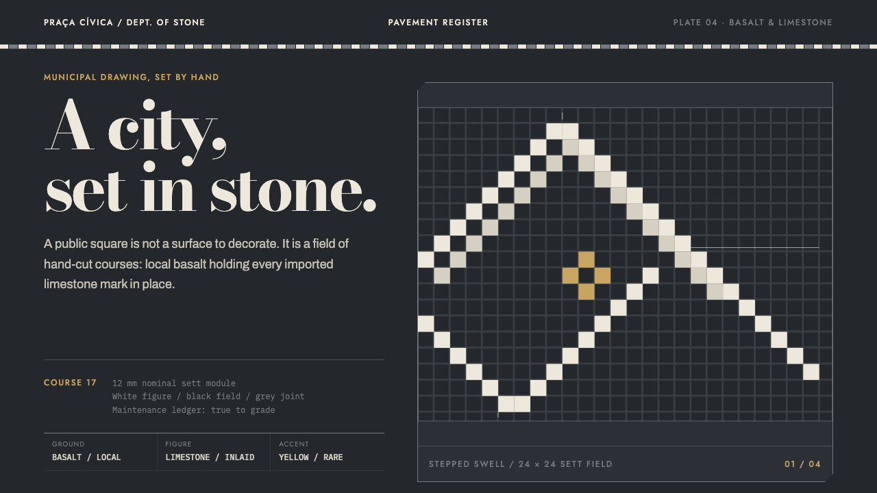 Calçada PortuguesaA city drawn in stone. Stepped limestone courses cut across a basalt grid.
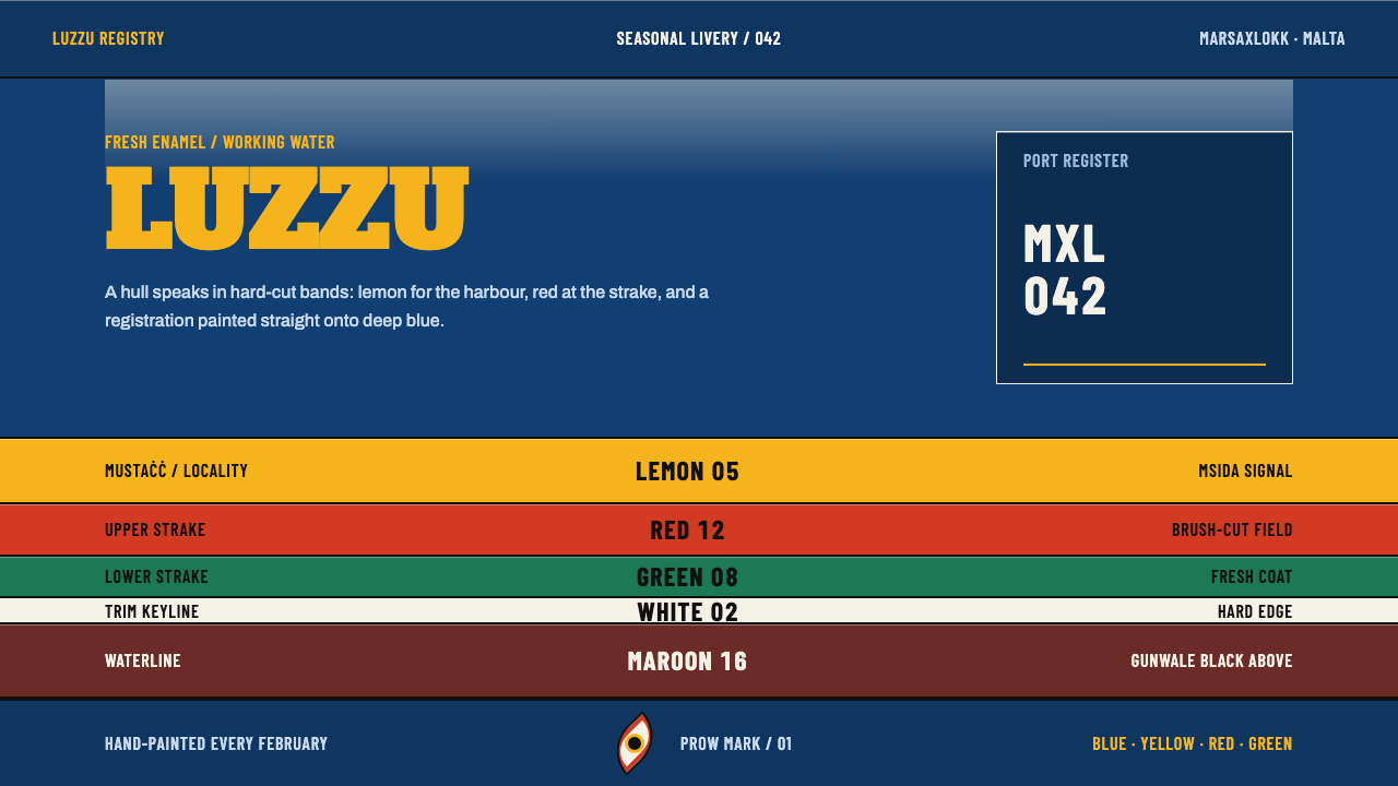 Maltese LuzzuColour is an address. Hard-cut enamel bands and condensed numerals command a…
 Monaco Grand Prix (1929)Speed becomes glamour. Riviera azure, racing red, and giant Deco numerals cut…
 Plečnik's LjubljanaA city made monumental by hand. Fired-clay courses and carved Roman capitals…