What is Fragrance Scent Pyramid?
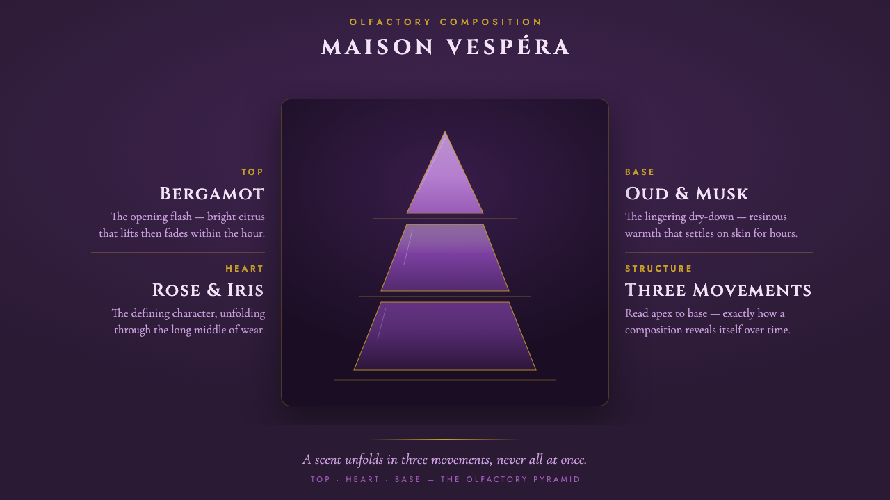
A fragrance scent pyramid turns perfume into a slow reveal — violet glass, gold rules, and engraved capitals making invisible notes feel architectural.
Fragrance Scent Pyramid in brief
The fragrance scent pyramid is the classic top–heart–base diagram used by luxury perfume houses to explain how a scent unfolds over time. Its triangular structure presents the fragrance as a sequence of olfactory movements: an opening impression, a developing center, and a lasting foundation. Rather than depicting a bottle or a literal landscape, the diagram gives form to duration itself.
In this visual system, the pyramid is built from violet-glass tiers that move from deep plum toward pale lilac. Fine gold hairlines divide the layers and make the hierarchy immediately legible, while note families are labelled in engraved serif capitals. The result is luxurious without becoming obscure: ornament is concentrated in material suggestion, letterform, and light.
Everything sits on a deep aubergine card, deliberately never on cream. The dark field gives the violet tiers room to glow, lets the gold dividers act as quiet structural signals, and turns small ingredient line-art into a refined index of the fragrance. The overall mood is polished, nocturnal, and explanatory rather than merely decorative.
Where does Fragrance Scent Pyramid come from?
The system belongs to the dominant era of online fragrance marketing and review culture, from 2010 to now, and operates globally across luxury perfume houses, brand boutiques, and fragrance communities on the internet. Its visual language grows from a practical communication need: perfume is experienced gradually, but a shopper often needs to understand its progression before trying it.
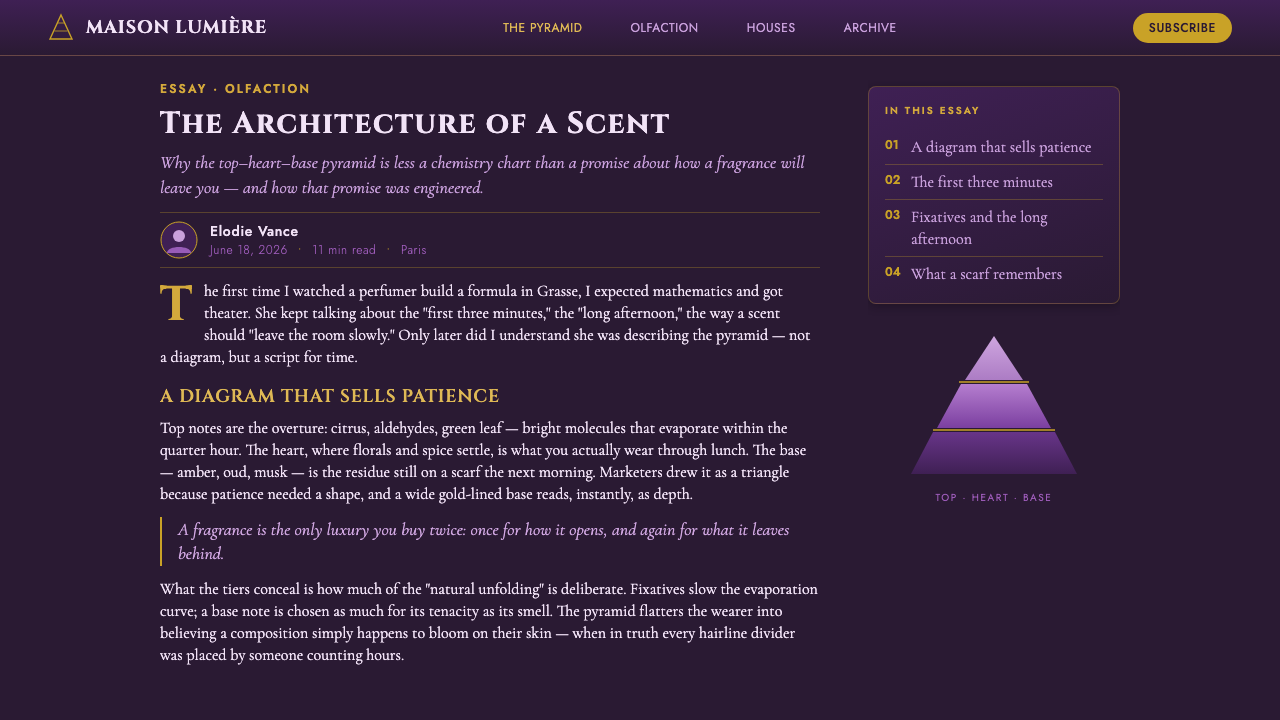
The olfactory-pyramid infographic convention solves that problem through a familiar vertical metaphor. Notes are arranged as tiers, allowing the viewer to read the fragrance as an ascent or descent through time. The triangle is therefore both diagram and promise: it suggests transformation, proportion, and a movement from immediate brightness toward depth and persistence.
Online fragrance culture made this convention especially visible. Brand pages and review platforms need to communicate many ingredients and note families without turning the explanation into a technical catalogue. The pyramid condenses that information into a compact visual object, while the dark aubergine field and violet-glass treatment elevate the diagram into the visual language of luxury fragrance marketing.
The ecosystem includes perfume houses and noses, the review culture represented by Fragrantica, and named reference points such as Creed and Eisenberg. Together they indicate the range of contexts in which the system appears: authored fragrance creation, commercial presentation, and public interpretation. The design language keeps these contexts connected through the same promise of legible mystery — a scent can remain atmospheric while its structure is made visible.
What defines the Fragrance Scent Pyramid look?
Violet Glass
The central material cue is glossy violet glass, moving from deep plum into lilac as the pyramid rises or recedes through its tiers. The surface should feel translucent and polished rather than metallic or plastic. Its luxury comes from controlled light and tonal depth, not from simulated texture or visual noise.
Dark Aubergine Ground
A deep aubergine card establishes the atmosphere and protects the pyramid from becoming a generic pastel diagram. The dark ground is not an afterthought; it is the stage that allows violet surfaces to glow and gold rules to remain crisp. Cream is intentionally excluded because it would shift the mood toward softness and familiarity.
Gold Hairlines
Gold hairlines divide the pyramid into readable movements without interrupting its elegance. They should behave as precise structural marks, not ornamental borders. Their restraint matters: a line that becomes too loud competes with the scent labels, while a line that disappears loses the sense of sequence.
Engraved Serif Capitals
Display typography uses serif capitals with an engraved, editorial character. The letterforms suggest perfume labels, archival packaging, and the authority of a carefully composed catalogue. Contrast should come from scale, spacing, and placement, keeping the words legible against the luminous tiers rather than burying them in theatrical styling.
Ingredient Line-Art
Fine ingredient line-art acts as an index of the scent pyramid. These drawings should remain delicate and schematic, offering recognition without turning the composition into botanical illustration. Their purpose is to connect abstract note families with a visual hint of material while preserving the system's refined distance.
Layered Time
The pyramid is not merely a stack of decorative panels. Its tiers encode the temporal behavior of perfume: the first impression, the evolving heart, and the enduring base. Every visual decision should reinforce that progression, from the direction of the tonal movement to the order of labels and the measured separation between layers.
Who shaped Fragrance Scent Pyramid?
Perfume houses and noses are the authored voices behind the system. The house gives the fragrance a public identity, while the nose represents the expertise and interpretation that shape its olfactory composition. In the visual language, their authority is expressed through disciplined hierarchy, engraved typography, and a diagram that feels considered rather than improvised.
Fragrantica represents the online review and discovery culture in which scent pyramids become shared reference tools. The pyramid lets readers compare note families and understand a fragrance through a common visual convention. Its role is not to replace smelling, but to give conversation about an invisible experience a stable structure.
Creed appears in the approved reference set as a named luxury fragrance context for this language. Within the system, the name carries the expectation of a composed, premium presentation: the pyramid should feel like an object of discernment, with every tier and label contributing to an atmosphere of intentional refinement.
Eisenberg is another named reference point within the luxury fragrance landscape supplied for this system. It helps locate the design between product explanation and brand theatre. The visual language should therefore remain informative enough to clarify the scent structure, while retaining the dark, polished, almost ceremonial mood associated with a premium fragrance presentation.
How do you use Fragrance Scent Pyramid today?
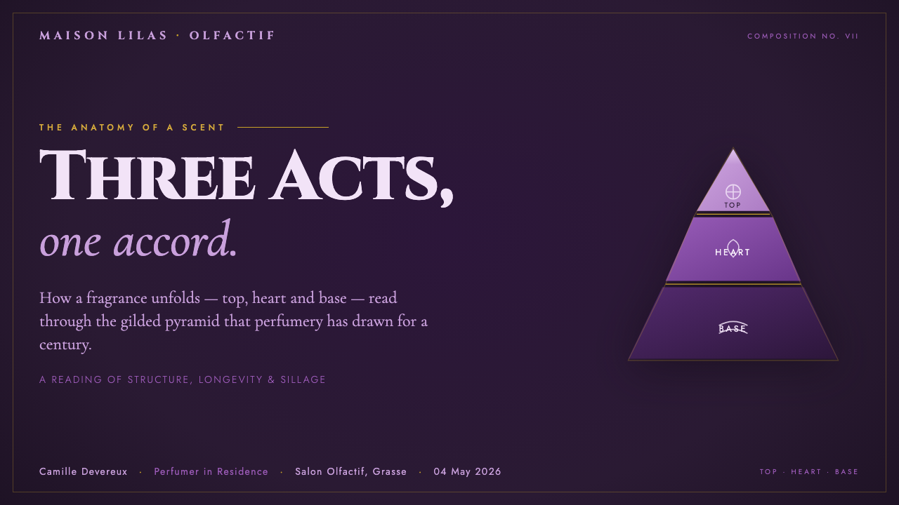
For presentation slides, use the scent pyramid as both a cover motif and a content structure. A cover can place the luminous triangular form against the aubergine field, with the title treated as an engraved label rather than a loud slogan. Content slides should preserve the same hierarchy: introduce the opening notes first, then the heart, then the base, using gold rules to guide the eye. Data slides can turn note families into measured visual tiers, keeping the diagram legible and atmospheric.
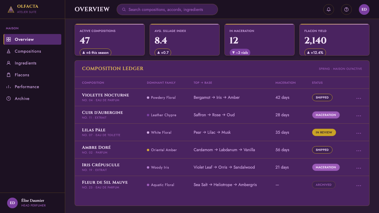
For web interfaces, the system suits fragrance dashboards, discovery tools, and pricing pages for premium products. Keep the dark card as the main container, use violet tonal movement to distinguish tiers or product states, and reserve gold for active selection, dividers, and essential calls to action. Labels should remain typographic and calm. Cards, filters, and comparison panels should feel like parts of a display case rather than generic software controls.
For editorial and marketing work, the language supports product stories, launch pages, review features, and campaign landing pages. A narrow reading column can sit beside ingredient line-art or a compact pyramid, allowing the written description and the visual diagram to explain one another. Marketing sections can alternate between deep aubergine fields and luminous violet surfaces, but the transition should remain controlled so that the fragrance, not the effect, remains the subject.
The system also works well for content that needs a sense of sequence: a campaign can move from the first impression to the emotional center and finally to the lasting trace. Use the gold lines as recurring editorial punctuation, and let engraved capitals identify sections without filling every surface with display type. The strongest applications make the reader feel that the page is unfolding like the scent itself.
The common mistake is treating luxury as a pile of effects. Excessive glow, too many gold borders, busy ingredient drawings, or several competing serif treatments can make the pyramid feel theatrical but unreadable. Another mistake is placing the system on a light cream ground, which removes the nocturnal contrast that gives the violet glass its depth. Keep the hierarchy spare, let one material cue lead, and allow empty dark space to carry part of the mood.
Fragrance Scent Pyramid — FAQ
What does the scent pyramid actually communicate?
It communicates the temporal structure of a fragrance. The tiers distinguish the opening impression, the developing heart, and the lasting base, turning an invisible and gradual experience into a readable diagram. It is not a literal map of ingredients or a guarantee that every wearer will perceive the notes in exactly the same way. Its value is explanatory: it gives fragrance houses, reviewers, and shoppers a shared way to discuss progression.
Why must the system use a dark aubergine ground?
The dark aubergine ground creates the contrast that makes the violet-glass tiers appear luminous and dimensional. It also gives the gold hairlines and fine ingredient drawings enough visual authority to remain visible without becoming loud. A cream ground would change the emotional register, making the system softer and more familiar. The dark field is therefore structural to the mood, not simply a background preference.
Can the pyramid be used without glass effects?
It can, but removing the glass cue changes the identity of the system. The violet surface is meant to suggest polish, translucency, and layered depth, not merely a purple fill. If a flatter treatment is necessary, retain the essential relationships: dark aubergine surroundings, a controlled movement from plum to lilac, gold separation, and clear engraved serif labels. The material can become quieter, but the hierarchy should remain.
What role do the gold dividers play?
They are both navigational and atmospheric. As structural marks, they separate the scent movements and help the viewer read the pyramid in order. As a material cue, their restrained gold suggests premium packaging and careful craft. They should never become a decorative grid laid over the whole composition. Their effectiveness depends on remaining quiet enough to support the labels and the violet tiers.
Where does this style work best, and where can it struggle?
It works best for premium fragrance marketing, product education, review culture, discovery tools, campaign pages, and presentations that need to make sequence feel luxurious. It can struggle when applied to cheerful, casual, or highly utilitarian contexts whose values do not align with nocturnal refinement and ceremonial hierarchy. It also fails when the designer keeps the effects but loses the diagram: without clear tiers and labels, the result becomes purple decoration rather than a scent pyramid.
Related design styles
 Wicked Elphaba EmeraldGreen made monumental. Jewel emerald spotlit on a black-box void, in engraved…
 Chartreuse Liqueur GreenAcid glow rules the cellar. Cormorant Garamond and brass hairlines frame yell…
 Mauveine (Perkin 1856)Electric purple, framed as luxury. Gilt rules and Playfair serifs turn dye in…
 Argentine Tango Poster (1940)Nocturnal drama in ink. Oxblood ground, antique gold rules, Bodoni capitals.
 Babylonian Hammurabi SteleAuthority carved in stone. Basalt-black grids, parchment panels, and imperial…
 Benin Bronze (Edo, 1500)Royal memory, cast in bronze. Cream plaques and gilded lines carry museum gra…