What is Santos de Palo?
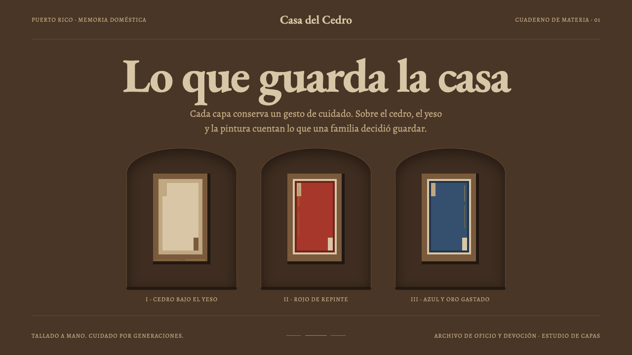
Santos de palo are Puerto Rican saints carved from cedar and repainted in devotion until their surfaces became geological: gesso, white, red, worn gold and bare wood.
Santos de Palo in brief
Santos de palo, literally 'saints of wood', are small devotional figures carved in rural Puerto Rico from Spanish cedar. They stand between six and eighteen inches tall and were cut by farmers who carved on the side, often from branches, roots and offcuts. They lived on household altars rather than in churches, and families looked after them as part of everyday religious life.
What makes them distinctive for design is their surfaces. Because families repainted them as an act of devotion, each figure carries a record of care: gesso beneath lead white, lead white beneath zinc white, gilt worn off the high points, black fill chipped back to bare wood. Conservators who worked on the Vidal collection at the Smithsonian saw exactly this in cross-section. The figure is a stratigraphy of devotion.
Curio's Santos de Palo system takes that stratigraphy literally. Surfaces recess instead of lifting, so cards read as niches. Colour arrives as a repainted layer rather than a flat fill. Gold appears only as a thin worn line. Objects sit one to a niche, centred and frontal, and are grouped in threes after the Three Kings.

Where does Santos de Palo come from?
The tradition belongs to rural Puerto Rico, in both the mountain interior and the coastal towns. It runs from the seventeenth century through the nineteenth, with the workshop tradition continuing through the twentieth. It grew out of Spanish colonial popular imagery: the saints and holy figures that arrived with the colonial church, reinterpreted in local wood by local hands.
The makers were santeros, carvers of saints, many of whom were farmers first. Their wood was Spanish cedar and their carving time was borrowed from farm work. Because the figures were meant for the home rather than the church, they did not need to meet the standards of a cathedral workshop. They needed to be present, portable and loved. The result is a style of directness: simplified bodies, frontal poses, and surfaces that tell the story of use.
The tradition is also a story of workshop lineages, in which carving habits were passed along families and neighbourhoods. Among the names that appear in the record are Teodoro Vidal, whose collection of santos the Smithsonian later conserved, and the santeros Zoilo Cajigas Sotomayor and Florencio Cabán. The Vidal collection is why the layered surfaces of these figures are so well understood today.
The grouping of figures in threes follows the Three Kings, who hold a special place in Puerto Rican devotion, and sets of Kings are part of the santos tradition. The design system borrows this as its rule for arrangement: a household altar with three figures echoes the story, and a layout with three items in a row inherits its sense of ceremony. Caribbean folk devotional carving, in other words, supplies the structure as well as the surface.
What defines the Santos de Palo look?
A Cedar-Dark Ground
The base tone is the dark of old Spanish cedar combined with aged gesso: a warm brown-black rather than a cold neutral black. It reads as wood that has lived in a room for generations, and it gives the colours that sit on it, the repainted red and the cloak blue, a depth that a pure black or white page would not.
A Stratigraphic Surface
Gesso lies under lead white, lead white under zinc white, with gilt worn off the high points and black fill chipped back to bare wood. The surface is a section through time, and each layer is visible where the one above it has failed. In design, this means surfaces that show their history through wear, chips and layered tones rather than a single clean coat.
Recessed Niches
Cards are not slabs that float above the page; they are niches cut into it, with a shelf edge left at the lower rim. Objects sit inside, not on top. The logic reverses the usual idea of elevation, so depth comes from recess and shadow within the surface rather than from lift.
Repainted Colour
Red is the repainted robe and blue is the Virgin's cloak, each laid on as an opaque, slightly chalky layer over what came before. Colour here is an event of repainting, not a flat fill chosen by a designer. It is saturated enough to be devotional but never glossy, and it carries the faint unevenness of a hand-applied coat.
The Worn Gold Line
Gilt survives only as a thin, broken line where it has not been rubbed away. It is never a field or a fill. Gold is therefore the rarest element in the system, used for a hairline edge or a focus trace, and its power comes from the fact that most of it is gone.
Frontal, Centred, in Threes
Each figure stands alone in its niche, facing forward and centred, and figures are grouped in threes after the Three Kings. The composition is formal and devotional: no diagonal action, no crowding. A layout built this way feels like a household altar, where each object is given its own space and attention.
Hand-Carved Simplicity
The figures were cut by farmers working in spare hours from branches, roots and offcuts, so forms are simplified and slightly irregular: a body reduced to a few readable masses, a face reduced to essentials, proportions set by the piece of wood rather than by a canon. The simplicity is honest rather than naive. In design it translates to plain geometric components with slightly irregular edges and no ornamental flourish, where the shape of a thing is allowed to be what the material permitted.

Who shaped Santos de Palo?
The name attached to the Vidal collection of Puerto Rican santos, which the Smithsonian later conserved. Conservation work on that collection revealed the layered surfaces on which this design system is built: gesso, lead white, zinc white, worn gilt and exposed wood. His collection is why these figures are so well documented today.
A santero named among the key figures of the Puerto Rican tradition. Santeros like him carried the workshop lineages through which carving habits, formal conventions and ways of painting passed along families and neighbourhoods.
Another santero named in the tradition's record. Together with Cajigas Sotomayor, Cabán stands for the individual carvers whose names have survived from within a largely anonymous folk practice, and for the santero workshop lineages that kept it alive into the twentieth century.
Not a person but the force that shaped the style. Families repainted their santos as an act of devotion, and in doing so produced the layered surfaces that give the style its character. The tradition is the sum of generations of care, applied by people who owned the objects rather than by professionals paid to restore them.
How do you use Santos de Palo today?
Santos de Palo is a dark, warm, recessed system built on the idea that surfaces carry history. It rewards layouts that place a few important things in formal, centred spaces and let wear, depth and layered colour do the decorative work. It is at its best when the content comes as discrete, individually valued items, because the system gives each one its own niche and its own moment of attention.
For presentation slides, a cover can be a single niche: a dark cedar-toned ground, one centred title set in a recess with a shelf edge below, and a thin worn gold line as the only ornament. Content slides keep the dark ground and use recessed panels, grouping points in threes. Data slides suit three-series charts, with a repainted red for the key series and the gold hairline reserved for a single marker or baseline.
In interfaces, the style suits dashboards and portfolios where panels can recess into the page, with inset borders and a lower shelf edge rather than drop shadows. A pricing page maps naturally onto three niches, one for each tier, with the recommended tier centred. Gold appears only as a thin line, for a focus ring or an active-state edge, and buttons use the repainted red as a matte fill.
In editorial and marketing work, the style suits folk art, cultural heritage, museum shops, Caribbean food and music, and craft and devotional objects. Present one image per niche, set captions on the shelf edge beneath, and let the dark ground carry photography of carved or painted objects. Use the Three Kings as an organising device where content comes naturally in threes.
The most common mistake is spending the gold. Once gold becomes a large fill or a shiny gradient, the worn-away logic of the system is gone and the result looks like generic luxury. A second is raising cards off the page with drop shadows, which contradicts the recessed niche. A third is making surfaces too clean: without wear, chips and layered tone, the stratigraphy disappears. Finally, because these are devotional objects, handle religious subject matter with respect rather than as a costume.

Santos de Palo — FAQ
What does santos de palo mean?
Santos de palo literally means 'saints of wood'. They are small devotional figures, six to eighteen inches tall, carved in rural Puerto Rico from Spanish cedar by farmers who carved on the side. They were made for household altars rather than churches, and they come out of Spanish colonial popular imagery and Caribbean folk devotional carving.
Why do the surfaces look layered or damaged?
Because families repainted their santos as an act of devotion, generation after generation. Gesso lies under lead white, which lies under zinc white, while gilt has worn off the high points and black fill has chipped back to bare wood. Conservators of the Vidal collection saw exactly this. The layers are the history of care, not a defect.
Why are things grouped in threes?
The grouping follows the Three Kings, who hold a special place in Puerto Rican devotion, and sets of Kings are part of the santos tradition. The design system uses it as an arrangement rule: objects sit one to a niche, centred and frontal, and are presented in sets of three. It gives layouts a formal, ceremonial rhythm.
How should gold be used?
Sparingly, and only as a thin worn line. On the carved figures the gilt survives only where it was not rubbed away, so gold in this system is a hairline edge or a focus trace, never a fill, a gradient or a shiny background. Its effect depends on how little of it there is.
Can the style work in light mode?
It can be adapted, but the system is conceived as cedar-dark, with recesses reading as shadowed niches. A light variant should keep the aged gesso as a warm cream ground, preserve the recessed panels and the shelf edge, and still treat gold as a thin line. Switching to a bright white page would remove the sense of old wood and layered history.
Related design styles
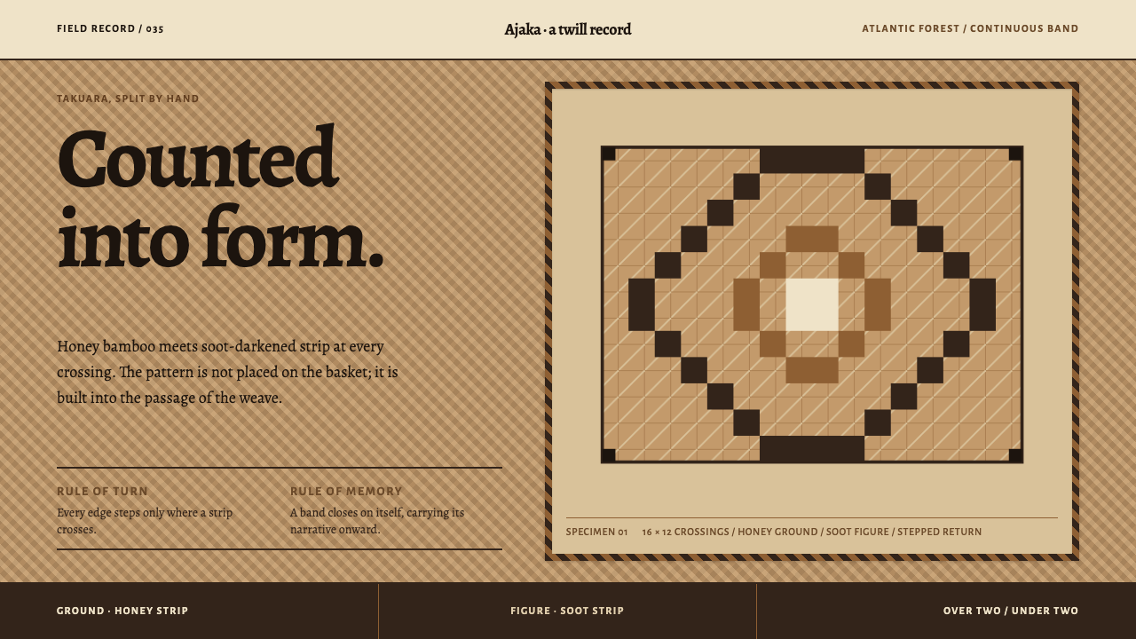 Guaraní Takuara BasketPattern is a record, not garnish. Honey bamboo and soot strips lock into a co…
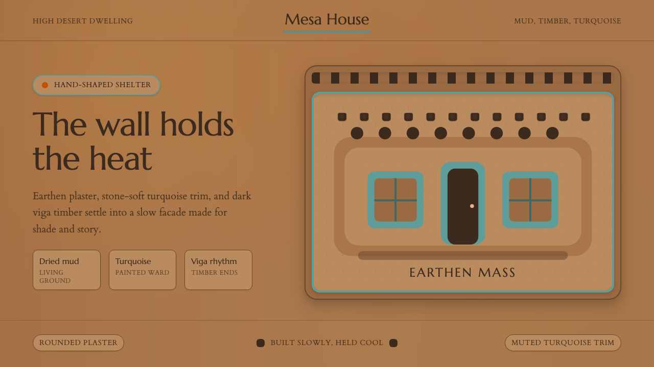 Adobe Pueblo SouthwestFeels made by hand. Earthen tan, turquoise trim, and viga rhythm shape the fr…
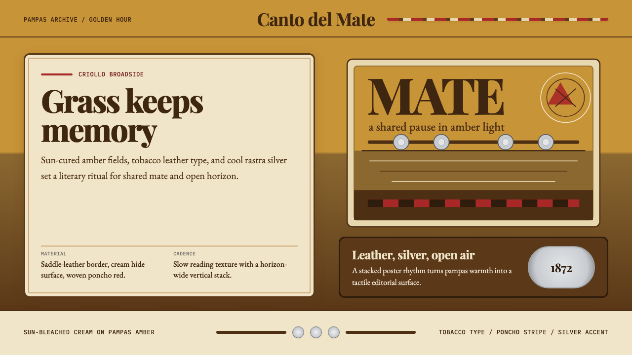 Argentine Gaucho (Pampas Mate Culture)Open grassland, printed warm. Amber fields, Playfair serif, and silver rastra…
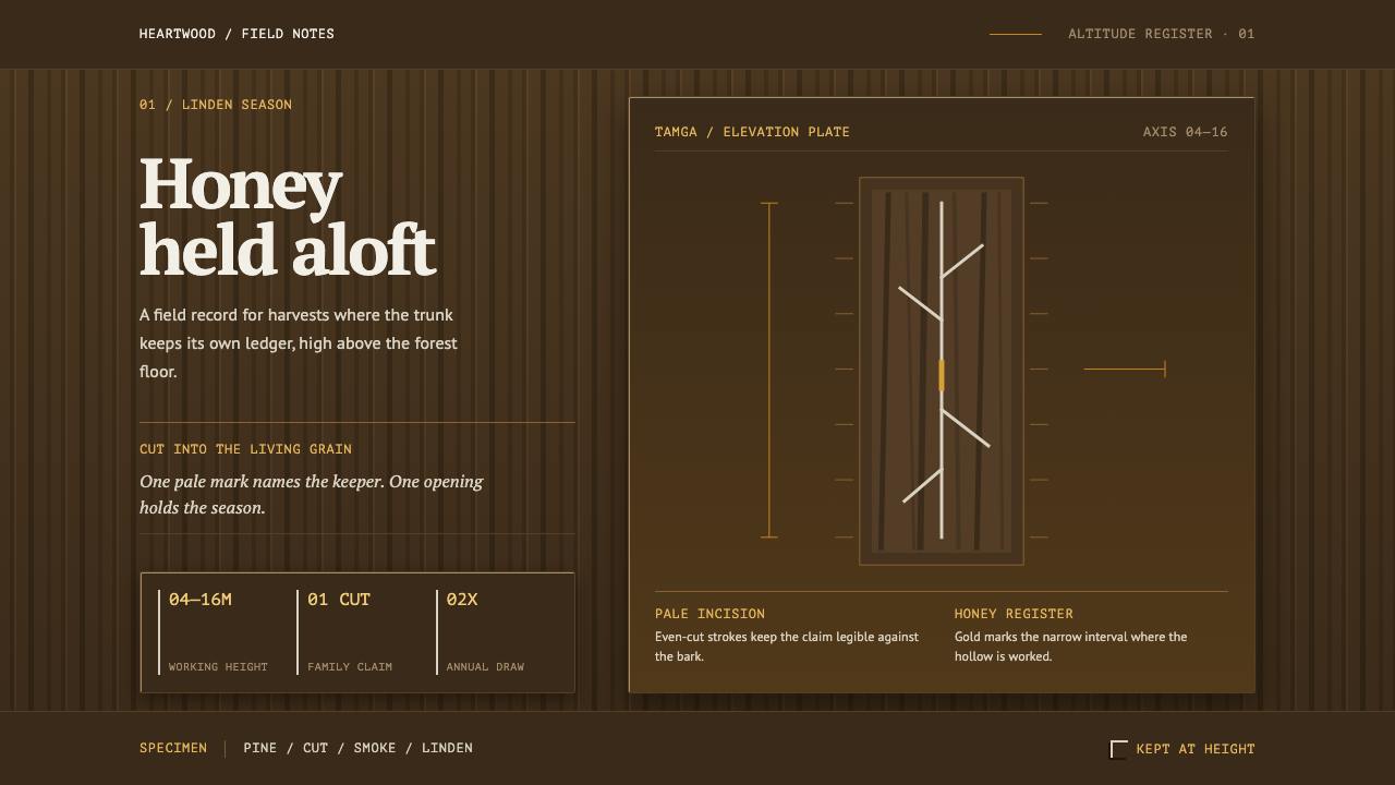 Bashkir Wild HoneyA working forest held on one axis. Pale tamga cuts and honey gold rise throug…
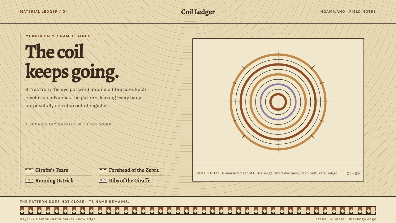 Botswana Coiled BasketThe pattern keeps travelling. Bark-brown stepped bands wind across a straw co…
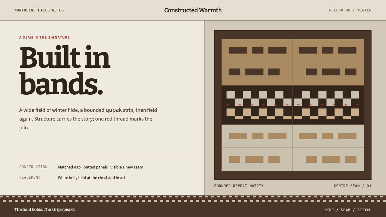 Iñupiat ParkaStructure carries the signature. Caribou-hide bands frame a bounded qupak rep…