What is Registan Tilework?
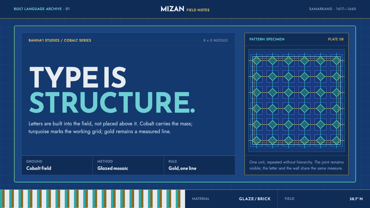
The Registan turns three madrasas raised two centuries apart into a single wall of pattern, where lettering, tile, and brick share one plane and nothing is mere background.
Registan Tilework in brief
Registan Tilework names the visual system carried by the three madrasas that ring the Registan square in Samarkand, Uzbekistan: the Ulugh Beg Madrasa, the Sher-Dor Madrasa, and the Tilla-Kari Madrasa, built across roughly two and a half centuries under Timurid patronage and its successors. Although the three buildings were separate commissions from different eras, the ensemble reads as one continuous field of ornament — a cobalt-ground tile mosaic running over a body of fired ochre brick, with lettering built directly into the wall rather than painted onto it afterward. The style treats an entire facade, not an isolated panel, as its basic unit of design.
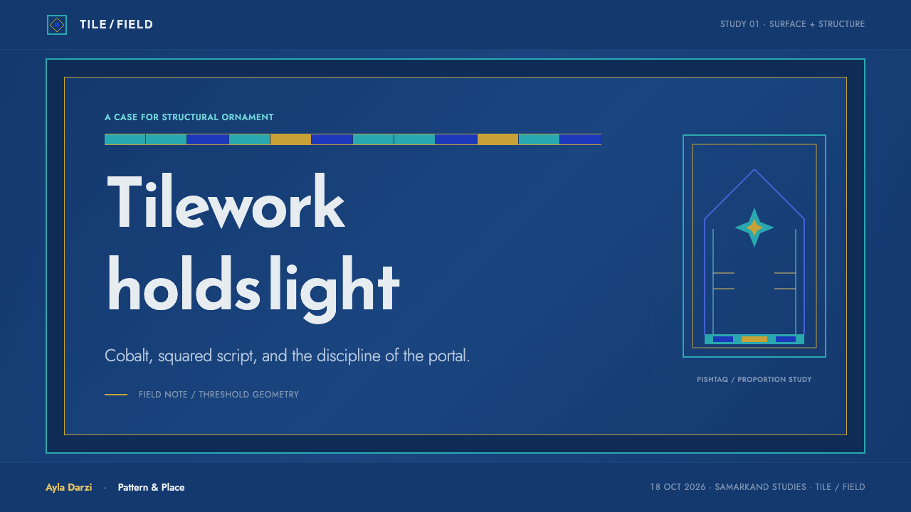
Each madrasa announces itself with a pishtaq — a rectangular portal so tall and so wide that it visually eclipses the building mass standing behind it. The pishtaq is not an entrance dressed up for effect; it is the building's primary communicative surface, a vertical rectangle nested inside a slightly larger rectangle, itself framed by a running band of script. Above a modest base course, almost nothing is left as bare masonry. The rectangle, repeated at shifting scale — portal, panel, cartouche, single tile — is the system's basic compositional unit, and every other decision in the design answers to it.
The lettering that crosses these walls is banna'i, a squared form of Kufic script built out of the coursing of brick or glazed tile itself, rather than inscribed onto a finished surface after the fact. Because the letterforms share the same rectangular module as the wall's structural fabric, type and structure become one operation, with no visible seam between 'building' and 'inscription'. Around and beneath the script, girih strapwork — interlocking line-work generated from stars and polygons — fills the remaining ground, so the pattern reads as load-bearing geometry rather than applied decoration.
Where does Registan Tilework come from?
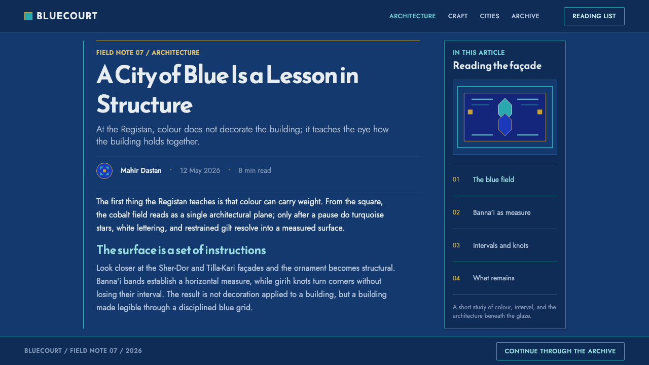
The earliest of the three buildings, the Ulugh Beg Madrasa, was commissioned by Ulugh Beg and built between 1417 and 1420, in Samarkand, the city Timurid rule had made its imperial seat. Its facade established the vocabulary the later square would extend rather than replace: a pishtaq faced entirely in glazed kāshī tile, organized around bands of banna'i script and girih geometry set against a saturated cobalt ground. As a work of Timurid architecture, it belongs to a building culture that treated tilework not as applied finish but as the primary structural skin of a monumental facade.
Almost two centuries passed before the square was completed. In the early seventeenth century, the local governor Yalangtush Bahadur commissioned the Sher-Dor Madrasa and, later, the Tilla-Kari Madrasa, built between 1619 and 1660 and set facing and beside the older Ulugh Beg building so that the square would read as a single composed ensemble rather than three unrelated structures. The architect Abdul-Jabbar is named among the builders responsible for realizing this later work, carrying the original fifteenth-century vocabulary of cobalt ground, turquoise field, and thin gold accent forward into the new century's construction.
The craft underlying all three facades is kāshī glazed-tile revetment: individual tiles or tile mosaic fragments, fired and glazed in a narrow register of blues, whites, and turquoise, then set into cobalt-ground fields over a fired ochre brick body. Because the glaze is a thin surface fired onto a ceramic body rather than a painted layer, color in this tradition sits flat and matte-bright rather than glossy or gradated, and gold — when it appears — is applied as an actual thin leaf rather than suggested through shading.
Girih strapwork, the geometric line-work built from interlocking stars and polygons, and banna'i, the brick-based squared Kufic lettering, are the two structural systems that generate everything else on these walls. Both depend on a repeating rectangular or polygonal module that can be laid out in advance and then executed in tile or brick by trained craftsmen — a method that let complex, mathematically precise ornament be reproduced consistently across a very large wall surface, and across two and a half centuries of intermittent construction, without the pattern language drifting.
What defines the Registan Tilework look?
Ground Color
The dominant field is a saturated cobalt blue, deep enough to read as structural rather than merely tinted. It functions the way a page background functions in print — everything else is composed against it, and it is used at full strength rather than diluted into a pale tone.
Working Color
Turquoise carries the actual pattern work — the lines of banna'i lettering and girih strapwork read out against the cobalt ground in this lighter, cooler blue-green. It is the color doing the drawing, while cobalt does the holding.
Gold, Used Thin
Where gold appears, it is applied the way real leaf is applied: as a thin, flat, non-reflective accent rather than a glowing highlight or a gradient meant to simulate shine. It marks a detail as important without turning the page into metalwork.
Rectangular Framing
Every unit of the composition — portal, panel, cartouche, tile — is a rectangle nested inside another rectangle. Hierarchy is built by scale and nesting rather than by circles, ovals, or freeform shapes breaking the frame.
Ochre Brick Ground
Beneath the glazed field, the fired ochre brick body is allowed to show at base courses and structural edges. It is the material the cobalt tile is applied over, and it is treated as an honest ground rather than something to be hidden.
Script as Structure
Banna'i lettering is squared to the same module as the surrounding brickwork, so headline text reads as an architectural band rather than a caption laid over an image. Letterforms are rectilinear, never cursive or freehand.
Geometric Fill
Any ground not occupied by lettering or a major panel is filled with girih strapwork — interlocking star-and-polygon line-work — rather than left empty or filled with a decorative flourish unrelated to the underlying geometric grid.

Who shaped Registan Tilework?
Ulugh Beg commissioned the earliest of the square's three buildings, the madrasa that bears his name, built between 1417 and 1420 in Samarkand, the city that served as the Timurid capital. His building set the vocabulary — cobalt-ground tile, banna'i script, girih geometry — that the square's later, seventeenth-century additions would extend rather than depart from, making his madrasa the founding statement of the entire ensemble.
Yalangtush Bahadur, the local governor of Samarkand in the early seventeenth century, commissioned the Sher-Dor and Tilla-Kari Madrasas, built between 1619 and 1660, roughly two centuries after the Ulugh Beg Madrasa. By positioning the new buildings facing and beside the older structure, he turned three separately commissioned madrasas into a single composed square, extending a fifteenth-century visual language into a new era of construction.
Abdul-Jabbar is named among the architects responsible for realizing the square's later, seventeenth-century construction phase. His work carried the founding vocabulary of cobalt ground, turquoise pattern, and thin gold accent established by the earlier Ulugh Beg Madrasa forward into new buildings, ensuring the square would read as one continuous system rather than two eras in visible competition.
How do you use Registan Tilework today?
Registan Tilework transfers well wherever a design needs to feel monumental, precise, and built rather than merely decorated — but applying it correctly means treating cobalt as structure and turquoise as the working line, not scattering both at equal weight across a layout.
For presentation slides, a cover page benefits from a deep cobalt field with a single rectangular frame nested near center, title type treated as a banna'i-style band rather than free-floating text, and a thin gold rule reserved for one moment of emphasis. Content slides should hold to strict rectangular containers for every block of information — charts, quotes, data callouts — with turquoise reserved for the lines and labels doing active work, and cobalt held as the resting field beneath everything.
For web interfaces, the system suits dashboards and product pages that want to feel authoritative and exact: a cobalt header or sidebar, turquoise for active states and data lines, and rectangular card framing throughout rather than rounded or freeform containers. Gold should be reserved for a single premium indicator or highlight state, used sparingly enough that its rarity carries meaning, exactly as thin leaf did on the original facades.
For editorial and marketing layouts, the style supports a strong masthead treatment: a wide cobalt band carrying a squared, geometric wordmark, with turquoise rules dividing sections and ochre or warm neutral tones reserved for body text areas that need to read as grounded rather than decorative. Pull quotes work well set inside a rectangular frame echoing the pishtaq's nested-rectangle logic.
A common mistake is treating this as a generic 'Islamic geometric' palette and reaching for saturated gold as a dominant color. In the source material, gold is a rationed accent, not a field color — a design that fills large areas with metallic gold or gradient shine misreads the discipline entirely. The palette's authority comes from cobalt and turquoise doing almost all of the work, with gold appearing rarely enough to still register as precious.
Registan Tilework — FAQ
Is Registan Tilework the same as generic 'Islamic geometric pattern' design?
No. Generic geometric-pattern design usually treats the pattern as an all-over texture applied uniformly across a surface. Registan Tilework is specific: it is organized around the rectangular pishtaq portal as its primary unit, uses a disciplined three-part color hierarchy of cobalt ground, turquoise working line, and rationed gold, and integrates lettering directly into the geometric structure through banna'i script rather than treating type and pattern as separate layers.
Why does the system insist on rectangular frames instead of arches or circles?
Because the pishtaq itself — the portal every one of the three madrasas is organized around — is a rectangle nested inside a rectangle, and the tile mosaic, banna'i lettering, and girih strapwork covering it are all generated from the same rectilinear module. Introducing circular or freeform shapes at the same visual weight would compete with this logic rather than extend it, which is why the style holds hierarchy through scale and nesting instead.
How should gold be rationed in a design using this style?
Treat gold the way actual gold leaf behaves: thin, flat, and applied to a small number of specific details rather than spread across a field. A single rule, a single cartouche border, or a single accent line is enough. If gold starts functioning as a background color or a gradient highlight, it has stopped following the source material's logic, where its rarity is exactly what gives it weight.
Does this style require actual Arabic or Kufic script to work?
The visual logic — type built from the same rectilinear module as the surrounding structure, so lettering and geometry read as one operation — can be applied to any script or wordmark, including Latin type set in a heavy, squared, geometric sans. What matters is the discipline of treating a headline as an architectural band rather than free-floating text laid over a pattern, not the specific alphabet used.
What kind of products or pages does this style struggle with?
It struggles wherever a design needs to feel casual, playful, or fast-moving — consumer social apps, children's content, or anything built around quick, disposable interaction. The style's authority depends on precision, nested framing, and a rationed palette that reads as deliberate and monumental; forcing it into a lightweight, high-frequency interface flattens the very qualities that make it distinctive.
Related design styles
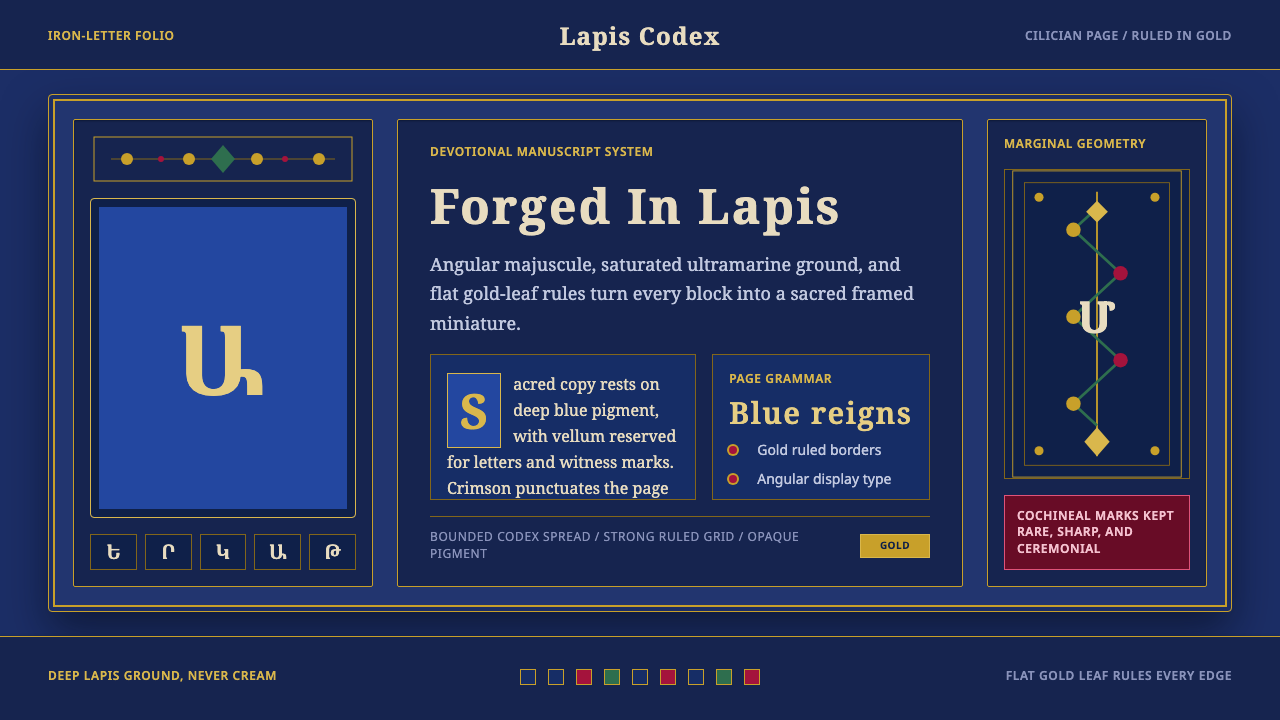 Armenian ErkatʿagirDevotional lapis reigns. Gold rules and angular serif glyphs frame a sacred g…
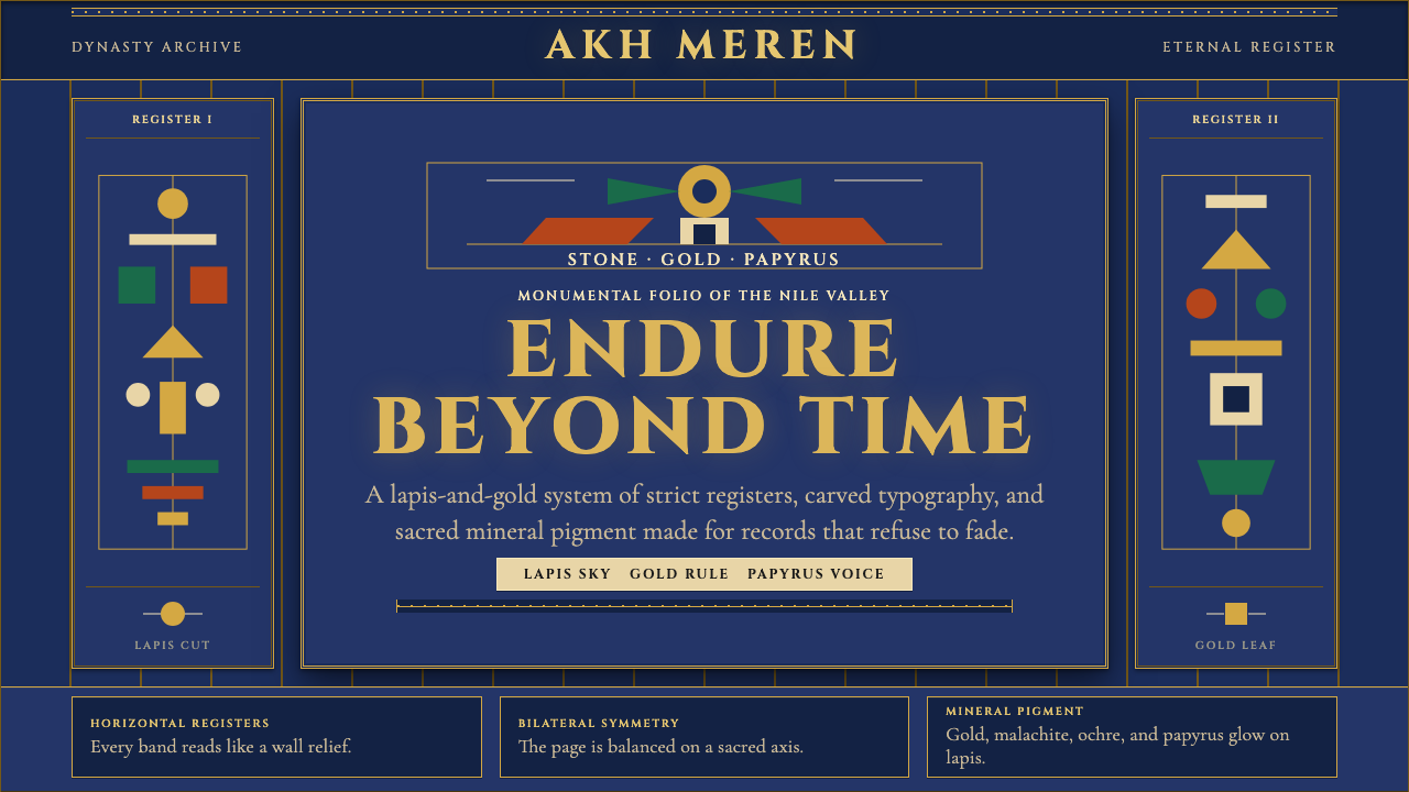 Egyptian PharaonicRegal permanence. Gold rules and Cinzel capitals carve papyrus registers into…
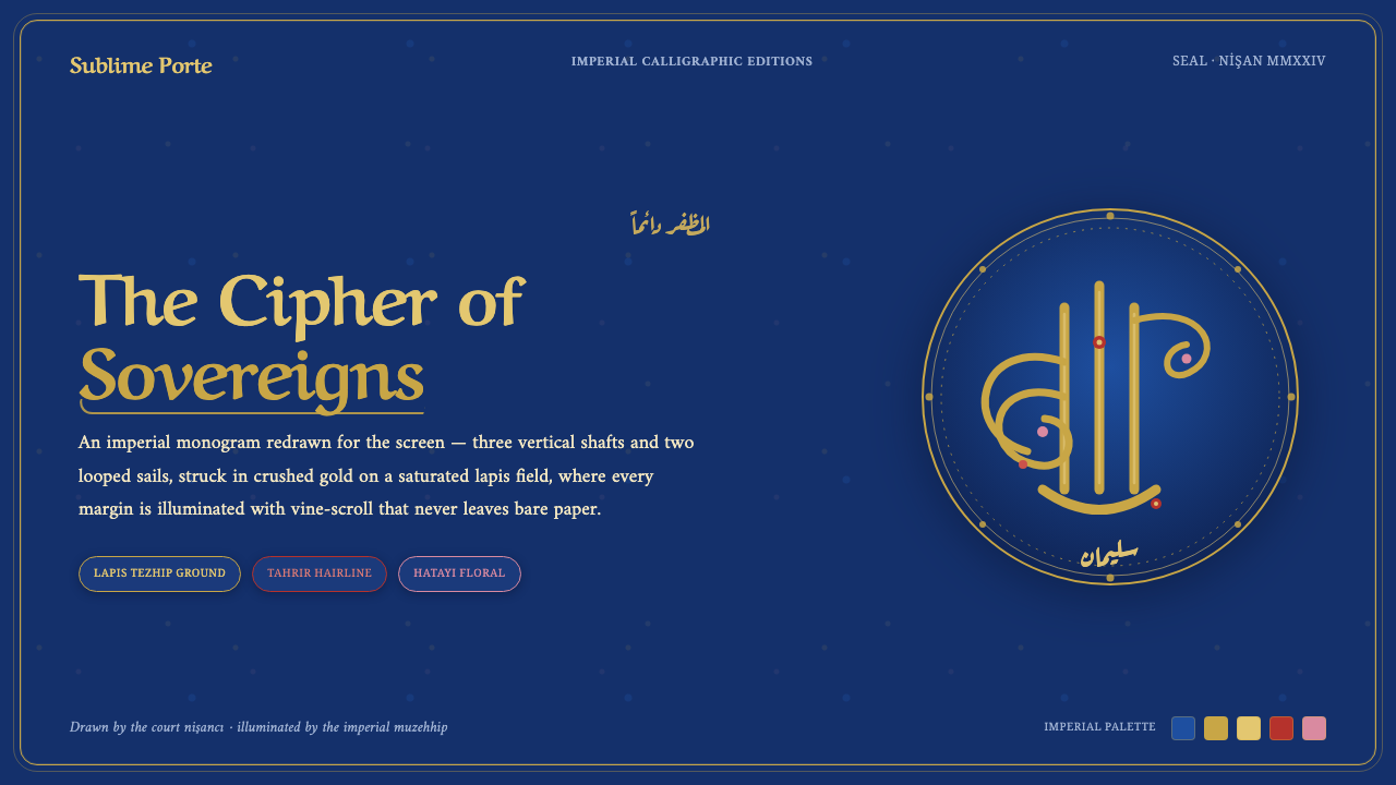 Ottoman Tughra SealEvery surface is a state seal. Gold tughra cipher on lapis, Aref Ruqaa script…
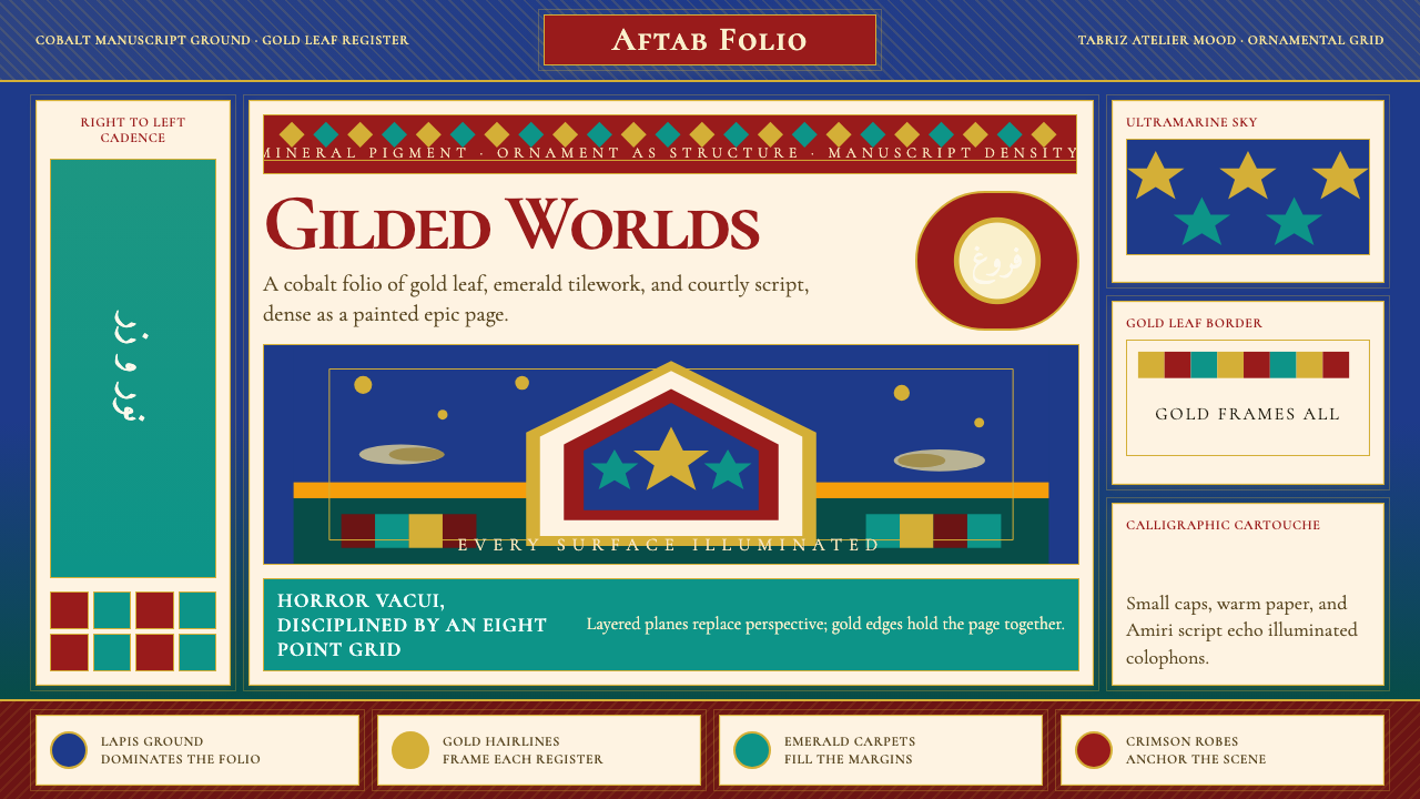 Persian Miniature (Shahnameh era)Manuscript luxury turns maximal. Cobalt ground, gold borders, and Cormorant S…
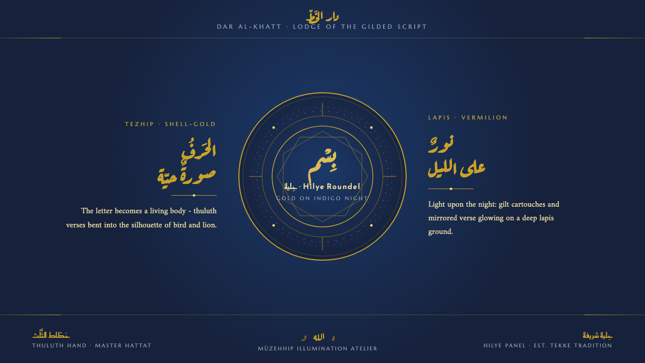 Sufi Zoomorphic CalligraphySacred script made flesh. Shell-gold thuluth on indigo-night grounds, framed…
 Armenian Illuminated ManuscriptGilded maximalism. Burnished gold, lapis frames, and vermilion initials build…