What is Sakha Ice Architecture?
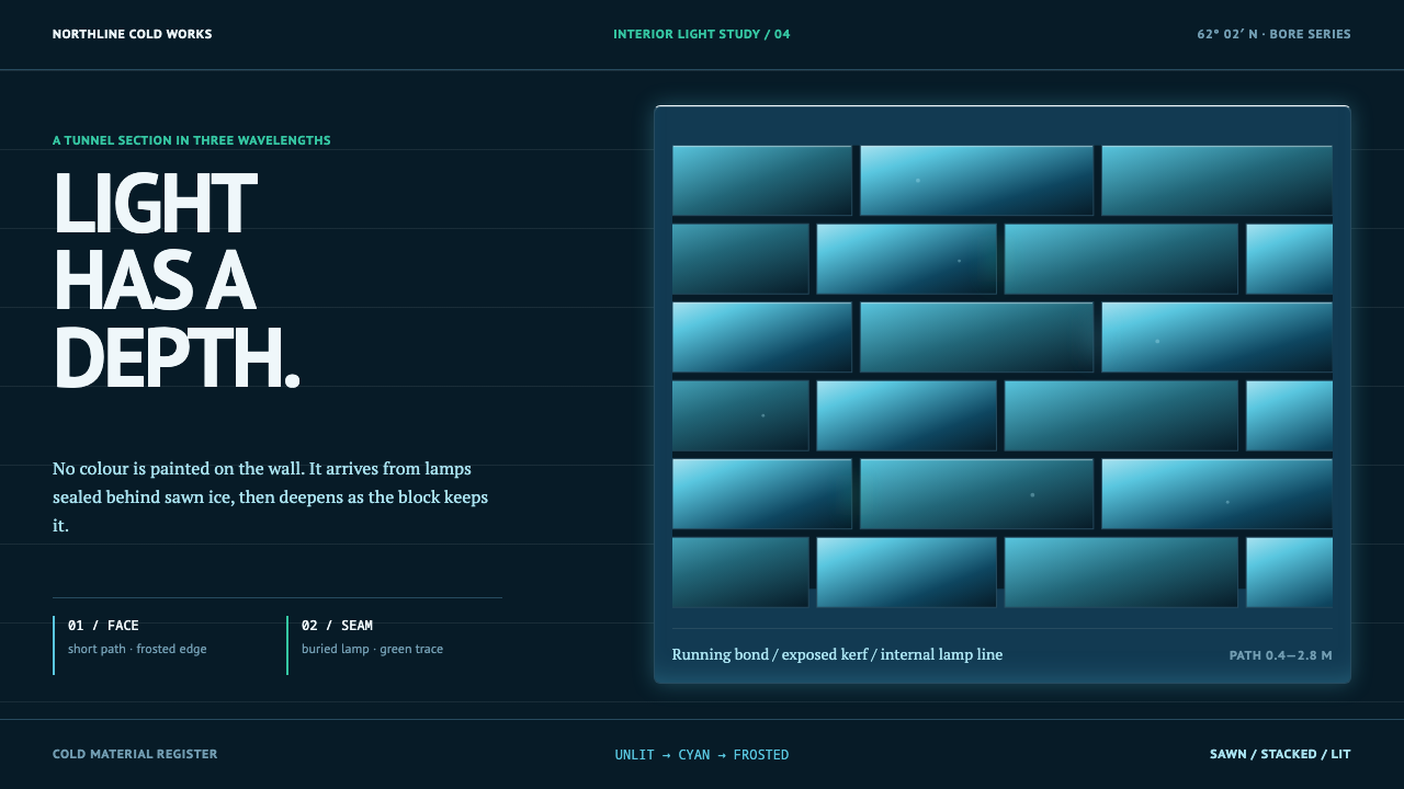
Sakha ice architecture is light with depth — near-black blocks of Lena River ice, lit from within, with cyan glowing through hard rectangular seams and deepening with distance.
Sakha Ice Architecture in brief
Sakha Ice Architecture is a dark, cold design language drawn from the ice buildings of Yakutsk, in the Sakha Republic (Yakutia) of the Russian Far East. Its ground is near-black with a blue-green cast, because that is what ice looks like when nothing is lit. Every other colour in the space comes from a lamp set behind or inside a block and glowing out through its fracture planes and trapped air.
The geometry is blocky and hard. Ice is sawn from the Lena River into rectangular blocks and stacked into walls, tunnels and sculpture, so light escapes through straight seams and square-edged windows rather than as a soft haze. Saw marks, bubbles and cracks are left in. The cyan that dominates the palette deepens with distance: the thicker the ice, the bluer the light, a consequence of physics rather than taste.
As a system, it is about the interior. Dark ground, hard rectangular light and a single cold family of hues together make a style in which light is a material with depth, and the design problem is deciding how much of it comes through, from how far behind, and through which seam.
Where does Sakha Ice Architecture come from?
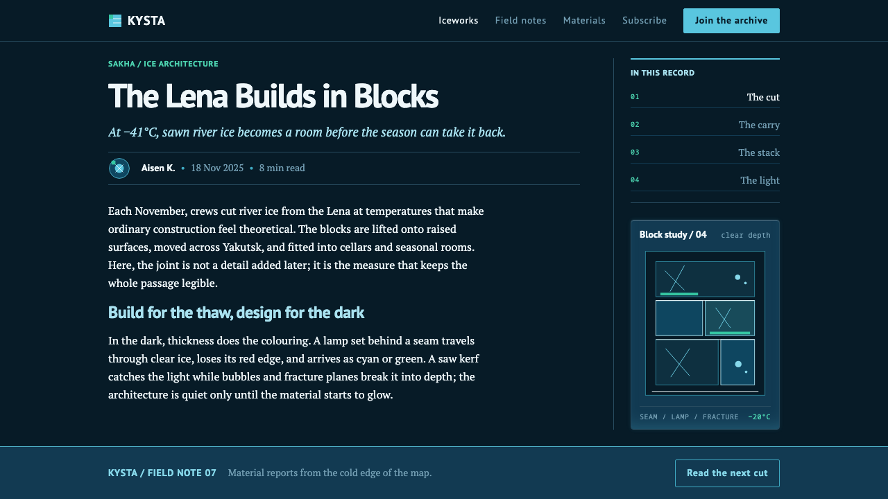
Yakutsk cuts ice from the Lena River in November, at −41°C. The reason is practical: piped water runs for only about two and a half months of the year, so ice is at once the water supply and the building material. The same sawn blocks build the winter ice town, the entries in the sculpture contest, and the tunnels bored into the frozen hill at Permafrost Kingdom.
Permafrost Kingdom, known locally as Chochur-Muran, opened in 2005, and the current visual language of ice-lit interiors in this system's lineage runs from 2010 to the present. The ice-cutting practice itself is far older. The three movements named in the lineage — permafrost engineering, seasonal ice construction and Sakha carving — mark three layers: the technical problem of building in frozen ground, the yearly cycle of sawing and stacking ice, and a carving tradition that turns blocks into figures.
Two further reference points give the culture its shape. The Diamonds of Yakutia snow and ice sculpture contest shows ice treated as an art material, cut from the same river as the building blocks. Chyskhaan, whom the lineage names as the Lord of Cold, gives the climate that makes all of this necessary a character of its own. Taken together they place ice somewhere between infrastructure and art: it is water, it is wall, it is canvas.
The system is built from the interior of those tunnels. Unlit ice reads near-black with a blue-green cast, and thicker ice is bluer because the stretching vibrations of water molecules absorb red light — physics, not an aesthetic decision. So the page is pushed to its darkest, and light enters only as hard-edged rectangles through the seams between blocks, with the saw marks, bubbles and fractures preserved. The look is honest to a particular material under particular light.
What defines the Sakha Ice Architecture look?
Near-black ground with a blue-green cast
The base is not black but near-black with a cold blue-green undertone, the colour of unlit ice. This matters because it gives the light something to push against: a flat, neutral black reads as a void, while this ground reads as dense material with the light trapped inside it.
Colour as lamp light
Beyond the faint cast of the ice itself, the ice carries no colour of its own. Every colour in the space is a lamp set behind or inside a block, glowing out through fracture planes and trapped air. In design terms, colour is not a fill applied to surfaces but an emission that comes from inside them, and it should always appear to have a source.
Hard rectangular light
Light is shaped by the blocks it passes through, so it comes out as straight-edged rectangles and narrow seams, never as round glows. This is the visible signature of the system. The brightness is high, the edges are crisp, and the geometry is that of masonry rather than of atmosphere.
Cyan that deepens with distance
The dominant hue is cyan, and it is not one flat value. Thin ice or close ice lets a lighter, greener cyan through; thick ice or distance pulls it toward a deeper blue as water absorbs red light. The system uses this as a depth cue, so tone carries the sense of near and far without any perspective drawing.
Visible saw marks, bubbles and cracks
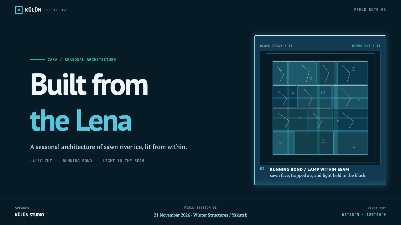
The imperfections of cut river ice are kept: saw marks, trapped air, fracture planes. They are not noise to be cleaned up but the places where light bends and breaks and becomes visible. A surface scrubbed to perfect smoothness would lose the thing that gives the glow its structure.
Seams as structure
Blocks are stacked in courses, and the joints between them are where light escapes. The grid of seams organises the whole composition: panels, columns and cards are blocks, and the thin luminous lines between them are the layout's rhythm. Space is built, not poured.
One cold family of hues
The palette stays inside a single cold family running from blue-green to cyan to deep blue. Within a scene of ice at extreme cold, a warm accent would read as a foreign object. The restraint is part of the atmosphere: the cold is total, and the variety comes from depth and intensity rather than from hue.

Who shaped Sakha Ice Architecture?
The tunnel complex bored into the frozen hill, opened in 2005, and the direct source of this system's interior. Walls, ceilings and sculpture are built from the same sawn blocks, and every colour in it comes from lamps set behind or inside the ice. When the system calls for dark ground, hard rectangular light and visible seams, it is describing what a visitor sees in these tunnels.
The sculpture contest where the same river ice becomes art. It shows the other face of the material: not walls and tunnels but forms carved and polished until they catch light. For a designer it is a reminder that the same stuff — cut blocks with a blue-green cast — can serve as architecture, as sculpture and as light source, and that the visual language should hold together across all three.
The lineage names Chyskhaan as the Lord of Cold, which gives the extreme climate of the region a character rather than treating it only as a condition. The useful lesson for a design system is tonal: cold here is not a mood of emptiness or distance but a presence with weight, depth and its own light, and the palette should feel inhabited by it.
How do you use Sakha Ice Architecture today?
Sakha Ice Architecture is a dark-ground system in which light is the only colour, so the design question is always where the light comes from and how much of it gets through. Applied well it produces layouts that feel dense, cold and quietly luminous; applied badly it becomes generic neon. The difference lies in hard edges, a single hue family and visible seams.
On slides, the cover is a near-black field with one lit rectangle — the title panel — glowing in cyan as if a lamp were set behind a block. Content slides work as courses of blocks: cards or columns divided by thin luminous seams, with the brightest block reserved for the key point. For data slides, build bars and areas as lit blocks and use depth of hue to show order, with lighter cyan for the nearest or newest and deeper blue for the furthest or oldest.
On the web the style fits developer tools, security and infrastructure products, climate and polar science, expedition and documentary sites, music and games. A dark dashboard built from hard-edged cards separated by luminous seams suits it well, and a pricing page can treat plans as blocks with the recommended tier lit from within. Keep corners square or near-square, keep glows contained inside their rectangles, and let one cyan carry the interactive states.
In editorial and marketing work — long reads about cold places, expedition reports, film and festival posters, product launches that want a sense of depth — the style gives a strong atmosphere with very few ingredients. Photographs can be pushed to a dark duotone that ends in cyan, type can sit in the pale end of the range, and a single lit seam can serve as the divider between sections.
The common mistakes are all forms of softening. Diffuse neon bloom, frosted-glass panels, round blobs of light and rainbow gradients turn ice into generic cyberpunk. A flat void with no internal light loses the material, and a warm accent breaks the cold. Perfectly smooth, scrubbed surfaces remove the saw marks, bubbles and fractures that make the glow read as coming through something.
Sakha Ice Architecture — FAQ
Why is the ice near-black rather than white?
Because that is how thick, unlit ice actually looks. It reads near-black with a blue-green cast, and every colour inside the tunnels comes from lamps set behind or inside the blocks. A white scheme would describe frost or snow, which is a different surface. The dark ground is what lets the light feel like it is travelling through a dense material rather than sitting on top of it.
Why is the light cyan?
Because thicker ice is bluer: the stretching vibrations of water molecules absorb red light, so what gets through the ice shifts toward blue-green and then deeper blue with depth. The cyan is therefore a consequence of the material rather than a styling choice, and it deepens with distance. The system uses that shift as a depth cue instead of varying hue arbitrarily.
Is this just a neon or cyberpunk style?
No. Neon glows are soft, saturated and surface-driven; here the light is hard-edged and structural, shaped by blocks and seams. The ground is a dense, near-black material rather than an empty night sky, and the palette is one cold family rather than a spread of hot colours. If your layout glows in round halos or mixes magenta and cyan, it has drifted away from the ice.
Can this system work in a light theme?
It is built on a dark ground, and the relationship between a dense dark material and light passing through it is the whole idea. A true light version would be a different design. If you need a light surface, borrow only the block grid, the visible seams and the single cold hue family, and accept that the sense of depth carried by darkness will be weaker.
Which products and brands suit it, and which do not?
It suits technical, atmospheric and scientific work: developer tools, security, infrastructure, climate and polar content, documentaries, music, games and anything that wants a cold, immersive depth. It is a poor fit for warm, social or domestic products — food, family, wellness — where the total cold would feel hostile, and for interfaces that depend on a wide palette of status colours.
Related design styles
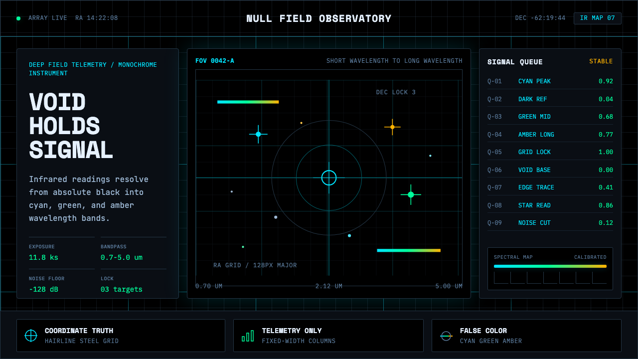 Deep Space ObservatoryTrust the void. Cyan telemetry and amber wavelength bars lock to a steel grid.
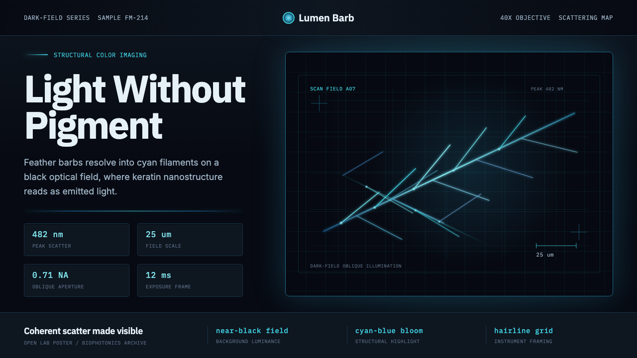 Feather MicroscopyPhysics glows in the dark. Cyan filaments and mono scale bars cut a black ima…
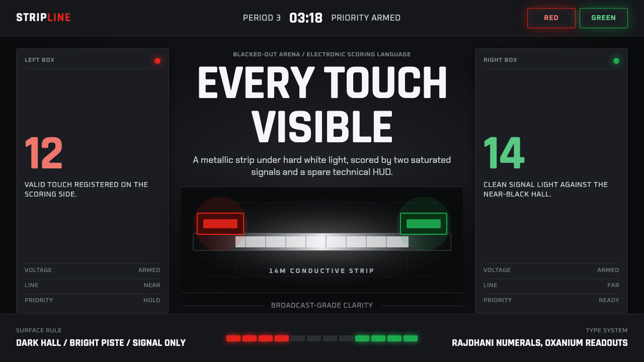 Fencing PisteTurns darkness into signal. Rajdhani HUD type frames a white piste and red-gr…
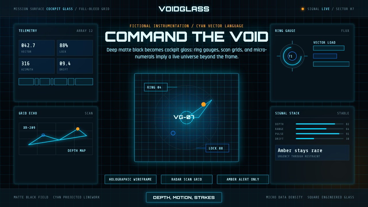 FUI Sci-Fi HUDBlack until it glows. Cyan wireframes, ring gauges, and radar grids sell live…
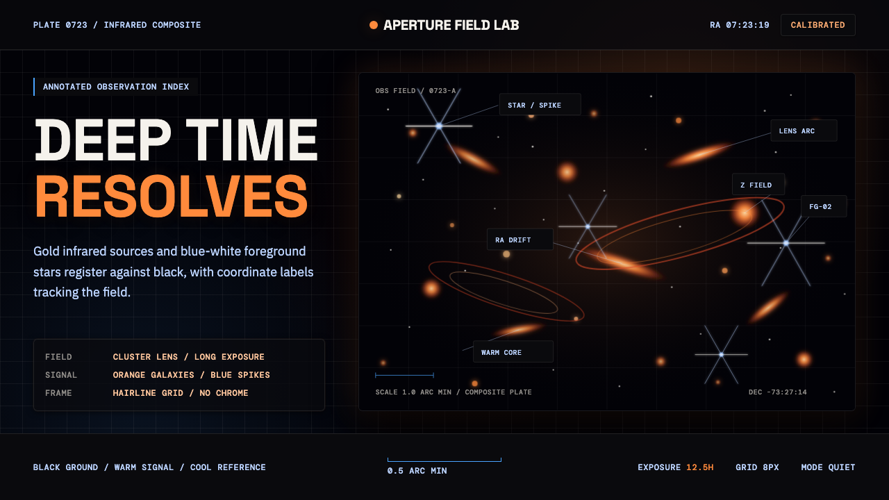 JWST Deep FieldPrecision in deep black. Orange galaxies, blue spikes, and DM Mono callouts m…
 Lunar Regolith SettlementMoonlight without the myth. Regolith gray, hard terminators, and a strict tec…