What is Sahrawi Melhfa?
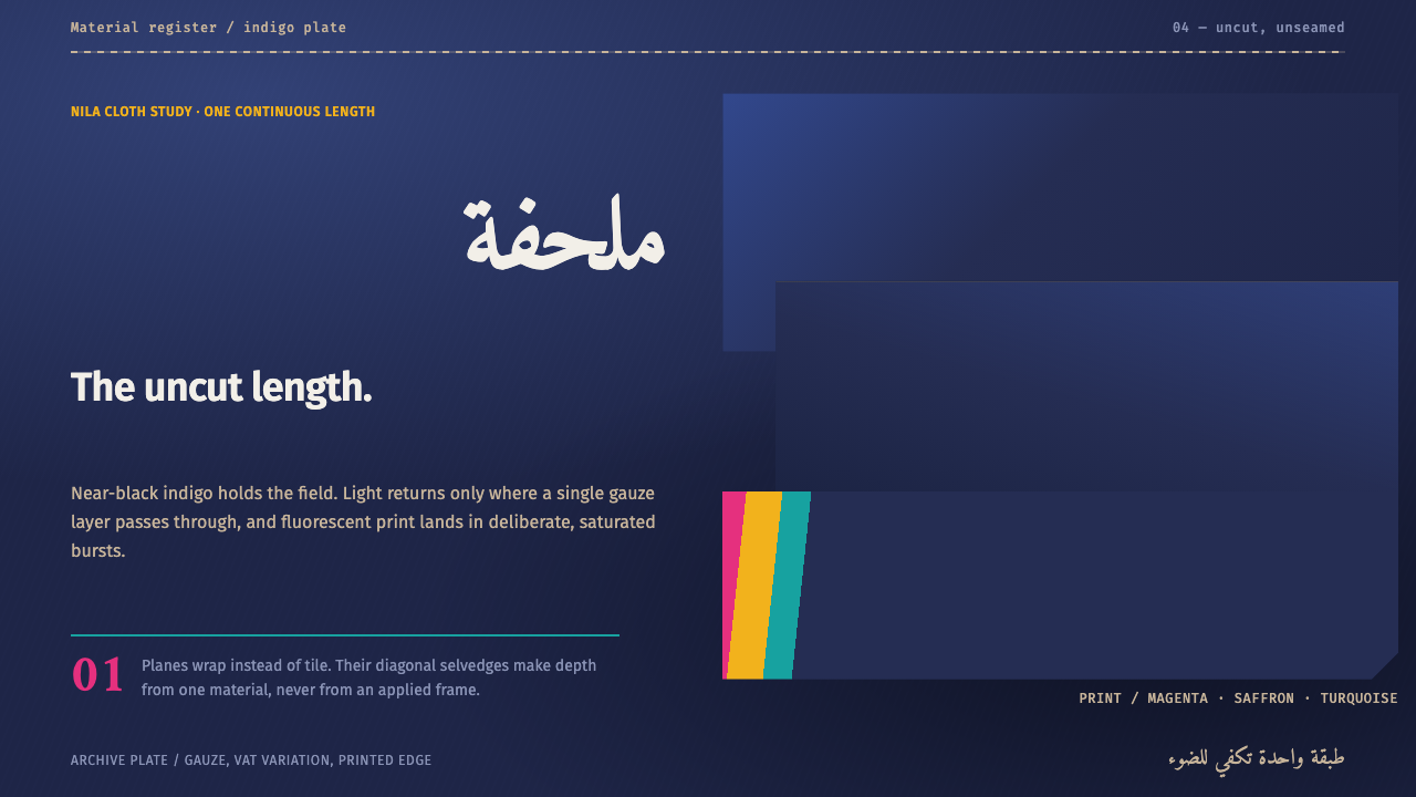
A melhfa is a single uncut length of indigo gauze, dyed so deep that it reads as black until light passes through one layer — and this design language is built on exactly that behavior.
Sahrawi Melhfa in brief
Sahrawi Melhfa is a dark-ground design style drawn from the melhfa, the wrapped garment of Sahrawi women in Western Sahara and in the refugee camps on the Hamada plain near Tindouf, Algeria. Its visual language is easy to state and hard to fake: a vast near-black indigo field, print color arriving in concentrated bursts of magenta, turquoise and saffron at full saturation, planes that overlap instead of tiling, and edges that are the finished edge of a cloth rather than a drawn outline.
The garment explains the style. A melhfa is one length of fabric, somewhere between four and ten metres long and about two metres wide, never cut and never seamed, so thin that it counts as gauze and so light that a whole garment weighs less than half a kilo. Indigo goes into it so deeply that from a distance it looks black. Only when light passes through a single layer does the blue come back. The design system treats that as a rule of behavior: darkness here is not an absence of color but a very deep, slightly translucent color, and whatever sits on top of it has to feel printed on cloth, not lit on a screen.
In practice this produces layouts that look quite different from the usual dark mode. The ground is worked unevenly, the way a dye vat works, so it carries tonal drift instead of a dead flat black. Color is rationed: most of any composition is indigo and empty space, and the print hues appear in only a few places, but where they appear they arrive at full strength. Where two planes cross, the overlap grows lighter, as it does when two layers of thin cloth are held up to the sun. The result is calm, quiet and strikingly specific — a style about silence and sudden color, not about glow.
Where does Sahrawi Melhfa come from?
The reference object is documented for the first half of the twentieth century, roughly 1900 to 1950, as an indigo-dyed garment of the Saharan world. It belongs to two overlapping traditions that the source material names plainly: Saharan indigo dyeing, which gave the cloth its depth, and Hassaniya dress custom, the code of how cloth is worn in the Hassaniya-speaking societies of the region. Neither is a decorative idea. Indigo is a working dye, and a dye vat never gives perfectly even results — which is exactly why the ground of this design system is uneven rather than flat.
What makes the garment unusual as a model for design is how it is used. The melhfa is wrapped around the body and then wrapped again in the wind of the Hamada, the stone desert plain on which the camps stand. It is one piece of cloth that works as dress, veil and protection from weather at once, and it is handled constantly: wrapped, adjusted, passed on. The tradition behind this system describes Sahrawi women as the people who wrap, trade and print melhfas, and that triple role matters. They are wearers, merchants and surface artists at once, which is why print on a melhfa reads as a deliberate act laid over a dark field rather than a pattern woven into it.
The second chapter begins in 1975. From that year the garment has been continuous in the Sahrawi camps near Tindouf, where weaving and dyeing workshops keep the craft going and where camp art archives, associated with the ARTifariti name, record how people there make images. The source material calls this post-1975 camp material culture, and the phrase is accurate: the melhfa in the camps is not a museum survival but an everyday object carried through displacement. That continuity is why the design system treats the cloth as a living reference rather than a historical costume. The era of the documented indigo garment and the era of the camps meet in the same piece of fabric.
Translating this into a design language means choosing what to carry over and what to leave behind. The system keeps the dye-vat unevenness, the rationed saturated print, the layered translucency, the selvedge edge and the stone-desert emptiness. It deliberately drops anything that would turn the garment into a pattern swatch: no repeating motif wallpaper, no tiled grid of identical cards, no ornamental border. Print colors appear as events, not as textures. Anyone using the style benefits from remembering that the reference is a working garment of living communities, and from letting its underlying logic — depth, restraint, overlap — do the work instead of copying surface motifs.
What defines the Sahrawi Melhfa look?
Indigo Ground
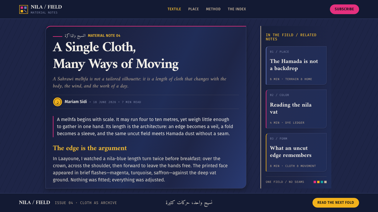
The foundation is a vast field of near-black indigo, but it is never a flat black. A dye vat does not color evenly, so the ground carries slow tonal drift: some regions deeper, some where the blue comes through. Treat the background as a material with a hue, not as the absence of light. Panels and surfaces are other layers of the same cloth, a shade or two apart, rather than outlined boxes sitting on a void.
Print Bursts
Print color is limited to a small family of saturated hues: magenta, turquoise and saffron. They never appear as pastel tints or soft glows. Each hue is used at full strength in a concentrated place and then withdrawn, so a composition holds two or three events of color rather than an even sprinkling. The rationing is what gives every burst its force.
Layered Translucency
Planes overlap rather than tile. Where two layers cross, the overlap is lighter than either layer, the way two thicknesses of gauze held up to the sun let more through than one. In interface terms this favors semi-transparent surfaces stacked on one another, and it discourages heavy drop shadows, which would suggest lamplight on a solid object instead of daylight through cloth.
Selvedge Edges
Edges are selvedge, not stroke. The finished edge of a woven cloth is a fact of its construction, not a line drawn around it. Shapes therefore end where their color ends. Avoid outlines, borders and rule lines that box content in; if something needs separation, let space or a change in depth do the work. This single rule removes most of the visual clutter that dark interfaces tend to accumulate.
Open Ground
Emptiness is allowed to be bold. The reference landscape is the Hamada, a stone plain where a single standing figure fills the horizon, and the style borrows that logic of scale: one subject, a large empty field around it. Crowded grids of equal tiles fight this. Large margins, wide gaps between groups and a single focal element per view all feel native to the system.
Light, Quiet Type
Typography follows the cloth: light in feel, low in quantity, high in legibility against the dark ground. Text should read like print on fabric, quietly sharp rather than ornate, with hierarchy carried mostly by size and spacing and with print color reserved for the one word that must be found. Avoid glowing type, outlined type or heavy display faces; the garment weighs less than half a kilo, and the lettering should feel equally unburdened.
Who shaped Sahrawi Melhfa?
The tradition behind this style places Sahrawi women at every stage that matters: they wear the cloth, wrapping it around the body and again against the wind; they trade it; and they print on it. That makes them the primary authors of the visual vocabulary this system borrows — a dark indigo ground with rare, intense print — and the reason the style should be approached as the product of a living practice rather than an anonymous pattern library.
In the camps on the Hamada plain near Tindouf, workshops keep weaving and dyeing alive as a craft, continuing the indigo tradition under conditions of displacement since 1975. They stand for the idea that the melhfa is current material culture and not a heritage costume, and they supply the style's emphasis on handwork — unevenness, variation and the visible trace of process.
The camp art archives associated with ARTifariti are a documentary record of image-making in the camps, and they appear among the key references for this system. They matter for design because they preserve how the community itself depicts and arranges its world, giving anyone who wants to look past the surface palette a primary source for the compositions underneath.
How do you use Sahrawi Melhfa today?
Sahrawi Melhfa is a dark-ground style with a strict internal economy, which makes it unusually good at one job: making a small amount of color feel important. It suits any context where a few things must be found and everything else should recede, and it asks for restraint more than for any particular component. The simplest way to think about it is as a decision about where the print goes.
For presentation slides, the cover is the strongest page: a large near-black indigo field, one short title set quietly, and a single burst of magenta, turquoise or saffron placed off-center like a printed motif at the corner of a cloth. Content slides keep that ground and stack two or three translucent planes at different depths instead of dividing the page with lines. Data slides work well when the chart sits on the indigo field with one series in a full-strength print hue and every other series in tonal neighbors of the ground, so that one story color does all the talking.
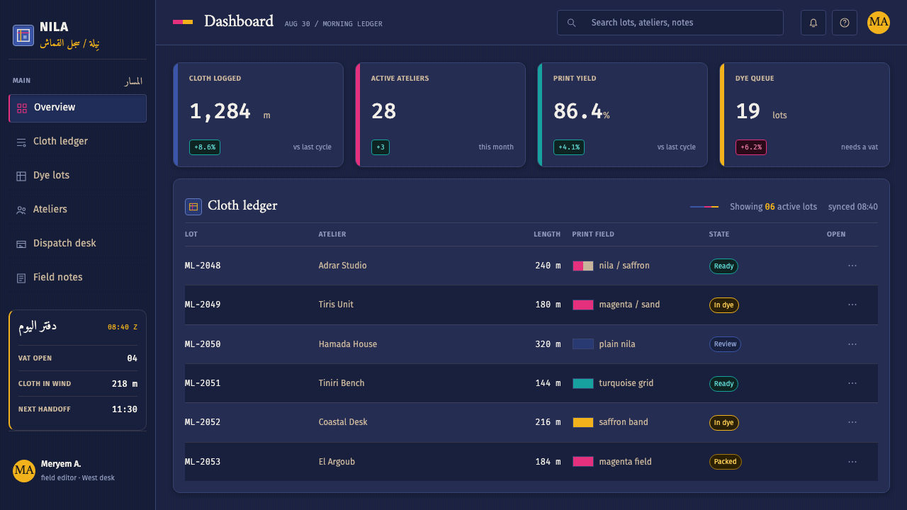
For web interfaces, the style fits dashboards and tools that people use at night or for long sessions, and pricing or feature pages that want to highlight one thing. Build surfaces as layered translucent panels rather than bordered cards, keep navigation quiet, and give the recommended plan, the primary action or the live alert the only print color on the page. Forms and tables are better separated by space and depth than by rules. Icons should be simple and thin so they feel printed, not embossed.
For editorial and marketing pages, the style rewards long vertical scrolling with generous emptiness: a hero that is mostly dark field with one printed accent, sections divided by changes of depth, and pull quotes set large against open space. Photography works best when it is cropped tightly or toned toward the ground so it feels like another layer of the cloth. Campaign and launch pages can use one print hue as the signature of that campaign and change only the hue from release to release.
The most common mistake is using the three print hues together, everywhere, at the same weight. That turns the system into generic neon-on-dark and loses the rationing that gives it meaning. The second mistake is flat black: without the slow tonal drift of the dye vat, the ground looks like a default dark mode. The third is mixing in outlined cards, tiled grids and heavy drop shadows, all of which bring back the strokes and solid objects that the selvedge-and-gauze logic is meant to avoid. If a screen feels loud, remove a burst of color before adding anything else.
Sahrawi Melhfa — FAQ
What is a melhfa?
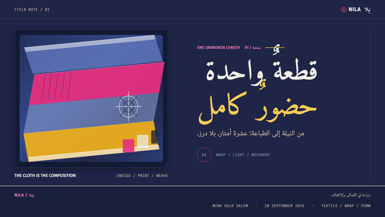
A melhfa is the traditional garment of Sahrawi women: a single length of cloth, four to ten metres long and about two metres wide, never cut or sewn and light enough that the whole garment weighs less than half a kilo. It is wrapped around the body and re-wrapped as conditions require. In the indigo version that inspires this style, the dye is so deep that the cloth looks black until light passes through a single layer.
Is Sahrawi Melhfa a dark-mode style?
It is a dark-ground style by nature, but it should not be mistaken for a generic dark theme. The ground is an uneven, deep indigo rather than neutral black, surfaces are layers of translucent cloth rather than outlined cards, and color is rationed into a small number of full-strength bursts. If you simply invert a light theme, you lose all of that.
How many print colors should one screen use?
As few as possible. The palette of magenta, turquoise and saffron works because each hue arrives as an event in a mostly dark composition. One hue per view is a safe default, two is common, and all three together is a rare exception that the content should earn. Using the full set at once flattens the hierarchy and makes the screen feel loud.
Does the style work for text-heavy pages?
It can, with discipline. The dark ground gives strong contrast for text, but long passages on a dark interface tire the eye, so keep line lengths moderate, give paragraphs generous space, and avoid tinting body text with print colors. Reserve color for links and the one phrase that must be found. For reference documentation and reading-heavy products, consider pairing the style with a lighter reading surface for long-form content.
Is it appropriate to borrow a cultural garment as a design reference?
It is appropriate when the reference is understood and credited. The melhfa is a living garment worn, traded and printed by Sahrawi women, including in the camps near Tindouf, and this style is derived from its logic of depth, rationing and layering rather than from reproducing any specific community's motifs. Use the structural ideas, name the source where context allows, and avoid using the style as costume or as exotic decoration for unrelated products.
Related design styles
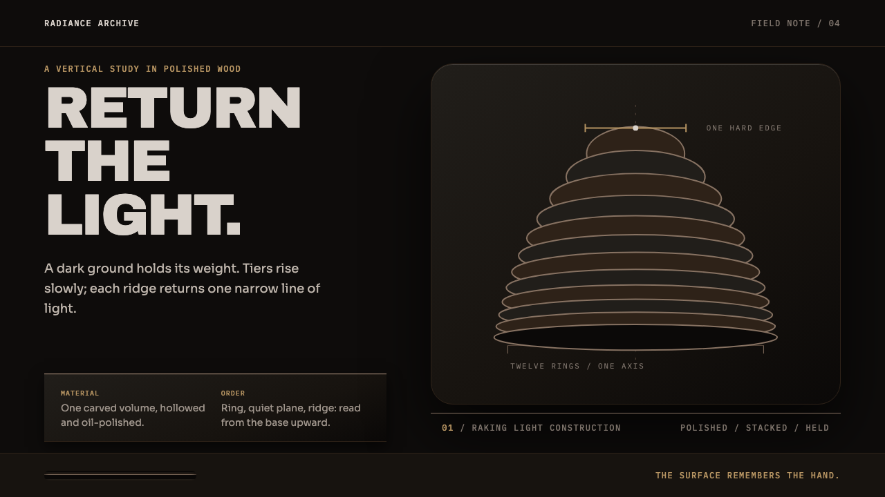 Sowei Helmet MaskLight is earned, not spread. Blue-black tiers and hard ridge highlights hold…
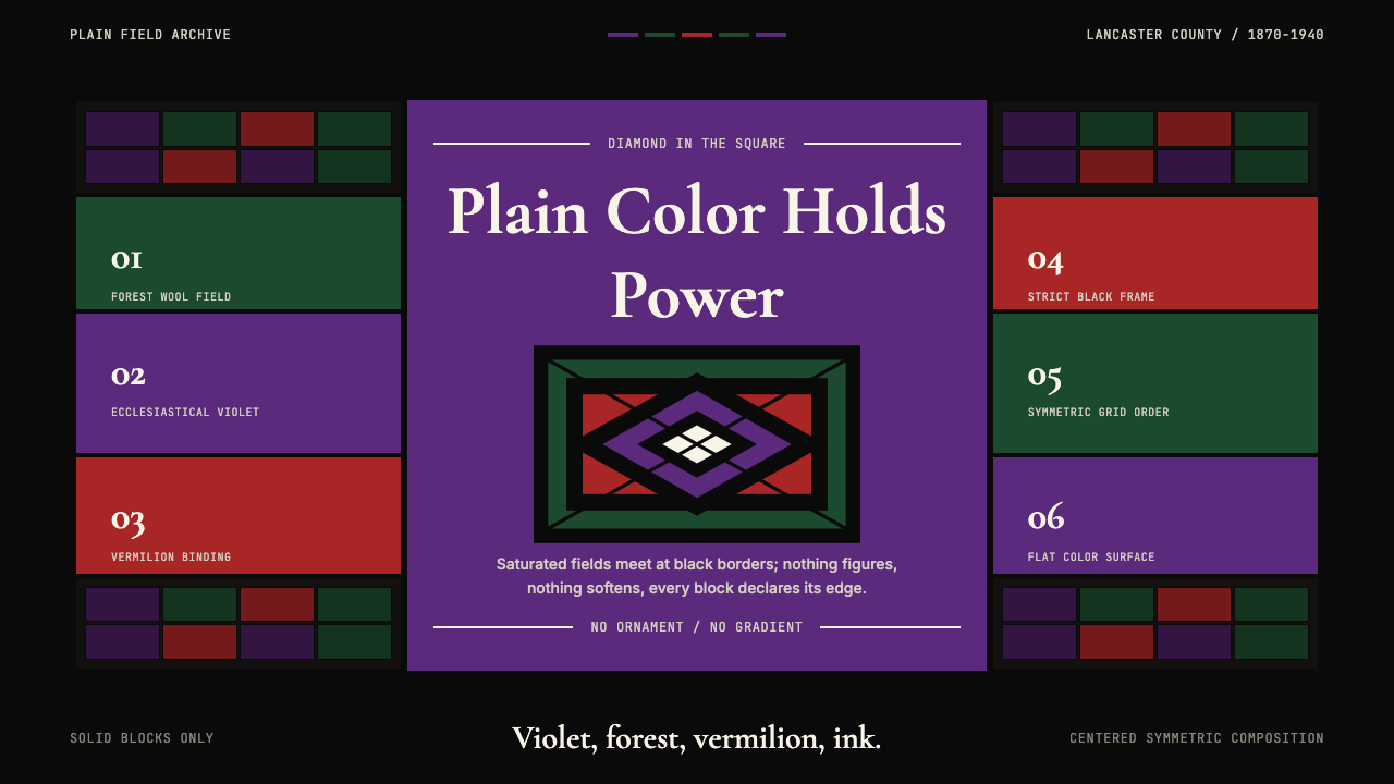 Amish Pennsylvania Quilt Bold GeometricRadical plainness. Violet, forest, and vermilion blocks lock into ink-black q…
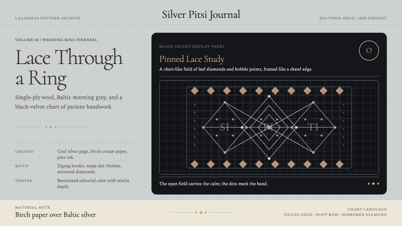 Estonian Haapsalu Lace ShawlQuiet craft, held in silver light. Cormorant type meets nupp dots and velvet…
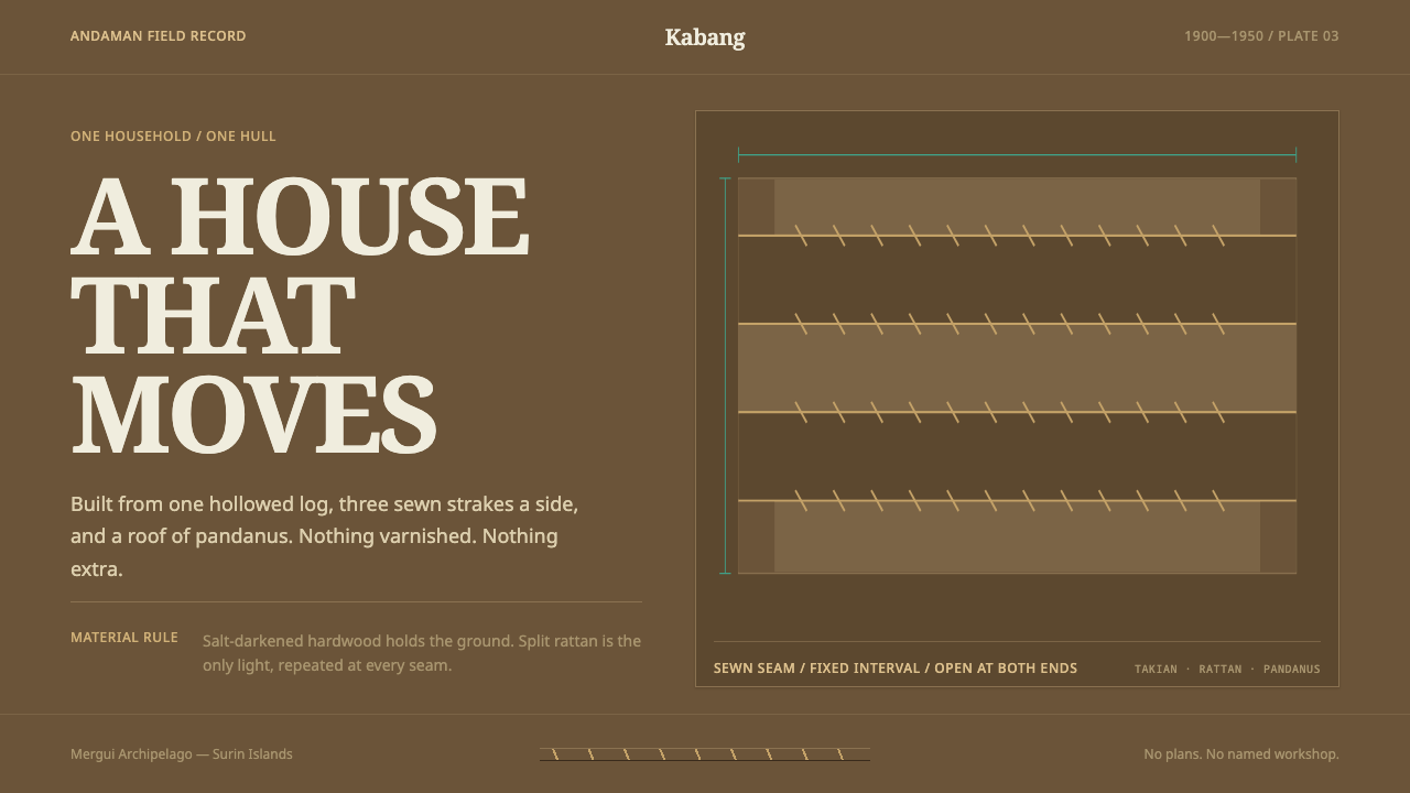 Moken KabangNothing extra survives at sea. Salt-dark wood and rattan seams make a spare m…
 Undyed Khadi WhiteModest, never cream. Greige homespun cotton with gray slub flecks and plain h…
 Beni Ourain Berber CarpetRestraint feels tactile. Greige wool field, Oswald type, and a loose charcoal…