What is Sabaean Inscription?
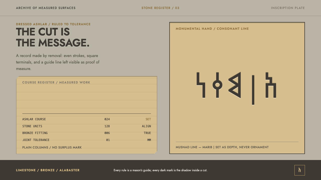
The Sabaeans did not write on stone; they removed stone until the letter existed — and this system makes the page behave like dressed ashlar with the writing cut into it.
Sabaean Inscription in brief
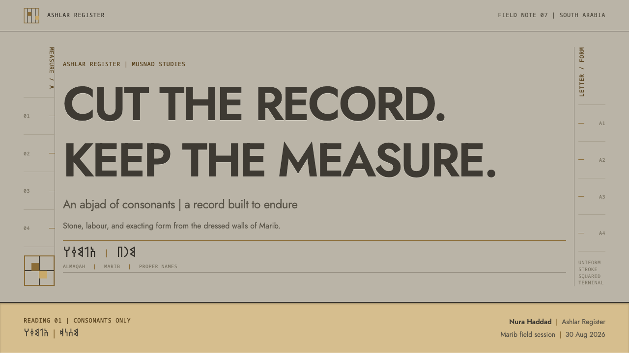
Sabaean Inscription is a design language derived from the monumental inscriptions of the Sabaean kingdom of ancient South Arabia, in what is now Yemen. Its central idea is that writing is excavation: the letter is the part of the stone that has been taken away, so type reads as depth rather than ink. Musnad, the script of these inscriptions, is an abjad, an alphabet of consonants, drawn to engineering tolerances with uniform stroke width, squared terminals and even gaps.
The page is treated as dressed ashlar, a block of cut and smoothed limestone. A ruled lattice, the guide grid that the mason scored before carving, stays visible after the work is done. Panels behave like inscribed blocks with a chamfered edge, and accents come from restrained bronze and pale alabaster. Nothing is decorative that is not also load-bearing.
The system's second voice is administrative rather than ceremonial. Its tables borrow their plainness from the repair records of the Great Dam of Marib, which list workers counted, quantities of material and costs aligned in columns. The result feels both ancient and rigorously practical: monumental headings and a humble ledger, from the same hand.
Where does Sabaean Inscription come from?
The Sabaeans ruled a kingdom whose heartland lay in the highlands of what is now Yemen and along the desert edge known as Ramlat as-Sab'atayn. The centres named in this system's source are Marib and Sirwah. The source period runs from the early first millennium BCE to the sixth century CE, more than a thousand years in which Sabaean writing was cut into temple walls and into the records of building and repair.
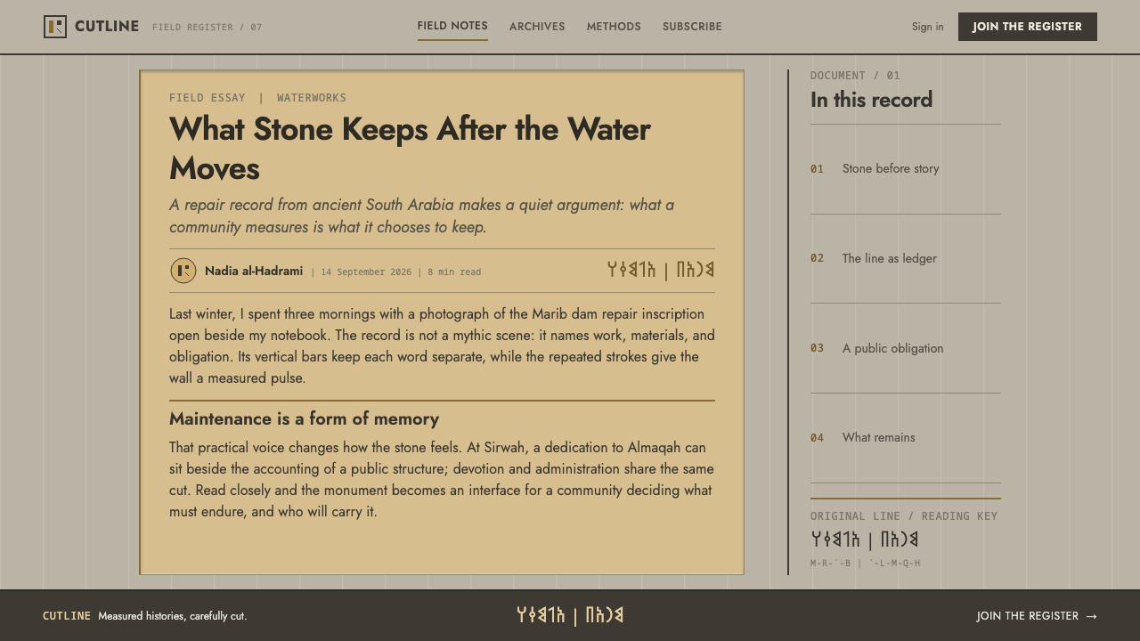
Musnad is the monumental script of these inscriptions. Its letters were made with deliberate geometry: strokes of uniform width, squared ends and even gaps, set on a ruled lattice that the mason left visible when the cutting was done. Words were separated not by a space but by a vertical bar, a divider on the original stones. This system keeps that bar as part of its visual identity, so that a line of text is a sequence of cut words, each walled off from the next.
Two places anchor the story. The Awwam Temple is associated with Almaqah, the god named among the key figures, and it stands for ceremony and dedication. The Great Dam of Marib stands for engineering and administration, and its records list workers counted, quantities and costs. Together they explain why one script could carry a deity's name and a column of figures, and why the design can sit comfortably in both registers.
The source also names a second hand, the Zabur cursive, the everyday counterpart to the monumental Musnad. Where the monumental letter is carved and square, the cursive was written. Mentioning both is a useful reminder that the monumental style was a choice of register, adopted when something was meant to last, and not the only way the Sabaeans wrote. This design language takes that monumental register and applies it where permanence is the message.
What defines the Sabaean Inscription look?
Letter as Relief
Type is treated as depth rather than ink. The letter is the part of the stone that has been removed, so headings read as cut into the surface, with a sense of shadow in the recess. The effect is dark relief on a pale ground, quiet and heavy, and it asks that text be set with a sense of permanence rather than animation.
Uniform Strokes and Squared Terminals
Musnad is drawn to engineering tolerances: every stroke is the same width, every terminal is cut square, and the gaps between letters are even. There is no contrast between thick and thin, no flourish and no taper. The letterforms feel like machined parts, which is why they sit so naturally in a system that also contains tables and ledgers.
Visible Ruled Lattice
The mason scored a lattice of guide lines before cutting, and did not remove it afterwards. In this system the same lattice stays visible as faint lines behind and between the text. It is a structural trace, evidence of how the page was laid out, and it gives every composition a sense of order that is earned rather than imposed.
Ashlar Surface and Chamfered Panels
The page is dressed stone: a pale limestone-like surface, smooth but not glossy. Panels behave like inscribed blocks set into a wall, each with a chamfered, cut edge that gives it a slight bevel instead of a hard right angle. Cards and containers feel built rather than floating, and they sit flush as masonry does.
Bronze and Alabaster Accents
Two materials do the accenting: restrained bronze and pale alabaster. Bronze is a dull, warm metal tone used for marks, small emphasis and primary actions, and alabaster is a luminous off-white used for lifted surfaces. Neither is shiny. The rest of the page is left as stone, and the restraint is the point.
Ledger Tables
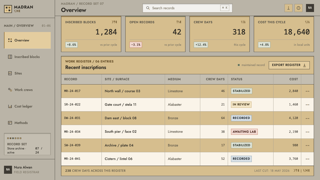
Tables take their plainness from the Marib dam records: workers counted, quantities listed, costs aligned in columns. They have no decoration, no zebra effects and no rounded chips. The value is in alignment, the way figures stack and compare. A table in this system feels like a record that someone will have to answer for.
Vertical Word Divider
On the original stones, words were separated by a vertical bar rather than a space. The system keeps this as a signature device, using a thin vertical rule between words in headings and labels. Used sparingly it gives a line the feel of a row of cut blocks; used everywhere it becomes noise, so reserve it for places where the effect is wanted.
Who shaped Sabaean Inscription?
Almaqah is the god named among the key figures, associated with the Sabaean kingdom and with its temples. His name stands for the ceremonial register of the inscriptions: dedications meant to last, cut in stone for a divine reader. It is the reason the system's headings carry weight, and the reason permanence, rather than novelty, is the value the style communicates.
The Awwam Temple is the architectural counterpart to Almaqah in the source. It is the sort of building on whose walls monumental Musnad was cut, and it stands for dedication, ritual and the public face of the kingdom. In design terms it is the origin of inscribed blocks, chamfered panels and the idea of a page as a wall.
The Great Dam of Marib is the engineering counterpart to the temple. Its repair records, listing workers counted, quantities of material and costs, supply the plain, aligned voice of this system's tables. It reminds us that the same script served administration as well as worship, and that a design can be monumental and practical at once.
The Zabur cursive is named among the source's movements as the everyday counterpart to monumental Musnad. It is not a person, but it is a reminder that behind the monumental style was a living, written hand. Treat it as context rather than as a visual device to copy: its job here is to remind the designer that monumentality is a choice of register.
How do you use Sabaean Inscription today?
Sabaean Inscription is a system for work where gravity, permanence and accountability are the message. It suits institutions, archives, heritage subjects and any product that wants to feel built to last. Because it combines monumental headings with plain ledger tables, it is especially good at content that needs to be both dignified and exact.
For presentation slides, make the cover a single large inscribed block: the title cut into a pale stone panel, the lattice faintly visible behind it and a small bronze mark in one corner. Content slides can be built from panels set flush like masonry, with the vertical bar separating key terms. Data slides should lean on ledger-style tables, with figures aligned in columns and totals set apart, rather than decorative charts.
On the web it fits documentation, financial and accounting dashboards, registries, archives and museum sites. Buttons can be chamfered blocks, with bronze reserved for the primary action and alabaster used for lifted surfaces. Pricing can be shown as a ledger of tiers, quantities and costs lined up in columns. Keep the stone surface calm and let alignment, not colour, carry hierarchy.
In editorial and marketing work it supports archaeology and history features, institutional and annual reports, certificates and commemorative pieces. Set headlines as cut text and body copy as plain readable type; use the vertical divider sparingly in headings; and let tables stay unadorned. A page in this style should feel as if it will outlast the campaign it was made for.
The usual mistakes are to fake stone with heavy textures, to add glossy bronze gradients and deep emboss shadows, or to set Latin text in imitation Musnad letterforms that ruin legibility. Another is to use a decorative faux-ancient typeface, which keeps the surface and loses the engineering. The system's discipline is uniform strokes, squared ends and honest alignment, so never trade readability for atmosphere.
Sabaean Inscription — FAQ
What is Musnad?
Musnad is the monumental script of ancient South Arabia, used in the inscriptions of the Sabaean kingdom in what is now Yemen. It is an abjad, an alphabet that writes consonants. Its letters have uniform stroke width, squared terminals and even gaps, and they were set on a ruled lattice. The system also names a cursive counterpart, the Zabur hand, used for everyday writing.
Why does the style talk about writing as excavation?
Because the Sabaeans cut letters into stone by removing material, so the letter is an absence that has depth. In design terms this means type should read as relief rather than ink, with a sense of recess and shadow, and panels should feel like blocks in a wall. It changes how headings, cards and containers are conceived: as built, not as painted.
Do I need to use Musnad letters in my design?
No. The system translates the principles of the script, uniform strokes, squared terminals, even gaps and a visible lattice, into whatever alphabet your content uses. Setting Latin or Chinese text in imitation Musnad letterforms damages legibility and adds nothing. Use the real script only where the content is actually Sabaean, and then with proper credit.
Why is there a vertical bar between words?
On the original stones, words were divided by a vertical bar rather than a space. The system keeps it as a signature detail, a thin rule between words in headings and labels that makes a line of text look like a row of cut blocks. Use it sparingly, in places where the monumental feel is wanted, and never in long running text.
Is it a good fit for data-heavy interfaces?
Yes, within limits. The table style comes from the Marib dam records: workers counted, quantities listed, costs aligned. That plainness suits ledgers, registries, reports and financial views. It is less suited to playful or highly animated data displays, because the system values stillness and alignment over visual excitement.
Related design styles
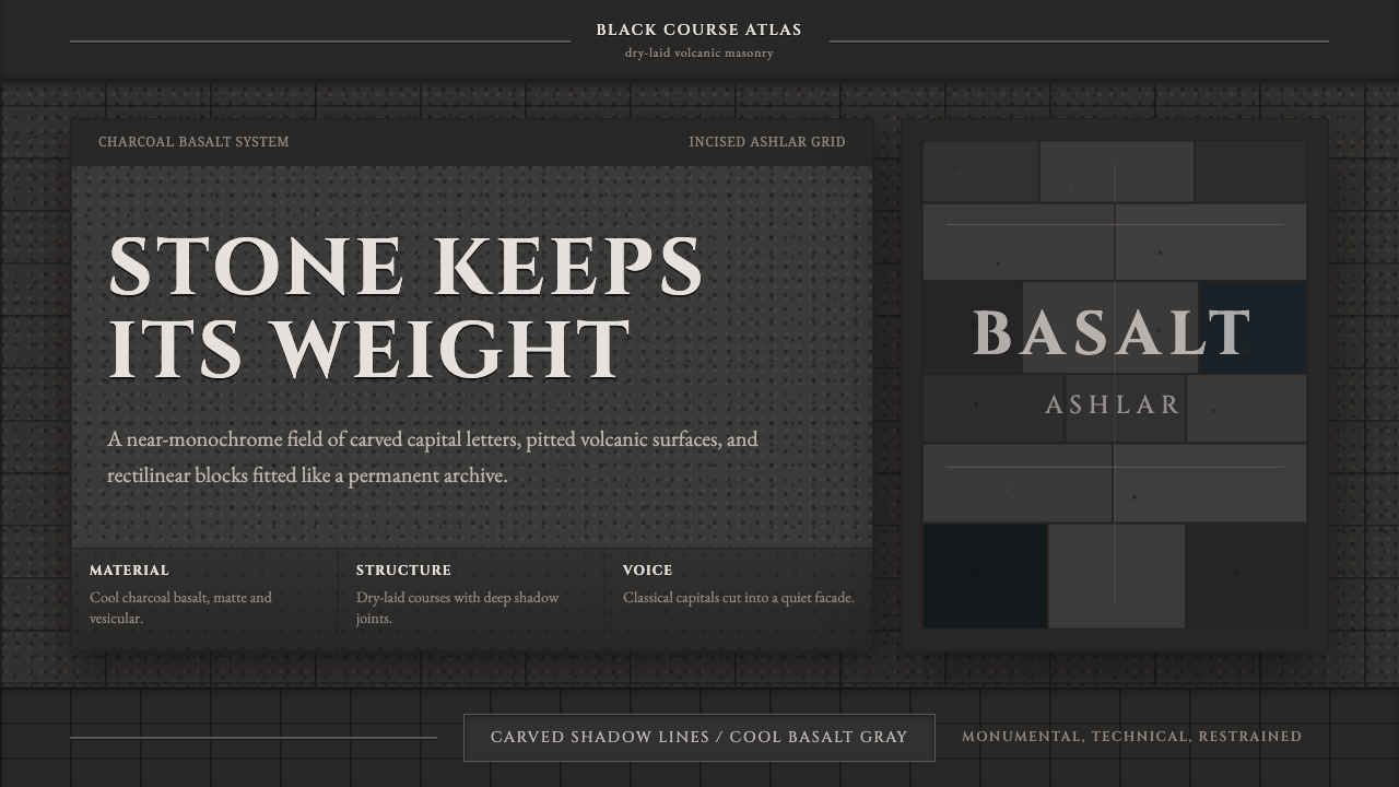 Hauran Basalt StoneMonolith refuses shine. Charcoal Cinzel capitals lock into dry-laid basalt gr…
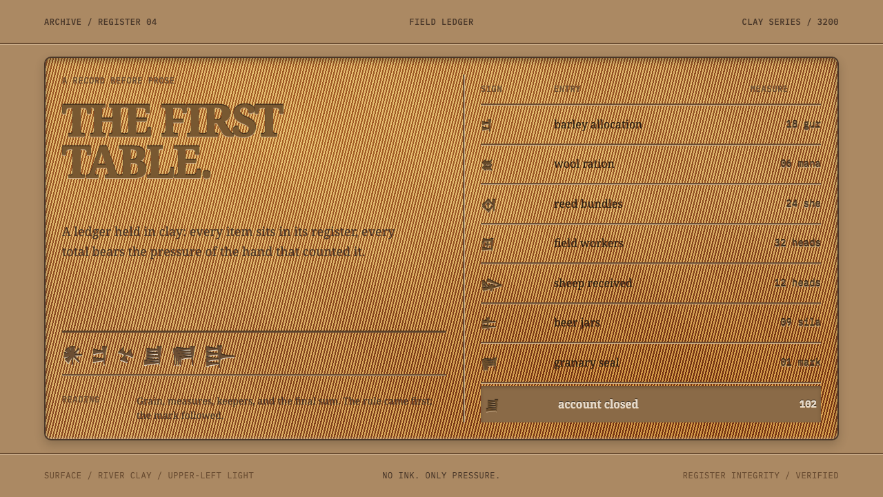 Sumerian Cuneiform TabletData began as pressure. A clay ledger uses scored grids and shadowed Noto Ser…
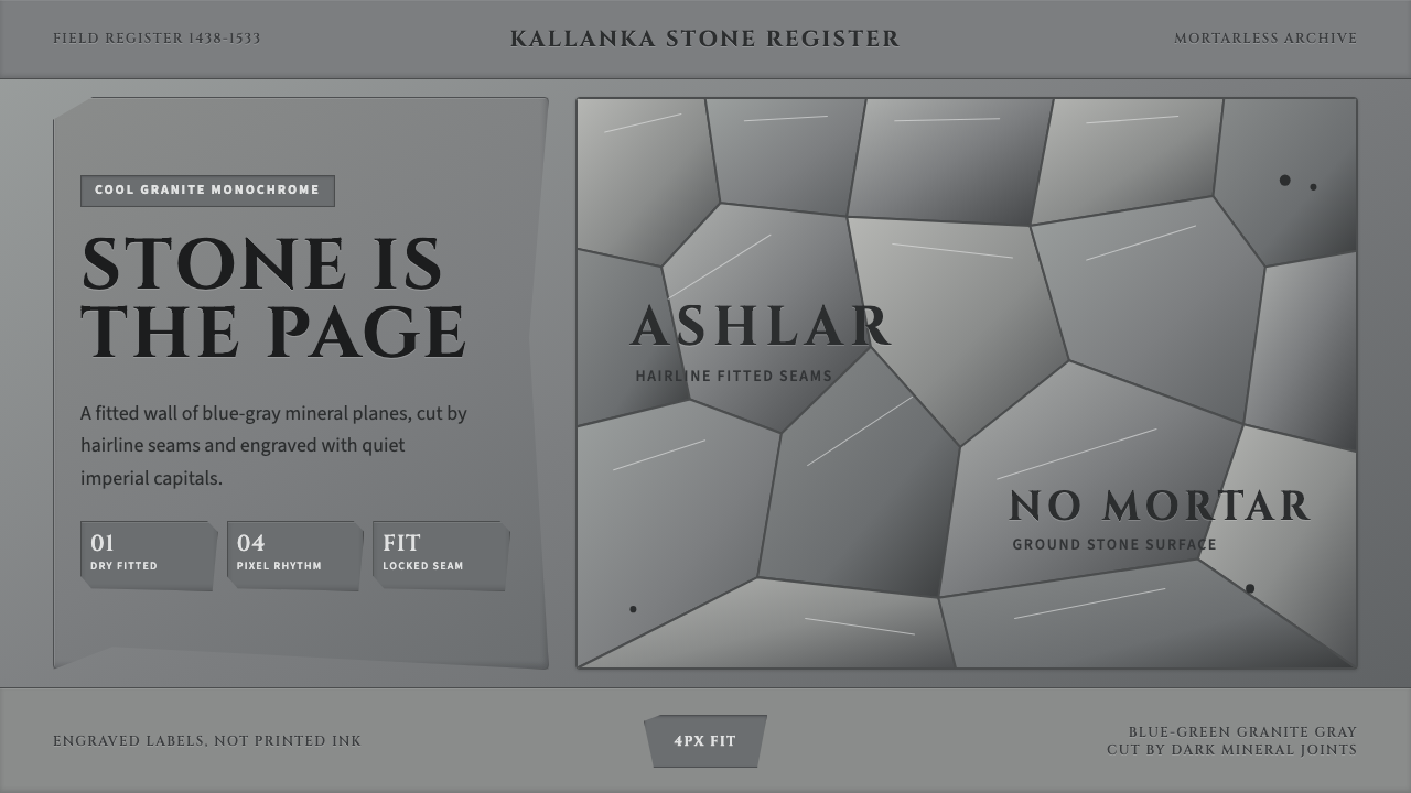 Inca Ashlar StoneworkStone becomes the page. Granite-gray planes lock into hairline ashlar seams.
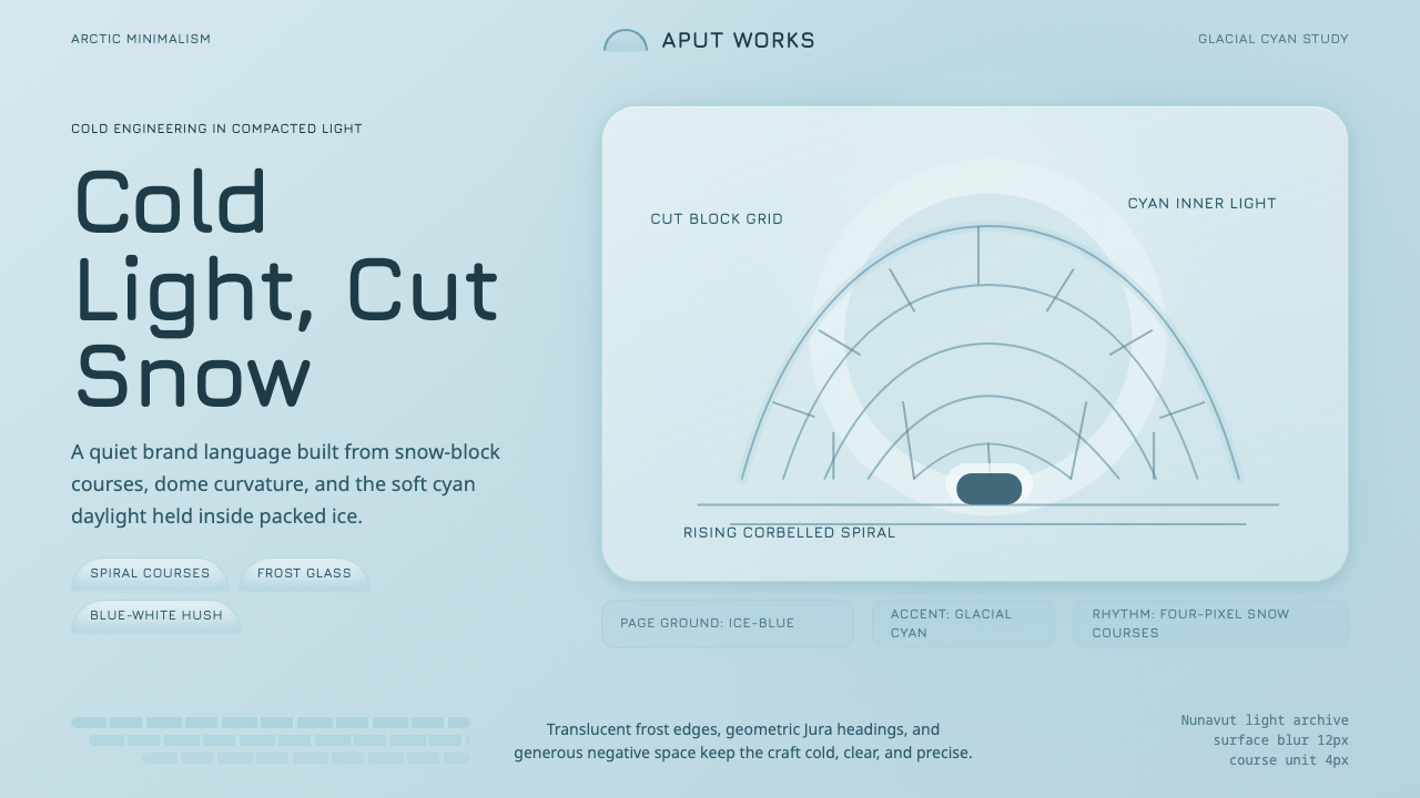 Inuit IglooCold craft, clear light. Glacial cyan and Jura type trace a spiral-block dome…
 Israeli Bauhaus Tel Aviv (White City)Austere urban modernism. Stucco-white grid, Jost type, hairline borders, and…
 Mohs Hardness ScaleRanked by what scratches what. Ten mineral-gray chips on cool chart-white, en…