What is Robotic Ghost Kitchen?

The robotic ghost kitchen style is the operator's view of a restaurant with no dining room: a white tile grid, steel rails, robot orange for what is active, and colour that only ever reports status.
Robotic Ghost Kitchen in brief
The Robotic Ghost Kitchen style imagines a delivery-only kitchen in 2032, with no dining room and no front of house. Orange robot arms work over a fryer rail and along a long stainless makeline, and every order appears on a board as a ticket counting down to its preparation target. The interface is not a menu for customers but a live operations view for the people running the kitchen.
Its visual identity comes from the room itself. A white tile grid recalls kitchen walls, steel rails and brushed metal surfaces recall the equipment, and an industrial orange recalls the paint on factory robot arms. Headings use a tall condensed display face for station names, while timers, temperatures and order numbers are set in a monospaced face, always with their units.
The governing rule is that colour is always a status. Orange marks the active station and the live order. Tickets age from grey to yellow to red as they approach and pass their target, and turn green once handed to a courier. Red is kept for anything overdue or out of range. Nothing is coloured for decoration, so a glance at the screen answers the only question that matters: where is something stuck?

Where does Robotic Ghost Kitchen come from?
This is a projected style, anchored in real technology that already exists. The kitchen is set in 2032, but its reference points are Flippy, the robotic fry-station assistant that began appearing in commercial kitchens in 2018, and the automated makeline built by Hyphen, which went into operation in 2022. These machines turned the kitchen into a place where work is divided into stations and where timing, temperature and queue length can be measured continuously.
Three overlapping movements shape the look. The first is commercial kitchen automation, in which robots take on repetitive and hazardous tasks such as frying and assembly. The second is the rise of delivery-only ghost kitchens, restaurants that exist solely to fill online orders and so have no reason to design for diners. The third is the kitchen display system, the screen that replaced paper order tickets above the line and told cooks what to make next and how long they had.
Several people are associated with this lineage. Buck Jordan and David Zito are connected with Miso Robotics, the company behind Flippy, and Stephen Klein is connected with Hyphen and its makeline. The geography is global: Augsburg in Germany, home of the industrial robot orange that inspired the accent colour, and Pasadena and San Jose in California, where the kitchen robotics companies work.
The aesthetic that results is closer to an air-traffic or manufacturing control room than to a restaurant brand. It has no need to seduce a customer, so it can be entirely functional. That is exactly what makes it a useful reference for any interface where speed of understanding matters more than atmosphere.
What defines the Robotic Ghost Kitchen look?
Colour as status
Every use of colour carries a meaning. Orange means active, grey means waiting, yellow means approaching the target, red means overdue or out of range, and green means handed off. Because the same colours always mean the same things, the screen can be read from across a room without reading a word.
Tile-grout grid
The ground is white and divided by fine grout-like lines into a visible grid of tiles. Cards, lanes and panels snap to this grid, so the layout feels like a cleaned and orderly kitchen wall. The grid is a visible feature, not a hidden scaffold, and it keeps dense information tidy.
Steel rails and lanes
Each robot arm or station gets its own horizontal lane, drawn like a steel rail. Tickets travel along the lane in order, so progress reads left to right. Metal-like neutrals frame the lanes, with brushed grey surfaces and hard edges rather than soft shadows.
Condensed station names
Station names and section titles are set in a tall condensed display face, in capitals. The tight, vertical forms read like stencilled labels on kitchen equipment, and they let long names fit into narrow lanes without losing size.
Monospaced timers with units
Times, temperatures, counts and order numbers are set in a monospaced face so that digits line up and changing values do not jitter. Every number carries its unit, since a figure with no unit is ambiguous at speed. This habit is one of the most transferable parts of the system.
Countdown tickets
The central object is the ticket, a card with an order number, its contents and a countdown to its target. It ages visibly through its colour states. A ticket is a small, complete story: what it is, how long it has, and whether it is on time.

Who shaped Robotic Ghost Kitchen?
Jordan is associated with Miso Robotics, whose Flippy robot brought automation to the fry station of commercial kitchens from 2018 onward. His work stands for the first anchor of this style: robots as colleagues on the line.
Zito is likewise associated with Miso Robotics and its work on robotic kitchen assistants. Together with the Flippy lineage, his name stands for the idea that cooking can be broken into stations that a machine can perform and a screen can monitor.
Klein is associated with Hyphen and its automated makeline, which went into operation in 2022. The makeline is the second anchor of the style, the long stainless line along which bowls are assembled and which the lane-based interface mirrors.
How do you use Robotic Ghost Kitchen today?
The Robotic Ghost Kitchen style is best understood as a method rather than a costume. It is a way of making a status board readable at a glance. Used faithfully, it gives any operational interface a clear logic: a visible grid, lanes for resources, cards for items, units on every number and colour reserved for state.
For presentation slides, a cover can show a tile-grid field with a large condensed title and a single orange marker. Content slides work as boards: lanes for teams or stages, cards for items, and a status colour for each. Data slides suit dashboards of timers, throughput and exceptions, where red is used only for what truly needs attention and the rest stays neutral.
For web and product design, the style suits operations monitoring, logistics, manufacturing and warehouse dashboards, support queues, deployment pipelines, incident boards, order management and any product where it must be obvious at a glance what is stuck. Its habits are easy to port: a legend of status colours, monospaced figures with units, and a lane per worker or machine.
In editorial and marketing work, it gives case studies and explainers about automation, logistics or food technology a credible, systems-minded look. Diagrams of workflows can use the lane and ticket vocabulary to show how work moves through a process.
The most common mistake is to use the colours decoratively. If red, orange and green appear for style rather than state, the board stops being readable and the whole point is lost. Another is dropping the units or the monospaced figures, which makes numbers harder to compare. Keep colour tied to meaning, keep the grid visible and keep the tone calm.

Robotic Ghost Kitchen — FAQ
What is the Robotic Ghost Kitchen design style?
It is a status-board style that imagines the operator's screen of a delivery-only robotic kitchen in 2032: a white tile grid, steel rails and lanes, robot orange for the active item, condensed station names, monospaced timers with units, and tickets that age from grey to red.
What does each colour mean?
Orange marks the active station and the live order. A ticket is grey when new, yellow when it nears its target, red when overdue and green once handed to a courier. Red is also kept for anything out of range. Colour is never decorative in this style.
What real technology is it based on?
It is projected to 2032 but anchored in Flippy, a robotic fry-station assistant used in commercial kitchens since 2018, and in Hyphen's automated makeline from 2022. It also draws on delivery-only ghost kitchens and kitchen display systems.
Where does this style work best?
It works for operations, logistics, monitoring and queue-management interfaces, such as dashboards, incident boards, order management and pipelines, where seeing at a glance what is stuck matters most. It suits marketing pages less well, since it prioritises information over atmosphere.
Why must numbers always carry units?
On a fast-moving board a number without a unit is ambiguous: is it seconds, minutes or degrees? Units remove the doubt, and a monospaced face keeps digits aligned so that values can be compared quickly. Both habits are easy to reuse in any dashboard.
Related design styles
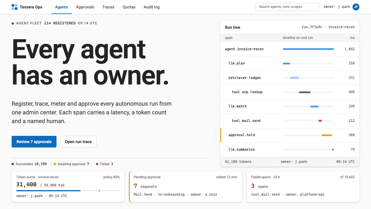 Agent Ops ConsoleGovernance as a queue. Fluent blue on grey, mono run trees, marigold for pend…
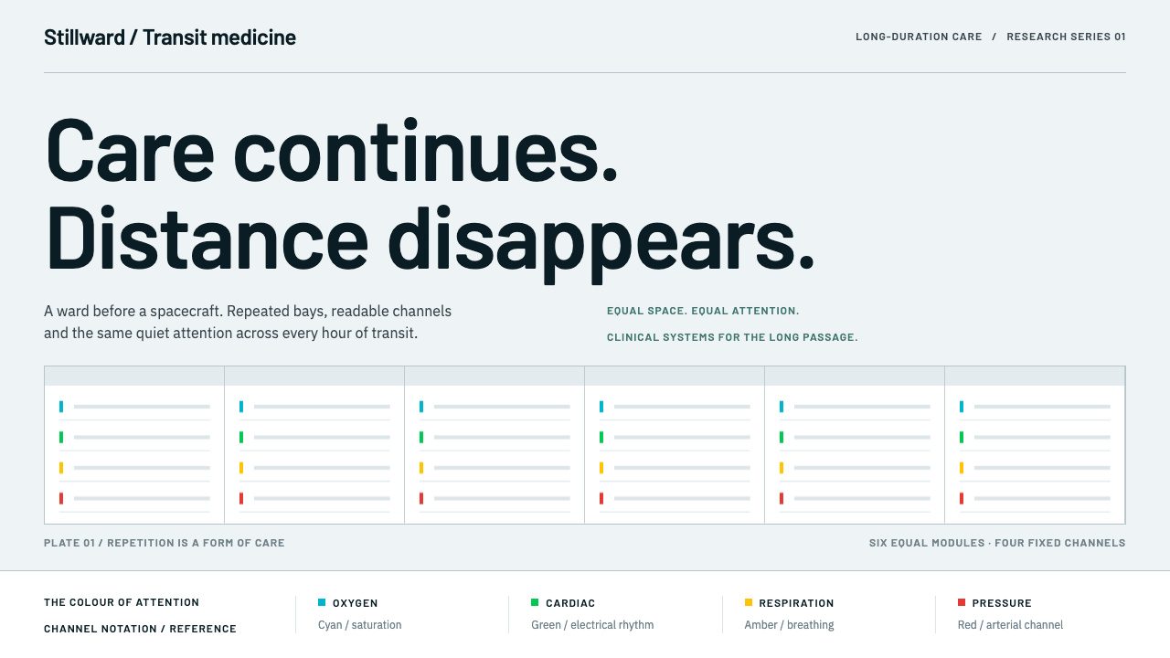 Cryosleep Transit WardCare without spectacle. Clinical white, equal bay grids and the fixed colours…
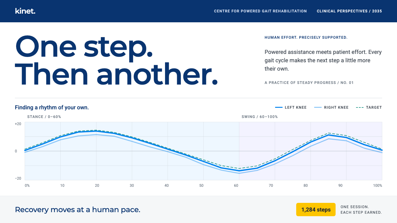 Exoskeleton Gait ClinicProgress at a human pace. Dynamic Blue torque traces and teal targets on clin…
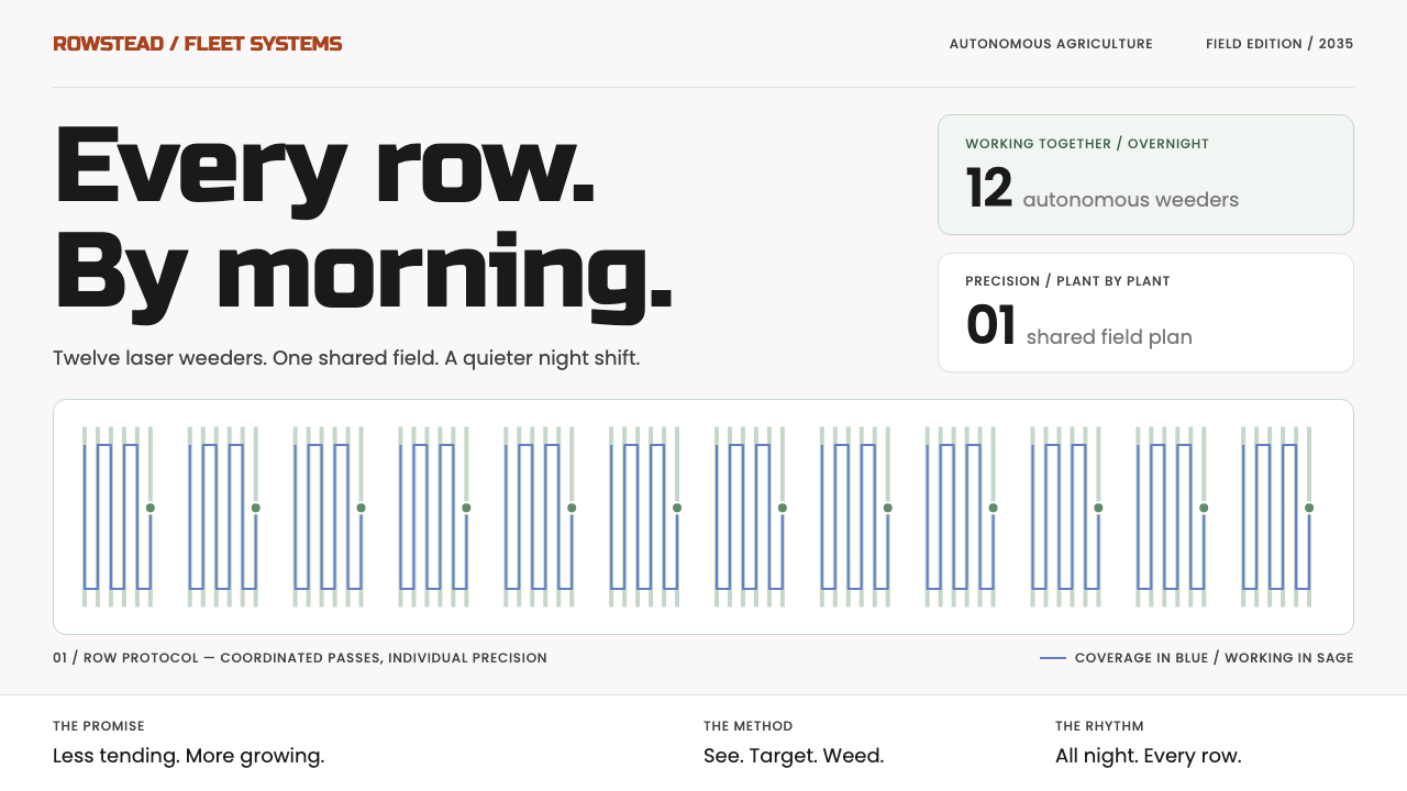 Farm Robot FleetPrecision without noise. Sage row patterns and blue routes meet plain black P…
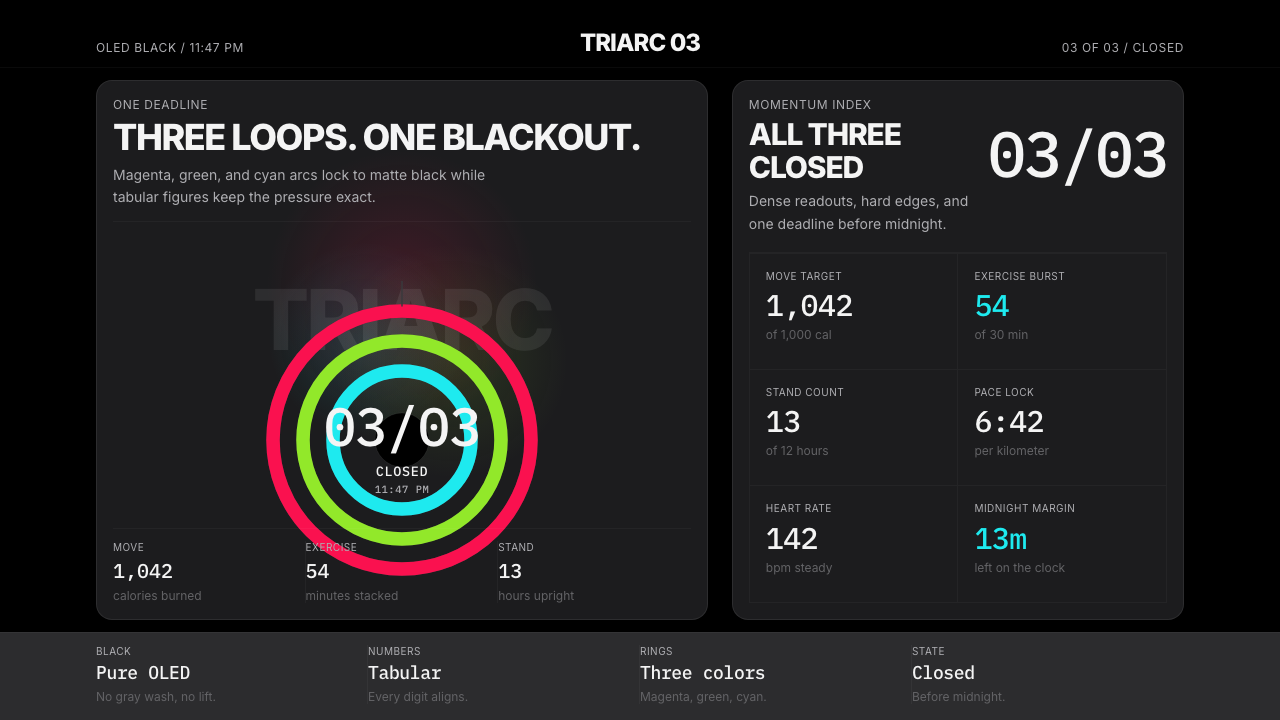 Apple Fitness Rings Closed (2024)Midnight feels exact. Magenta, green, and cyan rings lock onto OLED black.
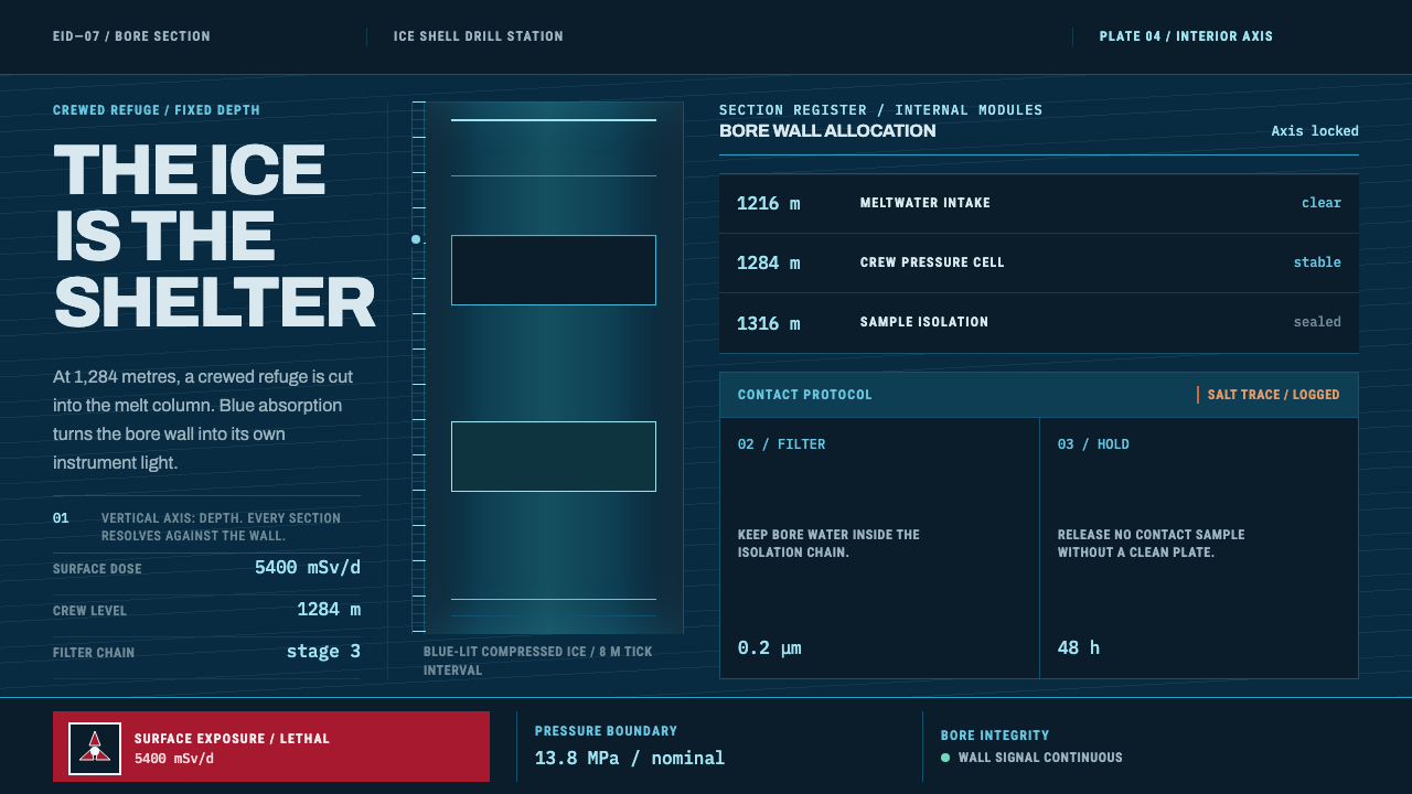 Europa Ice Drill StationShelter is a depth, not a room. Blue bore axis, hard tables, and earned radia…