What is Robotaxi Rider App?
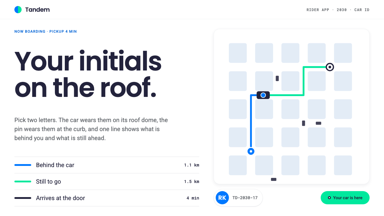
The Robotaxi Rider App imagines a ride-hailing screen for a car with nobody in the front seat: a white map, one route line that changes color at the vehicle, and a pair of initials that tells you which car is yours.
Robotaxi Rider App in brief
Robotaxi Rider App is a mobile interface language for riders of autonomous taxis. It is projected forward to a hypothetical 2030 rider app but built from the public look of today's driverless ride service, and it follows the established pattern of map-first ride-hailing: the map fills the screen, and everything else is a layer on top of it.
What sets it apart is what it leaves out. With no driver, there is no driver photo, no star rating, no tipping prompt and no small talk to design for. The interface instead concentrates on two questions a passenger actually has: where is my car, and how far along are we. A single route line answers the second, and a personalized identifier answers the first.
The aesthetic is light, calm and slightly technical. Surfaces are white, the map is pale, and the bottom of the screen carries a rounded sheet that the rider can pull up or down. Minutes and distances are set in a monospaced voice, and a pared-back view of what the vehicle perceives uses only simple boxes and lane lines. It feels like a utility more than a brand, and that is the intent.

Where does Robotaxi Rider App come from?
The lineage begins with the Google self-driving car project, which started in 2009 in Mountain View, California. Sebastian Thrun, a roboticist who had led a winning entry in an earlier government-sponsored autonomous vehicle challenge, was a central figure in launching it, and Chris Urmson played a leading technical role in the program's early years. For a long time the work was an engineering research effort, and the idea of an ordinary person ordering a driverless car from a phone belonged to the future.
That future became a public service in 2018 with Waymo One, the commercial ride-hailing offering from the company that grew out of the Google project. Leadership later passed to Tekedra Mawakana and Dmitri Dolgov, who are associated with the company's operational and technical direction. The rider app that accompanied the service had a hard design problem: it had to build trust in an experience with no human to reassure the passenger, and it had to do so on a small screen, often at a crowded curb.
The visual vocabulary was inherited from the broader world of Material Design light surfaces, with their white cards, rounded sheets and clear elevation logic. It also drew from the map-first conventions that ride-hailing apps established over the previous decade, in which a route, a pin and a moving car icon are the primary elements. The Robotaxi Rider App takes these conventions and pushes them toward their logical conclusion for a driverless future.
A third thread is autonomous-vehicle perception visualization: the practice of showing riders a simplified picture of what the car senses, such as surrounding vehicles, pedestrians and lane geometry. Showing this view reassures passengers that the car sees the same road they do. This design system keeps that view deliberately pared back, as boxes and lines, so that it informs without becoming a spectacle. The 2030 label signals that the language is a forward projection, a plausible next stage of an interface that already exists today.
What defines the Robotaxi Rider App look?
A white map as the whole stage
The screen is dominated by a pale, almost colorless map. Roads are light grey on white, parks and water are barely tinted, and labels are small and quiet. This neutrality is functional: the only strongly colored things on screen are the route and the vehicle, so the rider's eye goes straight to the information that matters. Controls float above the map rather than interrupting it.
One route line, two colors
The route is a single fairly thick line. Behind the vehicle, the distance already covered is drawn in a calm blue; ahead of it, the path still to go is drawn in a fresh green. The color changes exactly at the car, like a progress bar laid along the street. A rider can see at a glance how far along the trip is without reading any text, which is a quiet piece of trust-building.
Car ID: your initials on the roof
The rider chooses two initials, the vehicle shows them on its roof dome, and the app repeats them on a small chip, on the pickup pin and on the vehicle card. At a busy curb with many similar white cars, recognition takes a glance. The mechanism turns anonymity into personalization: the car is not a stranger's car but one that has your mark on it.
A rounded bottom sheet with stops
Details live in a rounded sheet at the bottom of the screen that snaps to three resting heights: a peek that shows the essentials, a middle state with trip details, and a full state for settings and support. The rounded top corners and soft lift from the map make the sheet feel like part of the phone rather than part of the street. It keeps the map visible while still letting information deepen on demand.
Monospaced minutes and distances
Arrival times, minutes remaining and distances are set in a monospaced face. Digits stay the same width as they tick down, so the numbers do not jitter, and the type has a faint instrument-panel quality that suits a machine-driven ride. The surrounding labels are plain sans-serif so the numbers stand out as data rather than as headlines.
Pared-back perception view
The top-down view of what the vehicle tracks is intentionally minimal: simple boxes for other vehicles and people, thin lane lines, and a highlighted path for the car itself. There are no photoreal textures or alarming warning colors. The aim is calm literacy, a picture that says the car is paying attention without turning the ride into a video game.

Who shaped Robotaxi Rider App?
Roboticist who led a prize-winning autonomous vehicle team before helping launch the Google self-driving car project in 2009. He is the figure most associated with turning academic research into a practical program, which is the origin of everything this interface assumes.
A leading technical figure in the early years of the project, associated with the engineering foundations of the perception and driving software whose output riders later see in simplified form on their phones.
A later leader of the company, associated with taking the technology from experiment to a commercial public service. Her era is the one in which the rider-facing experience, and its need to earn everyday trust, became central.
Another long-serving technical leader, associated with the autonomous driving system itself. His work stands behind the behaviours the interface must explain: when the car slows, waits or changes lane.
How do you use Robotaxi Rider App today?
For slides, the style suits mobility, logistics and urban-technology presentations. A cover can be a nearly empty pale map with a single colored route line crossing it and the title set small in a corner. Content slides work well when they borrow the bottom-sheet structure, a large visual above and a rounded panel of text rising from below. For data slides, lean on the monospaced figures: show minutes, distances or counts in a calm instrument voice, and use the blue-then-green idea to show progress, before and after, or past and future.
For web and app interfaces, the language fits any product in which something moves through space toward the user: delivery tracking, field service, shared bikes, airport transfers or fleet management. Build the screen around a pale map or a pale canvas, put the one thing that matters in a strong line or marker, and push everything else into a rounded sheet that can be dragged. Dashboards in this style should use the two route colors to express state, such as done and remaining, rather than adding a rainbow of statuses.
For editorial and marketing work, the personal identifier is the useful idea. A campaign page can show a vehicle, a parcel or a seat carrying the reader's own initials, because personalization at the moment of recognition makes an automated service feel warm. Keep illustrations flat and light, show routes as simple lines, and avoid dramatic futuristic imagery. The message is that the service is ordinary, reliable and quietly clever.
A common mistake is to turn the route line into a decorative gradient or to add more colors to it. The meaning depends on a single clean change at the vehicle, and any extra hue weakens it. Another is to bring back driver conventions such as portraits, star ratings and chat bubbles that have no purpose when nobody is driving. A third is to make the perception view dramatic with glowing outlines or alarm colors; it should reassure, not alarm. Finally, do not make the map dark and busy, because the design depends on a pale field to let the route read.

Robotaxi Rider App — FAQ
Why is there no driver information in this design?
Because there is no driver. Traditional ride-hailing interfaces spend a lot of space on a driver's photo, name, rating and tip. In a driverless service, that space is freed for what the passenger needs instead: recognizing the car, seeing progress, and feeling that the vehicle is aware of its surroundings.
Is this an official app from a robotaxi company?
No. It is a design language inspired by the public look of existing driverless ride services and projected forward to an imagined 2030 rider app. It borrows ideas such as the two-color route and personalized vehicle identifiers, but it is an independent system for designers and builders to use as a reference.
What does the blue and green route line mean?
Blue marks the distance the vehicle has already covered, and green marks the path still ahead. The color changes at the car's position, so the line works as a progress indicator laid directly on the map. It lets riders judge how long is left without reading text.
Can I use it for something other than ride-hailing?
Yes. The core pattern, a pale canvas, one meaningful line, a personal identifier and a draggable rounded sheet, translates well to delivery tracking, logistics dashboards, travel itineraries and any progress-based product. It works best where position and progress are the main story.
Why use monospaced type for numbers?
Monospaced digits keep a constant width, so counting-down minutes and changing distances do not shift the layout. The face also gives the numbers a measured, instrument-like feel that suits a machine-driven ride, and it separates data from ordinary labels at a glance.
Related design styles
 Agent Ops ConsoleGovernance as a queue. Fluent blue on grey, mono run trees, marigold for pend…
 Astro Islands Architecture 2022Warm cosmic devtools. Deep violet, magenta glow, Inter clarity, and island ge…
 Cryosleep Transit WardCare without spectacle. Clinical white, equal bay grids and the fixed colours…
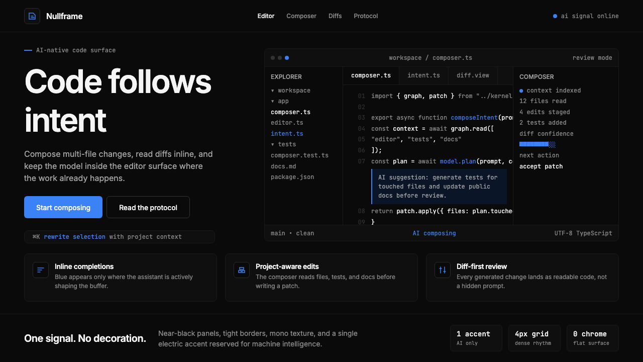 Cursor IDEAI-first code editor. Pure dark surfaces, off-white text, electric blue reser…
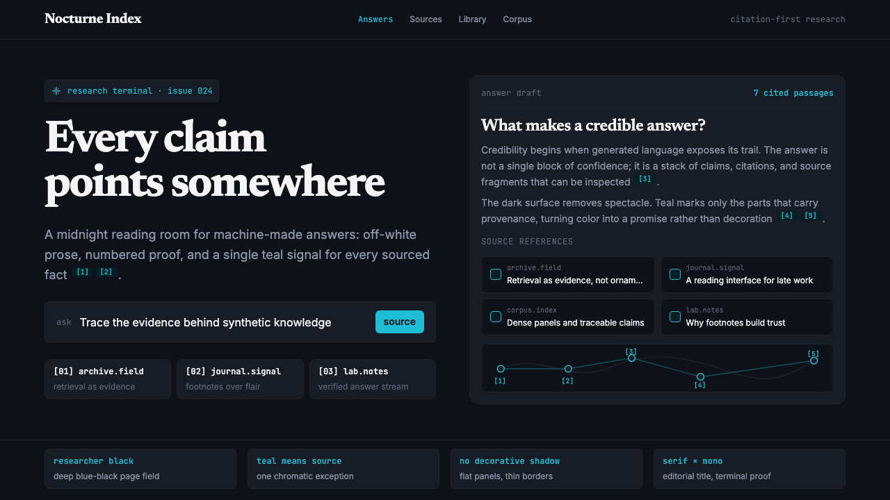 Perplexity AISerious search after midnight. Teal citations cut through black panels and de…
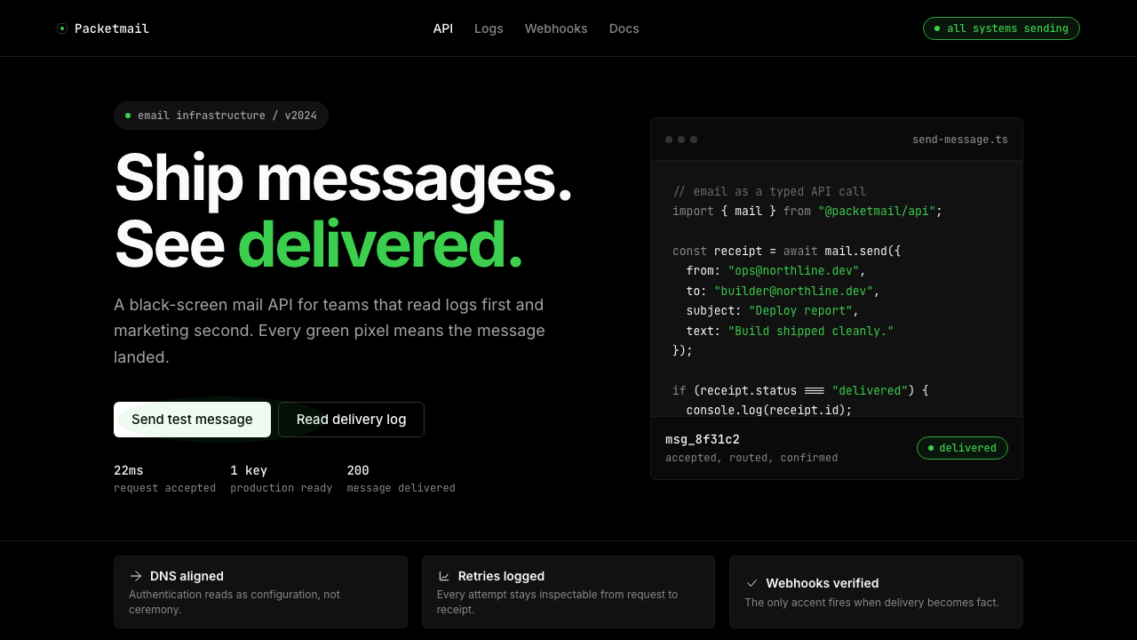 Resend 2024Clean code becomes brand. Pure black, JetBrains Mono, and one green delivered…