What is Robin Hood (Sherwood ballad)?
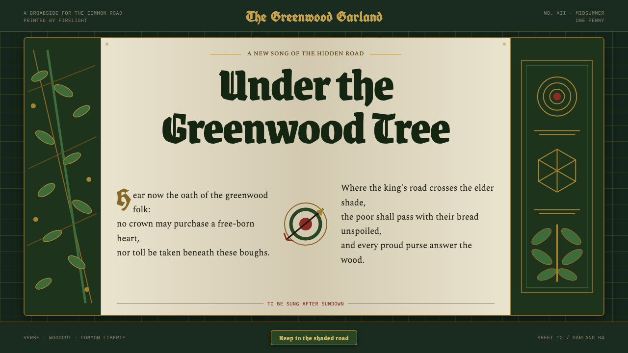
The greenwood sings in print: black-letter, Lincoln green, arrow-red, and gilt oak leaves turning a Robin Hood ballad into a page read by firelight.
Robin Hood (Sherwood ballad) in brief
Robin Hood (Sherwood ballad) is a dark, story-led design system drawn from the greenwood outlaw tale. Its visual world combines Lincoln-green cloth, arrow fletching, gilt oak-leaf heraldry, and the dense darkness of a medieval woodcut. The result is not generic medieval decoration. It should feel like a ballad made physical: a printed sheet carrying danger, fellowship, pursuit, and the shelter of the forest.
Its primary historical reference is the pre-1900 printed tradition of Robin Hood garlands: black-letter broadsides, hand-cut oak and yew borders, and the flat mineral greens associated with Kendal cloth. These references establish a clear hierarchy. The page begins in the shadowed forest at its edges, opens into a parchment-like clearing for words and story, then takes direction from the hard diagonal of an arrow.
The style is richly framed but never soft. Foliage should appear pressed, cut, or printed rather than naturally painted; gold should read as a heraldic accent rather than a luxury finish; and the central field should preserve enough calm for a ballad to be read aloud. It is a visual language of enclosed wilderness, where the king’s road passes close to the outlaw’s trees.
Where does Robin Hood (Sherwood ballad) come from?
The style belongs to the English Robin Hood ballad tradition, which spans the fourteenth through seventeenth centuries and is rooted in Sherwood Forest, Nottinghamshire. In this tradition, the outlaw tale was not a distant literary relic. It was a story carried through verse, repetition, performance, and affordable printed matter. That oral-and-printed character matters to the design system: words are expected to carry rhythm, borders act as a stage, and each page should feel ready to be voiced.
Printed garlands and later revivals, dated here from 1765 to 1888, supplied its most immediate graphic vocabulary. Broadside ballad printing lends the style its commanding black-letter presence and its sense of a page made to be seen from a distance. Hand-cut borders of oak and yew turn the margin into a living woodland enclosure, while the central open field recalls the practical need for a ballad’s verses to remain legible.
The visual language also draws from Victorian medieval-revival illustration and Arts and Crafts book design. These movements make room for crafted borders, deliberate page construction, and an image-text relationship in which ornament supports narrative rather than merely filling empty space. The design should therefore retain the force of a printed broadside while giving its foliage, heraldry, and lettering the considered presence of a made book.
Joseph Ritson, Thomas Percy, Howard Pyle, and Louis Rhead are the named figures associated with this lineage. Together, they locate the style between ballad preservation, revival, illustration, and book design. Their presence is useful less as a demand to imitate a single artifact than as a reminder that Robin Hood has repeatedly been carried forward through printed interpretation: old material re-formed for a new reader without leaving the greenwood behind.
What defines the Robin Hood (Sherwood ballad) look?
Forest Dark and Parchment Clearing
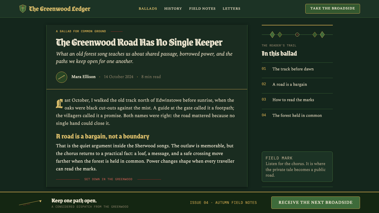
The composition begins with deep forest darkness, especially around its perimeter. Foliage, shadow, and carved border matter accumulate at the edges, making the centre feel protected rather than empty. Against this enclosure, a parchment-like clearing receives the title, verse, or principal image. The contrast is narrative: one reads from safety while the wood remains close.
Lincoln Green and Arrow Red
Lincoln green is the governing color: mineral, cloth-like, and flat rather than luminous or synthetic. It belongs to the greenwood and should establish atmosphere before it calls attention to itself. Arrow-red is sharper and rarer, used where direction, action, or a sudden break in the woodland calm is needed. Gilt accents provide heraldic distinction, but neither red nor gold should overwhelm the green-black world.
Black-Letter Voice
Black-letter gives the system its audible visual voice. It is most effective in titles, invocations, names, and short declarations, where its compressed rhythm can feel like a public ballad opening. It should not turn every sentence into a dense historical imitation. Supporting text needs a clearer, quieter companion so that the page keeps the tension between proclamation and storytelling.
Cut Woodland Borders
Oak and yew borders should read as hand-cut printed matter. Leaves, branches, and small heraldic turns are dense enough to create a woodland threshold, but their forms remain flat and graphic. The border is not a detached frame placed around content after the fact. It is part of the page’s geography, narrowing and opening like a path through trees.
Arrow Diagonal
The straight diagonal of a loosed arrow is the style’s decisive motion. It cuts through foliage, parchment, and heraldic stillness with a line that is clean rather than ornamental. Use it to connect a title to a scene, break a field of text, or establish a reading path across a composition. Its force comes from restraint: one clear trajectory says more than many decorative slashes.
Gilt Heraldry
Gilt oak-leaf heraldry introduces ceremony into an otherwise rough printed world. It works best as a crest, initial, rule, seal-like detail, or controlled highlight among darker materials. Gold should feel pressed onto the page, not poured across it. Its role is to mark allegiance, memory, or a moment of ballad importance, giving the outlaw world a symbolic order without making it courtly.
Printed Flatness
Everything should appear made for print: mineral color laid in fields, foliage cut into silhouettes, and depth implied by overlap rather than atmospheric illusion. The style gains authority from this flatness. It recalls a broadside or chapbook whose limitations became expressive tools, allowing the page to feel old, immediate, and forceful without becoming a theatrical simulation of the past.

Who shaped Robin Hood (Sherwood ballad)?
Ritson is a key figure in the style’s ballad-preservation lineage. His association anchors the system in the printed and collected Robin Hood tradition, where the tale survives through words made available to readers. In a design context, that legacy argues for treating verse, titles, and names as central material rather than as captions added beneath imagery.
Percy belongs to the same revival-facing ballad lineage. His presence reinforces the idea that old verse can be preserved, selected, and given renewed public life through publication. For this visual system, that means a page should maintain the dignity of a literary artifact even when it is used for contemporary editorial, promotional, or interface work.
Pyle is associated with the later illustrated revival of the Robin Hood world. Within this design language, his role points toward narrative image-making: the forest is not scenery alone, but a dramatic setting that gives figures, emblems, and action their meaning. Illustration should therefore support the ballad’s movement and atmosphere rather than function as neutral decoration.
Rhead connects the theme to illustrated book-making and the broader crafted-page values of Arts and Crafts design. His association supports the system’s attention to border, lettering, and the page as a complete object. A successful Sherwood ballad layout should feel composed as a whole, with image, text, and ornament sharing one printed terrain.
How do you use Robin Hood (Sherwood ballad) today?
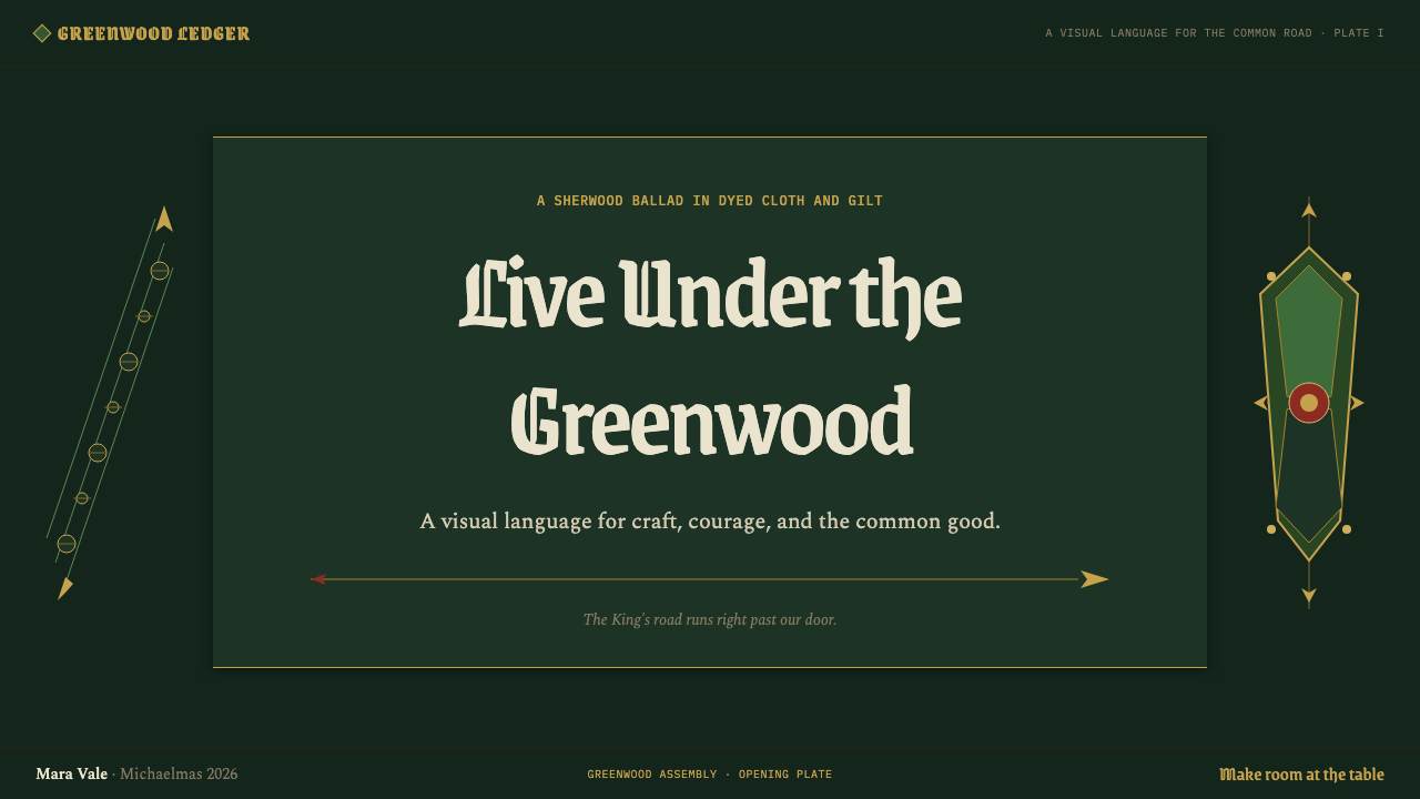
For presentation covers, treat the page as a ballad frontispiece. Let the dark greenwood gather around a parchment-like title field, introduce black-letter only where the title needs ceremonial force, and place one arrow diagonal or heraldic device as the main act of movement. Content slides should become quieter printed pages: retain the woodland border in a reduced role, give verses or explanatory copy a generous clear field, and use headings to preserve the voice of the tale.
Data slides can use the system without turning information into scenery. Keep charts and comparison structures plain, then use Lincoln green as the atmospheric foundation and arrow-red only for a decisive point of contrast. Gilt can identify a key total or a selected category, while the border should stay peripheral. The purpose is to make information feel like part of a printed chronicle, not to force every mark into a leaf or crest.
For web interfaces, the style is strongest in story libraries, cultural projects, membership pages, collections, and editorial dashboards that benefit from a sense of place. A dark forest frame can establish navigation and atmosphere, while a parchment-like central panel protects readability. In dashboards and pricing pages, use heraldic dividers and green-black grouping to distinguish sections, but keep controls, comparisons, and task states unmistakably clear.
For editorial and marketing work, use the system’s broadside character to make announcements feel collectible. A long-form article can open with a dense oak-and-yew margin before relaxing into an uncluttered reading measure. A campaign page can use one strong ballad title, a gilt seal-like callout, and repeated arrow motifs to guide attention through the story. The key is continuity: every detail should appear to belong to the same forest and printed sheet.
The common mistake is to treat the style as a pile of medieval symbols. Too many leaves, crests, gold effects, distressed surfaces, and black-letter passages make the work illegible and costume-like. Preserve the clearing at the centre, choose one principal directional gesture, and let ornament occupy the margins. The style succeeds when the reader senses the forest’s density without being lost in it.
Robin Hood (Sherwood ballad) — FAQ
Is Robin Hood (Sherwood ballad) simply a medieval style?
No. Its references are specific: the English Robin Hood ballad tradition, pre-1900 printed garlands, black-letter broadsides, oak and yew borders, Kendal-like mineral green, Victorian medieval-revival illustration, and Arts and Crafts book design. Generic castle imagery, polished fantasy armor, or courtly luxury can move the work away from its printed greenwood character.
How should black-letter be used without harming readability?
Give it a ceremonial role. It is effective for a title, a named section, an opening declaration, or a brief line of verse because it establishes the ballad voice immediately. Let supporting copy remain quieter and more open. The contrast is essential: black-letter announces the tale, while the companion text allows the tale to be read.
Can the style work for a modern dashboard or pricing page?
Yes, if the historical language supplies atmosphere and hierarchy rather than obstructing tasks. Use the dark greenwood and parchment clearing to separate regions, reserve gilt or arrow-red for meaningful emphasis, and keep comparisons direct. The interface should borrow the page’s sense of enclosure and printed order, not reproduce every ornamental feature inside every control.
Why is the central clearing so important?
Because the style is based on ballads and printed pages, not on an uninterrupted forest scene. The dense margin creates atmosphere precisely so the centre can carry verse, title, evidence, or action. Without that clearing, foliage becomes visual noise and the design loses the practical generosity that makes a chapbook-like page inviting to read.
What separates a successful use from a fantasy pastiche?
A successful use is governed by the logic of print and ballad: flat mineral color, cut borders, a readable central field, and a small number of meaningful heraldic or directional accents. A pastiche adds historical-looking motifs without that order. If ornament does not frame a story, guide the eye, or reinforce the greenwood setting, it is probably excess.
Related design styles
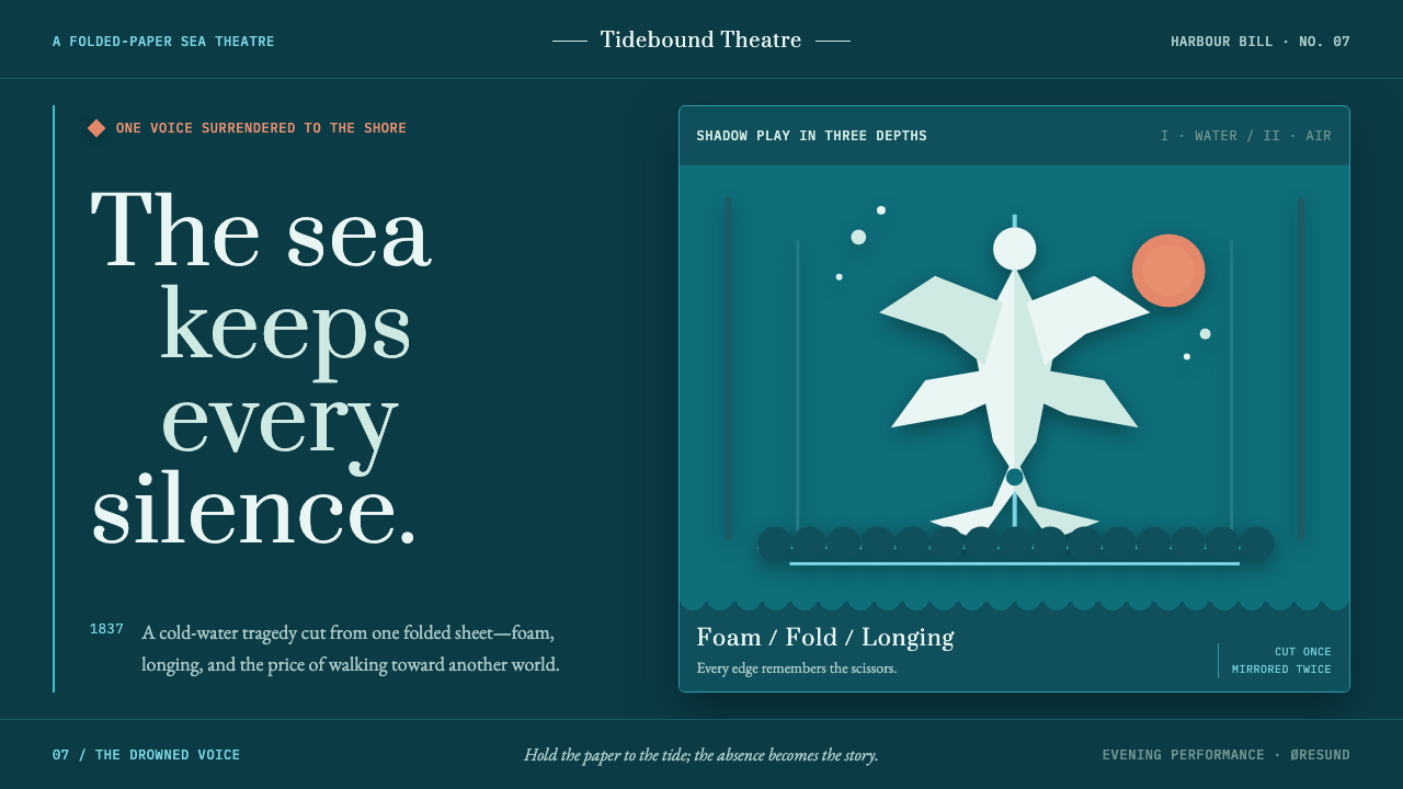 The Little Mermaid (Andersen, 1837)Cold longing, cut clean. Foam-white silhouettes drift on harbour teal with on…
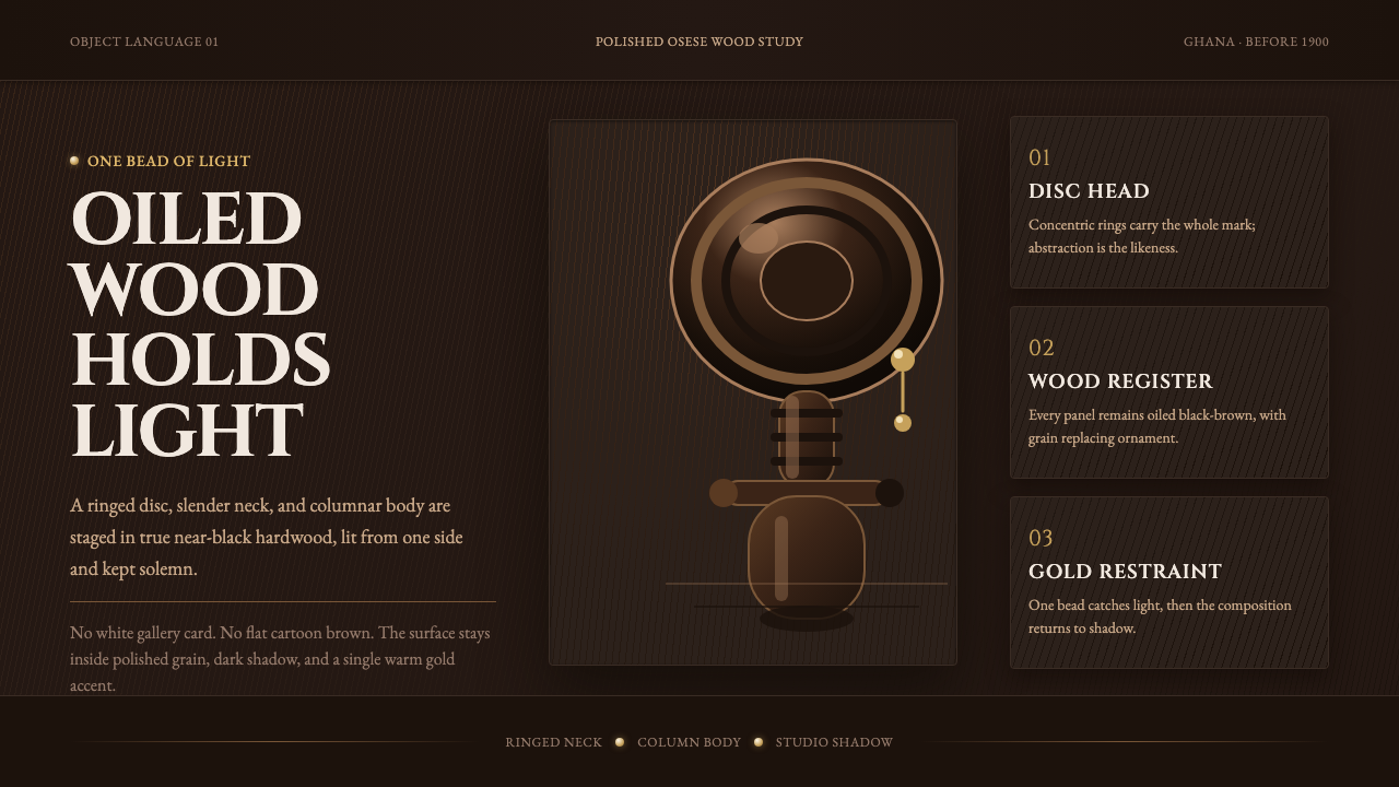 Akuaba Akan Fertility DollDarkness becomes sculpture. Near-black wood, ringed geometry, and one gold be…
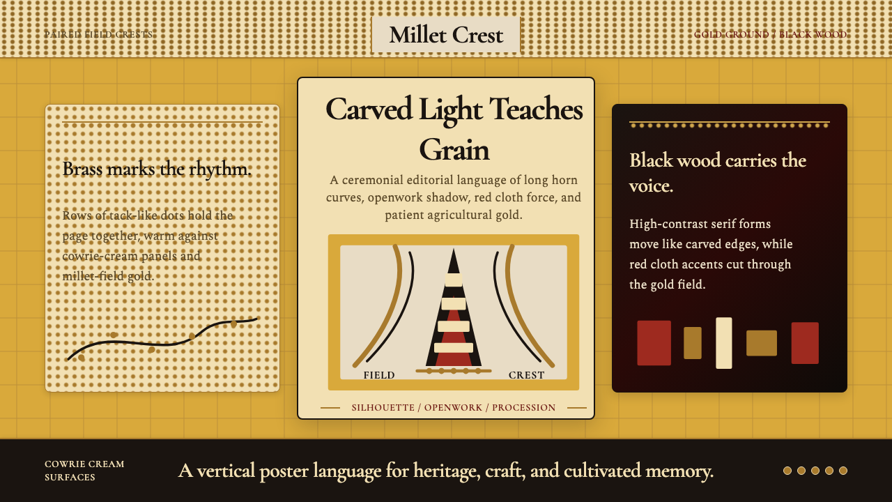 Bambara Chi Wara AntelopeCarved memory in gold. Black serif silhouettes and brass-dot borders carry th…
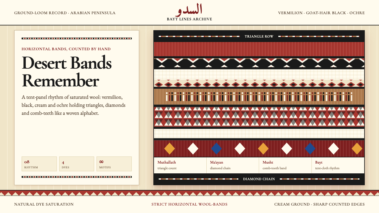 Bedouin Desert Textile (Sadu)Woven memory, not ornament. Vermilion-black bands count triangles and diamond…
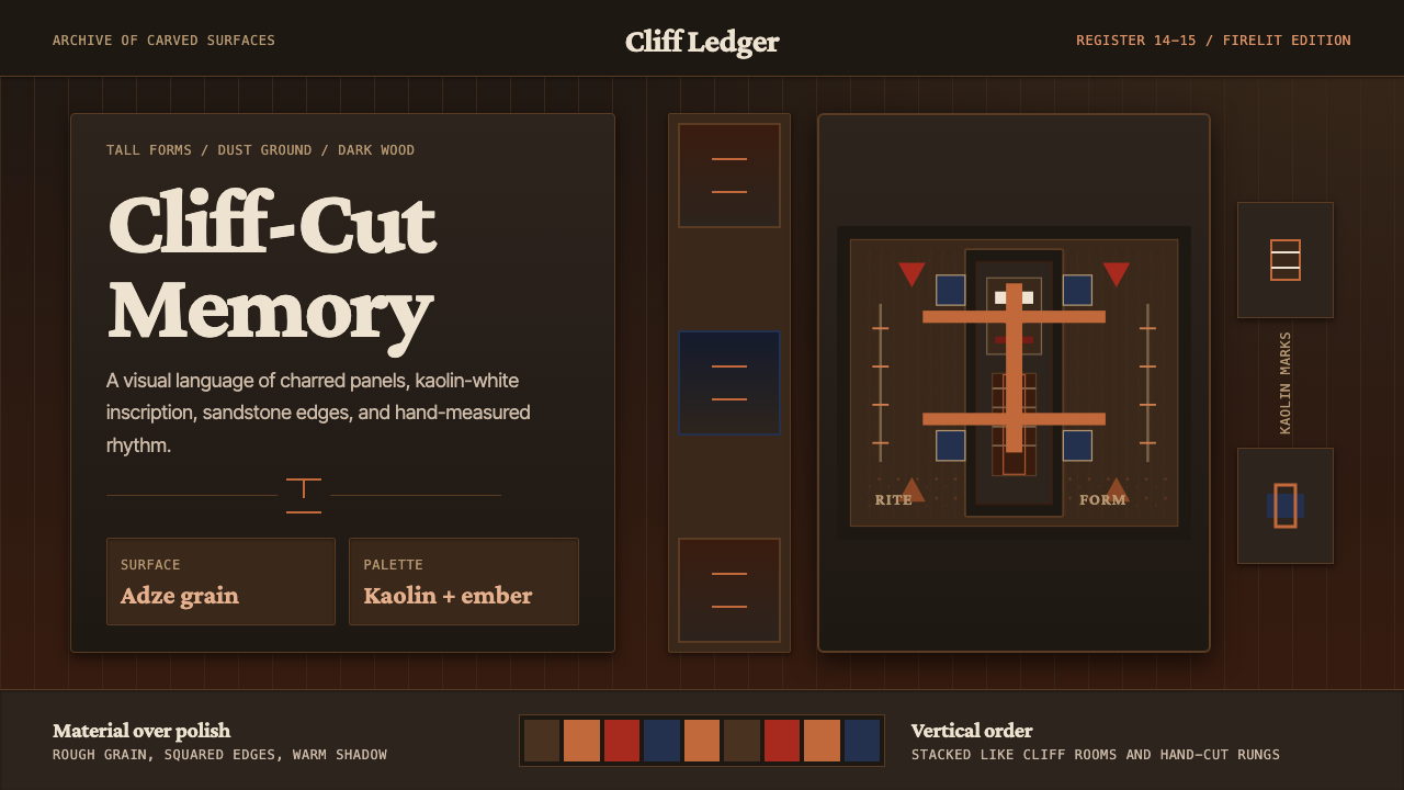 Dogon Bandiagara Cliff MaskHand-hewn gravity. Charred wood, kaolin type, and sandstone geometry stack li…
 Egyptian Coptic TextileWarmth woven flat. Madder, indigo and saffron medallions sit on linen cream.