What is Robert Ryman White Painting?
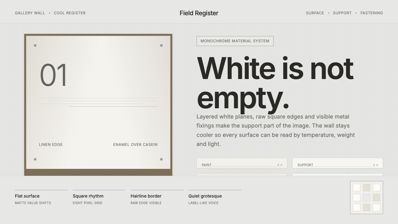
Robert Ryman made white an active material: a field where paint, support, edge, and fastening can all remain visible.
Robert Ryman White Painting in brief
Robert Ryman White Painting is a visual language drawn from Ryman’s sustained investigation of white as material rather than image. The square is not a neutral container for a scene, symbol, or story. It is a site where paint can gather, thin out, catch light, and reveal the character of the surface beneath it. Oil, enamel, and casein are treated as distinct presences, not interchangeable coatings.
The work refuses the usual expectation that white should disappear into a background. White becomes the subject because it is layered, edged, mounted, and set against a cooler, greyer wall. The contrast is quiet but deliberate: the wall recedes just enough for the painted surface to register as a separate physical thing. Difference comes through temperature, density, and material behavior rather than through color contrast.
As an interface language, this approach produces a restrained gallery-like atmosphere. Surfaces are built from subtly different whites rather than one undifferentiated blank field. Raw edges, seams, attachment points, and structural divisions can remain visible. The result is not decorative minimalism. It is an insistence that a surface should acknowledge how it is made, held, and placed.
Where does Robert Ryman White Painting come from?
The source of this system is Robert Ryman’s career-long concentration on white painting in New York. His mature work, especially from the 1960s onward, treated the white square as an investigation rather than a picture. Instead of asking what an image represents, the work asks what paint does, what support carries it, and how a painted object occupies a wall.
Ryman worked across oil, enamel, and casein, allowing each material to affect the character of the white field. He also used canvas, linen, steel, and aluminium as supports. These choices matter because the painting is never presented as a disembodied image. Its material basis remains part of what the viewer sees, whether through the surface, the edge, or the relation between the painted area and its support.
Raw square-support edges and visible metal fasteners are central to the language. Rather than concealing the devices that attach a work to the wall, Ryman leaves them frank and legible. The fastening is not an embarrassing technical remainder outside the artwork; it participates in the work’s physical presence. Wall, support, paint, and hardware become parts of one visible arrangement.
The resulting position connects with Minimalism, monochrome painting, and process or materialist abstraction. Yet the useful lesson for contemporary design is not simply to make everything white or sparse. It is to let construction remain perceptible. A cool grey wall, a layered white surface, an unhidden edge, and a metal attachment can establish hierarchy without importing a separate decorative vocabulary.
What defines the Robert Ryman White Painting look?
White as Material
White is not empty space and not a default background. It is built up through distinct painted layers whose differences are sensed through density, surface, and temperature. The eye is invited to notice white against white rather than to seek a colored focal point.
Cool Gallery Ground
The surrounding field is cooler and greyer than the principal white surfaces. This small separation lets white read as figure rather than vanish into its setting. The ground should feel like a wall that receives an object, not a decorative backdrop competing for attention.
Layered Surface
Depth comes from accumulation, not illusion. Oil, enamel, and casein suggest a surface assembled through material decisions. In a digital interpretation, overlapping whites, restrained seams, and clearly separated planes can carry that same sense of gradual construction.
Raw Edges
The square support is allowed to retain its edge. A boundary does not need to be polished into invisibility before it can look resolved. Visible edges establish the surface as an object with limits, thickness, and a relationship to the wall around it.
Exposed Hardware
Metal fasteners remain visible rather than being hidden behind a clean facade. Their presence makes attachment legible and turns support into part of the composition. Hardware should read as factual, cool, and precise, not as an ornamental industrial gesture.
No Color Register
Nothing is colored in the usual expressive sense. Hierarchy is carried by white, off-white, cool grey, material contrast, and the occasional metal element. This discipline makes subtle variation meaningful because no bright accent is available to solve attention by force.

Who shaped Robert Ryman White Painting?
Robert Ryman is the sole named figure behind this language. His career-long focus on white painting establishes its central proposition: the white square can be a field for examining paint, support, and fastening rather than a vehicle for pictorial imagery.
Ryman’s use of oil, enamel, and casein, on canvas, linen, steel, and aluminium, gives the system its material vocabulary. White is not singular because each medium and support changes how the surface gathers, reflects, or holds the painted layer.
Ryman’s visible raw edges and metal fasteners define the system’s ethic of exposure. The painting acknowledges its wall and its means of attachment. For designers, this is the most transferable principle: construction may remain visible when it clarifies the object’s presence.
How do you use Robert Ryman White Painting today?
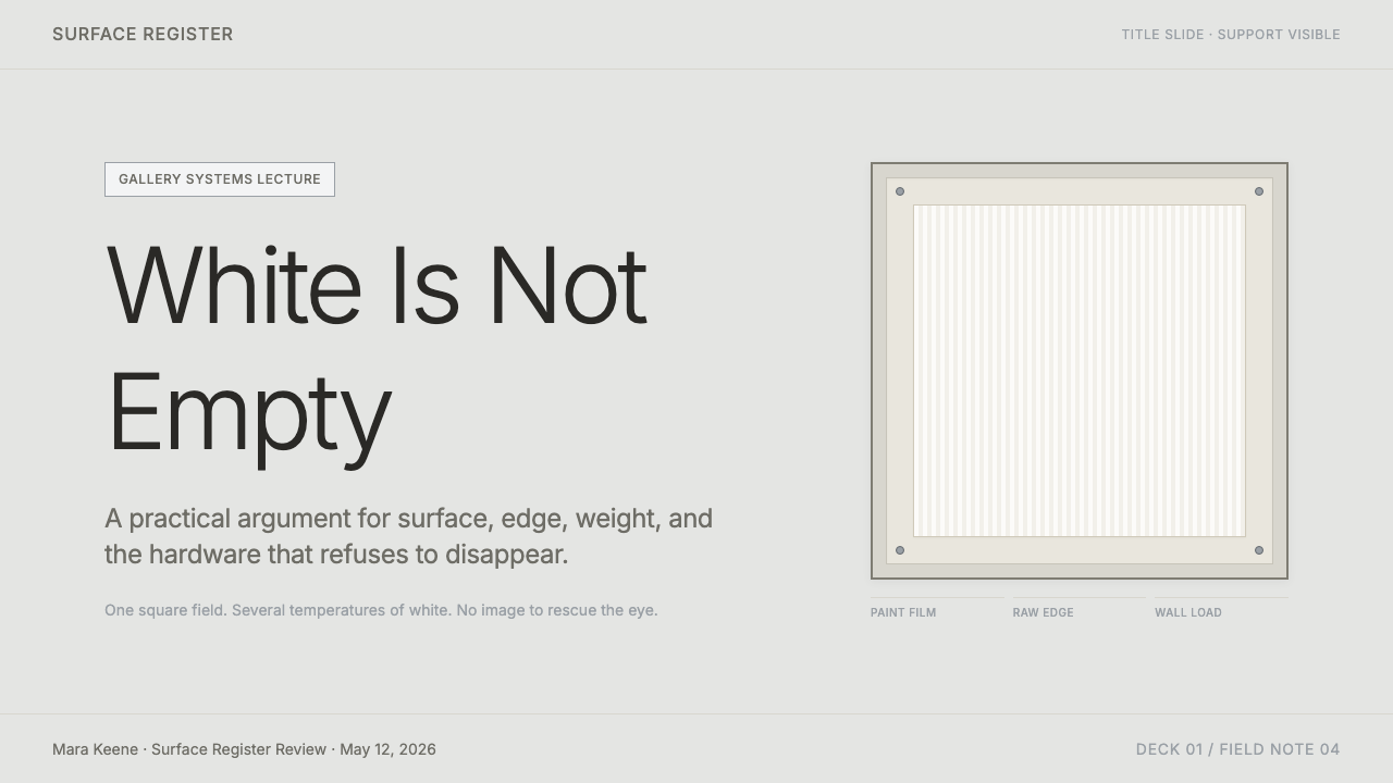
For presentation covers, use the cool gallery ground as the setting and let one layered white panel act as the central object. The title should feel placed on or beside that object, not floated over an atmospheric background. A thin raw-looking boundary or a small exposed attachment can establish the visual premise before any explanatory content appears.
For content and data slides, organize information as separate white supports against the cooler field. Let headings, notes, tables, and diagrams occupy distinct planes so that reading order comes from placement and surface difference. Data should remain sober and legible; the style is strongest when it makes the chart or table feel mounted and examined rather than decorated.
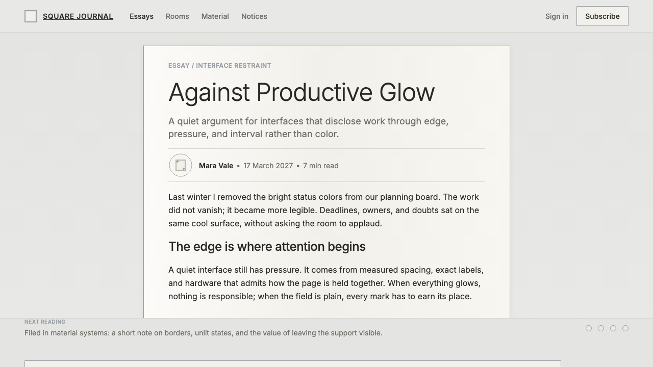
For web interfaces, this language suits dashboards, archives, collection tools, and pricing pages where calm scrutiny matters. Panels can appear as white objects on a slightly cooler ground, with visible divisions and attachment-like details used sparingly to explain structure. Controls should feel materially located within a surface rather than dissolved into a seamless field.
For editorial and marketing work, the system supports product stories, portfolios, exhibition pages, and long-form writing that benefit from a sense of care and material attention. Give images, quotations, captions, and text blocks their own white fields. The page should resemble an arrangement of works on a wall, with enough separation for each item to retain its edge and presence.
The common mistake is to equate this style with blankness. A pure white interface without layered distinctions, cooler context, raw edges, or visible construction loses the central idea. Another mistake is adding color to create energy. The system depends on holding attention through material variation, not through a bright accent that overrides every subtle relationship.
Robert Ryman White Painting — FAQ
Is this simply a white minimalist style?
No. Minimal reduction is part of the result, but the decisive idea is material investigation. White must remain differentiated through layers, support, edge, wall temperature, and fastening. If every white surface is flattened into the same neutral field, the style becomes generic rather than Ryman-derived.
Why is the background cooler and greyer than the white surface?
The cooler gallery-wall ground gives the white surface enough contrast to read as an object. The distinction should stay quiet. Its purpose is not to create a dramatic color field, but to let the layered whites, raw edges, and fasteners emerge with greater clarity.
Should metal fasteners always be visible?
They should be visible when they truthfully explain how a surface is held, mounted, or divided. In the source language, exposed fasteners make the attachment relationship legible. Used without a structural reason, however, they become a decorative imitation of hardware rather than an expression of material honesty.
Can photography or illustration be used with this system?
It can, provided imagery is treated as a mounted surface within the same material order. Give it a distinct white support, a clear edge, and room against the cool ground. The image should not dissolve the interface into a colorful scene; it should remain one object among paint-like fields, text, and visible structure.
What most often breaks the effect?
The effect breaks when white is treated as absence rather than material. Uniform blank panels, hidden construction, and added color all remove the quiet evidence that makes the system work. Preserve subtle white-on-white difference, the cooler wall relationship, and only those exposed details that clarify how the surface exists.
Related design styles
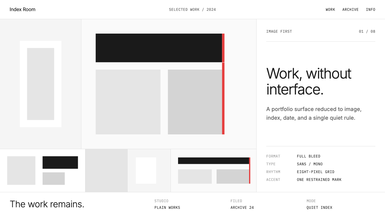 Cargo Collective PortfolioInterface disappears. White space, full-bleed blocks, mono metadata and hairl…
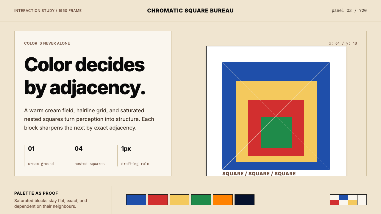 Josef Albers — Homage to the SquareColor becomes event. Warm cream, cobalt-red-yellow nested squares, exact hair…
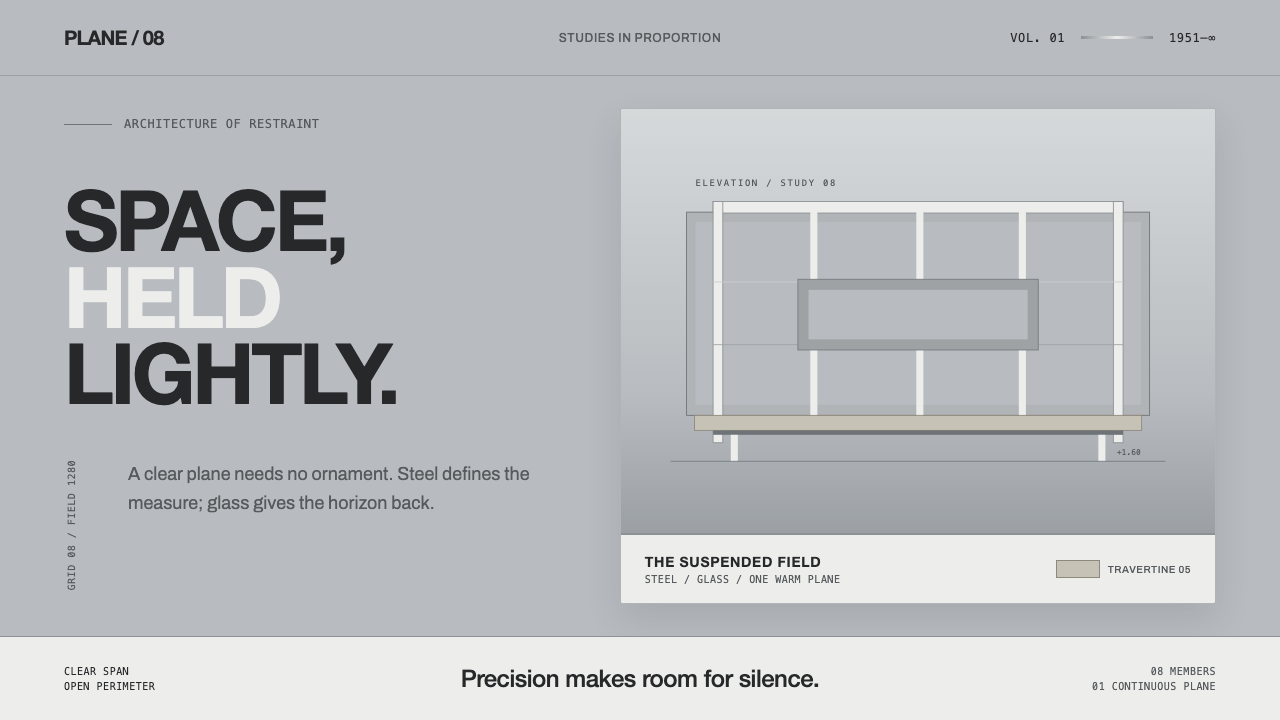 Farnsworth HouseWeightless by precision. White steel planes float across reflective gray with…
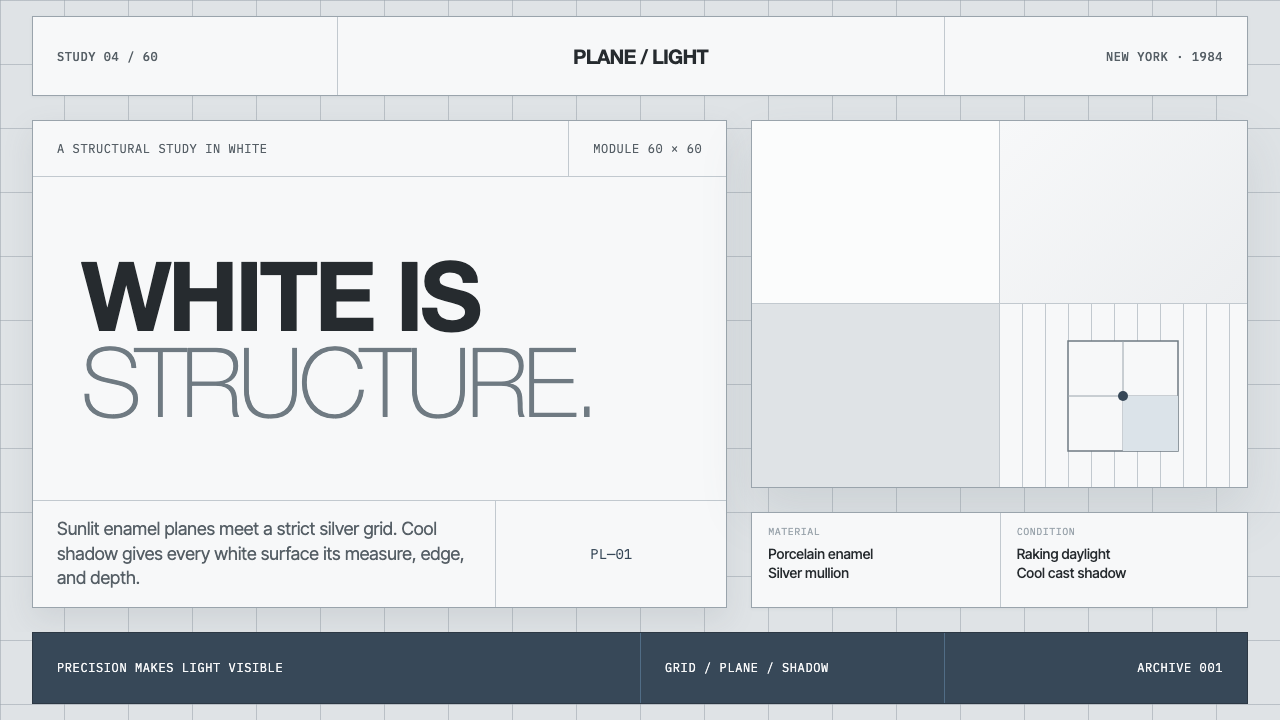 Richard Meier White ArchitectureWhite becomes structure. Cool enamel planes emerge through silver grids and b…
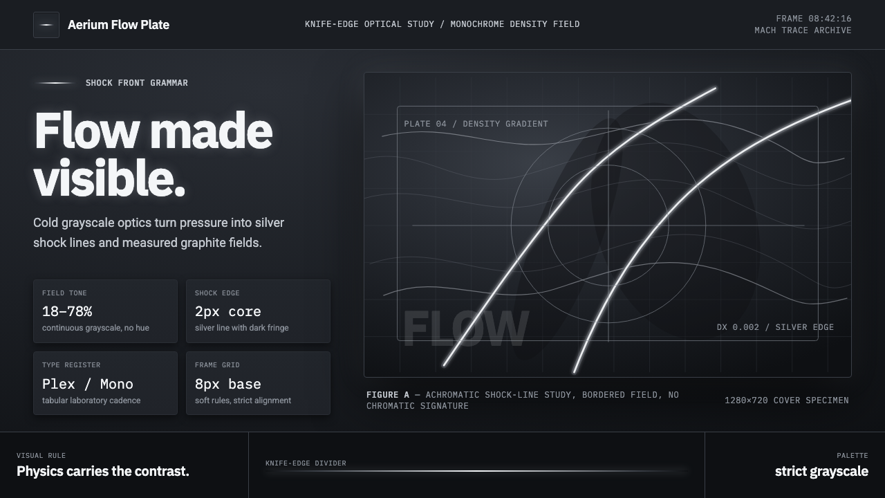 Schlieren ShadowgraphInvisible air becomes silver. Cool grayscale fields cut by precise shock line…
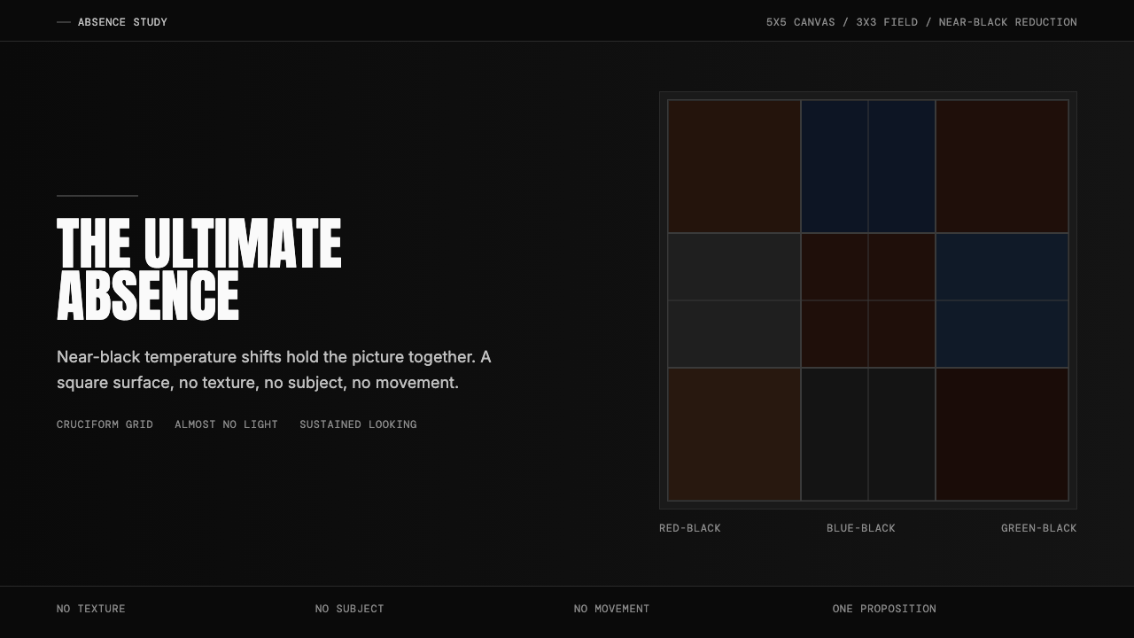 Ad Reinhardt Black Painting (1953)Austere absence. Near-black grid shifts reveal structure on sustained looking.