What is Rio Carnival Neon Feathers?
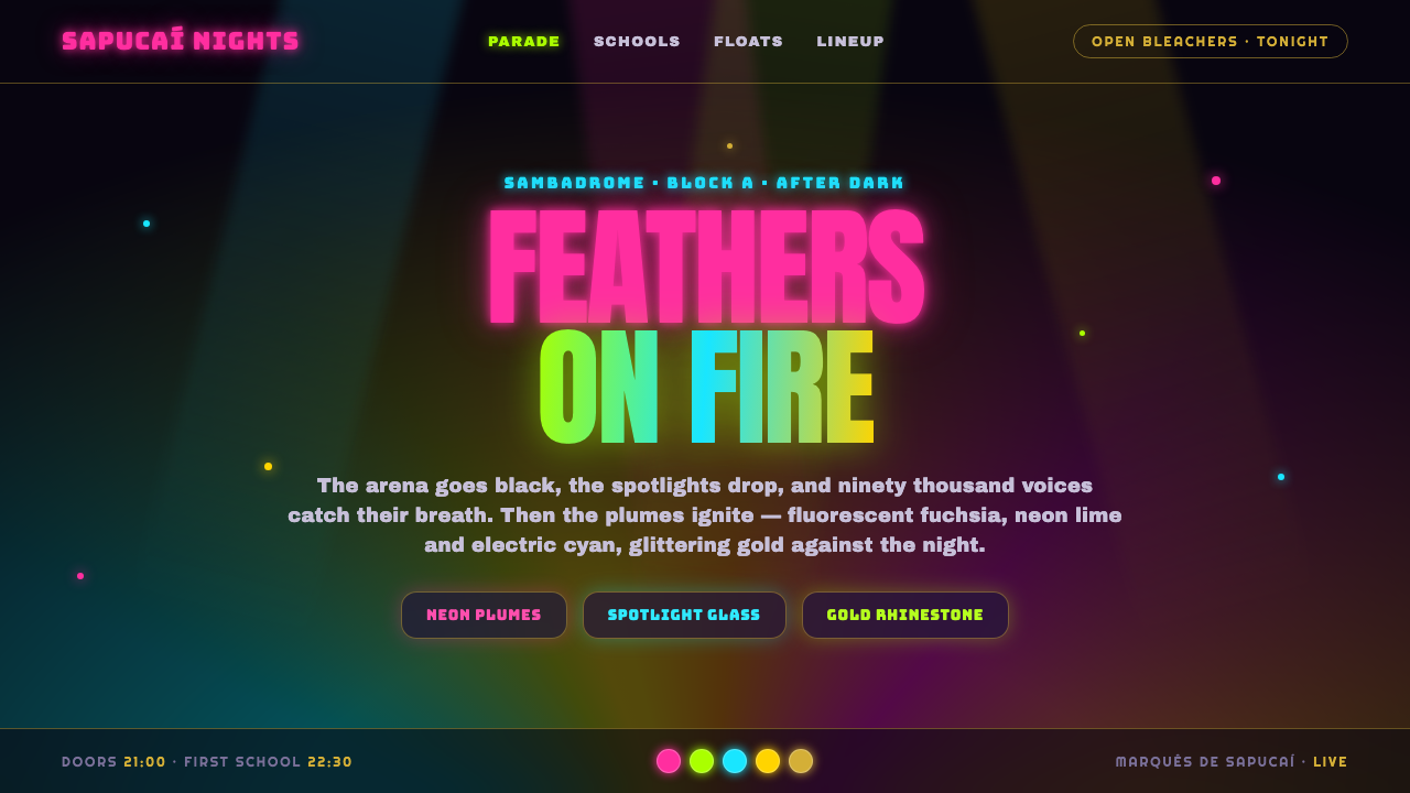
Rio Carnival Neon Feathers turns the Sambadrome after dark into a digital spectacle of night-black space, fluorescent plumes, rhinestone brilliance, and gold that seems to catch every parade spotlight.
Rio Carnival Neon Feathers in brief
Rio Carnival Neon Feathers is a dark, maximalist design language inspired by the Sambadrome at night in Rio de Janeiro. Its foundation is a near-black ground, recalling the unlit arena behind the parade, while fluorescent green, fuchsia pink, lemon yellow, cyan, and glittering gold recreate the visual force of samba-school costumes under concentrated spotlights.
The style is not merely colorful. It depends on contrast, accumulation, and theatrical reveal. Electric accents should appear to blaze out of darkness, while feathers, sequins, rhinestones, and metallic surfaces suggest motion even when rendered in a still interface. The result is festive rather than polished, abundant rather than restrained, and intentionally larger than ordinary digital utility.
Its visual logic comes from parade pageantry: every element competes for attention, yet the spectacle remains legible through strong grouping and dramatic focal points. Black provides the stage, neon supplies the shout, and gold adds ceremonial richness. The system works when the interface feels illuminated from within, not when bright colors are scattered evenly across a neutral layout.
Where does Rio Carnival Neon Feathers come from?
The source is the modern Brazilian Carnival tradition associated with Rio de Janeiro, especially the samba-school parade pageantry that developed across the latter half of the twentieth century. The relevant era is 1950–1990, when the parade became a highly organized public spectacle whose costumes, movement, music, and visual scale transformed the city’s carnival identity.
The Marquês de Sapucaí venue, commonly known as the Sambadrome, opened in 1984 and gave this tradition a permanent architectural stage. It is a vast parade arena where samba schools present elaborately coordinated visual worlds beneath the night sky. For this design style, the important impression is not architectural documentation but the relationship between darkness, procession, spotlight, and costume.
Rio samba schools are central cultural figures in the source tradition. Their parade presentations turn collective identity into visual pageantry, while carnavalesco costume designers shape the themes, silhouettes, colors, and materials that become visible from the arena. Feathers, sequins, rhinestones, neon surfaces, and glittering gold belong to a world designed to read with force across a large, dark space.
Rio Carnival Neon Feathers distills that spectacle rather than reproducing it literally. It takes the Brazilian Carnival movement, samba-school parade pageantry, and festive spectacle design as its foundation, then translates them into an interface language of near-black fields, electric accents, luminous edges, and metallic suggestion. The historical reference matters because the style’s intensity comes from celebration and collective performance, not from generic nightlife imagery.
What defines the Rio Carnival Neon Feathers look?
Night-Black Ground
The background is nearly black, dense enough to feel like the Sambadrome after sunset. It should act as a stage rather than a flat neutral. Dark space gives every fluorescent accent room to flare and makes the interface feel illuminated by parade lights.
Fluorescent Color
Electric cyan, neon green, fuchsia pink, and lemon yellow form the active palette. These colors are not background decoration; they signal energy, movement, emphasis, and celebration. A composition usually benefits from one dominant neon family with the others appearing as deliberate flashes.
Gold Shimmer
Gold supplies ceremony and material richness. It should feel reflective, glittering, or lightly illuminated rather than simply flat yellow. Gold works best around titles, borders, badges, or moments of reward, where it can distinguish the exceptional from the merely active.
Feathered Motion
Forms should imply plume, sweep, and rotation. Curved silhouettes, layered marks, radiating accents, and irregular edges can suggest feathers without turning the interface into literal costume illustration. Movement is expressed through direction and overlap, not through clutter.
Reflective Surface
Panels and containers may carry a glass-like or lacquered impression, especially when bordered with gold or edged by neon light. The surface should remain dark and translucent in spirit, with highlights that suggest reflected stage light rather than a generic glossy interface treatment.
Festive Maximalism
Abundance is part of the identity. The system welcomes layered accents, luminous details, dramatic badges, and expressive focal graphics, provided that they are grouped into a clear hierarchy. Emptiness can still appear, but it should feel like a pause in a parade, not an argument for minimalism.
Spotlight Hierarchy
Hierarchy should behave like a lighting cue. The most important message receives the brightest contrast or most concentrated color, while supporting information recedes into quieter tones and darker surfaces. Every luminous element should have a reason to be on stage.
Who shaped Rio Carnival Neon Feathers?
Rio samba schools are the collective cultural force behind the parade tradition that inspires this system. Their presentations transform shared identity into coordinated spectacle, using costume, color, movement, and scale to communicate across a dark arena. The design language borrows that collective intensity rather than treating carnival as an individual decorative theme.
Carnavalesco costume designers give the parade its visible vocabulary. They shape the themes, silhouettes, color relationships, and material effects that make feathers, sequins, rhinestones, and gold read as a unified visual world. In the digital adaptation, their influence appears as deliberate layering, material contrast, and a commitment to spectacle that remains organized.
The Marquês de Sapucaí parade tradition provides the architectural and atmospheric setting: a permanent Sambadrome stage, a vast dark arena, and a procession made legible through concentrated light. Its importance to the style lies in the contrast between night-black surroundings and costumes designed to blaze visibly across the route.
The Sambadrome after dark is the system’s defining visual reference. It is not a person, but it functions as the central stage on which every color and material is understood. Night turns neon into light, gold into shimmer, and costume detail into a sequence of dramatic focal points.
How do you use Rio Carnival Neon Feathers today?
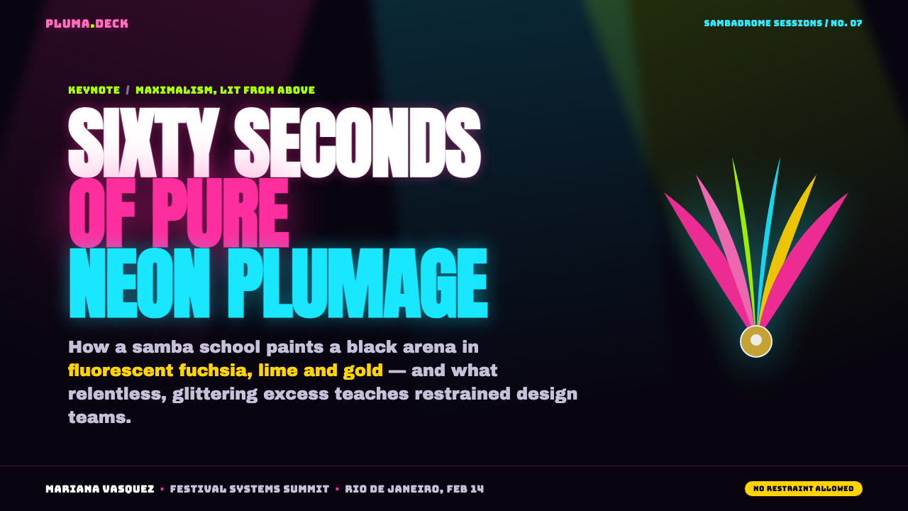
For presentation covers, use the night-black field as an open stage and let one oversized fluorescent gesture establish the mood: a plume-like sweep, a radiant title block, or a concentrated cluster of gold and neon detail. The title should feel announced by a spotlight, with supporting information kept quiet enough that the cover retains the force of a parade entrance.
For content and data slides, preserve the spectacle through hierarchy rather than filling every surface with color. Let one neon accent identify the active idea, use cyan or green for movement and progression, fuchsia for emphasis, lemon yellow for energy, and gold for awards or key outcomes. Charts should feel like illuminated parade forms: bold, grouped, and easy to read against the dark ground.
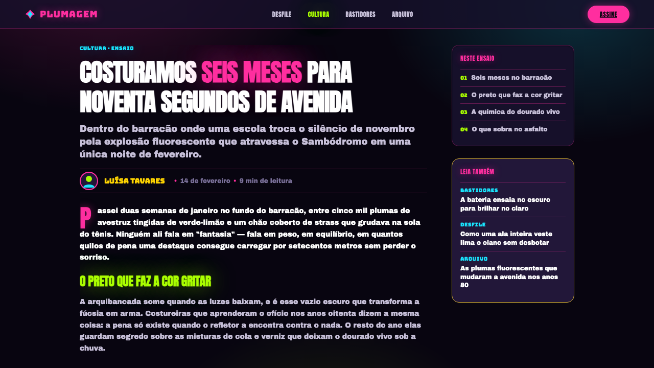
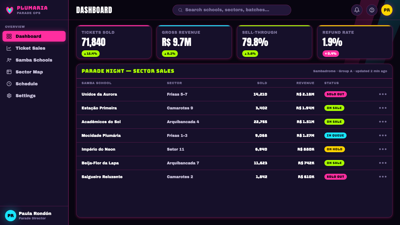
For web interfaces, the style suits dashboards, event platforms, entertainment products, and pricing pages that want energy and memorability. Use near-black surfaces for the main canvas, reserve fluorescent color for actions and state changes, and give cards a dark glass-like presence with restrained gold or neon edging. Pricing tiers can be differentiated by color intensity and material richness rather than by unrelated decorative illustrations.
For editorial and marketing work, the system supports campaign pages, launch stories, festival announcements, and brand moments that need theatrical presence. Alternate dense spectacle with deliberate pauses so the page feels choreographed. Gold can mark ceremonial moments, while feather-like graphics, luminous borders, and cropped color fields create a sense of motion around headlines and calls to action.
The common mistake is treating neon as a substitute for hierarchy. If every label, border, panel, and button glows at once, the interface loses the very spotlight logic that makes the style legible. Keep the background deeply quiet, choose a dominant accent, use gold selectively, and let the most important message receive the clearest burst of light.
Rio Carnival Neon Feathers — FAQ
Is Rio Carnival Neon Feathers meant to reproduce a literal carnival costume?
No. It extracts the atmosphere and visual mechanics of the Sambadrome at night rather than copying a specific costume. The useful references are contrast, plume-like movement, reflective material, concentrated color, and the feeling of collective spectacle. A successful application may suggest feathers and rhinestones without becoming a costume illustration.
Can this style work without a black background?
It can be adapted, but the dark ground is its strongest structural reference. A lighter background reduces the sense that neon is emitting light and makes gold feel more like ordinary yellow. If the ground changes, the application should preserve the central contrast between a quiet stage and a small number of highly energized accents.
How much neon should appear in a single interface?
There is no fixed quota, but neon should be organized as a spotlight system. Choose a leading accent, then use the other bright colors to distinguish meaningful states or moments. The more luminous the palette becomes, the more important grouping, contrast, and quiet dark space become. Festive abundance works only when attention still has somewhere to land.
What makes the gold feel appropriate rather than decorative?
Gold should carry ceremonial or material meaning. It can identify a reward, a featured moment, a special tier, or an edge catching parade light. When gold is spread across every surface, it loses its sense of rarity and becomes another bright color. Its role is to add shimmer and distinction to the neon spectacle.
Related design styles
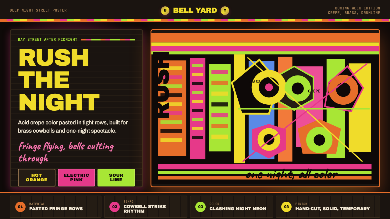 Bahamian Junkanoo CowbellNight refuses silence. Acid crepe stripes and block type collide like cowbell…
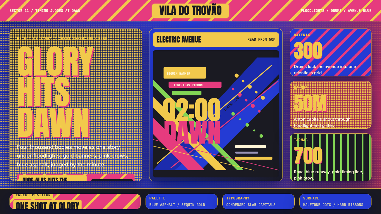 Brazilian Samba School (2000s Carnaval)Parade at floodlight volume. Royal blue asphalt, sequin gold type, pink ribbo…
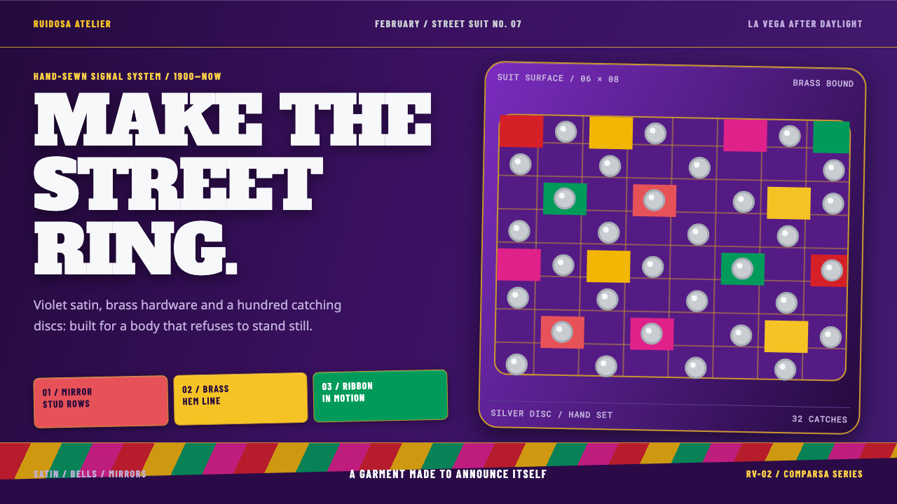 Diablo Cojuelo CostumeBuilt to be seen moving. Violet satin, brass edges, and mirror-disc grids mak…
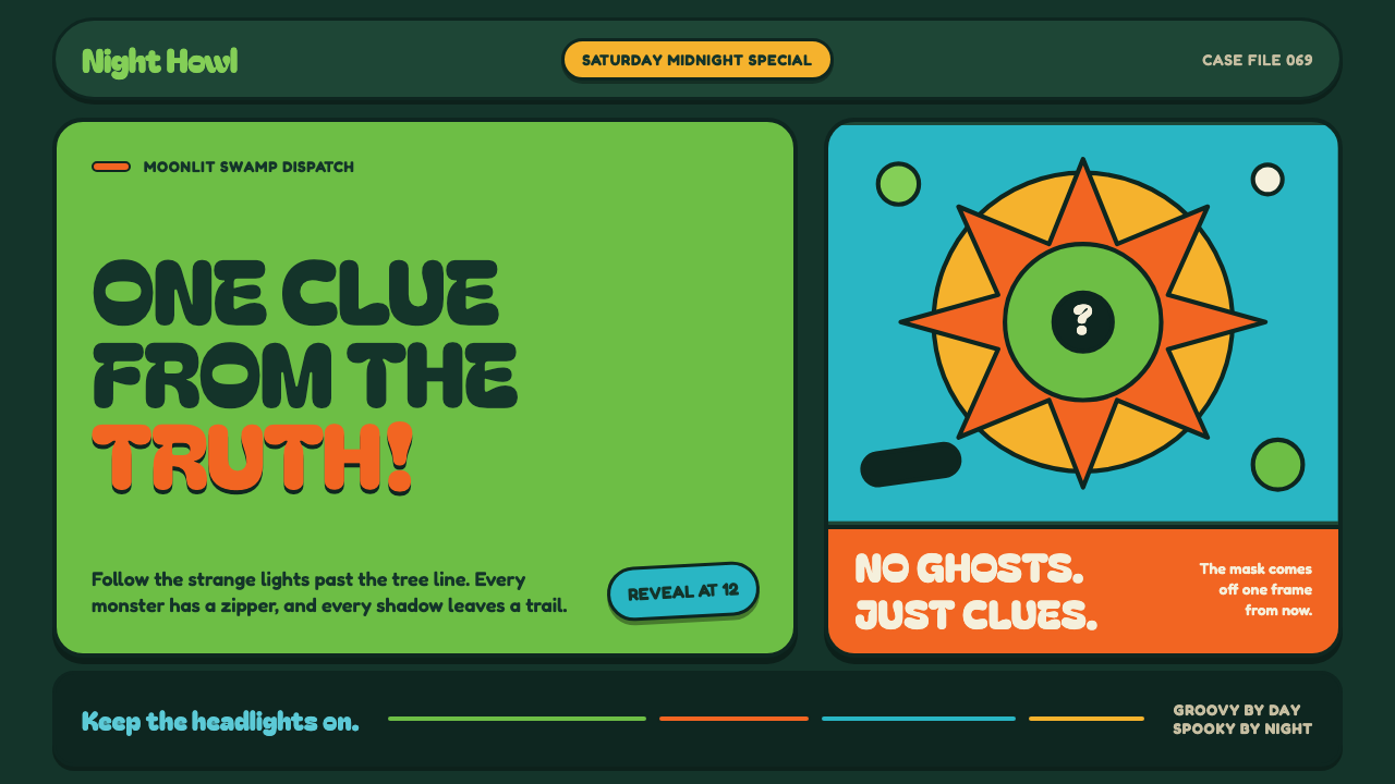 Mystery Machine (Scooby-Doo 1969)Groovy by day, spooky by night. Balloon type and acid-green panels hide the n…
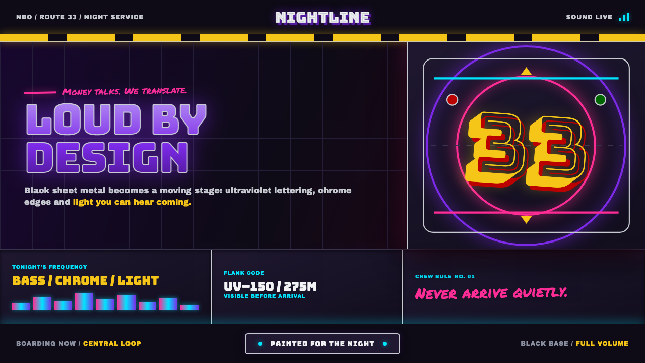 Nairobi Matatu ArtBuilt to be unmissable. Neon airbrush and chrome blaze across night-black hor…
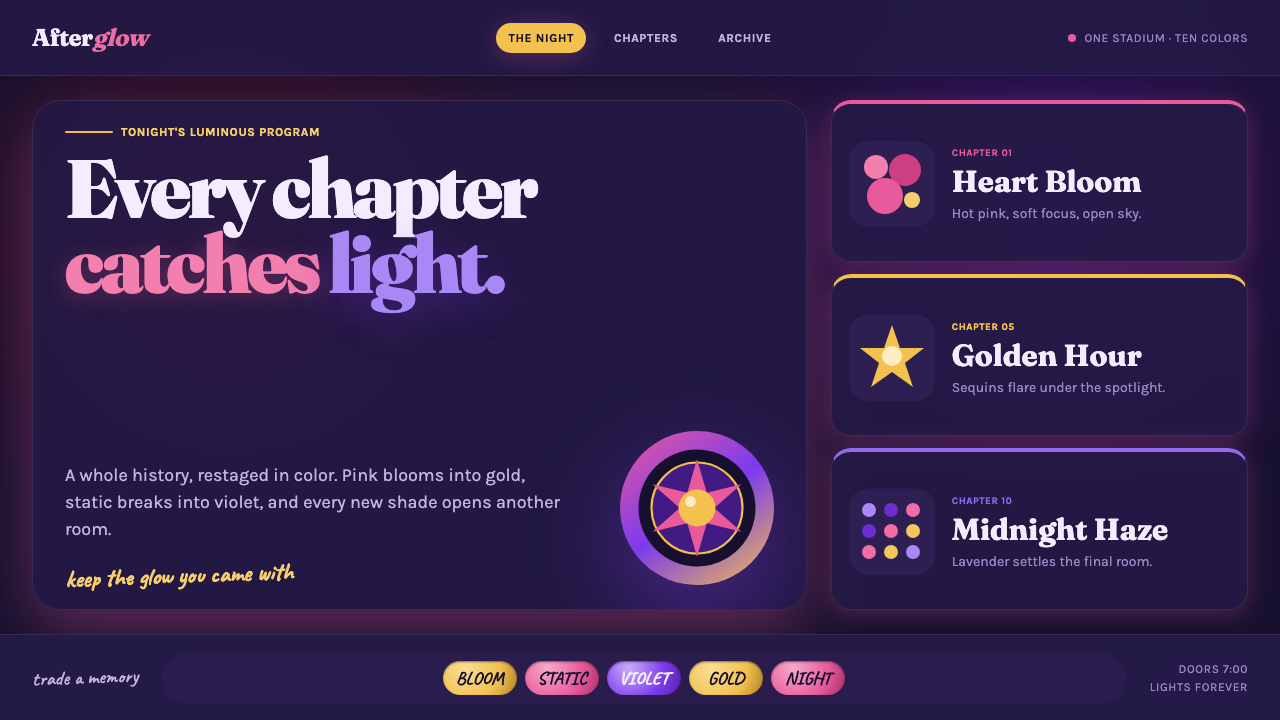 Taylor Swift Eras (2023)Every chapter catches light. Hot pink, lavender, gold and beadwork glow on mi…