What is Riga Jugendstil?
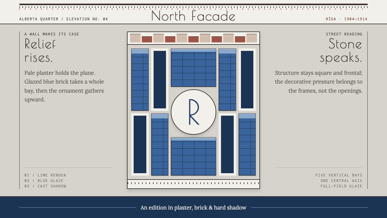
Riga's Jugendstil facades argue their whole case on the street elevation — strict vertical bays, pale plaster, fields of blue glazed brick, and ornament that thickens as it climbs toward the cornice.
Riga Jugendstil in brief
Riga Jugendstil is Art Nouveau as it was built in the Latvian capital between roughly 1901 and 1914 — Jugendstil being the German name for the movement, literally 'youth style'. Its signature is not a curve but an elevation: a street facade treated as one flat, frontal picture, organised in strict vertical bays along a symmetrical axis, with rectangular openings punched cleanly into the plane and ornament concentrated in relief on the wall above and around them.
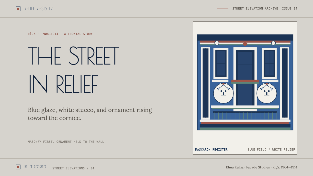
The palette is the building's own materials. Pale grey lime plaster and white stucco form both the ground and the relief; broad fields of blue glazed brick are set hard against the white with no transition between them. Colossal female heads flank the central bay, and Medusa, lions and griffins are threaded through the plasterwork. The result reads less like decoration applied to a house than like an argument made in relief, with the wall as the page.
What makes the style useful as a design language is the discipline underneath the display. Curves are allowed only in the ironwork and in the tendrils of the stucco; the structure itself — the bay rhythm, the axis, the window openings — stays rectilinear. Ornament does not spread evenly. It escalates: calm at the base, denser and more theatrical as the eye travels up toward the cornice. A gradient of intensity held inside a rigid frame is the whole idea.
Where does Riga Jugendstil come from?
Riga holds the densest concentration of Art Nouveau in Europe. About a third of the buildings in the city centre belong to the movement, and most of them went up in one compressed decade, 1904 to 1914. The historic centre of Riga is a UNESCO World Heritage site, and its Jugendstil blocks are part of the context in which the city's architecture is now understood. Alberta iela, Elizabetes iela and Strēlnieku iela are the streets this system's lineage names, and along them whole frontages of the movement stand shoulder to shoulder.
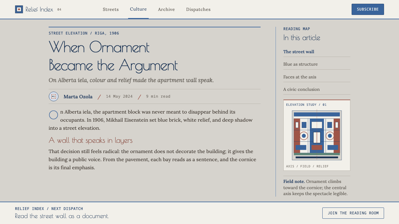
Within that decade there is an order of arrival. Mikhail Eisenstein's houses on Alberta iela and Elizabetes iela date from 1901 to 1906, which places them at the leading edge of the wave. On Alberta iela he took what was structurally an ordinary apartment block and put the entire argument on the street elevation: pale lime plaster for the ground, white stucco relief climbing the wall, colossal female heads either side of the central bay, Medusa, lions and griffins between them, and broad fields of blue glazed brick laid hard against the white. The block behind is ordinary; the facade is the statement.
Alongside Jugendstil, the lineage lists Latvian National Romanticism, and the roster of key figures includes Konstantīns Pēkšēns, Eižens Laube and Jānis Alksnis next to Eisenstein. The point is that Riga's version was not one architect's mannerism. Several hands worked on the same grammar in the same city within the same few years, and a distinctly local current ran alongside. For a designer this matters, because it means the look has stable rules that can be abstracted, not just a personal signature to be imitated.
Translating a building into an interface requires a decision about viewpoint, and this system makes it deliberately: it reads the elevation flat and frontally, the way an architect's drawing does, and refuses perspective. The facade becomes a plane, the bays become columns, the openings become rectangular cut-outs, and the ornament becomes a density map that rises from base to cornice. Everything that made the real street feel lavish — the curves, the masks, the colour — is kept, but it is kept on the surface, which is the only place a screen or a slide can hold it.
What defines the Riga Jugendstil look?
Frontal, flat elevation
The composition is read straight on, as a surface rather than a space. There is no vanishing point and no invitation to walk into the picture; depth, where it exists, is carved into the wall in relief instead of being suggested by perspective. This is the first decision in the system and the one that most separates it from the swirling, atmospheric reputation of Art Nouveau.
Vertical bays and a symmetrical axis
The structure is a rhythm of tall vertical bays organised around a central axis. Symmetry gives the facade its authority and the bay rhythm gives it pace. Every opening is a clean rectangle punched into the plane, and the central bay is the place where the building raises its voice.
Ornament that escalates
Ornament is graded, not sprinkled. The lower zones are calm, restrained wall; decoration gathers as the eye rises and peaks at the cornice. Think of it as a density gradient. It tells the reader where to look and in what order, and it is the main hierarchy tool in the whole system.
Curves confined to ironwork and tendrils
The organic line that Art Nouveau is famous for is allowed in only two places: the ironwork, and the stucco tendrils that climb the wall. The load-bearing geometry never bends. The effect is tension — a living, vegetal line caught inside a rigid frame — and it disappears the moment curves leak into the structure.
Blue fields against pale plaster
Colour arrives in large blocks, not accents. Fields of blue glazed brick, glossy and deep, sit directly against pale grey lime plaster and white stucco with no tonal bridge between them. The cool, saturated blue and the chalky pale surfaces give the palette its whole identity; there is no secondary decorative colour competing for attention.
Colossal faces and mythic beasts
The central bay is flanked by colossal female heads, with Medusa, lions and griffins threaded through the plasterwork. These figures give the facade its theatre. Because they are relief, they appear through light and shadow on the wall, and they behave as events on the surface rather than as a repeating wallpaper pattern.

Who shaped Riga Jugendstil?
The figure at the centre of the system. His houses on Alberta iela and Elizabetes iela, built between 1901 and 1906, are the clearest statement of the style: an ordinary apartment block turned into a readable street elevation, with pale lime plaster, white stucco relief, colossal female heads and fields of blue glazed brick. This system is built by reading one of his Alberta iela elevations flat and head-on.
Named among the key figures of Riga's Jugendstil, and placed in this lineage next to Latvian National Romanticism, the other movement it lists. His presence corrects the one-architect story: the look was a city-wide current rather than a single signature. Individual commissions are best traced in architectural histories of the city; what this system borrows is the shared grammar.
Another architect named in the lineage. Together with Pēkšēns and Alksnis he stands for the many authors behind the third of central Riga that is Art Nouveau, most of it raised in the compressed decade between 1904 and 1914. When several designers converge on one grammar of bays, axis and graded ornament, the grammar can be extracted and reused — which is exactly what a design system does.
Completes the roster of named architects. Its value to a designer is its range: a list of names, not a name, so the style reads as a vocabulary shared across many commissions in the same years rather than a personal mannerism. Anyone applying it should lean on the shared rules — strict bays, a calm base, rising ornament, rectilinear structure — rather than copying the details of one building.
How do you use Riga Jugendstil today?
Riga Jugendstil is a light-ground, high-ornament style held inside a rigid frame, which makes it unusually teachable: the frame is a set of rules, and the ornament is a controlled budget. Applying it well means treating the screen or the slide as an elevation — a flat, frontal picture with a central axis — and spending decoration deliberately from the bottom of the layout to the top.
On slides the cover is where the style shines. Place the title on the central axis as though it were the central bay, set one broad field of deep blue against the pale ground as the 'brick', and run an ornamental band along the top edge where the cornice would sit, leaving the lower half calm. Content slides work best as two to four tall columns that behave like bays, with consistent gutters and rectangular image openings. Data slides should make bars and areas solid fields of blue on pale ground, keep charts rectilinear, and let one stucco-style flourish live in the header rather than inside the chart.
On the web the style suits hospitality, heritage, cultural institutions, property and boutique commerce, where civic dignity is part of what is being sold. A hero section can mirror the facade: a symmetric layout, a strong central call-out, ornament gathered into the header band, then quieter content blocks below. A pricing page can treat the tiers as bays, with the featured tier standing as the central one. Navigation, buttons, inputs and cards stay rectangular, and curves belong to a single decorative layer such as dividers or icons. Denser dashboards can borrow the grammar if the ornament stays in the header and the data area stays plain.
In editorial and marketing work — programme booklets, exhibition posters, invitations, packaging for heritage goods — the style hands you a ready-made hierarchy: a masthead carrying the heaviest ornament, a calm body set in strict columns, and large flat panels of blue where a photograph might otherwise sit. Masks, tendrils and heraldic beasts can be drawn as relief-like line or tone work, always attached to the wall of the page rather than floating over it.
The common mistake is letting the curves into the structure. Rounded cards, pill-shaped buttons, circular avatars everywhere and swooping layout lines turn the facade into generic Art Nouveau pastiche and remove the tension that defines it. Close behind are spreading ornament evenly so that nothing rises to a peak, softening the blue-against-white contrast with gradients, and adding perspective or tilt to a composition that depends on being read straight on.
Riga Jugendstil — FAQ
Is Jugendstil the same thing as Art Nouveau?
In the sense that matters here, yes. Jugendstil is the German name for the movement that is called Art Nouveau elsewhere, and Riga's buildings are filed under both names. The label matters less than the local character: in Riga the style is distinguished by frontal, bay-by-bay facades and by ornament graded toward the cornice, rather than by the whiplash curves many people expect from the name.
Why does an Art Nouveau style look so rigid and symmetrical?
Because the curves were moved out of the structure. The bay rhythm, central axis and rectangular openings stay strictly straight, and the organic line is confined to ironwork and stucco tendrils. The contrast is deliberate: the rigid frame is what makes the vegetal ornament look alive. Remove the frame and the ornament looks like clutter; remove the ornament and the frame looks like an ordinary apartment block.
How much ornament is too much?
Count it by position, not by quantity. The style tolerates a great deal of ornament at the top of a composition, where the cornice sits, and very little at the base. Decoration that stays calm for the first half of the layout and thickens as the eye rises feels like Riga; the same amount spread evenly feels like wallpaper. A good test is whether you can point to the single place where the ornament peaks.
Can Riga Jugendstil work on a dark background?
This system is built on a light ground — pale plaster, white relief, blue brick — and its contrast depends on blue meeting white directly. A dark inversion is possible, but the relief logic changes: pale ornament on a deep ground reads as glowing rather than sculpted, and the blue loses its identity as a separate field. If you invert, keep the bays, axis and graded ornament unchanged, treat the blue as a lighter panel, and check that the ornament still reads as relief.
What kinds of products and brands suit it?
Anything that benefits from civic dignity and craft: hotels, restaurants, museums, galleries, concert programmes, property developments, heritage brands, travel guides and editorial about cities. It is less suited to playful consumer apps, children's products or minimal utilities where the ornament would compete with the task. In those cases borrow only the structural lessons — strict bays and a central axis — and leave the stucco behind.
Related design styles
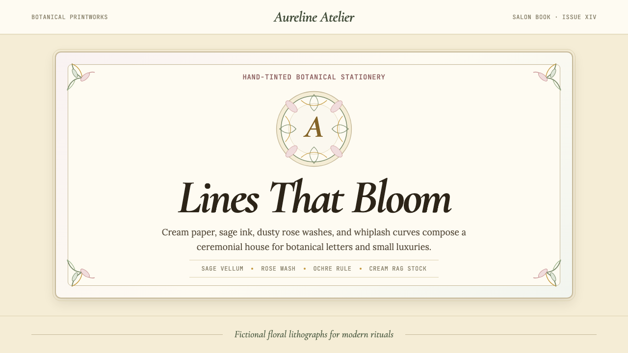 Art Nouveau (Mucha)Mucha's whiplash arabesques. Botanical halos, muted lithograph palette, no ma…
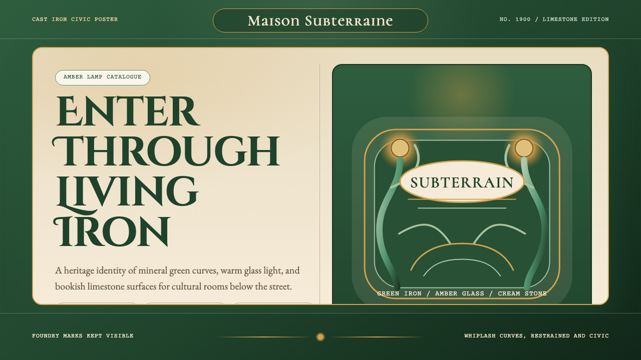 Paris Metro Guimard (1900)Civic sculpture, softly lit. Metro green ironwork frames amber glow and limes…
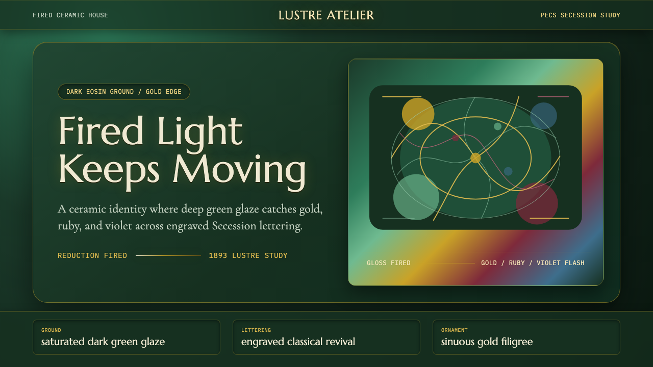 Zsolnay Eosin CeramicsGlaze becomes theater. Dark eosin green flashes gold, ruby, and violet throug…
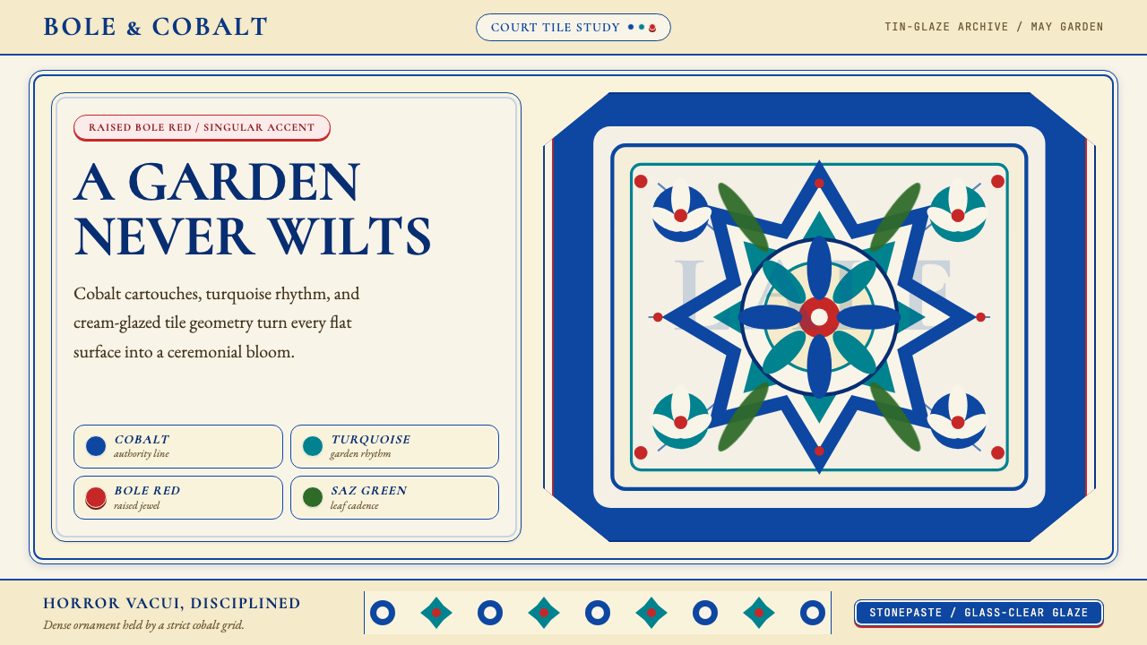 Turkish İznik CeramicBlooms with discipline. Cobalt grid and cream glaze hold turquoise motifs wit…
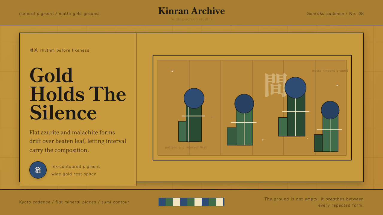 Edo Rinpa (Kōrin)Matte gold breathes. Azurite and malachite repeats float across inked screen…
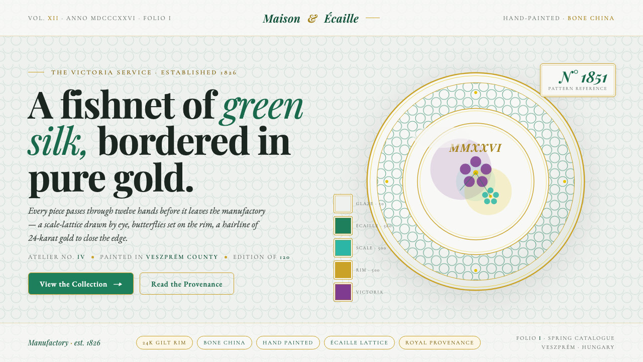 Herend PorcelainRoyal porcelain, drawn by hand. Cool glaze, écaille fishnet, gilt rim, Playfa…