What is Ray Gun / David Carson?
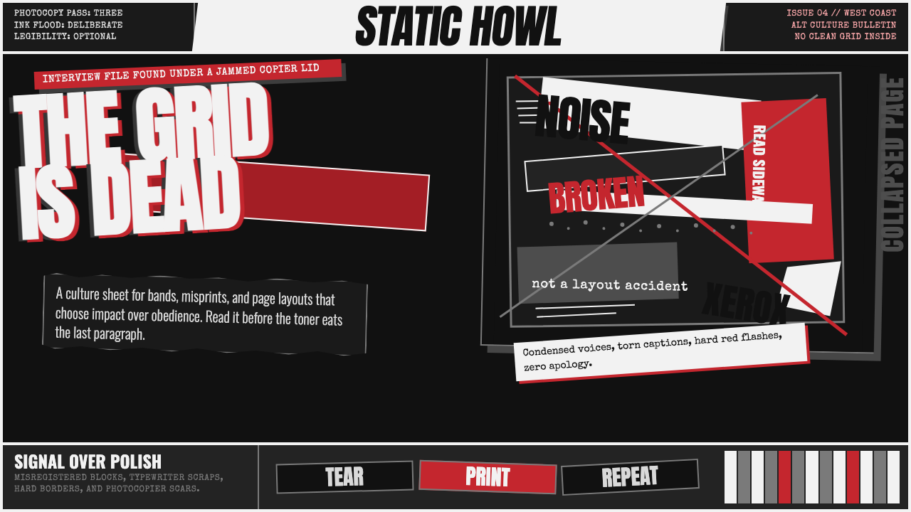
Ray Gun turned disorder into authorship — ink-black fields, colliding type, photocopied abrasion, and a red wound where a clean layout should have been.
Ray Gun / David Carson in brief
Ray Gun / David Carson is the visual language associated with the American alternative music magazine Ray Gun during its early-to-mid-1990s transformation under art director David Carson. It treats the editorial page less as a neutral container for information than as an emotional surface. Headlines break apart, text collides with imagery, and the page can feel ink-flooded, torn, unstable, or deliberately difficult to decode.
Its defining argument is that chaos can carry a voice. Where tidy editorial systems promise clarity through regularity, Ray Gun accepts interruption, friction, and visual noise as meaningful parts of communication. Oversized display type may crash into a photograph; compressed, distressed letterforms may sit under layers of photocopier grain; a block of copy may be pushed beyond ordinary expectations of comfort.
The result is not random mess. The style uses illegibility selectively, making reading feel like an encounter rather than a passive transfer of information. Its black grounds, damaged surfaces, broken grids, and rare red accents create a visual register that feels loud, abrasive, intimate, and tied to alternative print culture rather than polished institutional publishing.
Where does Ray Gun / David Carson come from?
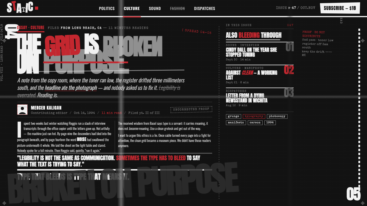
Ray Gun launched in 1992 as a music magazine in the United States, within the West Coast alternative music-magazine scene. Under David Carson, typography became the site of the magazine’s strongest confrontation. Rather than treating type as an orderly support system for articles and photographs, the pages made letterforms compete, fracture, overlap, and refuse the calm authority associated with conventional editorial order.
The style emerged in conscious opposition to the tidy Swiss grids that preceded it. Ray Gun replaced stable alignment with deconstructed composition, smooth reproduction with Xerox-like grain, and conventional hierarchy with scale clashes and abrupt visual shifts. The page no longer had to reassure its reader that every element was obediently in place; instability itself became part of the magazine’s identity.
By 1996, grunge typography had become a recognizable genre, and Ray Gun’s visual vocabulary was cited as a defining moment in which editorial design openly admitted chaos as a design tool. The work belongs to a wider field described as deconstructed and postmodern editorial design, but its force comes from the particular pressure it places on music, image, type, and attitude within a printed magazine.
What defines the Ray Gun / David Carson look?
Ink-Black Ground
Darkness is not merely a background choice; it establishes pressure. Ink-black fields make pale type, damaged imagery, and occasional red marks feel excavated from the page rather than neatly placed upon it. The mood is dense, nocturnal, and physically printed.
Type Collision
Typography behaves like image and impact. Anton-scale display lettering, condensed distressed faces, cropped words, and overlapping lines create confrontation rather than smooth reading flow. Type can obscure a photograph or be obscured by it, with neither element automatically granted priority.
Broken Grid
The grid is collapsed, interrupted, or visibly resisted. Elements may appear to have slipped out of alignment, yet their tension still shapes the composition. This is not the absence of structure; it is structure made unstable enough to register as energy.
Xerox Abrasion
Photocopier grain, ink flooding, rough reproduction, and layered noise give surfaces their tactile charge. Images are not expected to remain pristine. Their damage makes them feel handled, copied, pressured, and circulated through a living print culture.
Selective Illegibility
Difficulty is used as emphasis. Carson’s decision to set an interview in Zapf Dingbats made the act of withholding readability part of the editorial statement. In this system, obscurity can signal boredom, refusal, intensity, or a deliberate challenge to passive consumption.
Red Scar
Red appears as a wound-like interruption against the black, photocopied field. It should feel sharp, scarce, and consequential rather than decorative. Its force comes from contrast with the otherwise damaged monochrome atmosphere, where every vivid mark reads as an alarm.
Who shaped Ray Gun / David Carson?
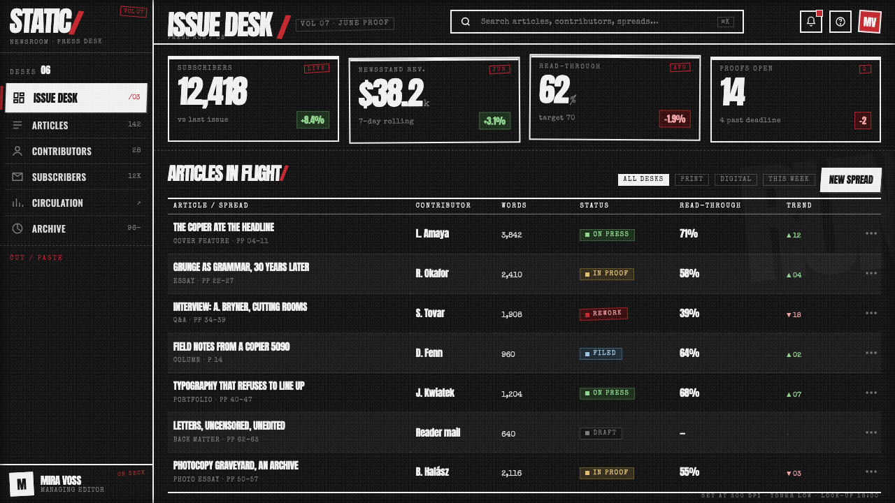
As Ray Gun’s art director, Carson made typography the magazine’s most disruptive instrument. The source material identifies his pages with torn headlines, collapsed grids, ink-heavy reproduction, and deliberate passages of illegibility. His role is central because the visual disorder is not incidental atmosphere; it is the editorial voice the magazine chose to speak in.
Barry Deck is named among the key figures associated with the Ray Gun / David Carson theme. Within this style’s story, his presence places the visual system in the wider creative field of 1990s alternative print culture, grunge typography, and deconstructed editorial design rather than reducing it to a single isolated page treatment.
Ray Gun itself is the editorial platform through which this language became visible. Launched as a music magazine in 1992, it gave the style a recurring printed environment where photography, headlines, interviews, and article text could be treated as competing materials. The magazine made the visual system inseparable from an alternative music-publication voice.
How do you use Ray Gun / David Carson today?
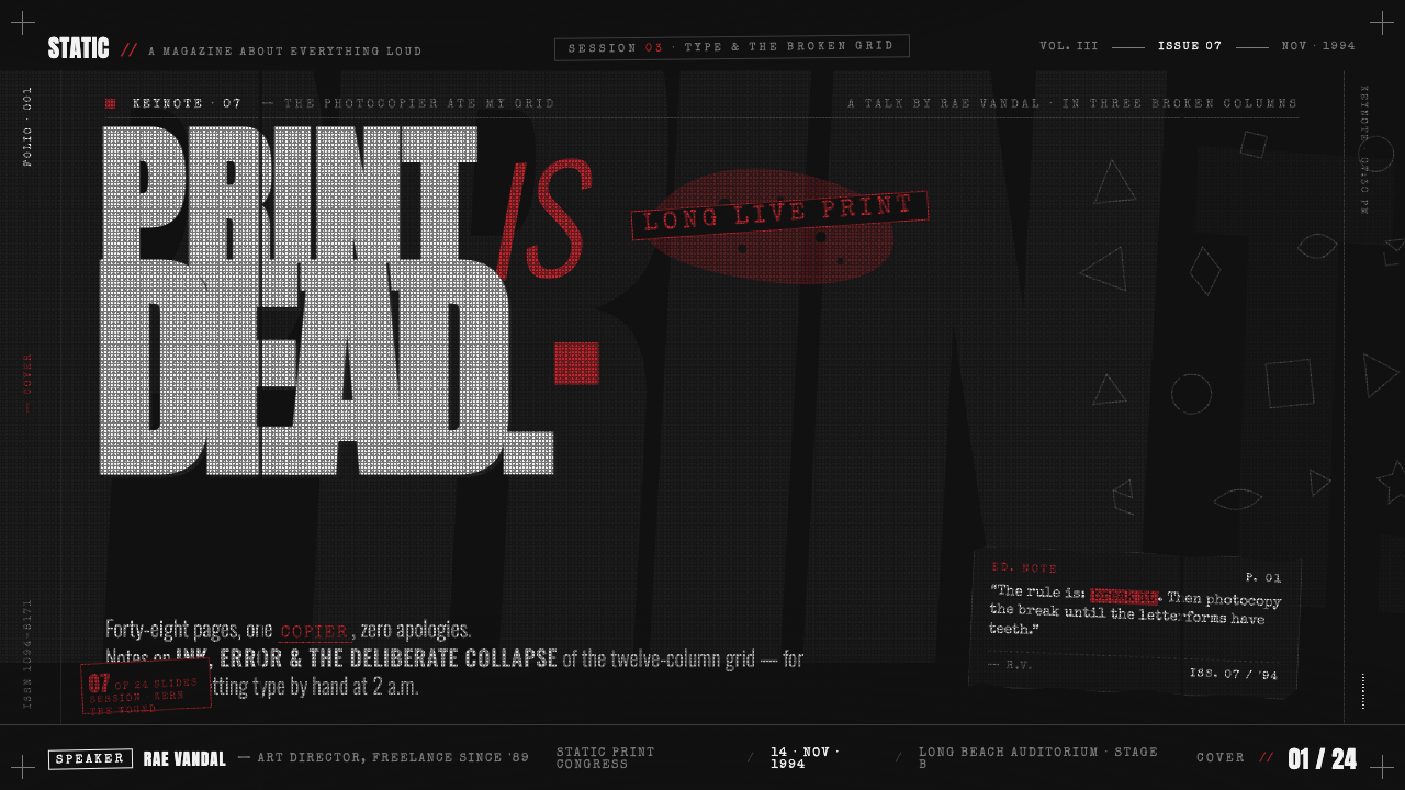
For presentation covers, use the style as a concentrated announcement rather than a complete visual explanation. Let a black field, an aggressively cropped image, and an oversized fractured title establish the subject’s emotional temperature. Keep the red intervention rare enough to feel like a rupture. The cover should suggest that the topic has arrived with force, not that it has been politely introduced.
On presentation content and data slides, the style needs restraint. Preserve a readable information layer, then let a damaged headline, grainy image edge, or broken alignment carry the Ray Gun energy around it. Data should remain legible and comparable; use abrasion as framing or interruption, not as a veil over the values. A successful data slide feels charged without making evidence inaccessible.
For web interfaces, this language is strongest in editorial landing pages, artist profiles, campaign-like stories, and culture-led dashboards where attitude is part of the product. Use the dark field to establish immersion, then create contrast between stable interaction zones and deliberately unruly visual zones. Navigation, actions, and essential form controls should remain dependable even when surrounding typography is confrontational.
For editorial and marketing work, Ray Gun can give launch pages, music coverage, event announcements, and limited-run campaigns a memorable physicality. Crop images hard, let display type challenge their edges, and use Xerox grain to make the page feel reproduced rather than digitally polished. The style is especially useful when the message benefits from tension, refusal, subculture, or a sense of urgent circulation.
The common mistake is copying surface damage while restoring conventional order everywhere else. Random grain, torn textures, and oversized lettering do not create this language if they never disrupt hierarchy or editorial attitude. The opposite mistake is making every word equally chaotic. Ray Gun gains force from contrast: some material must remain readable, while selected moments are allowed to resist the reader.
Ray Gun / David Carson — FAQ
Is Ray Gun typography simply random or messy?
No. The style deliberately collapses conventional order, but its disorder is used to create voice, pressure, and editorial attitude. Oversized collisions, Xerox grain, broken grids, and difficult passages matter because they alter how a reader encounters the content. Randomness without tension, contrast, or a reason to interrupt reading only imitates the surface.
Does the style require unreadable text?
No. Selective illegibility is one of its most recognizable gestures, not a requirement for every line. The Zapf Dingbats interview demonstrates that withholding readability can be an editorial act, but most practical applications need a clear reading layer. Use difficulty where it carries meaning, and preserve access where the audience needs instruction, evidence, or action.
How is this different from Swiss-grid editorial design?
The source material positions Ray Gun as a visual scream against the tidy Swiss grids that preceded it. Swiss order is treated here as the condition being challenged: regular alignment, stable hierarchy, and smooth legibility give way to collision, distressed reproduction, and compositional instability. Ray Gun does not merely loosen the grid; it makes the grid’s failure visible.
Where does Ray Gun / David Carson work best today?
It works best where the communication benefits from a forceful editorial voice: music and culture publishing, artist-led stories, event launches, identity moments, and campaign-like pages. It is less suitable where calm comparison, routine task completion, or continuous reading matters most. The deciding question is whether friction strengthens the message or merely makes it harder to use.
Related design styles
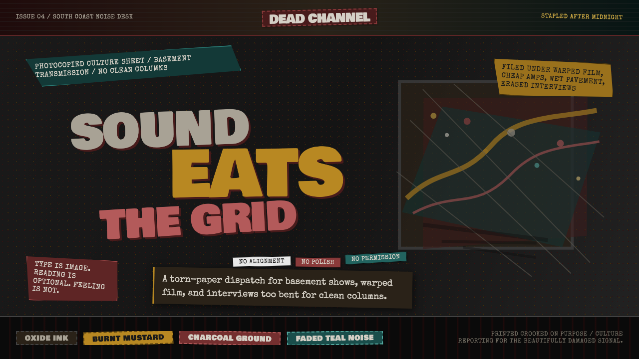 Grunge (Carson 1993)Carson's anti-rules, photocopied. Oxblood on charcoal, distressed type, delib…
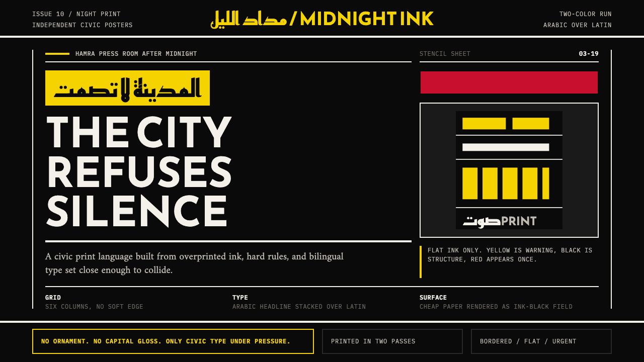 Beirut Indie Graphic DesignCivic type as protest. Sulfur yellow Arabic blocks collide with ink-black pos…
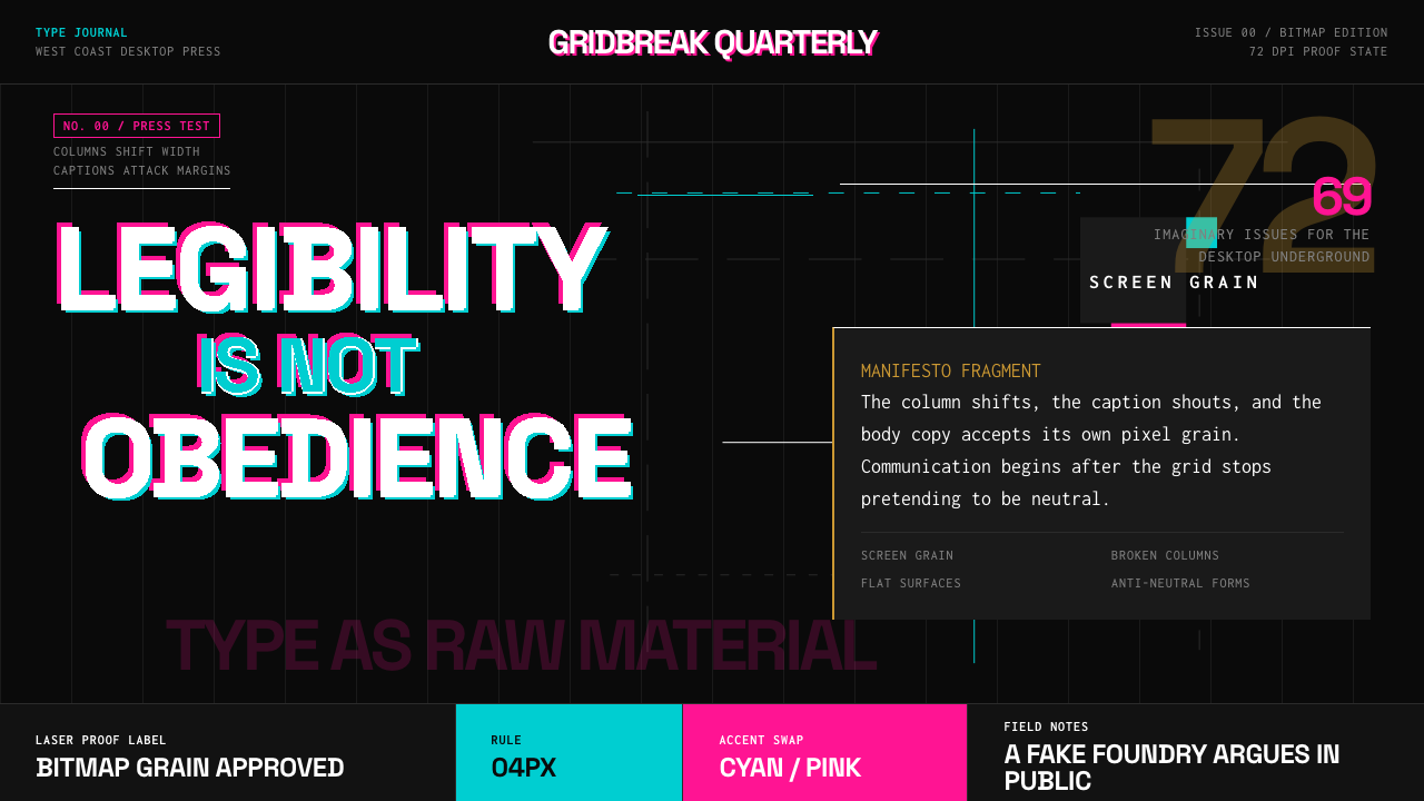 Emigre Magazine (1984–2005)Defies the tidy grid. Cyan, ochre, and hot-pink bitmap type collides on black.
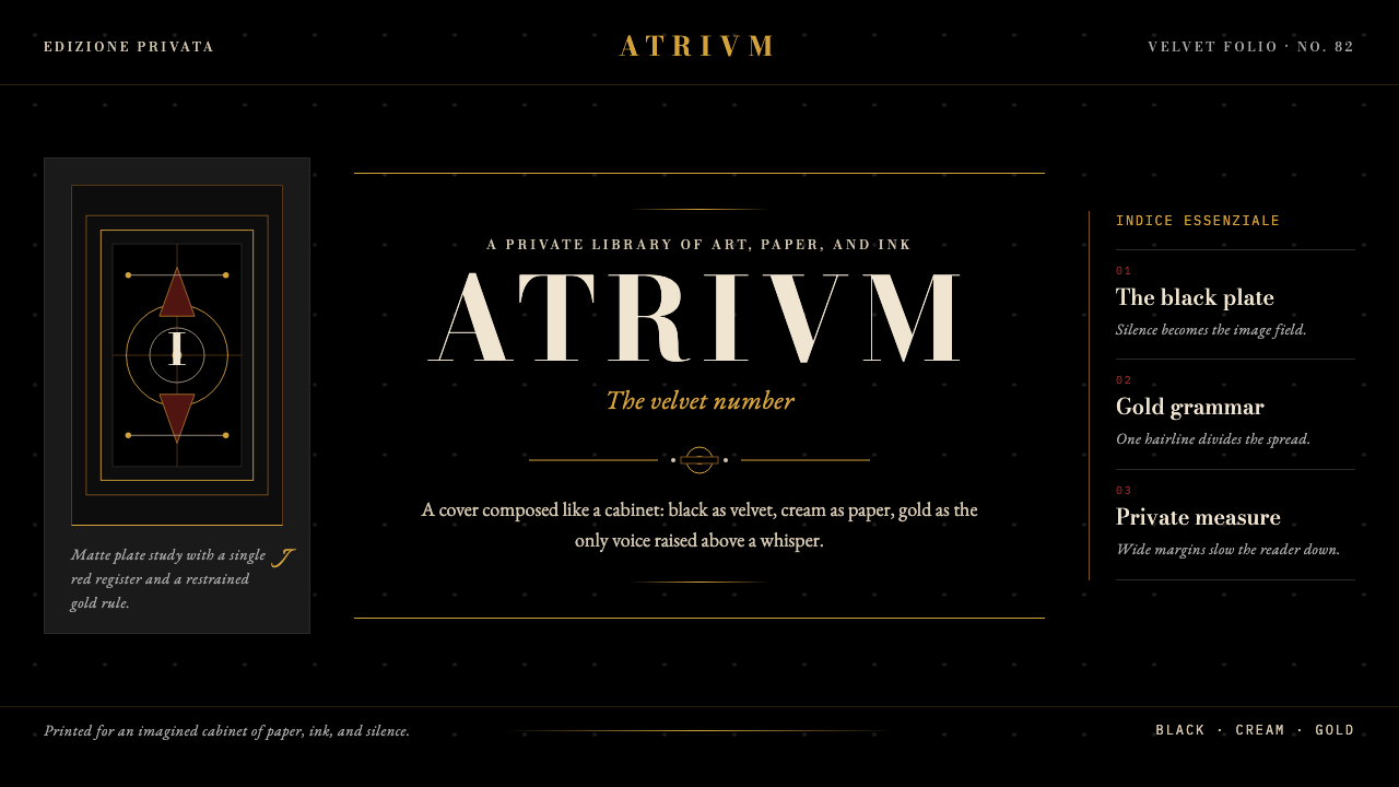 FMR (Franco Maria Ricci)Opulence held in silence. Velvet black, Bodoni serifs, and warm gold hairline…
 Peter Saville / Factory RecordsAnti-design becomes high art. Void black, white pulsar lines, and FAC mono la…
 Weimar CabaretMenace at 2 a.m. Blood-red Fraktur, smoke-black grid, acid-yellow spotlight c…