What is Frankenstein (1818)?
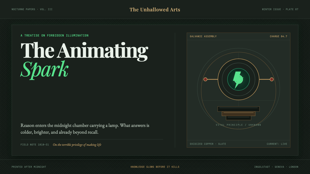
Knowledge glows before it kills: Frankenstein turns a midnight Regency laboratory into a storm-lit language of slate, brass, oxidized copper, and rare acid-green life.
Frankenstein (1818) in brief
Frankenstein is Mary Shelley’s 1818 novel rebuilt as a design language. Its setting is not the cheerful haunted house of seasonal decoration, but a Regency laboratory at midnight: tall Gothic windows admit lightning, instruments gather on heavy surfaces, and galvanic sparks make knowledge briefly visible. Storm-slate creates the enclosing darkness; brass gives that darkness structure; oxidized copper introduces age, chemistry, and unease. Through it all runs one unnaturally vivid signal: green electricity, sudden enough to feel less like illumination than an event.
The emotional register is Romantic rather than merely macabre. This is a system for the sublime, mournful, over-reaching atmosphere of the novel: ambition standing before consequence, reason leaning into horror, an act of making that cannot be separated from what it unleashes. It should feel serious, intimate, and perilous. Darkness is not used to conceal information; it is used to make each illuminated word, instrument, diagram, and flash of color carry moral pressure.
Visually, the style combines Didone title-page serifs with slabs of slate and engraved brass. Cross-hatching gives surfaces the dry, tactile density of an old illustration; spidery scientific handwriting makes notes look provisional, personal, and slightly fevered. The result should not imitate a museum display or a generic monster poster. It stages a collision between disciplined inquiry and Gothic dread, where an apparatus can be precise while the world around it remains unstable.
Where does Frankenstein (1818) come from?
The source period for this visual world stretches from 1816 to 1831. It begins with the conception of Frankenstein at Villa Diodati in 1816, moves through the novel’s publication on 1 January 1818, and includes the illustrated 1831 edition as a later image-bearing horizon. Those dates matter because the style is not a timeless bundle of Gothic signs. It belongs to an early nineteenth-century atmosphere in which the printed page, the laboratory, the storm, and the imagination could all appear to speak to the same question: what happens when human knowledge reaches beyond its moral shelter?
Lake Geneva, Ingolstadt, and London form the geographic frame named for the theme. Lake Geneva supplies the charged weather and Romantic isolation: a place where sky, water, darkness, and sudden light can become emotional architecture. Ingolstadt supplies the laboratory imagination, with apparatus, annotations, physical materials, and the pressure of study. London introduces a worldly counterweight: the printed title page, the urban circulation of ideas, and the public life of a story born from private dread. The visual system can move among these places without becoming scenic illustration.
Romanticism, the Gothic novel, and galvanism are the three movements that organize the language. Romanticism contributes the sublime: weather, solitude, ambition, sorrow, and scale beyond human comfort. The Gothic novel contributes the threshold state, where familiar rooms, learned systems, and domestic objects become charged with menace. Galvanism contributes the animating image of electricity: not clean contemporary technology, but a troubling green spark that makes matter seem almost capable of crossing into life.
Mary Shelley is the central authorial presence in the theme, while Theodor von Holst, Giovanni Aldini, and Luigi Galvani appear among its key figures. Their inclusion establishes the article’s visual field around authorship, illustration, galvanic inquiry, and the cultural force of the novel. The illustrated 1831 edition is especially useful as a reminder that Frankenstein is not only a text about vision, experiment, and consequence; it is also a work whose afterlife can be approached through the material drama of title pages, marks, images, and printed surfaces.
What defines the Frankenstein (1818) look?
Storm-Slate Darkness
The ground should feel like storm clouds, wet stone, or a laboratory after midnight. It is deep and cool, but not featureless black. Subtle shifts between slate, blue-grey, and soot give the page atmospheric depth while preserving the sense that light has to struggle to exist. Empty dark areas are valuable: they make a title, a brass rule, or a green spark arrive with force.
Acid-Green Animation
Green is the system’s rare live current. It should appear as an interruption: a galvanic arc, a small glimmer on copper, a charged contour, or a word that has become suddenly dangerous. Its scarcity is essential. If green becomes ordinary decoration, the central metaphor collapses; used sparingly, it makes knowledge look active, unstable, and morally alarming.
Brass and Oxidized Copper
Brass supplies the constructed, instrument-like side of the style. It works best as framing, ruled detail, plate, fitting, or engraved fragment rather than as luxury gloss. Oxidized copper complicates that order with age and chemical change. Together they make machinery feel handled and historical: a rational apparatus that has survived weather, experimentation, and neglect.
Didone and Notebook Hand
Didone-style title-page serifs establish literary gravity: crisp contrast, formal poise, and the authority of an old printed work. Against them, spidery handwritten notes introduce uncertainty and private obsession. The two voices should not blend into a neutral editorial system. Their tension is the point: published certainty faces the restless margin note, and the finished title faces the experiment still being revised.
Engraved Cross-Hatch
Cross-hatching is not background texture added for antique charm. It is a method of making darkness physical. Dense engraved lines can describe weather, cast shadow, a brass plate, the edge of an instrument, or the pressure around an image. Keep the marks directional and purposeful, as if each line had been cut into a surface. Loose decorative scribbling weakens the effect.
Gothic Aperture
Tall Gothic windows provide a compositional device as much as an architectural reference. They create a vertical aperture through which lightning, weather, and exterior scale can invade an enclosed laboratory. Use pointed framing, narrow verticals, and sudden bands of light to imply the window without turning the composition into historical set dressing. The outside world should feel immense, cold, and briefly visible.
Who shaped Frankenstein (1818)?
Mary Shelley is the author at the center of Frankenstein and the figure who anchors this design language in the 1818 novel. The style should retain the book’s mournful Romantic seriousness: it is concerned with knowledge, making, responsibility, and dread, rather than reducing the work to a familiar monster image.
Theodor von Holst is named among the theme’s key figures and sits beside the illustrated 1831 edition in its visual horizon. His presence supports an approach that treats Frankenstein as an image-bearing literary object: a work of title pages, engraved marks, dark passages, and the uneasy relationship between text and vision.
Giovanni Aldini appears among the key figures behind the theme’s galvanic field. Within this visual system, galvanism is the source of its most charged image: electricity as an unsettling threshold between inert matter and animation. The resulting design language should make every green flare feel consequential, never merely technological.
Luigi Galvani is also named as a key figure, locating the style’s laboratory atmosphere within galvanism. His place in the theme reinforces the contrast that defines Frankenstein: carefully observed apparatus and material detail on one side, and the fearful possibility of animation on the other.
How do you use Frankenstein (1818) today?
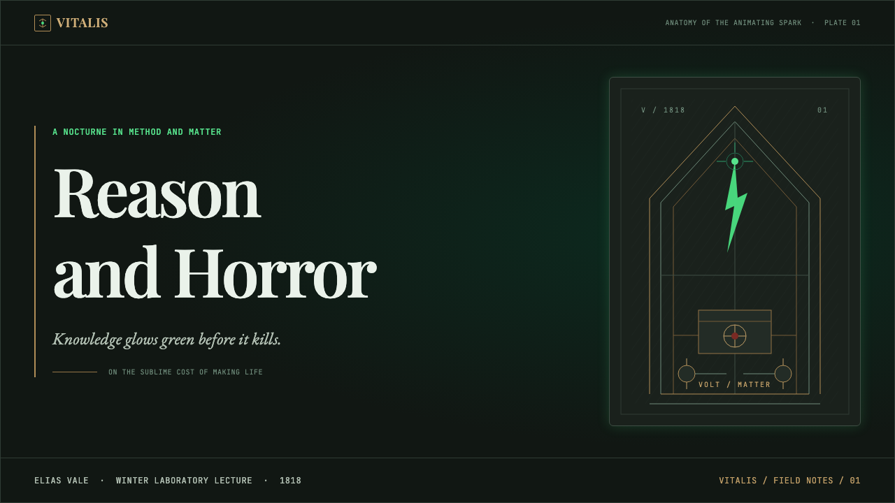
For presentation covers, let a slate-dark field establish silence before information begins. A Didone title can occupy the page with formal calm while a narrow Gothic aperture or a brass instrument fragment creates vertical tension. Reserve the acid-green flash for one charged edge, symbol, or word. On content slides, use the laboratory metaphor structurally: titles are plates, notes are annotations, and dividers resemble engraved rules. Keep the body copy clear enough that atmosphere never becomes an obstacle to reading.
Data slides benefit from the style when charts are treated as apparatus rather than decoration. Use restrained brass-like rules, engraved linework, and dark space to separate values and groups. A single green emphasis can identify the live question, anomaly, or decisive finding. Avoid making every series luminous or every chart heavily textured; the value of the system lies in the contrast between measured information and one alarming point of activation.
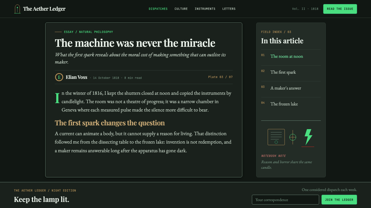
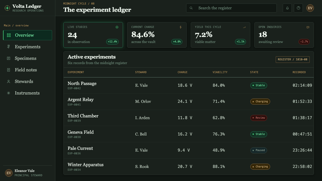
For web interfaces, Frankenstein works especially well for dashboards, analytical products, research tools, and pricing pages that need to make inquiry feel consequential. A dark slate environment can hold panels like instrument plates, with brass-toned structure and sparse green indicators guiding attention. Navigation should read as part of an ordered notebook or apparatus. Interactive emphasis must remain legible and consistent, because the visual premise depends on electricity behaving like a rare signal rather than a permanent glow.
For editorial and marketing work, use the style to frame a long-form story, a product launch, or an educational feature around tension and discovery. A broad dark margin can carry handwritten marginalia; engraved cross-hatch can introduce sections; a serif display title can give the page literary authority. Marketing compositions should lead with the question or the consequence, not with decorative horror. The most convincing version feels like a discovery under examination, not an attraction asking to be screamed at.
The common mistake is to confuse Frankenstein with generic Halloween Gothic. Cobweb ornament, cartoon monsters, crowded skull imagery, and indiscriminate neon all weaken the source material’s sorrowful intelligence. Another mistake is making every surface brass, every line handwritten, and every element green. The system needs disciplined darkness, a small number of material cues, and a genuinely scarce electrical event. Reason and horror must remain in the same composition; when either side disappears, the style becomes costume.
Frankenstein (1818) — FAQ
Is Frankenstein design just Gothic horror?
No. Gothic dread is essential, but it is only one part of the system. Frankenstein combines Gothic darkness with Romantic sublimity and galvanic inquiry. The visual tension comes from the coexistence of disciplined instruments, literary gravity, storm-scale nature, and an impossible green animation. If the work feels playful, camp, or merely spooky, it has lost the novel’s mournful seriousness.
Why is green used so sparingly?
Green represents the moment when knowledge appears to become animate. Its force depends on rarity. A mostly slate, brass, and copper world gives the green flare narrative weight: it interrupts the normal order of material, weather, and print. When green is spread across buttons, backgrounds, borders, and illustrations at once, it stops reading as electricity and becomes a general-purpose accent.
Can the style work without literal laboratory illustrations?
Yes. The laboratory can be expressed through structure rather than literal scenery: an engraved rule can suggest a measuring instrument, a brass frame can imply an apparatus, marginal handwriting can imply observation, and a green interruption can imply galvanic force. This usually produces a stronger and more flexible result than filling the page with props. The design should evoke a state of inquiry under pressure, not document a room.
How should typography balance literary drama and usability?
Use Didone display type where literary authority and theatrical contrast are useful: titles, section openings, pull lines, and key statements. Keep explanatory copy calm and highly readable, with handwritten notation reserved for marginal detail rather than primary instructions. The contrast should feel like a printed novel meeting a scientist’s notebook. If every line is ornate or handwritten, hierarchy vanishes and the experience becomes harder to use.
Where does this style fit best?
It fits projects that can benefit from a serious atmosphere of inquiry, consequence, and discovery: educational features, research interfaces, analytical dashboards, editorial storytelling, and launch pages for ideas that need intellectual weight. It is less suitable when the product needs immediate warmth, casual friendliness, or bright everyday ease. The central question is whether the experience should make knowledge feel charged and risky, rather than simply efficient.
Related design styles
 Carnivorous Pitcher PlantBotanical danger glows. Crimson traps and gold rims float on jungle-dark gree…
 Dracula Gothic (1897)Victorian dread after dark. Blood-red initials and tarnished gilt haunt coffi…
 Dutch Tulip ManiaSpeculation burns in shadow. Flame red petals, violet stripes, gold frames on…
 Ex Libris BookplateScholarly ownership, cut in ivory. Cinzel caps and crosshatch rules rise from…
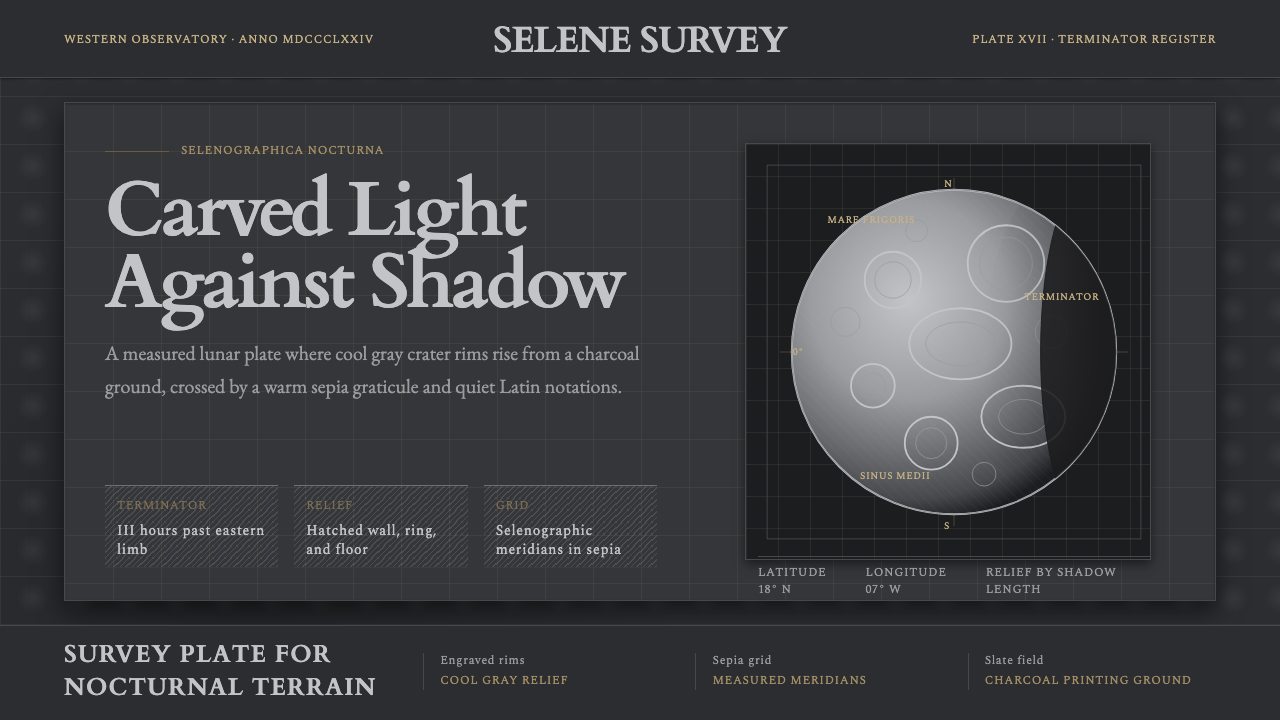 Lunar SelenographyMoonlight becomes measurement. Slate ground, sepia grid, and hatched gray cra…
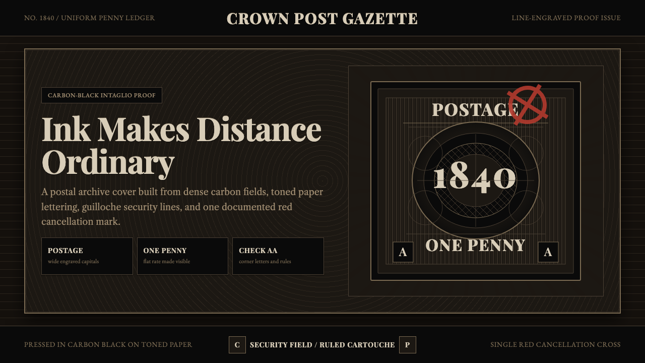 Penny Black StampBlack carries authority. Guilloche lines, Victorian serifs, and one red cross…