What is Raw Umber Sketchbook?
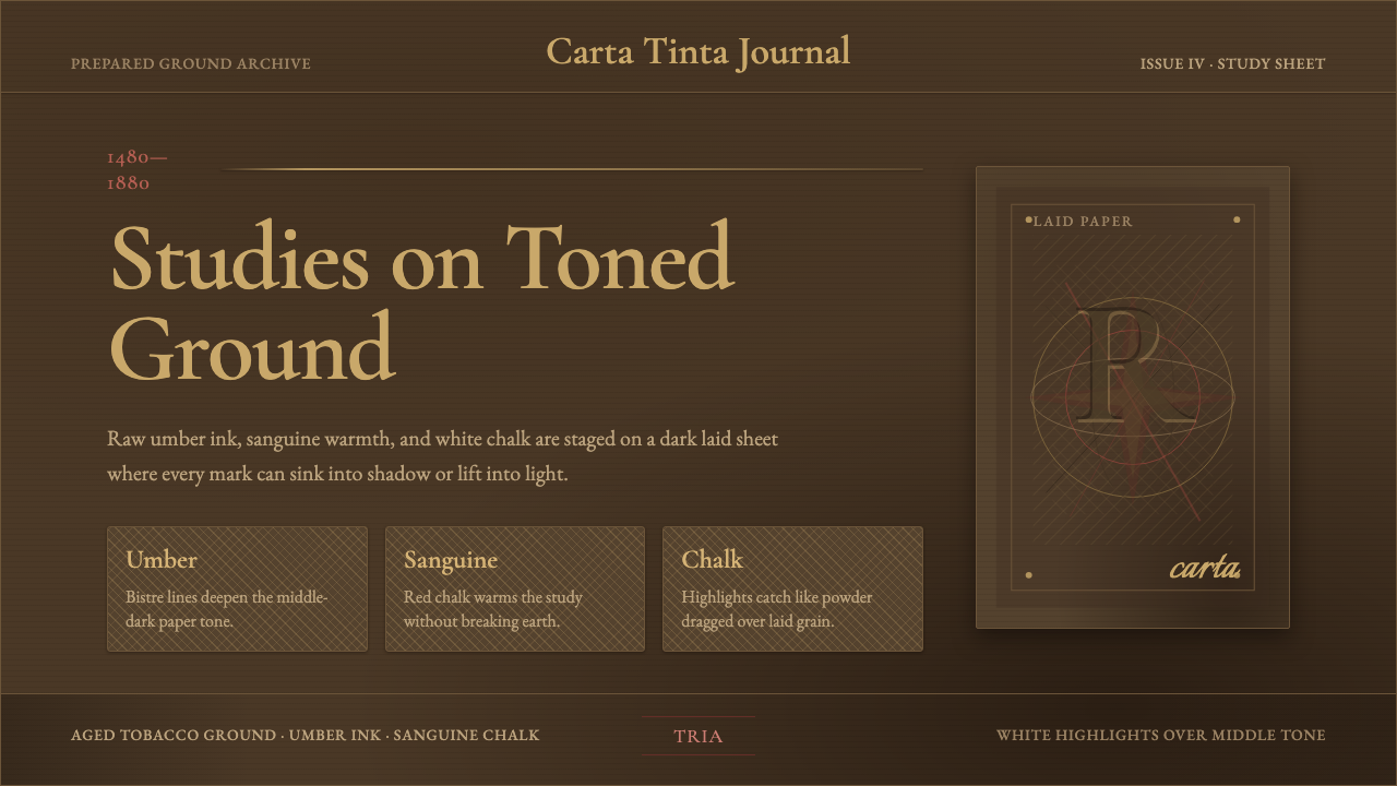
Raw Umber Sketchbook recreates the toned paper of an Old Master drawing — tobacco-brown ground, umber ink structure, sanguine warmth, and chalk highlights lifted from the middle tone.
Raw Umber Sketchbook in brief
Raw Umber Sketchbook is built from the authentic working surface of a prepared Old Master drawing sheet, known in the studio tradition as carta tinta — a toned ground, brushed onto laid paper and darkened over centuries into a deep tobacco-brown, rather than the bright, neutral white of a modern sketchbook page. The style begins from the premise that a drawing surface is never truly blank; it is already a tone the artist must work both darker and lighter against.
On that toned ground, raw umber and bistre inks describe structural line and shadow, sanguine red chalk warms flesh tones and adds a sense of living color without full painting, and white chalk is reserved exclusively for the brightest highlights — the point where light actually strikes a form. This three-material approach, historically called à trois crayons (drawing in three chalks), is fundamentally different from drawing on white paper: instead of adding dark marks to a light page, the artist works in both directions from a middle value, which is why the style reads as more dimensional and dramatic than a simple pencil sketch.
Crucially, this is the aesthetic of a working studio sheet, not a finished, precious art object — it carries hatching, smudged transitions, and the faint stain of fixative, the visible evidence of an artist actively reasoning through form. The style deliberately preserves this sense of process rather than presenting a clean, finished illustration; a raw umber system should look used, not pristine.
Where does Raw Umber Sketchbook come from?
The toned drawing ground, or carta tinta, has roots reaching back to Renaissance Italy, where paper was often prepared with a wash of diluted ink, watercolor, or gouache before any drawing began, giving artists a mid-value surface from which to work both up toward light and down toward shadow. This was not a stylistic flourish but a practical studio technique: a blank white page forces an artist to invent the lightest values as well as the darkest, while a toned ground supplies the middle value already in place, letting the artist focus effort on the extremes.
The technique reached a particular refinement in the à trois crayons method — drawing with black, red (sanguine), and white chalk together on toned paper — associated with French and Flemish studio practice from the sixteenth through eighteenth centuries. The Italian draftsman Federico Barocci, working in the sixteenth century, was among the early masters known for elaborate, highly finished chalk studies on colored ground, using the technique to work out figure poses and drapery before committing to a final painted composition.
The Flemish painter Peter Paul Rubens, in the early seventeenth century, was a particularly prolific and virtuosic user of red and black chalk on toned paper, producing preparatory figure studies of remarkable warmth and immediacy that were valued in their own right as works of art, not merely as preparatory notes. The French Rococo painter Antoine Watteau, in the early eighteenth century, became closely associated with the trois crayons technique specifically, using red, black, and white chalk on tan paper to capture fleeting, naturalistic poses and expressions with an economy that full painting could not match.
By the later eighteenth century, the sculptor Jean-Antoine Houdon continued this drawing tradition into figure and portrait studies, and the broader academic drawing curriculum across European art schools institutionalized toned-paper chalk study as the standard method for training the eye and hand in figure work — a practice that persisted in academic instruction well into the nineteenth century, long after the specific studio conditions that originally necessitated the toned ground had changed.
What defines the Raw Umber Sketchbook look?
Color
A deep tobacco-brown ground carries raw umber and bistre for structural line, sanguine red for warmth, and white chalk reserved strictly for the brightest highlights. The middle tone is the foundation everything else works against, not an empty background waiting to be filled.
Typography
Type should feel drawn or inked rather than typeset with mechanical precision — old-style serif letterforms with visible stroke variation sit naturally within this system, echoing the hand-drawn, studio-notebook quality of the surrounding marks.
Hatching and shading
Cross-hatching and smudged tonal transitions build form the way a chalk study builds it — through accumulated, directional strokes rather than a flat fill or smooth digital gradient. This hand-built quality of shadow is central to the style's authenticity.
Highlight economy
White chalk highlights appear only where light genuinely strikes a form directly — never as a general brightening device. Because the middle-dark ground already supplies most of the tonal range, highlights carry disproportionate visual weight and should be used sparingly and precisely.
Warmth through sanguine
The red chalk register carries all the system's sense of living warmth — flesh tones, emotional emphasis, focal accents — functioning the way a limited spot color functions in an otherwise monochrome system, never spreading evenly across every surface.
Process marks
Faint fixative stains, smudged edges, and visible pentimenti (traces of reworked lines) should be treated as authentic surface qualities to preserve, not flaws to erase — they are the visible record of an artist actively working through a problem, which is the entire spirit of a sketchbook rather than a finished plate.
Composition
Figures and forms sit loosely on the page, often with unfinished edges fading back into the toned ground rather than a hard, contained border — the composition should feel like a study in progress, with attention concentrated where the artist's focus actually falls, and the rest left more sketchily resolved.

Who shaped Raw Umber Sketchbook?
A sixteenth-century Italian painter known for elaborate, highly finished chalk studies on colored ground, used to work out figure poses and drapery arrangements ahead of a final painted composition. His practice helped establish toned-paper chalk drawing as a serious, refined studio discipline rather than a merely preparatory afterthought.
A prolific and virtuosic early seventeenth-century Flemish painter, Rubens produced preparatory chalk figure studies of remarkable warmth on toned paper, works that were prized in their own right as art objects rather than merely as working notes. His command of red and black chalk together set a benchmark for the technique's expressive potential.
An early eighteenth-century French painter closely associated with the à trois crayons technique, Watteau used red, black, and white chalk on tan paper to capture fleeting, naturalistic poses and expressions with an immediacy that finished oil painting could not achieve. His drawings remain a definitive reference point for the toned-paper chalk tradition.
A late eighteenth-century French sculptor who continued the toned-paper chalk drawing tradition into figure and portrait studies, demonstrating that the technique remained a vital working method for artists across disciplines, not only painters, well after its Renaissance origins.
How do you use Raw Umber Sketchbook today?
Raw Umber Sketchbook is a style built around process and mid-tone drama — applying it well means resisting the pull toward a clean, finished-illustration look and preserving the sense of an artist actively working through a problem on a toned page.
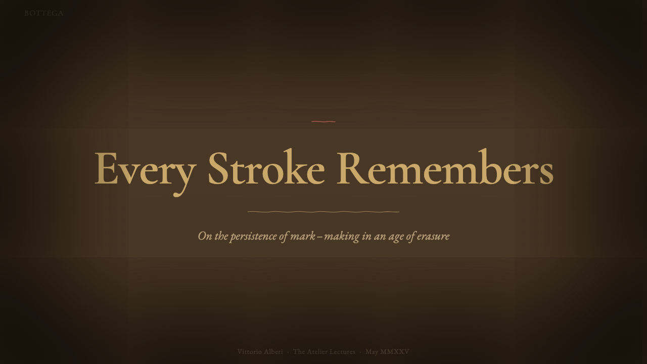
For presentation slides, the style produces an atmospheric, studio-notebook cover: a tobacco-brown ground with a loosely rendered central motif in umber line and sanguine accent, white highlight reserved for a single focal point such as the title itself. Content slides should keep the toned ground consistent throughout and use sanguine red sparingly, as a genuine accent color for emphasis or callouts rather than a secondary decorative hue.
For web interfaces, this style suits editorial and portfolio products in art, design education, and cultural heritage spaces — an art history platform, a drawing-instruction product, a museum or gallery digital experience. It is a poor fit for high-density transactional interfaces like dashboards or checkout flows, where the mid-tone ground and hand-drawn texture work against fast scanning and clear affordance cues.
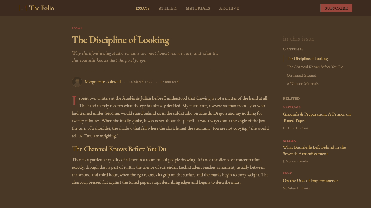
For editorial and marketing work, the style is well suited to long-form cultural writing, art criticism, and craft-focused brand storytelling, where a reader is meant to slow down and absorb atmosphere. A magazine-style article treatment benefits from using the toned ground as a full background with body text set in dark, ink-like tone, rather than confining the texture to a decorative header image alone.
A common mistake is treating the toned ground as a mere brown filter applied over an otherwise conventional light-background layout — the mid-tone has to be the actual working ground that both shadow and highlight are built from, not a color wash sitting behind an unrelated white-page composition. Another mistake is overusing white highlight, which should remain a scarce, high-value accent rather than a general brightening tool.
Raw Umber Sketchbook — FAQ
Why does this style use a brown or tan background instead of white, which most sketchbooks use today?
The style is drawn from the historic carta tinta studio practice, in which paper was deliberately toned before drawing began so the artist could work both toward light and toward shadow from an established middle value. A white page requires inventing both extremes from nothing; a toned page supplies the middle tone already, which is precisely why Old Master draftsmen favored it for serious figure study, and why this style commits to that mid-dark ground rather than a modern white default.
What is the à trois crayons technique, and why does it matter for this style?
À trois crayons means drawing with three chalks — black or dark umber, red (sanguine), and white — together on toned paper, a method closely associated with French and Flemish studio practice from the sixteenth through eighteenth centuries. It matters because it defines the style's entire color logic: dark for structure, red for warmth and flesh tone, white reserved strictly for highlight, all working against the paper's own mid-tone rather than a blank ground.
Does this style require visible hatching and smudging, or can it be cleaner?
The style is specifically defined by its process quality — it represents a working studio sheet, not a finished illustration plate. Removing hatching, smudged transitions, and process marks in favor of clean, smooth shading moves the result closer to a generic vintage-paper filter and away from what makes this style historically and visually specific: the visible evidence of an artist reasoning through form in real time.
Can this style be used for non-figurative content, like data or abstract graphics?
It can, provided the same tonal logic is respected: a mid-dark toned ground, structural marks built from hatching rather than flat fills, and highlight used sparingly for the most important data point rather than throughout. It works less well for interfaces that need many distinct color-coded categories, since the palette is intentionally narrow — three tonal registers, not a wide categorical color set — so dense multi-series charts are a weaker match than single-focus diagrams.
How does this differ from a generic 'vintage paper' or 'aged parchment' texture often used in design?
A generic aged-paper texture is usually applied as a surface filter over an otherwise conventional composition, mainly to suggest age. Raw Umber Sketchbook is structurally different: the toned ground is the working value the entire drawing is built from, following a specific historical technique (à trois crayons) with a defined three-material logic — umber structure, sanguine warmth, chalk highlight — rather than a single flattening texture applied for atmosphere alone.
Related design styles
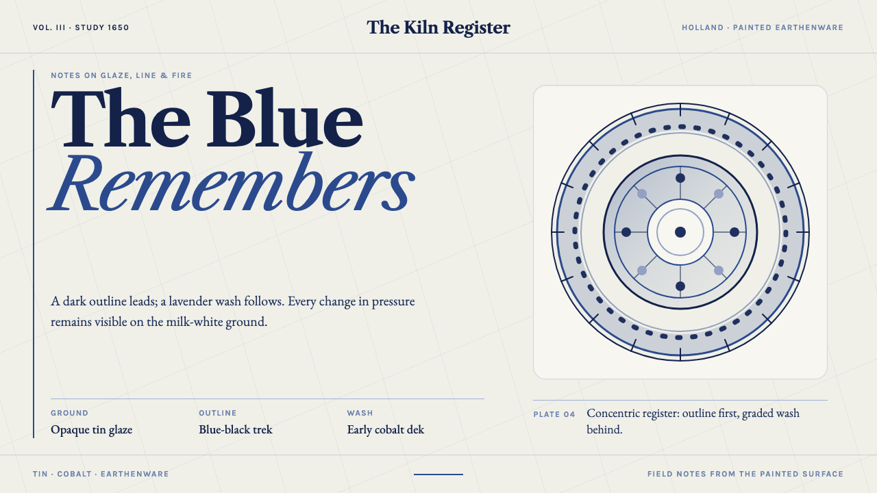 Delft BlauwBrushwork remembers. Lavender cobalt washes follow blue-black lines across mi…
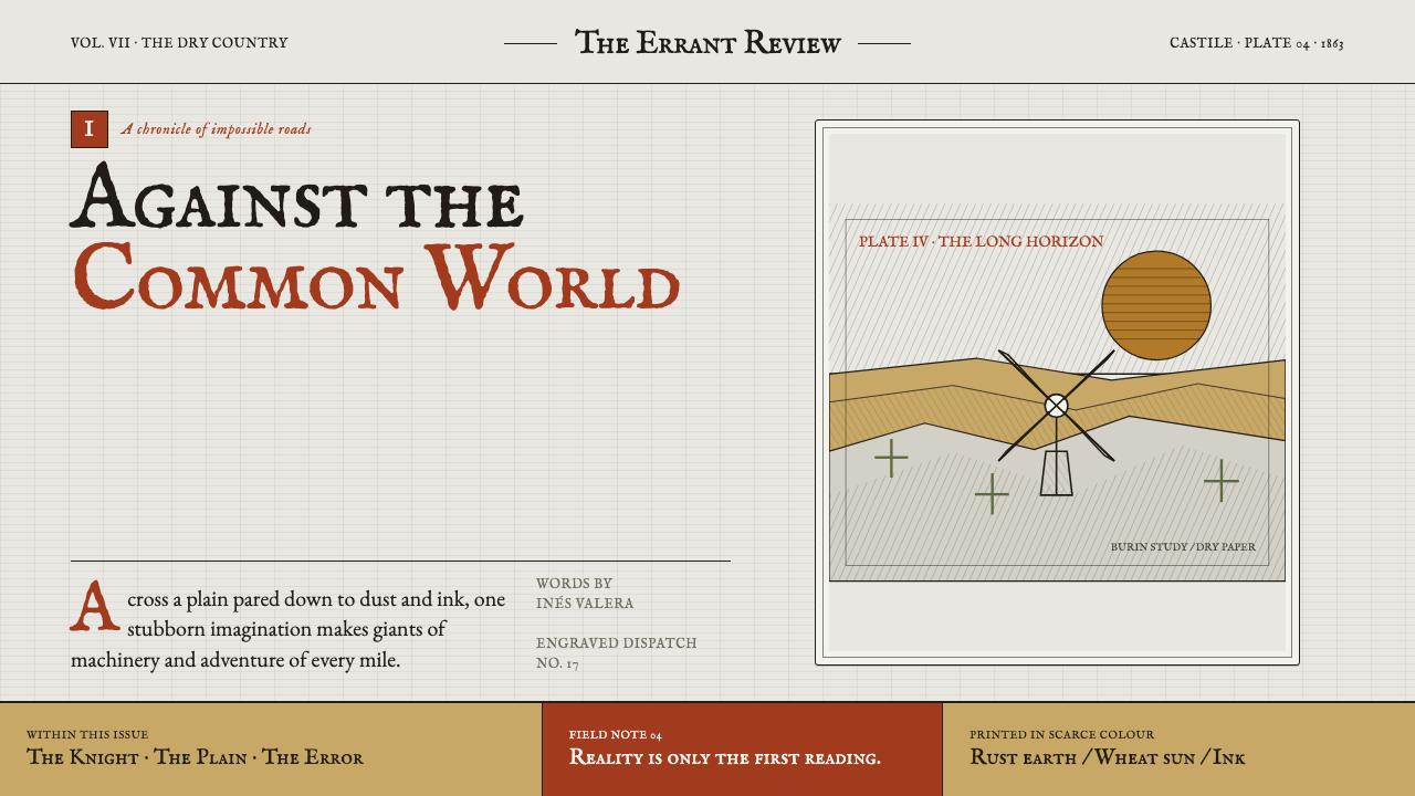 Don Quixote (1605)Imagination defies the plain. Rust capitals and cross-hatched ink score a dry…
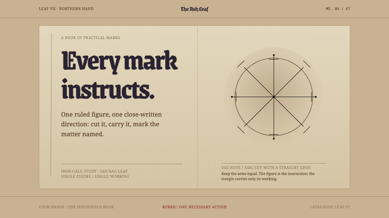 Icelandic GaldrabókEvery mark instructs. Iron-gall geometry stands alone on a smoke-darkened tan…
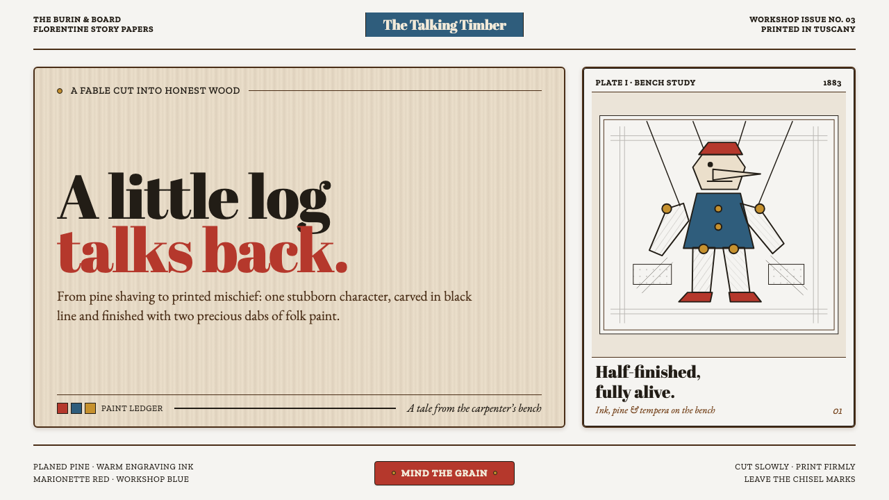 Pinocchio (1883 Marionette Workshop)Carved from honest timber. Red, blue and ochre punctuate crisp engraved lines.
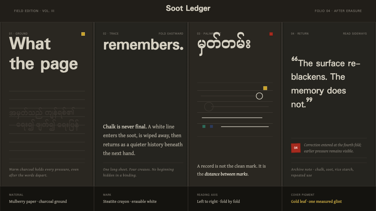 Shan Parabaik ManuscriptMemory survives erasure. Chalk-white lines and grey ghosts travel across warm…
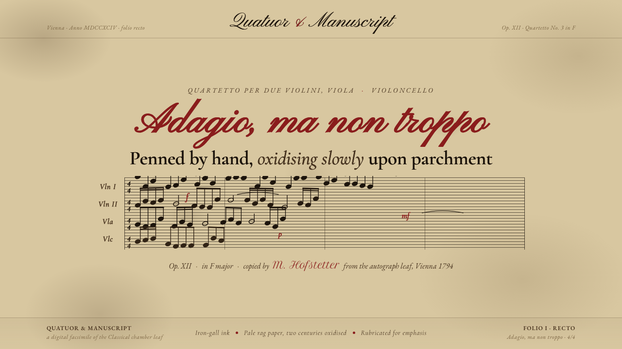 String Quartet ScorePenned by hand, oxidising slowly. Iron-gall ink browned on deep aged parchmen…