What is Ravenna Gold Mosaic?
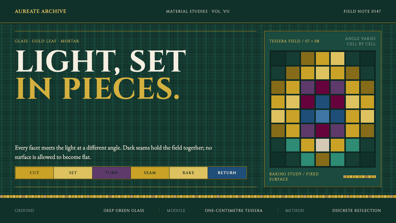
The gold in San Vitale's presbytery does not glow — it flickers, because every cell is a small flat facet of glass tilted at its own angle and seamed in dark mortar, so light rakes across the surface instead of lying flat on it.
Ravenna Gold Mosaic in brief
San Vitale's mosaic represents Byzantine wall mosaic pushed to its technical limit: glass tesserae roughly one centimetre across are bedded into the wall at deliberately varied angles rather than laid flush and flat. This is not a decorative flourish — it is the entire optical mechanism of the style. Because each small facet catches light from a slightly different angle than its neighbours, the surface never presents one continuous reflection. It shifts as the viewer moves, or as light moves across it, producing a shimmer that comes from variation between individual cells rather than from any single glossy or luminous surface. A visitor standing still in the presbytery and simply turning their head experiences the wall as genuinely different from moment to moment, which is precisely the effect the tilted setting was built to produce.
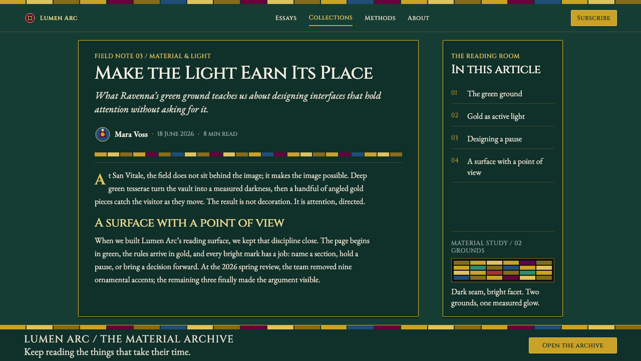
The vault's colour structure alternates between exactly two grounds, never blending them into one another. One is a gold ground, built by fusing gold leaf between two layers of clear glass so the metal sits protected and permanently bright inside the tessera itself. The other is a deep green ground carrying paradise-meadow imagery — foliage and pasture rendered as a settled, cooler field that gives the gold ground somewhere to alternate with rather than dominate everything at once.
Construction discipline is absolute: gold is always built from discrete, individually placed faceted cells, never smoothed into a gradient or a continuous sheet of colour, and every edge between tesserae is seamed with visibly dark mortar rather than blended or hidden. Nothing in the system is permitted to blur or glow in the way a modern lighting effect would; the entire visual richness comes from the accumulation of many small, sharply bounded decisions rather than from any single smooth surface. Figural elements — the processional portraits, the peacock and lamb roundels, the acanthus scrollwork — are built from the same small faceted units as the plain ground fields, so image and background share one identical construction method throughout.
Where does Ravenna Gold Mosaic come from?
San Vitale was built between 526 and 547, consecrated in that final year under the guidance of Bishop Maximian, during the reign of the Byzantine emperor Justinian I. Ravenna at this time served as the Byzantine capital of Italy, the seat of the Exarchate governing newly reconquered Italian territory, which made the church's decoration a matter of imperial statement as much as religious devotion.
Construction was privately funded by the banker Julianus Argentarius, whose financial backing made possible a decorative programme of a scale and material cost — gold leaf fused into thousands of individual glass tesserae — that few ecclesiastical patrons of the period could otherwise have commanded. The result placed enormous technical and artistic resources in service of a single presbytery, concentrating what a whole city's wealth of skilled labour and material could produce onto one relatively small, sacred space.
The presbytery's most celebrated imagery consists of processional panels depicting Justinian and Theodora together with their respective retinues, rendered in the same faceted mosaic technique as the surrounding decoration. These portraits functioned as a claim of imperial presence and authority within newly reconquered Ravenna, translating political power directly into the same glittering, permanent medium used for the church's religious imagery.
Surrounding this imperial programme, the vault's decorative vocabulary draws on a mix of Christian symbol and classical ornament: peacock and lamb roundels carrying resurrection and Christological meaning, and acanthus scrollwork borrowed from earlier classical decorative tradition, all recombined within the same alternating gold-and-green ground. Together, this body of work stands as one of the defining monuments of Early Byzantine wall mosaic and Justinianic court art.
What defines the Ravenna Gold Mosaic look?
Angled Tesserae
Small glass units, roughly one centimetre across, are bedded at deliberately varied angles rather than laid flush, so the surface catches raking light differently from cell to cell.
Alternating Grounds
Two grounds alternate across the composition — a gold ground built from gold leaf fused in glass, and a deep green ground carrying paradise-meadow imagery — never blended into a single field.
Discrete Gold Cells
Gold is always constructed from individually placed faceted cells, never rendered as a smooth gradient or a continuous sheet of colour.
Visible Mortar Seams
Every edge between tesserae is seamed with visibly dark mortar, never blended away, so the surface reads as an accumulation of distinct small units rather than one continuous plane.
Imperial Processional Figures
Processional panels of Justinian and Theodora with their retinues render imperial portraiture in the same mosaic medium as the surrounding religious decoration, fusing political and devotional imagery.
Symbolic Ornament
Peacock and lamb roundels and acanthus scrollwork recur as decorative vocabulary, combining Christian symbolism with classical ornamental tradition within the same faceted technique.
Who shaped Ravenna Gold Mosaic?
As Byzantine emperor during San Vitale's construction, Justinian I is depicted in a processional mosaic panel with his retinue, a portrait that functioned as a statement of imperial authority over newly reconquered Ravenna.
Empress Theodora appears in her own processional mosaic panel with her retinue, paired with Justinian's, extending the church's imperial iconographic programme to the empress as a figure of parallel authority.
Maximian oversaw the completion and 547 consecration of San Vitale, and is himself depicted within the imperial processional panel, linking the church's ecclesiastical leadership directly to the imperial imagery it commissioned.
As the banker who privately funded San Vitale's construction, Julianus Argentarius made possible the scale of gold-leaf tessera work and figural mosaic that the church is now defined by.
How do you use Ravenna Gold Mosaic today?
For slide covers and hero sections aimed at luxury, heritage, or premium brand positioning, this style works as a richly textured gold-cell field for a title panel, paired with a deep green content field for the rest of the deck — echoing the vault's alternation between the two grounds rather than mixing them on the same surface.
Content slides and web pages should confine the faceted gold texture to headers, hero banners, or single decorative frames rather than spreading it across dense content areas: the technique's richness works against legibility if it is applied where a reader needs to scan text or numbers quickly. Data areas are better served by the plain deep-green ground alone.
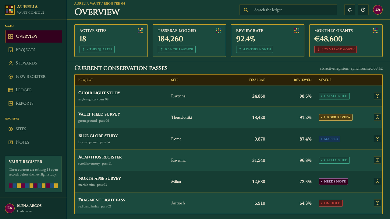
In web interfaces, this style is a poor default for functional dashboards — the surface's deliberate visual busyness fights against the clean scanning a data-heavy screen requires. Where it is used at all, restrict it to a hero header or brand moment and keep working screens in a plain, unornamented palette. A loading state or an empty-state illustration is another reasonable place for it, since those moments are seen briefly and do not require the same scanning speed as an active data view.
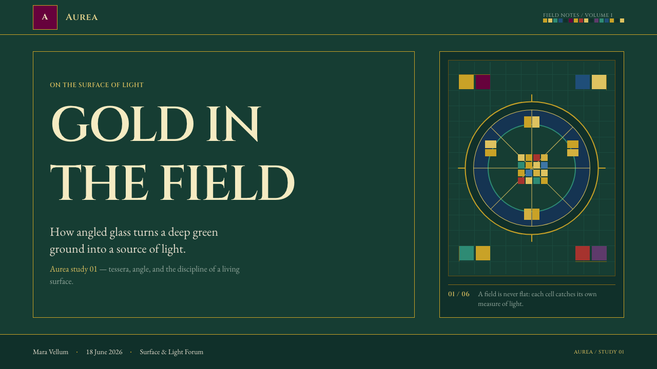
For editorial and marketing content built around craft, heritage, or luxury positioning, the peacock, lamb, and acanthus motifs make effective icon frames or section dividers, and a row of small roundel-style icons can evoke the processional imagery without reproducing specific religious portraiture.
The most common mistake is faking the gold shimmer with a smooth gradient rather than building it from discrete faceted cells with visible dark seams — a gradient reads as glossy and modern, while the authentic effect depends entirely on visible variation between small, sharply bounded units. A second mistake is blending the gold and green grounds into one another at their border, when the source material treats them as two distinct, alternating fields that meet at a clear edge rather than fading into each other.
Ravenna Gold Mosaic — FAQ
Why does the gold appear to flicker rather than glow smoothly?
Because it is built from many small, individually angled glass facets rather than a single smooth surface. Each facet catches light differently from its neighbours, so the overall effect shifts with the viewer's position or the light's movement rather than presenting one continuous reflection.
What are the two grounds used in the vault, and why do they alternate?
The vault alternates between a gold ground, built from gold leaf fused between layers of clear glass, and a deep green ground carrying paradise-meadow imagery. Alternating rather than blending the two keeps each ground's identity distinct and gives the gold somewhere to contrast against.
Who commissioned San Vitale, and why does that matter for its imagery?
Construction was privately funded by the banker Julianus Argentarius during the reign of Justinian I, with Bishop Maximian overseeing its 547 consecration. Ravenna's status as the Byzantine capital of Italy at the time made the church's imperial processional panels a statement of political authority as much as religious devotion.
Does this style suit product or dashboard interfaces?
Not for dense, functional screens. The faceted texture's visual richness works against the clean scanning a data-heavy interface requires, so it is best confined to hero sections, headers, or brand moments rather than applied across an entire working product.
Why are the dark mortar seams between tesserae left visible instead of hidden?
Visible seams are what let the surface read as an accumulation of many distinct small units rather than one continuous plane. Hiding or blending them would collapse the faceted construction into something closer to a flat painted surface, losing the very quality that makes the wall shimmer rather than glow.
Related design styles
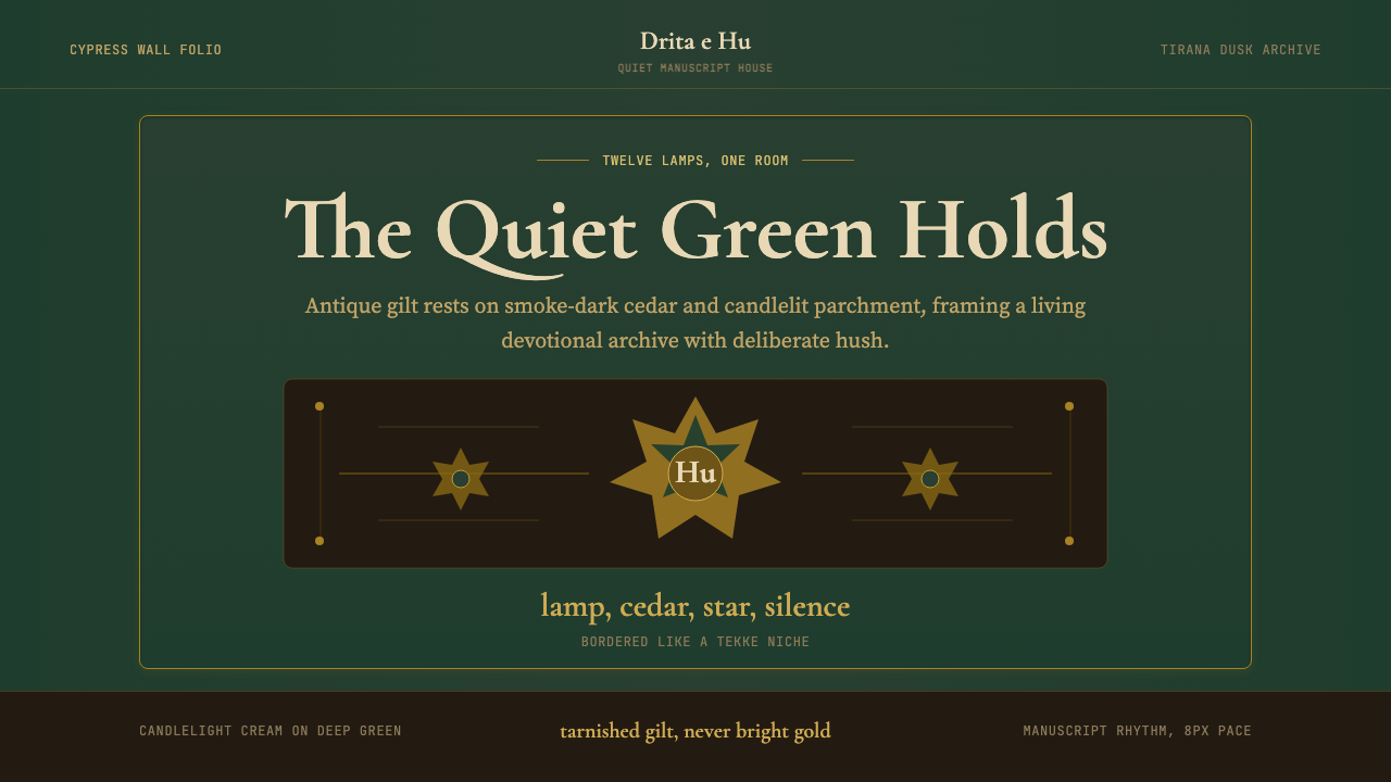 Albanian Bektashi Sufi (Tekke)Sacred quiet in cypress green. Gilt stars and Cormorant type frame a dusk tek…
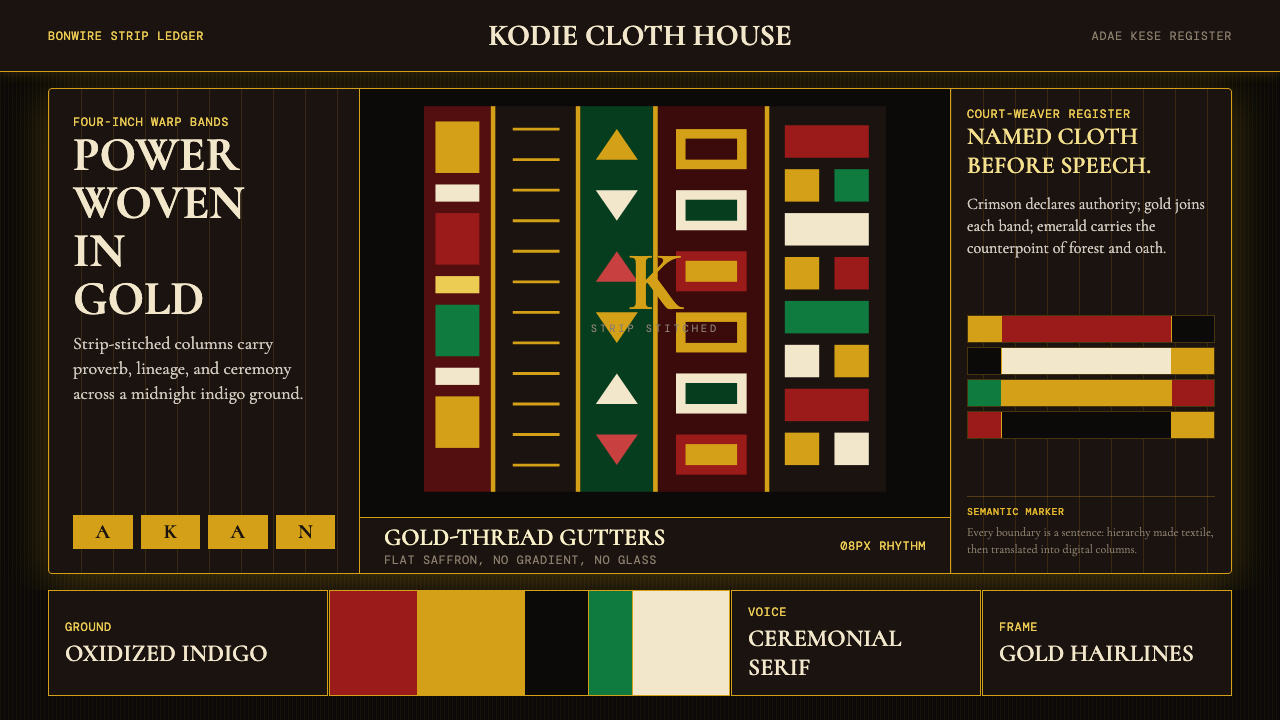 Ghanaian Kente (Asante Royal Gold)Royal authority, woven dark. Gold gutters stitch crimson and indigo strips in…
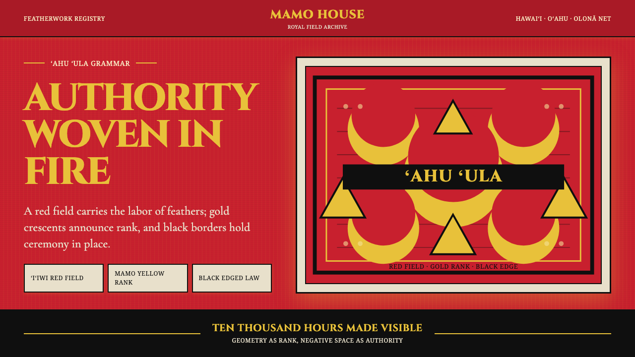 Hawaiian Feather Cape (ʻAhu ʻUla)Ceremony has weight. Red feather fields, mamo yellow crescents, black borders.
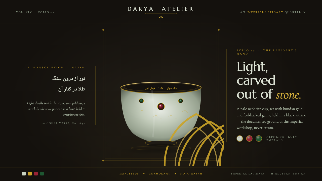 Mughal Jade CarvingImperial luxury, lit from inside. Pale nephrite glows on black, kundan gold f…
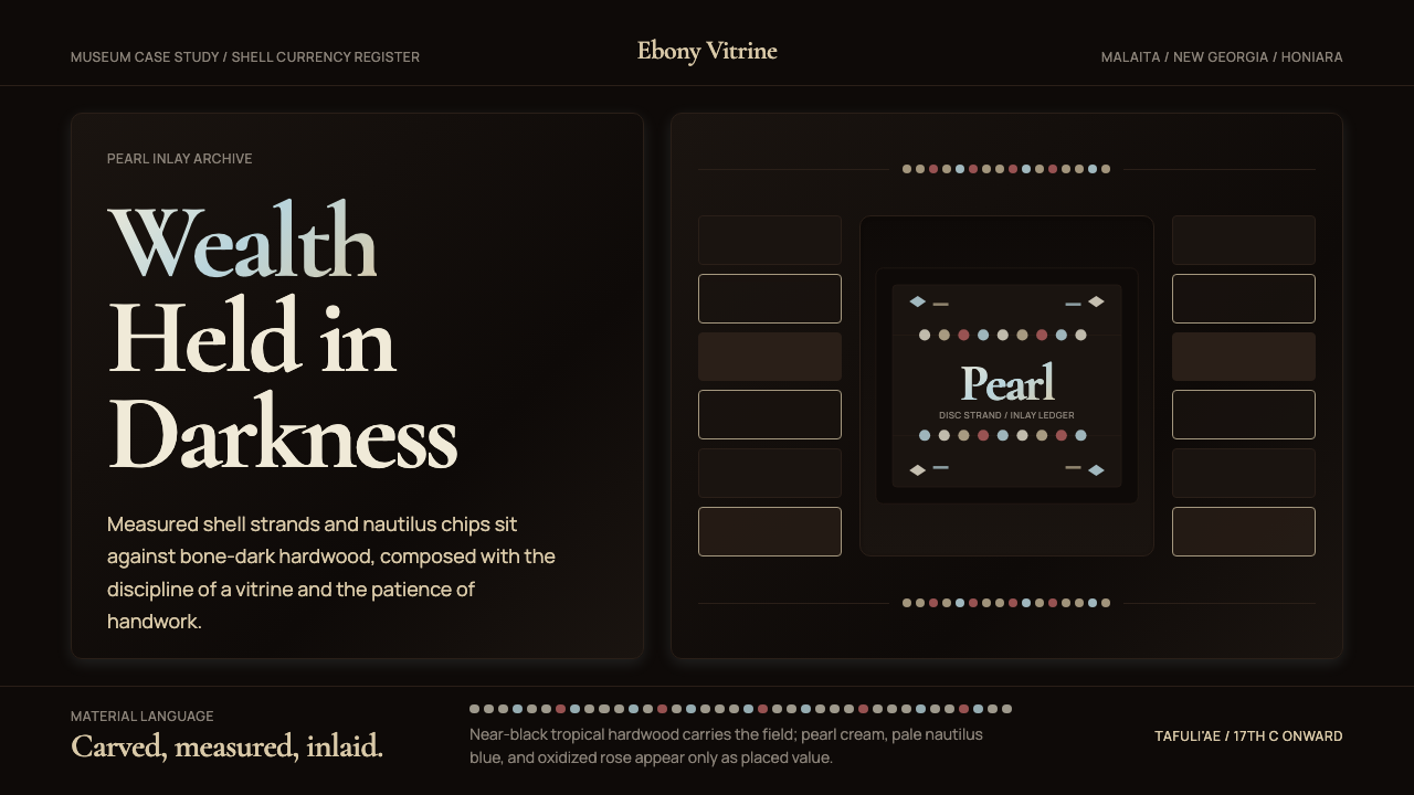 Solomon Shell Money & Pearl InlayDignity inlaid in darkness. Pearl cream and nautilus blue form strict shell-s…
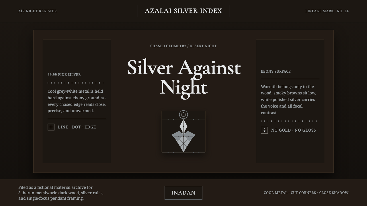 Tuareg Agadez Cross SilverSilver refuses warmth. Cool chased geometry cuts across ebony-dark surfaces.