What is rabbit r1?
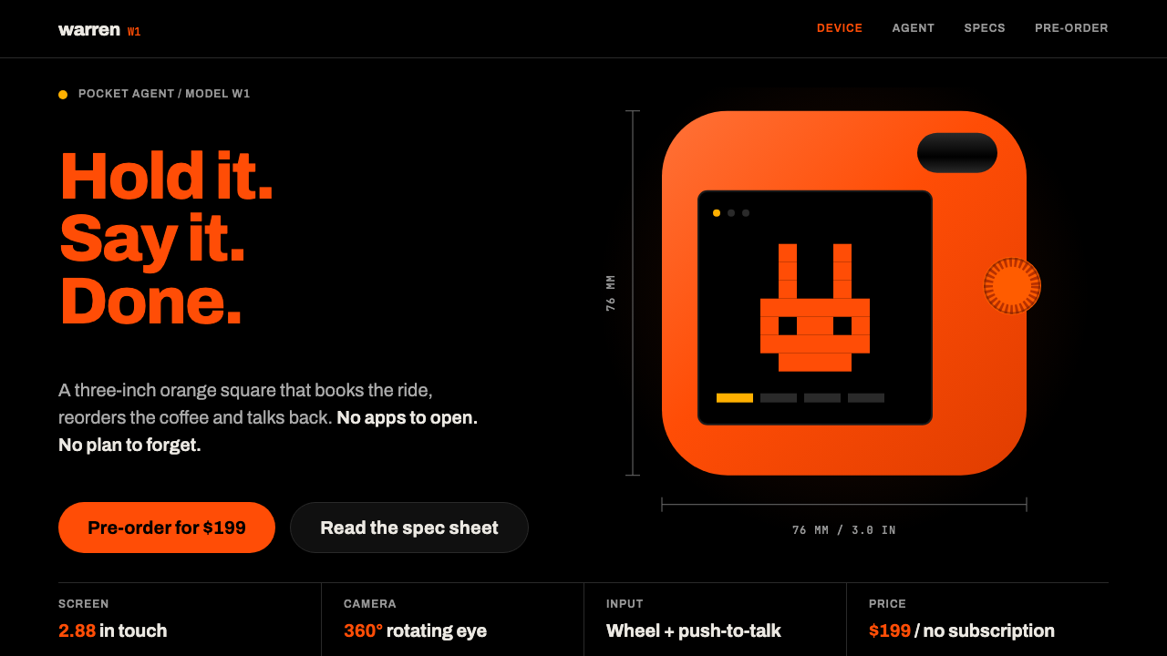
The rabbit r1 style makes one orange object the only thing on a pure black page: heavy grotesk type, a bouncing pixel rabbit and spec rows drawn with the thinnest of lines.
rabbit r1 in brief
The rabbit r1 style is a dark, product-first design language built from a single piece of hardware: the rabbit r1, a small square of painted orange metal that rabbit inc. and Teenage Engineering showed on stage at CES in January 2024. The device has a scroll wheel, a push-to-talk button and a rotating camera, and a pixel rabbit bounces on its screen while the agent thinks. The design system takes that object as the sun and arranges everything else around it.
The page is pure black, the type is one heavy grotesk and orange is used sparingly, so that whenever orange appears it reads as the device itself. Spec labels sit in small capitals, rows are separated by hairline rules, and the main call to action is a single orange button that asks you to hold and talk. There is little else on the page, and that is exactly the point.
The tone is playful but strict. It borrows the toy-like charm of a handheld console, yet every detail is tightly resolved. This pairing of retro warmth and rigorous discipline makes the style feel like a premium gadget rather than a children's game, and it explains why it suits AI hardware, where a friendly face has to carry a very serious technical promise.

Where does rabbit r1 come from?
The rabbit r1 was unveiled at CES on 9 January 2024 and began shipping in April 2024, with rabbitOS updates continuing through 2024 and 2025. It was made by rabbit inc., based in Santa Monica, California, with industrial design collaboration from Teenage Engineering of Stockholm. Its founder and public face is Jesse Lyu. The pitch was bold: a pocket-sized companion with an AI agent that could handle tasks by voice, and a physical design that was a deliberate departure from the glass slab of the smartphone.
Teenage Engineering is known for toy-like, colourful and highly crafted electronics, and its sensibility is what gives the r1 its distinctive character. The device is a small square with rounded corners, a bright orange shell and a minimal control set: one wheel, one button. Teguh Arief is a key name connected with the project. The result looked closer to a collectible gadget than to a conventional phone, and that visual surprise was a large part of its impact at launch.
The interface carries the same attitude. A pixel rabbit, drawn in a deliberately coarse, retro style, bounces when the agent is working, giving a machine intelligence a very simple, endearing face. This fits a broader pixel-art UI revival, in which designers return to blocky graphics for warmth and character. It also belongs to the wider wave of AI hardware companions, products that try to make artificial intelligence feel like a physical object with a personality rather than an app.
The design system distils all this into a web and presentation language. Pure black stands in for the dark of the stage and the device's screen. Heavy lettering stands in for the confidence of the launch. The sparing orange stands in for the single object that matters. The three origins, AI hardware, Teenage Engineering's toy-like industrial design and the pixel-art revival, are visible together in every composition.
What defines the rabbit r1 look?
Pure black ground
The page ground is true black, not charcoal or navy. It behaves like a stage in a dark room, pushing everything except the product into the background. Because black absorbs light, the orange device and white text feel luminous without any extra effects.
The single orange
Orange is the colour of the device, and the style treats it as a name rather than a decoration. It is used for the product, the primary button and nothing else. When a reader sees orange, they should think r1. Resisting the urge to use it on links, icons and headings is what keeps the effect strong.
One heavy grotesk
All type comes from a single heavy grotesque sans-serif family. Headlines are large and dense, and hierarchy is created through scale and weight rather than by mixing typefaces. This singleness gives the page the confidence of a product launch slide and the clarity of an industrial label.
Pixel rabbit
A small blocky rabbit bounces to show that the agent is thinking. It is the only illustrated character in the system and the main source of its warmth. It should be small, rendered with coarse pixels and animated simply, as if on a tiny low-resolution screen.
Small-caps spec labels
Specifications are presented as a table of labels in small capitals, each paired with a value. The labels are quiet and consistent, like the printing on the back of a device. This is where the style borrows from engineering documentation to support its premium feeling.
Hairline rows
Rows and sections are divided by the thinnest possible rules in a muted grey on black. There are no boxes, fills or shadows. The result is airy and exact, with enough structure to scan quickly and nothing to compete with the product.
Hold-to-talk button
The main call to action is a single orange button that echoes the device's push-to-talk key. It carries the only strongly coloured fill on the page and is worded as an invitation to speak. This is a good model for any AI product: one clear action, one colour.

Who shaped rabbit r1?
Founder of rabbit inc. and the public presenter of the r1 at CES in January 2024. His keynote framed the device as a pocket companion, which is the story the style visually tells.
Stockholm design and electronics company known for toy-like, colourful and meticulously made products. Its industrial design collaboration gave the r1 its square orange body and tactile controls.
A key name connected with the r1 project and its design. The device's combination of playfulness and precision is part of the reference that the style borrows.
How do you use rabbit r1 today?
In slides, the rabbit r1 style makes outstanding product-launch and keynote decks. A cover is a black field with one orange object and a short heavy headline. Content slides have a single message each, set in white against black, with the orange used only for the point that matters. Spec slides can reuse the small-capital label and hairline row pattern for features, comparisons and timelines. It is ideal for hardware reveals, AI demos and investor updates that want a launch-day feeling.
In web interfaces, the style fits product pages, AI assistant front ends, voice interfaces, companion apps and developer tools with a retro handheld flavour. The main screen can hold one large element, such as the device, a waveform or a response, and an orange hold-to-talk button. Dashboards are feasible when data is shown as hairline rows with small labels. Pricing pages can use a single orange highlight for the recommended plan. Dark mode is the native mode here, and a light version would need to be a separate design rather than a simple inversion.
In editorial and marketing work, it suits launch announcements, teaser posters, social cards, trade-show graphics and packaging inserts. Large heavy headlines on black are naturally striking, and the pixel rabbit can be used as a sticker-like mascot. It works well for tech journalism about AI hardware, where an image of the device on black is already half the story. Keep copy short, because the style rewards confidence and brevity.
The most common mistake is spreading orange. Once links, icons, charts and headings are orange as well, the device no longer stands out and the style looks like a generic dark theme. Another mistake is adding extra typefaces, gradients or glassy effects, which dilute the toy-and-instrument purity. A third is ignoring the pixel rabbit's scale; if it grows too large, it turns a refined product page into a children's game. Finally, avoid crowding the black: the emptiness is the stage on which the orange object performs.

rabbit r1 — FAQ
What is the rabbit r1 design style?
It is a dark, product-first design language based on the rabbit r1 AI device. It uses a pure black page, one heavy grotesk typeface, a rationed orange that stands for the device, a bouncing pixel rabbit, small-capital spec labels and hairline dividers.
Who made the rabbit r1 and when was it shown?
It was made by rabbit inc. of Santa Monica, California, with design collaboration from Teenage Engineering of Stockholm. It was unveiled at CES on 9 January 2024, started shipping in April 2024, and received rabbitOS updates through 2024 and 2025.
Which projects suit this style?
Hardware launches, AI assistants, voice products, developer tools with a retro handheld feel, keynote decks and tech editorial. It works best when there is one hero object or action to put in orange against black.
How strictly should orange be rationed?
Very strictly. Use it for the product and the main action only. If orange also appears on links, icons and headings, the page loses the idea that orange equals the device, and the style stops working.
Can it be done in light mode?
Not by simple inversion. The style is built on a pure black stage, so a light version needs its own design, probably a very pale ground, black type, the same single orange and the same hairline structure. Dark is the native form.
Related design styles
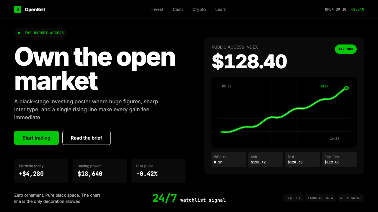 Robinhood 2023Markets feel immediate. Pure black, Inter numbers, and one neon-green line do…
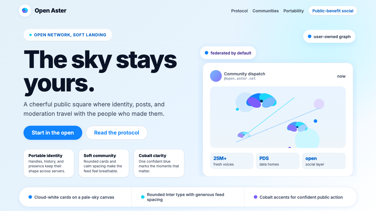 Bluesky AT Protocol 2024Open tech feels warm. Pale sky, cloud cards, Inter, and one cobalt accent car…
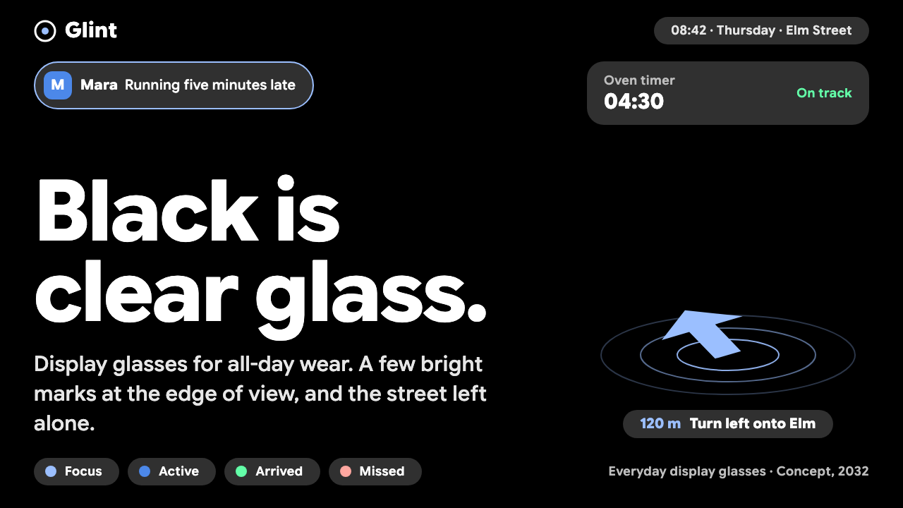 AR Glasses OverlayBlack is clear glass. Grey capsules and one pale-blue arrow at the edge; the…
 DevsEngineering turns sacred. Near-black void, sodium gold, and a centered dimple…
 Tesla Cybertruck Stainless (2023)Refusal made material. Void black, stainless hairlines, cyan edges, faceted I…
 Among Us (crewmate space)Trust is ready to break. Loud capsule colors cut through a navy void with har…