What is Qing Imperial Yellow?
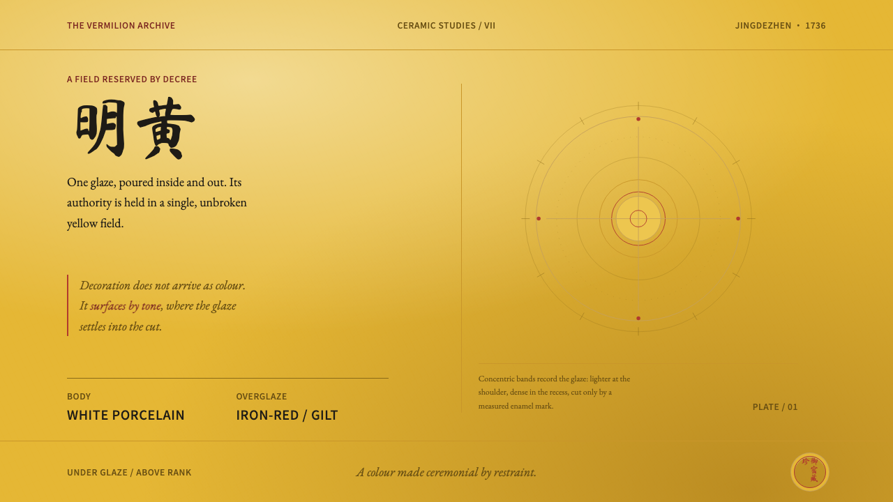
Qing Imperial Yellow treats one glaze as law: the yellow is the page, ornament is read by tone alone, and a single small mark of iron-red is the only voice allowed on top.
Qing Imperial Yellow in brief
Qing Imperial Yellow is a design language drawn from the yellow-glazed porcelain of the Qing court, made at the imperial kilns of Jingdezhen and sent north to Beijing. Its defining move is simple and total: a deep, creamy yellow, the colour of egg yolk or rendered chicken fat, covers the entire vessel, inside and out, and nothing is permitted to compete with it. The yellow is not an accent placed on a neutral page. It is the page.
Every other decision follows from that one. Ornament is not painted on the surface; it is cut into the white clay body before glazing, so a dragon survives only as faint relief, legible through slight differences in how thickly the glaze has pooled. The one thing allowed to sit above the glaze is a small passage of iron-red enamel with gilding, such as a ring of reign-mark characters in double lines or a fine stroke along a dragon's spine, and it occupies a very small share of the field.
What results is authority through subtraction. This is the restraint of ritual and court vessels, not the bustle of export porcelain: one colour, one accent, wide calm surfaces, and a hierarchy that is read rather than announced. For a designer, the lesson is how much presence a single, fully committed colour can carry when everything else steps back.
Where does Qing Imperial Yellow come from?
Imperial yellow was not a preference; it was a prohibition. Under Qing sumptuary law, the bright yellow called 明黄 (míng huáng) was reserved for the emperor. A bowl glazed in it, inside and out, was therefore a legal instrument as much as a vessel. It announced rank, it could not be mistaken for anything else, and it left the viewer no escape from the single colour. The yellow was a credential.
The technique behind the colour, a tender yellow (娇黄, jiāo huáng) glaze built on iron and antimony, reaches back to the Ming reign of Hongzhi (1488–1505) and runs on through the Qing. The wares came from the imperial kilns at Jingdezhen in Jiangxi and were supplied to the court in Beijing. Pieces in this tradition carry the reign marks of the Shunzhi, Kangxi, Yongzheng and Qianlong emperors, which gives the style a documentary spine: the same restrained formula can be followed from reign to reign, each leaving its own signature on it.
The order of making explains the order of the look. First the potter cut the dragons into the white body, a technique known as 暗刻 (anhua), incised decoration that hides beneath the glaze. Then the glaze went over everything, filling and softening the carving so that the pattern could be seen only as relief. Only after that came the last decoration: iron-red overglaze enamel with gilt, 矾红描金, laid down in a few exact lines. The body carries form, the glaze carries colour, the enamel carries the signature. Hierarchy is built into the sequence.
Behind the emperors stood the supervisors of the Jingdezhen imperial kilns, the administrators responsible for turning the court's wishes into fired objects. A colour reserved by law has to be recognisable vessel after vessel, so a small and consistent vocabulary suits it. The restraint of imperial yellow is partly aesthetic and partly institutional, and both halves can still be read in the objects.
What defines the Qing Imperial Yellow look?
Color: Yellow as the Page
A deep, warm, creamy yellow, closer to egg yolk than to lemon, fills the whole field and does the work that a neutral background would do in other systems. There is no supporting palette of blues or greens waiting in the wings. Variation exists only within the yellow itself: slightly lighter where the surface catches light, slightly deeper where the glaze has gathered. The effect is saturated but calm, because there is nothing beside it to argue with.
Tone-on-Tone Relief
Pattern is carried by depth, not by a contrast of hue. Dragons are cut into the body before glazing and show afterwards as soft ridges and hollows, visible through small shifts between lighter and darker yellow. On a screen this means ornament should whisper: a faint embossed or inset impression in the same yellow, never an outline in a second colour. If the pattern can be seen from across the room, it has been over-drawn.
The Single Red
Iron-red enamel is the only colour permitted to rest on top of the glaze, and it is used the way a seal is used on a scroll: once, small, and with intent. It marks the place where authorship or authority is declared, not the places where the eye wants decoration. A page with several red elements has already misread the system. Red here is a signature, not a palette.
Gilt and Hairline
Gold appears only as fine line work that accompanies the red: a delicate stroke along the spine of a dragon, the thin edge of a ring. It is never a filled area, never a gradient, never a background. Because the lines are so slender, they reward close looking and add no weight to the overall composition. Think of it as a hairline, not as a block of colour.
The Reign Mark
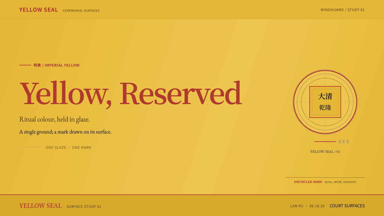
The double-line mark that rings an inscription on the base of a vessel is the system's signature device: a compact, enclosed, centred inscription in iron-red. In design terms it becomes the logo lockup, the colophon, the footer seal, the single place where the brand speaks in its own voice. It is small, framed by a doubled line, and set apart by a wide margin of empty yellow, so that it reads as an authenticating stamp rather than a headline.
Generous Emptiness
Large parts of a composition are simply left alone. Between the field of yellow and the tiny red passage there is no intermediate decoration, no border pattern, no ring of motifs acting as a visual staircase. This emptiness is the opposite of vacancy: it is what makes a small mark feel significant. The restraint of ritual and imperial wares, as opposed to the busier surfaces made for export, is the emotional register of the whole system.
Who shaped Qing Imperial Yellow?
One of the reigns whose marks appear on wares in this tradition. In the system's logic he stands for continuity: the court's reservation of bright yellow was in force, and the formula of an all-over glaze with a single small red signature could be repeated and recognised as imperial. His reign mark is a model for a design lesson that still holds: a signature should be tiny and unmistakable.
His reign mark appears on wares in the same tradition. The yellow-glazed vessels that carry it show the style at its quietest: the dragon is present, but only as relief, visible to anyone who looks closely and invisible to anyone who does not. That is the principle to carry across into design, that texture and depth should reward attention rather than demand it.
The last of the four reigns named in this lineage. By his time the formula had a long history behind it, reaching back to the Hongzhi-era glaze and through every earlier Qing reign, which is why a piece bearing a Qianlong mark reads less as innovation than as inheritance. For a design system that is the point: authority comes from adherence to a narrow, long-established vocabulary, not from novelty.
The administrators of the imperial kilns answered to the court and stand behind every vessel, though most of their names are not remembered. That suits the style: the glaze, not the maker, was the point. They represent the discipline of the system, a consistent yellow, a small repertoire of marks, no improvisation, and the idea that a good design system is enforced by its constraints.
How do you use Qing Imperial Yellow today?
Qing Imperial Yellow suits work that needs gravity, ceremony or heritage without turning to gold leaf and ornament. Applying it well means committing: the yellow has to be the ground of the page, not one swatch among several, and everything else has to be quiet enough for that to feel intentional.
On presentation slides, the cover is the system's strongest card. Fill the whole slide with the yellow, set the title in dark, unfussy type, and place one small red element, such as a framed mark or a short rule, where a signature would go. Leave generous empty space around it. Content slides keep the same ground and rely on size, weight and spacing for hierarchy rather than boxes and dividers; a faint tonal band can separate sections the way relief lifts a dragon out of the glaze. For data, use a single dark tone for the main series and reserve the red for the one number the audience should remember.
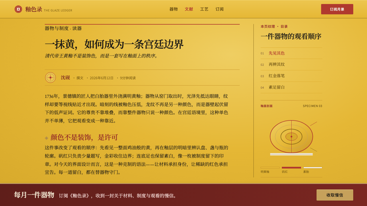
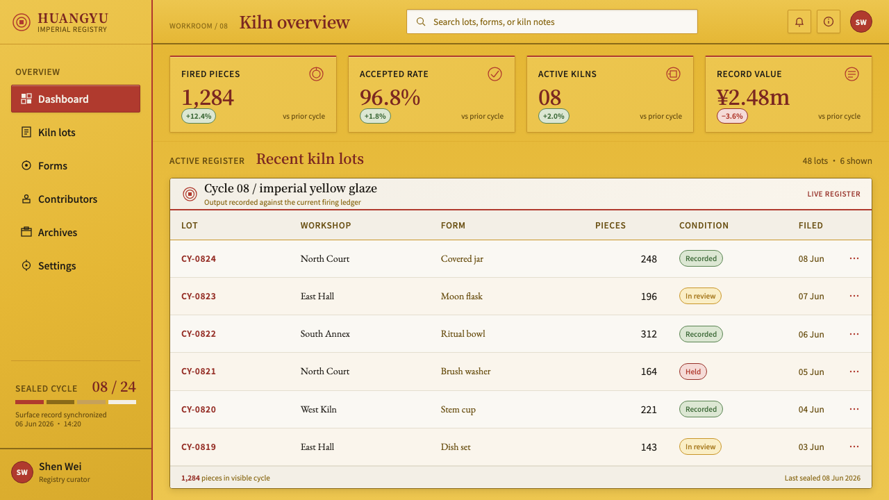
In web interfaces the system fits product pages, memberships, ceremonial sites, premium services, and pricing pages where one clear choice matters. Make the yellow the page background, keep text dark for legibility, and let cards and panels be distinguished by slightly deeper or lighter yellows and soft inset edges instead of borders in a second hue. The single red belongs to the primary call to action or the chosen plan. Forms, tables and dashboards can work too, provided status colours are kept to a minimum. If a product also needs error states, mark them with shape, icon and wording rather than flooding the page with the signature red.
For editorial and marketing work, the style gives a quiet, authoritative voice. Long-form pages benefit from a narrow text column on the yellow ground, a framed mark as colophon, and section breaks made with a single hairline in gold or in a darker tone of the same yellow rather than an ornamental divider. Campaign pages, invitations, awards and heritage product launches can use the yellow as a full-bleed field with one carefully placed red seal. Photography works best when it is toned warm and set into the page as a flat panel, not allowed to introduce competing colours.
The most common mistake is turning the single red into a palette: red buttons, red headings, red icons and red badges together make the page loud and cancel the idea of a signature. The second is treating yellow as an accent on white, which keeps the vocabulary of imperial colour but loses its logic. Finally, avoid decorating with dragons, clouds and borders in visible outlines. The pattern belongs in the relief, not on the surface, and a design that draws it boldly has misunderstood what the glaze was doing.
Qing Imperial Yellow — FAQ
Is Qing Imperial Yellow just a yellow theme?
No. Many themes use yellow as an accent or as a bright signal on a neutral ground. Here the yellow is the ground itself, and the system's other decisions exist to serve it: ornament carried by tone, one small red, gilding only as fine line, and wide emptiness. Swap the yellow for another hue and the structural logic would survive, but the cultural meaning would not. The identity of the style rests on its reference to imperial yellow.
Why is the red used so sparingly?
Because its job is to authenticate, not to decorate. On the porcelain, the iron-red and gilt passage is the signature: a reign mark and a fine line along a dragon, occupying very little of the surface. The smaller the area, the more weight it carries against such a large yellow field. Spread the red across a page and it stops marking anything.
Can I make a dark version of it?
The system is built on a light, yellow-glazed ground, so a dark version is not part of its logic. Turning the background black would demote the yellow to an accent and remove the glaze effect the whole system leans on. If you need something for low-light use, keep a deep, warm yellow as the ground rather than inverting to neutral black, and keep the single red and the fine gilt lines as they are.
How do I show a pattern or texture without adding colours?
Do what the kiln did: carve it into the surface rather than onto it. Use a faint inset or raised impression in a tone only slightly lighter or darker than the yellow ground, so the pattern appears when the eye lingers and disappears when it moves on. If you need stronger separation, change spacing or size before you change colour.
Is it suitable for playful or youthful brands?
Rarely. The system's emotional register is ceremony, gravity and heritage. It works best for cultural institutions, premium craft, awards, formal invitations and any product that benefits from a sense of tradition, and it struggles where bright, multi-colour energy is the point. It also helps to remember the colour's history: it was reserved for a single person, and the design should carry that seriousness rather than treat it as a novelty yellow.
Related design styles
 Dehua Blanc de ChineIvory becomes light. Warm porcelain glows as one quiet form against a near-bl…
 Diwali Festival of LightsNight blooms from within. Molten gold and jewel-bright rangoli radiate across…
 English Afternoon TeaOrnament is the ritual. Old-rose porcelain, gilt rims, and script rest on ros…
 Gilt Leather BindingWeight without noise. Deep Morocco leather, Cinzel capitals, and burnished gi…
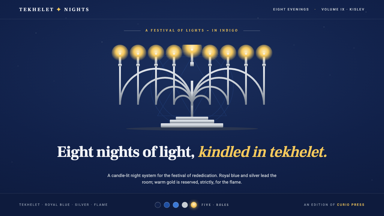 Hanukkah MenorahEight nights kindled in tekhelet. Royal blue and silver hold the dark room; g…
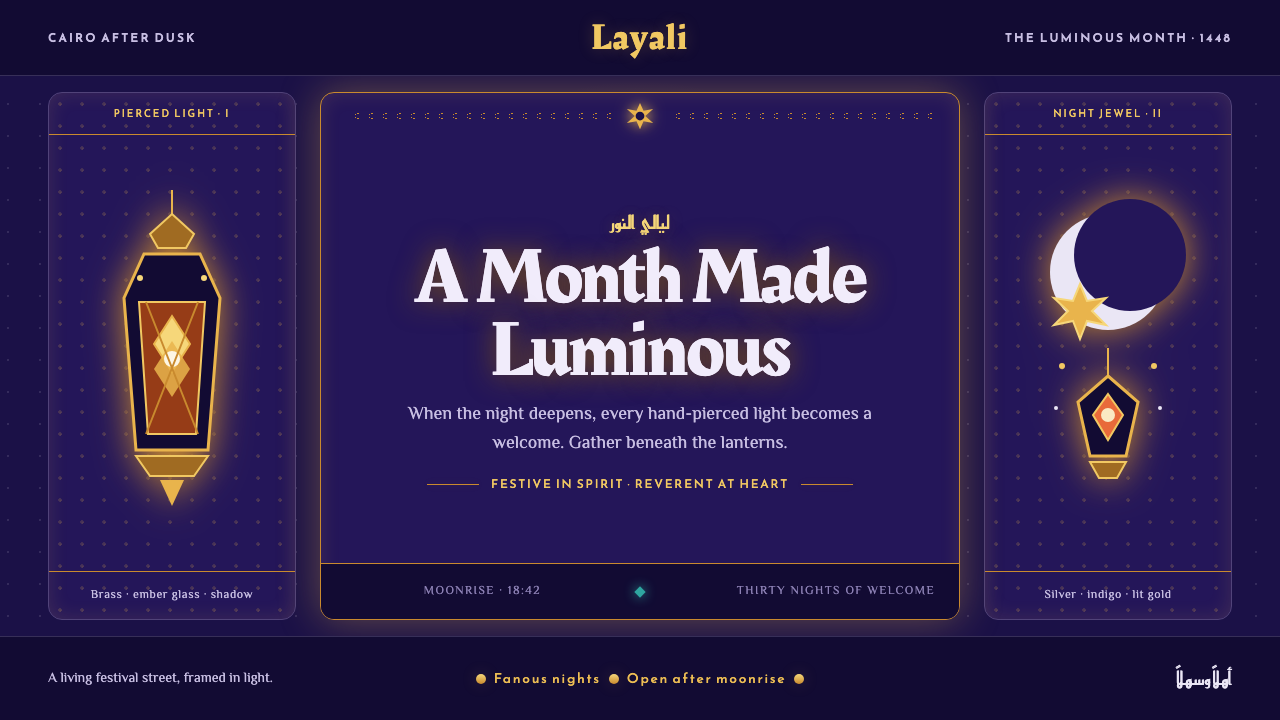 Ramadan Lanterns (Fanous Nights)Night becomes sacred light. Pierced brass and amber glow burn across bottomle…