What is Psychedelic Haight-Ashbury 1968?什么是 Psychedelic Haight-Ashbury 1968?
When Wes Wilson and Victor Moscoso made concert posters for the Grateful Dead and Jefferson Airplane, they turned color theory into controlled hallucination — hot pink against lime green, letterforms melting into vines, ink that vibrated on paper before you even read a word.当韦斯·威尔逊和维克多·莫斯科索为感恩至死乐队与杰弗逊飞机乐队绘制演出海报时,他们将色彩理论化作受控的幻觉——热粉对抗青柠绿,字母融化成藤蔓,墨迹在你尚未读出一个字之前便已在纸面上震颤跳动。
Psychedelic Haight-Ashbury 1968 in briefPsychedelic Haight-Ashbury 1968 速览
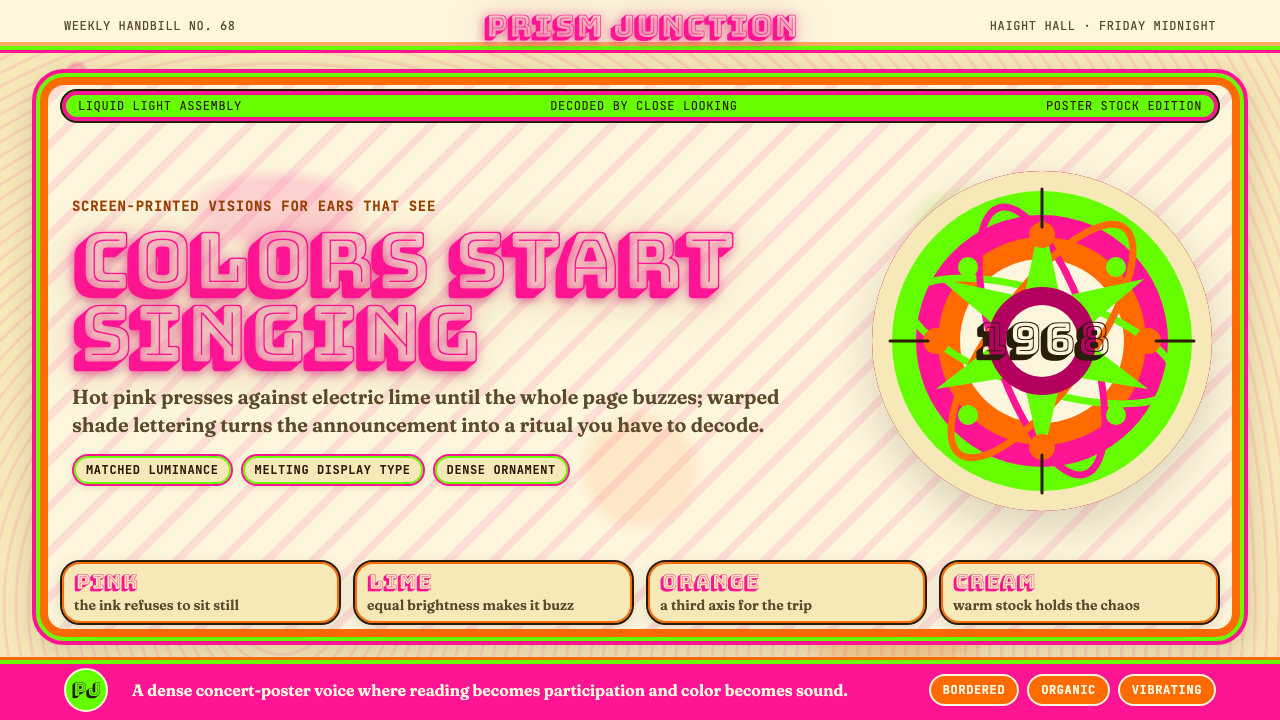
Psychedelic Haight-Ashbury 1968 refers to the concert poster art that erupted in San Francisco's counterculture neighborhoods between roughly 1965 and 1971, reaching its visual peak during the Summer of Love in 1967 and the turbulent political year of 1968. It is a style defined by maximum chromatic tension: complementary colors — typically hot pink and acid lime, or deep violet and blazing orange — paired at nearly identical luminance so that the boundary between them appears to oscillate. The eye cannot resolve where one color ends and the other begins, producing an optical shimmer that was partly deliberate and partly a visual analog for the chemical experience the posters were advertising.迷幻海特-阿什伯里1968,指的是大约在1965至1971年间在旧金山反文化街区爆发的演出海报艺术,在1967年的爱之夏与动荡的政治之年1968年达到视觉顶峰。这是一种以最大色彩张力为标志的风格:互补色——通常是热粉与荧光青柠,或深紫与炽橙——以近乎相同的明度并置,使两色之间的边界看起来在振荡摆动。眼睛无法辨认一种色彩在哪里终结、另一种从哪里开始,产生一种光学闪烁效果,这既是刻意为之,也是对那些海报所宣传的化学体验的视觉类比。
Typography in this style is radically anti-legibility. Letterforms swell, pinch, curve, and spiral; serifs extend into tendrils; counters fill with decorative infill. The Art Nouveau lettering of Alphonse Mucha and the Vienna Secession provided the historical template, but the psychedelic artists pushed those curves past elegance into something approaching visual dissolution. A poster by Wes Wilson might require real effort to decode — that difficulty was part of the point, rewarding the initiated viewer who paused long enough to read.这种风格中的排印设计是彻底反可读性的。字母形体鼓胀、收缩、弯曲、盘旋;衬线延伸为须蔓;字腔填满装饰性细节。阿方斯·穆夏与维也纳分离派的新艺术主义字母为其提供了历史模板,但迷幻艺术家们将那些曲线推过了优雅的界限,进入某种接近视觉消融的状态。韦斯·威尔逊的一张海报可能需要相当的努力才能破译——这种困难本身就是意义的一部分,它奖赏那些驻足足够长时间去阅读的知情观者。
Ornamental illustration surrounds and interpenetrates the type: paisley swirls, celestial motifs, stylized faces and figures drawn in sinuous continuous line, all rendered at a density that leaves almost no bare ground. The overall effect is maximalist and immersive — a designed object that asks to be stared at rather than glanced at. This is a style built for posters pinned to walls and gazed at in dim light, not for quick navigation.装饰性插画包围着、渗透进文字:腰果形佩斯利花纹、天体母题、以流畅连续线条描绘的风格化面孔与人物,所有这些都以几乎不留空白底面的密度呈现。整体效果是极大化的、沉浸式的——一个要求被凝视而非被扫视的设计对象。这是一种为贴在墙上、在昏暗光线下被注视的海报而生的风格,而不是为快速导航而生的。
See the Psychedelic Haight-Ashbury 1968 design system查看 Psychedelic Haight-Ashbury 1968 完整设计系统
Where does Psychedelic Haight-Ashbury 1968 come from?Psychedelic Haight-Ashbury 1968 从何而来?
The geographic and cultural epicenter was San Francisco's Haight-Ashbury district, a Victorian neighborhood that became the gathering point for the counterculture beginning in 1965. The Fillmore Auditorium, operated by promoter Bill Graham, and the Avalon Ballroom, run by the Family Dog collective, were the primary venues commissioning the poster art. Both venues required weekly promotional posters for their concert series, creating an unusually high-volume, fast-turnaround context for a style that was simultaneously inventing itself. By 1967, poster artists were producing work that had no precedent in the mainstream commercial design of the time.地理与文化的核心是旧金山的海特-阿什伯里区——一个维多利亚式街区,从1965年起成为反文化运动的聚集地。由演出推广人比尔·格雷厄姆运营的菲尔莫尔礼堂,以及由家庭犬集体运营的阿瓦隆舞厅,是委托这些海报艺术的主要场地。两个场地都需要为其演出系列每周制作一批宣传海报,为一种正在同步发明自身的风格创造了异乎寻常的高产量、快周转语境。到1967年,海报艺术家们正在创作出在当时主流商业设计中毫无先例的作品。
The historical antecedents were eclectic and self-taught. Wes Wilson, who designed some of the most recognizable early posters, discovered the sinuous letterforms of Alfred William Finch and the Vienna Secession through library browsing rather than formal art education. Victor Moscoso held a formal fine-arts education — he had studied at Yale under Josef Albers, whose color interaction theory directly informed Moscoso's strategy of pairing colors at matched luminance to maximize optical vibration. Moscoso was unusual among the group for consciously applying academic color theory to counterculture ends; most of his peers worked more intuitively.历史渊源是折衷且自学成才的。设计了若干最具标志性早期海报的韦斯·威尔逊,是通过图书馆浏览而非正式艺术教育发现阿尔弗雷德·威廉·芬奇与维也纳分离派的流线型字母形式的。维克多·莫斯科索则接受过正式的美术教育——他曾在约瑟夫·阿尔伯斯门下于耶鲁求学,阿尔伯斯的色彩互动理论直接影响了莫斯科索以相近明度并置色彩以最大化光学振动的策略。莫斯科索在这个群体中是罕见的,他有意识地将学院色彩理论应用于反文化目的;他的大多数同伴则更凭直觉工作。
The movement was also shaped by its production constraints. Early psychedelic posters were printed on newsprint-weight paper using offset lithography with limited color separations. Artists learned to exploit the way ink behaved on cheap stock — the slight dot gain and warm yellow cast of uncoated paper became aesthetic assets. The warm cream ground that characterizes many canonical posters was often simply the unprinted paper itself. When the posters gained collector status and began to be reprinted on heavier coated stock, they looked slightly wrong: too bright, too crisp, the color relationships subtly altered.这场运动也被其生产条件所塑造。早期迷幻海报用胶版印刷、在新闻纸克重的纸张上以有限色版印制。艺术家们学会了利用墨水在廉价纸张上的表现——微小的网点扩张和未涂布纸轻微的暖黄色调成了美学资产。许多经典海报标志性的温暖奶油色底面,常常就是未经印刷的纸张本色。当这些海报获得藏家地位并开始在更厚重的涂布纸上重印时,它们看起来略有不对:太亮、太清晰,色彩关系被微妙地改变了。
By 1968, the style had evolved and splintered. Rick Griffin — whose work for the Grateful Dead included some of the most complex and mystically charged imagery of the period — had pushed letterforms toward the edge of pure abstract pattern. Alton Kelley and Stanley Mouse, collaborating as a team, introduced imagery drawn from Art Deco, biker culture, and American vernacular that diversified the movement beyond its Art Nouveau origins. Bonnie MacLean, who took over many of the Fillmore poster commissions after Wilson, brought a cooler palette and tighter draftsmanship. The style that had been radical in 1966 had, by 1969, become recognizable enough to be parodied and commercialized — a cycle that the artists themselves mostly watched with ambivalence.到1968年,这种风格已经演化并分裂。里克·格里芬——其为感恩至死乐队创作的作品包括这一时期最复杂、最具神秘色彩的意象——已将字母形式推向纯粹抽象纹样的边缘。阿尔顿·凯利与斯坦利·马鼠斯以搭档形式合作,引入了来自装饰艺术、摩托车文化与美国本土传统的意象,使这场运动超越了其新艺术主义起源而多元化。博妮·麦克莱恩在威尔逊之后接手了许多菲尔莫尔海报委托,带来了更冷静的色调与更严谨的绘图。1966年还是激进的风格,到1969年已经足够为人熟知,以至于被戏仿和商业化——而艺术家们大多以矛盾的心情旁观这个循环。
What defines the Psychedelic Haight-Ashbury 1968 look?Psychedelic Haight-Ashbury 1968 的视觉特征是什么?
Vibrating Complementary Color震颤互补色
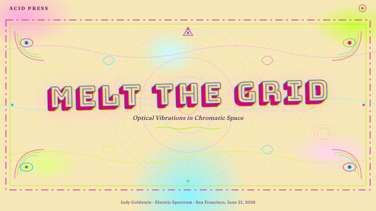
The defining visual move of the style is pairing colors that sit opposite each other on the color wheel — hot pink against acid lime, electric violet against blazing orange — at nearly identical luminance values. When two colors share the same perceived brightness but differ maximally in hue, the human visual system cannot process the boundary cleanly, producing an optical shimmer that appears to move. This is not an accidental effect: Moscoso studied it directly under Josef Albers and applied it deliberately. The palette is always high-saturation, never muted or dusty, and the warm cream of the poster ground reads as a neutral buffer between the competing chromatic fields.这种风格最核心的视觉手法,是将色轮上相对位置的颜色以近乎相同的明度并置——热粉对荧光青柠,电紫对炽橙。当两种颜色在感知亮度上相同却在色相上差异最大时,人类视觉系统无法清晰处理两者之间的边界,产生一种看起来会移动的光学闪烁。这不是偶然效果:莫斯科索直接师从约瑟夫·阿尔伯斯研习了这一原理并刻意加以运用。色板始终是高饱和的,从不沉闷或暗哑,而海报底面的温暖奶油色作为互相竞争的色彩场之间的中性缓冲地带。
Organic Morphing Letterforms有机变形字体
The typography of this style defies conventional readability. Letterforms inflate and deflate along their strokes, curve into arabesques, grow tendrils from their terminals, and merge with the surrounding illustration. The model is Art Nouveau lettering — especially the hand-lettered headings of the Vienna Secession and Alphonse Mucha — but pushed past decorative elegance into something that approaches dissolution. Reading becomes an act of decipherment. The implicit message is that this kind of seeing rewards time and attention; it is anti-scan-culture by design.这种风格的排印设计颠覆了传统的可读性规范。字母形体沿笔画鼓胀收缩,弯曲成阿拉伯式花纹,从末端生出须蔓,与周围插画融为一体。其原型是新艺术主义字母——尤其是维也纳分离派与阿方斯·穆夏的手绘标题——但被推过了装饰性的优雅,进入某种接近消融的状态。阅读成了一种解密行为。隐含的信息是:这种观看方式奖赏时间与注意力的投入;它是在设计层面上对快速扫视文化的反叛。
Dense Ornamental Ground密集装饰底纹
Where Bauhaus leaves negative space, the psychedelic Haight-Ashbury style abhors it. Every area of the composition that is not occupied by a letterform is filled with swirling illustration: paisley patterns, flame motifs, celestial bodies, stylized human and animal figures, and continuous flowing line that weaves through the entire composition. The density is intentional and immersive — it creates a total visual environment rather than an organized hierarchy of information. The eye is invited to wander rather than to follow a predetermined path.包豪斯留白,迷幻海特-阿什伯里风格则厌恶留白。构图中凡不被字母形体占据的区域,皆填满了旋转的插画:腰果形佩斯利纹、火焰母题、天体、风格化的人体与动物形象,以及贯穿整个构图的连续流动线条。这种密度是有意为之且沉浸式的——它营造出一个完整的视觉环境,而非有组织的信息层级。眼睛被邀请去漫游,而非沿预定路径行进。
Warm Poster-Paper Ground温暖的海报纸底色
The baseline tone of the composition is a warm, slightly yellowed cream — not pure white and not a heavily tinted color. In the original posters, this was simply the color of uncoated newsprint-weight paper. It gives the chromatic pairs room to vibrate without competing directly with the ground. When working digitally or on coated stock, this warmth must be deliberately reintroduced, as pure white backgrounds make the color relationships harsher and slightly brittle, destroying the soft luminosity that characterizes the authentic look.构图的基础色调是温暖、略带黄色的奶油色——既非纯白,也非重度着色的色彩。在原版海报中,这只是未涂布新闻纸克重纸张的本色。它为色彩对提供了在不直接与底面竞争的前提下振颤的空间。在数字环境或涂布纸上进行创作时,这种温度必须被刻意重新引入,因为纯白色背景会使色彩关系变得更生硬、略显脆弱,破坏正宗面貌所具有的柔和光泽感。
Continuous Sinuous Line连续流动线条
Illustration in this style is built almost entirely from continuous, flowing line rather than flat filled shapes or rendered tonal areas. The line is typically of varied weight — swelling where it curves, thinning at straights — creating an organic rhythm that echoes calligraphy and botanical illustration simultaneously. This line quality connects the style to its Art Nouveau antecedents but also gives it a hand-made immediacy that distinguishes it from the mechanically-reproduced commercial illustration of the same period.这种风格中的插画几乎完全由连续的流动线条构成,而非平面填充形或渲染过的调子区域。线条通常粗细变化——在弯曲处鼓胀,在直线处收细——营造出一种同时呼应书法与植物学插图的有机节奏。这种线条质感将这种风格与其新艺术主义前驱联结起来,同时也赋予了它一种手工制作的即时感,使其有别于同期的机械化复制商业插图。
Circular and Radial Composition圆形与放射状构图
Many psychedelic posters organize their composition around a central radial axis — elements spiral outward from a focal point, text arcs around curves rather than sitting on horizontal baselines, and the overall shape of the design tends toward the circular rather than the rectangular. This compositional logic reinforces the sense of movement and transformation, as if the design is itself rotating or breathing. It stands in direct contrast to the grid-anchored asymmetric balance of Bauhaus work or the mathematical column logic of Swiss International Style.许多迷幻海报围绕中央放射轴组织构图——元素从焦点向外螺旋展开,文字沿弧线排布而非坐落于水平基线上,整体设计形态趋向圆形而非矩形。这种构图逻辑强化了运动与转化的感知,仿佛设计本身正在旋转或呼吸。它与包豪斯作品的网格锚定非对称平衡,或瑞士国际主义风格的数学栏列逻辑形成直接对照。
Historical Collage of Influences历史影响的拼贴融合
The style is a conscious collage of historical references rather than a unified formal system. Art Nouveau organic curves, Victorian ornamental borders, Eastern mandala geometry, Native American decorative motifs, and the optical experiments of Op Art all coexist within single compositions. This eclecticism was partly a product of the self-taught, library-browsing research methods of the artists involved, and partly a deliberate statement that all traditions were equally available to the counterculture sensibility — that no single cultural hierarchy determined what could be combined with what.这种风格是对历史参照的有意拼贴,而非统一的形式系统。新艺术主义有机曲线、维多利亚时代装饰边框、东方曼陀罗几何、美洲原住民装饰母题,以及欧普艺术的视觉实验,在同一构图中共存。这种折衷主义一方面是参与艺术家自学成才、依靠图书馆浏览的研究方式的产物,另一方面也是一种刻意的宣言——所有传统对于反文化感性而言都同等可及,没有任何单一的文化等级制度规定什么可以与什么组合。
See the Psychedelic Haight-Ashbury 1968 design system查看 Psychedelic Haight-Ashbury 1968 完整设计系统
Who shaped Psychedelic Haight-Ashbury 1968?谁塑造了 Psychedelic Haight-Ashbury 1968?
Wilson is generally credited with inventing the warping, barely-legible letterform style that became the signature of San Francisco psychedelic poster art. Working primarily for the Fillmore Auditorium from 1966, he developed his hand-lettering approach by studying the display typography of the Vienna Secession, particularly the work of Alfred William Finch, which he encountered in the San Francisco Public Library. His innovations included the characteristic technique of letting letter spacing tighten to near-collision so that the overall mass of text reads as a dense visual field before individual words resolve. He produced over fifty Fillmore posters before breaking with Bill Graham in 1967 over compensation disputes.威尔逊通常被认为是旧金山迷幻海报艺术标志性扭曲、近乎无法辨识字体风格的发明者。从1966年起主要为菲尔莫尔礼堂工作,他通过研究维也纳分离派的展示排印——尤其是他在旧金山公共图书馆发现的阿尔弗雷德·威廉·芬奇的作品——发展出自己的手绘字体方法。他的创新包括让字母间距收紧至近乎碰撞,使文字的整体块面在单个词语显现之前先作为密集视觉场被感知这一标志性技法。1967年因薪酬争议与比尔·格雷厄姆决裂之前,他共创作了逾五十张菲尔莫尔海报。
Moscoso is distinctive within the group for having formal academic training in color theory — he studied under Josef Albers at Yale, where Albers's color interaction exercises explored exactly the kind of simultaneous contrast and optical vibration that became Moscoso's primary tool. His posters for the Avalon Ballroom are among the most technically sophisticated of the period, demonstrating a controlled command of chromatic tension that his more intuitively working peers could not always match. After the poster era, Moscoso became a significant figure in underground comics, collaborating with Robert Crumb on Zap Comix and bringing the same high-contrast visual energy to the comics page.莫斯科索在这个群体中以拥有正式学术色彩理论培训而独树一帜——他在耶鲁师从约瑟夫·阿尔伯斯,阿尔伯斯的色彩互动练习恰好探索了成为莫斯科索主要工具的那种同时对比与光学振动。他为阿瓦隆舞厅创作的海报是那一时期技术上最为精湛的作品之一,展示了他对色彩张力的受控把握,而他更多凭直觉工作的同伴们未必总能匹敌。海报时代之后,莫斯科索成为地下漫画的重要人物,与罗伯特·克拉姆合作《Zap漫画》,将同样的高对比视觉能量带入漫画页面。
Griffin's work for the Grateful Dead — particularly the iconic skeleton-and-roses imagery that became closely identified with the band — pushed the style toward its most complex and mystically charged expression. A devout Christian who had converted during the psychedelic period, Griffin brought an intense spiritual seriousness to his imagery that distinguished it from the more celebratory or politically charged work of his peers. His letterforms, by the late 1960s, had evolved to the point where they were barely functional as text at all — closer to medieval illuminated manuscript marginalia than to commercial advertising — and his compositions became increasingly dense with symbolic imagery drawn from religious iconography across multiple traditions.格里芬为感恩至死乐队创作的作品——尤其是与乐队紧密关联的标志性骷髅玫瑰图像——将这种风格推向了其最复杂、最具神秘色彩的表达。作为在迷幻时代皈依的虔诚基督徒,格里芬为其意象带来了一种强烈的精神严肃性,使其有别于同伴们更具庆祝性或政治色彩的作品。到六十年代末,他的字母形体已演化到几乎无法作为文本发挥功能的程度——更接近于中世纪彩饰手稿的边饰,而非商业广告——而他的构图也因汲取自多种传统宗教图像学的象征意象而日益密集。
Mouse and Kelley worked as a collaborative team, producing some of the period's most visually inventive posters through a practice that often involved collaging historical imagery — Victorian trade cards, Art Deco graphics, biker culture ephemera — into new psychedelic contexts. Their most famous work, the skull-and-roses image for the Grateful Dead drawn from a nineteenth-century piece by Odillon Redon, established a practice of recycling and recontextualizing earlier imagery that anticipated later postmodern appropriation art. Kelley brought draftsmanship and compositional instinct; Mouse contributed lettering and the entrepreneurial energy that helped establish their poster business.马鼠斯与凯利以搭档形式合作,通过一种常常将历史图像——维多利亚时代商业卡片、装饰艺术图形、摩托车文化印刷品——拼贴进新的迷幻语境的实践,创作出了这一时期视觉上最具创意的部分海报。他们最著名的作品——为感恩至死乐队创作的、取材自奥迪隆·雷东一幅十九世纪作品的骷髅玫瑰图像——确立了一种回收并重新语境化早期图像的实践,预示了后来的后现代挪用艺术。凯利贡献了绘图技艺与构图本能;马鼠斯则提供了字母设计以及帮助建立其海报生意的创业精力。
MacLean took over many of the Fillmore poster commissions following Wes Wilson's departure in 1967 and produced some of the most refined work of the period. Her palette tended toward cooler, deeper hues than the acid pinks and lime greens favored by Wilson and Moscoso, and her draftsmanship — she had a background in fine art — gave her figures and letterforms a sculptural solidity that distinguished her work from the more liquefied quality of her predecessors. MacLean is among the most underrecognized figures of the movement; her relative obscurity compared to her male peers reflects patterns of attribution in art history that the psychedelic poster field shares with many other mid-century design contexts.麦克莱恩在1967年威尔逊离开后接手了许多菲尔莫尔海报委托,创作出了这一时期最为精致的部分作品。她的色调倾向于比威尔逊和莫斯科索偏爱的荧光粉和青柠绿更冷静、更深沉的色相,而她的绘图技艺——她有美术专业背景——赋予了她的人物与字母形体一种雕塑般的立体感,使其作品有别于前辈们更加液化的特质。麦克莱恩是这场运动中被忽视最严重的人物之一;与其男性同伴相比,她的相对默默无闻折射出艺术史归因模式中的规律——这是迷幻海报领域与许多其他二十世纪中叶设计语境共同面临的问题。
How do you use Psychedelic Haight-Ashbury 1968 today?今天怎么用 Psychedelic Haight-Ashbury 1968?
Psychedelic Haight-Ashbury 1968 is not a neutral or universally applicable style. It arrives with strong cultural associations — counterculture, music, liberation, sensory intensity — and those associations cannot be fully separated from the aesthetic. Used well, it signals a particular kind of playfulness and maximalist confidence; used carelessly, it reads as retro pastiche or, in commercial contexts, as cynical nostalgia marketing. The first question before applying this style is always whether its cultural freight is appropriate to the product and audience.迷幻海特-阿什伯里1968并非一种中立或普遍适用的风格。它携带着强烈的文化关联——反文化、音乐、解放、感官强度——这些关联无法与美学完全分离。用得好,它传递出一种特定的趣味感与极大化的自信;用得不够谨慎,它会被读作复古拼贴,或在商业语境中被解读为投机性的怀旧营销。应用这种风格之前,首要问题始终是:它所携带的文化分量是否适合产品与受众。
For presentation slides, the style works best in contexts where the content itself is bold and the audience is receptive to unconventional visual approaches: keynotes for creative conferences, brand narrative decks for music or culture-adjacent companies, internal presentations where personality is valued over formality. A cover slide in this style should commit fully: a warm cream ground, high-saturation complementary color pair for the principal graphic element, hand-lettered or display-weight type for the title, and dense illustrative ornament filling the areas around the headline. Content slides should pull back considerably — use the palette and illustrative border elements to establish continuity, but keep body text in a legible, relatively neutral setting. Data slides can use the color logic — pairing complementary hues for contrast in charts — without attempting to render the charts themselves in the ornamental style.在演示文稿中,这种风格最适合内容本身大胆、受众对非常规视觉方式持开放态度的场合:创意会议的主题演讲、音乐或文化相关公司的品牌叙事提案、个性比正式感更受重视的内部演示。这种风格的封面幻灯片应当充分投入:温暖奶油色底面,以高饱和互补色对处理主要图形元素,标题采用手绘或展示字重字体,标题周围的区域以密集装饰性插画填充。内容页应当相当程度地退让——用色板与插画边框元素建立视觉延续性,但保持正文在可读、相对中性的设置中。数据页可以运用色彩逻辑——在图表中以互补色对形成对比——而无需尝试以装饰性风格渲染图表本身。
For web interfaces, this style is most appropriate for music platforms, festival and event sites, wellness and cannabis brands, and cultural institutions with counterculture affiliations. Navigation and functional elements should remain legible — the ornamental intensity should be concentrated in hero sections, feature headers, and decorative dividers, not applied uniformly to every interactive element. A common and effective approach is to use the full ornamental vocabulary at large breakpoints and progressively simplify toward mobile, where the complementary color pairing and warm ground can carry the aesthetic identity without the dense illustration.在网页界面中,这种风格最适合音乐平台、节日与活动网站、健康及大麻品牌,以及具有反文化背景的文化机构。导航与功能性元素应保持可读——装饰性强度应集中在英雄区块、功能标题与装饰性分割线上,而非均匀应用于每个交互元素。一种常见且有效的方式是在大断点处使用完整的装饰性词汇,向移动端逐步简化,在那里互补色对与温暖底色足以承载美学身份,而无需密集插画。
For editorial and marketing work, the style is well suited to poster-format content: event announcements, album covers, music festival collateral, brand activations in physical spaces. It is less suited to long-form reading contexts, where the anti-legibility of the typography becomes a genuine obstacle rather than a rewarding puzzle. Marketing pages for the right brands — those with genuine counterculture positioning, not just aesthetic borrowing — can use the style effectively for above-the-fold hero sections with more conventional content treatment below. Editorial spreads benefit from framing body text in a standard, highly readable setting while using psychedelic headers, drop caps, and section dividers to establish visual character.在编辑与营销内容中,这种风格非常适合海报格式的内容:活动公告、专辑封面、音乐节周边材料、实体空间中的品牌激活。它不太适合长篇阅读语境,因为在那里排印的反可读性会成为真正的障碍而非有益的谜题。具有真实反文化定位(而非仅仅借用美学)的品牌营销页面,可以有效地将这种风格用于首屏英雄区块,以下采用更常规的内容处理方式。编辑版面适合将正文置于标准、高度可读的设置中,同时使用迷幻风格的标题、首字下沉与段落分割线来建立视觉个性。
The most common mistake when applying this style is treating the complementary color pairing as straightforward decoration without understanding the luminance matching principle that makes it work. Simply placing hot pink next to lime green does not produce the optical vibration effect unless both colors are calibrated to a similar perceived brightness. When the luminance relationship is wrong — when one color is dramatically lighter or darker than its complement — the result is harsh contrast rather than shimmer, which reads as merely loud rather than hypnotically energized. A second frequent error is applying the ornamental density without the underlying linear discipline: the psychedelic poster style is extremely detailed but not chaotic — every element is drawn with intention and the continuous line quality gives the whole composition structural coherence even at maximum density.应用这种风格时最常见的错误,是将互补色并置当作直接的装饰手法,而不理解使其奏效的明度匹配原理。单纯地将热粉放在青柠绿旁边,并不会产生光学振动效果,除非两种颜色被校准至相近的感知亮度。当明度关系有误——当一种颜色比其互补色明显更亮或更暗时——结果是生硬的对比而非闪烁,读起来只是嘈杂而非催眠般充满能量。第二个常见错误是应用装饰性密度时没有底层的线条纪律:迷幻海报风格极为繁复但并非混乱——每个元素都经过深思熟虑的描绘,连续的线条质量赋予整个构图在最大密度下依然有效的结构连贯性。
See the Psychedelic Haight-Ashbury 1968 design system查看 Psychedelic Haight-Ashbury 1968 完整设计系统
Psychedelic Haight-Ashbury 1968 — FAQPsychedelic Haight-Ashbury 1968 · 常见问题
Is Psychedelic Haight-Ashbury 1968 the same as general 1960s or 1970s retro?迷幻海特-阿什伯里1968与泛泛的六七十年代复古风格是同一回事吗?
No. The psychedelic poster style is a specific and technically sophisticated visual system that differs from generic 1960s or 1970s graphic design in several ways. It is not tie-dye, it is not mod geometric pattern, it is not the flat-color simplicity of push-pin illustration, and it is not the earth-tone softness of mid-1970s design. Its defining characteristics — luminance-matched complementary color vibration, organic morphing letterforms, dense continuous-line illustration — are precise techniques, not vague period atmosphere. The style can be applied well or badly, and understanding what distinguishes it from adjacent period looks is the first step toward applying it well.不是。迷幻海报风格是一种特定且技术上精致的视觉系统,在多个方面有别于泛泛的六七十年代平面设计。它不是扎染,不是摩德几何图案,不是图钉插图那种平面色彩的简约,也不是七十年代中期设计那种大地色调的柔软感。其定义性特征——明度匹配的互补色振动、有机变形字母形体、密集的连续线条插画——是精确的技法,而非模糊的时代氛围。这种风格可以用得好或用得差,理解它与相邻时期风貌的区别,是正确应用它的第一步。
How do you handle legibility when the typography style is intentionally difficult to read?当排印风格有意地难以辨读时,如何处理可读性问题?
The original poster artists worked in a context where the primary delivery mechanism was a physical poster viewed at close range, often in low light, by an audience that was already familiar with the artists and venues and was using the poster as much for aesthetic pleasure as for informational content. Contemporary digital contexts are almost never this forgiving. The practical approach is to apply the anti-legibility typography selectively: use it for display text — headlines, event names, section titles — where decoding effort is appropriate and the text is short enough to reward it. Use standard, highly legible type for all body copy, navigational elements, calls to action, and any text that needs to be read quickly or under adverse conditions. The psychedelic style can frame legible content without requiring that all content be rendered in the distorted mode.原版海报艺术家工作的语境是:主要传播媒介是实体海报,在近距离、通常是昏暗光线下被阅读,观众本已熟悉艺术家和场地,使用海报的目的同等程度上是为了审美享受和信息获取。当代数字语境几乎从不具备这种宽容度。实际的做法是选择性地应用反可读性排印:将其用于展示性文字——标题、活动名称、章节标题——在那里解码的努力是适当的,且文字足够短暂以值得付出这种努力。所有正文、导航元素、行动号召,以及任何需要快速阅读或在不利条件下阅读的文字,都应使用标准、高度可读的字体。迷幻风格可以框定可读的内容,而无需要求所有内容都以变形模式呈现。
Can this style work for serious or corporate contexts, or is it only appropriate for entertainment and counterculture brands?这种风格能用于严肃或企业语境吗,还是只适合娱乐与反文化品牌?
It is extremely difficult to apply this style in genuinely serious or conventional corporate contexts without the style dominating and undermining the content. The cultural associations are simply too strong: psychedelic poster art carries connotations of informality, pleasure, and anti-establishment sensibility that cannot be neutralized by careful typography or subdued color choices. Attempting to apply the style to, say, a financial services firm or a healthcare provider is almost certain to produce cognitive dissonance. The exceptions are narrow: a pharmaceutical company with a genuine connection to the history of LSD research, a finance firm specifically targeting creative industry clients, or a healthcare provider in the cannabis or psychedelic-assisted therapy space. Outside those narrow lanes, the honest advice is to choose a different style whose cultural freight aligns more naturally with the product.在真正严肃或传统的企业语境中应用这种风格而不让风格压倒并损害内容,是极为困难的。其文化关联实在太强:迷幻海报艺术携带着非正式、享乐与反建制感性的内涵,这些内涵无法通过谨慎的排印或克制的色彩选择来中和。试图将这种风格应用于,比如,一家金融服务公司或医疗机构,几乎必然产生认知失调。例外情况很窄:与迷幻药物研究历史有真实关联的制药公司、专门服务创意行业客户的金融公司,或从事大麻或迷幻辅助治疗的医疗机构。在这些狭窄赛道之外,诚实的建议是选择一种文化分量与产品更自然契合的不同风格。
How does this style differ from Art Nouveau, which is one of its stated influences?这种风格与新艺术主义——其公认影响来源之一——有何不同?
Art Nouveau, particularly in its fin-de-siècle French and Belgian expressions, sought to elevate the decorative arts to the status of fine art through exquisite craftsmanship, refined color harmony, and organic line of restrained elegance. The psychedelic poster style borrows Art Nouveau's organic line and the sinuous letter forms of its graphic designers, but amplifies them past elegance into deliberate excess. Color in Art Nouveau is sophisticated and often muted — Mucha's palette tends toward dusty rose, sage green, and warm gold. Psychedelic color is maximally saturated and antagonistically paired. Art Nouveau aims at beauty; psychedelic Haight-Ashbury aims at disruption, at overloading the senses in ways that paralleled the chemical and musical experiences it was advertising. The lineage is clear but the intent and effect are quite different.新艺术主义,尤其是其世纪末法国与比利时的表达,试图通过精湛工艺、精炼色彩和谐与克制优雅的有机线条,将装饰艺术提升至纯艺术的地位。迷幻海报风格借用了新艺术主义的有机线条与其平面设计师创造的流线型字母形体,但将其放大至超越优雅进入刻意的过度。新艺术主义的色彩是精致的,通常是沉哑的——穆夏的色板倾向于暗粉、鼠尾草绿与暖金色。迷幻色彩是最高饱和度的、对抗性并置的。新艺术主义追求美;迷幻海特-阿什伯里追求扰乱,追求以平行于其所宣传的化学与音乐体验的方式使感官超载。血脉传承是清晰的,但意图与效果是截然不同的。
What makes a contemporary application feel authentic rather than merely retro?是什么让一个当代应用感觉真实可信而非仅仅是复古?
Authenticity in applying a historical style comes from understanding and applying the underlying structural principles rather than copying surface features. A contemporary design that simply reproduces the period palette and adds some wavy text and swirling ornament will read as costume — nostalgia marketing rather than genuine engagement with a visual tradition. What distinguishes an authentic application is the structural logic: actually calibrating the complementary color pair to matched luminance so the optical effect is present and not merely approximated; building illustration from continuous sinuous line rather than from digital fills and shapes; treating the warm ground as a genuine neutral rather than as one of several background options; allowing typography to distort in ways that reflect the organic logic of the style rather than applying a generic warp filter. The counterculture context was not incidental to the style — it was the condition of its production. Contemporary applications that engage with that context meaningfully, rather than emptying the style of its cultural content, are the ones that avoid the retro-pastiche trap.应用历史风格的真实可信感来自于理解并运用底层结构原理,而非复制表面特征。一个仅仅复制时代色板、再加上一些波浪文字和旋转装饰的当代设计,读起来像是服装——怀旧营销而非与视觉传统的真实接合。区分真实应用的是结构逻辑:实际将互补色对校准至相近明度,使光学效果真实存在而非仅仅被近似;从连续流线型线条而非数字填充与形状构建插画;将温暖底色当作真正的中性而非若干背景选项之一;让排印以反映这种风格有机逻辑的方式变形,而非应用通用扭曲滤镜。反文化语境对于这种风格而言不是附带的——它是这种风格生产的条件。那些有意义地与这一语境接合,而非将风格的文化内容抽空的当代应用,是能够避免复古拼贴陷阱的应用。
Related design styles相关设计风格
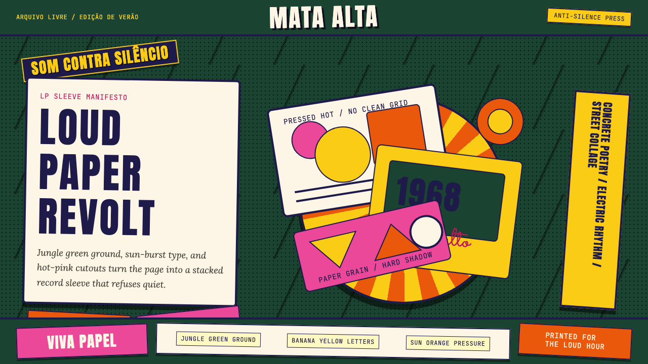 Brazilian Tropicália (1968)Art must be loud. Jungle green, banana yellow Anton type, and hard-shadow col…艺术必须喧哗:丛林绿、香蕉黄Anton字与硬阴影拼贴爆发。
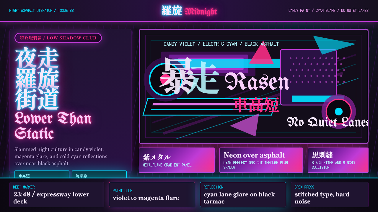 JDM BosozokuNight culture shouts. Candy violet, cyan neon, and stacked Mincho-blackletter…夜色里吼叫:糖果紫与电光青,明朝体和黑体叠满柏油。
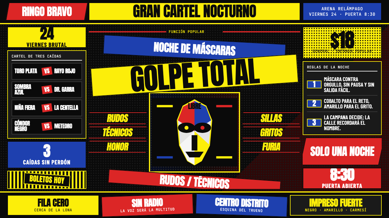 Lucha Libre PosterStreet-poster voltage. Yellow Anton banners, crimson diagonals, cobalt grids…街头高压海报:黑底上的荧光黄Anton、猩红斜线与钴蓝网格。
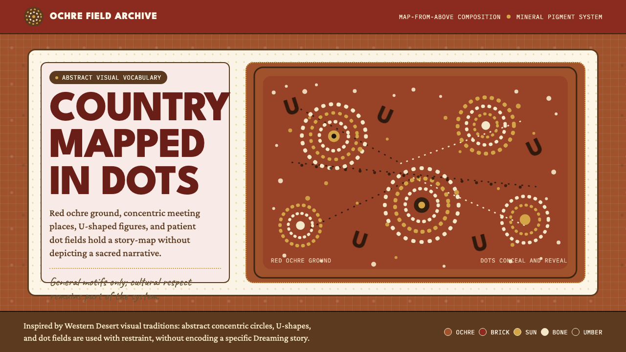 Aboriginal Dot PaintingAncient story-map energy. Red ochre, bone dots, concentric circles, and U-mar…古老故事地图感:红赭底、骨白点、同心圆与 U 形构成大地。
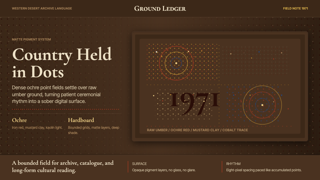 Aboriginal Dot Painting (Papunya 1971)Ochre memory, held steady. Raw umber ground, Cormorant type, disciplined dot-…赭石记忆沉稳留存:生赭黑地、Cormorant 字体与克制点阵。
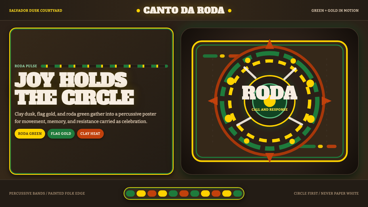 Capoeira RodaJoy as resistance. Roda green and flag gold orbit on dusk-clay terracotta.以欢愉抵抗:roda 绿与旗帜金在暮色陶土上环转。