What is Capoeira Roda?
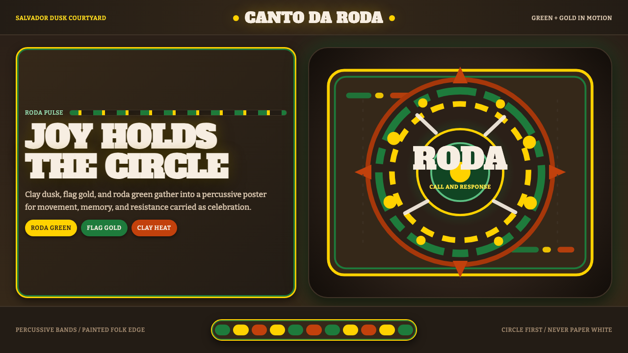
Capoeira Roda is the design language of resistance dressed as celebration — warm terracotta earth, roda green, and Brazilian-flag gold carrying four centuries of Afro-Brazilian memory into every arc and rhythm band.
Capoeira Roda in brief
Capoeira Roda is a design system rooted in the visual culture of Bahian capoeira — the Afro-Brazilian martial art, dance, and philosophical tradition played inside the roda, the sacred circle of bodies, instruments, and energy where the berimbau sets the tempo. The aesthetic draws directly from the sun-baked courtyards of Salvador's Pelourinho district at dusk: terracotta earth as the dominant ground, not paper-white or tropical pastels, and saturated roda green and Brazilian-flag gold as the two charged accent colors that orbit within it.
The system is fundamentally kinetic. Its visual grammar speaks in curved rotation lines that trace the ginga — the swaying foundational movement of capoeira — in bodies caught mid-movement, in repeating percussive color bands that mimic the layered rhythms of berimbau, atabaque, and pandeiro. Folk-instrument iconography is a recurring motif: the single-stringed berimbau, the hand drum pandeiro, the barrel drum atabaque appear as both decorative marks and cultural emblems. Edges carry intentional roughness, as if painted by hand on plaster or tile.
The emotional register is specific and must not be confused with generically tropical or carnival aesthetics. Capoeira Roda is earthy and percussive, not breezy and beachy. Its joy is hard-won — rooted in the history of enslaved Africans in Brazil who disguised combat training as dance, and who built a community ritual strong enough to survive four centuries of suppression. The design system holds that tension: celebration and memory, movement and rootedness, folk boldness and cultural pride.
Where does Capoeira Roda come from?
Capoeira's origins trace to the sixteenth and seventeenth centuries, when enslaved Africans — primarily from Angola and the Congo Basin — were transported to the Portuguese colony of Brazil, with the greatest concentration arriving in Salvador, the capital of Bahia and the largest slave port in the Americas. In the context of extreme social suppression, capoeira developed as a clandestine practice: a system of kicks, sweeps, and evasions taught within a camouflage of music and dance so that overseers could not identify it as combat training. The roda — the circle formed by participants who clap, sing, and play instruments while two players move in the center — was not decorative but functional, allowing sentinels to warn of approaching authorities.
The two principal lineages of capoeira formalized in the twentieth century in Salvador. Mestre Bimba, born Manuel dos Reis Machado in 1900, developed Capoeira Regional in the 1920s and 1930s — a more dynamic and systematized form that incorporated elements from other Afro-Brazilian martial arts. Facing the stigma that had long classified capoeira as a crime under the Brazilian Penal Code, Mestre Bimba persuaded state authorities to observe his students demonstrate the art's discipline and athleticism; the result was the legalization of capoeira in 1937. Mestre Pastinha — Vicente Ferreira Pastinha, born 1889 — championed Capoeira Angola, the older, more philosophical form that emphasized the art's African roots, its ritualistic dimension, and the importance of malícia: the quality of cunning, unpredictability, and strategic deception embedded in every movement.
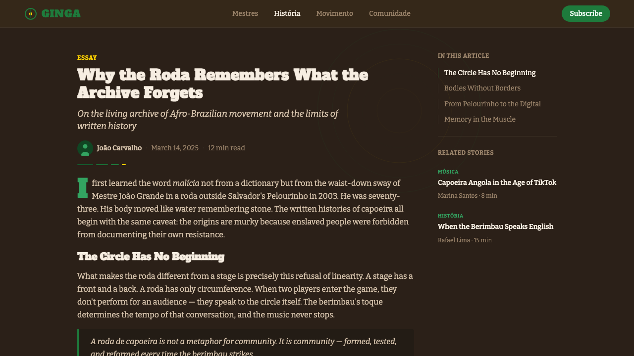
The visual culture of capoeira grew organically from its material environment. Salvador's Pelourinho district — the colonial hillside neighborhood that was also the site of the public pillory (the pelourinho itself) where enslaved people were punished — became the symbolic heart of Afro-Brazilian cultural identity. Its ochre and terracotta colonial buildings, its tiled courtyards, its cobblestones worn smooth under the dusk light shaped the color memory of the tradition. The colors of the Brazilian flag — green and gold — were absorbed into capoeira's visual language not as nationalism but as appropriation: a reclamation of national symbolism by the very people who had been excluded from the nation's founding narrative.
The internationalization of capoeira from the 1970s onward, through the diaspora of mestres and their students to Europe, North America, and Japan, carried the visual vocabulary of the roda worldwide. Mestre João Grande — João Oliveira dos Santos, born 1933 in Bahia — became one of the most significant transmitters, eventually settling in New York and receiving Brazil's highest cultural honor, the Premio Mestre da Cultura, in 2001. This global spread fixed the visual idiom of Capoeira Roda as a coherent, internationally legible aesthetic: not a Brazilian novelty, but a design tradition with documented lineage and philosophical depth.
What defines the Capoeira Roda look?
Color Palette
The three-color foundation is non-negotiable: terracotta earth as the dominant warm ground, roda green as the primary chromatic statement, and Brazilian-flag gold as the charged secondary. These are not neutral hues — they carry historical and symbolic weight that cannot be substituted with generic earth tones or tropical greens without evacuating the system's meaning. The palette reads as saturated and sun-warmed, never as dusty or muted. Black appears for structural line work and type; near-black is used for depth rather than pure cool gray.
Motion Lines and Arcs
Curved lines are the dominant gestural mark of this system. They trace the arc of a kick, the sweep of a ginga, the orbit of the roda itself. Unlike the hard straight geometry of modernist European design traditions, Capoeira Roda uses arcs and ellipses as structural elements — they create rhythm and direction without imposing rigidity. Motion lines may be single strokes or layered into percussive bands that pulse across a composition, suggesting the overlapping rhythms of the live roda.
Folk Instrument Iconography
The berimbau, pandeiro, and atabaque are not decorative additions — they are the cultural DNA of capoeira encoded in visual form. The berimbau is particularly potent: a single-stringed musical bow with a gourd resonator, its silhouette is instantly legible and carries enormous symbolic weight within the capoeira community. These instruments appear as motifs, as structural anchors in layout, and as the conceptual source for the rhythmic horizontal banding that runs through compositions. Using them correctly requires understanding their roles inside the roda, not merely their shapes.
Hand-Painted Edge Quality
Edges in Capoeira Roda compositions carry controlled imperfection. This is not digital distress or vintage texture applied as a filter — it is the visual memory of hand-painted signs, tile work, and street murals in Pelourinho and similar Afro-Brazilian neighborhoods. Color fields may have slightly uneven boundaries; strokes may show pressure variation; letterforms may carry the warmth of hand-drawn lettering. This quality distinguishes the aesthetic from slick tropical branding and anchors it in the material culture of its origins.
Circular and Spiral Composition
The roda is a circle, and that circle governs composition at every scale. Elements are arranged to suggest orbital motion — a pull toward a center, a rotation around a focal point. Spiral energy can be implied by the sequential layering of concentric bands or by the placement of figurative elements that appear to be mid-rotation. This compositional principle is not decorative; it is structural, reflecting the roda's role as the organizing social and ritual space of capoeira.
Percussive Rhythm Banding
Horizontal or curved bands of alternating color — echoing the layered percussion of the capoeira orchestra — give compositions their internal rhythm. These bands are not decorative stripes; they carry the same structural weight as musical measures. Their width relationships create hierarchy and pace, dense banding suggesting rapid tempo, wider bands suggesting slower, more deliberate movement. The palette within these bands stays tightly controlled: terracotta, roda green, and flag gold do not all appear in equal weight simultaneously.
Figural Silhouette
Human figures in Capoeira Roda compositions appear in dynamic mid-movement poses — the ginga sway, the au cartwheel, the martelo kick held at its apex. These figures are rendered as silhouettes or high-contrast outlines rather than photorealistic illustration, maintaining the system's graphic flatness while humanizing the visual. The body in capoeira is always in dialogue with gravity, space, and another player; compositions that include figural elements should reflect this relational quality rather than isolating figures as static icons.
Who shaped Capoeira Roda?
Manuel dos Reis Machado (1900–1974) was the founder of Capoeira Regional and the pivotal figure in capoeira's legalization in Brazil. Born in Salvador, Bahia, he began learning Batuque — an Afro-Brazilian combat dance — from his father at age twelve, and developed his own synthesis of capoeira traditions from his teenage years. His academy, the Centro de Cultura Física Regional, established in 1932 in Salvador, was the first formal capoeira school. By demonstrating the art's athleticism and discipline to the governor of Bahia and eventually President Getúlio Vargas, he achieved capoeira's legal recognition in 1937. Mestre Bimba's systematized curriculum — including a sequence of eight foundational movements called the cintura desprezada — gave capoeira a transmissible pedagogical structure and enabled its spread across Brazil and beyond.
Vicente Ferreira Pastinha (1889–1981) was the philosopher-practitioner of Capoeira Angola and the figure most responsible for articulating the tradition's African roots and ethical dimensions. Born in Salvador to a Spanish father and an Afro-Brazilian mother, he learned capoeira from an African man named Benedito as a child, and spent decades practicing before opening his Escola de Capoeira Angola at the Pelourinho in 1941. Mestre Pastinha emphasized that capoeira was not only a combat system but a philosophy of life — the cultivation of malícia, of patience, of jogo bonito (the beautiful game). His insistence on the art's African and spiritual dimensions provided the conceptual counterweight to Mestre Bimba's more athletic framing, and together their legacies define the breadth of capoeira's identity.
João Oliveira dos Santos (born 1933, Bahia) is one of the foremost living transmitters of Capoeira Angola, a direct student of Mestre Pastinha. He moved to New York City in 1990, where he founded the Capoeira Angola Center of Mestre João Grande and spent decades training practitioners across the United States and internationally. In 2001 he received Brazil's Premio Mestre da Cultura — the country's highest cultural honor — in recognition of his role in preserving and transmitting the tradition. His presence in the United States was instrumental in fixing the visual and philosophical vocabulary of Capoeira Angola as a globally recognized practice rather than a regional curiosity.
The berimbau is not a person, but as the ritual object that controls the roda, it functions as an agent with authority comparable to any individual master. A musical bow of African origin, consisting of a flexible wooden stave bent by a metal string, with a gourd resonator that the player presses to the belly, the berimbau produces a surprisingly expressive range of sounds from a single string by varying the string tension and gourd position. The toque — the rhythmic pattern played by the lead berimbau — dictates the energy, speed, and style of the game being played inside the roda. Its visual silhouette is the single most recognizable symbol in the Capoeira Roda design vocabulary.
The Pelourinho neighborhood — declared a UNESCO World Heritage Site in 1985 — is the material and symbolic origin of the Capoeira Roda visual palette. Its colonial-era buildings, painted in the warm ochres, terracottas, and muted yellows that survive from the Portuguese colonial period, line the steep streets of Salvador's historic center. The name itself means 'pillory' — a reminder that this neighborhood was the site of public punishment of enslaved people. The area's visual culture, shaped by Afro-Brazilian religious practice, street festivals, and the capoeira academies that still operate in its buildings, is the direct source of the palette and the textural vocabulary of the design system.
How do you use Capoeira Roda today?
Capoeira Roda is a high-specificity aesthetic — it works best in contexts where cultural grounding, kinetic energy, and the celebration of Afro-Brazilian identity are either the subject matter or a deliberate design choice by the creator. Its visual vocabulary is not a neutral earth-tone palette with some curved lines; every element carries specific cultural weight. Applying it well means understanding the roda, the instruments, and the history, then letting that understanding shape how you use the system rather than borrowing its surface appearance.
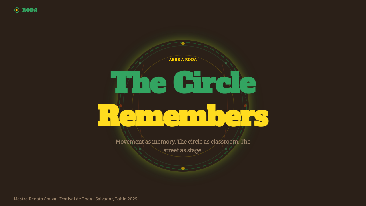
For presentation slides, the system excels at covers that announce energy and cultural pride. A cover composition uses the terracotta ground as the full-bleed background, positions a large roda-green or flag-gold arc in the upper half of the frame (suggesting the sweep of the roda), and anchors a bold title in near-black or white lettering with generous weight. Content slides work well with a strong horizontal band of roda green or gold at the top or bottom — echoing the percussive banding — with the rest of the slide on a warm off-white. Data slides should use the three palette colors deliberately: terracotta for base data, roda green for the highlighted metric, flag gold for the call-out or alert state.
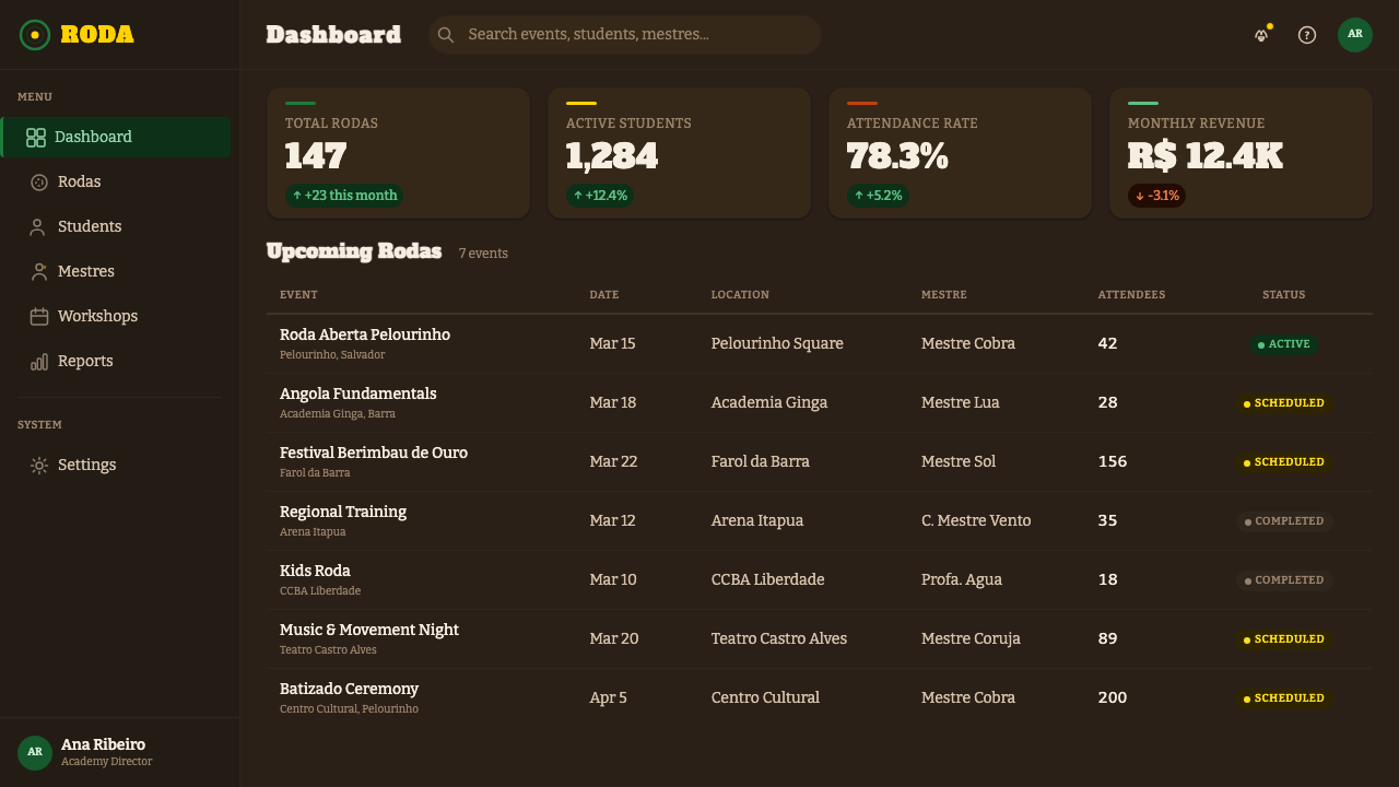
For web and app interfaces, the system is well-suited to cultural institutions, music platforms, sports and martial arts communities, and organizations whose identity is rooted in Afro-Brazilian, African diaspora, or Global South cultural frameworks. Navigation can use a terracotta or deep warm ground with roda-green active states. Hero sections benefit from large arc graphics — a single curved sweep — that suggest motion without being literal. Card components work well with hand-painted-edge borders in a slightly irregular stroke rather than perfect CSS borders.
For editorial and marketing work, the system brings the authority of a fully realized folk tradition to the page. Magazine layouts can use full-bleed terracotta or deep warm backgrounds for section openers, with white or near-white body text and flag-gold bylines or pull quotes. Poster work is where the system is most powerful: a single dynamic figure silhouette mid-ginga against a terracotta ground, a large arc of roda green, and the berimbau silhouette as a corner element can produce a composition of remarkable visual force.
The most common mistake in applying Capoeira Roda is collapsing it into generic tropical or Brazilian carnival aesthetics — adding bright teal, hot pink, or confetti, or using the palette in a way that reads as festive rather than earthy and percussive. The second most common mistake is treating the curved lines as decoration rather than as motion traces — applying them symmetrically as border ornaments instead of letting them imply directional energy. The system derives its meaning from the specific cultural context of capoeira, not from a general association with warmth or Latin America. Designs that forget this will read as regional pastiche rather than as honest engagement with the tradition.
Capoeira Roda — FAQ
Is Capoeira Roda appropriate for brands with no connection to Brazilian or Afro-Brazilian culture?
This requires careful consideration. Capoeira Roda carries the visual memory of a tradition born from African enslavement and kept alive as an act of cultural resistance. Using it as a purely aesthetic choice — without acknowledgment of that history or genuine connection to the tradition — risks treating a survival culture as decoration. That said, the design vocabulary of capoeira has spread globally alongside the art itself, and many practitioners from non-Brazilian backgrounds have trained seriously within the tradition. Meaningful engagement, informed use, and transparent acknowledgment of the source culture are the relevant standards — not ethnic origin of the designer.
How is Capoeira Roda different from other Afro-Brazilian aesthetic traditions like Carnaval or Candomblé?
The distinctions are significant. Carnaval is an urban festival tradition with a visual language dominated by sequins, feathers, saturated tropical palettes, and exuberant maximalism — it operates in direct contrast to capoeira's earthy, controlled restraint. Candomblé is an Afro-Brazilian religion whose visual vocabulary is organized around the orixás (deities), each associated with specific colors, materials, and ritual objects. Capoeira Roda's palette and motifs are specific to the practice of capoeira: the terracotta of Pelourinho, the colors of the Brazilian flag reclaimed by Black resistance, the instruments of the roda. Mixing these vocabularies without understanding the distinctions produces visual noise rather than cultural specificity.
Can the system work in a light or white background version without losing its character?
Yes, but with significant adjustments. The terracotta ground is canonical — it carries the specific warmth of the system — so substituting pure white risks producing a generic folk-art look rather than the culturally specific Capoeira Roda character. A warm off-white or pale terracotta can work as a lighter ground variant while preserving the system's warmth. On a lighter background, roda green and flag gold need to be used at fuller saturation to maintain visual authority; they can read as washed out on pure white. The percussive banding and arc motifs remain fully viable on light grounds; the hand-painted edge quality becomes more prominent and should be embraced rather than tightened into perfect geometry.
What is the role of darkness and shadow in this system, given its dark-mode designation?
The system is dark in the sense that terracotta is a deeply saturated warm ground — not cool or light. Shadow in Capoeira Roda is not the hard-edge offset geometry of modernist European design traditions; it is more organic, emerging from the layering of color bands rather than from explicit drop-shadow effects. Where depth is needed, it comes from overlapping arcs and bands of slightly differing tonal values within the terracotta family. Pure black is used sparingly, primarily for structural line work and type. The overall effect should feel like evening light in a clay courtyard, not like a dark UI theme with a tropical color accent.
How should the berimbau motif be used without it becoming a cliché?
The berimbau becomes clichéd when it is used as a decorative stamp — pasted into a corner as a cultural flag without structural integration. It works best when it functions as a compositional element: its elongated vertical form can anchor the left or right edge of a composition, its single curved bow can echo the arc motifs elsewhere in the layout, and its gourd resonator can provide a circular counterpoint to straight vertical lines. The berimbau should feel like it belongs to the physical space of the composition, not like a logo applied to a backdrop. Similarly, the instrument works best in silhouette or line form rather than as a detailed realistic illustration — the graphic simplicity preserves its emblematic power.
Related design styles
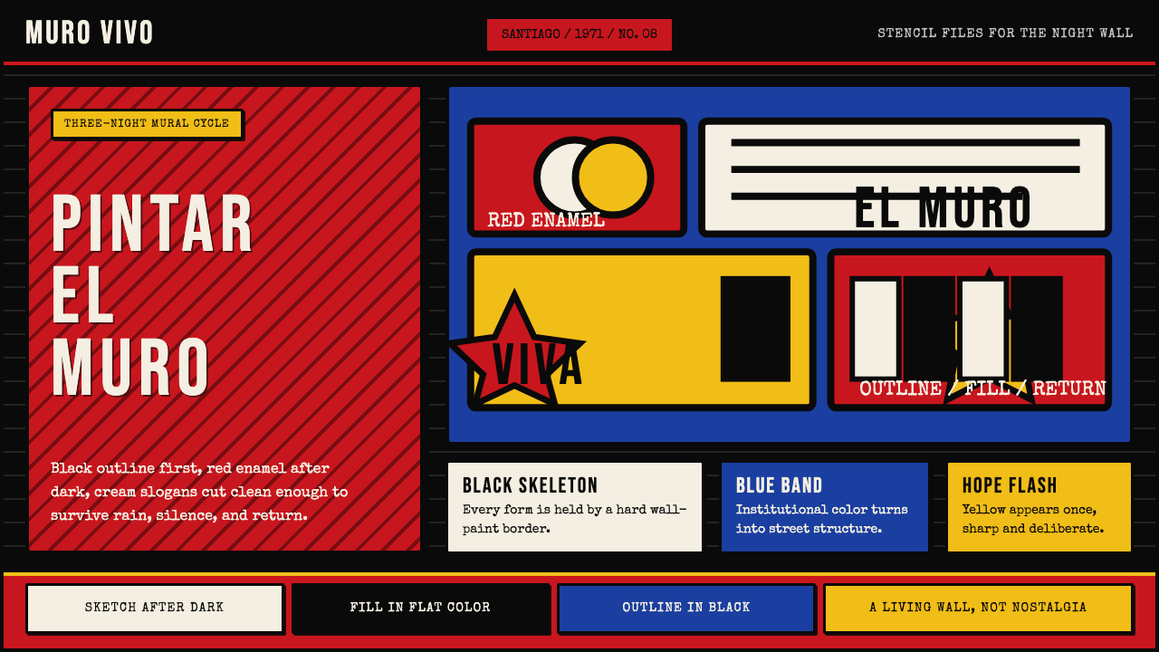 Chilean BRP Ramona Parra 1971Resistance stays alive. Blood red panels, black outlines, and stencil type re…
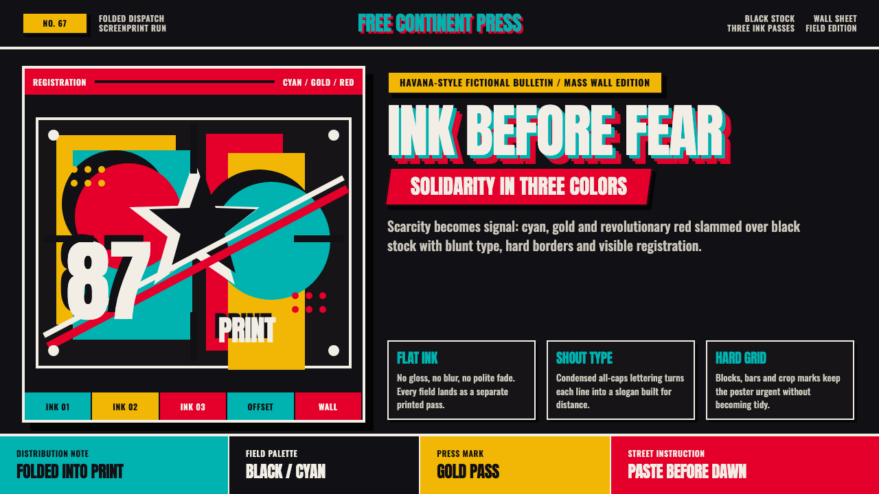 Cuban OSPAAAL Tricontinental PosterUrgency from scarcity. Cyan, gold and red slam over black in blunt silkscreen…
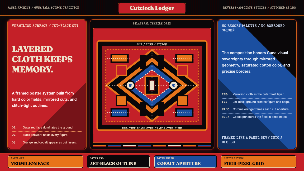 Panamanian Mola Kuna AppliquéSewn sovereignty. Vermilion panels reveal black, orange, and cobalt stitch-gr…
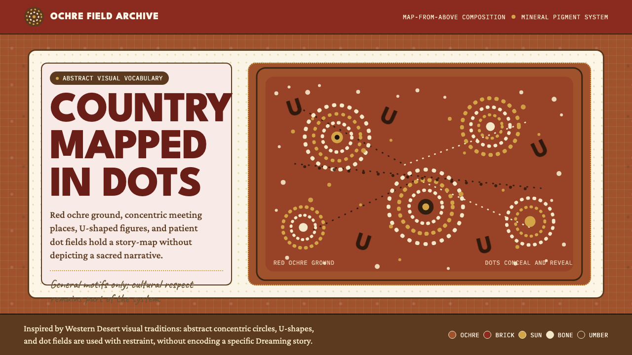 Aboriginal Dot PaintingAncient story-map energy. Red ochre, bone dots, concentric circles, and U-mar…
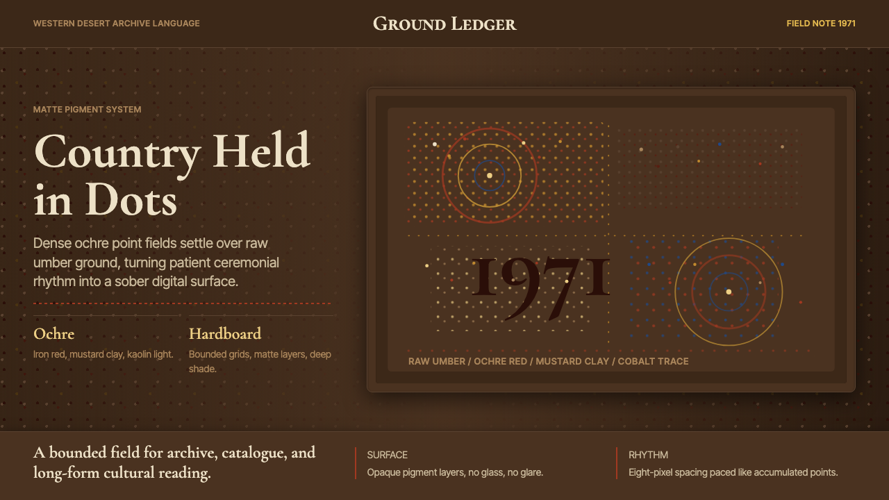 Aboriginal Dot Painting (Papunya 1971)Ochre memory, held steady. Raw umber ground, Cormorant type, disciplined dot-…
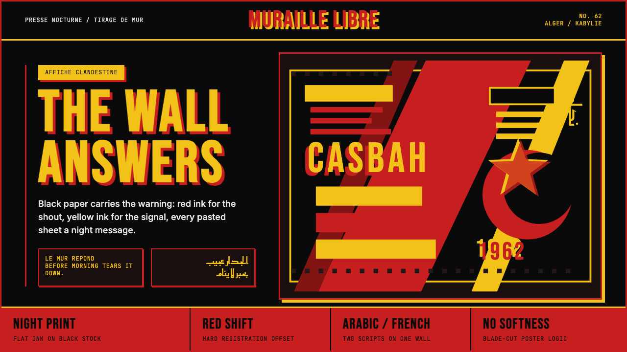 Algerian Casbah Poster (1954–1962)Every surface is a manifesto. Blood red, warning yellow, and stencil type hit…