What is Primer (2004)?
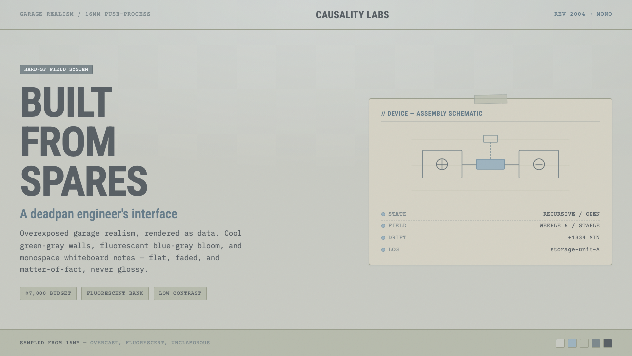
Primer turns the time-travel film into an engineer’s workbench: faded fluorescent light, monospace evidence, and provisional surfaces that feel tested rather than styled.
Primer (2004) in brief
Primer is Shane Carruth’s 2004 time-travel film, made in the Dallas, Texas suburbs as a micro-budget independent production. Its visual identity rejects the polished spectacle usually associated with science fiction. Instead of luminous machinery, dramatic darkness, or pristine laboratories, it presents an overexposed and flattened suburban-garage reality. The image feels cool, faded, deadpan, and engineered.
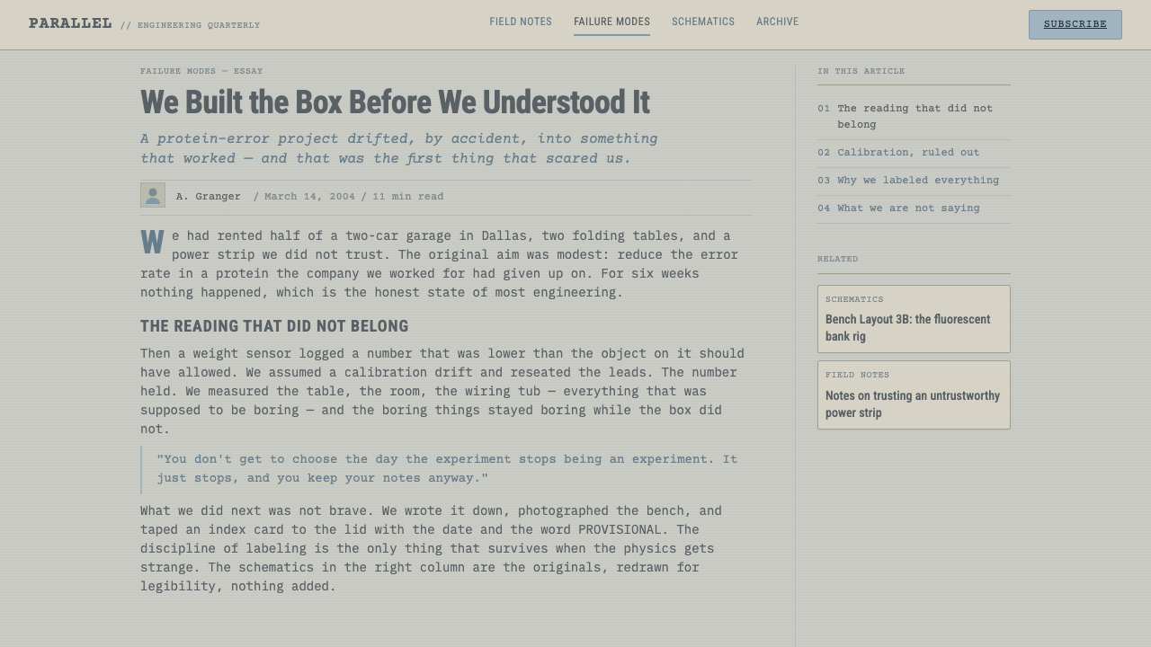
As a design language, Primer is not retro futurism and it is not generic industrial minimalism. It is the atmosphere of a working whiteboard translated into interface form: low-contrast green-gray and pale fluorescent blue-gray grounds, dense monospace information, practical grids, and index-card panels that appear taped into place. The system should feel useful before it feels finished.
The style’s central tension is between precision and contingency. Data can be exact while its presentation remains provisional; a panel can be organized while still looking like it was attached during a late-night experiment. Nothing is allowed to become luxurious, glossy, warm, or visually triumphant. Primer derives its authority from restraint, from the sense that each element exists to support a calculation, note, log, or decision.
Where does Primer (2004) come from?
Primer was made in 2004 by Shane Carruth for a budget of $7,000. That production fact is inseparable from the look, not because low cost automatically creates a style, but because the film’s means are visibly aligned with its subject and setting. It uses 16mm film and inexpensive fluorescent lighting rather than the glossy visual polish associated with large-scale science-fiction production. The result is a world that feels assembled from available materials and observed under ordinary working conditions.
The setting in Dallas, Texas suburbs matters to the system’s visual character. Primer does not place technical thinking in a monumental research campus or a futuristic metropolis. Its hard-SF realism is grounded in everyday, suburban-garage space: walls, tables, notes, equipment, and light that appear practical rather than cinematic. This makes the technical atmosphere more convincing precisely because it remains domestic, local, and unheroic.
The film sits within contemporary micro-budget independent cinema and is described as mumblecore-adjacent. That proximity helps explain its deadpan surface. The visual language does not perform importance through spectacle; it lets ordinary spaces, flat illumination, and dense conversation-like information carry the weight. In a Primer-derived interface, that same attitude means avoiding theatrical framing and treating content as work in progress rather than a staged reveal.
Its position as hard-SF realism gives the style its discipline. The interface should not promise a frictionless future or turn technical complexity into decorative abstraction. It should suggest that difficult ideas are being worked through with notes, constrained tools, and careful observation. The resulting design vocabulary is contemporary despite its analog materials: it is about evidence, iteration, legibility, and the visible texture of problem-solving.
What defines the Primer (2004) look?
Washed Fluorescence
Primer’s light is overexposed, cool, and deliberately unglamorous. Greenish-beige and pale blue-gray create a subdued field that never turns creamy or stark white. The mood is that of a garage or office seen under inexpensive fluorescent banks: functional, flat, and slightly drained.
Monospace Evidence
Monospace text should read as data, calculations, labels, and records rather than as a nostalgic coding costume. Its regular rhythm gives the interface an evidentiary quality. Use it where alignment, notation, timestamps, or compact technical language need to look inspectable and accountable.
Taped Index Cards
Panels behave like index cards attached to a shared working surface. They are bounded and legible, but not precious. The taped quality introduces a controlled sense of provisionality: information can be added, moved, compared, or superseded without pretending that the system was complete from the beginning.
Utilitarian Grid
The grid is plain and operational. It organizes evidence, groups related material, and leaves room for annotations instead of becoming a decorative pattern. Alignment should feel like the outcome of a practical filing method, with clear columns and deliberate gaps that prevent dense content from becoming theatrical clutter.
Low-Contrast Restraint
Contrast is intentionally moderated. The system avoids both comforting warmth and clinical white brightness, keeping surfaces close enough in value to feel observational rather than branded. Strong emphasis should come from grouping, typography, borders, and placement before it comes from loud color.
Anti-Gloss
Primer forbids sci-fi gloss. Avoid luminous chrome, dramatic reflections, seamless future-tech surfaces, and decorative visual effects that make engineering look magical. The desired finish is worn-in and matter-of-fact: a visual system that appears to have been used, revised, and kept because it works.
Who shaped Primer (2004)?
Carruth is the source material’s sole named creator and the maker of Primer. The style takes its direction from the film’s deliberately engineered, micro-budget realism: technical thought situated in ordinary surroundings rather than elevated into spectacle.
The use of 16mm is central to the film’s washed-out, overexposed, flattened image. In the design system, it is not a cue to imitate film damage; it is a reminder to preserve a muted, physical, observational surface instead of digital polish.
The inexpensive Walmart fluorescent banks supplied the pale, practical illumination named in the source material. Their design equivalent is a cool, even field with little theatrical drama: light that reveals notes and surfaces rather than turning them into an atmospheric display.
The Dallas suburban setting gives Primer its non-monumental technical world. It anchors the style in garages and everyday workspaces, where constrained tools and visible process carry more credibility than institutional polish or futuristic scale.
How do you use Primer (2004) today?
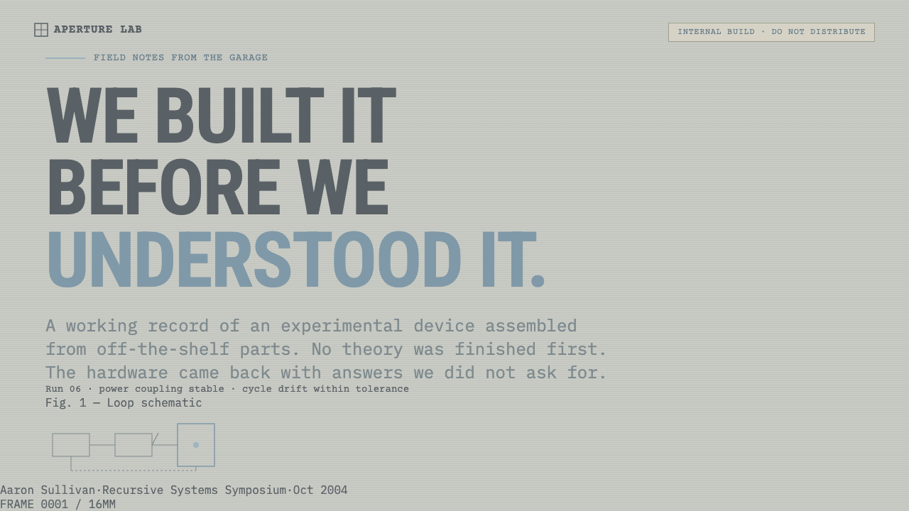
For presentation covers, treat Primer as a quiet technical premise rather than a cinematic poster. Set the title in a plain, information-bearing hierarchy on a washed-out field, then introduce a taped-card fragment, a compact monospace identifier, or a restrained ruled structure. The cover should imply that the presentation begins in the middle of an investigation. Do not use glowing timelines, cosmic imagery, or dramatic visual metaphors for complexity.
For content slides, use the utilitarian grid as a working surface. Separate statements, assumptions, evidence, and open questions into clearly related areas, with index-card panels used for notes that need to remain distinct. Body copy can stay calm and dense when headings, labels, and spacing make the reading path obvious. The aim is not sparse minimalism; it is the legibility of an active whiteboard.
For data slides, Primer is especially effective when numbers, logs, comparisons, or process states are central. Monospace blocks can carry raw values and short labels, while restrained rules and muted surface changes establish grouping. Charts should remain plain, sober, and inspectable. Treat the visualization as a technical artifact under review, not as a victory graphic designed to create excitement.
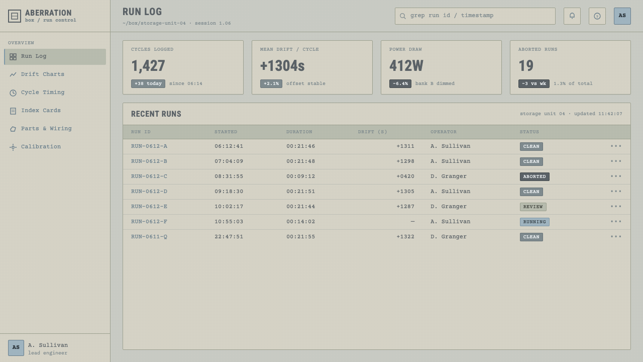
For web interfaces, the style suits dashboards, internal tools, analytical products, and pricing pages that benefit from disciplined hierarchy. Use a cool subdued ground, utilitarian panels, clear borders, and consistent labels. A dashboard can make records, status, assumptions, and recent changes feel part of one operational surface. A pricing page can use the same language to distinguish plans through structure and comparison rather than promotional shine.
For editorial and marketing work, use the style where a product needs to communicate rigor, candor, or experimental credibility. An article can combine a readable text column with note-like callouts, compact metadata, and taped evidence panels. Marketing should retain the film’s restraint: present a claim, show supporting detail, and leave room for uncertainty. The common mistake is to make Primer look like a fashionable hacker interface by adding neon, deep black space, excessive code, or futuristic effects. Its power comes from faded ordinary light and visible work, not digital intimidation.
Primer (2004) — FAQ
Is Primer a cyberpunk style?
No. Primer rejects the saturated neon, urban spectacle, darkness, and technological glamour commonly associated with cyberpunk. Its technical mood is suburban, pale, and practical. It is closer to an improvised engineering workspace than to a future city, and its visual tension comes from constrained tools and difficult reasoning rather than from visual excess.
Should a Primer-inspired interface look unfinished?
It should look provisional, not careless. Taped cards, plain grids, and low-contrast surfaces suggest that the system can be revised as new evidence appears. But text, alignment, grouping, and navigation must still be deliberate. The intended feeling is a reliable workbench with visible iteration, never a broken prototype or an accidental collage.
Can the style use warm colors or pure white backgrounds?
The source language specifically avoids warming into cream and bleaching into white. Primer works best when its ground stays cool, washed out, and low in contrast, with green-gray and pale fluorescent blue-gray doing the atmospheric work. A warm, welcoming palette changes the emotional premise from engineering observation to comfort or lifestyle branding.
When does Primer work poorly?
It is a poor fit when a product needs warmth, celebration, luxury, or immediate emotional reassurance. Consumer experiences centered on delight, softness, or aspirational polish may read the style as drained or overly severe. It works best when users benefit from seeing the system as accountable, practical, and still open to examination.
Related design styles
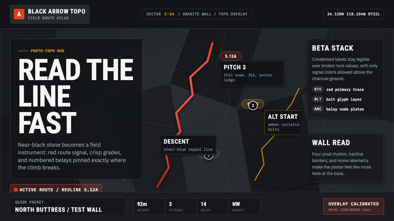 Climbing Topo GuideBeta at a glance. Red route telemetry cuts across near-black stone and conden…
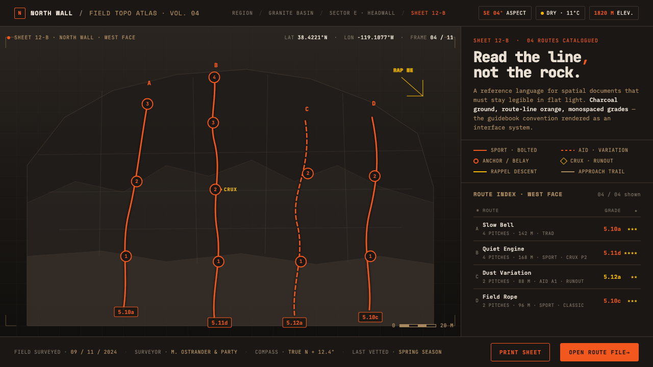 Climbing Topo MapA field manual, not an app. Charcoal crag ground, route-line orange, monospac…
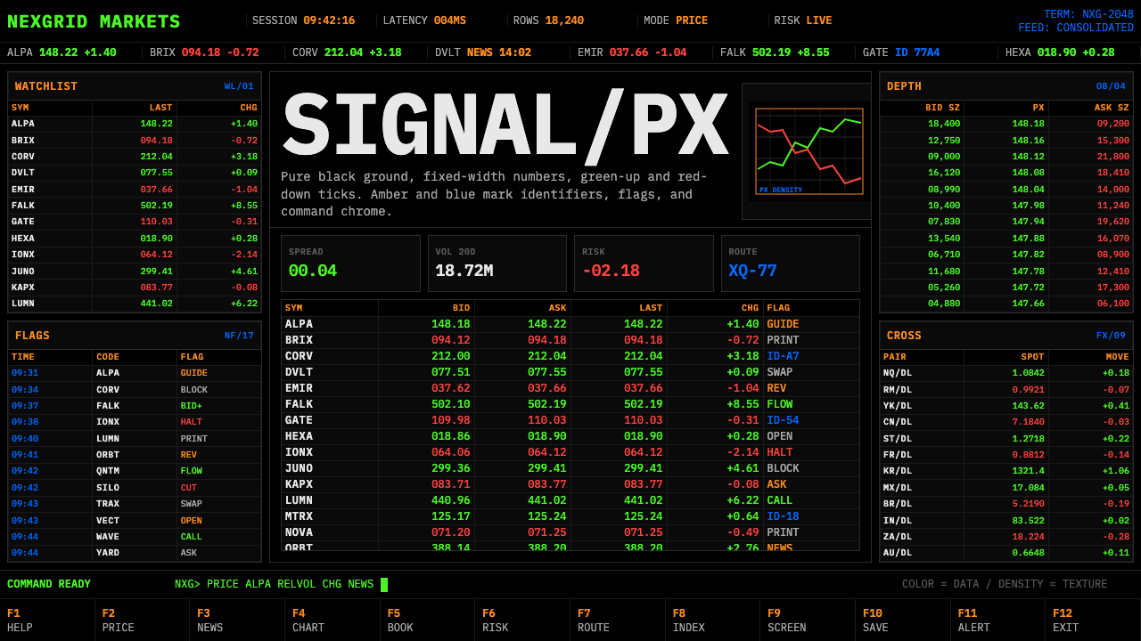 Financial Terminal MonoMaximum signal per pixel. Pure black, IBM Plex Mono, green-red ticks, amber-b…
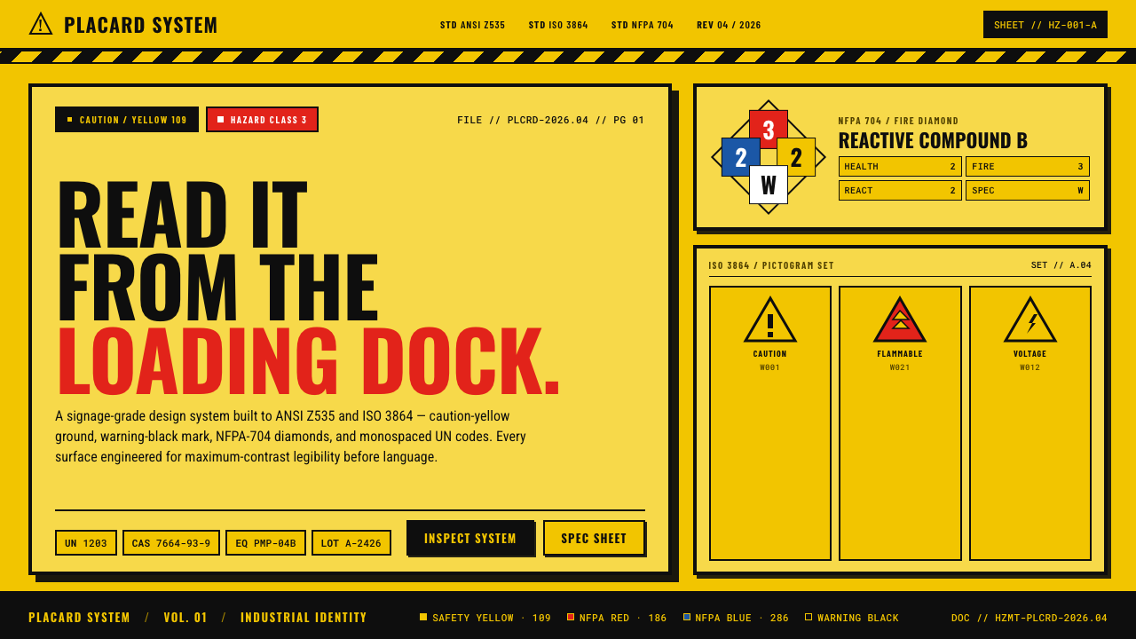 Hazmat SignageRead it from the loading dock. Caution-yellow ground, NFPA diamonds, monospac…
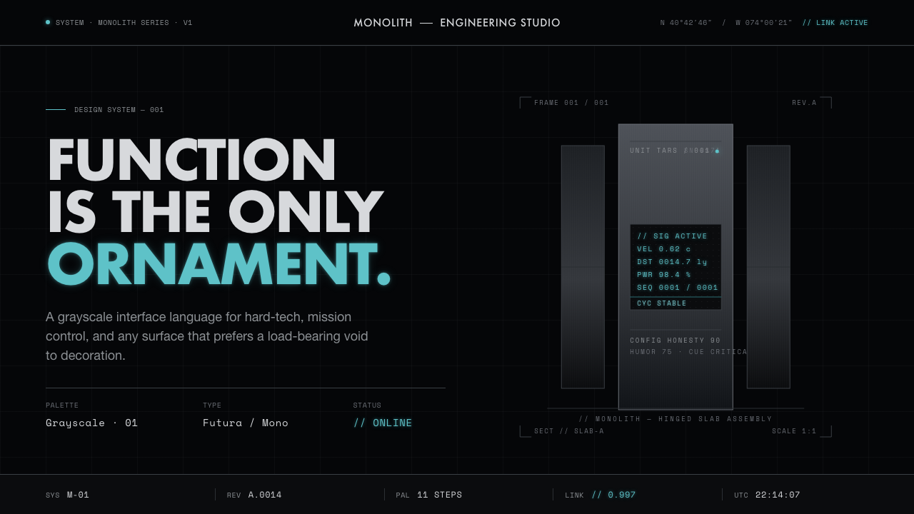 Interstellar TARSIf Mies built a robot. Brushed-aluminum grays on deep-space black, lit by one…
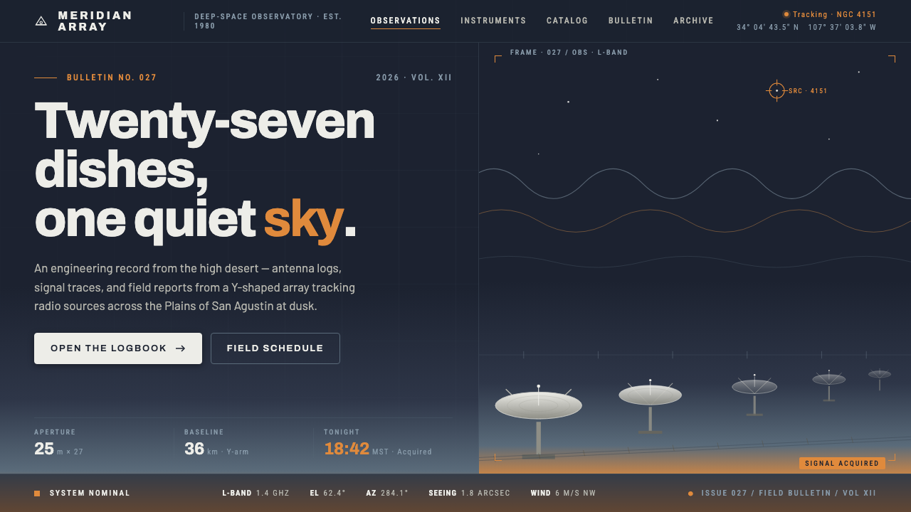 Radio Telescope ArrayEngineering at dusk. Steel-white dishes tilt against a twilight sky bleeding…