What is Post-Scarcity Civic?
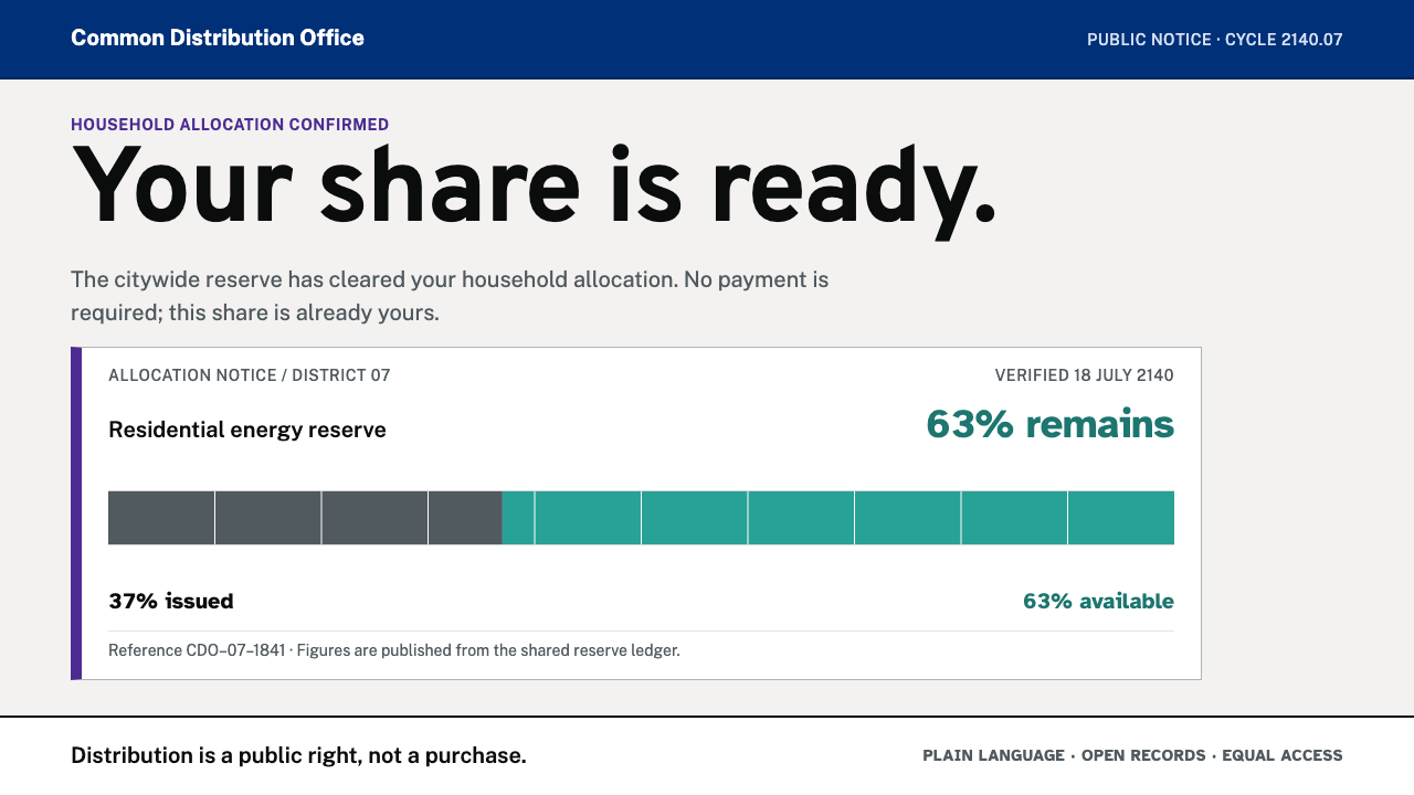
Post-Scarcity Civic imagines the interface of a society that no longer sets prices, and finds that it looks like the plain, readable pages governments already make.
Post-Scarcity Civic in brief
Post-Scarcity Civic is a speculative public-service interface for a society that no longer prices what it distributes. Where a commercial screen would print a price, this one prints an allocation, a remaining share or a position in a queue. The user is not a buyer but a citizen collecting what is due, and every element of the screen is arranged to make that share clear.
Nothing about the look is invented. The palette comes from the colour system of the British government's GOV.UK, the type is Public Sans from the United States Web Design System, and the layout rules are the ones government services already use: one column, flush left, body text larger than the web norm, no ornament. For forms and confirmations the system switches to Atkinson Hyperlegible, a typeface designed so that letters are easier to tell apart for readers with low vision.
The future it imagines is administrative, not cinematic. It reads less like a holographic control room than like a well-made government form: large type, a restrained line length, every number traceable to a source. Its premise is that a society which genuinely treats distribution as public business would want an interface that an ordinary person can read at a glance.
Where does Post-Scarcity Civic come from?
The style is framed at the year 2140, but its design lineage is documented and dates from the 2010s onward. It inherits from government digital service design, the movement that began in the early 2010s in which governments rebuilt public services as plain-language, user-tested websites instead of departmental brochures. GOV.UK in the United Kingdom is its best-known product, and the United States Web Design System, known as USWDS, is its American counterpart.
Ben Terrett and Dan Williams stand in the source for the early design culture of GOV.UK, in which the guiding idea was that a government service should work for everyone, including the people with the least time, confidence or technical ability. Long before it was a style, the idea was that a public service has no reason to impress and every reason to be understood. The palette and layout conventions this system borrows descend directly from that culture.
The type lineage matters. Public Sans, the open-source face adopted for the United States government's design system, descends from the Libre Franklin family drawn by Pablo Impallari, itself a revival of a classic American grotesque. Atkinson Hyperlegible comes from the Braille Institute, which developed it to make characters easier to distinguish for readers with low vision. Its distinct letterforms, in which look-alike characters such as a capital I, a lowercase l and a numeral one are told apart, are exactly what a form or confirmation screen needs.
What 2140 adds is only a premise. If scarcity ends and distribution becomes a public service, the interface should show shares, allocations and queue positions in place of prices. The visual language itself does not move at all, because the best civic design has always aimed at the same thing: be unmistakably readable, treat every user alike, and say plainly what you are owed and when. That is the point at which the speculative and the documentary meet in this style.
What defines the Post-Scarcity Civic look?
Civic grey ground
A pale grey page, taken from the GOV.UK system, is the default ground. It reads as institutional and calm, lets white content panels sit quietly against it and avoids the harshness of a pure white screen. The grey is a background for reading, not a mood.
Deep civic purple
The primary colour is a deep purple, also taken from GOV.UK, used for headings, links and the primary action. It is authoritative without being aggressive, and because it is the only strong hue in the layout it reliably points to what the user can do next.
Turquoise meters
Allocation is shown as a meter: a bar giving the share used and what remains, in turquoise on grey. The meter replaces the price tag as the characteristic information element, and each one is accompanied by a plain-text statement so that the figure never depends on colour alone.
Public Sans for reading
Running text is set in Public Sans, a clean, open, American-grotesque-derived sans with a modest range of weights. It has little personality, and that is the point: it disappears so the content can be read, and it looks the same on a phone, a kiosk or a printed notice.
Atkinson Hyperlegible for forms
Forms and confirmations switch to Atkinson Hyperlegible, whose letterforms are made to be told apart. These are the moments where misreading is most costly, so changing face there is a quiet signal that the user is now doing something that matters, and a practical aid to accuracy.
One column, flush left
Content runs in a single column, flush left, with a restrained line length and body text larger than the web default. Reading order is vertical and obvious, nothing sits beside the main flow, and the page survives any screen size or magnification without rearranging itself.
Zero ornament
Corners are almost square, there are no shadows and no gradients, and there is no illustration for atmosphere. Emphasis comes from type size, weight, spacing and one accent colour. The interface looks like a document, not a product, and that plainness is what gives it civic credibility.
Who shaped Post-Scarcity Civic?
Terrett is associated with the early design culture of GOV.UK, in which the guiding idea was that a government service should be so clear that it needs no explanation. The palette and layout conventions this style borrows descend from that culture, and his name stands for the proposition that civic design earns trust through plainness rather than polish.
Listed beside Terrett among the key figures, Williams represents the working designers who turned the early GOV.UK principles into everyday pages and components. The single-column, flush-left, ornament-free layouts that now seem natural for public services come out of this kind of patient, practical design work.
A type designer whose Libre Franklin family, a revival of a classic American grotesque, is the base from which Public Sans descends. His name stands for the open-source type tradition that lets a government publish a free, unbranded typeface that anyone can reuse, which is exactly the spirit of this style.
A United States non-profit serving people with sight loss, the Braille Institute developed Atkinson Hyperlegible, a typeface whose letterforms are deliberately distinct to improve character recognition. In this style it is the face for forms and confirmations, the places where misreading has real consequences.
How do you use Post-Scarcity Civic today?
Post-Scarcity Civic suits any context where fairness, clarity and plain language are the product's values: public services, civic tools, community resource platforms, non-profits, and internal allocation systems such as quotas, leave balances or shared resources. It is designed to be unremarkable and trustworthy, so it works best when the content, not the interface, is the event.
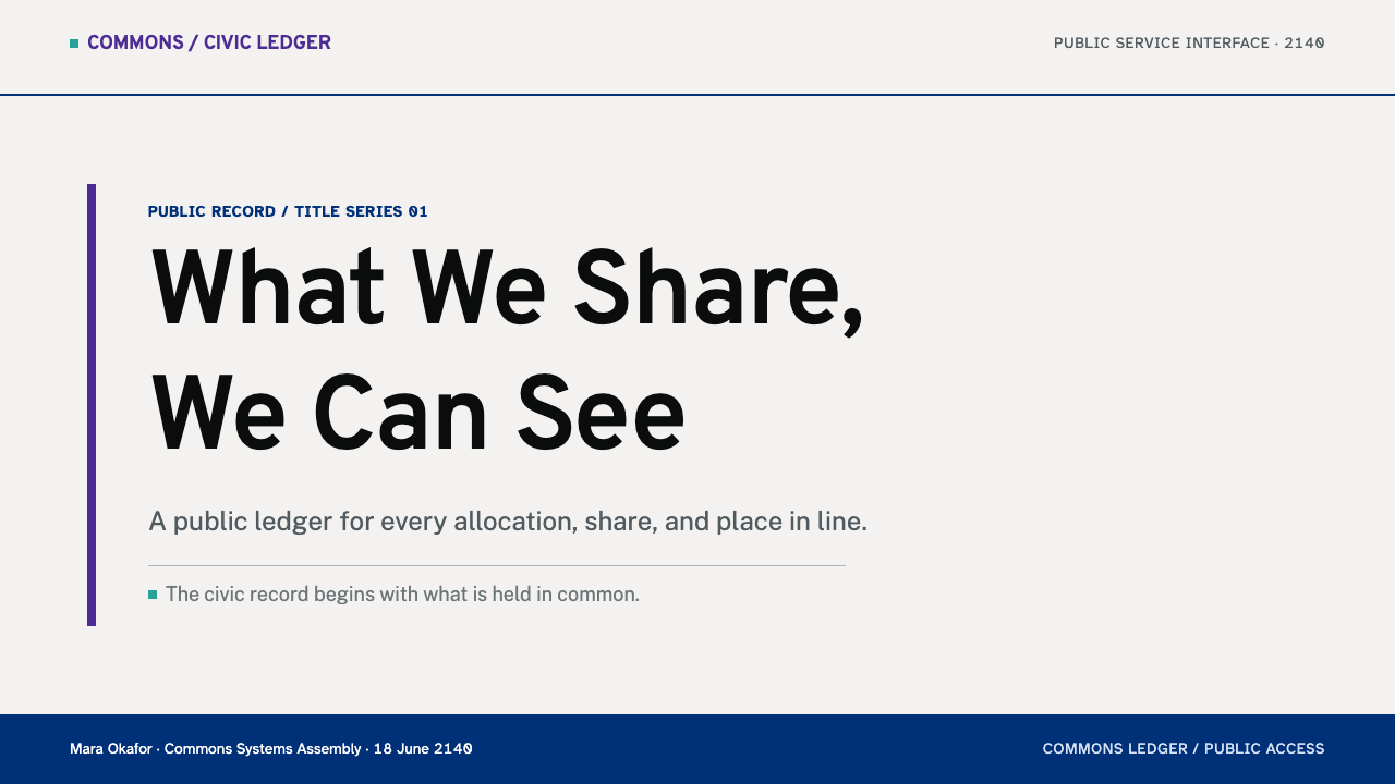
For slides, the cover is a plain, left-aligned title on the civic grey ground, a one-line statement of what the deck allocates or decides, and a single purple rule or tag. Content slides are single-column documents: a heading, a short paragraph and one meter or table. Data slides use turquoise meters for shares and remaining quantities, with the number written out beside each bar so that the figure can be read without reading the graphic.
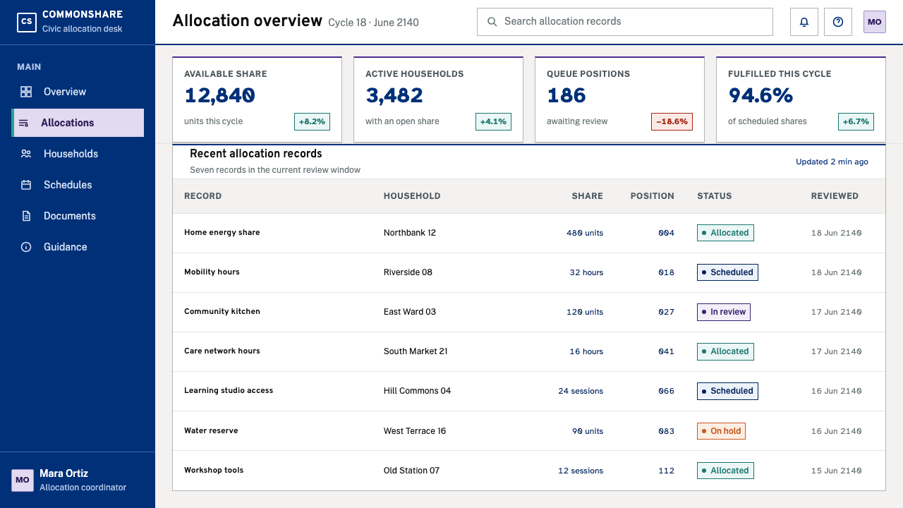
For web interfaces, think of a service page: a summary panel stating what the user is entitled to, a meter showing what remains, a clear primary action in purple and a plain-text explanation of the rules. Dashboards present allocations and queue positions, not conversion metrics, and pricing pages become entitlement pages in which tiers are described by what each person receives and when, not by what they pay. Forms use the hyper-legible face, with labels above fields, visible error messages and no placeholder-only labels.
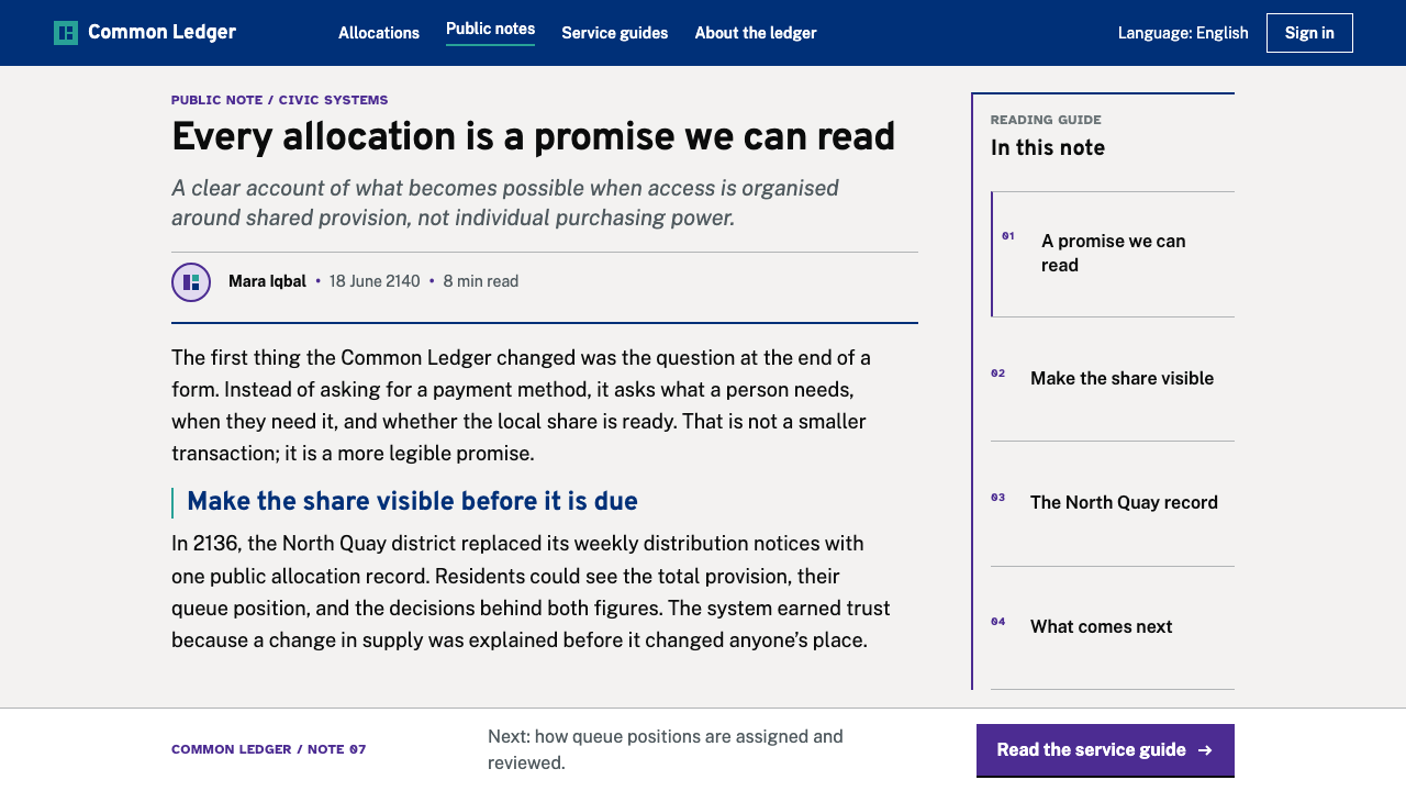
For editorial and marketing work the style fits policy explainers, reports, speculative-design projects and civic campaigns. It gives long-form content a document-like voice: large readable text, a short measure, numbered steps and plainly worded headings. Visual storytelling works best through diagrams and meters rather than photographic treatments; the future it describes should feel like paperwork that works.
The common mistake is to treat 'post-scarcity' as licence for sci-fi decoration: glowing gradients, translucent panels, neon meters. That is the cinematic future this style explicitly declines. Another is to show allocation as a price in disguise, such as a meter without a plain statement of what it means or a 'free' badge in a shopping layout. The language of the screen should consistently say share, entitlement and queue position, never discount or offer.
Post-Scarcity Civic — FAQ
Is Post-Scarcity Civic based on a real design system?
Yes. The palette is taken from GOV.UK, the type is Public Sans from the United States Web Design System, and the form face is Atkinson Hyperlegible from the Braille Institute. What is speculative is only the premise, an interface for a society that does not price what it distributes. The visual language is borrowed from systems that already exist and are already in daily public use.
Why does a 2140 interface look so plain?
Because the future it imagines is administrative, not cinematic. If distribution is a public service, the best interface is the one an ordinary person can read at a glance, and good civic design has aimed at that for a long time. The plainness is the argument: a society that treats allocation as public business would not need spectacle to explain it.
How does the style handle accessibility?
By making it structural. Body text is large, the layout is a single column that survives magnification, forms use a typeface built for distinct letterforms, and every meter is paired with its number in plain text so colour is never the only carrier of meaning. These are the habits of accessibility-first public interfaces, applied consistently rather than added as an afterthought.
What replaces prices in the interface?
Allocations, remaining shares and queue positions. Where a shop would show a cost, this style shows what you are entitled to, how much of it you have used and, where relevant, when your turn comes. The wording matters as much as the layout: it should say share, entitlement and position, and avoid the vocabulary of discounts, offers or upgrades.
Where does it not work?
It struggles in brands that depend on delight, persuasion, luxury or emotional storytelling, and in anything that sells urgency, such as flash sales or conversion funnels. A style whose whole point is to be unremarkable cannot carry a promise of excitement. It fits internal tools, civic platforms and any product whose value is fairness and clarity.
Related design styles
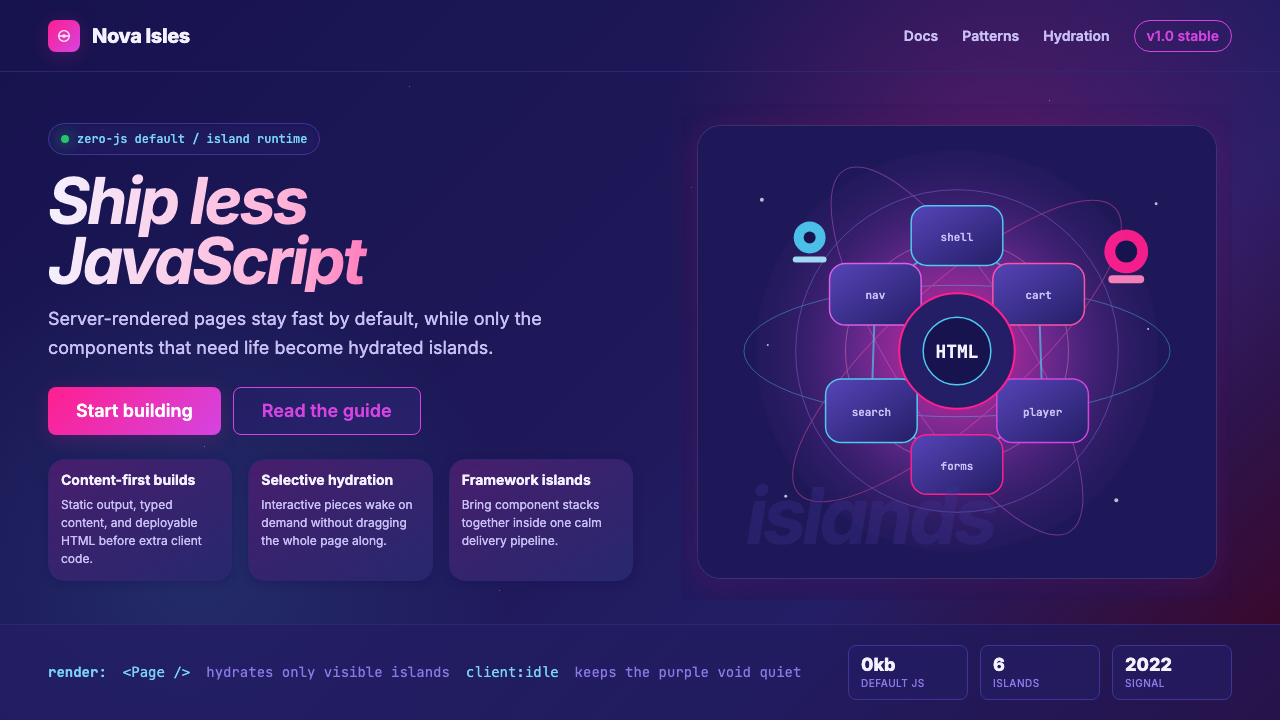 Astro Islands Architecture 2022Warm cosmic devtools. Deep violet, magenta glow, Inter clarity, and island ge…
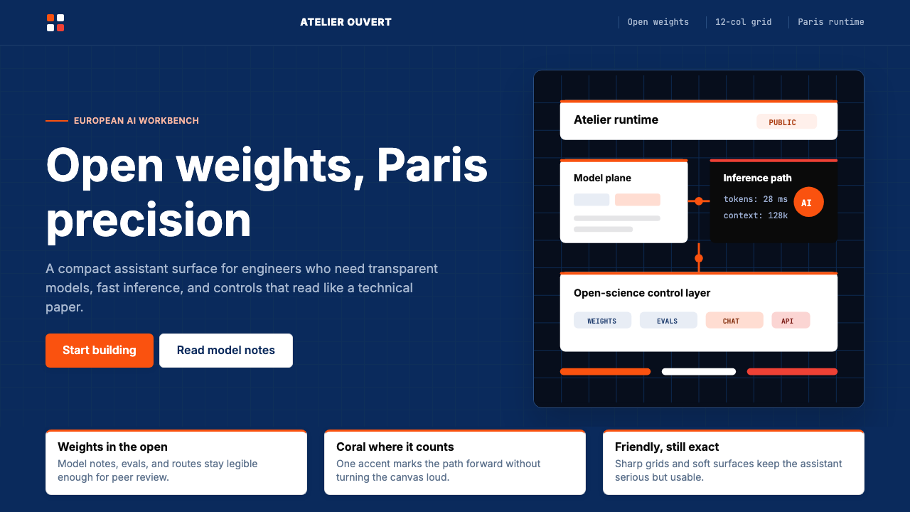 Mistral Le Chat French AIOpen science feels engineered. Navy panels, Inter grids, and coral stripes ke…
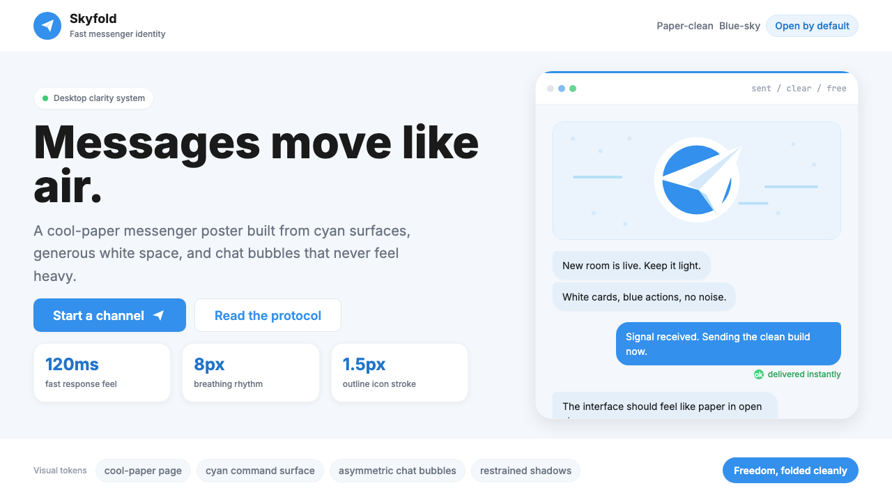 Telegram Blue Paper PlanePaper-clean speed. Cyan planes, white cards, and chat bubbles carry the ident…
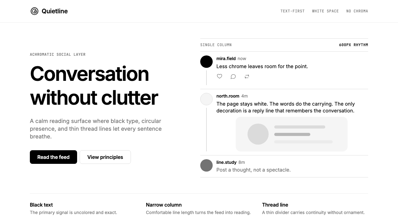 Threads (Meta)Restraint is the brand. Black Inter type, narrow feed, thin connectors, white…
 Zen BrowserSoftware steps aside. Warm white, slate hairlines, and muted plum carry the c…
 1Password Purple VaultSecurity stays quiet. Vault purple, Inter type, and crisp white cards do the…