What is Cultivated Meat Counter?
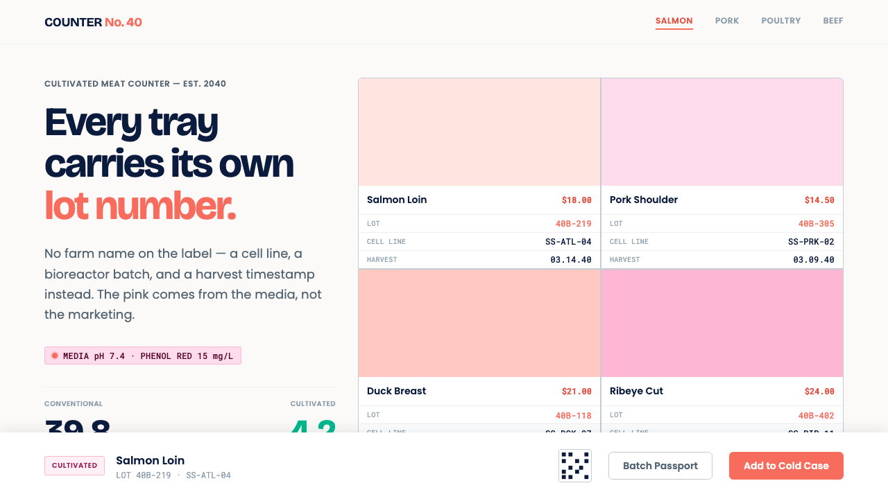
Cultivated meat gets a counter that looks like a butcher's but keeps a laboratory's books: white tile, a coral pink borrowed from the growth medium, and a lot code stamped on every tray.
Cultivated Meat Counter in brief
The Cultivated Meat Counter style imagines a shop that sells meat grown from cells and presents it as a butcher counter that keeps a laboratory's paperwork. The setting is white ceramic tile and a stainless-steel cold case. Trays are labelled not with a farm but with a cell line and a bioreactor batch. The page is near-white, the accent runs from coral to magenta, and every product carries a lot code in monospaced type on its face.
The pink is not styling. Phenol red, a pH indicator added in small amounts to culture media, reads pink-red at the near-neutral acidity that living cells need, so the growth medium genuinely is pink and the finished product's salmon-like tone echoes it. The colour is a fact of the process, which is why the style can use it without sounding decorative.
The mood is deliberately unglamorous. There is no laboratory drama, no glowing flasks and no science-fiction gloss. Information sits on the front of the product, in the manner of a food label rather than an app: restrained, wipeable and legible. The carbon claim is not a leaf but a numeric ledger, stated line by line in kilograms of carbon dioxide equivalent, written kg CO₂e.

Where does Cultivated Meat Counter come from?
Cultivated meat, also called cultured or cell-based meat, is real animal muscle and fat grown from cells rather than harvested from a slaughtered animal. The field of cellular agriculture produced its first cultured burger in 2013, a development associated with Mark Post at Maastricht University. Singapore approved cultivated meat for sale in 2020, a milestone linked to Josh Tetrick and his company Eat Just, and US regulators issued clearances in 2022 and 2023. The style projects that trajectory forward to a retail counter in 2040.
Three companies, Wildtype, UPSIDE Foods and Mosa Meat, each arrived independently at a near-white page with a coral-to-magenta accent. They work on different products, from seafood to poultry to beef, and are based on different continents, which is what makes the convergence notable. It has become the settled visual consensus of the category, and this style simply takes it seriously enough to build a whole counter from it.
Two traditions meet at that counter. Food-transparency labelling, the movement to put origin, ingredients and method on the front of a package, supplies the habit of displaying provenance openly: cell line, batch and harvest date. Laboratory-materials aesthetics supplies the surfaces of ceramic, stainless steel, glass and clean white, finishes chosen because they can be scrubbed down and trusted. A new food has to answer the question 'what exactly is this?' faster than a familiar one, and showing the paperwork is a way of answering.
The 2040 in the name signals that this is a projection, not a record. The date is a design conceit: a counter in a future where cultivated meat is ordinary enough to sit beside conventional cuts. Setting the style there lets it drop the apologetic tone of early launches and treat the product as normal retail, subject to the same expectations of freshness, traceability and honest claims as any other food.
What defines the Cultivated Meat Counter look?
White Tile Ground
The page is near-white, evoking glazed ceramic tile. The ground is clean, evenly lit and free of texture or pattern, as if the surface could be wiped down between customers. White also lets the pink read as a controlled accent and not as a mood.
Phenol-Red Accent
The accent runs from coral to magenta and is borrowed from the colour of culture medium rather than from fashion. It is used for category marks, prices, selection states and small identifiers, never as a wash across large areas. Its justification is chemical, which gives it a seriousness a decorative pink could not have. Pink never appears on body text, where it would hurt legibility and suggest sweetness.
Abutting Tray Cards
Product cards sit directly against one another with only a thin gap, like tiles in a wall. Each card is a tray with a name, a cut, a weight and a price. Corners stay modest and shadows are absent. The grid is the counter, and the eye scans it the way it would scan a row of trays in a cold case.
Monospaced Lot Codes
Cell line, bioreactor batch and harvest date are printed in monospaced type on the face of each tray, large enough to read without squinting. Monospace gives the code the look of a stamped record and keeps columns of codes aligned. The code is never tucked into a footer or hidden behind a link. The same convention extends to prices and weights, which sit in monospace beside the code so that every checkable fact shares one voice.
Carbon Ledger
The environmental claim is a table, not a symbol. Each row lists a stage with its emissions in kg CO₂e, summed at the bottom, so a reader can check the arithmetic. Leaves, globes and green ticks are absent because they assert without showing. A claim in this style has to survive being audited.
Steel and Glass Neutrals
Cool greys stand in for stainless steel and glass, appearing in cold-case frames, dividers and secondary text. They are neutral and slightly blue, so the coral reads warm against them. The palette is a laboratory's, put to work in a shop.
Front-of-Label Hierarchy
Information follows the logic of a food label: what it is, how much, when, where it came from. Nothing important is hidden behind taps or hover states. The result is quiet, cleanable and fast to scan, and it is a practice borrowed from regulated food packaging, not from app design.

Who shaped Cultivated Meat Counter?
The Maastricht University scientist associated with the first cultured burger in 2013, and later a co-founder of Mosa Meat. His demonstration turned cultivated meat from a laboratory idea into a public image, and Maastricht, where he worked, is one of the three places that anchor this identity.
Founder of UPSIDE Foods, the US company that went through regulatory clearance for cultivated chicken in the early 2020s. UPSIDE is one of the three firms whose near-white pages with a warm accent form the visual consensus this style is built on.
Co-founder of Wildtype, the San Francisco company working on cultivated seafood, especially salmon. Wildtype's salmon-pink product and clean white presentation are close to the template for the counter: food that is openly pink, openly made and labelled accordingly.
Co-founder and chief executive of Eat Just, whose cultivated chicken was approved for sale in Singapore in 2020. That approval is the date from which retail cultivated meat stopped being hypothetical, and so the date from which a style like this has a counter to describe.
How do you use Cultivated Meat Counter today?
The Cultivated Meat Counter style transfers to any product whose novelty creates a trust problem, and to anything that must show its working. The principle is to put proof on the front: the code, the date, the number, the origin. Colour and form then stay calm enough for that proof to be read.
On slides, a cover can be near-white with a single coral band and the title in plain type, as sober as a product specification. Content slides use tray-style cards butted together on a grid, each with a name, a figure and a monospaced code. Data slides should present ledgers, not infographics: rows of kg CO₂e with totals, one coral highlight for the line that matters, and sources named on the slide. Notes can name the cell line and batch of any example used, so that even a presentation carries its provenance.
For web products, the style suits e-commerce for novel foods, traceability dashboards, batch-record and quality-assurance tools, and compliance interfaces. Build product pages from tray cards, show lot codes and harvest dates beside the price instead of in the small print, and let filters read like a food label's fields. Keep interaction quiet and legible, and make every claim expandable into the figures that support it. Where a product is out of stock, say so plainly in text; a grey tray that still shows its lot code looks like a record rather than a failure.
In editorial and marketing work, packaging, shelf signage, explainers and impact reports can all use the same logic. Write labels as a regulated food label would, state what the product is in the first line, and show the numbers behind any environmental statement. Photography should be clean and ordinary, a tray under good light, not a laboratory staged to look futuristic. The test for any element is simple: could a food inspector read it and find it accurate?
The most damaging mistake is greenwashing by iconography: adding leaves, earth tones or vague eco badges that assert benefits without showing them. The second is overplaying the science, with dark backgrounds, glowing blue and sci-fi type that bring back the laboratory drama the style exists to remove. A third is treating the pink as sweetness, with pastel gradients that make a food product read like confectionery. And hiding the lot code defeats the whole premise.

Cultivated Meat Counter — FAQ
Why is cultivated meat branding so often pink?
Partly because the product really is pink. Culture media usually contain phenol red, an indicator that shows a pink-red colour at the acidity cells need, and cultivated cuts such as salmon are naturally in that range. Three leading companies independently adopted near-white pages with a coral-to-magenta accent, so the colour has become the category's shorthand. Using the pink openly is also an honesty move, since it declines to disguise how the product was made.
Is this a real retail style or a speculative one?
Both. The roots are real: the near-white, coral-accented pages of existing companies, and the food-labelling and laboratory-materials traditions. The 2040 counter is a projection that extends those roots to a time when cultivated meat sits alongside conventional cuts. Treat it as a well-grounded design hypothesis, not a description of any shop that exists today.
Why print lot codes in monospaced type?
Monospace makes codes read as records. Every character takes the same width, so strings of letters and digits stay aligned, are easy to compare and are hard to misread, which matters for anything that may be checked against a database or a recall notice. It also evokes the stamped or printed label of a laboratory.
Why show a numeric ledger instead of a green icon?
An icon can only assert; a ledger can be checked. Rows of kg CO₂e with a sum let a reader see where emissions arise and judge the claim themselves. In a category that attracts scepticism, showing arithmetic earns more trust than showing foliage, and it protects the brand from accusations of greenwashing.
Can the style be used for other foods or for biotech products?
Yes, wherever a product needs to display provenance and process openly: fermentation-based foods, supplements, diagnostics, laboratory suppliers and traceable-supply-chain tools. It is less suited to indulgent or nostalgic food brands, where warmth, texture and storytelling matter more than documentation.
Related design styles
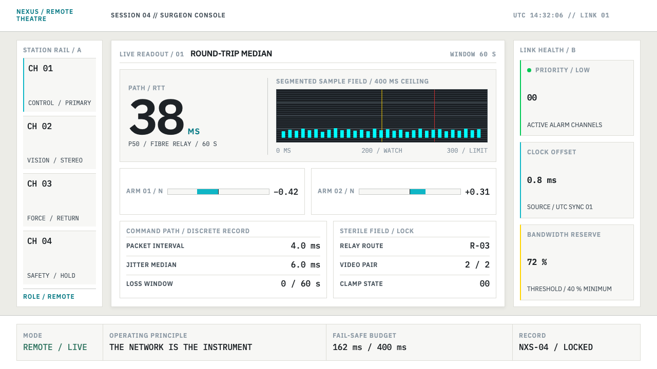 Telepresence Surgery SuiteNothing vague survives. Cyan latency bars and IBM Plex Mono make state measur…
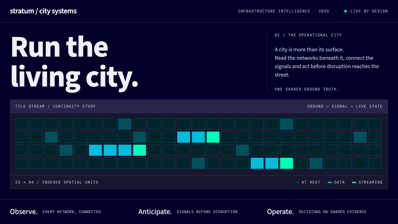 Digital Twin City OpsColour reports, never decorates. Deep blue grids reserve cyan and green for d…
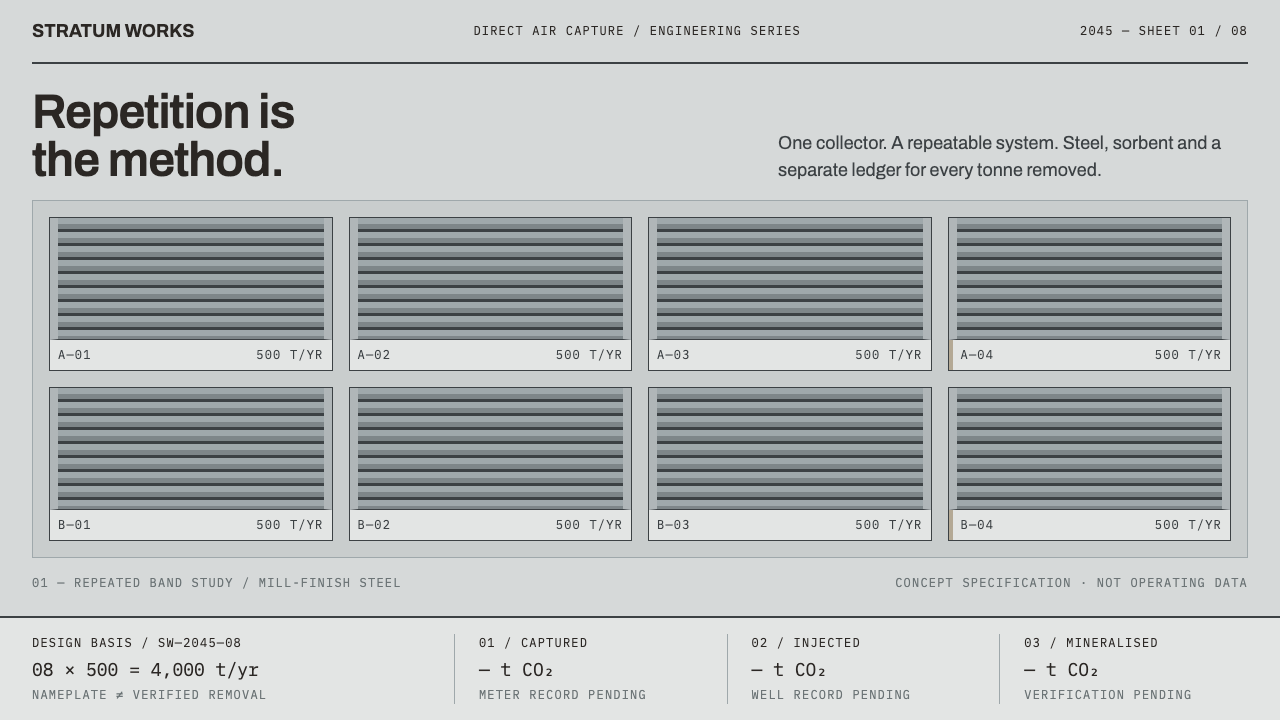 Direct Air Capture PlantRepetition, not rhetoric. Steel-grey louvre bands and monospaced ledgers make…
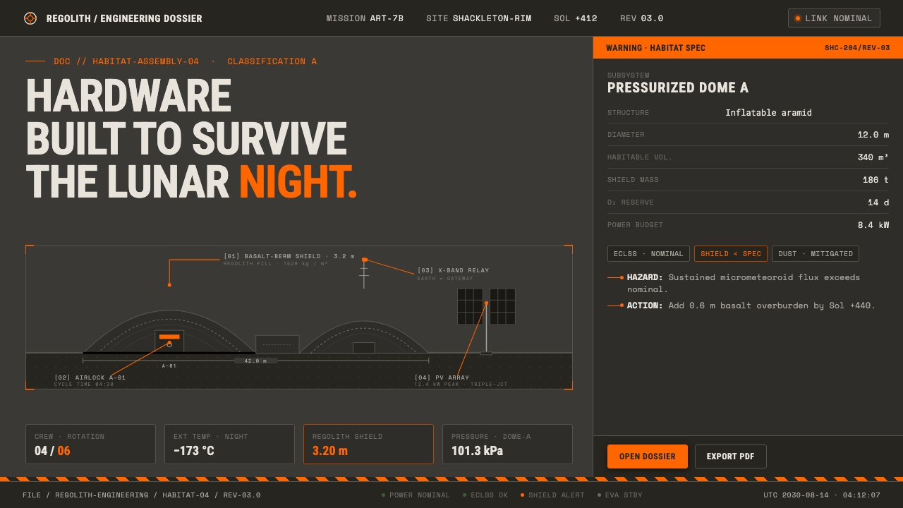 Lunar Base 2030Hardware built to survive the lunar night. Regolith gray, ANSI hazard orange,…
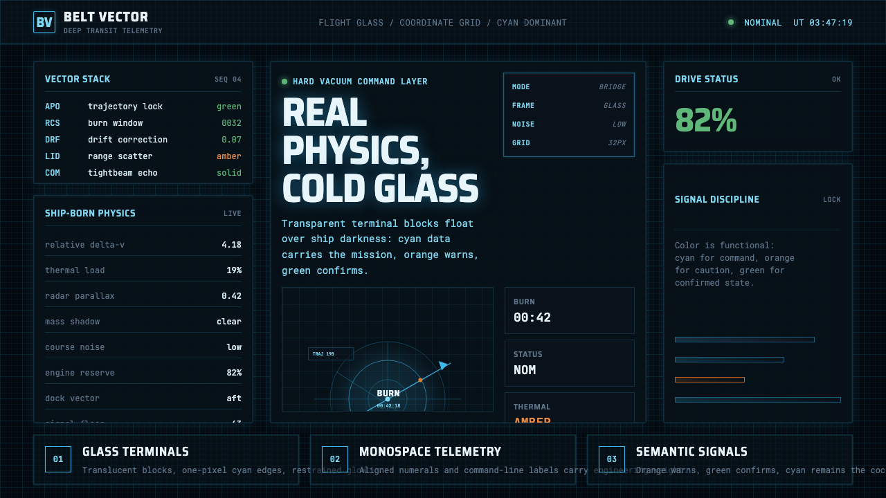 The Expanse Belter UIEngineering, not neon. Cyan glass panels, mono data, orange warnings on ship-…
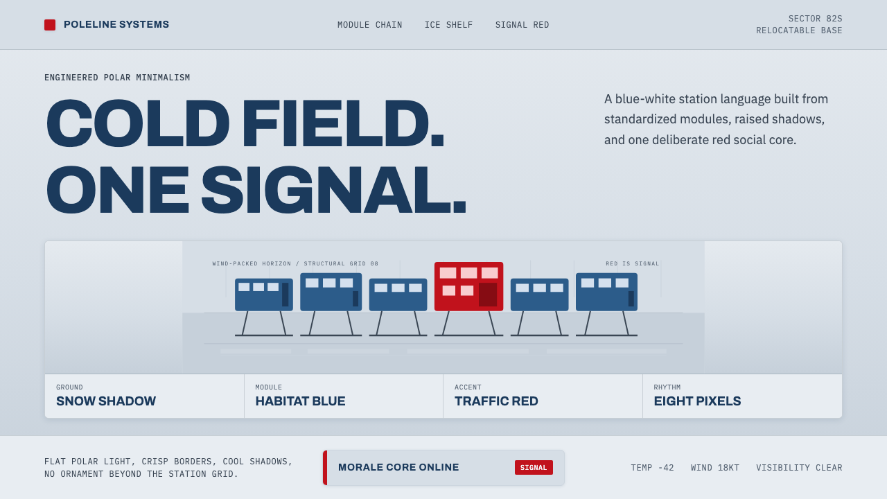 Antarctic StationCold precision, one red signal. Archivo modules ride a blue-white horizon gri…