What is Post-it Canary Yellow (1980)?什么是 Post-it Canary Yellow (1980)?
The most recognizable shade of yellow in the modern office was never designed — it was an accident of scrap paper, a failed adhesive, and six years of patient waiting.现代办公室里辨识度最高的黄色,从来不是刻意设计的产物——它是废纸、一款失败的胶水,与六年耐心等待共同造就的意外。
Post-it Canary Yellow (1980) in briefPost-it Canary Yellow (1980) 速览
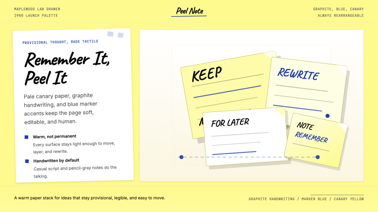
Post-it Canary Yellow is a design system rooted in the visual vernacular of the sticky note: a pale, slightly warm yellow ground, graphite-toned handwriting, occasional blue marker accents, and the slightly imprecise, tilted geometry of a paper square peeled from a pad and pressed onto a surface. It is a system that makes the provisional feel intentional — the aesthetic of a thought in progress.便利贴淡黄(Post-it Canary Yellow)是一套植根于便签视觉语言的设计系统:微微温暖的淡黄色底面、铅笔灰色调的手写字迹、偶尔出现的蓝色马克笔强调,以及从本子上撕下、贴于表面的纸片方块那种略带不规则的倾斜几何感。它是一套让临时感变得刻意的系统——关于一个尚在进行中的想法的美学。
Where many historical design languages emerge from artistic manifestos or institutional programs, Post-it Canary Yellow emerged from corporate accident: a 3M lab, a low-tack adhesive that failed to bond permanently, and the particular yellow of whatever scrap paper happened to be nearby. That origin — humble, unplanned, warmly functional — is inseparable from what the style communicates. It says: this is human, handwritten, not yet final, and that is perfectly fine.许多历史设计语言诞生于艺术宣言或机构计划,而便利贴淡黄却诞生于企业意外:3M的一间实验室,一款无法持久黏合的低粘胶水,以及恰好放在附近的废纸所特有的那种黄色。这一起源——朴实、无计划、有着温暖的功能性——与这种风格所传递的信息密不可分。它在说:这是人的手迹,是手写的,还没有定稿,而这完全没有问题。
Visually, the system is distinguished by its warmth and approachability. The dominant ground is a soft, slightly creamy yellow — not a saturated primary, but a muted, paper-like tone that reads as inviting rather than urgent. Letterforms lean toward the handwritten and informal. Accents in cool marker-blue or graphite-grey punctuate the yellow field, echoing the way a real sticky note accumulates layers of ink. Slight tilts, soft drop shadows, and paper-edge effects reinforce the tactile quality of physical notes without tipping into skeuomorphic excess.在视觉上,这套系统以温暖和亲切感为显著特征。主要底色是柔和、略带奶油感的黄色——并非饱和的原色,而是一种柔化的、类纸张的色调,给人亲近感而非紧张感。字形倾向于手写体和非正式风格。冷色调的马克笔蓝或铅笔灰的点缀在黄色底面上跳动,呼应着真实便签上层层叠加的墨迹。轻微的倾斜、柔和的落影与纸张边缘效果,在不过度拟物的前提下强化了纸质便签的触感品质。
See the Post-it Canary Yellow (1980) design system查看 Post-it Canary Yellow (1980) 完整设计系统
Where does Post-it Canary Yellow (1980) come from?Post-it Canary Yellow (1980) 从何而来?
The story begins in 1968, when Spencer Silver, a chemist at 3M's central research laboratory in Maplewood, Minnesota, was attempting to develop a strong, permanent adhesive. What he synthesized instead was a microsphere-based compound that bonded lightly and — crucially — could be removed and repositioned without leaving residue. Within 3M, Silver spent years presenting his discovery at internal seminars, convinced it had potential, but unable to identify a commercial application. The adhesive was too weak to hold things firmly; that was, everyone assumed, its fatal flaw.故事始于1968年。斯宾塞·西尔弗(Spencer Silver)是3M位于明尼苏达州梅普尔伍德中央研究实验室的一名化学家,当时他正在尝试研发一种强力永久粘合剂。然而他合成出的,却是一种基于微球体的化合物——黏合力温和,关键在于,可以撕下并重新粘贴,不留残胶。此后数年,西尔弗在3M内部研讨会上不断展示他的发现,坚信它有潜力,却无法确定商业应用场景。这款胶水太弱,无法牢固固定物品——人们普遍认为,这正是它的致命缺陷。
The application arrived through another 3M employee, Arthur Fry, who attended one of Silver's seminars in 1974. Fry sang in his church choir and was frustrated that his paper bookmarks kept falling from his hymnal. Silver's adhesive, he realized, was precisely what he needed: a way to mark pages that would hold gently but peel away cleanly. He coated strips of paper with Silver's compound and found they worked exactly as he had imagined. But neither Fry nor Silver initially considered what color that paper should be. The yellow — the specific canary yellow that became the note's defining visual identity — came from the scrap paper available in the lab next door. It was an arbitrary starting point that became permanent.应用场景来自另一位3M员工亚瑟·弗莱(Arthur Fry)。1974年,弗莱参加了西尔弗的一次研讨会。弗莱在教堂唱诗班献唱,一直为纸质书签不断从圣歌集中滑落而苦恼。他意识到,西尔弗的胶水正是他所需要的:一种能轻柔固定书页、却能干净撕除的方式。他将纸条涂上西尔弗的化合物,发现效果完全如他所想。但弗莱和西尔弗起初都没有考虑过纸张的颜色。那种黄色——最终成为便利贴视觉标识的特定淡黄色——来自隔壁实验室随手可得的废纸。一个随意的起点,就此成为永久的标志。
3M test-marketed the product as Press 'n Peel in 1977, with limited success. The reformulated product, renamed Post-it Notes, launched nationally in the United States in 1980. Geoff Nicholson, the product's development manager, and his team drove the commercialization strategy that transformed a laboratory curiosity into a universal office staple. The canary yellow was retained not from any aesthetic research but from manufacturing consistency: changing the color would have meant changing the supply chain. By 1981, Post-it Notes were named one of the best new products of the year by major business publications, and the yellow was already becoming inseparable from the concept of the sticky note itself.3M于1977年以『Press n Peel』品牌试销这款产品,反响有限。经过重新调整配方并更名为Post-it Notes后,产品于1980年在美国全国上市。产品开发经理杰夫·尼科尔森(Geoff Nicholson)及其团队推动了商业化策略,将一个实验室奇想转变为通用办公必需品。淡黄色之所以被保留,并非出于任何美学研究,而是供应链一致性的考量:改变颜色意味着改变供应链。到1981年,Post-it Notes被多家主要商业刊物评为年度最佳新产品之一,而这个黄色已经开始与便利贴这一概念本身合而为一。
The cultural resonance of Post-it Yellow deepened through the 1980s and 1990s as knowledge work — strategy sessions, brainstorming workshops, design sprints — adopted the physical act of writing on yellow squares as a primary thinking tool. The color took on meaning beyond its material origin: it became shorthand for provisional thought, for the moment before a decision is made, for collaborative intelligence that has not yet been formalized. By the time digital interfaces began simulating sticky notes as interface widgets in the early 2000s, the canary yellow was so deeply coded as a cognitive aid that any digital equivalent needed to inherit it, or risk being unrecognizable.Post-it黄的文化共鸣在1980至1990年代随着知识工作的兴起而不断加深——战略会议、头脑风暴工作坊、设计冲刺——将在黄色方块上书写的实体动作作为核心思维工具广泛采用。这种颜色获得了超越其物质起源的意义:它成为临时想法的视觉代名词,成为决定做出之前那个瞬间的象征,成为尚未被正式化的协作智慧的符号。到2000年代初期,当数字界面开始将便签模拟为界面控件时,淡黄色已在认知工具的语境中根植如此之深,以至于任何数字版本都必须继承它,否则就有失去识别性的风险。
What defines the Post-it Canary Yellow (1980) look?Post-it Canary Yellow (1980) 的视觉特征是什么?
Ground Color底色
The defining element of this system is its ground: a warm, muted yellow that evokes paper rather than paint. It sits closer to a cream-yellow than to a saturated primary, carrying the tactile suggestion of a physical substrate. This softness is what separates the aesthetic from the aggressive yellows of warning labels or taxi livery — it invites rather than alerts. The warmth comes from a slight orange undertone that prevents the yellow from reading as cold or acidic.这套系统最具决定性的元素是它的底色:一种温暖、柔化的黄色,令人联想到纸张而非颜料。它更接近奶油黄而非饱和的原色,带有实体材料的触感暗示。这种柔和感将这套美学与警示标签或出租车涂装的那种强攻击性黄色区别开来——它在邀请,而非警告。温暖感来自于轻微的橙色底调,使这种黄色不会被解读为冷色调或刺激性的酸黄。
Handwriting and Informal Type手写与非正式字体
Typography in this system leans toward the informal and the handmade. Where other design languages pursue mechanical perfection in letterforms, Post-it Canary Yellow privileges the slight irregularity of the written gesture — letterforms that carry the suggestion of a pen or pencil moving across paper. This does not mean illegibility; it means a warmth and personality that rigid geometric type cannot provide. The contrast between an informal written headline and a quieter, more neutral secondary text reinforces the note-like quality of the composition.这套系统的字体排印倾向于非正式与手工感。其他设计语言追求字形的机械完美,而便利贴淡黄则偏爱书写动作中那种轻微的不规则性——带有笔或铅笔在纸面上移动的暗示的字形。这并不意味着难以辨读,而是意味着一种刚性几何字体无法提供的温度与个性。非正式手写风格标题与更安静、更中性的次级文本之间的对比,强化了构图的便签气质。
Tilt and Imprecision倾斜与非精确感
Real sticky notes are never perfectly aligned. They are pressed on at a slight angle, catch a corner of air, or overlap each other with casual disregard for the grid. This system embraces that imprecision as a design principle. Cards, panels, and image frames are set at slight rotations. Stacking and layering are used to suggest accumulation rather than order. The effect communicates spontaneity and human decision-making — things were put here because they mattered, not because a template required it.真实的便利贴从不完全对齐。它们被随意贴上,略微倾斜,捎带一角空气,或者漫不经心地彼此叠压,完全无视网格的存在。这套系统将这种非精确感作为设计原则加以接纳。卡片、面板和图像框架被设置为轻微的旋转角度。叠加与分层用来暗示积累而非秩序。这种效果传递了自发性与人的决策感——事物被放在这里,是因为它们重要,而不是因为模板要求如此。
Graphite and Marker Accents铅笔灰与马克笔强调色
Against the warm yellow ground, two accent registers appear: the cooler, darker tone of graphite — evocative of pencil marks, ballpoint scrawls, and the neutral grey of printed text — and the brighter, more deliberate blue of a marker pen. Graphite handles body text and secondary information, staying subordinate to the yellow. Marker blue punctuates: underlines, circles, arrows, the marks someone makes when reviewing a note rather than writing it. Together these accents preserve the system's specificity without departing from the immediate world of the physical sticky note.在温暖的黄色底面上,出现两种强调色调:较冷、较深的铅笔灰——令人联想到铅笔痕迹、圆珠笔涂鸦和印刷文字的中性灰——以及更明亮、更刻意的马克笔蓝。铅笔灰处理正文和次要信息,始终从属于黄色。马克笔蓝起到点缀作用:下划线、圆圈、箭头——那些人在审阅便签而非书写便签时留下的痕迹。两种强调色共同保持了系统的特殊性,同时没有脱离实体便利贴的直接世界。
Paper-Edge Physicality纸张边缘的物质感
The physical sticky note has an edge — a slight shadow, a curl, the gummed top strip that suggests it came from a pad. This system references those material details with restraint: a faint drop shadow cast at a consistent angle, a slightly rough or uneven border, the visual cue that what you are seeing was placed here rather than always belonging. These physical references stop short of full skeuomorphism; they provide depth and presence without pretending to be something other than a screen.实体便利贴有边缘——一道轻微的阴影,一个卷角,顶部那条涂胶的边缘提示它来自一个本子。这套系统以克制的方式引用这些物质细节:以固定角度投下的淡淡落影,轻微粗糙或不规则的边框,以及「这个东西是被放在这里的,而非天然在此」的视觉暗示。这些物质引用没有走向完全的拟物设计;它们提供了深度和存在感,却不假装自己是屏幕以外的东西。
Warmth Over Perfection温度优先于完美
Perhaps the most fundamental quality of this system is its willingness to be imperfect. Unlike design languages that aspire to mechanical precision or minimalist purity, Post-it Canary Yellow treats slight irregularity as a feature. The system's visual warmth comes from its association with human gesture — the hand that wrote on the note, the finger that pressed it to the wall. Designs in this style should feel touched rather than generated, chosen rather than optimized.这套系统也许最根本的品质,是它对不完美的接纳意愿。与追求机械精度或极简纯粹的设计语言不同,便利贴淡黄将轻微的不规则视为一种特性。系统的视觉温度来自它与人的手势的关联——在便签上书写的那只手,将它按压到墙上的那根手指。这种风格的设计应该感觉像是被触碰过的,而非被生成的;是被选择的,而非被优化的。
Layering as Information叠层即信息
In the sticky-note workspace — a whiteboard covered in overlapping notes, a wall of clustered ideas — layering is itself a form of communication. Notes in front matter more, or came later; notes at the periphery are tangential; notes that overlap share a connection. This system translates that spatial logic into digital and print contexts through deliberate overlapping of cards, slight z-ordering of panels, and grouped clustering of related elements. Hierarchy is spatial as much as typographic.在便利贴工作场景中——一块覆满叠压便签的白板,一面聚集着想法的墙壁——叠层本身就是一种传达形式。在前面的便签更重要,或者更晚贴上;边缘的便签是旁支;相互叠压的便签有所关联。这套系统通过刻意的卡片叠压、面板轻微的层叠顺序感,以及相关元素的聚类分组,将这种空间逻辑转化为数字和印刷语境。层级既是空间性的,也是字体排印性的。

See the Post-it Canary Yellow (1980) design system查看 Post-it Canary Yellow (1980) 完整设计系统
Who shaped Post-it Canary Yellow (1980)?谁塑造了 Post-it Canary Yellow (1980)?
Silver joined 3M's central research laboratory in 1966 and in 1968 synthesized the pressure-sensitive microsphere adhesive that would eventually become the functional foundation of Post-it Notes. For six years, he actively promoted the adhesive within 3M through internal seminars, convinced of its potential despite the absence of an obvious application. His persistence in championing a solution in search of a problem is a canonical story in innovation history — and a reminder that the most enduring inventions are sometimes the ones that take the longest to find their purpose.西尔弗于1966年加入3M中央研究实验室,1968年合成出压敏微球体粘合剂,这正是Post-it Notes功能基础的最终来源。此后六年,他通过内部研讨会在3M内部积极推广这款粘合剂,坚信其潜力,尽管彼时没有显而易见的应用场景。他坚持为一个尚未找到问题的解决方案发声,已成为创新史上的经典故事——也提醒人们,最持久的发明有时是那些花了最长时间才找到用途的发明。
Fry was a 3M product development researcher who, in 1974, connected Silver's adhesive to a practical problem he experienced personally: choir bookmarks that would not stay in place. His insight was not technical — Silver had already solved the chemistry — but conceptual: he recognized that a weakness (impermanent bonding) was actually a feature (repositionability). Fry's prototype, made at his home with strips of paper coated in Silver's compound, demonstrated the core interaction that has remained unchanged since 1980.弗莱是3M的产品开发研究员,1974年,他将西尔弗的粘合剂与他个人经历的一个实际问题联系在一起:唱诗班乐谱书签总是滑落。他的洞见并非技术性的——西尔弗已经解决了化学问题——而是概念性的:他认识到,一个弱点(粘合不持久)实际上是一种特性(可重新定位)。弗莱在家中用涂有西尔弗化合物的纸条制作的原型,展示了自1980年以来始终未变的核心交互体验。
Nicholson served as the commercial development manager who drove Post-it Notes from an internal 3M prototype to a nationally distributed product. The path was not straightforward: the initial test marketing under the Press 'n Peel name in 1977 underperformed, and only after a direct sampling campaign — giving the product away to users in Boise, Idaho in what became known as the Boise Blitz — did its viral adoption demonstrate market potential. Nicholson's team understood that Post-it Notes had to be experienced to be understood; this insight shaped both the marketing strategy and the product's eventual ubiquity.尼科尔森担任商业开发经理,推动Post-it Notes从3M内部原型成长为全国分销产品。这条路并不平坦:1977年以Press 'n Peel为品牌的初次试销表现不佳,直到开展直接体验活动——在爱达荷州博伊西市免费发放产品,后来被称为『博伊西闪电行动』——用户的病毒式采用才证明了市场潜力。尼科尔森的团队深刻理解,Post-it Notes必须被体验才能被理解;这一洞见既塑造了营销策略,也造就了产品最终的无处不在。
The institutional context for Post-it Notes — 3M's culture of allowing researchers to spend a portion of their time on independent projects, known informally as bootlegging — is as important as any individual inventor. Silver's adhesive would likely have been discarded at a company with stricter project-termination criteria. The laboratory culture that permitted Silver to pursue a solution without a problem, and that kept his discovery alive through internal seminars for six years, is itself a design for innovation: one of the few documented cases where institutional patience produced a product used by billions.Post-it Notes的制度背景——3M允许研究人员将部分时间用于独立项目的文化,非正式地被称为『私酿』——与任何个人发明者同等重要。西尔弗的粘合剂在项目终止标准更严格的公司里很可能早已被抛弃。允许西尔弗追求没有问题的解决方案、并通过内部研讨会使他的发现存活了六年的实验室文化,本身就是一种关于创新的设计:这是少数有据可查的案例之一——制度性耐心催生了一款被数十亿人使用的产品。
How do you use Post-it Canary Yellow (1980) today?今天怎么用 Post-it Canary Yellow (1980)?
Post-it Canary Yellow is a style built around human impermanence and collaborative thought, which makes it well-suited for contexts where participation, creativity, and iteration are the primary values. Before applying it, designers should ask whether the product or communication benefits from appearing provisional and inviting — because that is what this aesthetic communicates. It is the wrong choice for contexts requiring authority, formality, or technical precision; it is the right choice when the goal is to feel approachable, generative, and open.便利贴淡黄是一套围绕人的临时性与协作思维构建的风格,因此它非常适合那些参与感、创造力与迭代是核心价值的场景。在应用之前,设计师应该先问一个问题:这个产品或传播内容是否能从「看起来是临时的、具有邀请感」中获益——因为这正是这套美学所传递的信息。它不适合需要权威感、正式感或技术精度的场景;它适合的场景,是目标希望感觉亲切、生发性强、对话开放的场景。
For presentation slides, the system works at two distinct registers: cover slides and ideation or workshop slides. A cover built in this style might feature a large tilted yellow card dominating the frame, with the title in a slightly informal letterform and a single graphite or blue accent mark. The composition should feel slightly off-center — as if the card was placed by a hand rather than positioned by a template. Content slides in brainstorm or planning presentations benefit from the clustered sticky-note layout: groups of yellow cards at slight angles, each containing one idea, organized into loose spatial clusters that communicate relationship without imposing rigid hierarchy. Data slides are more challenging in this style; when used, charts should be simplified to their most essential geometry, embedded in a yellow card, and annotated in handwriting-like type rather than presented as polished infographics.在演示文稿中,这套系统在两种截然不同的模式下发挥作用:封面幻灯片与头脑风暴或工作坊幻灯片。以这种风格制作的封面,可能会有一张大幅倾斜的黄色卡片占据画面主体,标题采用略带非正式感的字形,并有单一的铅笔灰或蓝色强调笔触。构图应该感觉略微偏心——好像这张卡片是被一只手放上去的,而非由模板精确定位的。头脑风暴或规划演示的内容幻灯片,可以从聚类便签式布局中受益:一组黄色卡片以轻微角度排列,每张包含一个想法,组织成松散的空间聚类,传达相互关系而不强加刚性的层级秩序。这种风格在数据幻灯片上挑战更大;若使用,图表应简化至最基本的几何形态,嵌入黄色卡片中,用手写风格的字体标注,而非呈现为精致的信息图。
For web and digital product interfaces, the style is most at home in tools centered on note-taking, planning, project management, and creative collaboration — Kanban boards, mind-mapping tools, digital whiteboards, brainstorming features. Dashboard applications can use the aesthetic to distinguish a notes or comments panel from more formal data displays, creating a visual language where the yellow zone signals human input and the neutral zone signals system data. Pricing pages and onboarding flows can use yellow card components to highlight key information in a way that feels friendly rather than promotional — the note quality implies the team put this here specifically for you to see, rather than that it was placed by a marketing algorithm.在网页和数字产品界面中,这种风格最自然地属于以笔记、规划、项目管理和创意协作为核心的工具——看板、思维导图、数字白板、头脑风暴功能。仪表板应用可以利用这套美学将笔记或评论面板与更正式的数据展示区分开来,建立一种视觉语言:黄色区域代表人的输入,中性区域代表系统数据。定价页面和入门引导流程可以使用黄色卡片组件,以友好而非促销的方式突出关键信息——便签的质感暗示:团队把这条信息放在这里是专门给你看的,而不是由营销算法放置的。
For editorial and marketing work, the style supports content that aims to feel personal, direct, and slightly urgent without the hard-edged urgency of red-and-black alert aesthetics. A campaign built around this palette might use yellow card compositions as a recurring motif — the brand is leaving you a note, literally. Social media cards benefit from the style's informal quality: a tilted yellow frame, a handwritten-style message, a graphite or blue accent. Print collateral in this style works well for creative industries, educational institutions, and technology companies that want to communicate approachability and collaborative culture. The style should never be pushed toward high gloss or extreme production values — perfection undermines the handmade quality that gives it its warmth.对于编辑和营销内容,这种风格支持那些希望感觉个人化、直接且略带紧迫感——但又没有红黑配色警示美学那种硬边紧迫感——的内容。围绕这套色调构建的广告活动,可以将黄色卡片构图作为反复出现的母题——品牌正在给你留一张便条,从字面意义上说。社交媒体卡片受益于这种风格的非正式质感:倾斜的黄色框架、手写风格的信息、铅笔灰或蓝色的强调。这种风格的印刷品对创意行业、教育机构和希望传递亲和力与协作文化的科技公司效果很好。这种风格绝不应该被推向高光泽或极致的制作精度——完美感会破坏赋予它温度的手工感质量。
A common mistake when applying Post-it Canary Yellow is using a fully saturated, aggressive yellow rather than the softer, slightly muted canary tone that defines the original product. The system's warmth depends on that specific quality of yellow — one that reads as paper rather than as signal. A second frequent error is over-tilting and over-layering: a composition where every element is rotated and stacked reads as chaotic rather than spontaneous. Reserve the tilt and layering for one or two focal elements and let the rest of the composition settle into quieter alignment. Finally, the handwriting quality of type should complement the yellow, not compete with it — if the letterforms are too ornate or too childlike, the result feels playful rather than thoughtful.应用便利贴淡黄时最常见的错误,是使用完全饱和、攻击性强的黄色,而非定义原始产品的那种较柔和、略微低调的淡黄色。这套系统的温度依赖于黄色的那种特定品质——一种被解读为纸张而非信号的黄色。第二个常见错误是过度倾斜和过度叠层:当每个元素都被旋转和堆叠时,构图会显得混乱而非自发。将倾斜和叠层保留给一两个焦点元素,让构图的其余部分回归较安静的对齐状态。最后,字体的手写质量应该与黄色相互补充,而非相互竞争——如果字形过于繁复或过于稚气,结果会感觉是在玩耍,而非在思考。
See the Post-it Canary Yellow (1980) design system查看 Post-it Canary Yellow (1980) 完整设计系统
Post-it Canary Yellow (1980) — FAQPost-it Canary Yellow (1980) · 常见问题
Is Post-it Canary Yellow the same as any warm yellow, or is the specific tone important?便利贴淡黄和任何暖黄色是一回事吗,还是说具体的色调很重要?
The specific tone is essential to the system's meaning. The original canary yellow reads as paper — warm, slightly muted, with a softness that prevents it from signaling urgency or danger. A fully saturated primary yellow tilts toward signal and warning; a cooler, greener yellow loses the warmth that gives the system its human quality. Designers applying this style should resist the temptation to use a 'more vibrant' yellow on the grounds that it will be more visible. The quieter tone is part of the communication: this is a note, not a headline.具体色调对于这套系统的意义至关重要。原始的淡黄色被解读为纸张——温暖、略微低调,带有一种柔和感,使其不会发出紧迫感或危险信号。完全饱和的原色黄倾向于信号和警告;偏冷、偏绿的黄色则失去了赋予系统人性温度的暖意。应用这种风格的设计师应该抵制「使用更鲜艳的黄色会更显眼」的诱惑。那种更安静的色调是传达的一部分:这是一张便条,不是一个标题。
Can this style work in a dark or night-mode interface?这种风格能在深色或夜间模式界面中使用吗?
Dark mode is possible but requires significant adaptation. The yellow-on-dark combination is inherently high-contrast and risks reading as warning or alert rather than as the warm, provisional quality the style depends on. A dark variant works best when the yellow is used sparingly — as a card accent or a highlight rather than as the primary ground — and when the dark background is warm-toned rather than pure black. A deep warm grey or dark brown ground allows the yellow to retain its paper-like quality rather than appearing to glow electrically.深色模式是可行的,但需要进行显著的调整。黄色置于深色背景上本质上是高对比度的,容易被解读为警告或提示,而非这套风格所依赖的那种温暖的临时感。深色变体的最佳做法是将黄色的使用限制在较少的场合——作为卡片强调或高亮,而非主要底色——同时让深色背景采用暖色调而非纯黑色。深暖灰或深棕色底面能让黄色保留纸张般的质感,而不是呈现出电光发亮的效果。
How do you maintain hierarchy and readability when the dominant surface is yellow?当主要界面是黄色时,如何维持层级感和可读性?
Hierarchy in this system is established primarily through the contrast between the yellow ground and the darker tones placed on it — graphite for body text and secondary information, near-black for primary headings, marker blue for emphasis. The yellow ground should carry minimal direct text; it functions as a field, not a page. When more text-heavy content must sit on yellow, reduce the saturation of the yellow slightly and use a deeper, weightier typeface to ensure sufficient contrast. For complex information, allow white or light-grey panels to appear within the yellow field — the yellow frames them, rather than serving as the primary reading surface.这套系统的层级感主要通过黄色底面与其上更深色调之间的对比来建立——铅笔灰用于正文和次要信息,近黑色用于主标题,马克笔蓝用于强调。黄色底面应该承载最少的直接文字;它作为一个场域发挥功能,而不是一个页面。当文字较密集的内容必须置于黄色上时,应略微降低黄色的饱和度,并使用更深、更有分量的字体以确保足够的对比度。对于复杂信息,可以在黄色场域中引入白色或浅灰色面板——黄色为它们提供框架,而不是作为主要的阅读底面。
What kinds of products and industries is this style least suited for?这种风格最不适合哪些类型的产品和行业?
Post-it Canary Yellow struggles wherever precision, authority, or formality are essential signals. Financial services products requiring trust and stability, legal or medical platforms where clinical clarity is expected, luxury goods where the handmade quality would undermine perceived value, and security or emergency systems where yellow carries warning connotations — all of these are poor fits. The style also underperforms in contexts requiring rich imagery or photography as a primary communication mode, because the yellow ground competes with photographic color rather than supporting it. The honest framing: this aesthetic says 'quick, handmade, provisional.' If your product needs to say the opposite, choose a different system.便利贴淡黄在精度、权威性或正式感是必要信号的场合会显得力不从心。需要信任感与稳定感的金融服务产品、期待临床清晰度的法律或医疗平台、手工感会削弱感知价值的奢侈品,以及黄色携带警告含义的安全或应急系统——这些都是糟糕的匹配。这种风格在以丰富图像或摄影为主要传达手段的场景中也表现欠佳,因为黄色底面与摄影色彩相互竞争,而非相互支撑。坦诚地说:这套美学传递的是「快速、手工、临时」。如果你的产品需要传达相反的信息,请选择不同的系统。
How is Post-it Canary Yellow different from broader 'playful' or 'friendly' design systems?便利贴淡黄与更宽泛的「活泼」或「友好」设计系统有什么不同?
The distinction lies in specificity. Many 'playful' design systems rely on rounded corners, bright multicolor palettes, mascot illustrations, and oversized type to signal approachability. Post-it Canary Yellow is narrower and more precise: its friendliness comes from a specific historical object — the physical sticky note — and from the cognitive associations that object carries: temporary thought, collaborative work, ideas in process. The style is approachable without being childlike, informal without being careless. Its warmth comes from the suggestion of human gesture rather than from visual sweetness. This specificity is its strength and its constraint: the style communicates a particular kind of human context, not friendliness in the abstract.区别在于特殊性。许多「活泼」设计系统依赖圆角、明亮的多彩色板、吉祥物插图和超大号字体来传递亲和力。便利贴淡黄更为狭窄和精确:它的友好感来自一个特定的历史物件——实体便利贴——以及这个物件所承载的认知联想:临时的想法、协作的工作、正在进行中的创意。这种风格亲切而不稚气,非正式而不马虎。它的温度来自人的手势的暗示,而非视觉上的甜腻感。这种特殊性既是它的优势,也是它的约束:这种风格传递的是一种特定的人文语境,而非抽象的友好感。
Related design styles相关设计风格
 Peanuts Comic Schulz (1950)Gentle melancholy on newsprint. Caveat lettering, cream panels, yellow and bl…温柔忧郁的新闻纸感:Caveat 手写字、奶油格框、黄蓝点色。
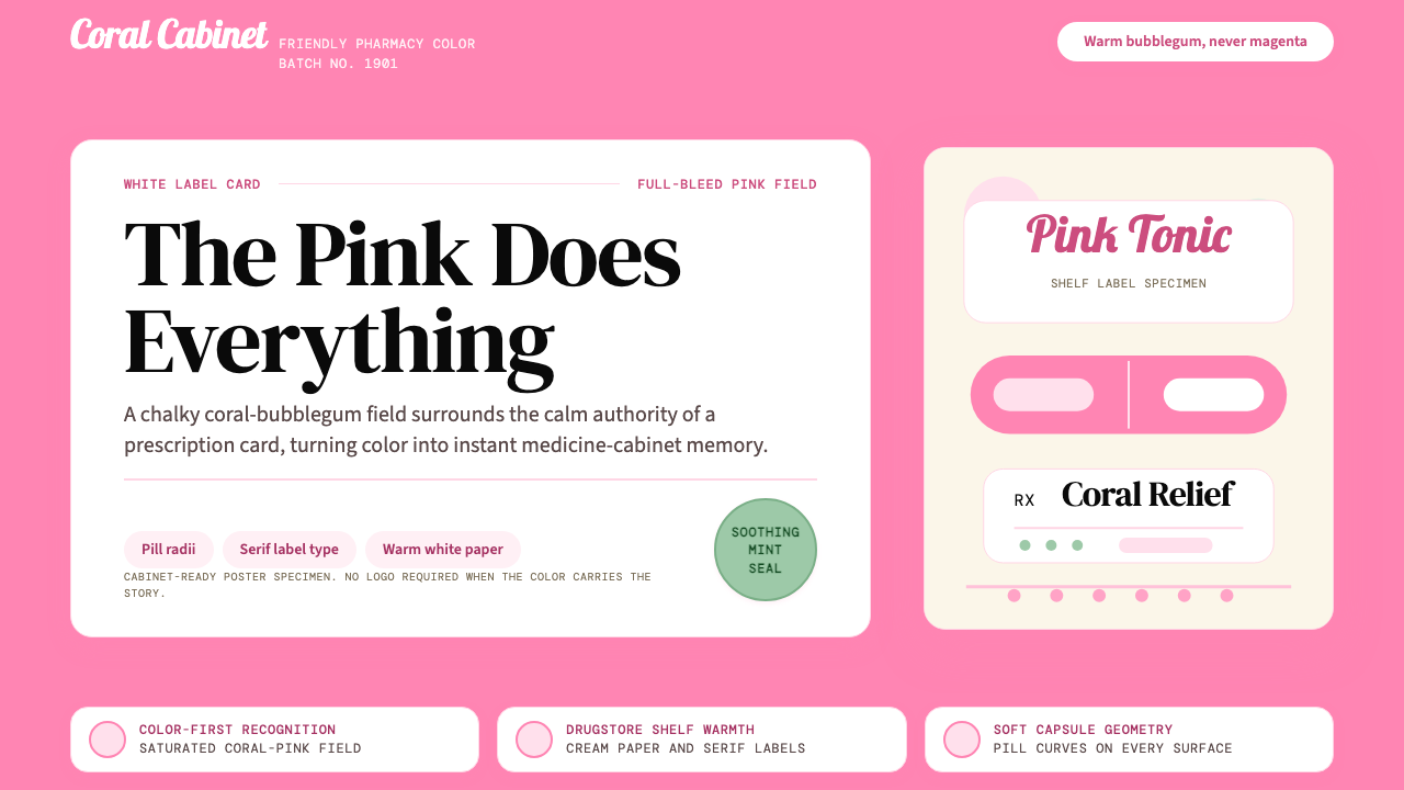 Pepto-Bismol Pink (1901)Color is the cure. Bubblegum pink floods the field; white label cards and pil…颜色就是招牌:泡泡糖粉铺满画面,白色标签卡和药丸弧度稳住信任。
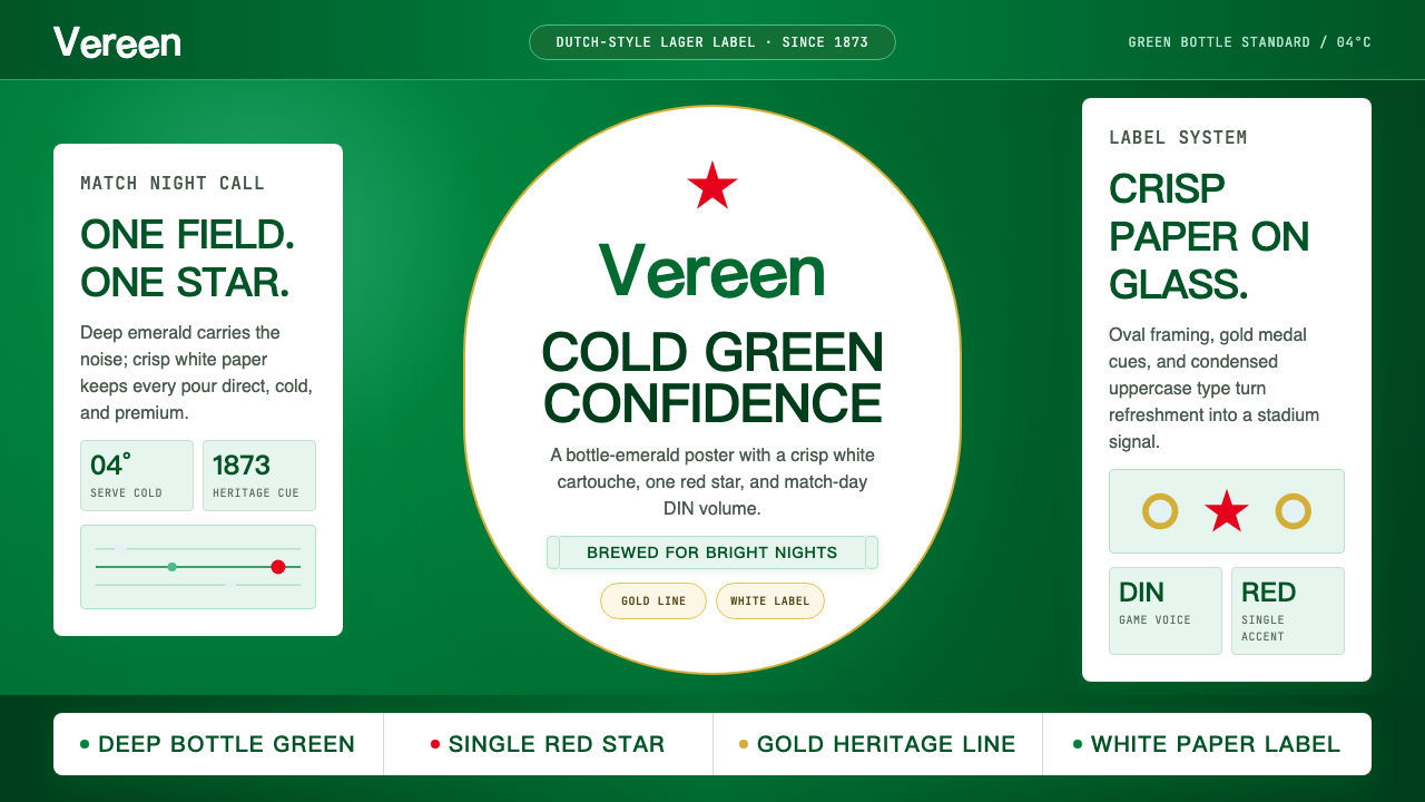 HeinekenEmerald owns the field. White label, red star, gold line, and condensed type…翠绿占满赛场。白标、红星、金线与窄体字让画面冰爽。
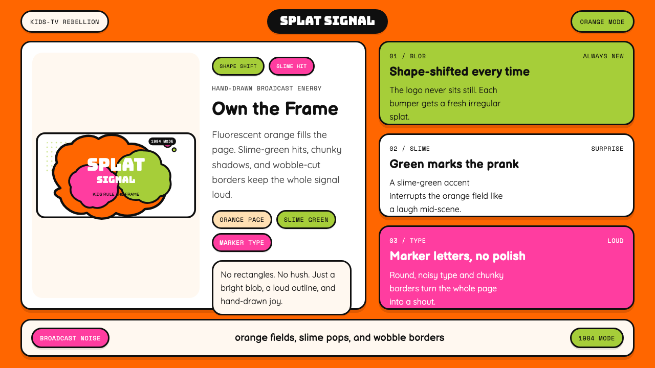 Nickelodeon Orange Splat (1984)Kids own the screen. Orange fields, slime-green pops, and wobble borders do t…孩子掌控屏幕。橙底、史莱姆绿点缀和歪斜边框一起喊话。
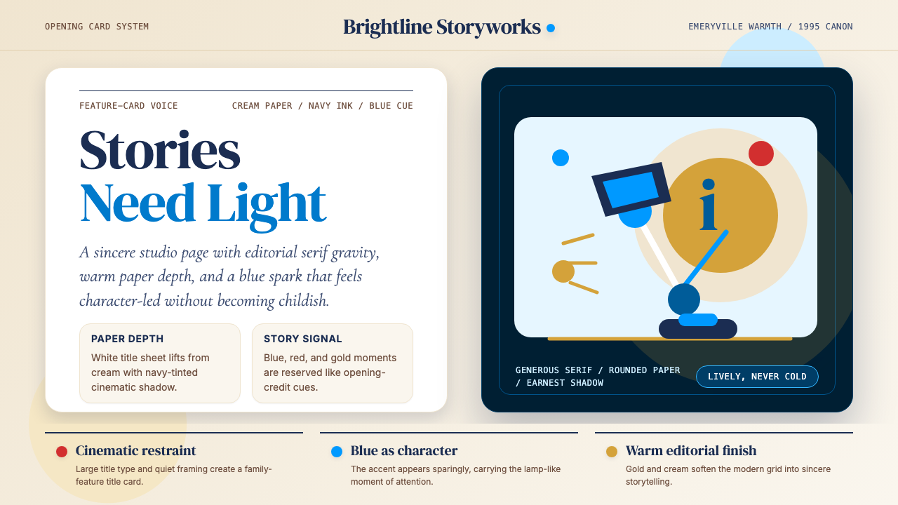 Pixar LuxoSincere story warmth. Cream paper, deep navy serif, and blue lamp geometry ho…真诚的故事温度:奶油纸、深海军蓝衬线与蓝色灯形稳住画面。
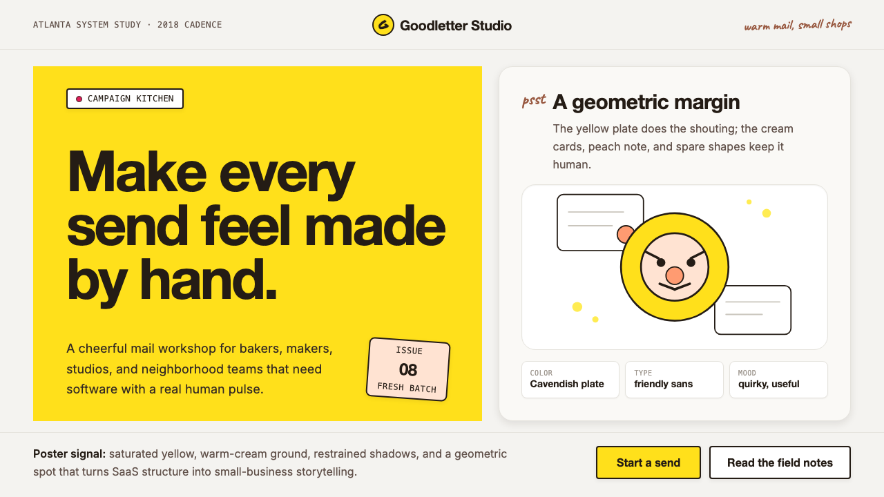 Mailchimp Freddie-YellowFriendly software, handmade. Cavendish yellow blocks and warm geometric masco…友善而手作。卡文迪许黄块与几何吉祥物撑起温暖版面。