What is Silesian Steelworks Gray?
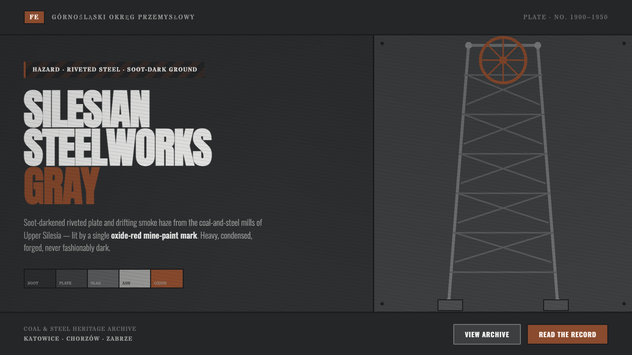
Silesian Steelworks Gray is forged, not fashionably dark: soot-charcoal plate, rivet shadow, lattice truss, and one oxide-red warning cut through the haze.
Silesian Steelworks Gray in brief
Silesian Steelworks Gray distills the coal-and-steel landscape of Upper Silesia, centered on the industrial cities of Katowice, Chorzów, and Zabrze. Its visual world is not an abstract dark interface. It begins with working surfaces: mills, mines, winding towers, coal dust, slag, smoke, and the heavy structural logic of equipment built to endure pressure. The dominant impression is charcoal-dark steel, interrupted by the recesses around rivets, dull mineral grays, and suspended haze.
The style takes its character from riveted plate and lattice truss rather than polished machinery. Surfaces should feel assembled, load-bearing, and used. Darkness is dense but not empty: it contains soot, abrasion, uneven deposits, seams, and the suggestion of smoke moving through industrial air. A panel should read as a piece of built infrastructure, not as a glossy black screen.
Its only chromatic release is oxide red, drawn from rust and the mine-paint associated with familok worker housing. Used sparingly, it behaves like a stencilled hazard mark, an operational signal, or a trace of exposed material. The red does not decorate the composition. It identifies a point of consequence against a soot-dark ground and makes restraint central to the style.
Where does Silesian Steelworks Gray come from?
The style belongs to the peak industrialization of Upper Silesia from 1900 to 1950, a period defined in the source landscape by steel and coal works rather than by a single designer or decorative school. Katowice, Chorzów, and Zabrze supply its geographic frame. Their mills and mines establish a vocabulary of weight, labor, extraction, heat, residue, and engineered support.
Two mining structures give the style a particularly direct architectural reference: the riveted winding towers of the Prezydent Shaft and the Anna coal mine. Their importance lies in construction rather than ornament. Riveted members, repeated joints, dark apertures, and open trusswork make visible how a structure is held together. The resulting visual language is functional architecture at its most exposed: every seam implies assembly, every lattice implies force moving through it.
Steel and coal works add the atmosphere that distinguishes this gray from a generic industrial palette. Soot-dark steel, rivet shadow, slag grays, and smoke haze are not separate decorative layers. They are mutually dependent readings of an industrial environment in which material, air, and surface condition affect one another. The mood is grimy and severe because the reference is materially severe.
Familok worker-housing communities provide the decisive accent. Their documented oxide-red mine paint and the color of rust establish a narrow but meaningful contrast with coal-dark surroundings. This connection prevents the red from becoming a fashionable highlight. It belongs to the industrial setting as paint, corrosion, marking, and habitation; in contemporary work, it should retain that sense of limited, practical consequence.
What defines the Silesian Steelworks Gray look?
Soot-Dark Ground
The base reads as charcoal-dark steel approaching black, but it should never feel like a perfectly uniform void. Let the field retain the impression of soot, smoke deposit, and worn industrial matter. Its depth comes from density and residue, not from polished darkness or cinematic luxury.
Riveted Plate
Heavy plate is the defining surface model. Rivets, seams, overlapping joins, and recessed shadows suggest that a panel has been assembled from material with thickness and burden. The aim is not a metallic shine. It is the visual certainty that the surface could bear load.
Lattice Structure
Lattice truss supplies the style's linework and rhythm. Repeated diagonals, braces, and open structural bays should feel engineered rather than ornamental. Use them to frame information, divide fields, or establish directional movement, always preserving the impression of a real support system.
Slag and Smoke
Secondary grays are mineral and atmospheric: slag, ash, weathered steel, and drifting smoke haze. They soften certainty without making the composition gentle. Their job is to reveal air and residue around the hard structure, creating a landscape of industrial exposure rather than a clean technical diagram.
Oxide-Red Mark
Oxide red is the sole active color and must behave as a mark with purpose. It can identify danger, selection, status, or a critical call to action, but it should remain exceptional. When red becomes a broad decorative field, the style loses the tension created by its coal-dark restraint.
Functional Severity
This is a heavy-industry language, not a retro costume. Every border, joint, shadow, and structural division should imply function: enclosure, reinforcement, warning, or navigation. The visual severity is persuasive only when it follows this logic. Added grime, decorative bolts, or theatrical distress without a structural role turn the style into imitation.
Who shaped Silesian Steelworks Gray?
The Prezydent Shaft winding tower is a central reference because its riveted construction makes industrial support visible. It anchors the style's preference for dark structural members, exposed joining points, and lattice geometry. In an interface, its lesson is not to copy a silhouette literally, but to let framing and support logic remain legible.
The Anna coal mine contributes the mine-side dimension of the language: extraction, machinery, dark openings, and the conditions of coal dust and smoke. It broadens the style beyond steel plate alone, connecting the near-black ground to a working industrial atmosphere rather than to generic darkness.
The region's steel and coal works provide the shared material setting for soot-dark plate, slag gray, abrasion, and haze. They are the reason the style rejects polished metal. The intended surface is not a showroom machine finish; it is an industrial exterior and interior marked by heat, residue, handling, and exposure.
Familok worker-housing communities establish the style's oxide-red accent through documented mine paint and rust. Their contribution is social as well as visual: the red belongs to an industrial landscape that includes housing and daily life, not only factories. That is why it reads most convincingly as a scarce, practical mark.
How do you use Silesian Steelworks Gray today?
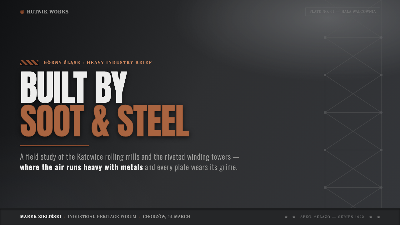
For presentation covers, use the style as a statement of industrial seriousness. Build the page around a soot-dark field, a plate-like frame or truss fragment, and one oxide-red mark that gives the title area a point of pressure. The title should feel fixed into the composition, as if mounted to infrastructure, while open dark space retains the atmosphere of smoke and scale.
Content slides should organize information as reinforced panels rather than as floating cards. Use seams, rails, and lattice-derived divisions to separate sections, but keep them subordinate to reading. Data slides are especially effective when bars, comparative blocks, and status markers resemble structural members or operational signals. Let oxide red identify the exceptional datum, warning, or selected series; do not distribute it evenly across every category.
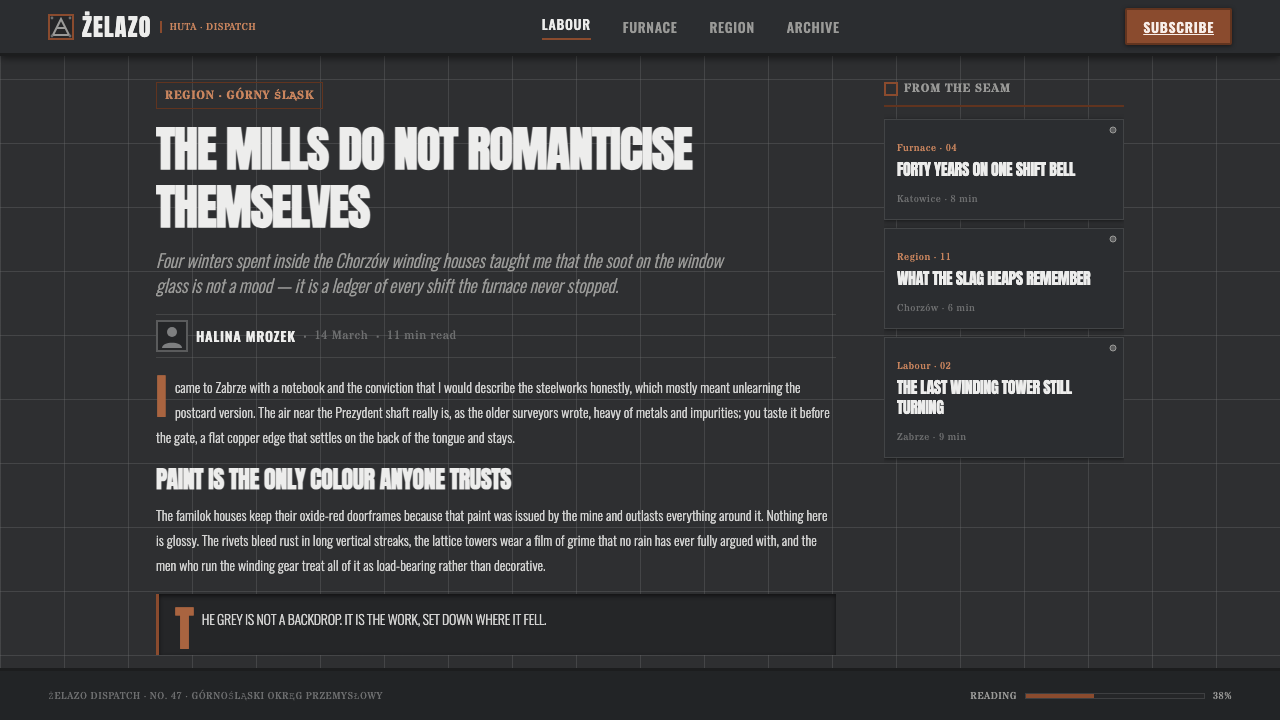
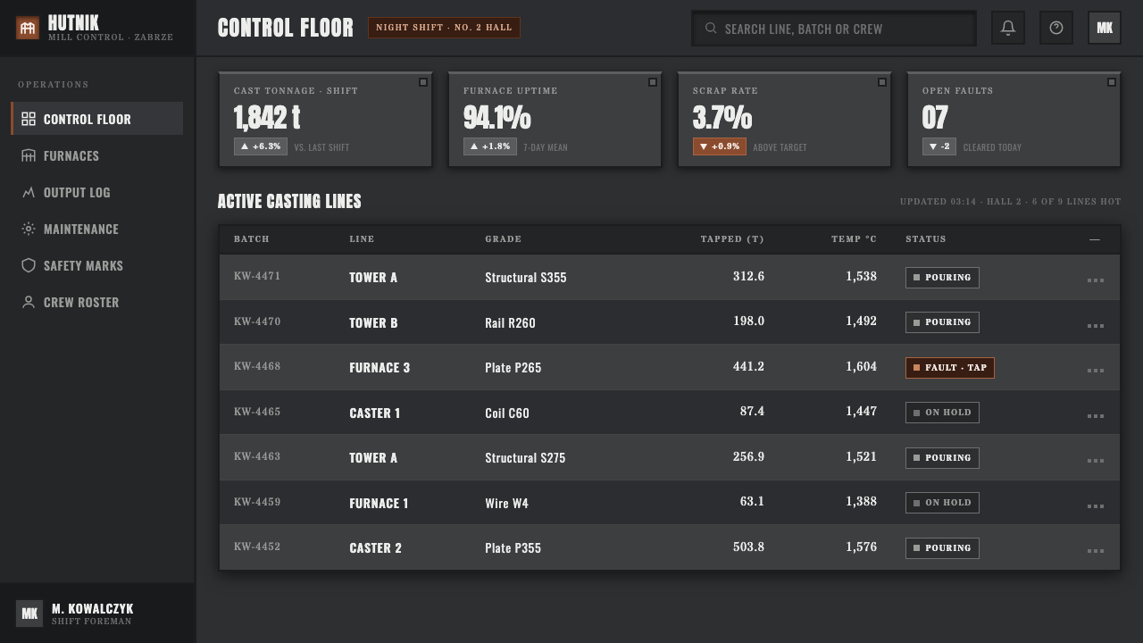
For web interfaces, Silesian Steelworks Gray suits operational dashboards, industrial archives, monitoring surfaces, and pricing pages that need authority rather than friendliness. Navigation can read like stencilled signage on plate, while panels carry visible boundaries and restrained depth. The result should make hierarchy feel engineered: primary actions are marked, secondary information recedes into slag gray, and structural divisions help users scan without visual clutter.
Editorial and marketing layouts benefit from the style when the subject calls for heritage, production, infrastructure, or material credibility. A feature story can alternate dense image-like industrial fields with quiet reading areas, using truss lines or plate seams as sectional devices. Marketing should focus on one consequential message at a time. The atmosphere is strongest when copy, imagery, and the lone red signal all point toward a shared idea of endurance and work.
The common mistake is confusing this style with generic dark-mode futurism. Smooth glass, polished chrome, neon-like color abundance, and decorative mechanical motifs all weaken its source logic. Another mistake is spreading oxide red through every button, chart, and label. Authentic use depends on soot-dark material honesty, visible structural purpose, and the discipline to let the red remain a rare warning rather than a theme-wide ornament.
Silesian Steelworks Gray — FAQ
Is Silesian Steelworks Gray simply an industrial dark mode?
No. Its darkness is tied to a specific coal-and-steel environment in Upper Silesia: soot-blackened plate, slag, smoke haze, riveted winding towers, and working industrial surfaces. A generic dark mode usually treats black as a neutral background. This style treats darkness as evidence of material conditions. If the interface looks sleek, spotless, or interchangeable with a luxury technology product, it has lost that distinction.
Why is oxide red used so sparingly?
Its force depends on scarcity. The red comes from rust and documented mine paint associated with familok housing, so it carries the practical character of marking and exposure. Used once, it can direct attention with unusual authority. Used everywhere, it becomes ordinary decoration and erases the contrast between a soot-dark industrial field and a consequential warning.
Should every surface include rivets, scratches, and smoke?
No. Rivets, abrasion, and haze are a vocabulary, not a texture to apply indiscriminately. Use rivets where a panel needs to read as assembled, trusswork where a division needs structural logic, and haze where atmosphere helps establish depth. Excess detail makes the interface theatrical and difficult to scan. The most convincing work lets a few material cues carry the full environment.
What kinds of products fit this style best?
It works best where industrial heritage, operational clarity, infrastructure, or endurance are meaningful values: monitoring dashboards, archives, technical reports, production-oriented presentations, and services that need to communicate consequence. It is less suitable when softness, abundance, or domestic comfort is the primary promise. The style asks the product to accept weight and restraint as part of its voice.
Related design styles
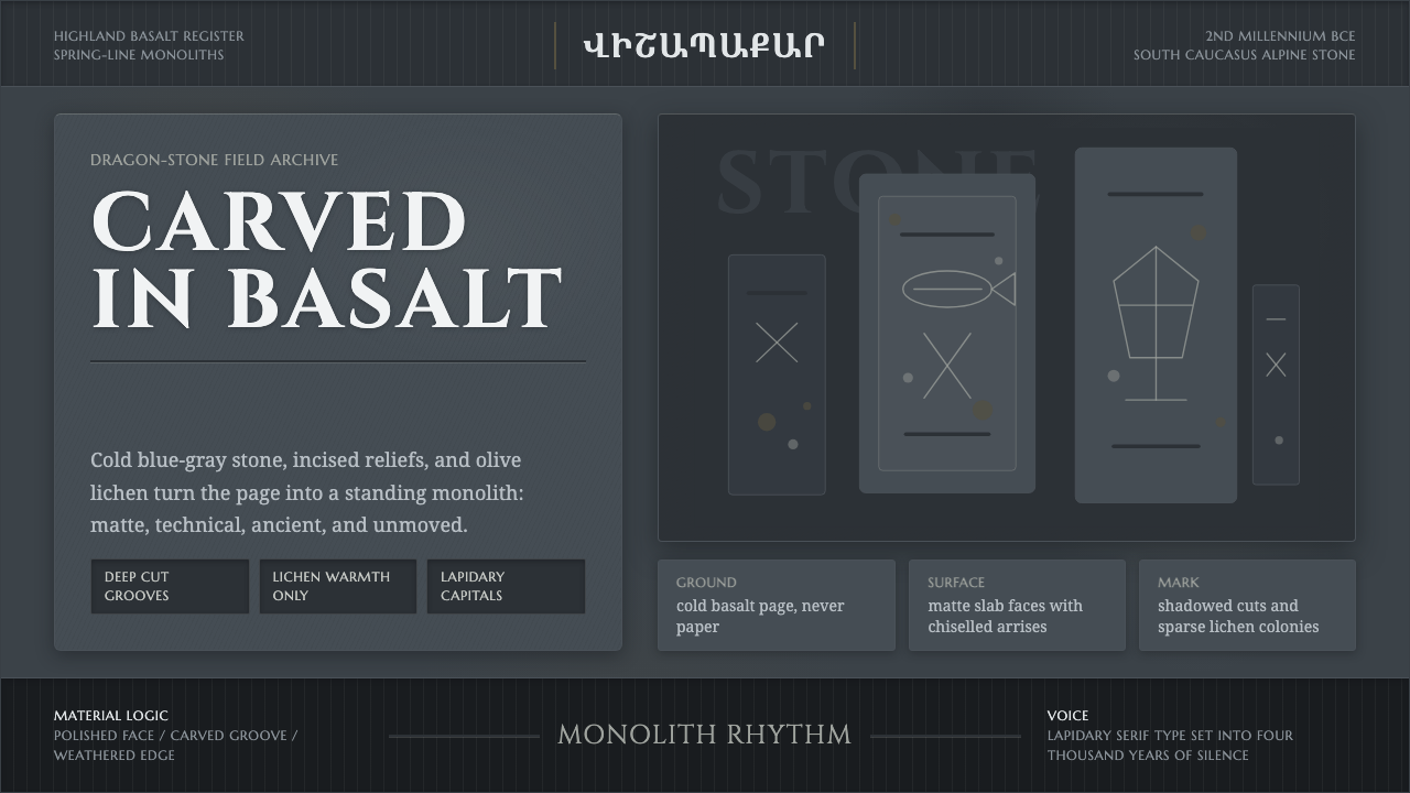 Armenian Vishapakar Dragon StoneAncient, cold, unmoved. Basalt gray slabs, incised grooves, sparse olive lich…
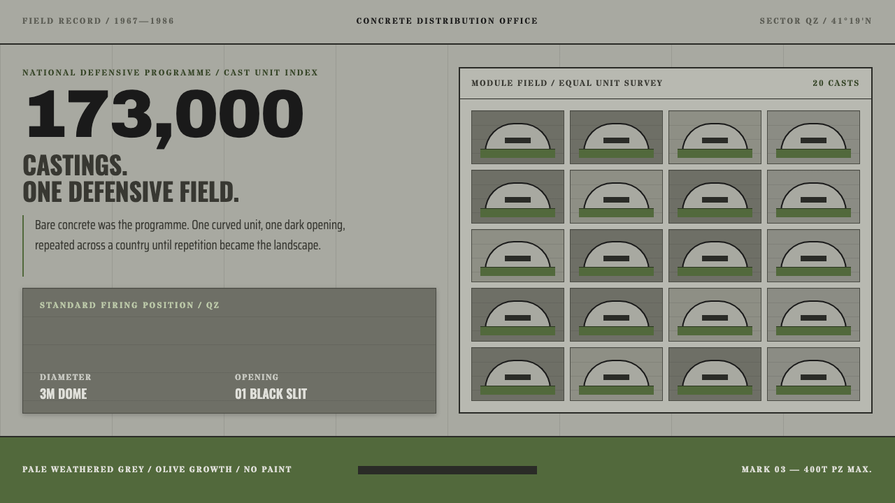 Albanian BunkersRepetition becomes landscape. Olive-and-concrete modules repeat around one bl…
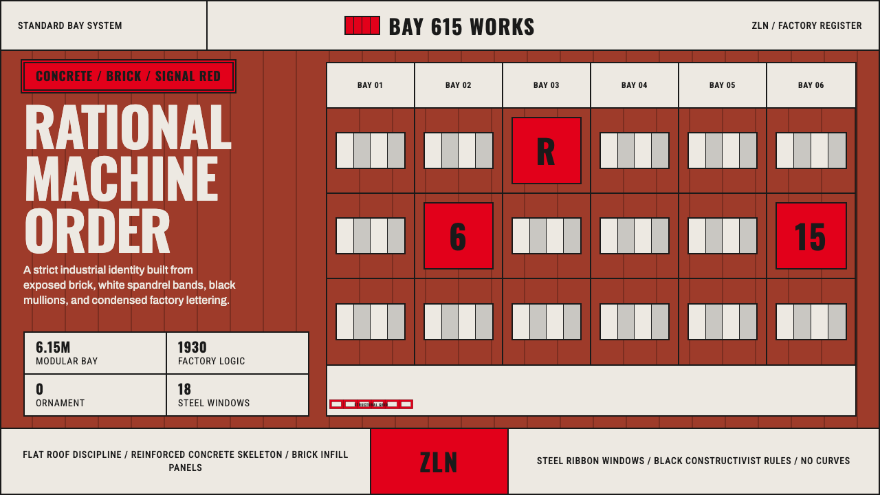 Baťa Zlín Functionalist BrandMachine-age precision. Brick red, concrete bands, and Oswald type lock into a…
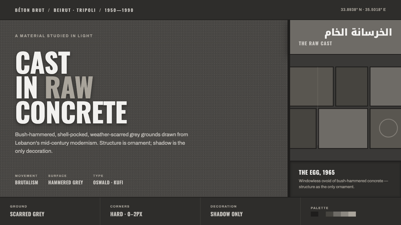 Beirut Brutalist GrayStructure is the only ornament. Scarred bush-hammered grey, monumental Oswald…
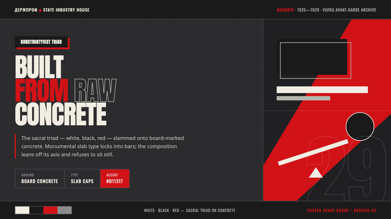 Kharkiv Constructivism (Derzhprom)Monumental, made structural. White-black-red triad on raw concrete, slab caps…
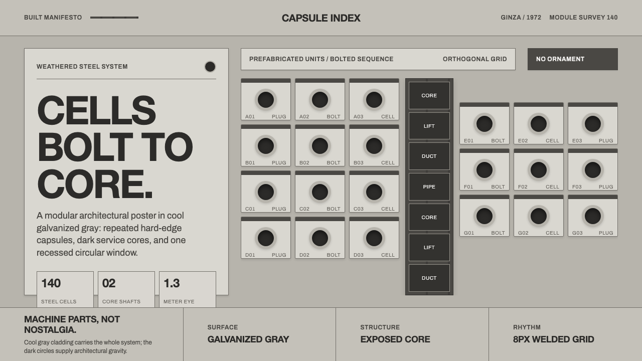 Nakagin Capsule TowerArchitecture as cells. Cool gray modules, dark cores, and porthole circles lo…