What is Warsaw Neon?
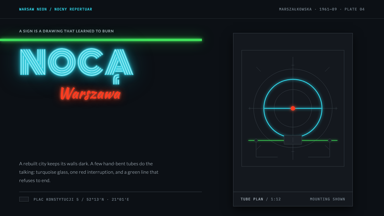
Warsaw Neon is the night city of 1960s Poland: unlit grey plaster, a few hand-drawn glass signs, and tube lettering that is stroked rather than filled.
Warsaw Neon in brief
Warsaw Neon is a design style derived from the hand-drawn neon signs of Warsaw, roughly between the mid-1950s and 1990, with a peak in the 1960s. It treats the night street as a composition: a dark, nearly black wall of grey modernist plaster, with a small number of signs supplying all of the colour and light.
Its lettering is the first thing to notice. Type is stroked, not filled: each letter is a hollow tube of glass bent along a path, turquoise or red or green, glowing against the dark. Scripts, a rooster and a volleyball player share one drawn, human line, since each sign was sketched on paper before it was ever lit.
The system is quiet in the way a night street is quiet. Most of the page is left dark, signs sit apart from each other rather than tiling into a neat grid, and mounting brackets, transformer boxes and wiring are drawn rather than hidden. The effect is handmade and quietly theatrical.
Where does Warsaw Neon come from?
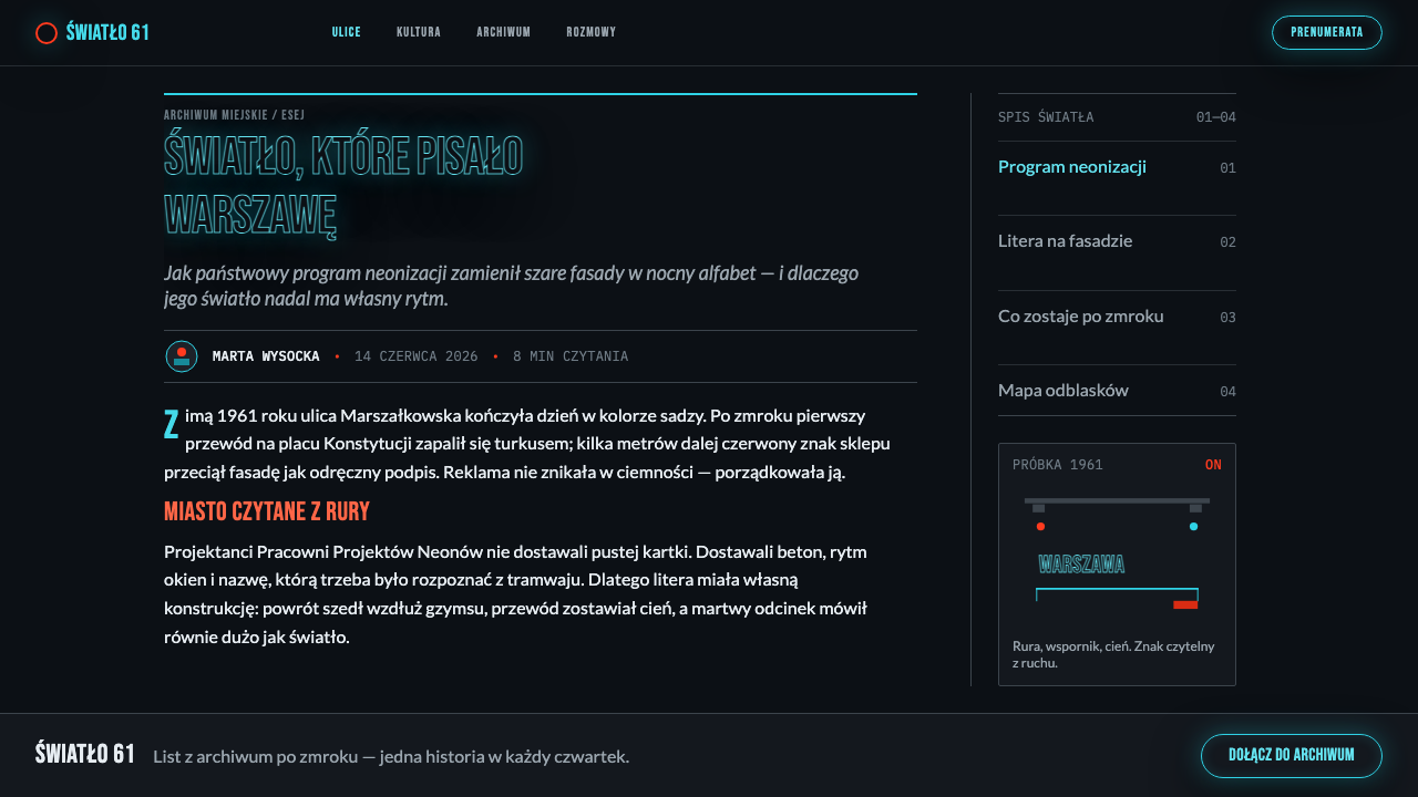
Warsaw Neon came from a state programme, not a marketplace. From the late 1950s the state advertising enterprise Reklama ran a neon design studio and hired poster artists of the Polish Poster School to draw signs for the shops, cinemas and cafés of a rebuilt capital. The designs were drawn on paper first; craftsmen then bent glass tubes into the strokes. Because the commissioner was a state enterprise rather than a rival shopkeeper, the signs read as individual pieces rather than a wall of competing logos.
The signature works show what this produced. Jan Mucharski's volleyball player at Plac Konstytucji, from 1961, pairs a red jersey with a green line running the whole height of the facade. The Cepelia Rooster, now a prized piece at Warsaw's Neon Museum, is a huge red bird. And a hundred script logotypes hung above doorways. The record places this world in the districts around Plac Konstytucji, along Marszałkowska and at the Ściana Wschodnia, the Eastern Wall.
The look sits where three things meet: the Polish Poster School's expressive, hand-drawn graphics; socialist modernism, whose rationalist plastered buildings provided the dark wall; and state-commissioned commercial graphics, a category in which advertising was produced by public institutions. The mix is unusual, with the visual freedom of poster art set against an architectural background of institutional grey.
The period is roughly 1955 to 1990, with the greatest neonisation of Warsaw in the 1960s. The style therefore carries the mood of one urban decade: a rebuilt capital whose night identity was drawn by artists. The system takes its rules from that city after dark, with its dark walls, sparse light and hand-drawn forms, and not from any single sign.
What defines the Warsaw Neon look?
Colour
The page is dark and the colour is local. Turquoise tube lettering, a red accent and a green facade line are the colours of the signs, and they appear against near-black plaster as the only sources of colour and light. Colour belongs to the sign, not to the surface behind it, which is why the same hues feel luminous instead of decorative.
Stroked Tube Type
Letters are drawn as a single stroke, an outline or a continuous line of tube, never as solid filled forms. A headline is therefore a path of light with a hollow centre. This makes the lettering feel physical, as if it were bent from glass, and it gives even plain words a hand-drawn rhythm that a filled typeface would lack.
Unlit Plaster
The grey socialist-modernist plaster goes unlit and reads as near-black. It is the page's ground, flat and unadorned, and its job is to withhold. A wall that gives back no light lets a few signs carry everything, and the contrast between dull plaster and bright glass is the style's whole drama.
Space Between Signs
Signs are separated and independent. They are not arranged into a neat tiled grid but placed as individual objects on a dark wall, each with room around it. Empty space between signs is the point of the composition: it is what makes each sign feel like a separate event in the night.
Visible Hardware
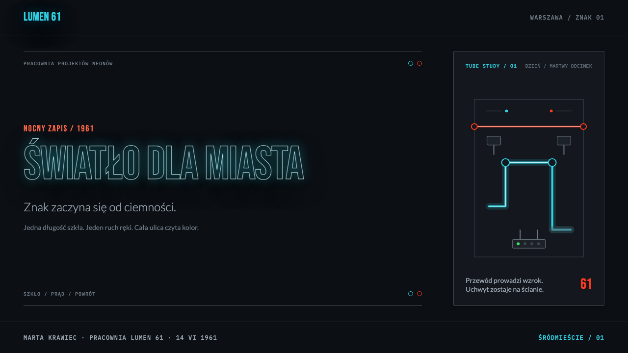
The mounting hardware stays in view: brackets, transformer boxes and wiring are drawn rather than hidden. The sign is shown as an object with a back and a power supply, not as a magical glow. This honesty about construction gives the style its working-city character, part signage, part machine.
Hand-Drawn Forms
Every sign began as a drawing by a poster artist, which shows in script logotypes, a rooster, a figure in motion. Curves are personal rather than geometric, and each mark has the slight irregularity of a pen line. In layout terms this favours a few expressive, drawn elements over many uniform ones.
Local Light
Light is local: it comes from the signs and falls away into dark. No surface is evenly lit, and no region of the page glows for its own sake. Illumination is a property of specific objects, which is how the night city actually looks, and it keeps the composition from turning into a uniformly lit screen.
Who shaped Warsaw Neon?
Mucharski drew the volleyball player at Plac Konstytucji, from 1961, a red-shirted figure paired with a green line that runs the whole height of the building. It is among the best-known Warsaw signs and the clearest illustration of how a poster artist's drawing became a piece of glass.
Reklama was the state advertising enterprise whose neon design studio, from the late 1950s, hired poster artists to draw signs for shops, cinemas and cafés. The institution is the reason for the style's shape: a public commissioner, no rivalry between shopkeepers, and a steady supply of artists who thought in drawn line.
These three are listed alongside Mucharski among the key names of the Warsaw neon tradition. Their individual signs are not catalogued here, but they belong to the same model the style borrows: a designer's hand-drawn sketch, turned by craftsmen into bent glass above a shop or cinema door.
The Polish Poster School supplied the artists and the attitude: expressive, hand-drawn graphics in which a single bold image carries the message. Its influence is why the signs of the 1960s have a drawn personality that purely commercial neon often lacks.
How do you use Warsaw Neon today?
Warsaw Neon suits subjects that belong to the night: cinema, cafés, music, venues, events, nightlife and the culture around them. It is a dark, sparse, hand-drawn system, so it needs breathing room and a limited number of lit elements. Applying it well means deciding what is the sign and what is the wall, and then letting everything else stay dark.
For presentation slides, a cover works as a near-black field with a single line of tube-style lettering in turquoise, drawn in outline, and perhaps a small piece of visible hardware for character. Content slides can show one sign per slide with generous dark around it. Data slides should use stroked lines and outlined bars rather than filled blocks, with one series in turquoise and one in red, so the chart looks bent from glass.
For web interfaces, the style suits venue pages, event sites, restaurants, galleries and portfolios. A hero can be a single wordmark in outlined tube type on a dark ground. Navigation stays plain and quiet; cards are separate islands with generous space between them, not a tight tiled grid. Dashboards and long forms are harder, since this system is built on sparseness.
For editorial and marketing work, it supports cultural essays, city histories, design-history features and poster-related content. Headings can use tube lettering sparingly, with body text in a plain, readable face on the dark ground. Photography of real signs against dark plaster is the ideal companion, since it shows the same relationship between wall and light.
The most common mistake is filling the letters solid, which loses the hollow-tube character that defines the style. A second is over-lighting: glowing every element or washing the whole page in light removes the contrast between dark wall and lit sign. A third is tiling signs into a tidy grid, or drifting toward a pink-and-purple synthwave look. This is a hand-drawn, state-commissioned, turquoise-and-red-and-green city, and the hardware should remain visible.
Warsaw Neon — FAQ
What is Warsaw neon?
It is the tradition of hand-drawn neon signs made for the shops, cinemas and cafés of postwar Warsaw, mainly between the mid-1950s and 1990 and at its height in the 1960s. The signs were designed by poster artists on paper and then bent into glass by craftsmen, commissioned through the state enterprise Reklama.
How is it different from cyberpunk or synthwave neon?
Cyberpunk and synthwave neon are about speculative futures, saturated pink and purple, and overall glow. Warsaw Neon is a real, hand-drawn, state-commissioned tradition: a few signs against dark grey plaster, drawn in turquoise, red and green, with the mounting hardware visible. It is sparse and human, not saturated and total.
Why is the lettering outlined instead of filled?
Because neon letters are tubes. A glass tube follows a path, so each letter is a line with a hollow centre and not a solid shape. The style keeps this logic on screen: lettering is stroked, and filling it would erase the very thing that makes it read as neon.
Can it work on a light background?
Not really. The whole idea depends on a dark wall that gives back no light, so that a few signs can carry the colour. On a light ground the glow, the contrast and the sense of night all disappear, and what remains is only coloured outlines. If a light version is unavoidable, treat it as a different, graphic poster style.
Who designed the signs?
Poster artists of the Polish Poster School, hired by the state advertising enterprise Reklama from the late 1950s. Jan Mucharski, with his volleyball player at Plac Konstytucji, is the best-known name; Witold Janowski, Janusz Rapnicki and Ilona Karwińska are also listed among the key names of the tradition.
Related design styles
 Bowie — Ziggy StardustTheater at full voltage. Cream-on-black portrait cut by one red and electric-…
 Soviet Brutalism (1972)Concrete refuses to breathe. Cement gray, Soviet red banners, and Anton stenc…
 Seismograph TraceCold truth in one red line. Smoked black grid, mono timestamps, sharp stacked…
 Hyper Light DrifterBeautiful ruin glows. Dusk purple holds crimson pixels and cyan grid light.
 No Man's SkyA paperback cosmos you can enter. Orange suns, magenta haze, and Jost type fl…
 Polish Cyrk Circus PosterPainterly state-circus maximalism. Vermilion and circus yellow blaze from nea…