What is Plants vs. Zombies?
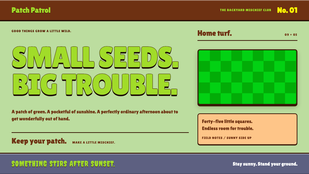
Plants vs. Zombies style is a front lawn turned into an interface: saturated checkerboard greens, chunky rounded lettering and thick brown outlines that make every button feel like a character.
Plants vs. Zombies in brief
The Plants vs. Zombies style is a cartoon game-interface language taken from PopCap's 2009 tower-defence hit. Its signature is the lawn: a grid of five rows and nine columns in two alternating greens, with a dark wooden seed bank along the top holding packet cards, and a sun counter glowing in an electric yellow. Menus feel carved into gravestones, and mini-game screens sit on kraft-paper brown.
Three habits give the style its personality. Type is fat, round and friendly, with a second, spooky display face reserved for warnings and monster names. Every surface carries a thick dark outline and a hard, cartoon-style drop beneath it, never a soft realistic shadow. And everything has a little bounce, so that hovering over a button feels like a sunflower nodding at you.
The result is a design that is loud on purpose but organised underneath. It is the visual equivalent of a pun told with a straight face: the content is a siege, the packaging is a garden party. That contrast between menace and cheerfulness is the style's core joke, and also its core usability trick, because players are never scared of the interface.

Where does Plants vs. Zombies come from?
Plants vs. Zombies was released by PopCap Games on 5 May 2009 for Windows and Mac, with console and mobile versions following in 2010 and 2011. PopCap was based in Seattle, Washington, and was already known for casual games that anyone could pick up in a minute. The game's designer was George Fan, and its premise, defending a house with a garden of plants against a slow zombie horde, took the tower-defence genre, then booming, and made it friendly enough for people who had never played one.
The look belongs to the late-2000s casual PC game scene and to the tradition of Flash-animated cartoon art. Characters are drawn with thick outlines, simple shapes and exaggerated expressions, so that a peashooter or a wall-nut reads clearly even when it is small and surrounded by action. Rich Werner is credited with the art, and the design system borrows the sense that every asset could have been drawn and animated in Flash: bold, flat-coloured, a little wobbly in the best way.
The interface follows from the gameplay. A lawn grid gives players a simple spatial rule, a seed bank gives them a row of choices, and a sun counter gives them a single resource to watch. These are all visible at once, so the layout is dense with information yet instantly readable. When the design system turns these elements into reusable components, it preserves that logic: a grid of cells, a tray of cards and a prominent counter.
Sound completes the identity. Laura Shigihara composed the game's music, and her playful, melodic approach matched the lettering and outlines, so that the game looked and sounded like the same cheerful joke. The design system does not reproduce audio, but its tone, bright and bouncy with a hint of spookiness, is tuned to the same mood. Together these threads place the style at the meeting point of casual PC gaming, the tower-defence boom and Flash cartoon art.
What defines the Plants vs. Zombies look?
Checkerboard lawn greens
Two saturated greens, one slightly lighter than the other, alternate across a grid to make the lawn. The contrast is strong enough to define each cell but never harsh. The same alternation can be reused for table rows, list backgrounds and card grids, turning any repeated structure into a little garden.
Dark wood and kraft paper
Supporting surfaces are warm browns: dark wood for the seed bank and toolbars, paler kraft paper for menus and mini-game screens. These earthy tones frame the bright lawn like a garden shed frames a yard, and they give text areas a calm, readable backing.
Sun yellow
An electric yellow is saved for the sun counter and for anything that signals a reward or a resource. It is the single hottest colour in the palette, so it draws the eye straight to the numbers that matter. Use it for scores, currency and primary calls to action.
Chunky rounded lettering
Headings and buttons use a heavy, rounded display face that echoes the logo voice of the original game. Letters are fat, tightly spaced and often outlined, so they look like toys you could pick up. Body copy stays plain so the personality is concentrated in the labels.
Spooky warning face
A second, horror-flavoured display face handles wave warnings and zombie names. It is used rarely and briefly, as a comic jolt, so the cheerful tone never disappears for long. The rule is simple: friendly letters for interface, creepy letters for monsters.
Thick outlines and hard drops
Every card, button and panel gets a thick dark outline and a hard offset shadow beneath it, never a blurred one. This separates objects cleanly against busy backgrounds and creates the look of cut-out cartoon pieces. Consistency matters: when every element has the same outline weight, the screen feels hand-drawn by one artist.
Bounce on interaction
Hovering and pressing trigger a small bounce or squash, as though the object were alive. The movement is short, elastic and cheerful, and it signals that something is clickable without relying on colour alone. Overdone, it becomes tiring, so it belongs to buttons and key cards, not whole pages.

Who shaped Plants vs. Zombies?
Designer of Plants vs. Zombies at PopCap. His idea of a friendly tower-defence game defending a house against a zombie horde supplied the structure of lawn, seed bank and sun counter that the style is built on.
Credited with the game's art. His thick-outlined, Flash-ready cartoon look is the reference for the system's outlines, flat colour and expressive shapes.
Composer of the game's music. Her playful melodies gave the game an audible twin to its visual jokes, and the style's bright, bouncy mood is tuned to match.
How do you use Plants vs. Zombies today?
In slides, this style is a gift for playful, instructive or community-facing decks. A cover can use the lawn grid as a full-bleed background with a fat lettered title in a wooden panel above it. Content slides work well as kraft-paper cards with one headline and a few lines of text. Data slides can make a bar chart out of lawn rows, with each bar a different plant or character, and use the sun yellow for the number you want the audience to remember. It suits training, game-night, classroom and product-fun presentations, not board reports.
In web interfaces, the style fits casual game sites, children's education products, event pages, loyalty programmes and any product that wants cartoon humour. A navigation bar can be dark wood with chunky labels, and cards can sit on the alternating green grid. Dashboards are possible if the data is light, with each metric in a seed-packet-style card and the key number in sun yellow. Pricing pages work as a row of packets to choose from. Keep body text on a calm kraft or cream surface so readability stays high even though the frame is loud.
In editorial and marketing work, it suits launch announcements, seasonal campaigns, stickers, social posts and event posters that want a smile on first sight. Large lettering with outlines makes a strong headline, and a lawn grid works as a pattern or border. The style is excellent for parent-and-child or classroom publications because it makes difficult subjects feel approachable. It also pairs well with simple mascots drawn with the same thick outline.
The most common mistake is forgetting the underlying structure and using only the colours. A green page with ordinary thin type and soft shadows is just a green page. The style needs the thick outline, the hard drop and the round lettering together. Another mistake is using the spooky display face for body text, which tires the eye quickly, or adding realistic gradients and photographs that fight with the flat cartoon look. A last one is bouncing everything: reserve motion for the elements a visitor is meant to click.

Plants vs. Zombies — FAQ
What is the Plants vs. Zombies design style?
It is a cartoon game-interface style taken from PopCap's 2009 game. It uses a checkerboard lawn of two greens, dark wood and kraft-paper panels, a sun-yellow counter, chunky rounded lettering, thick dark outlines, hard drop shadows and small bounce animations.
Who made the original game and when?
PopCap Games, based in Seattle, released it on 5 May 2009 for Windows and Mac, with console and mobile versions in 2010 and 2011. George Fan designed it, Rich Werner is credited with its art, and Laura Shigihara composed its music.
What kinds of projects suit this style?
Casual game sites, children's education, event pages, loyalty and reward programmes, classroom materials and any product that benefits from cartoon humour. It is a poor fit for serious financial, legal or medical interfaces where playfulness would undermine trust.
Why does it use two different typefaces?
The rounded, heavy face carries the friendly voice for headings and buttons, while the spooky face is reserved for wave warnings and zombie names. Splitting them keeps the interface cheerful and lets the scary moments land as jokes instead of threats.
How do I keep it from looking childish or cluttered?
Keep the outlines consistent, limit the yellow to rewards and key numbers, and put body text on a calm cream or kraft surface. Use bounce only on clickable elements and keep the spooky face short. A clear grid underneath the cartoon surface is what keeps it organised.
Related design styles
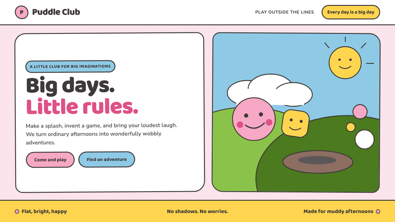 Peppa Pig (2004)Cheer without irony. Bubblegum pink, chubby type and thick outlines keep ever…
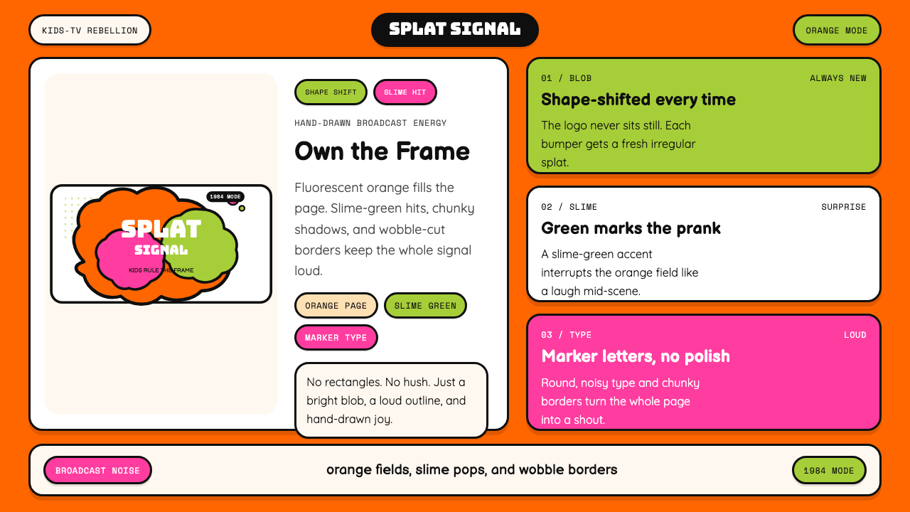 Nickelodeon Orange Splat (1984)Kids own the screen. Orange fields, slime-green pops, and wobble borders do t…
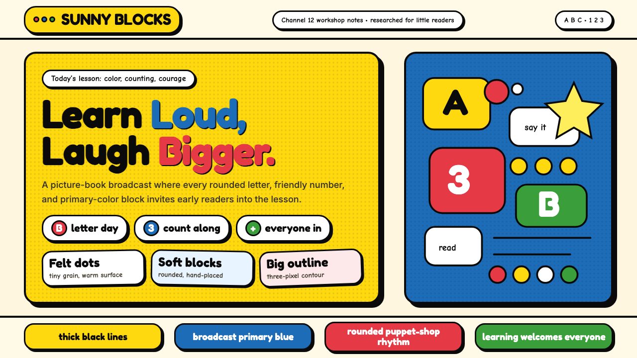 Sesame Street (1969)Learning feels handmade. Big yellow, monster blue, chunky outlines, and round…
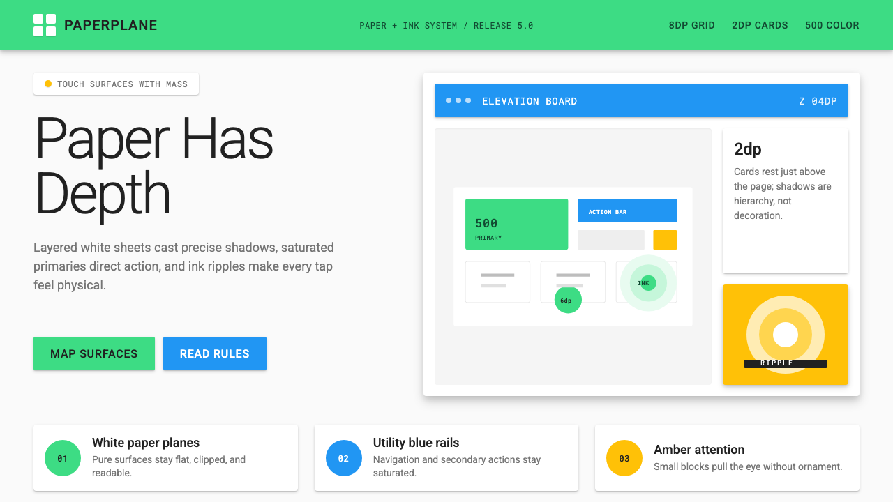 Android Lollipop (Material 1.0)Paper becomes physical. Roboto, green FABs and sharp shadows give white cards…
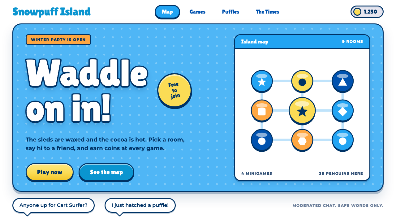 Club PenguinA snow-white island that talks like a kid. Sky-blue panels, navy outlines on…
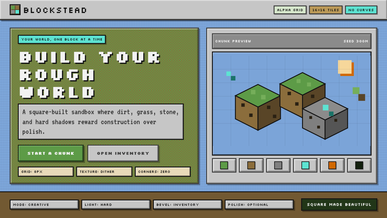 Minecraft VoxelUgly becomes buildable. Grass green, dirt brown, hard bevels, and 16×16 grids…