What is Plaid 2023?什么是 Plaid 2023?
Plaid's 2023 brand turns invisible financial infrastructure into something you can almost see — calm teal nodes on daylit white, making the pipes that move money feel trustworthy and tangible.Plaid 2023 年品牌将隐形的金融基础设施变得几乎可见——明亮白底上沉静的青绿节点,让流转资金的管道显得可信而具象。
Plaid 2023 in briefPlaid 2023 速览
Plaid 2023 is the visual design language developed by Plaid, the San Francisco-based financial data infrastructure company, to represent its API platform in a way that is simultaneously technical and reassuring. The aesthetic centers on a signature teal deployed against near-white grounds, a pipe-and-node illustration vocabulary that renders abstract data flows as tangible diagrams, and a geometric sans-serif typeface chosen for its clarity across every scale from mobile-screen labels to billboard headlines.Plaid 2023 是由旧金山金融数据基础设施公司 Plaid 开发的视觉设计语言,旨在以一种既技术又令人安心的方式呈现其 API 平台。这套美学以标志性青绿色搭配近白底面为核心,以管道与节点插图词汇将抽象数据流具象化为可读的示意图,并选用几何风格无衬线字体,在从移动端标签到广告牌标题的各个尺度上都保持清晰。
The system sits firmly in the lineage of modern fintech design — clean, grid-anchored, generous with whitespace — but it distinguishes itself through its infrastructure metaphor. Where many financial brands reach for authority through deep navy and gold, Plaid reaches for it through legibility and openness. The teal reads as calm precision rather than aggression. The near-white ground reads as daylight rather than sterility. The pipe illustrations read as systems you can understand rather than black boxes you must trust blindly.这套系统牢固地立足于现代金融科技设计谱系——整洁、依附网格、慷慨留白——但凭借其基础设施隐喻与众不同。许多金融品牌通过深海军蓝与金色来彰显权威,Plaid 则通过可读性与开放性来达成同样目的。青绿色传递的是沉静的精确感而非进攻性,近白底面呈现的是日光般的明亮而非无菌的冷漠,管道插图传达的是「你可以理解的系统」而非「你必须盲目信任的黑盒」。
As a design language, Plaid 2023 belongs to a moment when financial infrastructure companies began marketing directly to developers and enterprise buyers simultaneously. The system must speak to a developer who wants proof of technical rigor and to a CFO who wants proof of reliability — and it accomplishes both by making the underlying plumbing visible and comprehensible, not by hiding it behind consumer-facing gloss.作为设计语言,Plaid 2023 诞生于金融基础设施公司开始同时向开发者与企业采购方营销的特定时刻。这套系统必须同时打动渴望技术严谨性证明的开发者与寻求可靠性证明的 CFO——它的解决方式是让底层管道变得可见、可理解,而非将其隐藏在面向消费者的光鲜外壳之下。
Where does Plaid 2023 come from?Plaid 2023 从何而来?
Plaid was founded in San Francisco in 2013 by Zach Perret and William Hockey, initially as a consumer budgeting app before the founders recognized that the harder and more valuable problem was the infrastructure layer beneath such apps — the connective tissue between consumer bank accounts and the applications that needed to read or move that data. The company pivoted to become a pure API provider, and by the early 2020s it was processing transactions for thousands of fintech products including Venmo, Robinhood, and Coinbase, largely invisibly.Plaid 由 Zach Perret 和 William Hockey 于 2013 年在旧金山创立,最初以消费者记账应用起步,但创始人很快认识到更难且更有价值的问题在于这类应用之下的基础设施层——连接消费者银行账户与需要读取或转移该数据的应用程序之间的结缔组织。公司随即转型为纯 API 提供商,到 2020 年代初,它已在几乎不为人所知的情况下为包括 Venmo、Robinhood 和 Coinbase 在内的数千款金融科技产品处理交易。
The brand that emerged in the years around 2022 to 2024 reflects that infrastructure identity with unusual directness. Rather than softening or concealing the technical nature of the product — as many fintech companies do by leading with consumer-facing photography of smiling people or aspirational lifestyle imagery — Plaid chose to foreground the infrastructure metaphor itself. Pipe-and-node diagrams, which in another context might feel cold or engineering-only, become the brand's primary expressive vehicle. The result is a rare case of B2B technical branding that communicates at the level of the product's actual function.在 2022 至 2024 年前后成形的品牌以不同寻常的直接方式呈现了这一基础设施身份。许多金融科技公司倾向于通过笑脸用户照片或励志生活方式图像来软化或掩盖产品的技术属性,Plaid 则选择将基础设施隐喻本身置于前台。管道与节点示意图在其他语境中或许会显得冰冷或只属于工程师,却成为 Plaid 品牌的主要表达载体。这是 B2B 技术品牌难得一见的案例——在产品实际功能的层面上直接沟通。
The teal color that anchors the palette has precedent in financial and healthcare technology branding, where it has long been used to signal precision, trustworthiness, and modernity without the heaviness of navy or the aggressiveness of bright blue. Plaid's version sits in a range that reads as decisively digital — not the teal of a physical material but the teal of a screen rendering a data state — while remaining warm enough to avoid clinical coldness.锚定色板的青绿色在金融与医疗技术品牌中有其先例:长期以来,它被用来传递精确性、可信度与现代感,同时避免海军蓝的厚重与明亮蓝的进攻性。Plaid 的青绿版本落在一个明确属于数字语境的色域内——不是实体材料的青绿,而是屏幕渲染数据状态的青绿——同时又足够温暖,不会显得像临床环境一样冷漠。
The broader context for Plaid 2023 is the open banking movement, which gathered regulatory momentum in the European Union through PSD2 and in the United Kingdom through the Open Banking Standard, and which Plaid was actively shaping in the United States through its API ecosystem. A brand language that makes financial data flows legible is also, implicitly, an argument for the open banking model: that infrastructure should be transparent, that data flows should be visible, and that the plumbing of finance should be something consumers and businesses can inspect and understand rather than something that happens in the dark.Plaid 2023 的更广泛背景是开放银行运动:该运动在欧盟通过 PSD2 指令、在英国通过开放银行标准积累了监管势头,而 Plaid 正通过其 API 生态系统在美国积极塑造这一运动。一套让金融数据流变得可读的品牌语言,也隐含着对开放银行模式的论证:基础设施应当透明,数据流应当可见,金融的管道应当是消费者和企业能够检视与理解的东西,而不是在黑暗中运转的机制。
What defines the Plaid 2023 look?Plaid 2023 的视觉特征是什么?
Signature Teal on Near-White近白底面上的标志性青绿
The defining color relationship in Plaid 2023 is a single distinctive teal — positioned in the family of blue-greens associated with precision and calm technology — set against backgrounds that read as very light rather than pure white, giving the overall palette a slight warmth that prevents clinical coldness. This teal functions as the brand's primary identification color: it appears on interactive elements, illustration nodes, and section anchors, while the background does most of the breathing. Secondary neutral tones — soft grays and off-whites — provide supporting structure without competing with the teal for attention.Plaid 2023 最核心的色彩关系是将一种独特的青绿色——属于与精确感和沉静技术感相关联的蓝绿色族——置于偏暖的近白底面上,使整体色板带有轻微温度,避免临床般的冷漠。这一青绿色充当品牌的主要识别色:出现在交互元素、插图节点和区块锚点上,而底面承担大部分呼吸空间。柔和的灰色与米白色次级中性色提供支撑结构,不与青绿色争夺注意力。
Pipe-and-Node Illustration System管道与节点插图系统
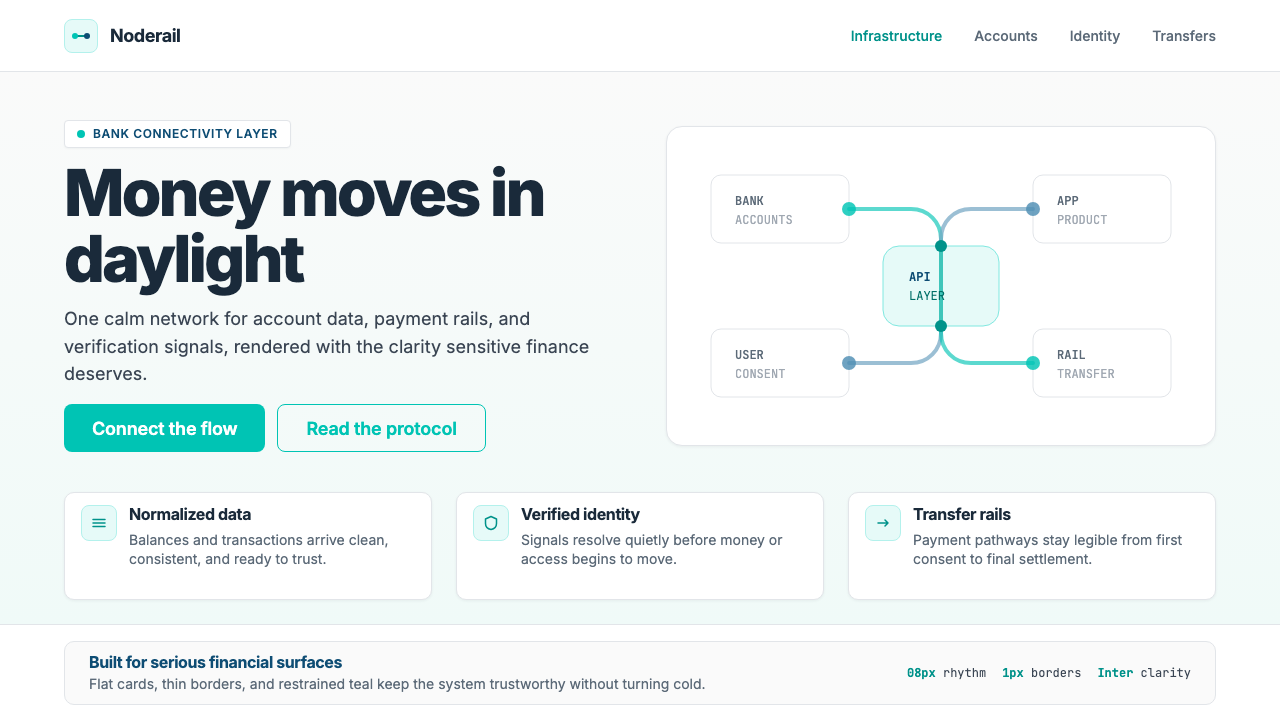
The most distinctive visual element in the Plaid 2023 system is its diagrammatic illustration vocabulary. Abstract data flows are rendered as networks of pipes and circular nodes — the visual language of engineering schematics, adapted into a clean, friendly register. Pipes are drawn with consistent weight and rounded corners, implying both the robustness and the smoothness of the underlying infrastructure. Nodes appear at connection points, often rendered in the signature teal, functioning simultaneously as data waypoints in the narrative and as visual focal points in the composition. These illustrations replace the lifestyle photography common in consumer fintech with something that speaks directly to the technical product.Plaid 2023 系统中最具辨识度的视觉元素是其示意图式插图词汇。抽象数据流被呈现为管道与圆形节点构成的网络——工程示意图的视觉语言,被改造为整洁、友好的风格。管道以一致的线宽和圆角绘制,同时暗示底层基础设施的稳健性与流畅性。节点出现在连接点处,通常以标志性青绿色呈现,在叙事中充当数据中继点,在构图中充当视觉焦点。这些插图以直接对应技术产品的方式,取代了消费者金融科技中常见的生活方式摄影。
Geometric Sans-Serif Clarity几何无衬线字体的清晰度
Plaid's typographic choice — a neutral, highly legible geometric sans-serif — reflects the brand's core value proposition: clarity above all. The typeface performs identically at the small scale of API documentation labels and at the large scale of campaign headlines, which is a practical requirement for a company whose brand surfaces range from developer console interfaces to outdoor advertising. Letter-spacing is kept open at display sizes and standard at text sizes, avoiding the tightly-tracked letterforms that can feel fashionable but reduce legibility in technical contexts. Hierarchy is established through size and weight contrast alone, without reliance on decorative devices.Plaid 的字体选择——中性、高可读性的几何无衬线字体——体现了品牌的核心价值主张:清晰高于一切。这款字体在 API 文档标签的小尺寸与活动标题的大尺寸下表现一致,这是一家品牌触点横跨开发者控制台界面到户外广告的公司的现实需求。字距在展示尺寸下保持宽松,在文本尺寸下保持标准,避免了时髦但会降低技术语境下可读性的紧凑字距。层级仅通过尺寸和字重对比建立,不依赖装饰性手段。
Generous Whitespace as Trust Signal大面积留白作为信任信号
Throughout the Plaid 2023 system, negative space is used at a scale that communicates confidence rather than economy. Sections breathe. Elements are not crowded against their neighbors. This generosity with space is not accidental — in financial contexts, density and clutter are associated with confusion and hidden complexity, while open space is associated with transparency and control. The layout discipline reinforces the brand's message that Plaid is infrastructure you can understand, not a black box. Padding within cards, margins between sections, and spacing between typographic elements all err on the side of openness.在整个 Plaid 2023 系统中,留白以一种传递自信而非节俭的尺度被运用。区块有呼吸感,元素不与相邻内容拥挤在一起。这种对空间的慷慨并非偶然——在金融语境中,密集与杂乱与混乱、隐藏的复杂性相关联,而开放的空间与透明度和掌控感相关联。版面纪律强化了品牌信息:Plaid 是你可以理解的基础设施,而非黑盒。卡片内的间距、区块间的留白、排版元素间的距离,都倾向于开放。
Restrained Color Application克制的色彩运用
Despite having a distinctive and memorable brand color, the Plaid 2023 system uses that teal with noticeable restraint. It does not flood surfaces. It does not appear on every interactive element. It is reserved for moments where it can do real communicative work — marking a key node in a diagram, highlighting a primary call to action, anchoring a section transition. This restraint amplifies the color's impact: when the teal appears, it means something. The rest of the palette is intentionally recessive, consisting of carefully chosen neutrals that ensure the teal always reads as signal, never as noise.尽管拥有一种鲜明而令人印象深刻的品牌色,Plaid 2023 系统对这一青绿色的使用却显著克制。它不会漫溢整个界面,不会出现在每一个交互元素上,而是被保留给能发挥真正传达作用的时刻——标记示意图中的关键节点、突出首要行动号召、锚定区块过渡。这种克制放大了色彩的冲击力:当青绿色出现时,它意味着某件事。其余色板有意保持低调,由精心选取的中性色构成,确保青绿色始终作为信号而非噪声被读取。
Subtle Shadow and Depth微妙的阴影与深度
The Plaid 2023 system uses depth selectively and softly. Cards and UI components carry gentle, low-spread shadows that lift them slightly from the page without introducing the skeuomorphic heaviness that defined earlier generations of fintech interfaces. This approach to shadow is explicitly modern — it acknowledges that layering and depth are useful organizational tools while refusing to overstate them. The shadows are present enough to communicate hierarchy and interactivity but absent enough to keep the overall feel clean and flat-adjacent. They function as spatial metadata rather than stylistic statement.Plaid 2023 系统对深度的运用有选择性且柔和。卡片和界面组件带有轻柔、扩散范围小的阴影,将其从页面上轻微抬起,而不引入定义早期金融科技界面的拟物化厚重感。这种阴影处理方式明确属于当代风格——承认分层与深度是有用的组织工具,同时拒绝夸大它们。阴影的存在足以传达层级与交互性,但又足够内敛,保持整体感受整洁而趋近扁平。它们作为空间元数据而非风格声明而存在。
Infrastructure-as-Hero Messaging Frame「基础设施即英雄」的叙事框架
Underlying all the visual decisions in Plaid 2023 is a coherent messaging strategy: infrastructure should not be apologized for or hidden, it should be celebrated and made legible. This framing shows up in how diagrams are treated as heroes rather than supporting elements, in how the brand leads with the complexity of financial connectivity rather than simplifying it away, and in how technical vocabulary — APIs, connections, data flows — appears in marketing contexts without being translated into consumer-friendly euphemisms. The visual language and the verbal language are in alignment: both say that the pipes matter and that understanding them is a feature, not a burden.Plaid 2023 所有视觉决策的背后是一套连贯的叙事策略:基础设施不应被掩盖或为之致歉,而应被颂扬并变得可读。这一框架体现在示意图被当作英雄而非配角对待,体现在品牌以金融连接的复杂性为引领而非将其简化,体现在 API、连接、数据流等技术词汇出现在营销语境中而不被翻译为消费者友好的委婉表达。视觉语言与文字语言保持一致:两者都在说,管道很重要,理解管道是一种特性,而非负担。
Who shaped Plaid 2023?谁塑造了 Plaid 2023?
Perret co-founded Plaid in 2013 with William Hockey, initially as a consumer product before recognizing the infrastructure opportunity. As CEO, he has consistently articulated the vision of open banking infrastructure as a public good — a framing that directly informs the brand's emphasis on transparency and legibility. His public communications have helped position Plaid not just as a vendor but as a participant in shaping the architecture of financial access, which the 2023 brand language reflects in its infrastructure-forward aesthetic.Perret 于 2013 年与 William Hockey 共同创立了 Plaid,最初以消费者产品起步,后来认识到基础设施层面的机会。作为 CEO,他始终如一地将开放银行基础设施阐释为公共基础设施——这一框架直接影响了品牌对透明度和可读性的强调。他的公开沟通帮助将 Plaid 定位为不仅是供应商,更是参与塑造金融准入架构的一方,2023 年品牌语言在其基础设施优先的美学中体现了这一定位。
Hockey co-founded Plaid and served as its CTO during the company's foundational years, overseeing the technical architecture that the brand's pipe-and-node visual vocabulary was eventually designed to represent. The engineering culture he helped establish — precise, systematic, concerned with reliability over flash — is legible in the design system's restraint and its preference for diagrammatic clarity over decorative ambition.Hockey 共同创立了 Plaid,并在公司奠基年间担任 CTO,监督了品牌管道与节点视觉词汇最终所要呈现的技术架构。他参与建立的工程文化——精确、系统化、注重可靠性而非华丽——在设计系统的克制中以及对示意图式清晰度而非装饰性野心的偏好中清晰可见。
The in-house brand and design team responsible for the 2022–2024 visual identity is the direct author of the system described here. Their central contribution was the decision to make the infrastructure metaphor the brand's primary visual register rather than softening it for a consumer audience. This required confidence that the core buyers — developers and enterprise decision-makers — would respond to technical directness rather than require the aspirational lifestyle imagery common in consumer fintech. The team's choice to build a coherent illustration system around pipe-and-node forms rather than relying on stock photography or generic iconography gives the brand a distinctive and ownable visual voice.负责 2022—2024 年视觉识别的内部品牌与设计团队是本文所描述系统的直接作者。他们的核心贡献是决定将基础设施隐喻作为品牌的主要视觉基调,而非为消费者受众软化它。这需要一种自信:核心买家——开发者与企业决策者——会对技术性的直接表达有所响应,而不需要消费者金融科技中常见的励志生活方式图像。团队选择围绕管道与节点形态构建连贯的插图系统,而非依赖图库摄影或通用图标集,赋予了品牌一种独特且可拥有的视觉声音。
Not a person but an essential shaping force: the global push for open banking — accelerated by regulatory frameworks like PSD2 in Europe and the Open Banking Standard in the United Kingdom — created the market context in which Plaid's infrastructure brand became legible and necessary. Open banking posits that financial data belongs to the consumer and should flow freely between institutions and applications via standardized APIs. A brand that visualizes those data flows as transparent, comprehensible networks is also, implicitly, an argument for this model. The Plaid 2023 aesthetic cannot be fully understood without this regulatory and ideological backdrop.这不是一个人,而是一种不可或缺的塑造力量:全球开放银行推进——被欧洲 PSD2 等监管框架与英国开放银行标准加速——创造了 Plaid 基础设施品牌变得可读且必要的市场背景。开放银行主张金融数据属于消费者,应通过标准化 API 在机构与应用程序之间自由流动。一个将这些数据流可视化为透明、可理解网络的品牌,也隐含着对这一模式的论证。Plaid 2023 美学若脱离这一监管与意识形态背景,便无法被完整理解。
How do you use Plaid 2023 today?今天怎么用 Plaid 2023?
Plaid 2023 is a well-defined system with a clear value proposition — infrastructure made legible — and it transfers well to any context where technical precision, transparency, and calm authority are the desired signals. Understanding the system well enough to apply it correctly means internalizing its core logic: teal is used sparingly so it means something when it appears, whitespace is used generously so complexity reads as organized rather than overwhelming, and illustration does the work that lifestyle photography does in consumer brands.Plaid 2023 是一套定义清晰、价值主张明确的系统——让基础设施变得可读——它能很好地移植到任何以技术精确性、透明度和沉静权威感为期望信号的语境中。正确应用它需要内化其核心逻辑:青绿色被克制使用,因此它出现时才有意义;留白被慷慨运用,因此复杂性呈现为有组织而非令人不知所措;插图承担了消费者品牌中生活方式摄影所做的工作。
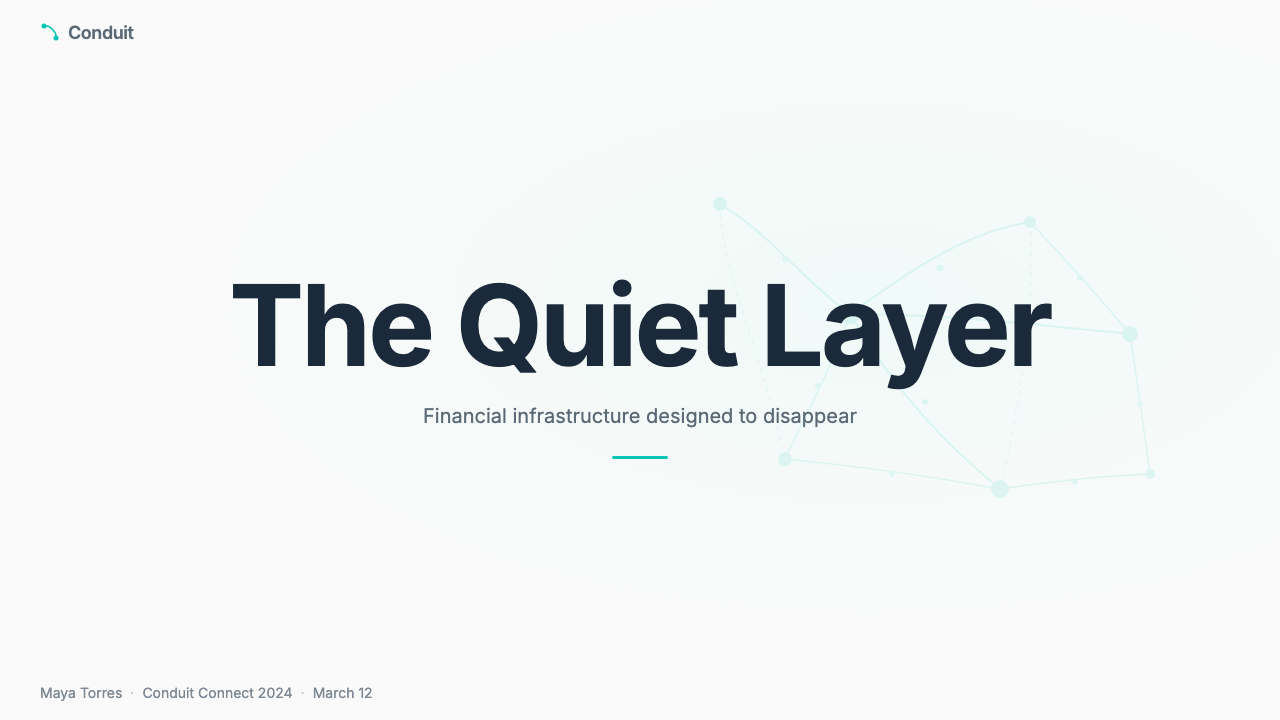
For presentation slides, the Plaid 2023 aesthetic works exceptionally well for both cover slides and technical content slides. A cover benefits from a bold pairing of the near-white ground with a large teal illustration element — a pipe diagram, a node network — positioned as the hero, with the title in clean geometric sans-serif at generous scale. Content slides should maintain the system's disciplined spacing: one primary idea per slide, supported by a diagram or a small number of data points, with generous margins on all sides. Data slides can take on a diagrammatic quality directly influenced by the brand's own illustration system — network graphs, flow charts, and process diagrams feel native rather than borrowed. Avoid dense bullet lists, which undercut the brand's core promise of clarity.对于演示文稿,Plaid 2023 美学在封面幻灯片和技术内容幻灯片上都表现出色。封面适合以近白底面与大型青绿插图元素——管道示意图、节点网络——的大胆组合为英雄,标题以整洁的几何无衬线字体、大尺寸置于其上。内容幻灯片应保持系统的规律间距:每张幻灯片一个主要观点,辅以示意图或少量数据点,四周保留充足边距。数据幻灯片可以呈现出直接受品牌插图系统影响的示意图式品质——网络图、流程图和过程图感觉是原生的而非借来的。避免密集的要点列表,它们会削弱品牌对清晰度的核心承诺。
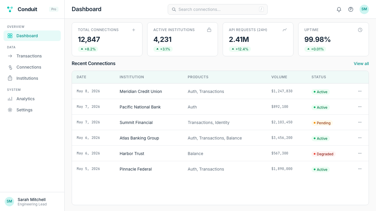
For web UI including dashboards and pricing pages, the Plaid 2023 language translates directly. Dashboards benefit from the system's card-based hierarchy: lift components with a subtle shadow, use the teal exclusively for active states and primary data indicators, and build a strict column grid that ensures every element has a clear positional relationship to its neighbors. Pricing tiers work well with the system's restrained color approach — use the teal to mark the recommended or featured tier, leave the others in neutral ground, and rely on typographic size contrast to differentiate features. Navigation should be typographic, with minimal icon use and clear label hierarchy.对于包括仪表板和定价页面在内的网页界面,Plaid 2023 语言可以直接转译。仪表板受益于系统的卡片式层级:用微妙阴影抬起组件,将青绿色专门用于活动状态和主要数据指示器,构建严格的列网格以确保每个元素与相邻元素具有清晰的位置关系。定价层级适合系统克制的色彩方式——用青绿色标记推荐或特色层级,其余保持中性底面,依靠字体尺寸对比区分功能特性。导航应当以字体为主,图标使用最小化,标签层级清晰。
For editorial design and marketing materials, the infrastructure-as-hero framing opens compositional possibilities that distinguish Plaid-influenced work from generic fintech aesthetics. Feature sections can lead with a large pipe-and-node diagram as the primary visual, with supporting text positioned to read as annotation rather than caption. Marketing pages work well with a rhythm of full-width sections that alternate between near-white grounds with teal illustration elements and dark grounds with near-white type — the contrast creates forward momentum without requiring photographic content. Print materials such as conference handouts or one-pagers follow the same spacing logic: wide margins, single-column or two-column body text, and teal used only for the most important navigational or structural element on the page.对于编辑设计和营销材料,「基础设施即英雄」的框架开启了将 Plaid 风格作品与通用金融科技美学区分开来的构图可能性。特性区块可以以一张大型管道与节点示意图作为主要视觉,配套文字定位为注释而非图说。营销页面适合采用全宽区块的节奏:近白底面与青绿插图元素的区块,和深色底面与近白文字的区块交替出现——对比创造前进动力,而不需要摄影内容。会议材料或单页简报等印刷材料遵循同样的间距逻辑:宽边距、单列或双列正文,青绿色仅用于页面上最重要的导航或结构性元素。
A common mistake when applying the Plaid 2023 aesthetic is treating the teal as a fill color rather than an accent color — flooding backgrounds, buttons, and illustrations with it until it loses the signal value that makes it effective. The system works because the teal is outnumbered by neutral space; as soon as it dominates, the careful balance collapses and the design reads as a generic brand color rather than a precision instrument. A related mistake is over-populating illustrations: pipe-and-node diagrams should feel like they are revealing just enough of the underlying system to be illuminating, not like complete architectural blueprints. Edit the diagrams to the fewest nodes that still communicate the intended flow.应用 Plaid 2023 美学时最常见的错误,是将青绿色视为填充色而非点缀色——将背景、按钮和插图大面积染成青绿,直到它失去使其有效的信号价值。这套系统之所以有效,是因为青绿色在中性空间中处于少数;一旦它占主导,精心维持的平衡就会崩溃,设计便被读作普通品牌色而非精密仪器。另一个相关错误是过度填充插图:管道与节点示意图应当让人感觉它只揭示了足够多的底层系统以便理解,而不是完整的架构蓝图。将示意图精简到仍能传达预期流程所需的最少节点数量。
Plaid 2023 — FAQPlaid 2023 · 常见问题
How does Plaid 2023 differ from generic fintech design?Plaid 2023 与通用金融科技设计有何不同?
Most fintech brands resolve the tension between technical complexity and consumer reassurance by hiding the technology — leading with smiling people, aspirational photography, and warm lifestyle imagery while keeping the underlying infrastructure out of sight. Plaid 2023 takes the opposite position: it leads with the infrastructure, makes the pipes and nodes the visual hero, and treats technical directness as a feature rather than a liability. This makes it unusual in the fintech space and well-suited to an audience of developers and enterprise buyers who are more interested in how things work than in how they feel.大多数金融科技品牌通过隐藏技术来化解技术复杂性与消费者安心感之间的张力——以笑脸用户、励志摄影和温暖生活方式图像为引领,同时将底层基础设施置于视野之外。Plaid 2023 采取了相反的立场:以基础设施为引领,将管道与节点作为视觉英雄,将技术上的直接表达视为优点而非负担。这使其在金融科技领域显得不寻常,并非常适合对事物工作原理的兴趣超过对感受的开发者和企业采购方受众。
Can the Plaid 2023 style work for consumer-facing products?Plaid 2023 风格能用于面向消费者的产品吗?
With significant adaptation, yes — but the system was not designed for that context and its strengths become weaknesses in consumer-facing emotional territory. The infrastructure metaphor, the diagrammatic illustration style, and the restrained teal-on-white palette convey precision and trustworthiness very effectively to developers and enterprise buyers. For general consumers, the same elements can read as cold, technical, or inaccessible. Consumer applications that need to evoke warmth, joy, or personal connection will find the Plaid 2023 aesthetic insufficient on its own and will need to supplement it with photography, softer color relationships, and a warmer typographic voice.经过大量调整,可以——但这套系统并非为该语境设计,其优势在面向消费者的情感领域会变为弱点。基础设施隐喻、示意图式插图风格以及克制的青绿配近白色板,对开发者和企业采购方非常有效地传递了精确感与可信度。对于普通消费者,同样的元素可能被解读为冷漠、技术性或难以接近。需要唤起温暖感、愉悦感或个人连结的消费者应用,会发现 Plaid 2023 美学本身不够充分,需要用摄影、更柔和的色彩关系和更温暖的字体声音来补充。
How should the teal be used when building with this aesthetic?在运用这套美学时,青绿色应当如何使用?
Treat the teal as a signal, not a surface. Its correct uses are: marking the most important interactive element on a given view (a primary button, a key call to action), indicating an active or selected state in navigation or controls, anchoring the primary node or connection point in a diagram, and providing a color accent at section transitions to orient the reader. Its incorrect uses are: filling large background areas, appearing on every button or interactive element regardless of hierarchy, or being applied to illustration elements so broadly that the diagrams lose tonal variety. The teal should appear less often than you might initially think is necessary — that restraint is what gives it power.将青绿色视为信号,而非表面。它的正确用途包括:标记给定视图中最重要的交互元素(主要按钮、关键行动号召),在导航或控件中指示活动或选中状态,锚定示意图中的主要节点或连接点,在区块过渡处提供色彩点缀以引导读者方向。它的错误用途包括:填充大面积背景区域,不论层级差异出现在每个按钮或交互元素上,或被如此广泛地应用于插图元素以至于示意图失去色调变化。青绿色出现的频率应当比你最初认为必要的更少——正是这种克制赋予了它力量。
Is Plaid 2023 suitable for dark-mode interfaces?Plaid 2023 适合深色模式界面吗?
The canonical Plaid 2023 palette is light-ground — near-white backgrounds are central to the system's openness and legibility. A dark mode adaptation is possible and can be effective, but it requires deliberate choices rather than a simple inversion. On a dark ground, the teal may need to be slightly adjusted in brightness to maintain its contrast ratio and prevent it from either disappearing into the background or becoming electrically intense. The pipe-and-node illustration system adapts well to dark grounds because the line-based forms maintain legibility across tonal ranges. The deeper risk in a dark adaptation is that the open, transparent quality that defines the light version becomes harder to maintain — dark grounds can read as more opaque and technical, which may work for developer documentation but less well for enterprise marketing contexts.Plaid 2023 的经典色板以浅色底面为主——近白背景是系统开放性与可读性的核心。深色模式改编版本是可能的,且可以有效,但需要审慎的选择而非简单反转。在深色底面上,青绿色可能需要在亮度上做轻微调整,以维持其对比度,防止它消失在背景中或变得过于刺眼。管道与节点插图系统对深色底面的适应性较好,因为基于线条的形态在不同色调范围内保持可读性。深色改编最大的风险在于,定义浅色版本的开放性、透明感变得难以维持——深色底面可能显得更不透明、更技术性,这对开发者文档可能奏效,但对企业营销语境则未必。
What kinds of projects benefit most from this aesthetic?哪类项目最能受益于这套美学?
The Plaid 2023 aesthetic performs best for B2B technology products, developer tools, and enterprise software where the audience values precision, transparency, and competence over warmth and aspiration. It is particularly well-suited to: API documentation and developer portals, where the technical vocabulary of diagrams and code feels native; enterprise SaaS dashboards, where clarity and information density need to coexist; fintech or data infrastructure products positioning themselves as trustworthy and serious; and conference presentations or technical marketing materials where the audience already understands the problem being solved and simply needs to evaluate the solution. It is less suited to consumer e-commerce, children's products, food and beverage, or any context where emotional warmth is a primary purchase driver.Plaid 2023 美学对于 B2B 技术产品、开发者工具和企业软件表现最佳——受众在这些场景中重视精确性、透明度和能力,而非温暖感与励志情感。它特别适合:API 文档和开发者门户,示意图和代码的技术词汇在此感觉原生;企业级 SaaS 仪表板,清晰度与信息密度需要共存;将自身定位为可信赖且严肃的金融科技或数据基础设施产品;以及会议演示或技术营销材料,受众已理解所解决的问题,只需评估解决方案。它对消费者电商、儿童产品、食品饮料或任何情感温暖是主要购买驱动因素的场景适应性较差。
Related design styles相关设计风格
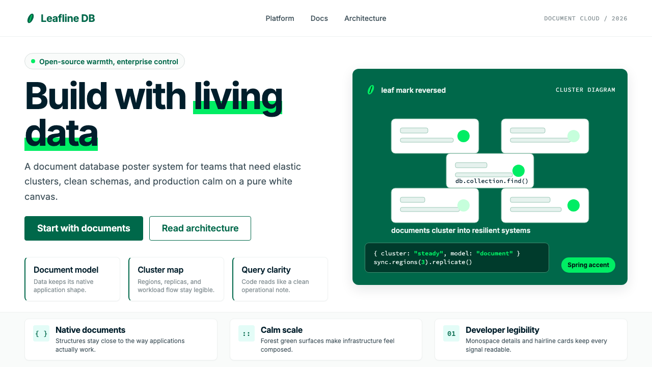 MongoDB Leaf GreenDisciplined green, open warmth. Forest leaf forms and Spring accents breathe…克制的绿有开源温度:森林绿叶形与春绿点缀,留白呼吸。
 Android Bugdroid GreenFriendly tech, reduced to geometry. Vivid green pops from Grey 900 and rounde…友好科技化为几何:明绿从 Grey 900 与圆润字形中跃出。
 AsanaCalm productivity breathes. Cream canvas, lavender panels, coral-blue-yellow…安静生产力会呼吸:奶油画布、薰衣草面板与三色圆点。
 Cursor IDEAI-first code editor. Pure dark surfaces, off-white text, electric blue reser…以 AI 为核心的代码编辑器:近乎纯黑背景、柔白文字、唯一的电光蓝色专为 AI…
 Figma 2024A brand that looks like its canvas. Five dots scatter like cursors, soft card…把产品体验直接变成品牌:五枚标志圆点如共享光标散落、柔和圆角卡片、紫色药丸按钮…
 GitLab 2023DevOps in daylight. Tanuki orange-to-purple gradient, Inter, warm enough for…DevOps 走出暗色房间:标志性狸猫橙紫渐变、宽松行高、Inter 字体——…