What is Indie Pixel-Art Game?
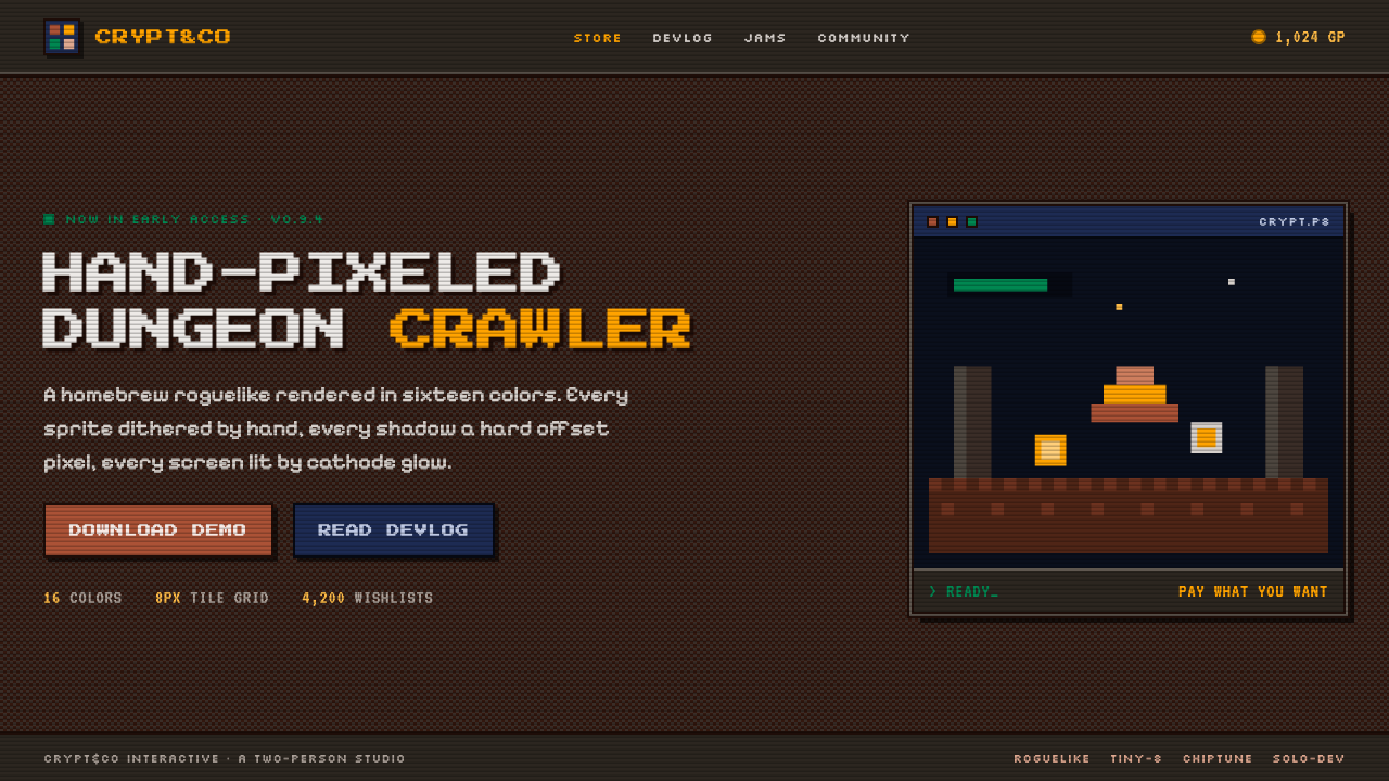
Indie Pixel-Art Game makes limitation feel alive: a dungeon-dark screen, hand-placed color, and the warm persistence of a CRT running a homebrew adventure.
Indie Pixel-Art Game in brief
Indie Pixel-Art Game is the visual language associated with itch.io storefront culture and the PICO-8 fantasy-console scene. It presents games, interfaces, and promotional art as if they belong to a compact homebrew RPG: sprites sit against a nearly black dungeon canvas, earthy browns meet dark teal, and every visible edge is deliberately stepped. The image does not try to conceal its construction. Pixels remain individual marks, assembled into characters, terrain, menus, icons, and atmosphere.
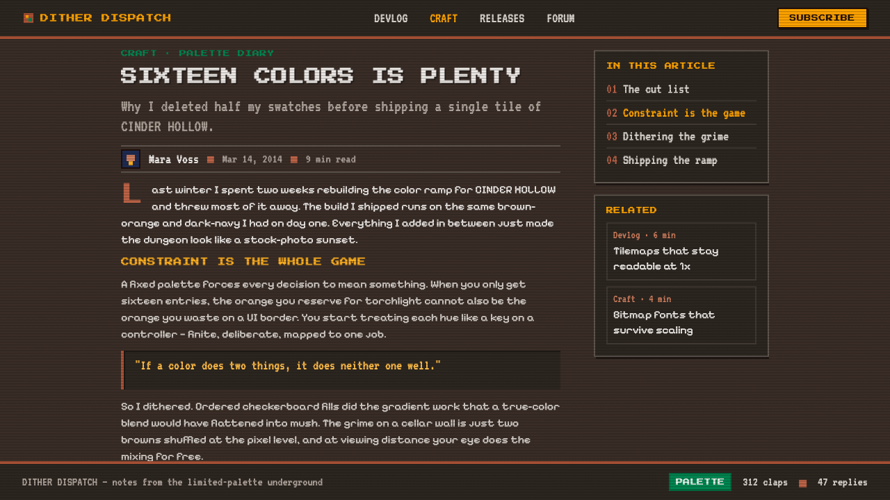
Its palette is intentionally small and closely managed, often drawing on the DawnBringer DB16 and PICO-8 palette traditions. Rather than relying on smooth tonal transitions, artists create shading through ordered dithering: neighboring pixel clusters alternate so that two colors appear to blend at a distance while remaining visibly separate up close. This produces surfaces that feel textured, worn, mineral, or candlelit without becoming painterly.
The style extends beyond game art into interface behavior and framing. Blocky bitmap lettering, chunky borders, compact panels, and CRT scanlines make a page feel like a screen inside a screen. A slight warm glow may soften the whole composition, but the underlying forms stay hard and square. It is not a polished retro simulation; it is a contemporary indie language that treats old technical limits as an expressive discipline.
Where does Indie Pixel-Art Game come from?
The style belongs to the internet-native indie-game culture that developed from 2010 onward around itch.io, fantasy consoles, and pixel-art communities. Its context is global rather than tied to one physical school or city: developers, artists, and hobbyists share small games, visual experiments, tools, and palettes online. In that environment, pixel art became more than a legacy production method. It became a recognizable signal of handmade authorship, compact scope, and personal creative control.
PICO-8, created by Joseph White through Lexaloffle, gave this culture a particularly clear visual frame. As a fantasy console, it invited creators to work within a deliberately bounded imagined machine rather than chase contemporary hardware realism. The result was an aesthetic of chosen constraint: sprites, text, menus, and environments had to communicate with economy. A successful scene could suggest a whole dungeon, quest, or world while remaining visibly constructed from simple blocks of color.
DawnBringer's DB16 palette, introduced in 2012, supplied another important common reference. It offered pixel artists a compact family of earthy, dark, and readable colors that encouraged intentional selection over unlimited picking. The palette's influence is visible not because every work must copy it exactly, but because it helped normalize a way of thinking: color should have a job, shadows should be designed, and variation should come from placement and rhythm rather than indiscriminate additions.
The movement is also demoscene-adjacent in spirit. It values the pleasure of making a limited system visibly perform: ordered patterns, concise image-making, and the transformation of technical-looking artifacts into atmosphere. On itch.io and in the wider Lospec community, that attitude merged with indie game development. The resulting style can be nostalgic, but its real subject is craft — the sense that every sprite, border, and dithered patch has been chosen by hand.
What defines the Indie Pixel-Art Game look?
Dungeon-Dark Ground
The canvas is usually very dark, closer to a dungeon interior or an unlit game screen than a neutral modern background. Dark teal and deep brown establish depth before any object appears. Brighter colors are therefore scarce and consequential: a lit window, a selected menu item, or a character sprite can immediately become the visual event.
Limited Earthy Palette
Color is selected from a small, coherent family rather than sampled freely from the full spectrum. Earthy browns, dark teal, muted lights, and warm highlights create a world that feels excavated from soil, stone, and old phosphor. The palette should feel shared across every surface, so no element appears imported from a cleaner or more contemporary interface.
Ordered Dithering
Dithering is not accidental noise. It is a visible pattern used to bridge neighboring colors, describe rough material, and imply light without soft blending. Repeated clusters can suggest stone walls, worn ground, mist, or screen shimmer. Because the pattern remains legible, the viewer sees both the atmosphere and the method that constructed it.
Hard Pixel Edges
Contours are stepped, square, and unapologetically discrete. Curves are interpreted through deliberate pixel placement rather than softened into smooth digital shapes. This gives icons, sprites, frames, and letters a shared physical logic. Anti-aliasing would weaken that logic by hiding the very grid the style wants the viewer to notice.
Bitmap Typography
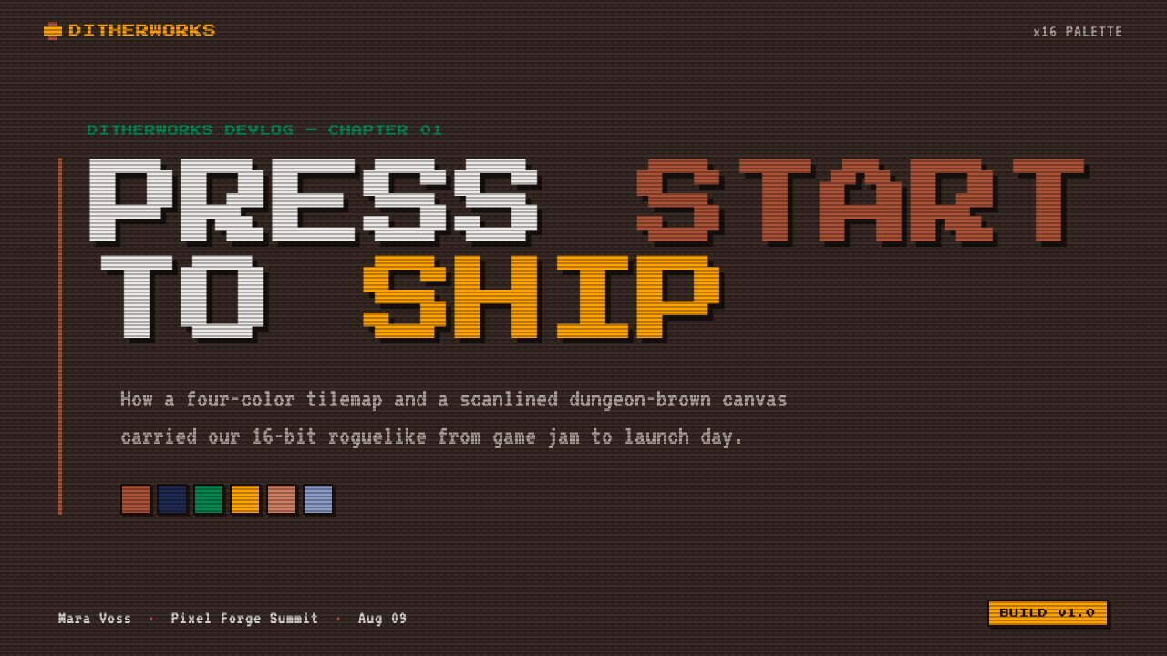
Type is blocky, compact, and visibly built from a grid. It should read like part of the game world, not like interface copy laid over it afterward. Headlines can feel like title-screen lettering, while body labels remain terse and functional. The key is crisp legibility with an intentionally mechanical rhythm, not decorative retro lettering detached from the rest of the screen.
Chunky Frames and Panels
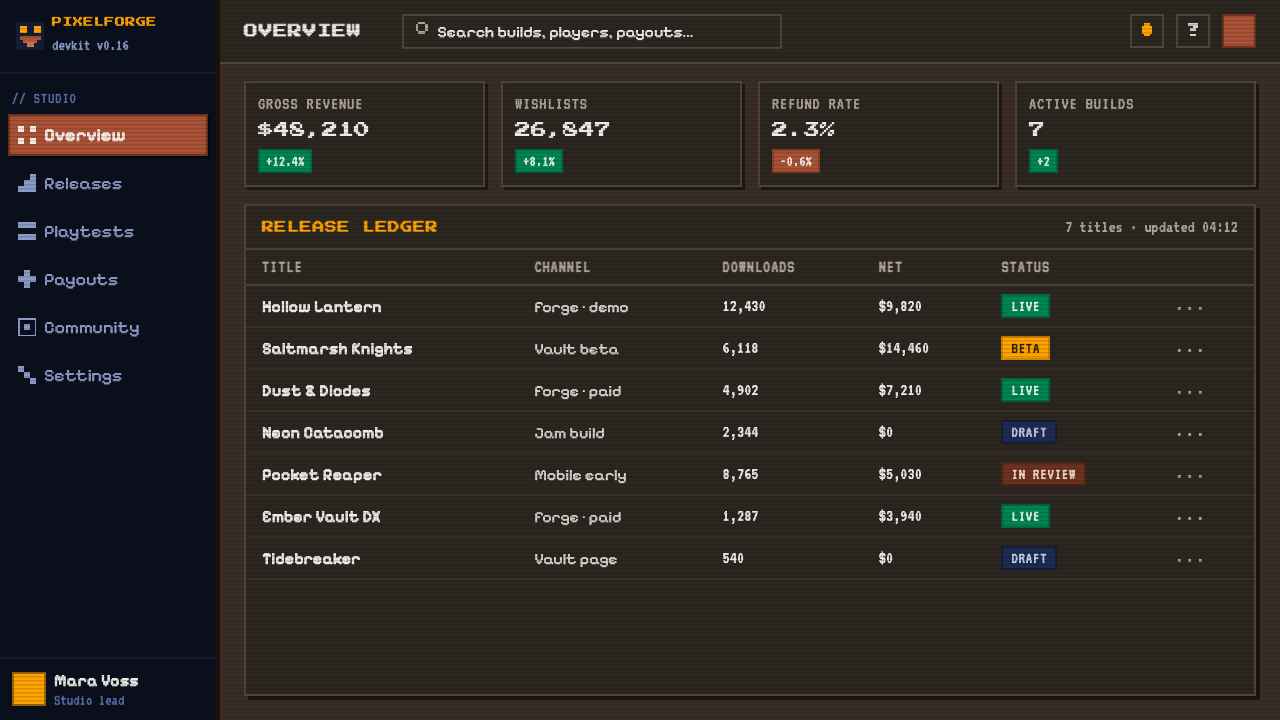
Panels are enclosed by strong pixel borders that make each region feel like a game window, inventory slot, dialogue box, or menu. Corners are square or visibly stepped, and separators behave like built assets rather than hairline rules. The framing gives dense information a tactile, contained quality while preserving the low-resolution worldbuilding.
CRT Warmth
A scanline overlay and restrained glow recall a cathode-ray display, adding warmth to an otherwise dark and granular surface. The effect should make the image feel emitted by a screen, not polished behind glass. It remains secondary to the sprites and text: scanlines support the illusion of a running game, while the pixel grid remains the real subject.
Who shaped Indie Pixel-Art Game?
Joseph White is the creator associated with Lexaloffle and PICO-8. PICO-8 gave indie creators a shared fantasy-console context in which deliberate limitation could guide visual choices. Its influence on this style comes from making compact sprites, controlled color, bitmap text, and game-like interfaces feel like parts of one coherent creative system.
DawnBringer is associated with the DB16 palette, a widely recognized reference in limited-palette pixel art. Its importance lies in demonstrating how a compact color family can remain expressive when each hue is assigned a clear role. The palette encourages artists to solve atmosphere, contrast, and material through relationships between colors rather than through unlimited variation.
The pixel-art developers publishing through itch.io are the style's distributed practitioners rather than a single formal school. Their storefront pages, game screens, prototypes, and small releases keep the language contemporary. In this community, handmade pixels are not merely a historical reference; they are a practical way to give independent work a distinctive world, clear scope, and authored personality.
How do you use Indie Pixel-Art Game today?
For presentation slides, use the style to make a deck feel like a game interface without sacrificing information hierarchy. A cover can place a single dithered scene or sprite-like emblem within a dungeon-dark field, with a bitmap title framed like a title screen. Content slides should use strong panels for sections and short labels for navigation. Keep empty space dark and intentional, so lit accents read as discoveries rather than decoration.
Data slides benefit when charts are treated as game-world instruments rather than generic business graphics. Bars, progress states, legends, and selected values can sit inside chunky frames, using a restrained palette to distinguish categories. Ordered dither can indicate secondary areas or incomplete states. The goal is not to make data illegible for nostalgia; it is to make comparison feel as immediate as reading health, inventory, or quest information.
For web interfaces, the approach suits dashboards, creator tools, game hubs, and pricing pages that benefit from a strong sense of atmosphere. Use bitmap labels sparingly for interface identity, reserve bright warm accents for active or important states, and group controls inside clearly bounded panels. A dark ground and visible scanline texture can unify the experience, but navigation and input must remain more readable than the surrounding visual effects.
For editorial and marketing work, this language is especially effective when presenting an indie release, a creative tool, or a community-built product. Crop scenes like screenshots from an imagined game, pair them with direct copy, and use borders to turn facts into quests, features, or collectible discoveries. The texture should support a story of handmade invention: a small team or individual has made a world with deliberate tools and visible care.
The common mistake is to mistake pixel art for a filter applied after a conventional interface is finished. Smooth icons, broad uncontrolled color, soft modern cards, and generic text will conflict with a pixel border and a scanline overlay. Start with the constraint instead: choose a limited palette, build forms on a visible grid, use hard edges, and let dithering carry texture. CRT warmth should be the final atmosphere, never the substitute for a coherent pixel system.
Indie Pixel-Art Game — FAQ
Is Indie Pixel-Art Game simply a retro style?
It uses references associated with older screens and game hardware, but its defining quality is chosen constraint rather than historical imitation. The style is contemporary because indie creators use limited palettes, hard edges, and bitmap systems as active design decisions. It can evoke memory while still describing a new game, a new tool, or a new community.
Why is dithering so important to the look?
Dithering lets a limited palette describe more than flat color alone can describe. By arranging pixels in repeatable patterns, it suggests shadow, texture, worn surfaces, and transitions while preserving hard edges. It is important because it keeps the image visibly pixel-built. Smooth blending would create a different kind of atmosphere and weaken the style's handmade, constrained character.
Can this style work for a light-background product?
It can, but the dungeon-dark canvas is one of its strongest organizing devices. A light version needs another way to preserve the feeling of a contained game screen, such as strong pixel frames, a carefully limited palette, and clearly stepped forms. If the surface becomes too clean or spacious, the result may retain pixel motifs while losing the CRT-lit, homebrew-RPG atmosphere.
Should every part of the interface use bitmap type?
No. Bitmap type is most effective where it establishes identity or marks compact game-like labels. Long explanatory content still needs comfortable reading and a clear hierarchy. The key is consistency of visual logic: typography should sit naturally beside pixel borders and sprites, while dense information should never become difficult to read merely to prove the theme.
What makes an application feel authentic rather than like a pixel filter?
Authenticity comes from making the constraints structural. Palette selection, stepped geometry, dither patterns, bitmap framing, and compact text all need to agree before scanlines or glow are added. When only the surface effect is retro, the interface underneath still feels generic. When the whole composition follows pixel logic, even a simple screen can feel like a specific handmade game world.
Related design styles
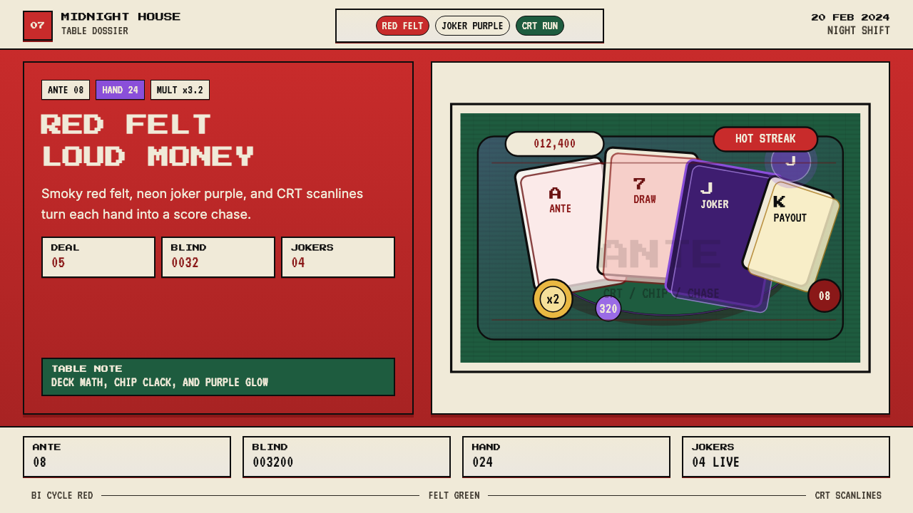 Balatro Poker RoguelikeLate-night poker math with a grin. Bicycle red, felt green, and CRT scanlines.
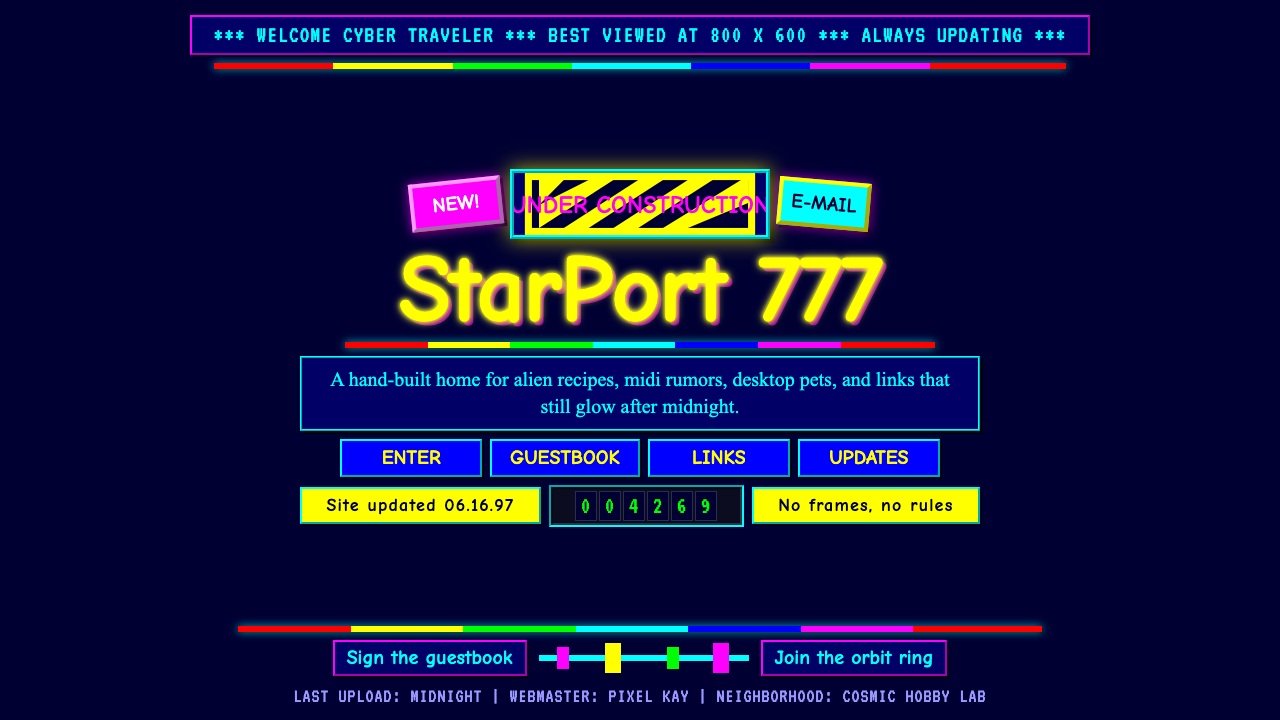 GeoCities Personal WebClutter is celebration. Starfield tiles, cartoon headings, rainbow rules, and…
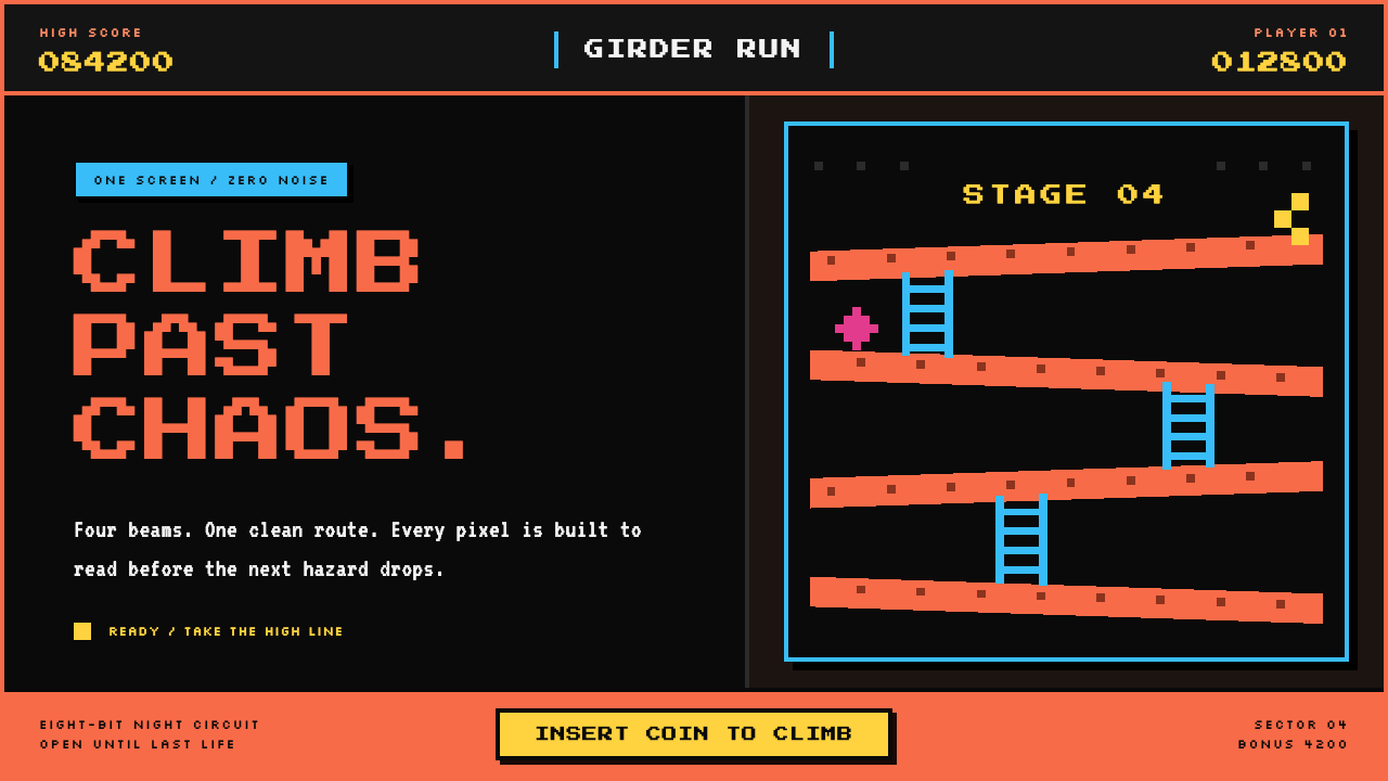 Donkey Kong (1981 Arcade)Built to read through the smoke. Coral girders and cyan ladders cut across a…
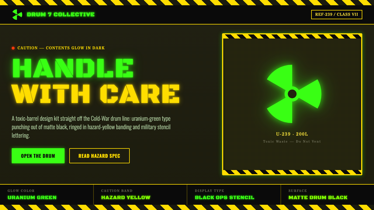 Radioactive Trefoil SignToxic-barrel glow, not the official sign. Neon-green trefoils on matte-black…
 Slimer Ghostbusters GreenBlacklight goo shouts. Ecto-green Bungee type, drips, and proton streaks hit…
 Weird Twitter / ShitpostGloriously ugly on purpose. Blown-out HDR reds and white-stroke Impact caps o…