What is Pikmin?
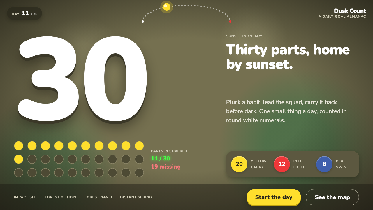
Pikmin looks at a backyard from the dirt up, so a bottle cap becomes a monument and a fallen leaf becomes a bridge.
Pikmin in brief
Pikmin is a visual style drawn from Nintendo's 2001 GameCube strategy game, produced by Shigeru Miyamoto. Its defining idea is scale. The camera stays low, the ground fills the frame, and ordinary garden debris is turned into landmarks. The interface that grew around this world is warm, earthy and unexpectedly gentle for a game about survival.
Visually, the system is built from three ingredients. Olive soil and moss form the dark, organic ground. Yellow, red and blue, the colours of the three Pikmin types, supply the only loud colour on the screen. And rounded white numerals count the day down to sunset. Nothing else competes for attention, so those few bright notes read immediately against the muted earth.
The mood is one of small-scale adventure: patient, curious and a little melancholy. Time is always running out, but the tone is never harsh. It feels like a miniature expedition at the edge of a garden, with soft shadows under the leaves and a low, golden light that tells you the day is nearly over.

Where does Pikmin come from?
Pikmin was released by Nintendo in 2001, first in Japan in October and then in North America in December, during the launch period of the GameCube. It came out of Kyoto, the city where Nintendo is based, under the production of Shigeru Miyamoto, and it was one of the console's earliest original creations rather than a sequel to an existing series.
The premise is simple and memorable. Captain Olimar crash-lands on an unfamiliar planet and has thirty days to recover thirty scattered parts of his ship. The planet is plainly someone's backyard, seen from a perspective so low that everyday objects look enormous. That conceit explains the style: the world is built from soil, grass, leaves and small household leftovers, and its interface has to sit quietly on top of it.
The look draws on garden macro photography, the kind of close-up work that makes insects and pebbles feel like landscapes. Rather than invent an alien world from scratch, the designers asked what a familiar place would feel like if you were only a few centimetres tall. The answer shaped the lighting, the colour of the ground and the way objects are scaled against each other.
The staff credited with the game include Shigeru Miyamoto, Shigefumi Hino, Masamichi Abe and Hajime Wakai. The genre is often described as console real-time strategy, a category that had mostly lived on personal computers. Pikmin translated it into something readable on a television from a sofa, with simple controls, a visible clock and bright, learnable colour coding.
What defines the Pikmin look?
Earth palette
The ground is olive soil and moss, dark and slightly warm, with dappled tree shadows breaking it up. It makes the page feel like a surface you could kneel on. Dark mode is native to this system, not an option added afterwards.
Three bright colours
Red, yellow and blue, the colours of the Pikmin themselves, are the only saturated hues. They always carry meaning: each denotes a type, a group or a role. Using them for anything decorative weakens the code.
Chunky white numerals
Time and counts are shown in rounded white numerals, large and friendly. They count the day down to sunset and report how many Pikmin are in the field, and they remain readable against the dark ground at a glance.
Low camera scale
Elements are sized as if seen from a few centimetres above the ground. Large shapes dominate, small things become landmarks, and the page rewards a sense of wonder at ordinary objects. Dense small print fights this.
Soft organic shapes
Corners are rounded, outlines are gentle, and shapes look grown rather than machined. Panels feel like leaves or pebbles, not rectangular glass. The softness keeps a clock-driven game from feeling anxious.
Late-afternoon light
Warm, low light and soft shadow suggest the approach of sunset. It gives a sense of time passing without needing an alarm, and it makes the muted earth tones glow instead of go flat.

Who shaped Pikmin?
Miyamoto produced Pikmin at Nintendo in Kyoto. His long career in game design is the reason the project is read as an authored world with a distinct personal sensibility, rather than a genre exercise.
Hino is one of the developers credited with the original game, and his name is part of the core team associated with its 2001 release.
Abe is also listed among the key figures behind the original Pikmin, and his work belongs to the small team that shaped its backyard world.
Wakai is also among the names credited with the game's creation, as part of the staff of the GameCube launch period.
How do you use Pikmin today?
Pikmin is a style for products that want warmth, curiosity and a gentle sense of urgency. It suits anything that involves small things adding up, such as collecting, counting, growing or exploring, and it works especially well for dark interfaces that should still feel friendly.
For slides, use it on covers and chapter pages with a low, earthy field and one or two of the three bright colours. A title in large rounded white type reads strongly against the olive ground. Content slides should keep the number-first approach: one big friendly figure, a short label and plenty of dark space. Charts work best as simple, chunky shapes in red, yellow and blue.
For web and app interfaces, the style fits onboarding, progress and gamified dashboards. Use the dark earth tone as the base, large rounded numerals for timers and counters, and rounded cards that feel like stones or leaves. Reserve red, yellow and blue for state or category, so users learn the colours as a code. Buttons should be big and tactile.
For editorial and marketing work, Pikmin suits family-friendly campaigns, garden and outdoor products, nature education and small-team stories. Pair full-bleed ground textures with oversized numerals and short, plain sentences. The tone should stay observant and tender rather than shouty.
A frequent mistake is brightening the base. Replace the olive soil with a pale background and the whole premise, a world seen from the dirt, disappears. Another is using the three bright colours everywhere at once. They are strong because they are the only loud notes; spread them across every surface and the game-like clarity is gone.

Pikmin — FAQ
What is Pikmin?
Pikmin is a strategy game from Nintendo for the GameCube, produced by Shigeru Miyamoto and released in 2001. Captain Olimar must recover thirty ship parts within thirty days on what is plainly a backyard seen from ground level.
Which colours define the style?
Olive soil and moss form the dark base. Red, yellow and blue, matching the three Pikmin types, are the only bright colours, and rounded white numerals carry the time and counts.
Is it a dark theme?
Yes. The earth-toned dark ground is native to the style, and the bright colours and white numerals are chosen to stand out against it. Turning it light changes its character completely.
What kinds of projects suit it?
Products built on small things adding up, such as habit trackers, collection apps, outdoor and garden brands, children's education and games. It is less suited to formal financial or legal contexts.
Where does the look come from?
It comes from the premise of the 2001 game: a world seen from just above the dirt, informed by garden macro photography. The small scale, earthy palette and warm low light all follow from that choice.
Related design styles
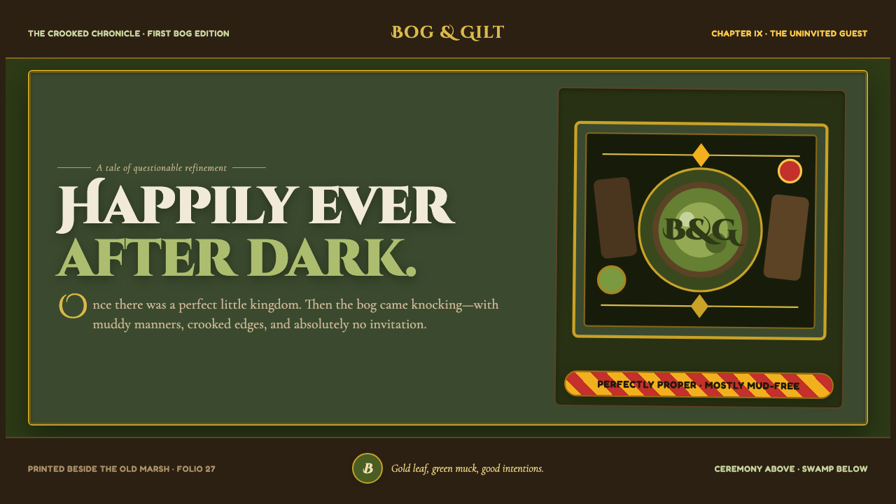 Shrek Swamp (2001)Fairy-tale ceremony gets muddy. Gilt frames collide with moss green and candy…
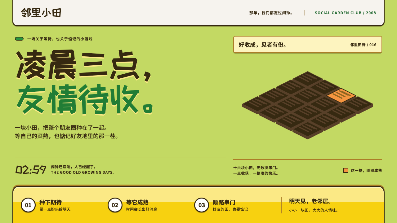 Happy FarmFriendship ripens after midnight. Lawn green, soil outlines and chunky yellow…
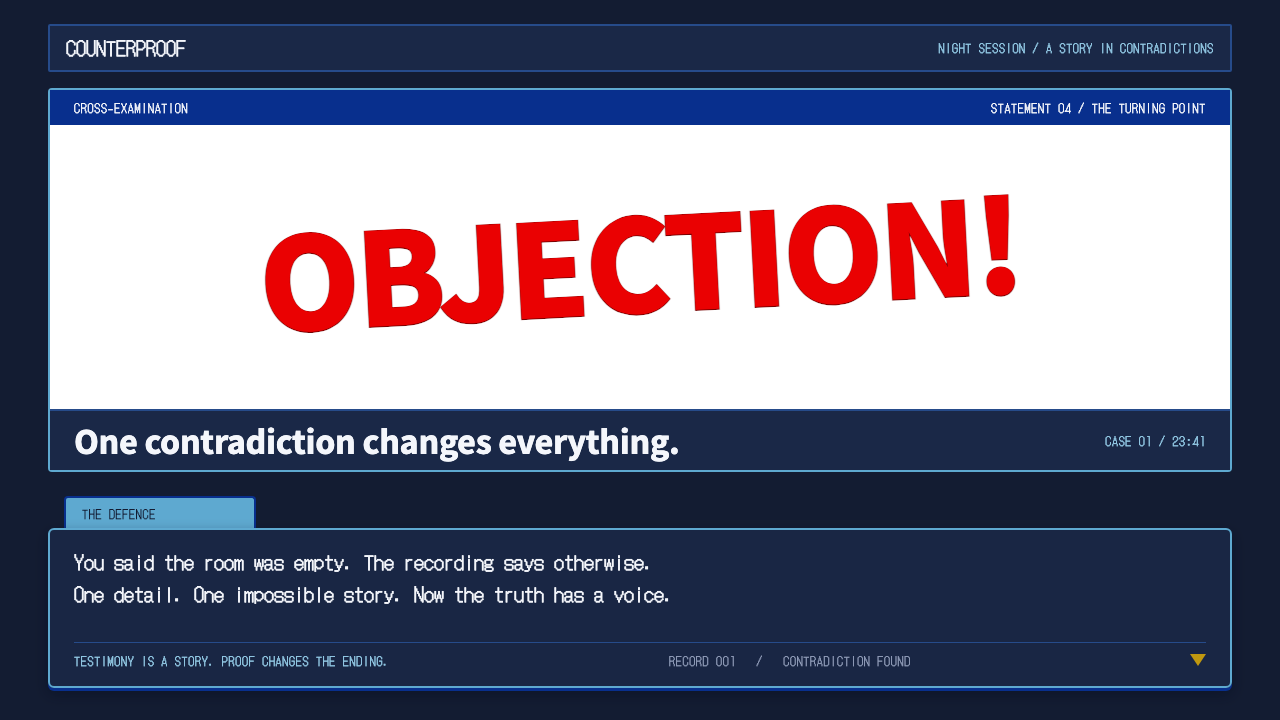 Ace AttorneyQuiet testimony. One red shout breaks the navy calm, with bitmap dialogue bel…
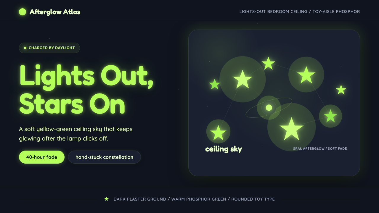 Glow-in-Dark Ceiling StarsTurns lights-out into wonder. Yellow-green stars glow across a dark blue-gray…
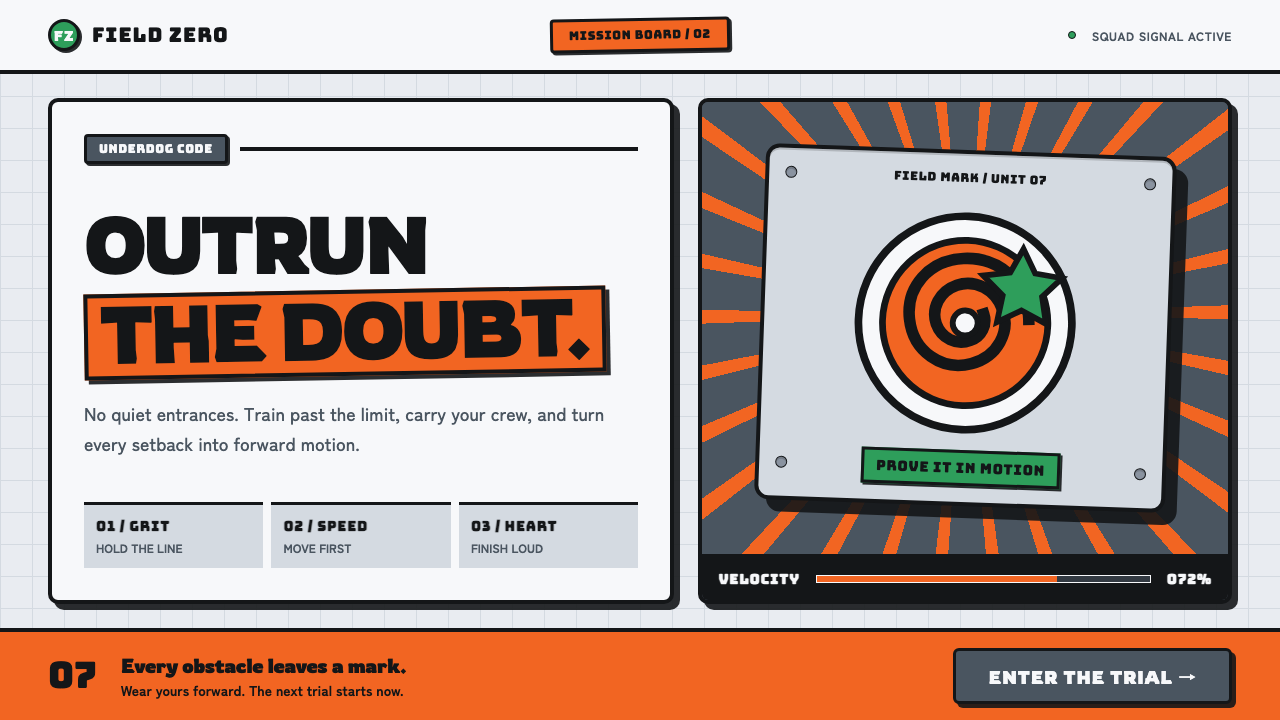 Naruto (2002 anime era)Underdog energy refuses the background. Hazard orange strikes steel-gray grid…
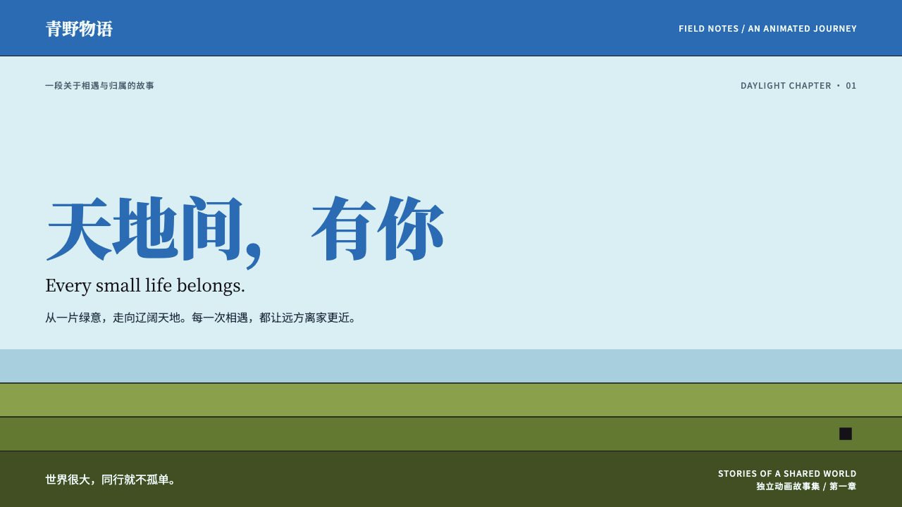 The Legend of HeiSmall lives, vast daylight. Cyan space, azure serif titles and flat olive ban…