What is Space Age Fashion?
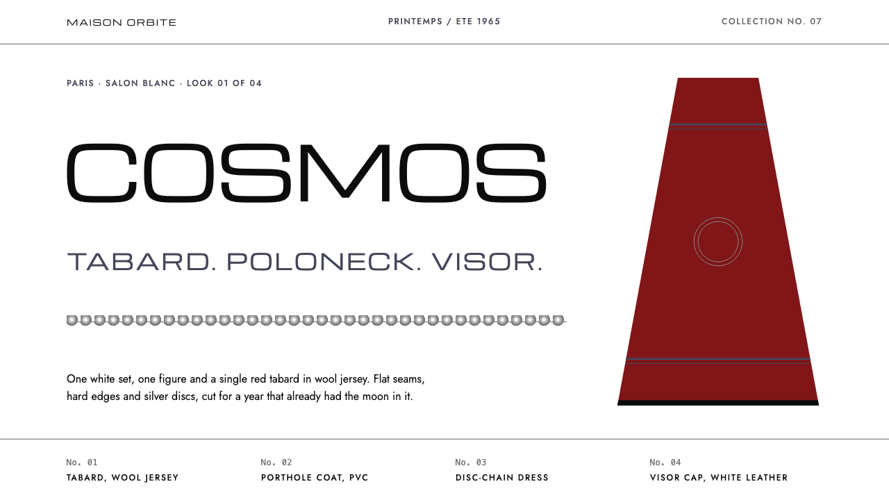
Space Age fashion dressed the future in optic white, silver and a single shot of red, years before anyone had walked on the Moon.
Space Age Fashion in brief
Space Age fashion is a Paris couture movement of roughly 1964 to 1967, led by Pierre Cardin, André Courrèges and Paco Rabanne. It imagined what people would wear in a future of rockets, laboratories and moon bases, and answered with clean white sets, geometric cuts, metallic surfaces and an almost clinical sense of order.
As a visual system it reads like a lookbook staged on a white runway. Space is generous, type is wide and capitalised, and the only warm note on the page is one deep red garment. Silver appears where metal would catch the light: as chains of linked discs, as hairline rules, as the cool mid-tone of a hard highlight and a hard shadow. Everything else stays white or black.
The mood is confident rather than playful. This is not retro-futurism with cartoon rockets; it is the polished, slightly austere optimism of the 1960s Youthquake, when young designers believed that new materials and new silhouettes could erase the past. The result feels precise, cool and expensive, and it still reads as modern today.

Where does Space Age Fashion come from?
The story begins in Paris in 1964. In that year Courrèges presented his Moon Girl collection, built around white leather flat boots, short gloves and trapeze dresses with a crisp, architectural line. Pierre Cardin showed his Cosmocorps designs the same year. Both houses had trained in conventional couture and both chose, almost at once, to leave its ornament behind.
Over the next three years the language spread and sharpened. In 1966 Paco Rabanne staged his twelve Unwearable Dresses, linking metal and plastic discs into something closer to chain-mail than cloth. In 1967 Cardin cut his Cosmos tunics in wool jersey, worn over black polonecks, with a single deep red tabard as the signature piece. The period sits between the first Courrèges and Cardin collections of 1964 and Cardin's Cosmos line of 1967.
The context was the Space Race. Rockets, satellites and the promise of a Moon landing filled newspapers, and the Paris houses, ahead of the actual landing, effectively prepared the wardrobe for it. At the same moment the Youthquake was shifting fashion's centre of gravity from older couture clients to young buyers, and geometric, Op-era dressmaking gave that younger audience a look that was unmistakably their own.
Materials mattered as much as silhouettes. Wool jersey, vinyl, plastic and metal replaced silk and lace, and these fabrics held sharp edges instead of draping softly. That is why the visual language that grew out of this moment is so hard-edged: flat white fields, strict geometry, reflective silver and no ornament that does not belong to the structure of the garment.
What defines the Space Age Fashion look?
Palette
The ground is optic white, like a runway set. Cardin black carries type and rules, a cool silver mid-tone with a hard highlight and shadow stands in for metal, and one deep red is allowed to appear as the only warm note. Restraint is the point: red works because it is alone.
Wide capitals
Collection names and headlines are set in wide, capitalised letters such as Michroma, giving each title the horizontal stretch of a runway banner. The letterforms feel engineered rather than drawn, which suits a design language about manufactured futures.
Reading type
Body copy uses a geometric sans such as Jost, with round bowls and simple construction. It keeps long text calm and legible while echoing the circles and discs of the garments, and it never competes with the display caps above it.
Silver disc chains
Dividers borrow from Rabanne's linked discs: a row of small metallic circles replaces the ordinary rule between sections. Used sparingly alongside hairline silver lines, it adds the one decorative idea the system allows, and that idea comes straight from the garment.
Space and layout
Large areas of white carry the whole composition. Elements are few, placed with intent, and aligned to a simple structure, the way a single model stands alone on a bare runway. Crowding would break the illusion of a clean laboratory.
Hard-edged geometry
Trapezoids, circles and clean horizontals dominate; corners are decisive. Nothing is blurred or feathered. Surfaces are flat or reflective, never textured, matching the stiff, shaped fabrics of the original collections.

Who shaped Space Age Fashion?
Cardin is the name this system is built around. His Cosmocorps designs of 1964 and Cosmos tunics of 1967, cut in wool jersey and paired with black polonecks, gave the movement its most graphic images, including the single deep red tabard that anchors the palette.
Courrèges's 1964 Moon Girl collection, with white leather flat boots, short gloves and A-line trapeze dresses, set the template for the white-on-white optimism that the visual system inherits.
Rabanne linked metal and plastic discs into dresses, most famously in his 1966 Unwearable Dresses. The disc chain used as a divider in this system is a direct descendant of that idea.
How do you use Space Age Fashion today?
Space Age fashion is a style for brands that want to look precise, cool and slightly aspirational. It works best when the content is sparse and the product is the hero, because the whole system depends on white space and a single accent. Treat it as a lookbook language, not a dense information layout.
For slides, use it on covers and section openers. A cover can be mostly white, with the title in wide capitals on a hairline silver rule and one small block of deep red as the sole accent. Content slides should hold one idea each, with generous margins and silver disc dividers used sparingly. Data slides suit thin lines and flat fills in black, silver and white, saving the red for the single number that matters.
For web interfaces, the style suits product launches, collection pages and portfolios more than dense dashboards. Keep backgrounds white, set headings in wide capitals and reading text in a geometric sans. Buttons can be flat and rectangular or fully round, but only one primary action per view should take the red. Navigation should be minimal text with plenty of air around it.
For editorial and marketing work, it is well suited to brand books, new-release announcements and exhibition pages. Large product photography against white, short captions, and a restrained disc-chain divider between chapters recreate the feel of a couture presentation. Keep copy short; the system rewards silence.
The most common mistake is overusing the red or the silver. If red appears on every heading, button and badge, it stops being a single warm note and the cool, laboratory calm is lost. A second mistake is setting body text in the wide display face: it is for names, not paragraphs, and long lines of it become tiring to read.

Space Age Fashion — FAQ
Who made Space Age fashion?
It emerged in Paris in the mid-1960s, led by Pierre Cardin, André Courrèges and Paco Rabanne. Courrèges and Cardin both showed key collections in 1964, Rabanne followed with his Unwearable Dresses in 1966, and Cardin's Cosmos line arrived in 1967.
What colours define the style?
White is dominant. Black handles text, silver stands in for metal, and one deep red is used as the single warm accent. The look depends on that discipline, so adding extra colours quickly dilutes it.
Is it the same as retro-futurism?
Not quite. Retro-futurism often leans on cartoon rockets, chrome and playful nostalgia. Space Age fashion is more austere: white sets, geometric cuts and a single accent, aimed at looking modern rather than looking like an old idea of the future.
What typefaces suit it?
A wide capital display face such as Michroma for names and headlines, paired with a clean geometric sans such as Jost for reading text. The contrast between stretched capitals and round, quiet body type is central to the look.
What is it best used for?
Brand books, new-release pages, exhibition sites and presentation covers, where a product or collection needs room to breathe. It is less suitable for dense data tables or crowded interfaces.
Related design styles
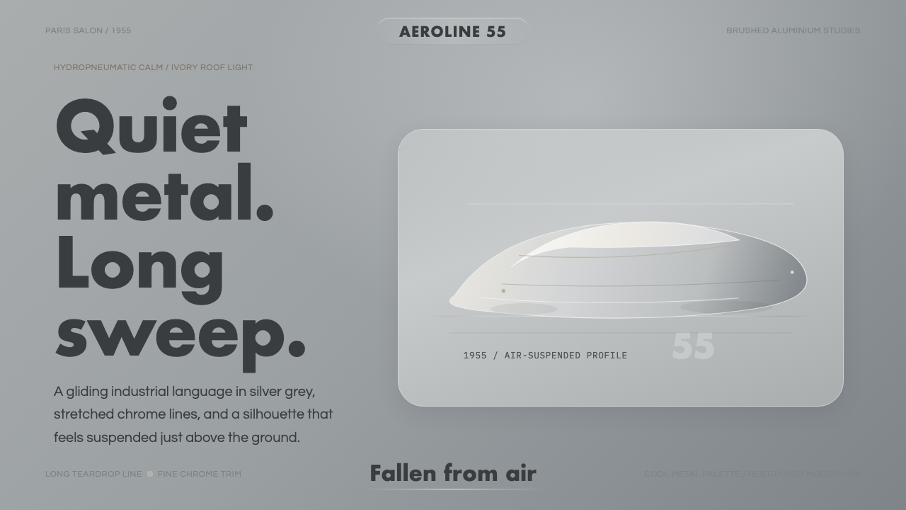 Citroën DSSilence made aerodynamic. Silver-grey ground, chrome hairlines, one long glid…
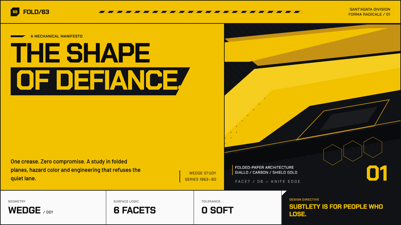 Lamborghini (1963)Subtlety loses. Scream-yellow wedges cut through carbon black with a gold hai…
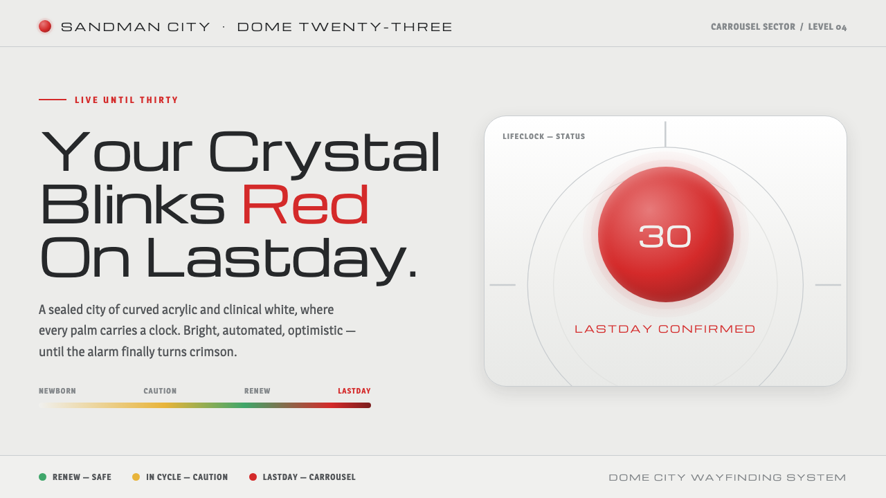 Logan's RunLive until thirty, then your palm crystal blinks red. Clinical mall-white, ch…
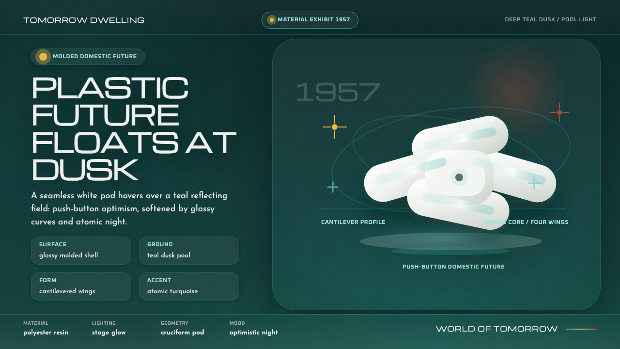 Monsanto House of the FuturePlastic optimism at dusk. Glossy white pod forms float over deep teal night.
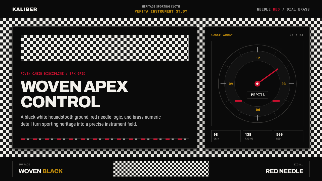 Porsche PepitaHeritage runs on instruments. Pepita checks, brass numerals, and red needles…
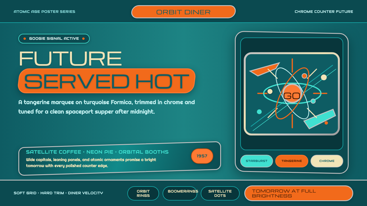 Atompunk / Raygun GothicTomorrow shines loud. Tangerine marquee type cuts through turquoise chrome ge…