What is Lamborghini (1963)?
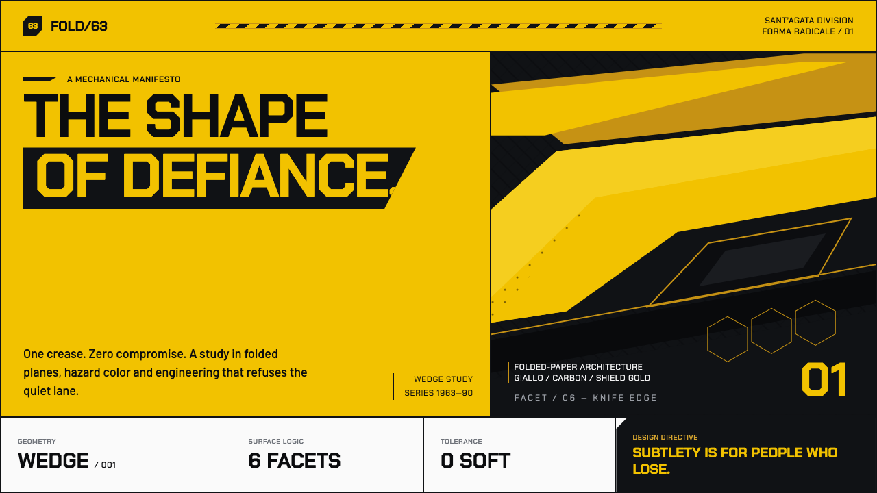
Lamborghini makes restraint look like retreat: hazard-yellow wedges, carbon-black voids, and a gold bull that announces speed before anything moves.
Lamborghini (1963) in brief
Lamborghini is an Italian automotive design language born in Sant’Agata Bolognese in 1963, defined by aggressive geometry, theatrical contrast, and a refusal of visual compromise. Its central image is a gold raging-bull shield against black, supported by paintwork that treats bright yellow as a public challenge rather than a polite accent. The style does not ask to be discovered slowly. It declares itself at first glance.
The visual system is built from wedges, creases, knife-edge planes, and sharply cut openings. Bodywork reads less like a continuously sculpted shell than a sequence of folded surfaces, as though broad metal sheets had been scored, bent, and tightened into position. Each facet catches attention independently, while the overall silhouette pushes forward with concentrated force.
The Miura introduced a softer expression of this language, but the Countach made its essential attitude unmistakable. Scissor doors, hard planar surfaces, and NACA-duct hexagons turned the supercar into a piece of near-futurist machinery. Lamborghini style is therefore not simply about being fast or expensive; it is about making mechanical ambition visible, exaggerated, and impossible to ignore.
Where does Lamborghini (1963) come from?
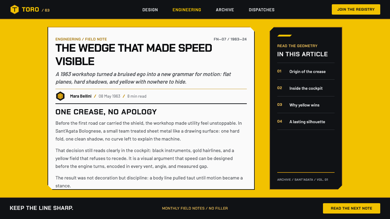
The origin story begins with Ferruccio Lamborghini, described as a tractor magnate who was insulted by Enzo Ferrari and answered with a wedge. That premise matters because it frames Lamborghini from the outset as a design response rather than a quiet market entry. The car becomes an argument: technical confidence expressed through an exterior that refuses conventional politeness.
Founded in Sant’Agata Bolognese in Emilia-Romagna, Lamborghini emerged from Italian carrozzeria design, where a car’s outer form could carry as much cultural force as its mechanical purpose. Within that setting, the marque developed an increasingly severe preference for folded-paper geometry: panels organized by decisive creases, broad planes interrupted by sharp cuts, and silhouettes that look assembled from visual force lines.
The defining wedge era began with the Miura in 1966 and reached its most forceful expression in the Countach, produced from 1974 to 1990. The Miura softened the language without abandoning spectacle. The Countach turned it into an instrument: wedge proportion, scissor doors, hexagonal duct forms, and an almost militant insistence that every surface should look engineered for impact.
Marcello Gandini, Nuccio Bertone, Paolo Stanzani, and Giampaolo Dallara belong to the group of key figures associated with this origin. Together with Ferruccio Lamborghini, their names place the style at the intersection of Italian carrozzeria design, the automotive wedge and folded-paper era, and 1970s supercar futurism. The result is a visual vocabulary that remains legible because its gestures are so direct: cut, fold, open, advance.
What defines the Lamborghini (1963) look?
Wedge Silhouette
The wedge is Lamborghini’s governing gesture. Its low, advancing profile compresses the car toward the ground and projects movement even when stationary. Rather than easing from front to rear, the silhouette appears to slice through space, turning the entire vehicle into a directional sign.
Folded Planes
Surfaces are treated as facets rather than flowing volumes. A single crease can reorganize an entire panel, producing the impression of origami cut with a scalpel. This makes the bodywork feel deliberate and mechanical: every change in direction reads as a decision, not an ornamental flourish.
Hazard Yellow
Bright Giallo paintwork is not used as a small highlight. It occupies the object with the confidence of a warning signal, making visibility part of the design’s attitude. Against carbon black, yellow becomes sharper and louder, converting color contrast into a statement of arrogance and intent.
Bull Shield
The gold raging-bull shield on black works as a compact emblem of the whole system. Gold introduces precision and ceremonial authority; black creates the void that lets it strike. The mark is strongest when treated as a shield, not as decoration: centered, protected by space, and allowed to carry symbolic weight.
Cut Openings
Air intakes and ducts should read as punctures in a hard shell rather than soft recesses. NACA-duct hexagons on the flanks are especially useful as a reference: functional-looking voids with crisp edges that make airflow feel graphic, structural, and visibly aggressive.
Theatrical Entry
Scissor doors embody Lamborghini’s preference for spectacle that still appears engineered. Their upward motion transforms entry into an event and gives the object a vertical gesture to counter its low wedge. The lesson is not to copy the door literally, but to make interaction feel like a revealed mechanism.

Who shaped Lamborghini (1963)?
The tractor magnate at the center of Lamborghini’s founding story. His answer to an insult from Enzo Ferrari established the brand’s combative premise: a car could be a public rebuttal, expressed through a wedge rather than restraint.
A key figure associated with the Lamborghini wedge era, placing the marque within the folded-paper and supercar-futurist language that made sharp geometry a defining visual force.
A key figure in the Italian carrozzeria context from which Lamborghini’s visual language emerged. His association emphasizes that the marque’s drama belongs to a broader culture of automotive form-making.
Named among the figures tied to Lamborghini’s origin, Stanzani represents the technical and design-minded environment in which the marque’s aggressive form language took shape.
A key figure associated with Lamborghini’s early identity and the period in which Italian automotive design, wedge geometry, and supercar futurism converged.
How do you use Lamborghini (1963) today?
For presentation covers, use a dominant wedge or diagonal plane to create immediate forward pressure. Let a short title occupy a protected black or near-black field, then introduce one bright yellow surface as the visual strike. Content slides should become controlled faceted compositions: a main plane for the argument, sharply separated supporting blocks, and generous empty areas that make each element feel machined rather than crowded.
Data slides work when charts are treated as engineered objects instead of neutral diagrams. Use angular containers, severe contrast, and one conspicuous highlighted series rather than many competing accents. A trend line can become a rising blade; a comparison can be separated by black voids and gold hairlines. Keep labels direct, because this style loses force when information becomes ornamental.
In web interfaces, Lamborghini works best for dashboards, product configuration experiences, launch pages, and premium pricing pages where drama can serve hierarchy. Black sections can create a tunnel-like stage for key actions, while yellow marks active states, urgent choices, or a single featured offer. Cards should feel like panels cut from a larger shell, with crisp boundaries and purposeful openings instead of soft, floating decoration.
For editorial and marketing work, build pages as sequences of reveals. A headline can arrive across a broad diagonal field; an image can be cropped to emphasize a wheel arch, scissor door, duct, or side plane; supporting copy can sit in a calmer black field behind it. Gold should remain a hairline signal for badges, rules, or shield-like marks, preserving its ceremonial quality.
The common mistake is mistaking loudness for Lamborghini. Filling every area with yellow, adding arbitrary hexagons, or placing diagonal cuts behind every paragraph produces noise, not menace. The style needs black voids, large untouched planes, and a single decisive gesture at a time. Its confidence comes from control: the wedge must look inevitable, not merely decorative.
Lamborghini (1963) — FAQ
Is Lamborghini style only about bright yellow?
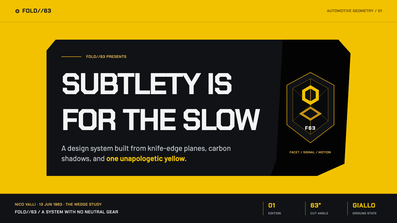
No. Bright Giallo is a defining expression, but the system depends on contrast between yellow, carbon black, and restrained gold. Yellow provides the shout; black provides the void that makes it legible; gold provides the precise, shield-like note of authority. Without the dark field and the hard geometry, yellow alone becomes generic spectacle.
Why is the Countach so important to the aesthetic?
The Countach weaponized the visual language that the Miura had softened. Its knife-edge planes, scissor doors, wedge form, and NACA-duct hexagons made Lamborghini’s futurism explicit. It established the idea that a supercar could look less like a streamlined object and more like a machine cut from forceful geometric decisions.
Can this style work outside automotive design?
Yes, especially where a product needs to signal force, rarity, technical ambition, or high-stakes choice. It translates well to launch campaigns, premium configuration tools, performance dashboards, and presentation storytelling. The transfer should preserve the underlying logic of wedge, contrast, void, and reveal rather than copying car imagery without purpose.
How should gold be used in a Lamborghini-derived layout?
Use gold as a hairline, shield edge, badge detail, or singular marker of status. It is most effective when it remains scarce beside black and yellow, where its precision can register immediately. Turning it into a dominant background weakens the visual hierarchy and removes the tension that makes the bull shield feel ceremonial.
What should designers avoid when borrowing the look?
Avoid decorative aggression without structural purpose. Random diagonals, repeated hexagons, and indiscriminate yellow create a costume version of the style. Every cut should imply direction, every dark area should create contrast or pause, and every bright accent should identify what matters. Lamborghini’s visual force comes from concentrated decisions, not maximum visual volume.
Related design styles
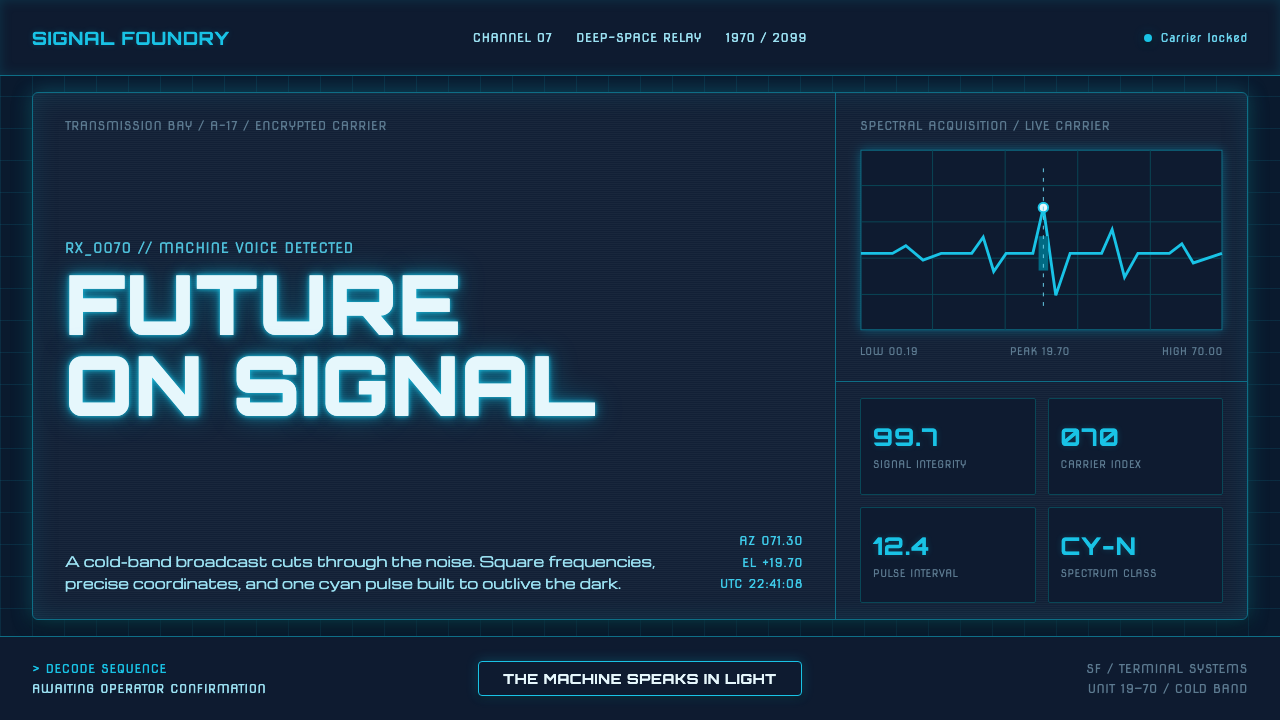 Data 70 Techno DisplayThe machine speaks in light. Cyan CRT type burns through a gridded blue-black…
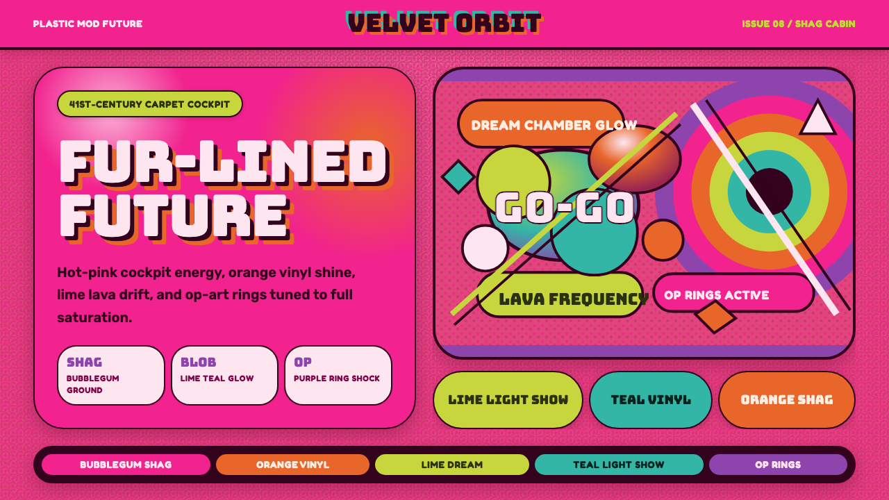 BarbarellaSpace-camp overload. Hot pink shag, lava blobs, and op-art rings collide.
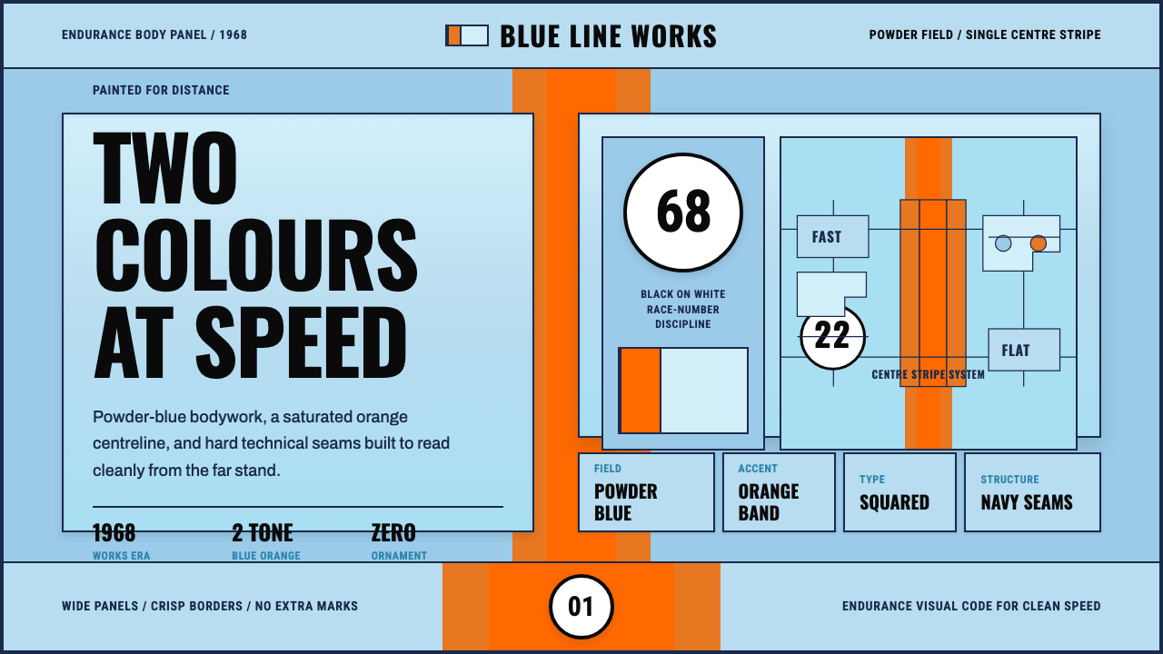 Gulf Racing LiverySpeed made disciplined. Powder blue, orange stripe, black roundel, strict gri…
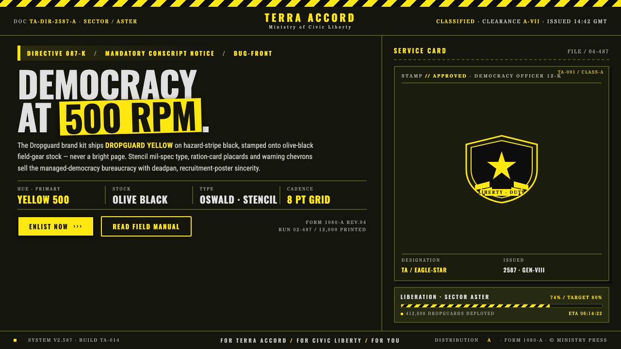 Helldivers (Super Earth)Democracy at 500 RPM. Helldivers Yellow stamped on hazard-stripe black, mil-s…
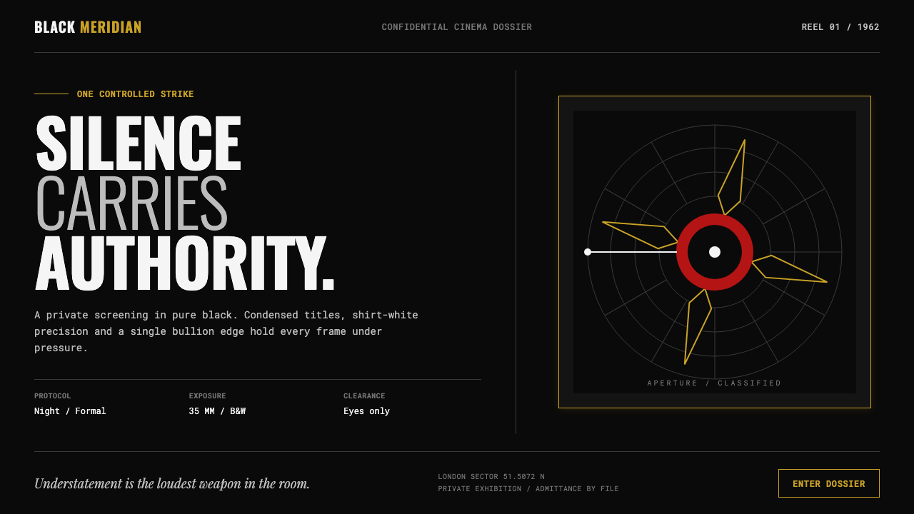 James Bond 007 (1962)Understatement carries authority. Pure black, condensed white type and one pr…
 Queen — Bohemian Rhapsody (1975)Rock assumes the crown. Engraved gold, Roman capitals and a lone spotlight ru…