What is Photoshop 1.0?
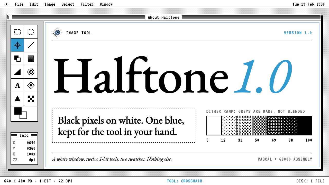
Photoshop 1.0 is the Macintosh interface at its most disciplined: black pixels on white, hairline frames, dithered greys, a narrow two-column toolbox, and one blue kept for the logo moment and the active tool.
Photoshop 1.0 in brief
Photoshop 1.0 is a retro software style based on the first release of Adobe Photoshop, which shipped for the Macintosh on 19 February 1990. The interface of that release was a white window, a narrow toolbox down the left side with icons for the marquee, lasso, magic wand, stamp, and airbrush arranged in two columns, and two large swatches for foreground and background colour beneath them. Every icon was drawn in 1-bit black on white, with no grey shading and no colour.
The visual language was not invented for Photoshop; it was simply the Macintosh's own. The system of the time drew in black pixels on white, so Photoshop looked like the machine it ran on. The splash screen followed suit with the product name in a Garamond-style serif on white. This design system keeps that discipline: everything is framed in a thin black line, corners are square, and nothing is rounded, glowing, or softly shadowed.
Greys are made by dithering, a pattern of black and white dots, rather than by blending, and selections are outlined with marching ants, the moving dashed border that became the signature of image editing. The only real colour is the blue Photoshop 3.0 used for its version numeral, saved for the logo moment, version numbers, links, and the currently active tool.

Where does Photoshop 1.0 come from?
Photoshop began as a program written by two brothers, Thomas Knoll and John Knoll. Thomas, working in Ann Arbor, Michigan, wrote the original code for displaying and manipulating images; John, who worked in Mountain View, California, saw its potential for professional image work. They built it in Pascal and 68000 assembly language, the tools of the Macintosh era, and version 1.0 reached the public in February 1990. The geography, a Michigan study and a California workplace, is part of the story of how a hobby project became a product.
The interface they used was the classic Macintosh one. Early Macs had black-and-white screens, so interface design was a matter of drawing meaningful shapes in two tones. Icons were small bitmaps, windows had thin black frames and title bars with patterns, and greys were simulated by dithering. Designers of that period learned to be economical: a single pixel could change an icon's meaning. Photoshop 1.0 inherits this economy, which is why its toolbox seems so compact and legible.
The style's timeline extends from 1990 to 1994, when version 3.0 added layers, and its splash lineage runs on to version 5.0 in 1998. The blue numeral used in 3.0's splash screen is the source of the single accent colour here. Over those years Photoshop shifted from a clever tool to the industry standard, and the splash screens, with their serif product name and quiet, framed composition, became a memorable corner of software design.
Three movements frame the style: classic Macintosh 1-bit interface design, early desktop publishing and digital imaging, and raster image-editing tools. Together they describe a moment when the screen became a place for making pictures, and when interface designers had to invent a visual grammar from scratch using only black and white. Photoshop 1.0 is a record of that moment, a kind of design history in miniature, and a model of how constraints produce clarity.
What defines the Photoshop 1.0 look?
Color
The page is black on white with no tints and no gradients. The only true colour is a single blue taken from the version numeral of Photoshop 3.0, used for the logo, version numbers, links, and the active tool. The scarcity of colour is the point: when everything is monochrome, one blue becomes a strong signal.
Frames and lines
Every panel, button, and window is outlined with a hairline black frame. Corners are square, borders do not vary in weight, and no element floats without an outline. The frame is the basic unit of structure, in the same way it was on the original Macintosh, and it makes the layout feel exact and mechanical.
Dithered greys
Where a grey is needed, it is made with a pattern of black and white dots instead of a blended tone. Light and dark greys are different densities of the same dot pattern. This gives backgrounds and shaded areas a distinctive, slightly grainy texture and keeps the strict two-tone rule intact.
The toolbox
A narrow strip of small square cells, arranged in two columns, holds the tools: marquee, lasso, magic wand, stamp, airbrush, and others. Each icon is a compact black bitmap. Beneath them sit two large swatches for foreground and background colour. The active tool is marked by inversion or by the single blue. It is the most recognisable component of the whole system.
Typography
The wordmark and titles are set in a Garamond-style serif, the same family used on the original splash screen, while interface labels use a plain system-style face rendered crisply, without smoothing. The contrast of a refined serif against blocky interface text reflects how the product felt: a craftsman's tool on a machine for everyone.
Selection and motion
Selections are outlined with marching ants, a dashed border that appears to travel around the shape. It is the style's only form of motion and works as a visual signature of image editing. Everything else is still. Interactions are immediate and mechanical, with no easing, fades, or bounces.

Who shaped Photoshop 1.0?
Working in Ann Arbor, Michigan, he wrote the original program that became Photoshop. His code for displaying and manipulating images, built in Pascal and 68000 assembly, is the technical foundation of the version 1.0 interface.
Working in Mountain View, California, he recognised the program's potential for professional image work and helped turn it into a product. The partnership of the two brothers explains how an experiment on the Macintosh became a lasting tool.
How do you use Photoshop 1.0 today?
For slides, Photoshop 1.0 is a natural choice for retro-computing talks, software history, design-tool launches, and nostalgic brand presentations. A cover can use a framed white window containing a serif product name, with a thin black title bar above. Content slides should be organised as windows: each one a framed panel with a clear title and a short body. Use the blue sparingly for the one thing you want the audience to click or remember.
For data slides, treat the layout like a classic desktop application. Tables with hairline borders, bar charts in solid black with dithered fills for secondary series, and labels in a crisp sans keep the two-tone discipline. Where you need distinctions, vary the dot density rather than adding colours. Resist the urge to smooth or soften anything, since the roughness is part of the charm.
For web interfaces, the style fits pixel-art tools, retro editors, developer utilities, creative software homepages, and portfolio sites with a nostalgic edge. A two-column layout with a narrow toolbox on the left and a canvas area on the right echoes the original. Buttons are framed rectangles, the active state is inverted, and the blue marks links and the current selection. Keep touch targets generous so it remains usable on modern devices.
For editorial and marketing work, it supports anniversary pieces, exhibition pages about digital imaging history, tributes to early software, and any brand that wants a craftsman's seriousness. Pair a serif headline with plain text, frame images with a thin black line, and use dithered patterns as decorative texture. Copy can be dry and precise, in the spirit of an instruction manual written by people who love the tool.
The typical mistake is to modernise it halfway: adding rounded corners, soft shadows, translucent panels, or a rainbow of accent colours. That destroys the strictness that makes the style work. Another mistake is overusing the blue so it no longer marks the active tool. Keep the frames thin, the corners square, the greys dithered, and the blue rare.

Photoshop 1.0 — FAQ
What is this style based on?
It is based on the interface of Photoshop 1.0, released for the Macintosh on 19 February 1990, with its white window, narrow two-column toolbox, 1-bit black icons, and two colour swatches. The visual language was the classic Macintosh interface itself, and this style also draws one accent blue from the version numeral on the Photoshop 3.0 splash screen.
Why are the greys dithered instead of smooth?
Because the original screens could show only black and white. Greys were simulated with patterns of dots, and different densities gave different tones. Keeping the technique in the design system preserves the strict two-tone rule and gives backgrounds a grainy, tactile texture that smooth gradients cannot imitate.
What is the blue used for?
It is the only real colour in the system, taken from the version numeral of the Photoshop 3.0 splash screen. It is reserved for the logo moment, version numbers, links, and the currently selected tool. Because everything else is black and white, a single blue immediately reads as important.
Can it be used for a modern product?
Yes, if the product benefits from a nostalgic or craft-oriented tone: creative tools, developer utilities, retro games, portfolios, or tributes to computing history. Keep touch targets larger than the originals and maintain readable contrast. Avoid it for products that need a soft, friendly, or luxurious personality.
What are the key rules to follow?
Frame everything in thin black lines, keep corners square, make greys by dithering, set titles in a Garamond-style serif, arrange tools in a narrow two-column strip, and reserve the blue for the logo, links, and the active tool. Do not add rounded corners, soft shadows, or extra colours.
Related design styles
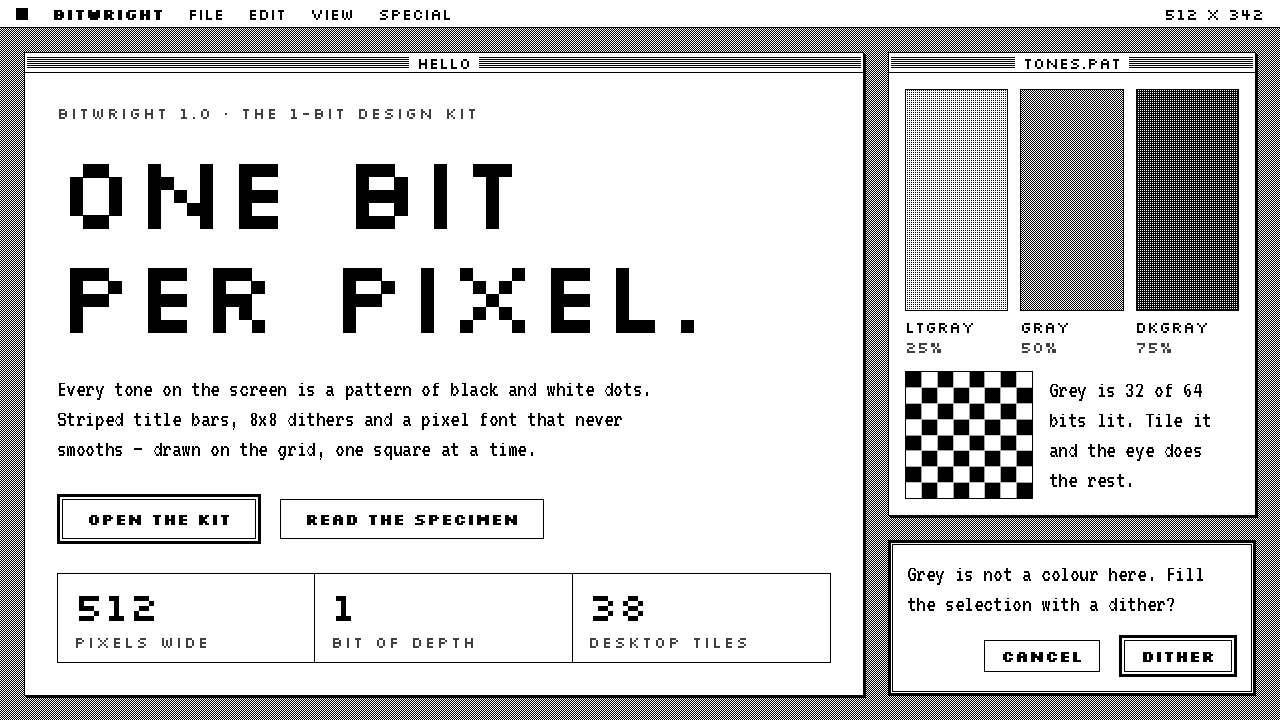 Macintosh 1984One bit per pixel, no grey. Black on white, striped title bars, dither fills…
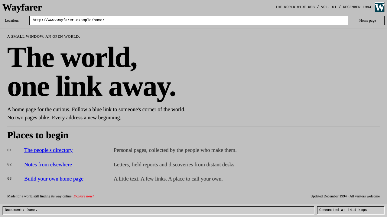 Netscape NavigatorThe web before polish. Grey bevels, blue underlined links and unadorned Times…
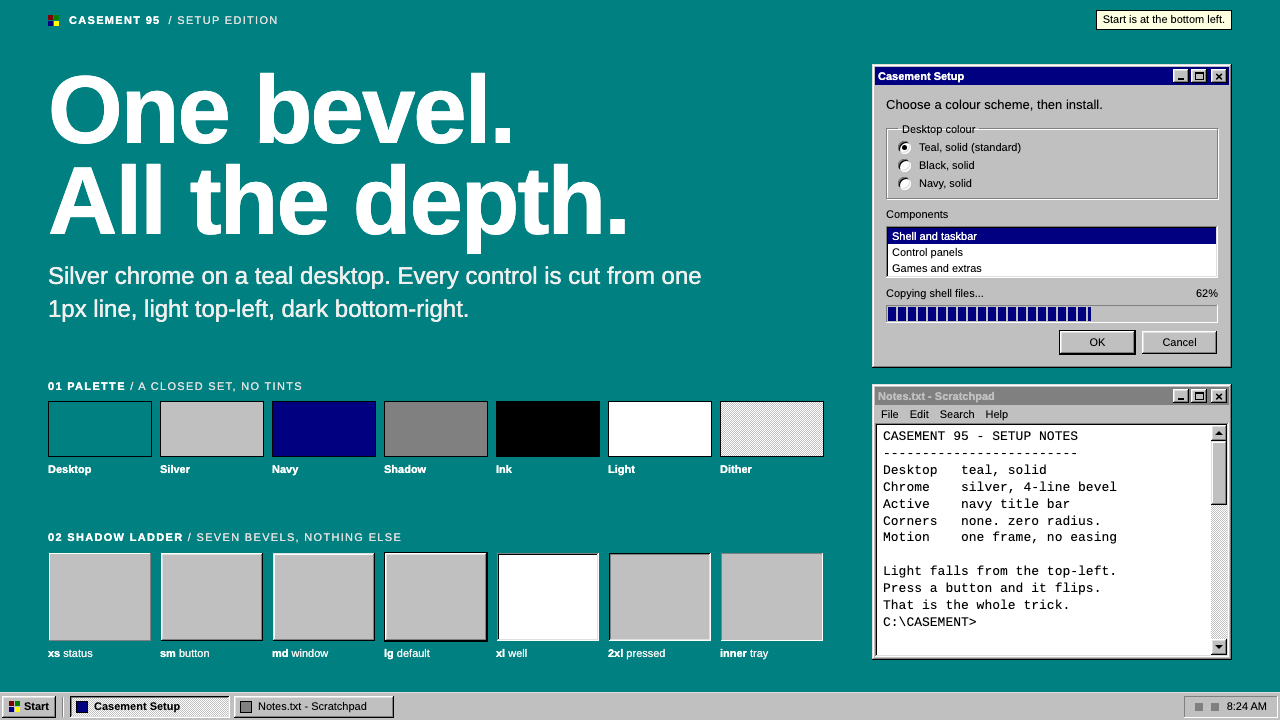 Windows 95One bevel does all the depth. Silver chrome and a navy title bar on a flat te…
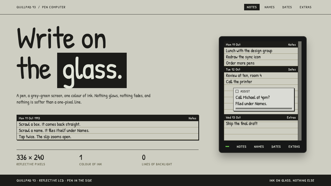 Apple NewtonOne ink, one glass. Pen strokes on grey-green LCD, ruled notes, dithered grey…
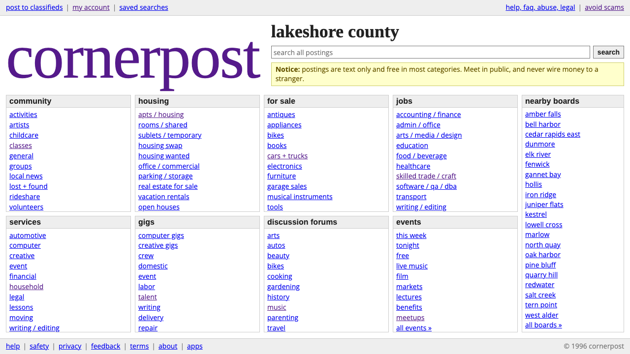 craigslistNothing designed, everything findable. Blue underlined links and a purple ser…
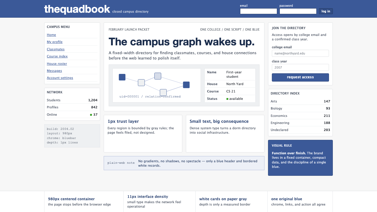 Facebook 2004Dorm-web austerity. Original blue, 980px grid, 1px borders, tiny Lucida Grand…