What is Apple Newton?
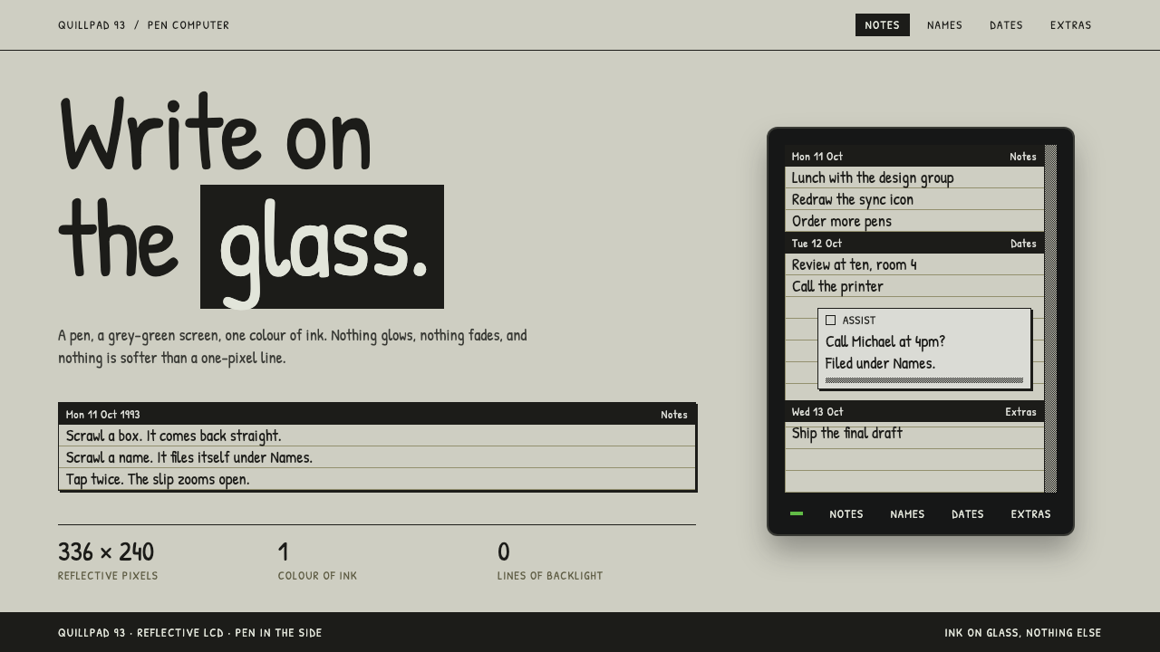
Apple Newton as a design style is one ink and one pane of glass: near-black pen strokes on a grey-green reflective screen, ruled note pages, dithered greys and a thick charcoal bezel.
Apple Newton in brief
The Apple Newton style recreates the screen of the Newton MessagePad, announced by Apple in August 1993 at Macworld in Boston, the device that helped make the term personal digital assistant familiar. Its display was a reflective monochrome liquid crystal panel with no backlight. Everything on it was a single dark ink on a grey-green ground, and the device was wrapped in a thick charcoal case with a pen that slid into the side.
The device was meant to be written on. You wrote directly onto the screen with the pen, and Newton OS converted the handwriting into text and straightened rough boxes into clean lines. Notes, dates and names were then filed into notebooks, calendars and address cards. The interface the design system copies is therefore a paper metaphor rendered in glass: lined note pages, dated divider bars and small floating slips.
The system keeps that one surface and refuses everything else. Every element is ink on LCD. Ruled notes are separated by dated bars. Floating panels are small slips with a thin black border and a close box. Grey is made with dithering, a fine pattern of dots, instead of gradients. Lettering is a hand-printed style kept small enough to read like bitmap text. There are no gradients, no transparency and no soft shadows. The whole screen is ink and glass.

Where does Apple Newton come from?
The Newton project began inside Apple in 1987 and took six years to reach the market. The MessagePad launched in August 1993 in Cupertino, California, and it was meant to open a new category of pocket computers driven by a pen instead of a keyboard. The source names several figures from the programme: John Sculley, Steve Capps, Larry Tesler, Michael Tchao and Stepan Pachikov. Sculley led Apple at the time, and Pachikov is associated with handwriting recognition, the technology on which the whole interface relied.
Newton OS 2.0 arrived in 1995 and improved the handwriting recognition and the overall interface. The line was discontinued in February 1998. In total, the product had a short but influential life, and its ideas, in particular the pen, the notebook metaphor and the PDA as a category, shaped what later handheld devices attempted.
The look of the system comes from the display itself. A reflective LCD without a backlight has a distinct physical character: the background is a muted grey-green, the ink is nearly black, and detail is limited by a coarse grid of pixels. Designers worked within those limits, using dither patterns for grey tones and small bitmap-like type. The design system treats these limits as a style rather than a handicap.
Two source movements meet here: early-1990s pen computing and the birth of the PDA category, together with the one-bit bitmap interfaces of the early Macintosh. From the early Macintosh comes the tradition of black marks on a light ground, crisp small windows with close boxes, and dithered patterns for shading. From pen computing comes the idea that the screen is a piece of paper that you write on, which explains the ruled pages and the hand-printed lettering.
What defines the Apple Newton look?
Grey-green glass
The ground is the muted grey-green of a reflective LCD. It is neither white nor truly grey, and it has a slightly greenish, paper-like quality. This one colour fills the entire screen and gives the style a distinctive, instantly recognisable warmth that no pure white or dark theme can match.
One ink
Every mark on the screen is the same near-black ink: text, lines, icons and borders. There is no second colour. Emphasis comes from placement, weight and inversion, not from hue. This restriction makes the interface feel unified and calm, and forces hierarchy to be built from structure.
Ruled note pages
Content sits on pages of horizontal rules, like lined paper. Entries are separated by dated bars, so a list of notes looks like a notebook with day headings. The rules give text a baseline to sit on and make the whole surface read as something written by hand.
Slips with a close box
Floating panels are small slips with a thin black border and a close box in the corner, the same idea as the early Macintosh window. They appear above the page without any shadow, so layering is shown only by the outline. A pop-up in this style looks like a paper note laid on the screen.
Dithered greys
Mid-tones are made with fine dot patterns instead of smooth gradients. Dithering gives areas of grey a visible grain that matches the coarse pixel grid. It is used for disabled states, selected rows, backgrounds of bars and subtle emphasis, and it should be applied in regular, tiny patterns.
Hand-printed small type
Lettering is a hand-printed style, set small enough to read like bitmap text on the LCD. It looks as if it were written by a pen, which echoes the device's handwriting recognition. Keeping type compact and consistent is what makes the screen feel like a single, coherent piece of paper.

Who shaped Apple Newton?
Sculley led Apple when the MessagePad was announced in August 1993 and is associated with the phrase personal digital assistant. As the executive face of the Newton, he framed it as the start of a new category of pocket computing.
Capps is listed among the key figures of the Newton project. He belongs to the group of Apple engineers and designers who worked on the system software and interface, the place where ruled pages, slips and pen-driven interaction took shape.
Tesler is another key figure named in the source. His name is tied to the long Apple tradition of human-centred interface thinking, which the Newton inherited from the early Macintosh: small windows, clear marks and straightforward interactions.
Tchao is named among the key figures of the Newton story. His role is part of the effort to explain a new kind of device to the public in 1993, when most people had never written on a screen.
Pachikov is listed in the source and is associated with handwriting recognition, the technology on which the device depended. The idea that a scrawl can become clean text is what gives the interface its character, and it is why the style looks like a conversation between pen and glass.
How do you use Apple Newton today?
In slides, the Newton style is ideal for decks about computing history, note-taking, handwriting, personal productivity and early digital devices. Use the grey-green ground for every slide, one dark ink for all text and lines, and a ruled page as the content area. A cover slide can be a single title written in the hand-printed face with a dated divider bar beneath it. Comparisons work well as lists of ruled entries, with dither used for the highlighted row.
On the web, it suits notebooks, journals, to-do lists, calendars, address books and any product centred on writing. Think of a note as a page of ruled lines with a date bar above it, and of a dialog as a slip with a close box. Because there is only one ink, hierarchy has to be built from spacing, inversion and rules, which makes it a good exercise in restraint for dashboards and lightweight tools.
For data presentation, use bars and lines in the single ink with dither patterns to separate series, rather than colours. A chart in this style should look like it was drawn on the LCD: simple marks, ruled axes and small hand-printed labels. It is both legible and distinctive, and it prints well in black and white.
In editorial and marketing work, the style is a powerful nostalgic signal for anything related to the early days of mobile computing, and equally good as a deliberately quiet look for a modern writing app or a personal site. Pair it with short, plain copy. The surface already has strong character, so the words should not need to compete with it.
The most common mistake is to soften it. Adding drop shadows, gradients, translucency or a bright accent colour immediately destroys the one-ink logic. Another common mistake is to set the type too large, which loses the bitmap feel, or to replace the dither with smooth tints. The strength of this style is that it accepts a small number of constraints completely, so every departure is noticeable.

Apple Newton — FAQ
What is the Apple Newton design style?
It recreates the screen of the 1993 Newton MessagePad: a reflective, unlit monochrome LCD with near-black ink on a grey-green ground, ruled note pages, dated divider bars, small slips with close boxes, dithered greys instead of gradients and small hand-printed type, all around a charcoal bezel.
Why is there only one ink colour?
Because the original display was monochrome. The style treats that limit as its identity: emphasis comes from position, weight, rules and inversion rather than hue. This restriction keeps the interface calm and unified, and it makes any extra colour stand out as a mistake.
What is dithering and why is it used?
Dithering means making a mid-tone with a fine pattern of dark dots instead of a smooth tint. On a screen that could only show ink or no ink, it was the way to suggest grey. In this style it is used for selected or disabled states and for subtle backgrounds, in place of gradients.
Which movements does it come from?
The source lists early-1990s pen computing, the birth of the PDA category, and the one-bit bitmap interfaces of the early Macintosh. Pen computing contributes the paper-and-ink metaphor, and the early Macintosh contributes small windows with close boxes and dithered shading.
Is it suitable for a modern product?
Yes, especially for writing, notes, journals and small personal tools, where its quiet and paper-like character is an asset. It is less suited to image-heavy or colourful products. Keep to the single ink, ruled structure and small type, and it will feel distinctive rather than merely retro.
Related design styles
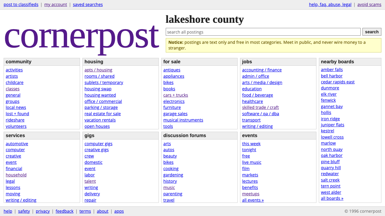 craigslistNothing designed, everything findable. Blue underlined links and a purple ser…
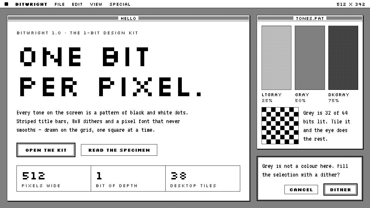 Macintosh 1984One bit per pixel, no grey. Black on white, striped title bars, dither fills…
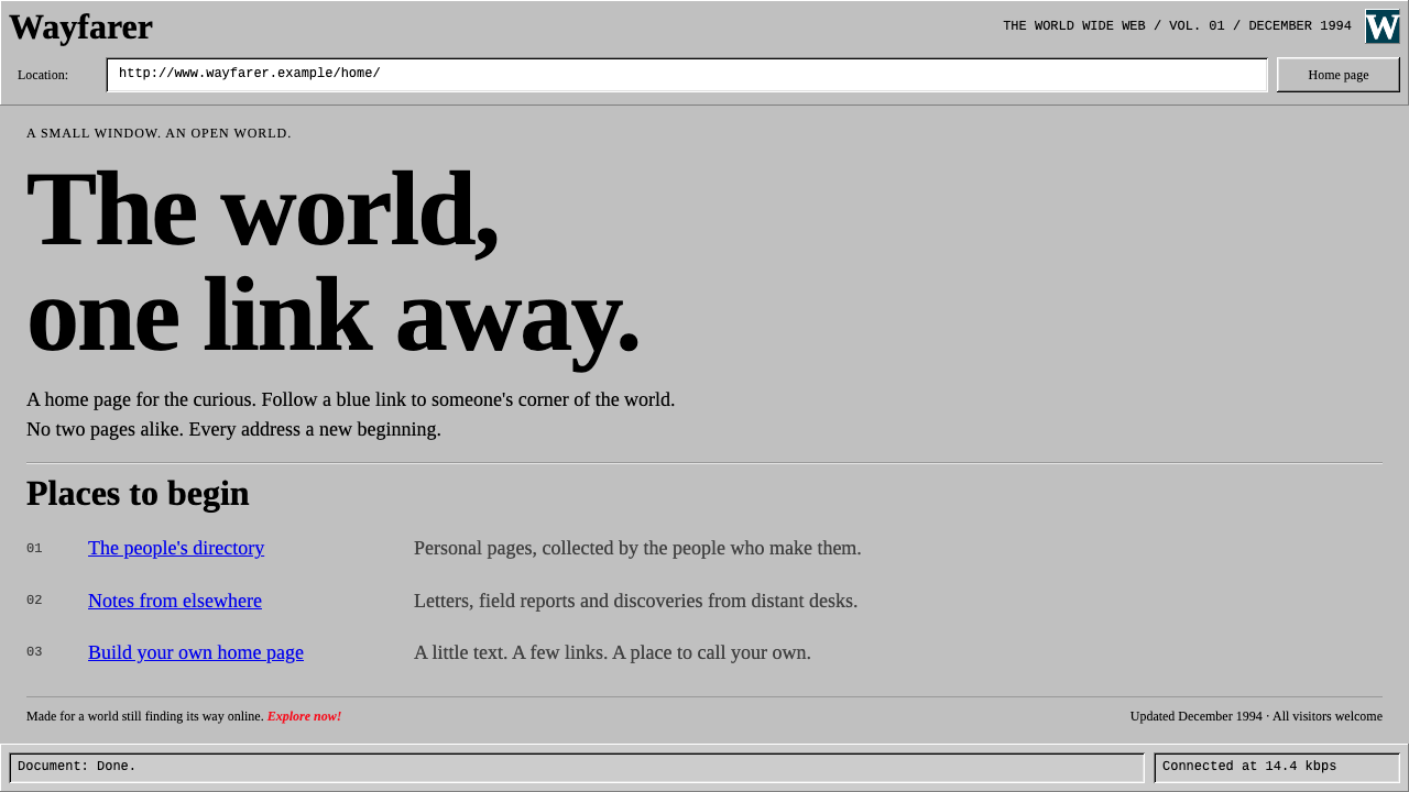 Netscape NavigatorThe web before polish. Grey bevels, blue underlined links and unadorned Times…
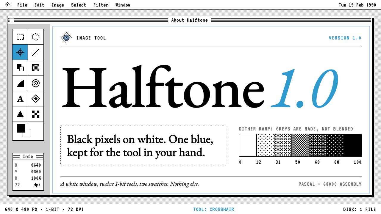 Photoshop 1.0One blue in a 1-bit world. Garamond wordmark, 1px frames, dithered greys, two…
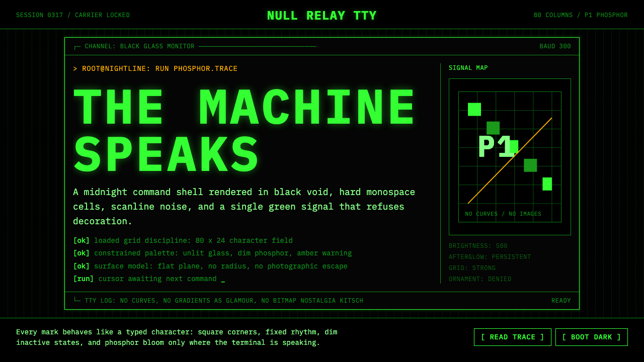 CLI Hacker Phosphor Green (1985)Pure terminal myth. Black glass, P1 green mono type, scanlines, and rigid 80-…
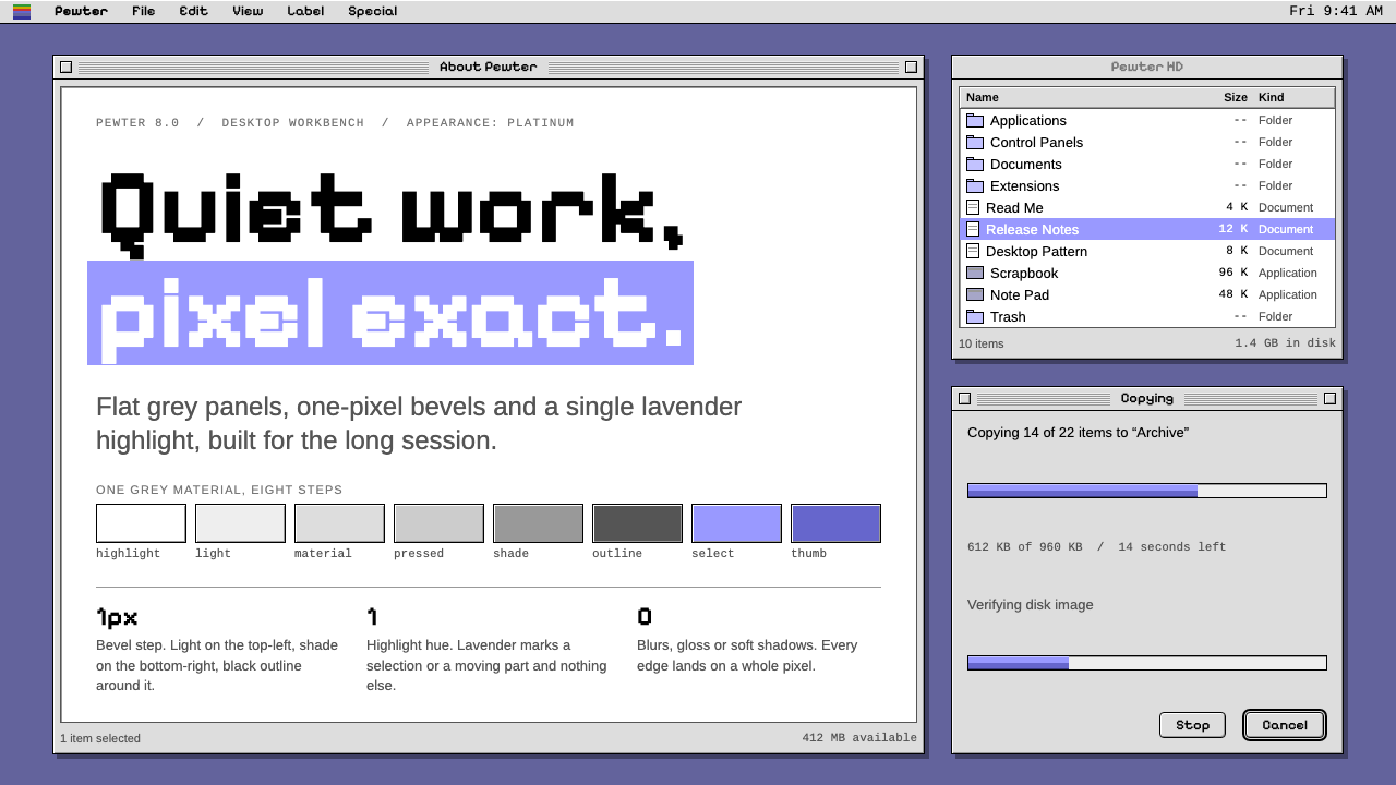 Mac OS PlatinumQuiet, exact, grey. 1px bevels on flat panels, pinstriped title bars, one lav…