What is Mac OS Platinum?
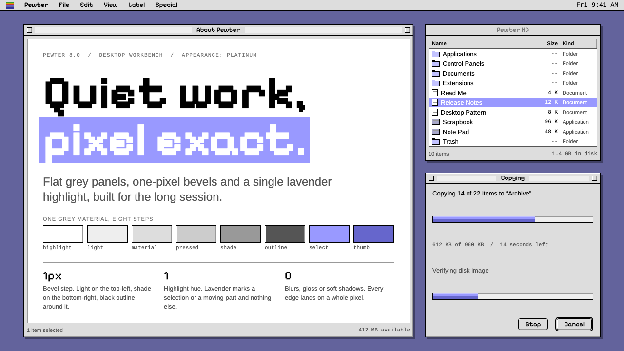
Platinum is quiet, exact and grey: flat panels with one-pixel bevels, pinstriped title bars and a single lavender highlight.
Mac OS Platinum in brief
Platinum is the grey, bevelled interface that Apple shipped with Mac OS 8 in July 1997 and kept through Mac OS 9. Every window, menu and button is a flat light-grey panel with a one-pixel step of light on its top and left edges and a step of shade on its bottom and right edges, all framed in black. The effect is a surface that appears slightly raised without any decoration.
Content areas stay white. Active title bars carry fine horizontal pinstripes. Colour appears in one place only, as lavender: menu highlights, selected text, scroll thumbs and progress bars. In the corner sits the six-colour rainbow Apple, and the Finder is the two-faced smiling icon.
The whole system is quiet, exact and pixel-aligned, and it was made for long working sessions. It suits tool-like interfaces where the user stays for hours and where nothing on the screen should demand attention for its own sake.

Where does Mac OS Platinum come from?
Mac OS 8 was released on 26 July 1997, and Platinum was its look. It carried on through Mac OS 9, up to Mac OS 9.2.2 in 2001, so the system is dated to 1997 through 2001. It came out of Cupertino, California, at a turbulent moment for Apple, when the company's leadership included Gil Amelio and Ellen Hancock and when Steve Jobs was returning to the company.
The look was originally prepared for Copland, the ambitious next-generation operating system that was never completed. When Copland was cancelled, the interface work was split out and used in Mac OS 8. The Copland Appearance Manager, which draws windows and controls centrally rather than leaving each application to do it, is what made Platinum consistent across the whole system. Because the drawing was handled in one place, themes became possible.
That theming ability led to the second movement recorded for this system: Kaleidoscope, a third-party tool that allowed users to replace the desktop's appearance. Its existence shows how seriously the Mac community took interface skins in the late 1990s, and Platinum is the sober, default alternative against which those skins were measured.
The third thread is the wider late-1990s greyscale bevelled desktop graphical interface. Across personal computers at the time, grey panels with raised and lowered edges were the shared vocabulary of the desktop. Platinum refined that vocabulary with restraint: thin bevels, fine pinstripes and a single accent hue, rather than the heavier chiselled look found elsewhere.
What defines the Mac OS Platinum look?
Color
Light grey for every panel, white for content and black for outlines and text. Colour appears only as lavender: menu highlights, selected text, scroll thumbs and progress bars. The six-colour rainbow Apple in the corner is the only multicolour moment. The restraint makes the one accent easy to find.
Bevels
Each panel carries a one-pixel step of light on its top and left edges and a one-pixel step of shade on its bottom and right edges, framed in black. The bevel is thin and exact, enough to say raised without creating depth theatre. Pressed states reverse the light and shade.
Pinstriped Title Bars
The active window's title bar is filled with fine horizontal stripes, while inactive windows fall back to plain grey. The stripes give a quiet texture and make the focused window easy to identify without colour or shadow.
Pixel Alignment
Every edge sits on a pixel boundary, and lines are exactly one pixel wide. Nothing is anti-aliased into a soft blur at the structural level. This exactness is the system's personality: it feels engineered rather than styled.
White Content
Documents, lists and text areas are white, so the grey chrome recedes and the user's work stands out. The interface behaves like a frame around content rather than a competitor to it.
Friendly Icons
The rainbow Apple and the two-faced smiling Finder icon add small moments of personality without breaking the grey calm. They are the human touch in an otherwise precise machine.

Who shaped Mac OS Platinum?
Apple's leader in the period when Platinum was developed and when Mac OS 8 was prepared. He is one of the key figures recorded for the system's origins.
A senior Apple executive of the same period, recorded among the key figures behind the company's operating-system direction at the time Platinum emerged.
Returned to Apple in the same period. Mac OS 8, released in July 1997, was the first major release of the operating system during that moment of change, and Platinum is its visual face.
How do you use Mac OS Platinum today?
Platinum is the style of calm, precise tools. It rewards projects that value legibility, consistency and long-session comfort over spectacle, and it carries a gentle nostalgia for the late-1990s desktop.
For presentation slides, a cover can be built as a single grey window on a plain ground, with a pinstriped title bar holding the title and a white content area for the subtitle. Content slides work as stacked windows with clear bevelled edges. Data slides suit this style well: white charts inside grey frames, lavender as the one highlight colour and black for text and lines.
For web interfaces, the style suits productivity tools, developer utilities, retro-themed projects and any product that wants an exacting, workmanlike tone. Use flat grey panels with thin light and dark edges, keep content areas white, make the lavender the sole accent for selection and progress, and keep control sizes consistent. Buttons should show a clear pressed state by reversing the bevel.
For editorial and marketing work, the look supports nostalgic features, technology histories and tool launches that want a recognisable late-1990s desktop mood. A page can be composed as a set of windows on a grey desktop, each with a pinstriped title bar, and the rainbow Apple or a smiling icon can serve as the single playful touch.
The most common mistake is to add soft shadows, gradients or rounded glass effects, which belong to later eras and break the flat, exact logic. Another is to scatter colour widely; Platinum only works when lavender is the one place the eye is invited to go.

Mac OS Platinum — FAQ
What was Platinum originally made for?
It was prepared for Copland, an ambitious next-generation system that was never completed. When Copland was cancelled, the interface work was used in Mac OS 8, and the Appearance Manager that draws windows and controls centrally became the backbone of the look.
Why is colour used so sparingly?
Because the interface is a frame for the user's work. Grey chrome and white content keep the screen calm for long sessions, and lavender is reserved for selection, highlights and progress, so that the eye always knows where the live thing is.
Is it a light or dark style?
It is a light style. Light grey panels, white content and black outlines are fundamental to the look, and the bevel logic of light on top-left and shade on bottom-right depends on that light base.
What is Kaleidoscope?
It is recorded as one of the movements around this system: a theming tool that let users replace the look of the desktop. It reflects how much the community cared about interface skins in the late 1990s, with Platinum as the sober default.
What projects suit this style best?
Productivity tools, developer utilities, retro-themed pages and technology histories. It is less suited to emotional consumer brands that need warmth, softness or visual drama.
Related design styles
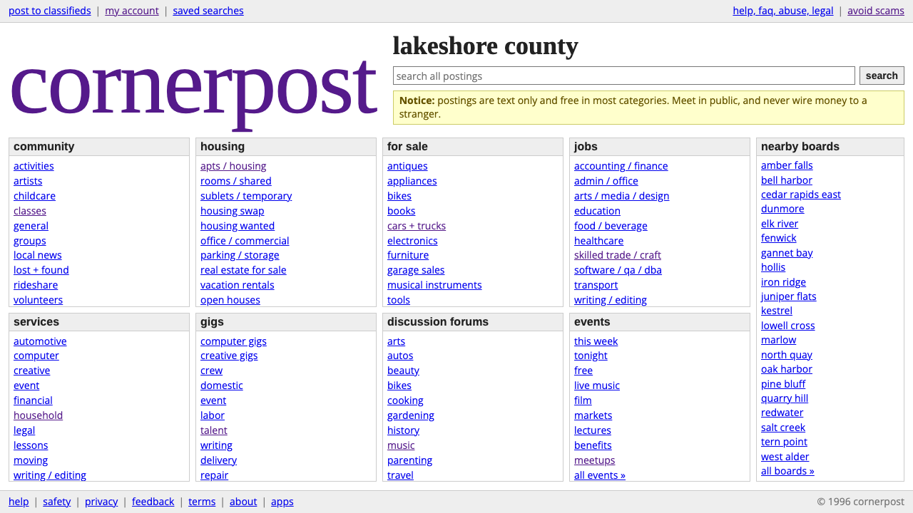 craigslistNothing designed, everything findable. Blue underlined links and a purple ser…
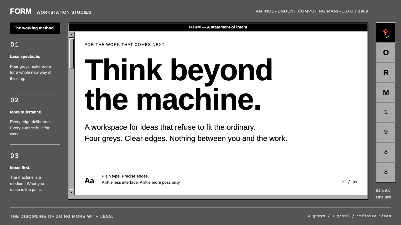 NeXTSTEPWorkstation discipline. Four greys, black title bars and one-pixel bevels kee…
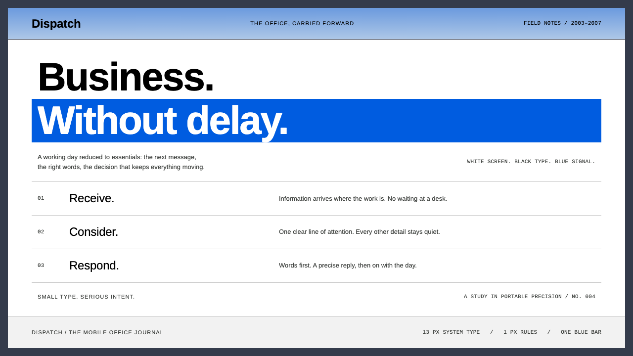 BlackBerryPortable precision. Dense black Arimo, white ruled rows and one decisive blue…
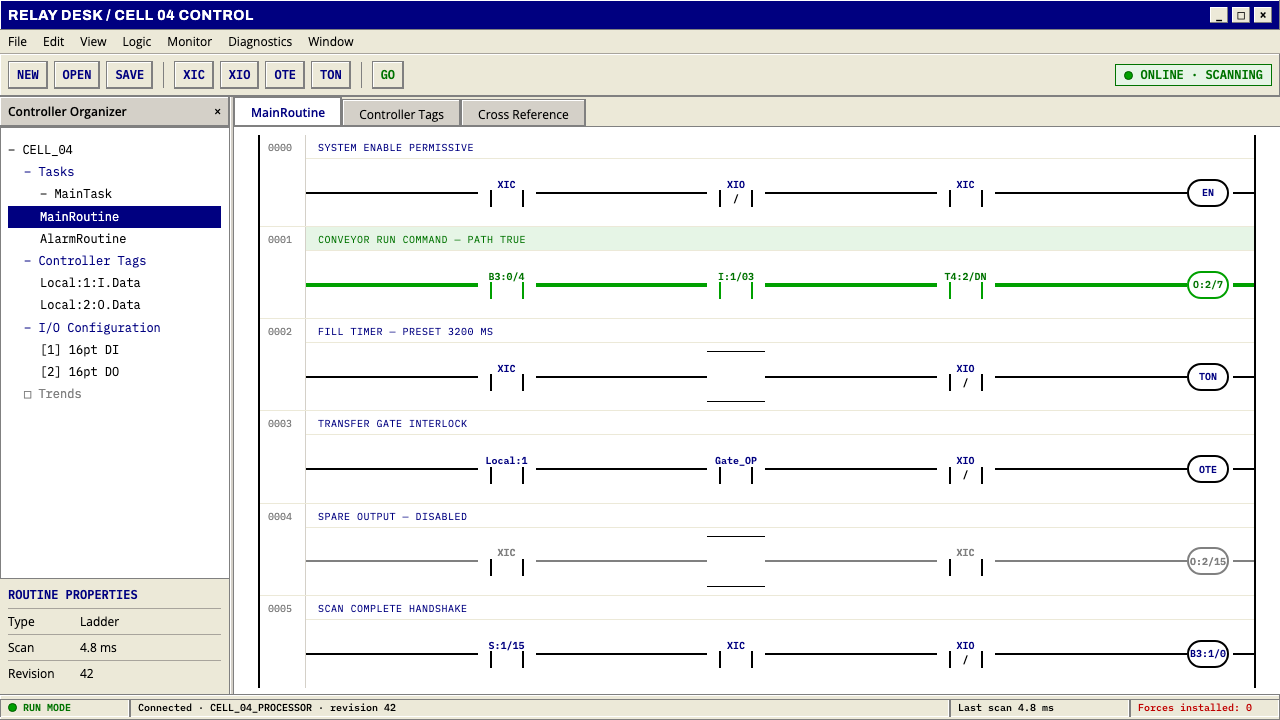 PLC Ladder LogicLogic made visible. Black rails and navy mnemonics turn green wherever the ci…
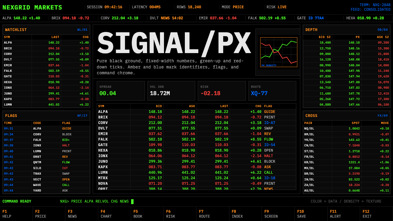 Financial Terminal MonoMaximum signal per pixel. Pure black, IBM Plex Mono, green-red ticks, amber-b…
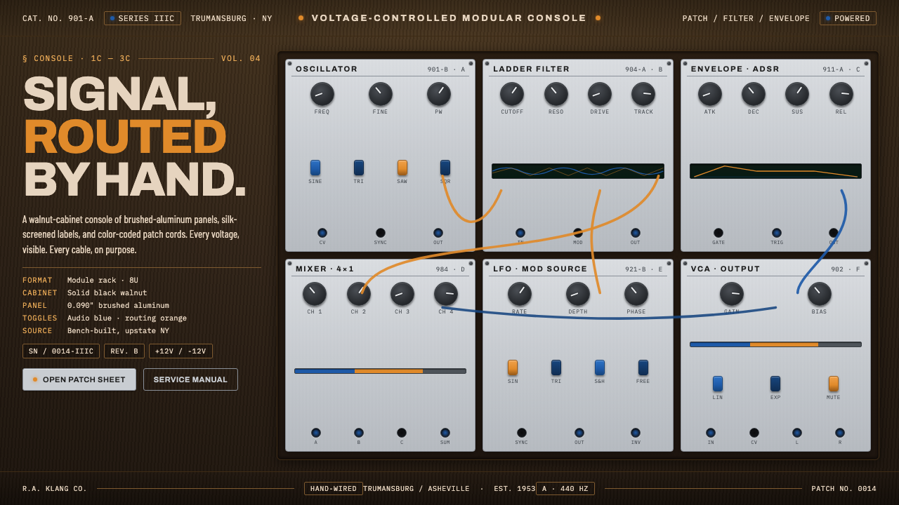 Moog Modular SynthWalnut cabinet, brushed-aluminum panels. Toggle-blue switches, orange patch c…