What is Philippe Starck?
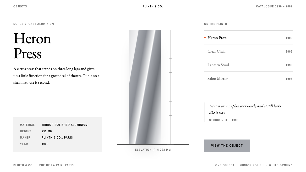
Philippe Starck as a design system: one object centred on white with room on every side, mirror-aluminium grey, a quiet serif title, and a single orange dot per view.
Philippe Starck in brief
Philippe Starck is a design style drawn from the way the French designer's objects are presented: a single thing, centred on a white ground, with generous room on every side. The two reference pieces are the Juicy Salif lemon squeezer, made for Alessi in 1990, and the Louis Ghost chair, made for Kartell in 2002. One is a polished aluminium creature on three slender legs; the other is a transparent plastic armchair that ghosts a classical silhouette.
The look is assembled from material cues. Mirror-polished aluminium supplies the grey, clear polycarbonate supplies the lightness, and the page behaves like a gallery plinth: the object is the subject and everything else steps back. Titles are set in a quiet serif in the Garamond manner, while captions are set in a narrow sans, in capitals, with open letter-spacing, like a label beside a museum piece.
Colour is almost absent. White and aluminium grey do nearly all the work, and orange or red appears once per view, as a link, a marker, or a single word, never as a field. The result is a gallery feeling that stays warm, a design that is confident enough to be quiet.

Where does Philippe Starck come from?
The style belongs to the 1990s and early 2000s, when designer objects entered mainstream retail. Starck, working in Paris, became one of the most recognisable names in this movement, and his collaborations with Italian manufacturers turned household things into talking points. The Juicy Salif, produced by Alessi at Crusinallo in northern Italy, is the best-known example: a kitchen tool that was also, unmistakably, a sculpture, and one that people displayed more often than they used.
Italy supplied the production culture. Alessi, based at Crusinallo, and Kartell, based near Milan, were companies that treated a designer's name as a creative signature and manufactured with a level of craft and technical ambition that made unusual forms possible. The relationship between a French designer and Italian makers is part of the style's genealogy: Paris sets the concept, northern Italy supplies the execution, and the object arrives in the world with the confidence of both.
The Louis Ghost, produced by Kartell in 2002, extends the story into another material. Rendering a historical armchair in clear polycarbonate preserved the proportion and decoration of the classical form while removing its visual weight. This is a postmodern gesture in the manner of the 1990s: quote the past, but change the material, and let the joke and the elegance coexist. It also belongs to a wider idea of democratic design in plastic, with well-designed objects at accessible prices.
Three movements frame it: 1990s postmodern product design, the Italian design-brand object, and democratic design in plastic. What links them is the idea that a mass-produced thing can carry personality and wit. The Starck presentation style, one object on white, is the logical visual outcome. It is the image language of a retail world in which the object is a character and the photograph is its portrait.
What defines the Philippe Starck look?
Color
White and mirror-aluminium grey are the whole palette. The greys are cool and slightly bright, like polished metal catching a studio light. A single orange or red appears once per view, as a link, a marker, or a single word, never as a field or a fill. The restraint is what lets one small dot feel like a signature.
Typography
Two voices carry everything. Titles use a quiet serif in the Garamond tradition, with a classical, unhurried rhythm. Captions and labels use a narrow sans in capitals with open letter-spacing, like a museum label. The pairing combines old and new, which is exactly the temperament of the objects it describes.
Space
Space is the main material. A page typically holds one object and very little else, centred, with wide margins and a large white field around it. The proportion of empty to occupied area is deliberately high. Crowding the page would break the premise that the object deserves undivided attention.
Surface and light
Surfaces imitate polished metal and clear plastic: smooth gradients are sparing, reflections are soft, and shadows are faint, as under a gallery spotlight. Panels are usually unframed. Where a boundary is needed, a hairline or a change of tone is enough. The overall impression is lightness and polish rather than weight.
Imagery
Photography is object portraiture: one product isolated on a white sweep, lit evenly, shot with a long and respectful distance. Lifestyle scenes and crowded compositions are avoided. If a second object appears, it is positioned so the page still reads as a single, balanced composition.
Shape language
Interface shapes echo the objects: slender lines, soft curves, and the occasional teardrop or arc. Buttons are understated and often text-only, underlined or marked by the single orange dot. There are no thick borders or heavy blocks. Elegance here means removing everything the object does not need.
Tone of voice
Copy is short, a little wry, and confident. A product is named, one fact is given, and the page stops. The humour of the originals, a lemon squeezer that looks like a creature, is allowed to appear but only as a single line. Overexplaining would undermine the quiet authority of the presentation.

Who shaped Philippe Starck?
The French designer, based in Paris, whose objects and presentation define this style. His Juicy Salif of 1990 and Louis Ghost of 2002 show his habit of turning an everyday object into a talking point with one clear gesture.
The Italian housewares manufacturer based at Crusinallo that produced the Juicy Salif in 1990. Its model of working with named designers made an everyday kitchen tool into a collectable object.
The plastics furniture maker near Milan that produced the Louis Ghost in 2002. Its mastery of moulded and transparent polycarbonate made the idea of a ghostly classical chair realisable and affordable.
How do you use Philippe Starck today?
For slides, this style is ideal for product reveals, portfolio presentations, brand introductions, and design talks. A cover places one object or one word centrally on white, with a serif title and a small capital caption beneath. Content slides repeat the discipline: one image, one short line, and wide margins. The single orange dot can mark the slide's key word or the next section.
For data slides, resist the temptation to fill the space. Show one number or one chart per slide, set in aluminium greys, with the orange applied to the single value that matters. Labels use the narrow capital sans and sit close to the data. If a slide needs a table, keep it to a few rows so the white field remains the dominant element.
For web interfaces, the style suits ecommerce product pages, portfolios, gallery sites, and boutique brand pages. Product pages put the object at the centre, with details in small captions below and a text-only call to action. Navigation is minimal, often a short row of capital labels. It is most effective where the product itself is photogenic and the catalogue is small enough to be curated.
For editorial and marketing work, think of a gallery catalogue or a museum label. Announcements, lookbooks, and launch emails can place one image per section, a serif headline, and a single line of copy. Write with confidence and a touch of wit, and let the photographs do the persuading. The style rewards editing: if a sentence can go, it should.
The usual mistake is to treat the orange as a colour theme and spread it over headings, buttons, and backgrounds; the single dot then loses its force. Another is to fill the white with extra decoration, badges, or banners, which turns a gallery into a shop window. Keep the object central, the grey cool, the type quiet, and the dot rare.

Philippe Starck — FAQ
What is this style based on?
It is based on how Philippe Starck's objects are shown: one thing, centred on white, with room on every side. The reference pieces are the Juicy Salif lemon squeezer for Alessi from 1990 and the Louis Ghost chair for Kartell from 2002. The style borrows their materials, mirror aluminium and clear plastic, as its palette and surface language.
Why does orange appear only once per view?
The single dot works like a signature or a pointer. Because everything else is white and grey, one orange or red mark immediately says look here. If it is repeated, it stops being a signal and becomes a theme, which destroys the quiet confidence the style depends on.
How is it different from generic minimalism?
Generic minimalism removes things; this style stages one thing. Its materials are specific, polished aluminium and clear plastic, its type pairs a classical serif with a narrow capital sans, and its rhythm is that of a gallery or museum label. There is also an element of wit that purely austere minimalism lacks.
Which projects suit it best?
Product pages, portfolios, gallery and boutique sites, brand introductions, and design presentations, especially where the product is visually striking and the collection is small enough to be curated. It works less well for dense catalogues, dashboards, or content-heavy sites where the white space cannot be afforded.
What should I avoid when applying it?
Avoid spreading the accent colour, filling the white with extra ornament, and using heavy borders or thick blocks. Do not crowd the page with several objects of equal weight. Keep one subject, a serif title, a small capital caption, cool aluminium greys, and a single dot of orange.
Related design styles
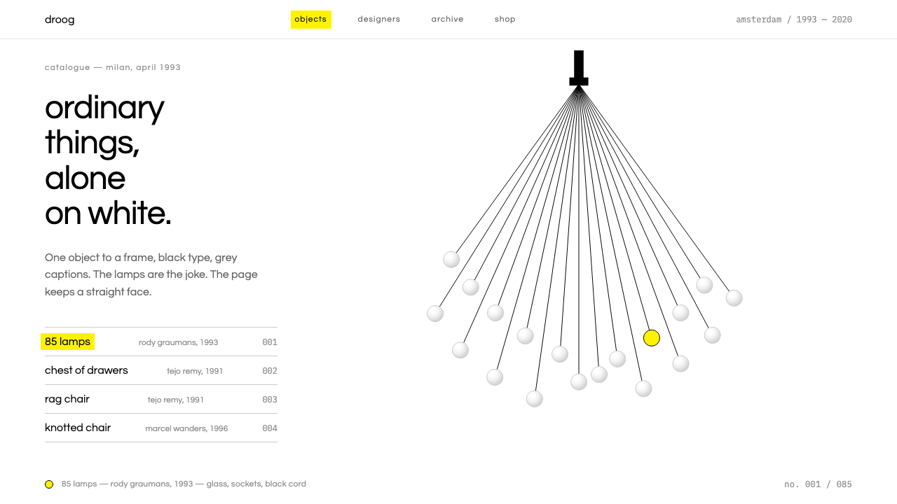 DroogDeadpan objects alone on white. Black type, grey captions, one yellow highlig…
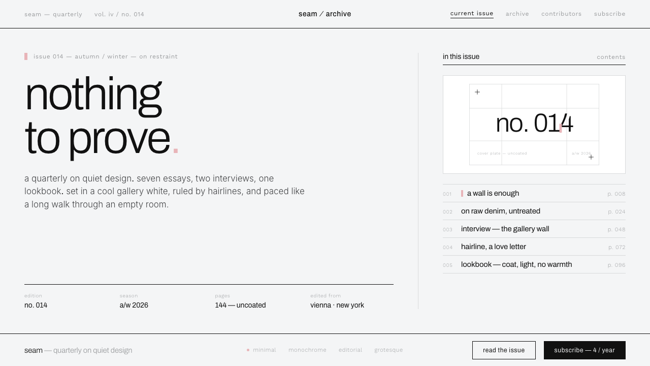 Helmut Lang MinimalismNothing to prove. Cool gallery white, 1px black hairlines, lowercase Archivo…
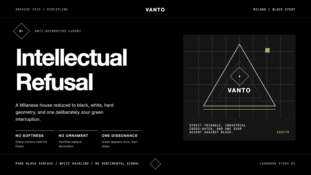 Prada Milan MinimalistLuxury refuses ornament. Pure black, austere sans, and one sour green hairlin…
 Wallpaper* ArchitecturePhotography does the speaking. Gallery-white grid, Inter captions, and hairli…
 Architect Monograph (Black Edition)Architecture stays sovereign. Matte black, Helvetica caps, hairline grids, bl…
 COS Gallery MinimalSilence has structure. Cool gallery white, Archivo uppercase, and concrete-gr…