What is Stamp Album?
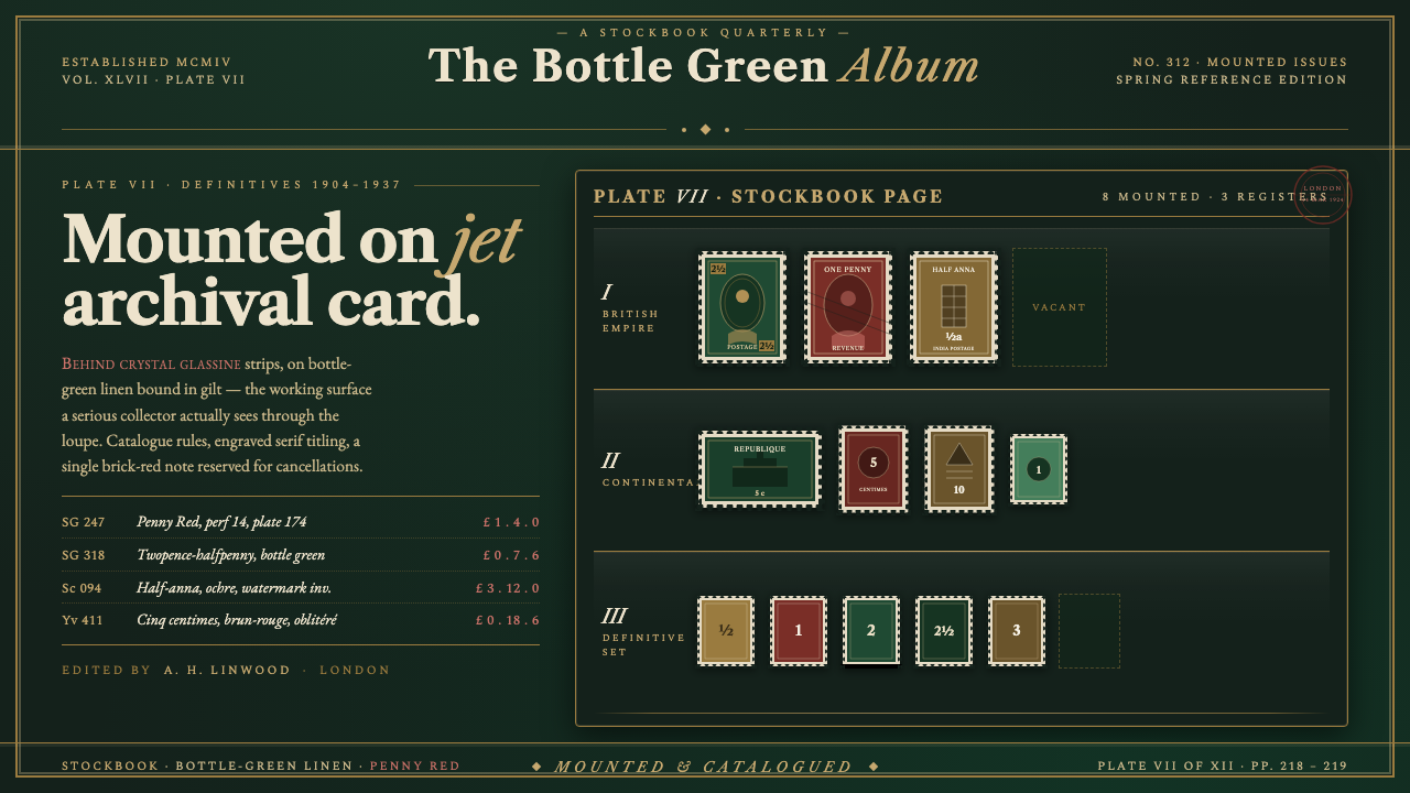
Stamp Album turns the collector’s dark archival page into an interface of bottle-green linen, gilt rules, and small treasures held beneath crystal strips.
Stamp Album in brief
Stamp Album recreates the working surface a collector sees when opening a serious stockbook: a near-black page with a bottle-green cast, dense enough to make every mounted stamp feel deliberate. Perforated pieces sit in measured rows behind clear glassine strips, while fine gilt rules divide the page into catalogue-like fields. The atmosphere is not nostalgic paper stationery. It is archival equipment: dark card, protective layers, careful indexing, and the quiet concentration of looking closely.
Its reference world is early-twentieth-century Western European philately, shaped by Stanley Gibbons catalogues, SAFE and Prinz stockbooks, brass loupes, and gilt-stamped serif titling. The visual vocabulary combines the collector’s practical apparatus with the authority of printed catalogues. A page feels organized before it feels decorative. Rules establish sequence, labels establish provenance, and the objects themselves remain the reason the page exists.
As a digital style, Stamp Album is an intentionally dark archival system. Bottle-green linen provides the ground; gilt lines define tables, borders, and divisions; brick-red definitive stamps create concentrated focal points; engraved serif letterforms give headings and records their documentary gravity. The page must never become cream correspondence paper. Its essential image is black mounting card, with information and artifacts carefully set upon it.
Where does Stamp Album come from?
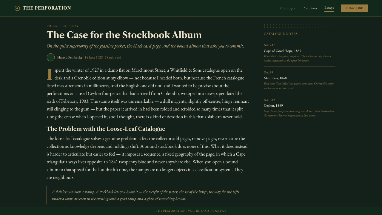
Stamp Album belongs to the golden age of philately and the printed stamp catalogue, spanning 1900–1950. In Western Europe, especially Britain and the Continent, the stamp album was not merely a decorative book for souvenirs. It was a working archive. Its dark pages gave mounted stamps contrast, while the strip or pocket created a practical boundary between the object, the hand, and the page beneath.
Organized philately supplied the style’s logic of classification. A stamp is small, but its placement asks for order: rows, groups, ruled divisions, concise labels, and room for comparison. The resulting visual language is deeply editorial. It does not seek the open-ended abundance of a scrapbook; it creates a controlled field in which each item can be inspected, named, and positioned in relation to its neighbors.
Archival album and stockbook manufacture gave that order a material character. SAFE and Prinz appear in the source world as makers associated with the collector’s stockbook, where crystal glassine strips hold stamps against jet archival card. The protective strip is central to the aesthetic because it introduces a restrained layer of depth. Objects are visible but contained, displayed but not casually exposed.
Printed catalogues gave the system its typographic authority. Stanley Gibbons and J.W. Scott stand in the source material alongside engraved catalogue typography, a tradition of serif titling, ruled tables, and compact descriptive records. Stamp Album translates those cues into an interface language. Its decorative richness comes from cataloguing, engraving, material contrast, and the gleam of gilt rather than from ornamental excess.
What defines the Stamp Album look?
Archival Darkness
The ground is near-black with a bottle-green undertone, recalling archival mounting card rather than a screen filled with generic dark gray. It should feel absorbent and weighty, allowing stamps, gilt rules, and pale text to emerge with the concentration of objects viewed under a loupe. Empty space remains dark card, not blank paper.
Linen Ground
Bottle-green linen supplies tactile character without turning the page into a theatrical textile sample. Its presence is sensed more than announced: a muted woven irregularity beneath the catalogue system. The texture should support the fiction of a bound stockbook and never compete with the small, precise objects placed above it.
Gilt Catalogue Rules
Fine gilt rules organize the page as a catalogue table and carry much of its refinement. They frame groups, establish columns, and separate notes without becoming loud borders. Gold is not a broad fill or a luxury flourish here; it is the disciplined glint of indexing, binding, and printed reference material.
Crystal Strips
Clear glassine strips are the style’s signature depth device. They imply that an item has been placed, protected, and held in a specific slot. Any transparency should remain crisp and restrained, like a physical protective layer over a stamp, rather than becoming a glossy glass-panel effect. The strip makes containment visible.
Brick-Red Definitives
Brick red is the concentrated accent, evoking the definitive stamp described in the source material. It works best as a small field of value within the dark page: a stamp face, a selected record, a seal-like marker, or a carefully limited signal. Its power comes from rarity and contrast, not from covering the interface.
Engraved Serif Records
Serif titling should suggest catalogue printing and engraving: composed, compact, and assured. Headings carry the dignity of a gilt-stamped volume, while descriptive text behaves like a record in a ruled table. Typography should make naming, sorting, and provenance feel ceremonial enough for a collection, yet practical enough for repeated consultation.
Who shaped Stamp Album?
Stanley Gibbons anchors the style’s association with the printed stamp catalogue. In Stamp Album, that reference appears through gilt-stamped serif titling, compact record structures, and the sense that every object belongs to a larger classified system. The name is useful not as a logo treatment, but as a cue for documentary authority.
J.W. Scott appears in the source world of printed catalogues and supports the style’s editorial side. Its relevance is the visual discipline of listing: concise labels, repeated fields, clear divisions, and an interface that rewards comparison. It reinforces that Stamp Album is as much about reference and arrangement as it is about collectible imagery.
SAFE is associated here with archival album and stockbook manufacture. Its contribution to the visual language is material rather than illustrative: the sense of a manufactured page built to store, preserve, and revisit small artifacts. Dark mounting card and protective strip logic should therefore feel functional, not like decorative stage dressing.
Prinz belongs to the stockbook reference set that defines Stamp Album’s collector-facing surface. It helps locate the style in a practical culture of ordered placement beneath strips, rather than in a generalized vintage mood. The resulting interface should feel handled, indexed, and cared for, even when it contains contemporary content.
How do you use Stamp Album today?
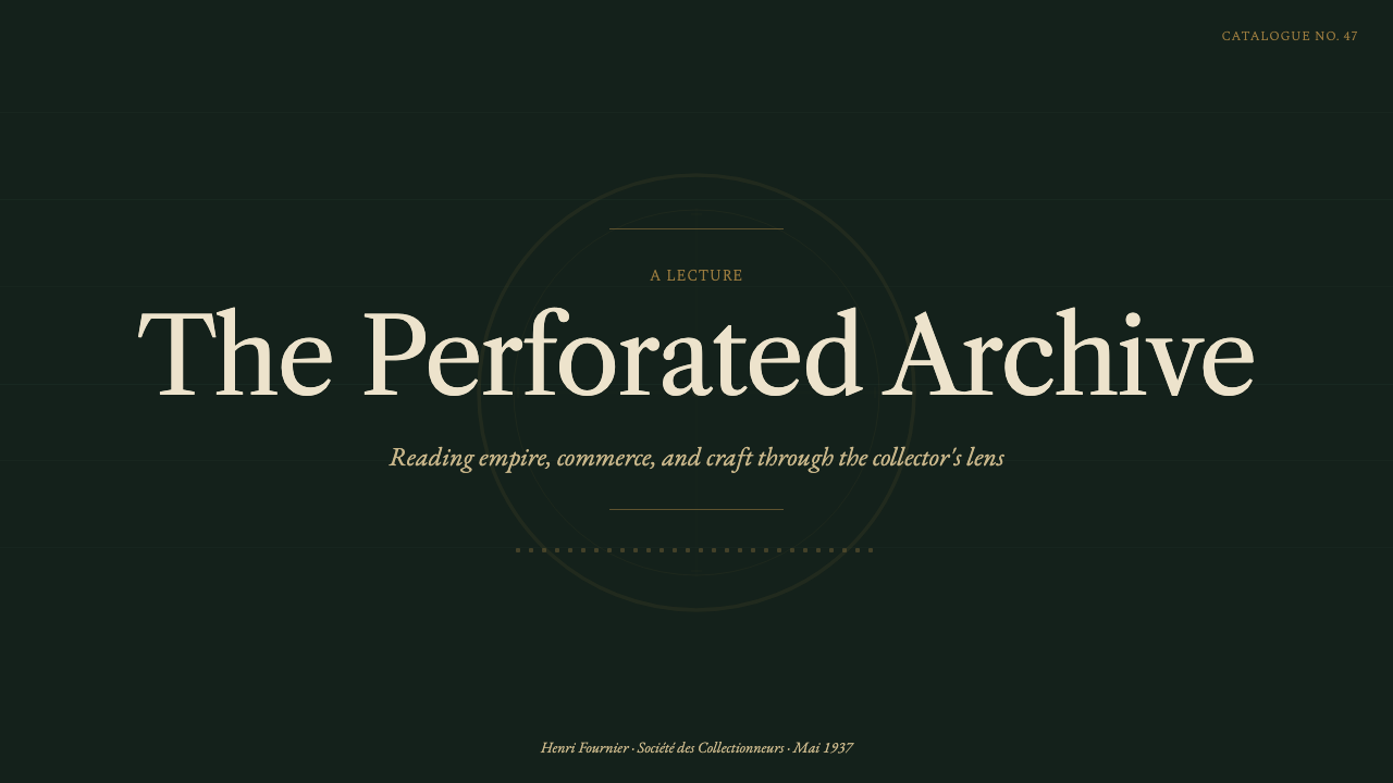
For presentation covers, treat the slide as the face of a bound archival volume. Let the bottle-green dark field dominate, use a serif title with the reserve of gilt-stamped titling, and introduce one contained stamp-like image or brick-red focal element. The cover should promise a catalogue to be opened, not a dramatic black poster. On content slides, use fine gilt rules to create calm record fields, keeping headings, notes, and images visibly assigned to their own compartments.
For data slides, the style is strongest when the data is treated as a catalogue entry rather than a spectacle. Organize metrics in ruled tables, grouped rows, and comparison fields that echo a stockbook page. A selected value may take the brick-red accent; a key boundary may receive gilt emphasis. Avoid treating every data series as a stamp, however. The archival metaphor works when it clarifies a collection of evidence, not when it turns a chart into costume.
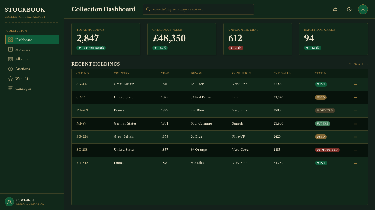
For web interfaces, Stamp Album suits dashboards, inventory views, libraries, archives, and pricing pages whose product value depends on trusted records or carefully differentiated offerings. Use the dark green linen ground as the continuous field, then let panels behave like cards or mounted compartments on that field. Navigation can borrow the cadence of catalogue sections, with compact serif labels and gilt separators guiding movement through a dense information space.
Editorial and marketing work benefits from the style’s built-in sense of rarity and stewardship. An article can begin with a title block that resembles a volume label, then move through disciplined sections divided by fine rules. A campaign page can present features as curated specimens, each with a short inscription and a protective-frame treatment. Images should be cropped and positioned like artifacts under strips, so their value comes from selection and context rather than from oversized visual noise.
The common mistake is making Stamp Album merely a dark interface with gold decoration. That loses the logic of the stockbook. The style needs containment, repeated cataloguing structure, a convincingly deep card-like ground, and restrained accents. Do not replace its near-black archival page with cream paper, flood every component with gilt, or scatter brick red across unrelated controls. The best applications preserve the hierarchy: card first, catalogue second, object third, ornament last.
Stamp Album — FAQ
Is Stamp Album simply a vintage dark theme?
No. Its darkness has a specific material role: it is the black archival card on which stamps are mounted. The bottle-green cast, crystal-strip containment, catalogue rules, and engraved serif records all support that surface. Remove the archival logic and the result becomes a generic luxury-dark treatment rather than Stamp Album.
Can the style use light paper backgrounds?
The defining source image says no: the page is never cream paper, but the black card on which stamps are mounted. Pale material can appear as a stamp face, a text field, or a contained artifact, but it should not replace the dark bottle-green archival ground as the page’s governing surface.
How should photography or product imagery appear?
Treat imagery as an artifact in a collection. Crop it deliberately, give it a defined compartment, and use a crystal-strip or mounted-card relationship to make placement legible. The image should feel selected, indexed, and protected. Full-bleed visual drama can work only when it does not erase the page’s archival structure.
Where does Stamp Album work best?
It is strongest where curation, provenance, scarcity, comparison, or careful record-keeping are meaningful product values. Archives, collections, inventories, research dashboards, editorial features, and differentiated pricing pages can all benefit from its orderly authority. It is less natural for interfaces whose central promise is carefree speed, broad friendliness, or bright spontaneity.
What is the quickest way to make the style feel inauthentic?
Using gold and dark green without the stockbook’s structure is the quickest failure. Oversized gilding, uncontained floating objects, glossy panels, and random red accents turn the reference into costume. Keep the page dark and card-like, make divisions useful, reserve red for meaningful objects, and let every visual layer imply preservation and classification.
Related design styles
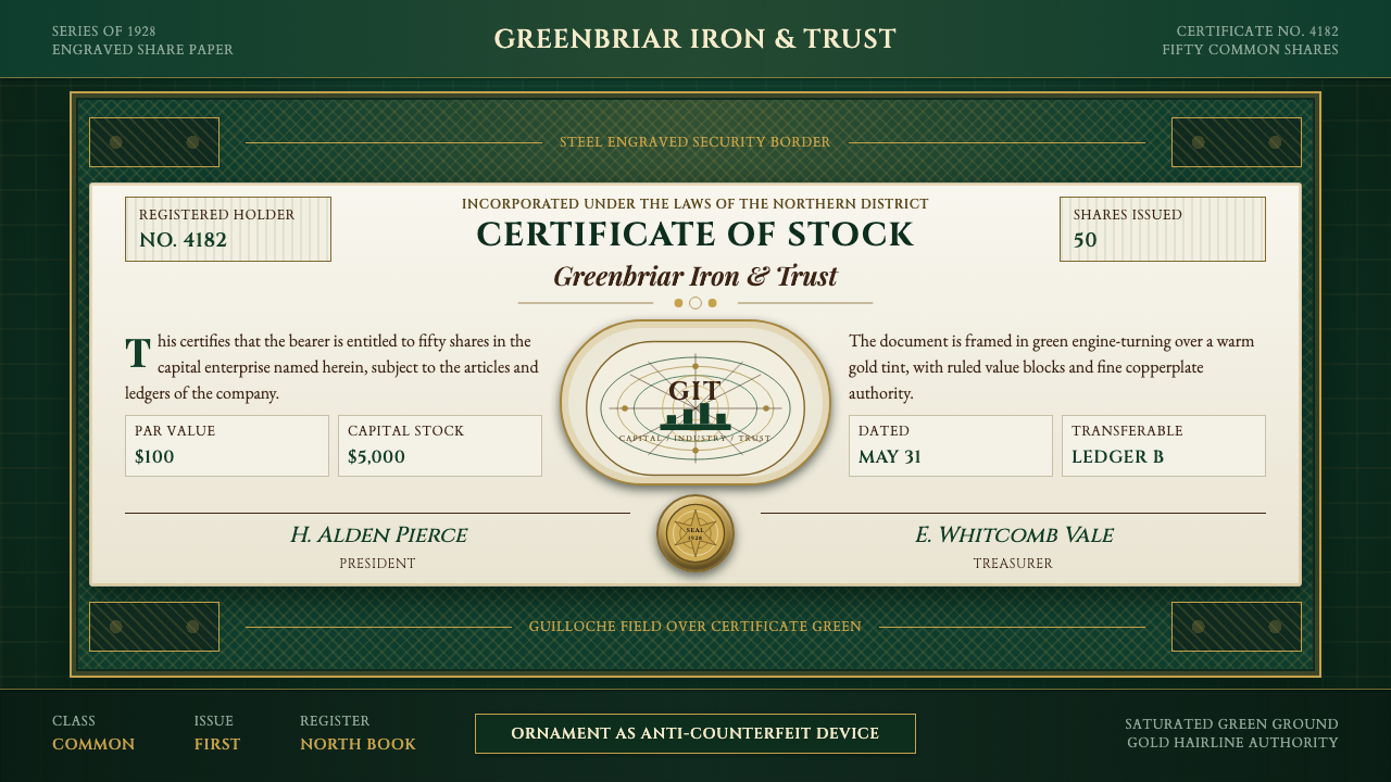 Stock CertificateCapital made ceremonial. Certificate green, gold hairlines, and guilloche bor…
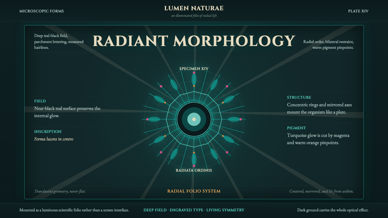 Haeckel KunstformenLuminous symmetry. Teal-black ground, Cinzel capitals, and radial turquoise s…
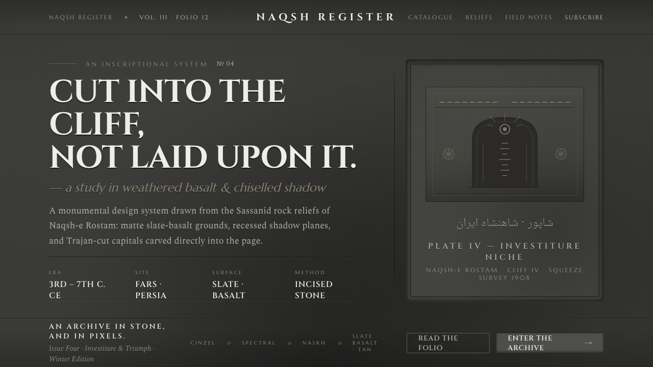 Iranian Dark Stone ReliefCarved into the cliff, not laid upon it. Slate-basalt grays, inset shadows, T…
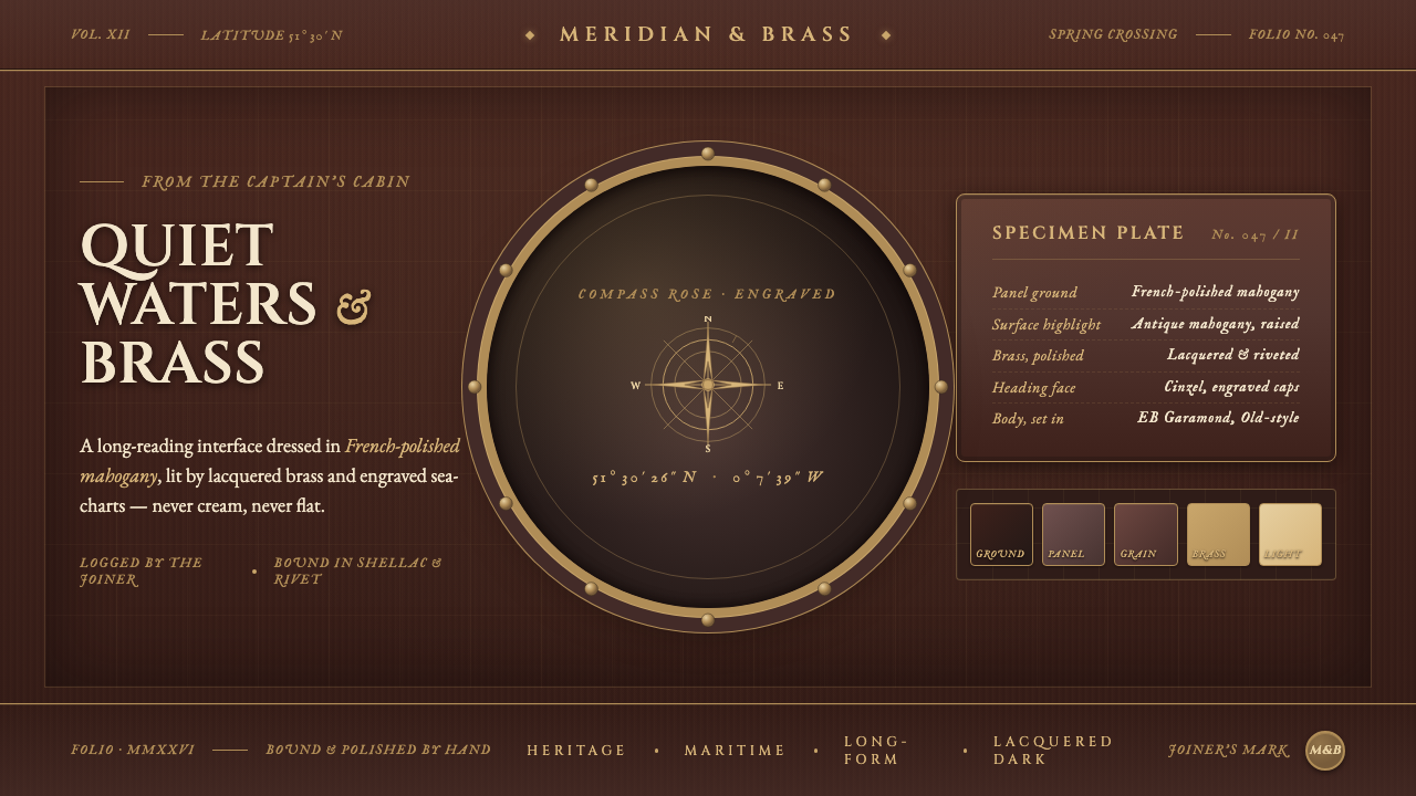 Mahogany Ship CabinPre-1900 maritime luxury. Mahogany panels, brass portholes, Cinzel caps over…
 Togolese Vodun Fa DivinationSacred clutter speaks. Shrine-black layers, chalk marks, and palm-oil red bui…
 Vintage Star ChartScholarly night, gilded. Cinzel caps orbit gold grids and magnitude stars.