What is Pewter & Tin Craft?
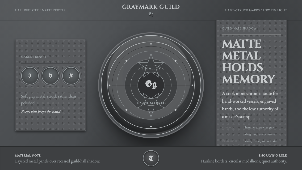
Pewter & Tin Craft chooses dignity over shine — matte metal gray, hand-hammered surfaces, and a guild stamp that answers for every object it marks.
Pewter & Tin Craft in brief
Pewter & Tin Craft is a design system drawn from the muted material world of medieval and guild-era tin-alloy tableware — tankards, chargers, and plates used across households and taverns for centuries before ceramics and glass displaced them. The vocabulary is entirely metallic but deliberately unglamorous: a cool, matte pewter-gray that reflects light softly rather than throwing it back in a sharp glare, closer to the sheen of a well-used utensil than a polished mirror.
The system treats craftsmanship marks as its primary ornament rather than applying decoration on top of the material. A pewterer's registered touchmark — a small stamped symbol pressed into the base or handle of a piece — and banded engraved lines running around a vessel's body stand in for the floral borders or gilding one might expect from finer tableware. These marks are functional first: they identified who made an object and vouched for its quality, in an era when pewter's tin-and-lead alloy content genuinely varied and needed policing.
Surfaces throughout the system read as hand-worked rather than machine-finished. Highlights are restrained — small, soft glints of tin rather than the hard specular flash of chrome or polished silver — and slight irregularities in surface and form are treated as evidence of the hammer rather than as flaws to be smoothed away. The overall effect is quiet authority: an object that doesn't need brightness to prove it was made carefully.
Where does Pewter & Tin Craft come from?
Pewter is an alloy built mainly from tin, hardened with small amounts of copper, antimony, or bismuth; historically, cheaper grades — sometimes called 'lay' pewter — also included lead, which was gradually phased out as its toxicity became understood. From the medieval period through the eighteenth century, pewter was the dominant material for everyday tableware across much of Europe, prized as an affordable substitute for silver: durable enough for daily use in a tavern or household, but far cheaper to produce and own.
The craft was tightly organized around guild structures that regulated quality and protected reputation. In London, the Worshipful Company of Pewterers — one of the historic livery companies — required every pewterer to register a personal touchmark, a distinctive symbol stamped into finished pieces and recorded on official touch-plates kept at the guild hall. A buyer could trace a stamped tankard back to its maker, and the guild could hold a pewterer accountable if their alloy or workmanship fell short. Similar structures existed across German-speaking lands, where Zinngiesser (tin-founder) guilds performed the same regulatory and quality-assurance role.
The objects themselves were built for function first. A tankard needed a handle sturdy enough for daily gripping and a body that wouldn't dent under ordinary tavern use; a charger needed to be large, flat, and stable enough to serve a joint of meat at table. Decoration, where it appeared at all, tended toward banded reeding — shallow parallel grooves turned into the metal on a lathe — rather than applied ornament, because pewter's relatively soft surface didn't reward fine raised relief the way silver or gold could.
Pewter's dominance faded from the eighteenth century onward as cheaper, more colorful ceramic tableware — creamware and its successors — became widely available, and later as stainless steel and glass displaced it further in everyday use. What survives in museum collections and antique markets today is largely tavern and household ware bearing the muted, hand-worked, guild-stamped character this design system draws from: objects built to be used for a working lifetime, not admired from a shelf.
What defines the Pewter & Tin Craft look?
Color
A cool, matte pewter-gray dominates, deliberately unsaturated and low-contrast. Highlights and shadows stay close in value to the base tone — this is a system built on subtlety of tone rather than dramatic contrast, closer to the quiet reflectivity of a well-worn utensil than a showpiece.
Typography
Lettering draws on Cinzel, a display capital typeface based on classical Roman inscriptional letterforms, giving headings the weight of engraved lettering rather than the lightness of a modern sans. Capitals are used for structural emphasis — titles, labels — rather than for body reading, echoing how lettering appeared on the objects themselves: stamped or engraved, not printed at length.
Touchmark Ornament
A small, circular maker's stamp — recalling the registered touchmarks of the pewterers' guilds — functions as the system's signature decorative element, used sparingly as a mark of authenticity rather than scattered as pattern. One touchmark per composition carries more weight than several.
Banded Engraving
Shallow, evenly spaced parallel bands — the visual echo of lathe-turned reeding on a tankard or plate rim — replace floral or figurative ornament. Bands mark structural transitions (a rim, a base, a section break) rather than filling empty space decoratively.
Hand-Worked Texture
Surfaces carry the faint irregularity of hammer-worked metal rather than the perfect uniformity of a cast or machined finish. Slight variations in surface tone and subtle asymmetry in form are preserved deliberately, signaling craft rather than mass production.
Restrained Highlight
Where light hits a surface, the response is a soft tin glint rather than a hard specular flash. This restraint is what separates the style from silver or chrome — the material answers light quietly, never aggressively.
Functional Form
Shapes follow use rather than display: sturdy handles, stable wide bases, generous flat surfaces on chargers built to hold weight. Nothing in the system's forms exists purely to be looked at — every silhouette reads as something built to be picked up and used.
Who shaped Pewter & Tin Craft?
This historic London livery company organized the English pewter trade, requiring every member to register a personal touchmark on an official touch-plate at the guild hall. The system it enforced — traceability, accountability, and a registered mark on every finished piece — is the direct source of this design language's touchmark ornament.
Across German-speaking lands, tin-founder guilds performed a parallel regulatory role to their English counterparts, standardizing alloy quality and craft technique across regional workshops. Their surviving touchmarks and hallmark registries document a craft tradition organized as tightly as any medieval trade.
Beyond any single guild, the broader practice of registering a personal maker's mark on an official plate — so a finished piece could always be traced back to its maker — established the accountability logic this style treats as its core ornamental idea: a mark that means something, not decoration for its own sake.
The everyday objects themselves — tankards handled nightly, chargers set weekly at table — are the tradition's true authorship. Their forms were refined not by a single designer but by generations of practical use, which is why the style prizes function-first silhouettes over ornamental ones.
How do you use Pewter & Tin Craft today?
Pewter & Tin Craft works best wherever a design needs to feel trustworthy, unshowy, and built to last, rather than flashy or trend-driven. Applying it well means resisting the urge to add shine — the entire point of the style is that authority comes from restraint, hand-worked texture, and a single accountable mark, not from brightness or ornament.
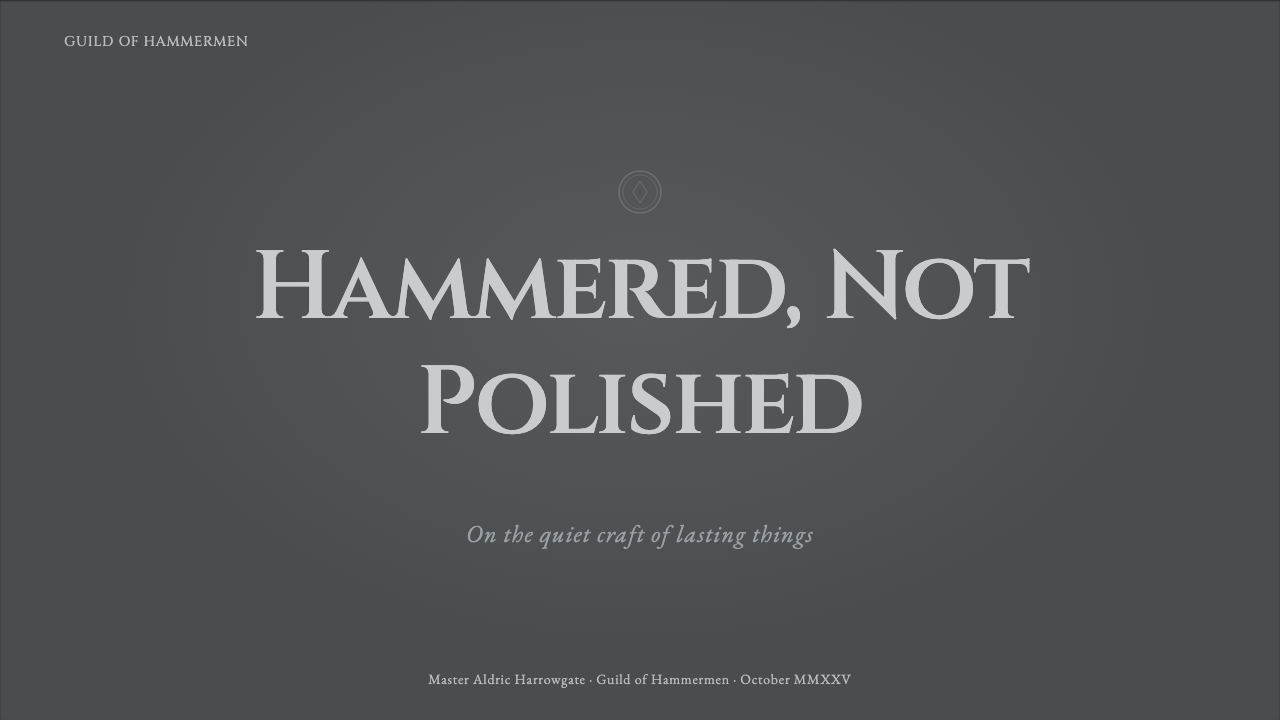
On a presentation cover slide, a matte pewter-gray field with a single circular touchmark-style emblem and a Cinzel-set title reads as immediately credible — think of it as a maker's stamp on the whole deck. Content slides benefit from banded rules used as section dividers instead of thin hairlines, and bullet hierarchy carried by capital-letter labels rather than color coding. Data slides suit a diagrammatic, engraved quality: bars and charts rendered with the same restrained highlight logic as the metal itself, avoiding glossy gradients entirely.
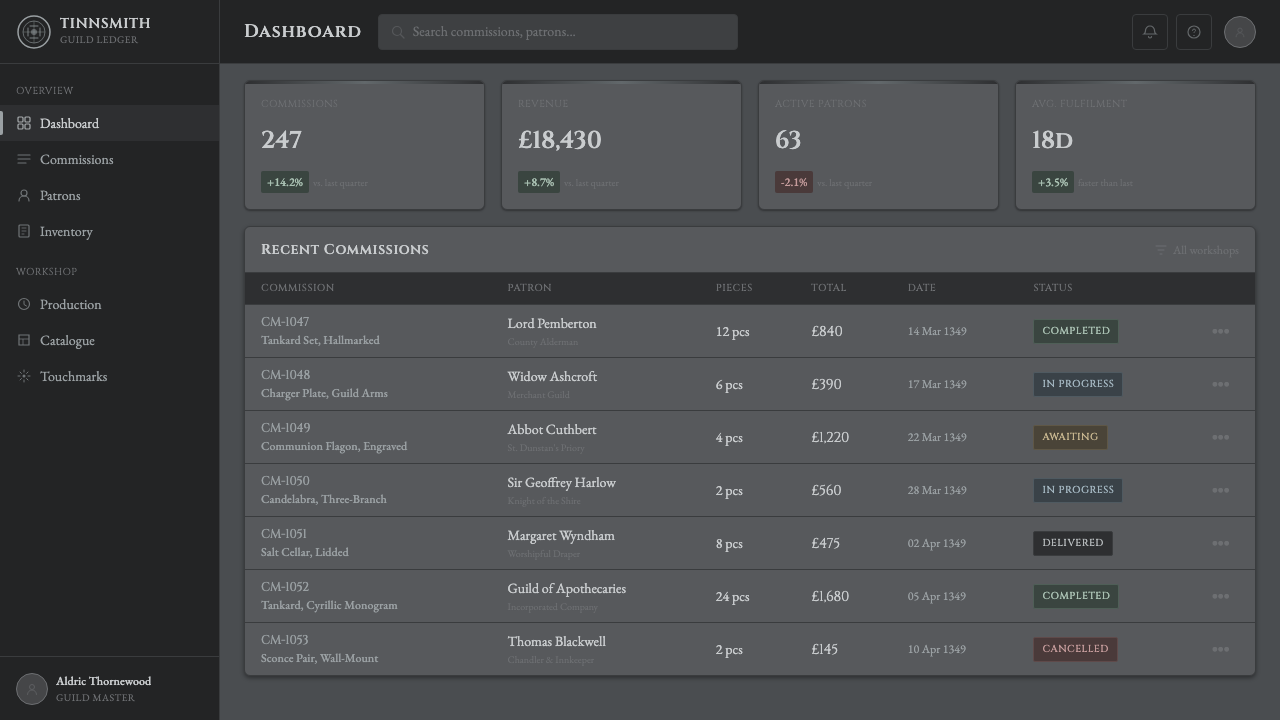
For web interfaces, the style suits products built around trust, craftsmanship, or long-term reliability — subscription services, professional tools, warranty or certification platforms. A dashboard can use pewter-gray as its dominant surface tone, reserve banded-line dividers for structural transitions, and treat any verification or premium badge as a touchmark-style stamp rather than a bright icon. Pricing pages benefit from restraint: differentiate tiers through weight and placement rather than saturated color, since the style's authority depends on not shouting.
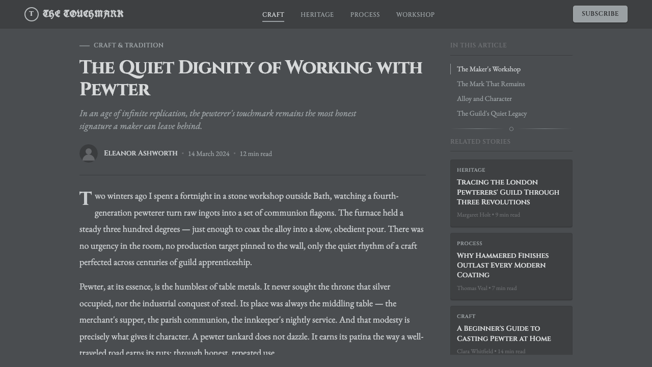
In editorial and marketing contexts, the style supports heritage, craft, and quality-focused storytelling particularly well — think artisanal goods, traditional trades, or brands built on longevity rather than novelty. Long-form articles read well with a narrow measure and banded rules marking section breaks; marketing pages benefit from a single touchmark-style emblem placed once, near a call to action, functioning as an implicit guarantee of quality.
A common mistake is polishing the style into something closer to silver or chrome — adding hard specular highlights, high contrast, or a glossy sheen erases the entire point of pewter's muted material identity. An equally common error is scattering the touchmark motif repeatedly across a layout as decorative pattern; in the historic craft, a touchmark appeared exactly once per object, and using it that way here preserves the accountability logic the mark is meant to carry.
Pewter & Tin Craft — FAQ
Why does the palette stay so muted instead of using bright metallic tones?
Because real pewter is deliberately unglamorous — it was prized as an affordable, durable everyday material, not a showpiece metal like polished silver or gold. Its matte, low-contrast reflectivity is the whole point: authority and trust here come from restraint, not brightness.
How many touchmarks should appear in a single composition?
One, generally. In the historic craft, a touchmark was a maker's single registered signature on a finished object — appearing repeatedly would have undermined its purpose as a traceable, accountable mark. Using it once, in a deliberate location, preserves that meaning; scattering it as pattern turns a signature into wallpaper.
Can this style work for a bright, playful consumer product?
Not comfortably. Its core identity — muted color, restrained highlight, quiet accountability — works against a playful or high-energy mood. It fits products that want to project reliability, craftsmanship, or longevity far better than it fits anything aiming for brightness or novelty.
What's the difference between this and a generic 'metallic' design theme?
A generic metallic theme usually chases shine — gradients, specular highlights, chrome-like reflectivity. Pewter & Tin Craft deliberately does the opposite: matte surfaces, hand-worked texture, and a single accountable stamp rather than a gleaming finish. The difference is restraint versus spectacle.
What's a common mistake when applying this style?
Polishing surfaces until they behave like silver or chrome — hard specular highlights and high contrast erase the muted, hand-worked identity the style depends on. A close second is over-decorating: adding floral flourishes or fine relief that pewter's soft surface historically couldn't support and that undermines the style's function-first restraint.
Related design styles
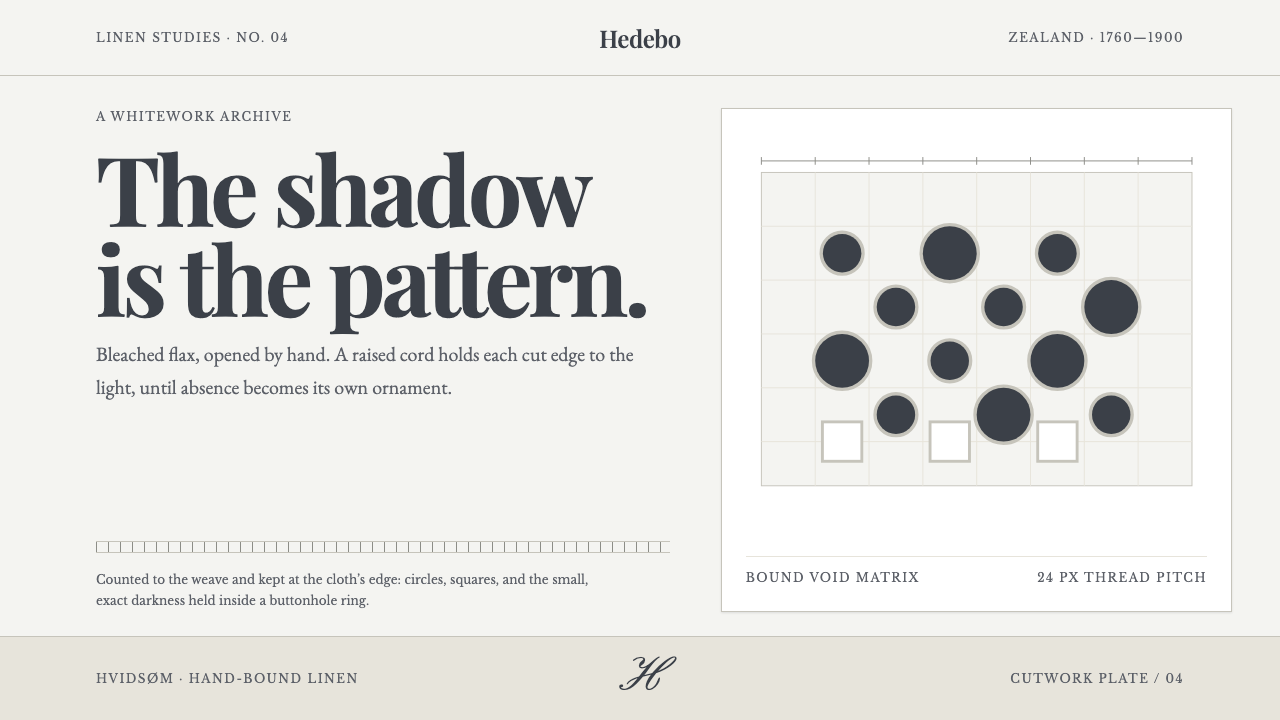 Danish Hedebo CutworkOrnament is cut, not applied. Bleached linen and bound shadow turn voids into…
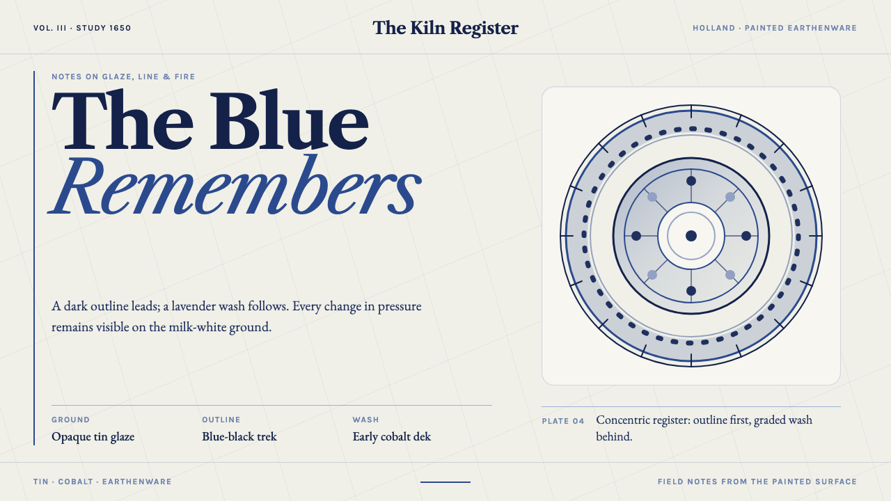 Delft BlauwBrushwork remembers. Lavender cobalt washes follow blue-black lines across mi…
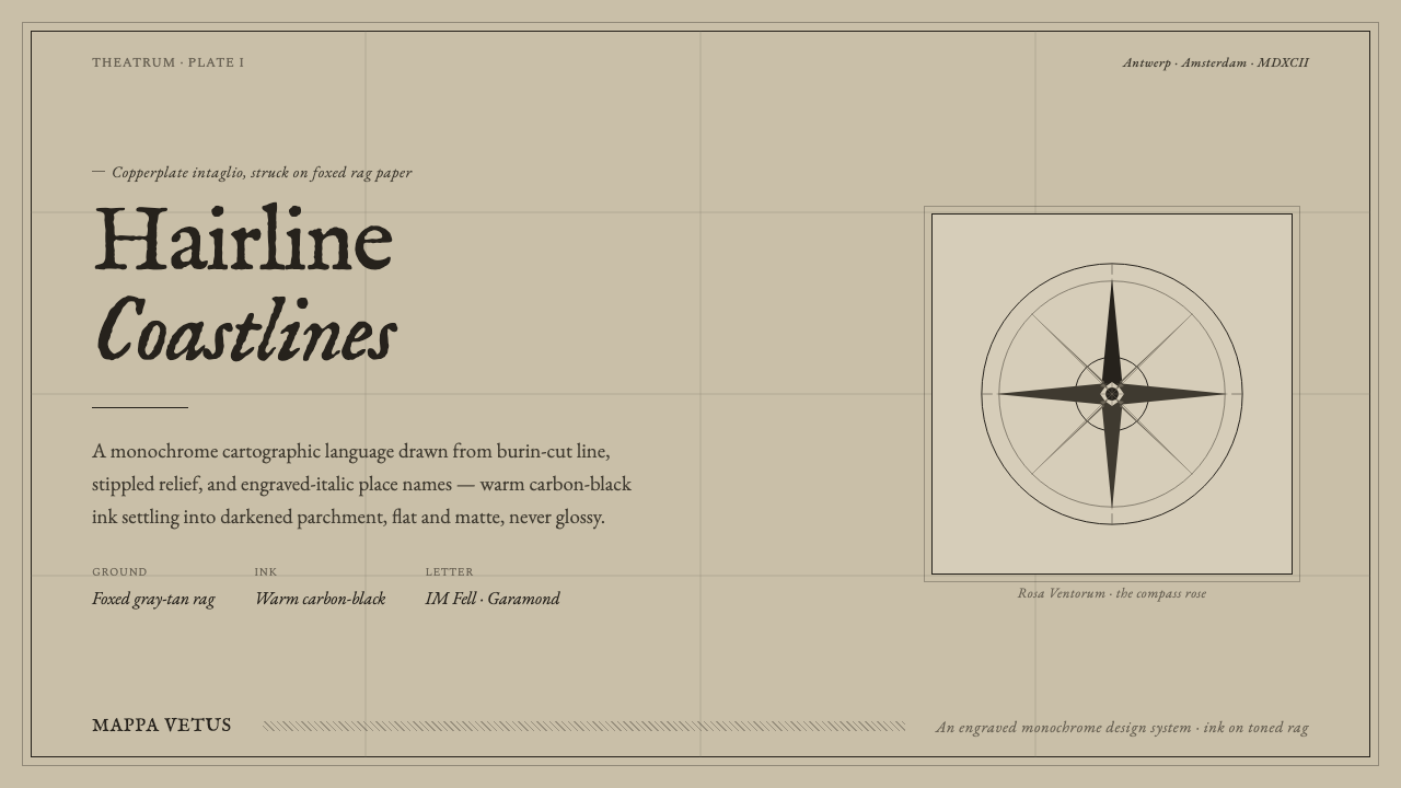 Engraved Monochrome MapThe gravity of an old printed sheet. Warm carbon-black ink on foxed rag paper…
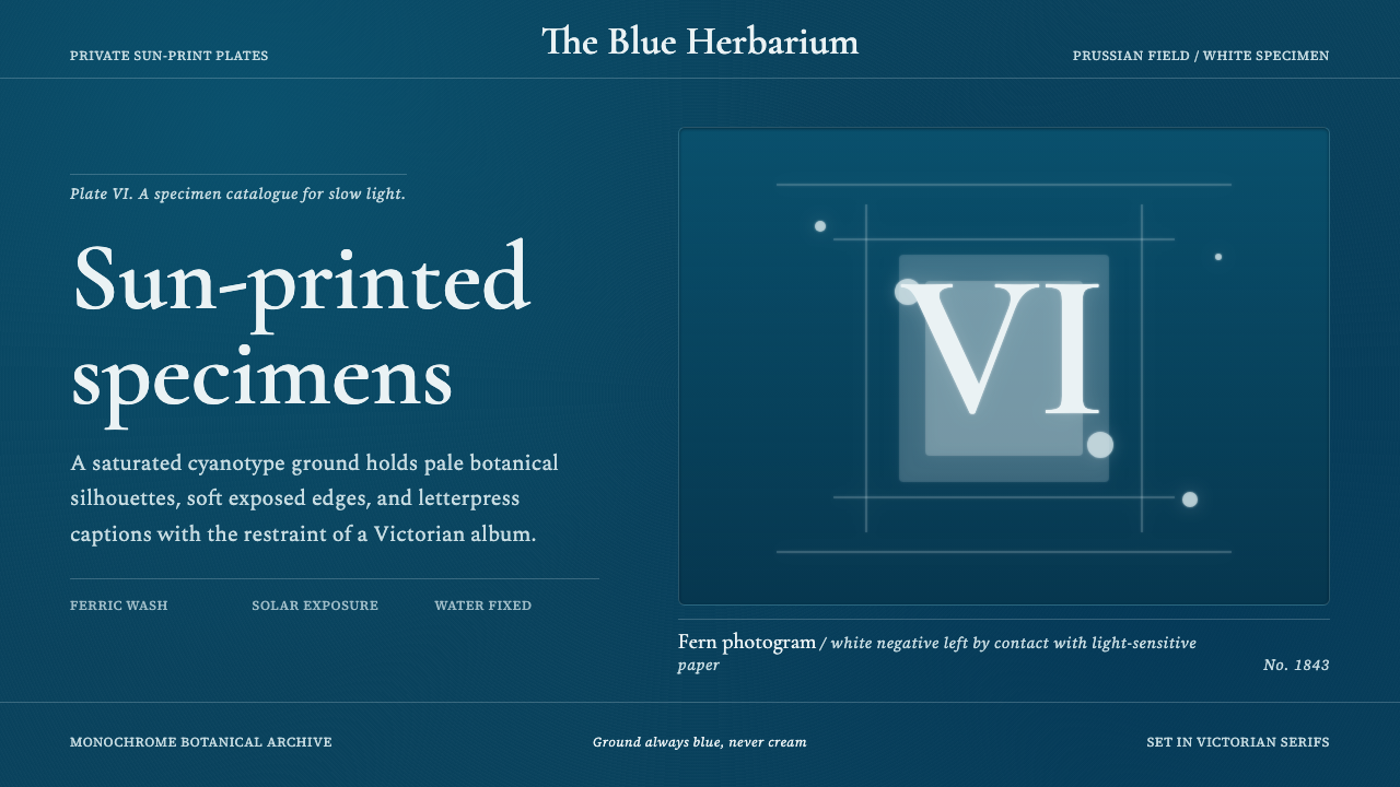 Fern CyanotypeStillness turns scientific. Prussian blue field, white photograms, Victorian…
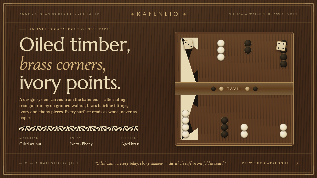 Greek Backgammon Tavli BoardThe kafeneio folded into a board. Ivory-and-ebony triangles inlaid on oiled w…
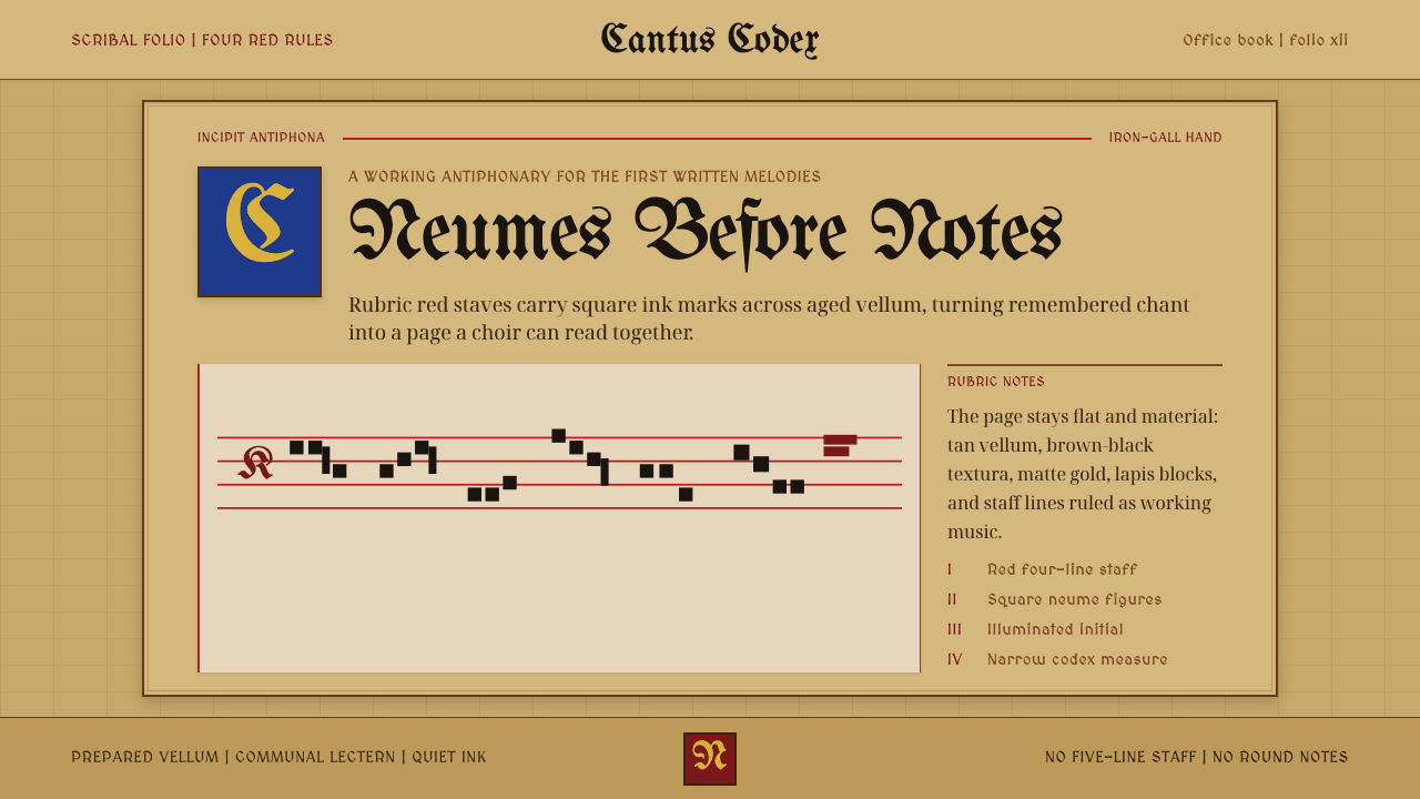 Gregorian Chant NeumesNotation becomes scripture. Rubric red staff lines and square neumes sit on t…