What is AI Tutor Classroom?
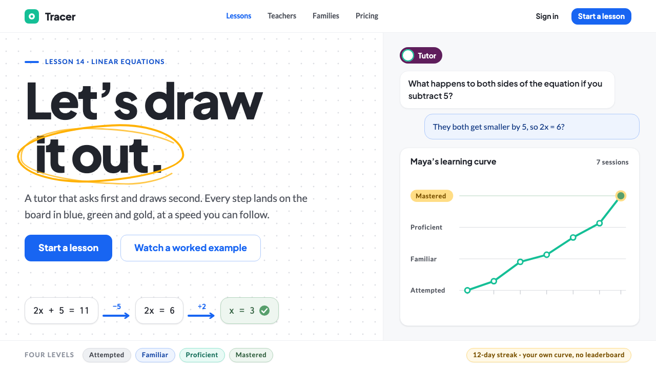
AI Tutor Classroom imagines a future teacher that draws before it talks: a white board, marker strokes in blue, green and gold, and one small eggplant avatar.
AI Tutor Classroom in brief
AI Tutor Classroom is a speculative design system set in 2035, in which every student has a personal tutor powered by artificial intelligence, and the tutor explains by drawing. It is anchored in a real product, Khan Academy's Khanmigo, introduced in 2023, and imagines the same idea a decade later, when the technology has matured and the interface has settled into something calm and familiar.
The page itself is a whiteboard. A pure-white base surface carries the tutor's reasoning as marker strokes: instructive blue for diagrams and explanations, mastery green for steps the student has got right, and streak gold for points worth remembering. Around the board, the interface stays flat and quiet, with soft rounded cards, pill-shaped chips, a conversation column in pale grey and, for each student, a learning curve that climbs from Attempted to Mastered.
The most important design decision is restraint about the tutor. It is not drawn as a robot and it has no glowing brain. It is a single eggplant-coloured chip, an avatar and a pen that never stops moving. The style says that the helper is a presence in the lesson, not a spectacle.

Where does AI Tutor Classroom come from?
The style draws on two decades of thinking about how people learn. One root is mastery learning, the idea associated with the educational psychologist Benjamin Bloom, that students should demonstrate understanding of a topic before moving on, with feedback and extra help along the way. His observation that one-to-one tutoring produces far better outcomes than group teaching has haunted education ever since, and the promise of AI tutoring is that it might make that benefit available to everyone.
The second root is Socratic tutoring, in which a teacher guides a student through questions rather than simply delivering answers. This is why the interface places so much weight on the conversation column and on the tutor's hints. A good tutor in this system asks, waits and nudges; it does not hand over the solution, and the visual design reflects that by showing the student's own attempts as clearly as the tutor's marks.
The third root is the pen-tablet explanation video, the format popularised by Sal Khan, founder of Khan Academy, in which a calm voice talks while a hand draws on a dark or light screen in real time. Millions of learners were taught this way, and its central insight is that drawing slows an explanation down to the speed of understanding. The Classroom style translates that format into an interface, making the tutor's reasoning appear stroke by stroke.
Visually, the system borrows from Khan Academy's open Wonder Blocks design tokens and from the learner-oriented Thunderblocks theme introduced in 2025. That gives it a believable grounding in a real educational product, with its friendly blues, gentle surfaces and clear status colours. The 2035 projection adds nothing flashy; the future in this style is not louder technology, but quieter, more personal attention available to every child.
What defines the AI Tutor Classroom look?
Color
A pure-white board is the base, with three functional marker colours on top. Instructive blue draws diagrams and explanations, mastery green marks correct steps and completed skills, and streak gold highlights points to remember and continuing streaks. A single eggplant tone is reserved for the tutor, so the helper is always recognisable and never competes with the student's work.
Typography
Type is friendly, rounded and highly legible, aimed at readers who may be young or still learning the language of a subject. Headings are plain and confident rather than decorative, and the board itself can host handwriting-like strokes for equations and sketches. Contrast and size favour comfort over density.
Marker strokes
The signature element is the stroke. Lines are drawn progressively, as if by a hand, with a slightly imperfect, human quality. Circles, arrows and underlines appear on the board in the order the tutor would draw them, so that the sequence of marks is itself part of the explanation.
Cards and chips
Everything around the board is flat and gentle. Soft rounded cards hold lessons and exercises, pill-shaped chips show status and topic, and shadows are barely there. The surfaces are designed to recede, so the eye stays on the board and the conversation.
Conversation column
The dialogue sits in a pale grey column beside the board, with the student's messages and the tutor's hints separated by gentle shape and alignment rather than loud colour. It reads like a quiet chat in the margin of a worksheet, not like a customer-service window.
Learning curve
Each student has a visible path that rises from Attempted through Familiar and Proficient to Mastered. The curve is shown as a simple line or stepped bar in the system's green, framed as progress rather than as a score, which keeps the tone encouraging and the focus on growth.

Who shaped AI Tutor Classroom?
Founder of Khan Academy and the best-known advocate of explaining by drawing on a screen. His work on free online lessons and, later, on the Khanmigo tutor is the direct inspiration for this system's whiteboard-first approach.
Educational psychologist associated with mastery learning and with the observation that one-to-one tutoring outperforms conventional group teaching. His ideas supply the intellectual backbone of the learning-curve display and the emphasis on moving on only after understanding.
Khan Academy's AI tutor, introduced in 2023, and the real-world starting point for this system. It showed that a tutor could guide with questions and hints rather than hand over answers, which this style turns into a whiteboard, a quiet conversation column and a visible path to mastery.
How do you use AI Tutor Classroom today?
For slides, treat the cover as a clean board. Use a white background, a short title in a calm, friendly typeface, and one hand-drawn-looking diagram stroke in blue. Content slides can pair a simple diagram on the left with a few short sentences on the right, using green ticks for completed ideas and gold for the single takeaway. Always leave space; the style is designed around clarity of thought.
For data slides, build charts as if they were drawn on the board. Use blue for the main series, green for progress or success, and gold for the one value to remember. Keep gridlines light and labels in plain words, and consider showing progress as a learning curve rather than a single percentage, which reinforces the idea of growth over time.
For web interfaces such as dashboards and pricing pages, the style suits education technology, training platforms, onboarding flows and any product where the user is learning something. A dashboard can show lessons as soft cards with status chips and a progress line, while the conversation with an assistant stays in a quiet side column. Pricing pages should be friendly and plain, with one clearly highlighted plan and no pressure.
For editorial and marketing work, the style is effective in explainers, course landing pages, school-district communications and parent-facing materials. Large whiteboard illustrations, annotated in the three marker colours, convey a human teacher's patience. Pair them with short, encouraging copy that talks about steps and understanding rather than speed or scores.
The most common mistake is to make the AI the star. A glowing orb, a cartoon robot or heavy sparkle effects contradict the system's premise that the tutor is a calm presence. A second mistake is to use the three marker colours decoratively; each has a job, and using green for something that is not mastery, or gold for something that is not worth remembering, quickly weakens the whole system.

AI Tutor Classroom — FAQ
What is the AI Tutor Classroom design style?
It is a speculative 2035 interface style for personal AI tutoring: a pure-white whiteboard surface on which the tutor draws in blue, green and gold marker strokes, surrounded by soft cards, pill chips, a pale grey conversation column and a per-student learning curve. The tutor is represented only by a small eggplant-coloured avatar.
Is it based on a real product?
Yes, in its inspiration. It is anchored to Khan Academy's Khanmigo tutor from 2023 and borrows the spirit of the open Wonder Blocks tokens and the 2025 Thunderblocks learner theme. The 2035 setting, however, is a projection, not a description of any shipping product.
Why does the tutor have only a single small chip?
Because the learning belongs to the student. Giving the tutor a modest, consistent mark keeps attention on the board and the student's attempts, and avoids the gimmicks of robot mascots or glowing brains that can make a helper feel either intimidating or childish.
How does it differ from a standard education app style?
Many education apps rely on bright game-like colours, badges and mascots. This style is calmer and more purposeful: three marker colours with clear meanings, a whiteboard focus, and progress presented as a curve of understanding. It feels closer to sitting beside a patient teacher than to playing a game.
What kinds of projects suit this style best?
Learning platforms, onboarding and training tools, educational explainers, school and parent communications, and any product that guides a person step by step through something new. It is less suited to high-intensity entertainment or luxury branding, where its calm, instructional tone would feel mismatched.
Related design styles
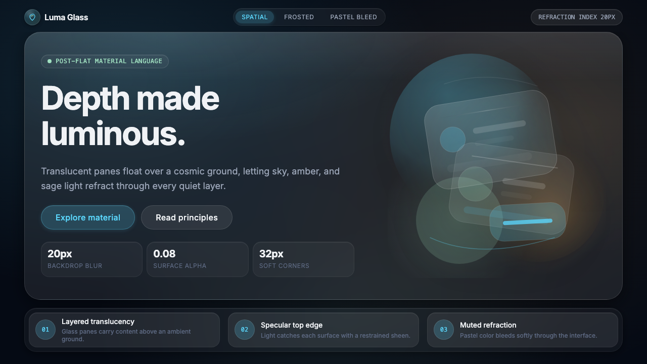 Apple Liquid Glass 2024Skeuomorphism, reborn for spatial. Frosted panels, specular highlights, depth…
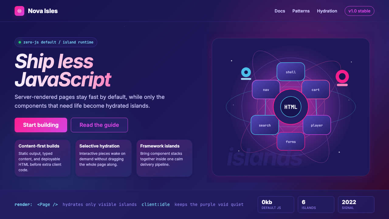 Astro Islands Architecture 2022Warm cosmic devtools. Deep violet, magenta glow, Inter clarity, and island ge…
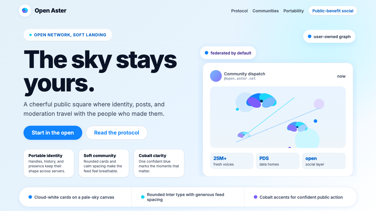 Bluesky AT Protocol 2024Open tech feels warm. Pale sky, cloud cards, Inter, and one cobalt accent car…
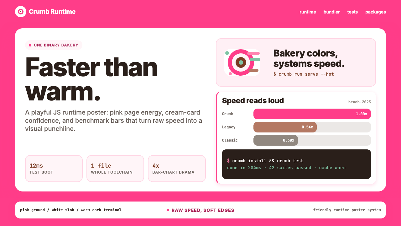 Bun JS Runtime Pink 2023Dev speed gets bakery-bright. Hot pink grounds white slabs, mono bars, and wa…
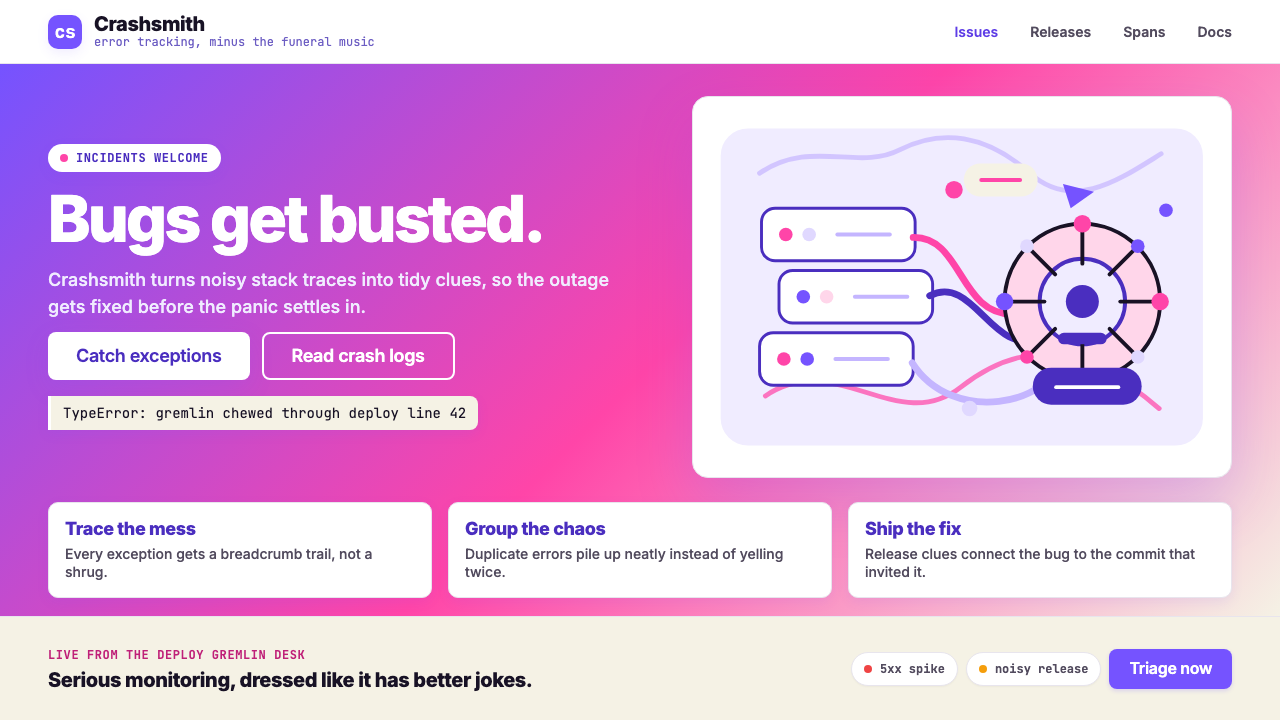 Sentry 2023Debugging gets weird on purpose. Purple-pink gradients, Inter heft, and doodl…
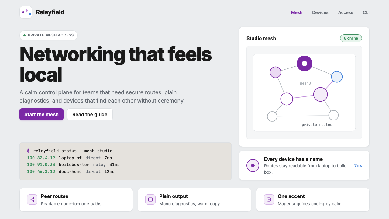 Tailscale Mesh VPN 2024Friendly infrastructure. Cool grey cards, magenta mesh nodes, and mono CLI bl…