What is Perseverance & Ingenuity?
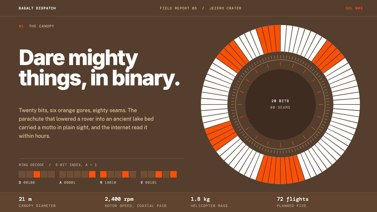
Perseverance & Ingenuity is a mission-feature style cut from the first weeks on Mars: dark Jezero basalt, a butterscotch sky, and one international orange reserved for the single thing that must be seen.
Perseverance & Ingenuity in brief
Perseverance & Ingenuity is a dark, editorial design style built from imagery of NASA's Mars 2020 mission: the rover Perseverance and its small helicopter companion Ingenuity, which landed in Jezero crater on 18 February 2021. Its ground is the dark reddish-brown basalt seen in the Mastcam-Z panorama taken on the third Martian day, its accent band is a sky the colour of butterscotch, and its single loud colour is the international orange of the parachute that slowed the descent.
The style reads like a long-form mission feature in a science magazine. Inter carries the headlines, Public Sans handles the reporting, and DM Mono is used for sol counts, flight logs, and captions. Photographs are shown as they came back: grayscale Navcam frames from the rover and its helicopter, uncropped, unretouched, and trusted to carry their own authority.
Its signature idea is that orange means a one-bit. On the original parachute, white and orange gores spelled a message in binary, so in this system orange is treated as information rather than decoration. It appears only where a reader must look, a key figure, a timestamp, a link, and nowhere else. Everything around it stays quiet so that one mark can be loud.

Where does Perseverance & Ingenuity come from?
The Mars 2020 mission launched in 2020 and brought Perseverance to Jezero crater, a basin that scientists believe once held a lake and a river delta. The landing on 18 February 2021 was followed by weeks of checkout, during which the rover's cameras began to build up a picture of the site. The style takes its look from those first weeks: the dark basalt ground in the Mastcam-Z panorama taken on the third sol, a pale warm sky, and the first black-and-white frames from the navigation cameras.
Ingenuity travelled to Mars attached to the rover's underside, and its first flight on 19 April 2021 was a demonstration that powered, controlled flight was possible in the thin Martian atmosphere. The helicopter's project was led at NASA's Jet Propulsion Laboratory in Pasadena by MiMi Aung. What mattered visually was that this small machine returned its own grayscale imagery, so the mission acquired a second camera perspective, and a second kind of image, a plain, low-resolution, honest one.
The parachute is the other root of the style. Its white and international-orange gores were not only a colour choice but a code: the pattern spelled Dare Mighty Things in binary, a phrase associated with Theodore Roosevelt and used as a motto at the laboratory. Ian Clark, an engineer on the landing system, is the person tied to the parachute and its hidden message. The detail explains the whole logic of the style: a single colour, given a single meaning, that rewards the people who look closely.
In design-history terms, the style combines three lines. First, the Mars 2020 mission itself and the way it was photographed and published. Second, the NASA brand system, with its confident, utilitarian sans-serif type and its disciplined use of a few signature colours. Third, mission-storytelling editorial: the feature layout in which long text, timestamps, and raw photographs share a page. The result is a style for explanation as much as for appearance.
What defines the Perseverance & Ingenuity look?
Color
The ground is dark basalt, a deep reddish brown that reads almost black on screen, with a butterscotch band for sky and warm off-white for text. Orange is the only saturated colour and it is rationed: one mark per view where possible. Grayscale photographs are left alone so the single orange feels like a decision rather than a theme.
Typography
Three typefaces divide the work. Inter, a clean grotesque, sets headlines with a confident weight. Public Sans, designed for public-service reading, sets the reporting in a calm and legible text size. DM Mono marks everything machine-made: sol counts, flight numbers, coordinates, and captions. The monospaced voice tells the reader that this is data, not narration.
Imagery
Photographs are mission frames, shown honestly. Navcam images stay grayscale, panoramas keep their wide aspect, and the grain and limited resolution are not hidden. There is no stock photography, no composite hero image, and no filter. Credit lines and sol numbers sit with each picture, treating it as evidence.
Layout
Pages follow a long-form feature rhythm: a wide opening image, a narrow reading column, margin notes in mono, and full-bleed panoramas that interrupt the text at key moments. Spacing is generous, sections are introduced by sol or date, and the page unfolds like a mission log rather than a brochure.
Surface and depth
Because the ground is dark, hierarchy comes from tone and spacing rather than shadows. Panels are slightly lighter or darker than the background, rules are thin and low in contrast, and photographs sit flat on the page. Nothing glows. The style borrows the stillness of a control-room display.
Data presentation
Timelines, flight logs, and tables are first-class citizens. Entries are set in the monospaced face, aligned in strict columns, and separated by quiet rules. Charts use warm greys with orange picking out the one value under discussion. The design assumes the reader will want to verify a number, not just admire it.
Motion and tone
Motion is minimal and purposeful: a slow reveal of a panorama, a gentle scroll that advances the timeline. Copy is plain, specific, and unembellished, closer to a flight engineer's briefing than a marketing line. Excitement is allowed, but it is earned by the facts on the page.

Who shaped Perseverance & Ingenuity?
An engineer on the Mars 2020 landing system, associated with the parachute and the binary message hidden in its gores. His work is the origin of the idea that one orange can carry exactly one bit.
Project manager of the Ingenuity helicopter at NASA's Jet Propulsion Laboratory. Under her leadership the small aircraft completed its first flight on 19 April 2021, giving the mission its second set of grayscale images and its second protagonist.
The phrase Dare Mighty Things is associated with him and was encoded on the parachute in binary. His presence in the story is a reminder that the style's drama comes from words and meaning as much as from hardware.
The laboratory in Pasadena, California, runs the Mars 2020 mission. Its public imagery, mission pages, and brand conventions are the practical source for the way this style tells a story with raw frames and plain, careful language.
How do you use Perseverance & Ingenuity today?
For slides, this style suits science, engineering, and research presentations: mission reviews, postmortems, lab updates, and technical talks. A cover can pair a full-width basalt field with a large Inter title and a single orange rule. Content slides work best as one photograph or one diagram with a short mono caption, leaving the rest of the slide dark and empty. Treat each slide like a page of a mission log.
For data slides, build timelines and tables first. A sol-by-sol or date-by-date sequence set in the monospaced face, aligned in columns, tells a project story better than a decorative infographic. When a chart is required, use warm grey lines and bars and apply orange to the one series or value the audience must remember. If everything is orange, nothing is.
For web and product interfaces, the style is a strong fit for status pages, technical documentation, engineering blogs, observability dashboards, and data journalism. Dark ground reduces glare for long reading, the three-font system gives a clear hierarchy, and mono labels make machine states easy to scan. Keep interactive elements understated and let orange mark the primary action or the live alert.
For editorial and marketing work, think long-form feature. Case studies, launch retrospectives, annual reports, and science-communication pieces can use a wide photographic opening, a narrow text column, margin annotations, and full-bleed images placed at turning points. Write in specific, concrete sentences with dates and measurements; the style punishes vagueness and rewards precision.
The most common mistake is spending the orange too freely. When buttons, icons, headlines, and borders all turn orange, the one-bit logic is lost and the page becomes a generic dark theme. A second mistake is retouching the photographs, adding colour grades or glowing overlays; the raw grayscale frames are the style's evidence. Keep the ground dark, the type calm, and the orange rare.

Perseverance & Ingenuity — FAQ
What does the orange mean in this style?
Orange means a one-bit: a single, deliberate signal. It comes from the Perseverance parachute, whose white and international-orange gores spelled a message in binary. In the design system, orange marks only what the reader must notice, such as a key figure, a live status, or a primary action, and is kept out of backgrounds and decoration.
Why three different typefaces?
Each face has a distinct voice. Inter carries the headlines, Public Sans carries the reporting, and DM Mono carries machine-made information such as sol counts and flight logs. The separation lets readers tell at a glance whether they are reading story, explanation, or data, which suits a mission-feature layout.
Is this a dark mode or a full dark theme?
It is a full dark theme with its own identity rather than an inverted light one. The ground comes from Martian basalt, the sky band and orange have fixed roles, and photographs are grayscale. Simply inverting a light site would lose the warm brown tone and the rationed-accent logic that define it.
Can I use it outside space or science topics?
Yes. Its underlying idea, a dark calm ground, three clear type voices, and a single rationed accent, suits any subject that values evidence and precision: engineering write-ups, security reports, financial research, data journalism, and documentation. The mission imagery is optional; the discipline is what carries over.
What is the main way to get it wrong?
Overusing orange and over-processing images. If every heading, button, and border is orange, or photographs are colour-graded and given glows, the page loses the honesty the style depends on. Keep one orange mark per view where you can, and show images as they are.
Related design styles
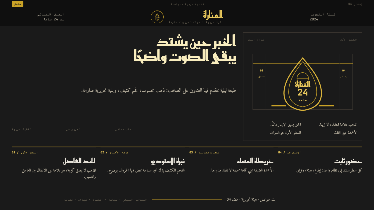 Al Jazeera Arabic NewsAuthority, stripped bare. Gold seal, dense Arabic type, matte charcoal.
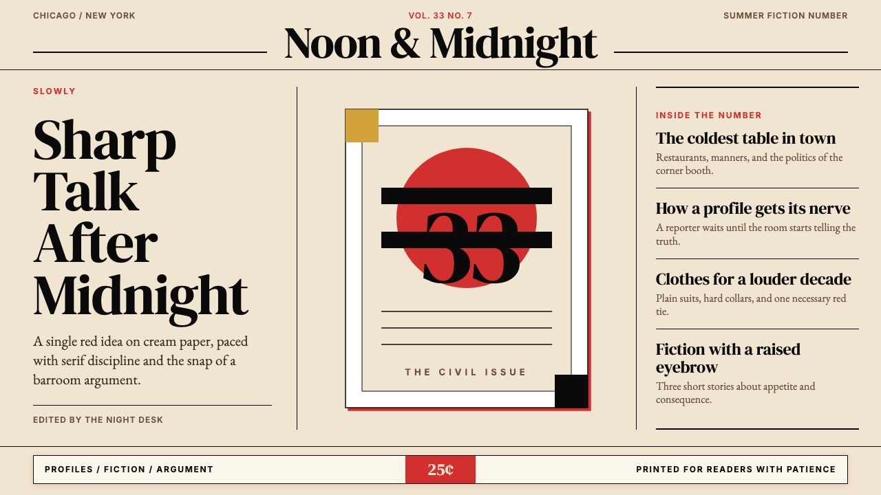 Esquire MagazineConceptual punch on paper. Cream stock, black hairlines, and one saturated re…
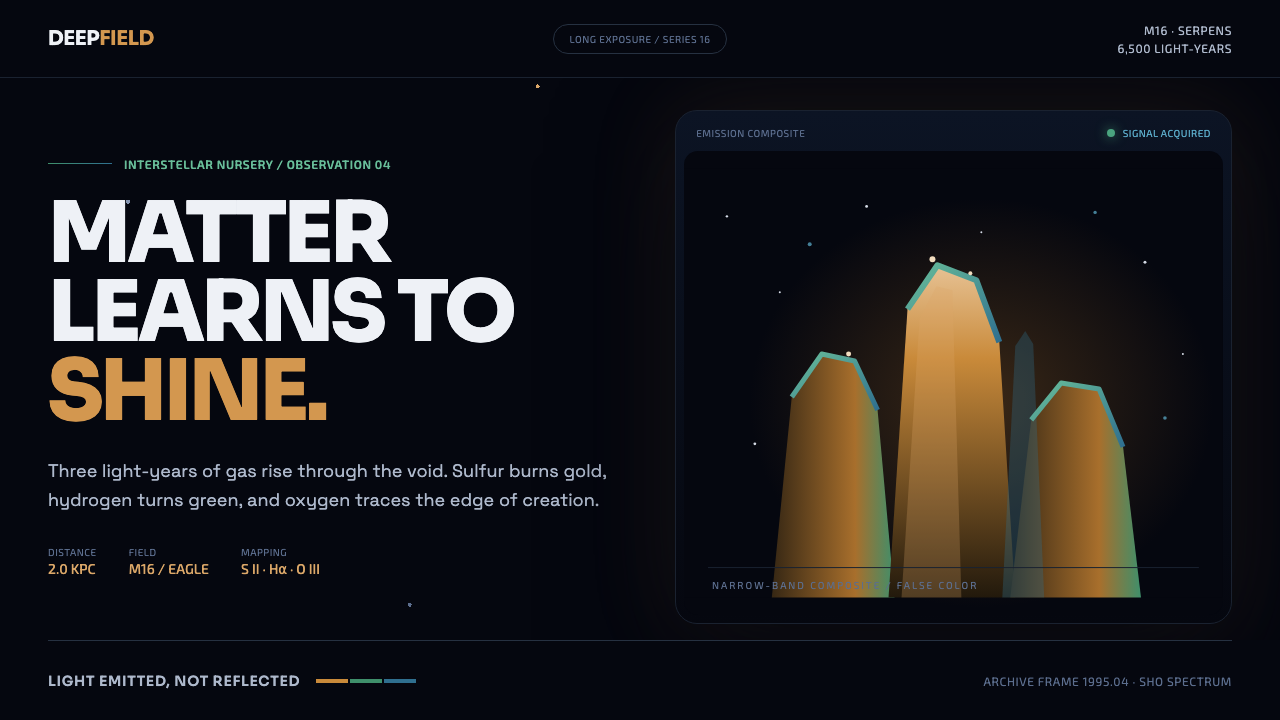 Hubble Pillars of CreationCreation glows from within. Amber towers rise through a cyan-green rim into t…
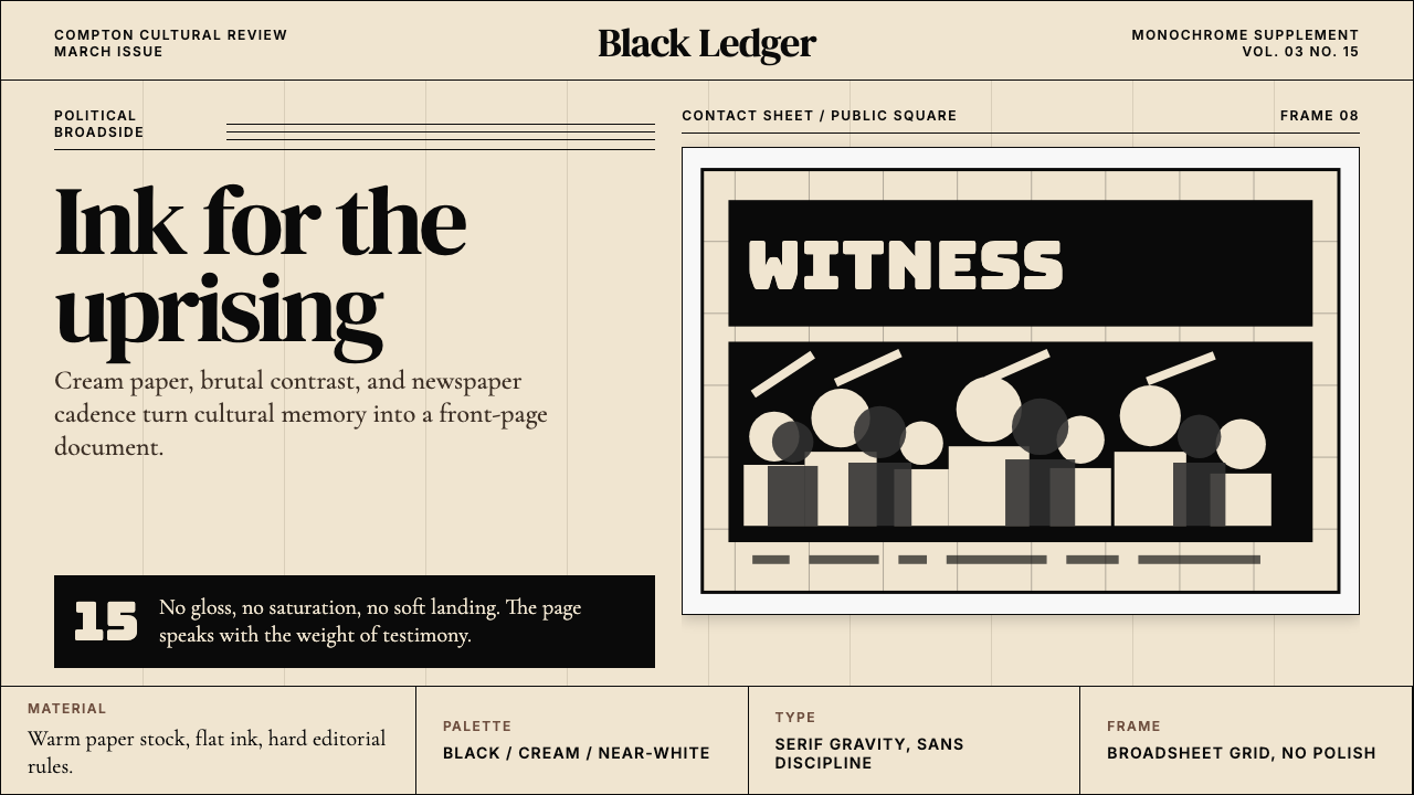 Kendrick — To Pimp a ButterflyPolitical weight, printed cold. Cream paper, hard serif type, monochrome crow…
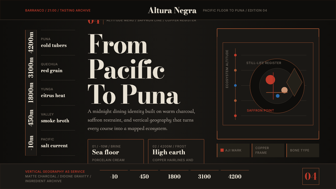 Lima Nuevo Andino CuisineAltitude turns luxurious. Charcoal fields, copper hairlines, and saffron-red…
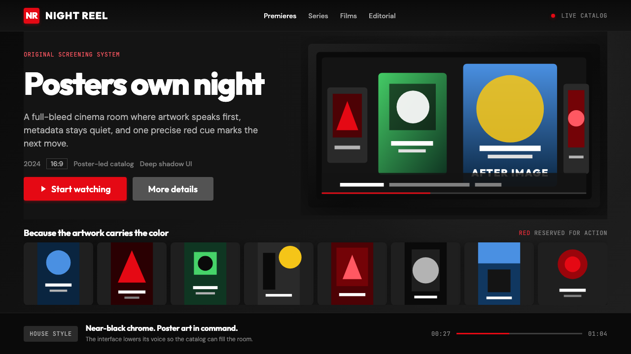 Netflix 2024Cinema UI goes dark. Near-black chrome, poster rails, and one surgical red ac…