What is Parasite?
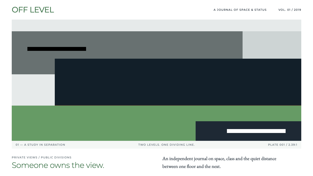
The Parasite style turns two film sets into one visual argument: cool grey, lawn green and stepped planes that stay perfectly still while quietly dividing the page into above and below.
Parasite in brief
The Parasite style is a design language drawn from Bong Joon-ho's 2019 film of the same name. It borrows the look of the film's two principal spaces: the Park family's hillside house, built from grey concrete, walnut panelling and one very long pane of glass facing a lawn, and the Kim family's semi-basement flat, whose only window sits at the height of passing feet. The style takes the architecture's calm, orderly surfaces and uses them as a layout system.
Visually it is a wide, cool, restrained look. Large areas of pale grey and white paper carry the page, and a lawn green appears in small, deliberate doses, most often as a title in a corner. Thin rules, strict right angles and stepped levels organise the content. Where a portrait or a key image appears, a black bar may cross it, a direct echo of the film's poster.
What makes the style distinctive is its tension. Everything is quiet and tidy, yet the page feels slightly uneasy, because the same orderliness that signals comfort also signals separation. Layouts are generous with empty space, and that emptiness is part of the message: the style is about what a calm surface hides rather than what it shows.

Where does Parasite come from?
Parasite premiered in 2019 and became a landmark of twenty-first-century Korean cinema. It won the Palme d'Or at Cannes in May 2019 and then the Academy Award for Best Picture in February 2020, the first non-English-language film to take that prize. Its subject is class: a poor family gradually works its way into the household of a wealthy one, and the story ends in violence. Because the theme is social position, the film's spaces had to do narrative work, and its visual identity grew directly out of them.
The Park house was not a found location. It was built as a set under the direction of production designer Lee Ha-jun, who conceived the house as a piece of modernist residential architecture, with concrete columns, warm walnut surfaces and a single wide window that frames the garden like a screen. The Kim family's semi-basement stands at the opposite pole. Its window looks out at street level, so the family's view of the world is the lower half of passing people. Together the two sets give the film a vertical structure, with the wealthy above and the poor below, and the staircases, slopes and level changes connecting them became the film's central visual motif.
The cinematographer Hong Kyung-pyo shot the film in a wide frame, which gave the architecture room to be seen as a composition, not just a background. Lines are long and horizontal, surfaces are clean, and the camera often holds still. That stillness is what the design system inherits. The style does not try to reproduce film frames; it translates their rhythm into spacing, alignment and proportion.
The graphic identity of the film's promotion is credited to the poster designer Kim Sang-man. His poster logic is the second foundation of the style: a white paper margin frames a garden scene, a green title in Korean letters sits in the upper corner, and black bars cross the eyes of the people pictured. It is a single, memorable idea, concealment, delivered with almost no decoration. The style takes that logic and turns it into a set of page habits: a white frame, one green accent, and the occasional deliberate obstruction. The result sits at the meeting point of Korean cinema, the social-class thriller and modernist domestic architecture used as a film set.
What defines the Parasite look?
Cool grey ground
The base of the palette is pale concrete grey and clean paper white, the colours of the Park house's walls and columns. The surfaces feel mineral, calm and slightly cold. Because there is so little chroma, any hint of colour becomes an event, and the page reads as expensive precisely because it refuses to shout.
Lawn green accent
Green is the only strong colour and it is rationed. It names the lawn seen through the great window and the title colour of the poster. It belongs on a heading, a small marker or a single link, never as a wide fill. One green element per view is usually enough.
Stepped planes
Content is arranged on levels that step up or down rather than sitting on one flat line. Blocks are offset against each other the way the film's stairs and slopes offset the two households. The stepping gives a calm page a spatial story: some things are higher, others lower, and the reader senses the difference before reading a word.
Wide-frame proportion
Hero images, banners and cards favour a long horizontal proportion borrowed from widescreen cinema. Images are cropped like film frames, with a lot of horizontal room and a thin sense of height. The proportion makes even a small section feel like a shot from a film.
Thin rules and right angles
Structure comes from hairline rules and strict orthogonal alignment, not from boxes, shadows or rounded corners. Lines divide space the way partitions and window frames do in the film's architecture. Everything is square, aligned and measured, which is what makes any irregularity feel meaningful.
The black bar
A black bar crossing a portrait or an image is the style's signature gesture, taken from the poster. It hides, redacts and quietly accuses. Used once, it creates intrigue; used everywhere, it becomes a gimmick, so it should remain the exception on any page.
Generous silence
Whitespace is abundant and deliberate. Paragraphs are short, margins are wide and there is rarely more than one idea in view. The emptiness is what produces the slight unease: a lot of room is set aside for something, and the reader wonders what.

Who shaped Parasite?
Director and co-writer of Parasite, whose social-class thriller won the Palme d'Or and Best Picture. His habit of expressing theme through architecture and levels is the root of the whole style.
Production designer who had the Park house built as a set: grey concrete, walnut and a long pane of glass facing a lawn, plus the contrasting semi-basement. The materials and proportions of the style come from his work.
Cinematographer who shot the film in a wide frame with long horizontal lines and a patient, often still camera. The stillness and proportion of the style descend from his framing.
Poster designer behind the film's graphic identity: a white paper margin, a green title in the corner and black bars over the eyes. The style's frame, accent and concealment gesture all trace back to this poster logic.
How do you use Parasite today?
In slides, the Parasite style suits decks that deliver an argument rather than a pitch. A cover works well as a pale grey page with a white frame, a single green title in the corner and one wide image below. Content slides should keep to one idea each, with a thin rule separating a short heading from a short paragraph. Data slides benefit from stepped layouts: place the higher-priority figure on an upper level and the supporting figures on a lower one, so the hierarchy is spatial and needs no extra decoration. Charts should be monochrome grey with green reserved for the one series that matters.
In web interfaces, the style is best for editorial, architectural, film-related and design-focused sites, where a calm and slightly unsettling tone is an asset. Navigation should be minimal and aligned to a strict grid. Cards can step down the page rather than sitting in a flat row. For dashboards and pricing pages it needs care: its generous silence suits a few high-quality options, not dense tables, so it should be used for overview and summary screens and relaxed where data density rises. Buttons stay simple, rectangular and understated, and green appears only on the primary action.
In editorial and marketing work, the style shines in film reviews, essays about housing and class, architecture features and long-form interviews. A white margin around a photograph, a green headline and a black bar over a detail make an instantly legible cover. Pull quotes should sit on their own level with a lot of space around them. Because the look is associated with a famous film, it works best as an homage or an analytical frame, and copy that discusses class, space and distance will feel natural beside it.
The most common mistake is overusing the signature gestures. Black bars on every image, green on every heading and steps on every section turn a refined system into a costume, and the unease the style depends on disappears. A second mistake is filling the space: crowding the page with content removes the silence that carries the meaning. A third is warming the palette with beige, gold or soft gradients, which dissolves the cool concrete feeling. When in doubt, remove something, align what remains and let one green mark do the speaking.

Parasite — FAQ
What is the Parasite design style?
It is a design language inspired by Bong Joon-ho's 2019 film Parasite. It combines cool grey and white surfaces, a rationed lawn green, thin rules, wide-frame proportions and stepped layouts. The goal is a page that looks calm and orderly while hinting at hidden divisions between above and below.
Where do its colours and layouts come from?
Two sources. The set designs supply the greys, the lawn green and the stepped levels: the Parks' concrete and walnut hillside house and the Kims' semi-basement. The film's poster, designed by Kim Sang-man, supplies the white paper margin, the green title in the corner and the black bars over the eyes.
What kinds of projects suit it?
It suits film reviews, architecture and design writing, essays about class and space, editorial sites and decks built around an argument. It is weaker for dense data products or playful consumer brands, where its silence and unease can feel wrong.
How do I avoid it looking like a costume?
Use the signature gestures sparingly. Keep one green element per view, use a black bar only where concealment makes sense, and step the layout only where hierarchy needs it. Keep margins generous and the palette cool, and let the stillness do most of the work.
Is it a good choice for dashboards or pricing pages?
Only with care. The style rewards a few well-spaced items, so it works for overview screens and short plan comparisons. When data density grows, relax the empty space and keep the grey ground, thin rules and single green accent so the page stays recognisable without becoming cramped.
Related design styles
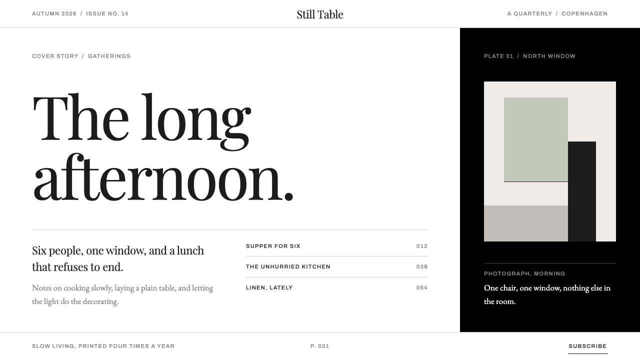 KinfolkA quarterly of mostly margin. Hairline serif on true white, broken by one ful…
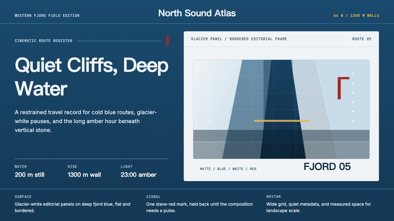 Norwegian Fjord TourismMonumental, not loud. Fjord blue, glacier-white panels, and one stave-red acc…
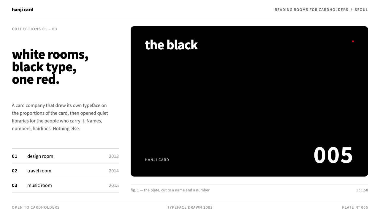 Hyundai CardA typeface on a card-shaped grid. One black plate in white rooms, hairline ru…
 Nordic Noir TitlesThe grade carries the drama. Cold blue-green plates and low tracked caps hold…
 Seydou Keïta PortraitsPattern is the portrait. Silver-grey cloth fields collide inside crisp white…
 ApartamentoRooms left as they were found. Heavy Fraunces over plain white, Jost captions…